The marketing technology (martech) landscape is booming—and so is the complexity that comes with it. With over 11,000 martech tools on the market, many organizations find themselves buried in platforms, subscriptions, and software that don’t deliver ROI.
If your martech stack feels more like a maze than a growth engine, it’s time for a strategic reset. Here’s how to go beyond the buzzwords and optimize your martech for real results.
Why Martech Optimization Matters
A bloated or misaligned martech stack can lead to:
- Redundant tools and wasted spend
- Disconnected data and siloed teams
- Underused software and poor adoption
- Difficulty proving ROI to stakeholders
Optimizing your martech means streamlining tools, aligning them to business goals, and ensuring every platform delivers measurable value.
Step 1: Align Martech to Marketing Goals
Start with the “why” before the “what.” Define:
- Primary objectives (Lead generation? Customer engagement? Attribution?)
- Success metrics (Conversions, CAC, lifetime value, campaign ROI)
- Key workflows that need to be supported by tech (Email automation? CRM integration? Ad targeting?)
This ensures your stack supports your strategy, not the other way around.
Step 2: Audit Your Existing Stack
Conduct a full martech inventory:
- List all platforms by category (CRM, email, CMS, analytics, etc.)
- Note users, costs, usage levels, and integrations
- Highlight tools that are underutilized or duplicative
Tools like CabinetM or G2 Stack can help visualize your ecosystem.
Step 3: Identify Gaps and Overlaps
Look for:
- Tools that serve the same function (e.g., two email automation platforms)
- Missing capabilities (e.g., no attribution modeling or A/B testing tool)
- Data disconnects between platforms
Ask: is each tool mission-critical, or is it a “nice to have”?
Step 4: Streamline and Strategically Select New Tools
For any new martech selection:
- Start with clear use cases
- Involve cross-functional teams (marketing, sales, IT)
- Prioritize platforms that integrate easily and scale with you
Beware of shiny object syndrome—choose utility over novelty.
Step 5: Ensure Adoption and Performance
A platform is only valuable if your team actually uses it. Focus on:
- Onboarding and training
- User-friendly dashboards and automation
- Regular check-ins and optimization cycles
- Tracking ROI with clear KPIs
Martech should evolve alongside your marketing strategy—not become an obstacle to it.
Cut the Noise. Maximize the ROI.
Effective martech isn’t about having more tools—it’s about having the right tools. By taking a strategic, user-centered approach to optimization, businesses can simplify their stack, reduce costs, and improve outcomes across the funnel.
Want help making your martech stack work harder (and smarter)? Connect with Bluetext to schedule a martech optimization consultation.
Marketing technology has transformed how businesses engage with their audiences, but managing an increasingly complex tech stack can be overwhelming. Without proper integration, companies risk inefficiencies, data silos, and missed opportunities. To maximize impact, businesses must streamline their Martech stack, ensuring seamless workflows, improved collaboration, and measurable results.
Understanding the Martech Landscape
The Martech ecosystem includes tools for automation, customer relationship management (CRM), content marketing, analytics, and more. However, the abundance of options often leads to bloated tech stacks that hinder efficiency rather than enhance it. Businesses must take a strategic approach to integrating their Martech tools to ensure they work together effectively.
Common Martech Challenges:
- Tool Overload: Using too many platforms can lead to inefficiencies and unnecessary costs.
- Data Silos: Disconnected tools prevent data sharing, leading to inconsistent insights.
- Lack of User Adoption: Employees may resist new technology if it’s not user-friendly or well-integrated.
- Security and Compliance Risks: Poor integration can lead to data breaches and regulatory non-compliance.
Building a Unified Martech Stack
A well-integrated Martech stack fosters collaboration, enhances automation, and provides actionable insights. Here’s how businesses can build a more efficient stack:
Key Steps to Martech Integration:
- Audit Existing Tools: Identify redundant, underutilized, or incompatible software.
- Define Core Business Needs: Ensure tools align with marketing goals, such as lead generation, engagement, or analytics.
- Prioritize Interoperability: Choose tools that integrate natively or through APIs to ensure seamless data flow.
- Implement a Centralized Platform: Consider a marketing operations platform that connects all tools for streamlined management.
- Regularly Review and Optimize: Continuously assess tool performance and eliminate inefficiencies.
Breaking Down Silos for Better Collaboration
Disconnected Martech tools can create barriers between marketing, sales, and customer service teams. Integration fosters collaboration and ensures everyone operates with the same data and insights.
Best Practices for Cross-Team Collaboration:
- Integrate CRM and Marketing Automation: Align sales and marketing efforts by ensuring real-time data sharing.
- Use Shared Dashboards: Provide unified analytics to enhance decision-making across teams.
- Implement Standardized Workflows: Automate lead nurturing, customer outreach, and reporting processes to improve efficiency.
Optimizing Automation & AI
AI and automation enhance Martech by personalizing customer interactions, improving efficiency, and providing data-driven insights. However, their effectiveness depends on seamless integration within the stack.
How to Leverage AI in Martech:
- Predictive Analytics: Use AI to anticipate customer behavior and optimize campaigns.
- Automated Customer Journeys: Personalize experiences based on user data and interactions.
- Chatbots & Virtual Assistants: Enhance customer engagement and support through AI-driven chat solutions.
Data Security & Compliance Considerations
With the increasing reliance on Martech, data security and regulatory compliance must be a priority.
Essential Security Best Practices:
- Ensure GDPR & CCPA Compliance: Adhere to data privacy regulations when collecting and processing customer information.
- Use Secure Integrations: Choose platforms with robust encryption and authentication measures.
- Regular Security Audits: Assess vulnerabilities and strengthen defenses against cyber threats.
Measuring Martech ROI
To justify Martech investments, businesses must track key performance indicators (KPIs) that demonstrate efficiency and revenue impact.
Key Metrics to Evaluate Martech Performance:
- Customer Acquisition Cost (CAC): Measure how Martech impacts lead conversion efficiency.
- Marketing-Qualified Leads (MQLs): Track the volume and quality of leads generated.
- Campaign Performance Metrics: Analyze engagement, conversion rates, and ROI.
- Operational Efficiency: Assess how Martech reduces manual workloads and improves productivity.
Final Thoughts
A well-integrated Martech stack enables businesses to execute smarter marketing campaigns, improve collaboration, and drive better results. By streamlining tools, optimizing automation, and ensuring data security, companies can unlock the full potential of their marketing technology investments.
The customer journey has never been more complex. With consumers interacting across multiple touchpoints—websites, social media, email, mobile apps, and in-person experiences—marketers must navigate vast amounts of data to understand and anticipate customer needs. Enter predictive AI, a game-changing technology that empowers brands to analyze customer behavior, forecast future actions, and deliver personalized experiences at scale.
In this blog, we’ll explore how predictive AI is transforming customer journey mapping and equipping marketers with the tools to enhance engagement, improve retention, and drive conversions.
What is Predictive AI?
Predictive AI uses machine learning algorithms, big data, and artificial intelligence to identify patterns in customer behavior and predict future actions. By analyzing historical data, predictive AI helps brands determine which marketing strategies are most effective, when customers are likely to make a purchase, and how to tailor messaging for maximum impact.
Key benefits of predictive AI include:
- Personalized Customer Experiences: AI analyzes behavioral data to customize interactions and recommendations.
- Improved Lead Scoring: AI assigns value to potential customers based on their likelihood to convert.
- Optimized Marketing Spend: AI identifies high-impact channels, ensuring budget is allocated efficiently.
- Proactive Customer Retention: AI detects churn risks early, enabling brands to intervene with targeted retention strategies.
How Predictive AI Enhances Customer Journey Mapping
Traditional customer journey mapping relies on past interactions to infer future behavior. Predictive AI takes this a step further by using real-time data and machine learning to create dynamic, constantly evolving journey maps. Here’s how:
1. Predicting Customer Needs Before They Arise
By analyzing browsing behavior, past purchases, and engagement history, predictive AI can anticipate customer needs and deliver proactive recommendations. For example, e-commerce platforms use AI to suggest products based on a customer’s browsing habits, while SaaS companies predict feature adoption trends to improve user retention.
2. Real-Time Personalization at Every Touchpoint
AI-driven journey mapping allows brands to personalize experiences across multiple channels. Whether it’s tailoring email content, adjusting website interfaces, or serving hyper-relevant ads, predictive AI ensures that customers receive the right message at the right time.
3. Identifying and Addressing Pain Points
Predictive AI analyzes customer feedback, sentiment data, and behavior to pinpoint friction points in the customer journey. By identifying where users drop off or disengage, brands can implement proactive solutions, such as chatbot support, improved UX design, or automated follow-ups.
4. Enhancing Customer Support with AI Chatbots
AI-powered chatbots leverage predictive analytics to resolve customer issues before they escalate. By understanding previous interactions and common pain points, these bots can provide personalized responses, reducing response times and enhancing customer satisfaction.
5. Driving Retention Through Predictive Churn Analysis
One of the most powerful applications of predictive AI is identifying customers at risk of churn. By detecting declining engagement, reduced purchase frequency, or negative sentiment, AI enables marketers to implement targeted retention efforts, such as exclusive offers, loyalty incentives, or personalized outreach.
Challenges and Considerations for Marketers
While predictive AI offers immense benefits, it’s not without challenges:
- Data Privacy and Compliance: AI relies on large datasets, making adherence to regulations like GDPR and CCPA essential.
- Quality of Data: AI is only as effective as the data it processes. Inaccurate or incomplete data can lead to misleading insights.
- Implementation Complexity: Integrating predictive AI into existing marketing strategies requires the right tools, expertise, and infrastructure.
How Marketers Can Leverage Predictive AI Effectively
To maximize the benefits of predictive AI in customer journey mapping, marketers should:
- Invest in AI-Powered CRM and Analytics Tools: Platforms like HubSpot, Salesforce, and Adobe Sensei offer AI-driven insights for customer journey optimization.
- Adopt a Data-Driven Mindset: Encourage teams to prioritize data collection, analysis, and refinement.
- Test and Iterate: Continuously monitor AI-driven insights and adjust strategies based on performance.
- Ensure Ethical AI Use: Maintain transparency in data collection and adhere to privacy regulations.
Transform Your Customer Journey with Bluetext
Predictive AI is redefining the way brands understand and engage with customers. By leveraging AI-driven insights, marketers can create seamless, personalized, and highly effective customer journeys that drive growth and loyalty. Ready to harness the power of predictive AI? Contact Bluetext today to discover how AI-driven customer journey mapping can elevate your marketing strategy.
Prefer listening over reading? Check out the podcast version of this blog below and enjoy insights on the go!
Artificial intelligence has revolutionized marketing, offering tools that enhance efficiency, precision, and scalability. From chatbots to predictive analytics, AI has unlocked new ways to engage audiences and optimize campaigns. However, as brands embrace automation, there is a pressing challenge: maintaining an authentic, human connection. How can marketers strike the right balance?
The Power of AI in Marketing
AI streamlines complex processes like data analysis, content creation, and personalization. Tools powered by AI can segment audiences, recommend tailored content, and predict consumer behavior—saving marketers time and boosting ROI. Chatbots enable instant communication, while AI-driven ad platforms ensure campaigns reach the right audience at the right time.
Moreover, AI enables real-time decision-making. Marketers can adjust campaigns based on live analytics, ensuring that messaging remains relevant. For instance, AI can identify trending topics on social media, allowing brands to join conversations and stay culturally relevant. Beyond efficiency, AI also enhances creativity through tools that generate content ideas or even design assets.
The Risk of Losing Authenticity
While AI enhances efficiency, it can risk alienating audiences if overused or misapplied. Consumers value human touchpoints, especially in industries that rely on trust, like healthcare or financial services. Over-reliance on AI can make interactions feel impersonal, leading to disengagement.
Additionally, there’s a growing concern about the ethical use of AI. Missteps in personalization, such as overly invasive data tracking, can erode trust. Similarly, relying too heavily on automated responses can create frustration when customers encounter complex issues that require empathy and nuanced problem-solving. Striking a balance between automation and authenticity requires intentionality and foresight.
Striking the Balance
- Human-AI Collaboration: Use AI for data analysis but let humans craft messages that resonate emotionally. For instance, AI can analyze customer sentiment, but human marketers should interpret that data to create meaningful campaigns.
- Transparent Communication: Disclose when AI is in use, such as chatbots, to build trust. Transparency fosters a sense of honesty, helping audiences feel respected and valued.
- Periodic Oversight: Regularly review AI-driven campaigns to ensure they align with brand values and audience expectations. Conduct audits to identify areas where human intervention might enhance effectiveness.
Leveraging AI Responsibly
Brands should view AI as a tool to enhance, not replace, human creativity and connection. By establishing clear boundaries—such as reserving certain touchpoints for human interaction—marketers can maintain authenticity. Training employees to work alongside AI systems can also create a more cohesive strategy where technology and humanity complement one another.

A Future of Synergy
By blending AI efficiency with human creativity, brands can achieve authentic connections that resonate deeply with audiences. Striking this balance isn’t just a best practice—it’s essential for long-term marketing success. As AI continues to evolve, the brands that succeed will be those that use it to enhance—rather than replace—the human touch. Contact Bluetext today to explore how we can help you navigate AI-driven marketing strategies that balance innovation with authenticity.
The government’s reliance on telecom solutions is more critical than ever. With growing demands for secure, reliable, and innovative networks, telecom firms have a unique opportunity to support agencies and institutions. However, successfully marketing to the public sector requires a nuanced approach.
Understanding the Government Market for Telecom Solutions
Governments at every level—federal, state, and local—rely on robust telecom infrastructure to deliver essential services, enable secure communications, and support mission-critical operations. From defense systems and emergency response to the growing demands of digital transformation, telecom solutions play a pivotal role.
Why Telecom Matters to Government: Governments require networks that are secure, resilient, and capable of supporting emerging technologies like 5G, IoT, and cloud-based communications. The rapid pace of innovation presents opportunities to modernize infrastructure and deliver greater efficiency.
The Complexity of the B2G Market: Unlike traditional B2B or B2C markets, the Business-to-Government (B2G) sector is defined by unique challenges. Procurement processes are highly structured, sales cycles are long, and decision-making involves multiple stakeholders. Agencies prioritize security, compliance, and proven reliability over cutting-edge features alone.
Understanding these dynamics is essential for telecom firms looking to position their solutions effectively in the government market.
Key Challenges in Marketing Telecom Solutions to Government
Navigating Regulatory Hurdles
Government procurement is heavily regulated. Telecom firms must ensure compliance with standards such as FedRAMP (Federal Risk and Authorization Management Program), NIST (National Institute of Standards and Technology), and other federal or agency-specific frameworks. Failing to meet these standards can disqualify solutions from consideration.
Building Trust and Credibility
Trust is paramount in the public sector. Agencies need assurances that telecom solutions will deliver on promises without compromising security or performance. Firms face the challenge of overcoming skepticism toward untested technologies, requiring a strong focus on case studies, certifications, and real-world proof points.
Procurement Complexity
Government procurement is a rigorous process. From Requests for Proposals (RFPs) to contract awards, telecom firms must navigate competitive bids, align their solutions with strict requirements, and anticipate lengthy timelines. Understanding the nuances of procurement cycles is critical for success.
Cybersecurity Concerns
With cyber threats on the rise, government agencies place heightened importance on secure telecom networks. Telecom firms must balance innovation with security, ensuring their solutions adhere to stringent cybersecurity mandates while offering cutting-edge performance.
![]()
![]()
Opportunities for Telecom Firms in the Government Sector
Digital Transformation in Government
Governments are increasingly prioritizing digital transformation initiatives. From smart city projects to next-generation infrastructure, telecom solutions serve as the backbone for modernization efforts. Firms can position their offerings as essential tools for improving connectivity, efficiency, and service delivery.
5G and Emerging Technologies
The rollout of 5G networks presents a transformative opportunity. Government agencies are exploring ways to leverage 5G, IoT, and cloud technology to enhance public services, communication systems, and defense operations. Telecom firms that showcase these capabilities can differentiate themselves as forward-thinking partners.
Cybersecurity as a Differentiator
Security is non-negotiable in government telecom solutions. Providers that prioritize cybersecurity—through certifications, secure infrastructure, and compliance—can leverage this as a key value proposition to build trust with agencies.
Strategic Partnerships
Collaborating with technology providers, systems integrators, and public-sector consultants can help telecom firms deliver comprehensive solutions. Strategic partnerships ensure alignment with government needs while expanding opportunities for larger contracts and projects.
Effective Strategies to Market Telecom Solutions to Government
Focus on Value-Driven Messaging
Government agencies prioritize outcomes, not just features. Telecom firms should emphasize the tangible benefits of their solutions—cost savings, improved efficiency, enhanced security, and mission success. Align messaging with specific agency priorities, showing how telecom infrastructure supports their goals.
Leverage Case Studies and Proof Points
Credibility is essential in the government market. Telecom firms should showcase successful implementations, complete with measurable results and real-world use cases. Case studies, certifications, and testimonials from other public-sector clients help build confidence in their solutions.
Navigate the RFP Process with Precision
Success in government sales often hinges on the RFP process. Telecom firms should invest in crafting tailored, detailed responses that align closely with agency requirements. Understanding procurement structures and adhering to compliance guidelines are critical.
Thought Leadership and Industry Presence
Establishing expertise is key to building credibility. Telecom providers can participate in government-focused conferences, webinars, and trade shows to showcase their solutions. Thought leadership through blogs, white papers, and research papers demonstrates knowledge of government priorities and challenges.
Targeted Digital and Account-Based Marketing (ABM)
Reaching decision-makers in government requires a targeted approach. Account-based marketing strategies can help telecom firms tailor outreach to key agencies and stakeholders. Digital campaigns that address specific agency pain points and priorities will resonate more effectively.
Final Considerations for Telecom Firms
Successfully marketing telecom solutions to the government requires a blend of patience, persistence, and expertise. By navigating regulatory challenges, addressing cybersecurity concerns, and positioning their solutions as essential for digital transformation, telecom firms can build strong relationships with government agencies.
The key lies in building trust, aligning offerings with agency missions, and delivering measurable value. Telecom providers who embrace a strategic, value-driven approach will be well-positioned to win in this complex but rewarding market.
Let’s Connect
Need help crafting a winning strategy to market telecom solutions to government agencies? Bluetext has the expertise to position your brand, build trust, and drive results in the public sector. Contact us today to learn how we can help you navigate the B2G market and reach your goals.
Innovation is a double-edged sword in the financial services industry. On one hand, businesses must innovate to stay competitive in a fast-changing landscape. On the other hand, financial services clients are cautious by nature, prioritizing stability, trust, and compliance above all else.
This presents a unique challenge for financial services marketers: how do you position your brand as an innovator without compromising the perception of reliability and security? This blog explores strategies to balance these seemingly conflicting priorities, enabling financial services firms to showcase innovation in a way that resonates with B2B buyers.
The Importance of Innovation in Financial Services
The financial industry is undergoing a transformation fueled by technology. From AI-driven analytics to blockchain solutions, innovation is reshaping everything from customer interactions to back-end processes. For B2B buyers in this sector, partnering with forward-thinking providers is no longer a luxury—it’s a necessity.
Communicating innovation effectively can:
- Highlight Your Competitive Edge: Position your brand as a leader in adopting and driving technological advancements.
- Build Client Confidence: Demonstrate how your innovative solutions address their challenges and align with their goals.
- Attract New Opportunities: Stand out to businesses looking for cutting-edge solutions to future-proof their operations.
But innovation alone isn’t enough—how you communicate it makes all the difference.
Strategies for Communicating Innovation in Financial Services
To convey innovation while maintaining trust, your messaging must strike the right balance. Here are proven strategies to achieve this:
- Highlight Real-World Applications
Innovation can feel abstract without tangible examples. Show how your solutions deliver results by sharing case studies, success stories, or pilot program outcomes. Focus on measurable benefits such as cost savings, improved efficiency, or enhanced security. - Leverage Thought Leadership
Publish content that explores the broader trends driving your innovations. Whitepapers, webinars, or blogs on topics like “The Future of Blockchain in Finance” position your brand as a thought leader while subtly promoting your capabilities. - Address Concerns Head-On
Financial services clients often worry that new technologies might disrupt their workflows or introduce risks. Use your messaging to proactively address these concerns, emphasizing how your solutions are tested, secure, and fully compliant with industry regulations. - Involve Client Testimonials
Let your clients do the talking. Testimonials and endorsements from respected industry players carry more weight than self-promotion, especially in a risk-averse sector.
Channels to Showcase Your Innovation
Reaching your audience effectively requires leveraging the right platforms and formats:
- LinkedIn and Professional Networks: Use LinkedIn to publish thought leadership content and engage with decision-makers in financial services.
- Industry Events and Webinars: Host or participate in events where you can showcase your innovative solutions directly to potential clients.
- Targeted Email Campaigns: Craft personalized campaigns for specific buyer personas, focusing on how your innovations meet their unique needs.
The key is to maintain a presence in spaces where financial services decision-makers seek insights and solutions.
Building a Future-Ready Brand
Innovation is not just about technology—it’s about solving problems in new ways. To establish your brand as both innovative and dependable:
- Focus on Collaboration: Showcase your ability to co-create solutions with your clients.
- Invest in Transparency: Be open about the steps you take to test, implement, and secure new technologies.
- Commit to Continuous Improvement: Demonstrate your commitment to staying ahead of industry trends and evolving alongside your clients.
This combination of forward-thinking and reliability will position your brand as a trusted partner for financial services businesses navigating change.
Showcasing Your Innovations with Confidence
In the financial services sector, innovation and stability don’t have to be mutually exclusive. By framing your solutions as both cutting-edge and secure, you can build trust with B2B buyers while showcasing your leadership in the industry.
Ready to take your financial services marketing to the next level? Bluetext can help you craft a strategy that communicates innovation with clarity and impact. Contact us today to get started.
The cybersecurity market has grown exponentially in recent years, driven by the increasing frequency of data breaches and cyberattacks. As a result, brands are finding it harder than ever to differentiate themselves in an oversaturated market. Standing out requires more than just advanced technology—it calls for a resilient brand that buyers trust, view as innovative, and recognize as a thought leader.
This blog explores actionable strategies to help your cybersecurity brand carve out its space in a crowded market and position itself as the go-to solution for customers seeking protection in an unpredictable digital landscape.
Establish Trust as Your Competitive Edge
In cybersecurity, trust isn’t just an advantage—it’s a requirement. Organizations are placing their most sensitive data and systems in your hands, making trustworthiness a key factor in every purchase decision. Here’s how you can build and communicate trust effectively:
- Highlight Proven Successes: Showcase your track record with detailed case studies. Demonstrate how your solutions mitigated real-world threats, protected sensitive data, or minimized downtime for clients.
- Emphasize Certifications: Industry certifications like ISO 27001, SOC 2, and GDPR compliance are essential trust signals. Feature them prominently across your website, marketing materials, and sales presentations.
- Be Transparent About Security Practices: Transparency builds confidence. Outline your security protocols, ongoing monitoring processes, and response strategies. This openness demonstrates you have nothing to hide and everything to offer.
By consistently reinforcing trust, your brand will earn the confidence of customers navigating an uncertain cybersecurity landscape.
Communicate Innovation as a Practical Benefit
Innovation is often the first promise cybersecurity brands make—but not all brands know how to communicate it effectively. To make innovation resonate, connect your advancements directly to customer outcomes.
- Focus on Real-World Impact: Instead of advertising “next-gen AI” or “cutting-edge machine learning,” explain how these technologies detect previously unseen threats, reduce false positives, or improve response times.
- Simplify Complex Concepts: Use customer-friendly language and engaging formats like explainer videos, infographics, or live demos to illustrate your innovative capabilities.
- Highlight Your Team’s Expertise: Technology alone isn’t enough—customers value the people behind the solutions. Spotlight your engineers, researchers, and cybersecurity professionals to humanize your innovations.
Positioning your brand as an innovator ensures it remains top of mind for customers seeking modern solutions.
Establish Leadership Through Insightful Content
Thought leadership is one of the most powerful tools in the cybersecurity marketer’s toolkit. Customers look to trusted brands for guidance on navigating a rapidly evolving threat landscape. Use your unique expertise to shape industry conversations and position your brand as a leader:
- Host Webinars on Emerging Threats: Partner with industry experts to educate customers about new and evolving cyber risks.
- Publish Research and Whitepapers: Share data-driven insights on trends such as ransomware, phishing, or AI in cybersecurity.
- Engage in Online Discussions: Build your presence on platforms like LinkedIn and Reddit to connect with your audience directly and share valuable insights.
When your brand becomes a trusted source of information, it naturally rises above competitors who merely offer products or services.
Building a Cybersecurity Brand That Lasts
In today’s crowded market, a resilient cybersecurity brand goes beyond selling solutions. It builds relationships rooted in trust, offers innovations that solve real problems, and educates customers through thought leadership. These efforts don’t just help you stand out—they ensure your brand remains relevant as the cybersecurity landscape continues to evolve.
Looking to differentiate your cybersecurity brand and drive meaningful results? Bluetext specializes in crafting strategies that establish trust, showcase innovation, and build thought leadership for industry leaders. Contact us today to learn how we can help you stand out in the cybersecurity space.
Holograms have long been associated with science fiction, from the iconic scenes in Star Wars to Tony Stark’s advanced interfaces in Iron Man. But today, what was once fantasy is fast becoming a reality. Holographic technology is moving beyond entertainment and into the world of marketing, offering brands a cutting-edge way to create captivating, immersive experiences that leave a lasting impression on consumers.
In this blog, we’ll explore how brands are using holograms in visual advertising, the benefits of this futuristic medium, and where it’s headed in the near future.
The Role of Holograms in Pop Culture
Before diving into the marketing applications, it’s important to recognize how holograms have already captured the public’s imagination through pop culture. One notable example is their use in the music industry.
In 2012, the world was stunned when a hologram of the late rapper Tupac Shakur performed at the Coachella music festival. This groundbreaking performance introduced the potential of holographic technology to resurrect beloved artists in a way that felt incredibly real. The music industry continued to embrace this technology when ABBA launched their “ABBA Voyage” concerts in 2022. Using holograms of the band in their prime, the concert experience allowed fans to enjoy a futuristic show where the performers looked as they did decades ago. These examples illustrate how holograms are evolving beyond novelty to become a tool for deep emotional connections, nostalgia, and immersive experiences.

Why Holograms? The Allure of Futuristic Advertising
Holograms offer an alternative to traditional 2D advertising by creating three-dimensional images that appear to float in midair, creating a sense of wonder and intrigue. For brands, this futuristic touch not only captures attention but also resonates deeply with tech-savvy and younger audiences.
The novelty factor of holograms can elevate a brand’s message, making it stand out in crowded environments like trade shows, product launches, or even on digital platforms. A hologram that interacts with the audience or a product can transform a static ad into a dynamic, memorable experience that builds a stronger connection between the brand and consumer.
How Brands Are Using Holograms in Advertising
Brands across industries are beginning to embrace holographic technology to create stunning, interactive marketing experiences. For example:
- Nike used holograms in-store to create a floating, life-sized display of their latest sneakers, allowing shoppers to see every angle of the product without physically touching it.
- Coca-Cola utilized holographic billboards that projected 3D images of their iconic soda bottle, making it appear as though the bottle was being poured into thin air.
- Samsung has integrated holograms into their product launches, giving audiences a detailed 360-degree view of their latest phones, enhancing the product reveal.
From retail environments to public events, holograms allow brands to engage with consumers in a way that feels fresh and innovative.

Benefits of Holographic Advertising
What makes holograms so effective as an advertising tool? Here are some key benefits:
- Immersive Experiences: Holograms offer a level of interactivity and immersion that traditional ads can’t match. They allow consumers to engage with products and branding in a 3D space, making the experience more memorable.
- Increased Engagement: The wow factor of holograms naturally attracts attention, pulling people in to interact with the content. This leads to higher engagement rates compared to static ads.
- Brand Differentiation: Holograms are still relatively new in the marketing space, which gives early adopters the chance to stand out from the competition and position themselves as innovative, forward-thinking brands.
Challenges and Considerations
While holographic technology holds immense promise, there are some challenges to consider:
- Cost: High-quality holographic displays require advanced technology and equipment, which can be expensive for some brands. However, as the technology becomes more mainstream, these costs are expected to decrease.
- Technical Barriers: Implementing holographic displays often requires specialized knowledge and equipment. Setting up large-scale holograms for events or retail spaces can be technically complex.
- Environmental Limitations: While holograms thrive in controlled indoor settings, outdoor use can pose challenges due to light interference or environmental conditions.
The Future of Holographic Advertising
As technology continues to advance, holographic advertising is likely to become even more widespread. The next 5-10 years could see holograms integrated with augmented reality (AR) and virtual reality (VR), creating even more immersive and interactive experiences. We may also see holographic displays becoming more affordable, allowing small and mid-sized businesses to adopt this technology for their marketing strategies.
Additionally, the potential for real-time customization is another exciting development. Imagine a future where brands can update their holographic ads on the fly, tailoring messages to specific audiences or locations with ease.
Ready to Bring Your Brand to Life with Holograms?
Holograms represent the next frontier in visual advertising, offering brands a unique opportunity to captivate and engage audiences with futuristic, immersive experiences. Whether through retail displays, product launches, or interactive billboards, holographic technology is quickly moving from sci-fi to reality, giving brands a powerful tool to create unforgettable moments. As the technology continues to evolve, the possibilities for holographic marketing are endless, paving the way for a new era of advertising innovation.
At Bluetext, we specialize in helping brands leverage the latest technologies to create unforgettable marketing experiences. Whether you’re looking to integrate holograms into your next campaign or explore other innovative advertising solutions, our team of experts is here to guide you every step of the way.
For SaaS companies, content marketing is more than a buzzword—it’s a core driver of user acquisition, engagement, and retention. At Bluetext, we’ve worked with leading SaaS brands to build strategic content marketing campaigns that not only attract users but keep them engaged long-term. In this post, we’ll share advanced tactics to help your SaaS company build high-performance content campaigns that drive product adoption and increase retention.
The Unique Challenges of SaaS Content Marketing
Unlike traditional products, SaaS offerings live in a fast-evolving digital environment where product updates are frequent, user education is critical, and retention is key to growth. For this reason, your content marketing must do more than just capture attention—it needs to nurture users, demonstrate ongoing value, and reduce churn.
At Bluetext, we understand that SaaS marketing requires a customer-first approach that meets users at every stage of their journey. From initial awareness to retention strategies, your content should deliver value, solve pain points, and provide the information users need to succeed with your product.
Key Tactics for High-Performance SaaS Content Campaigns
1. Customer-Centric Content Strategy
Your SaaS customers have different needs depending on where they are in their journey, and your content should reflect that. A strategic content marketing plan focuses on the following stages:
- Awareness: Attract potential customers with educational content that highlights industry challenges and trends. Think of blog posts, infographics, and whitepapers that position your brand as a thought leader.
- Consideration: Offer detailed comparisons, case studies, and solution-specific content to help users evaluate your product against competitors.
- Decision: Showcase product demos, free trials, and testimonials that reinforce the value of your SaaS solution and encourage sign-ups.
At Bluetext, we prioritize creating targeted, customer-centric content that speaks directly to each stage of the buyer’s journey—whether the goal is driving product sign-ups or nurturing current users.
2. Maximizing SEO for SaaS
SEO is a cornerstone of any SaaS content marketing strategy. High-intent, long-tail keywords that address specific problems your software solves are essential for capturing qualified traffic. But it’s not just about traffic volume; it’s about attracting the right audience.
Our team at Bluetext uses data-driven SEO strategies that combine technical optimization with high-quality, informative content. For SaaS companies, how-to guides, feature-focused blog posts, and use-case articles are particularly effective in driving organic traffic. These types of content not only rank well but also educate users and showcase your product’s capabilities.
3. Product-Led Content
SaaS users need more than just promises—they need to see how your product works and how it can solve their problems. That’s where product-led content comes in. From in-depth feature breakdowns to video tutorials, product-led content helps users understand how to extract maximum value from your software.
At Bluetext, we focus on creating product-centric content that empowers users to make informed decisions. This approach ensures that potential customers feel confident adopting your SaaS solution, while existing users stay engaged and continue to explore more features.
4. Building Credibility with Case Studies & User Stories
One of the most effective ways to build trust and credibility for your SaaS product is through the success of your customers. Case studies and user stories highlight real-world applications of your software and provide social proof that potential customers are looking for.
Whether it’s a Fortune 500 company or an emerging startup, the team at Bluetext knows how to craft compelling case studies that showcase measurable results. These narratives help potential customers see how your product fits into their own success story, boosting conversions and driving deeper engagement.
Distributing Content Effectively
Creating high-quality content is just one piece of the puzzle. For SaaS companies, how you distribute and amplify that content can make all the difference. At Bluetext, we build multi-channel distribution strategies to ensure content reaches your audience in the right place, at the right time.
1. Email Marketing for User Engagement
Email remains one of the most effective tools for SaaS marketers to nurture leads and retain customers. Onboarding emails, drip campaigns, and product update newsletters are all critical touchpoints to keep users engaged. Bluetext specializes in creating personalized email marketing strategies that ensure your users get the content they need when they need it.
2. Social Media Amplification
Social media is another powerful channel for SaaS companies to share content and engage users. Our team leverages platforms like LinkedIn, Twitter, and Facebook to promote blog posts, webinars, and case studies to targeted audiences. Whether it’s through organic posts or paid campaigns, we ensure your content is reaching decision-makers and influencers in your industry.
3. Partnerships and Co-Marketing
Expanding your reach through strategic partnerships is another effective way to grow your audience. At Bluetext, we help SaaS brands collaborate with complementary companies or thought leaders to share content and co-market campaigns. These partnerships not only increase brand visibility but also build valuable backlinks that improve SEO.
Measuring Success and Optimizing Campaigns
Content marketing isn’t static—it’s an ongoing process of analysis and refinement. For SaaS companies, success is measured by more than just clicks and traffic. At Bluetext, we use key performance indicators (KPIs) like content-driven conversions, churn reduction, and user engagement to track the success of our campaigns.
Our team continuously optimizes campaigns based on performance data, employing A/B testing for headlines, call-to-actions, and content formats to ensure that your content is always working toward its full potential.
Conclusion
High-performance content marketing for SaaS products requires a deep understanding of your customers, a tailored content strategy, and a robust distribution plan. At Bluetext, we’ve helped SaaS brands craft content campaigns that drive adoption, boost engagement, and foster long-term customer retention. By using these advanced tactics, you can turn your content into a powerful engine for SaaS growth.
Ready to elevate your content marketing strategy? Contact Bluetext today to see how we can help you drive SaaS adoption and retention through data-driven, high-performance content campaigns.
In today’s fast-paced digital landscape, brands must continually evolve to stay relevant and competitive. One of the most transformative forces in modern branding is artificial intelligence (AI). From automating design processes to creating personalized visual experiences, AI is changing how brands are developed and perceived. But how do you leverage this cutting-edge technology to enhance your brand design while staying true to your core identity? In this post, we’ll explore how integrating AI into your brand design strategy can help you stay ahead of the curve.
The Importance of AI in Brand Design
Artificial intelligence has infiltrated almost every industry, and brand design is no exception. Traditional brand design workflows, which used to be time-intensive and reliant on human intuition, are now becoming more efficient and data-driven thanks to AI tools.
AI can assist in logo creation, generate brand color palettes, suggest fonts, and even layout entire webpages or advertisements in seconds. These tools allow businesses to produce consistent and aesthetically pleasing visuals more quickly and with fewer resources. But beyond speed and convenience, AI also introduces a level of precision and adaptability that wasn’t possible before, allowing brands to make informed, data-backed design decisions.

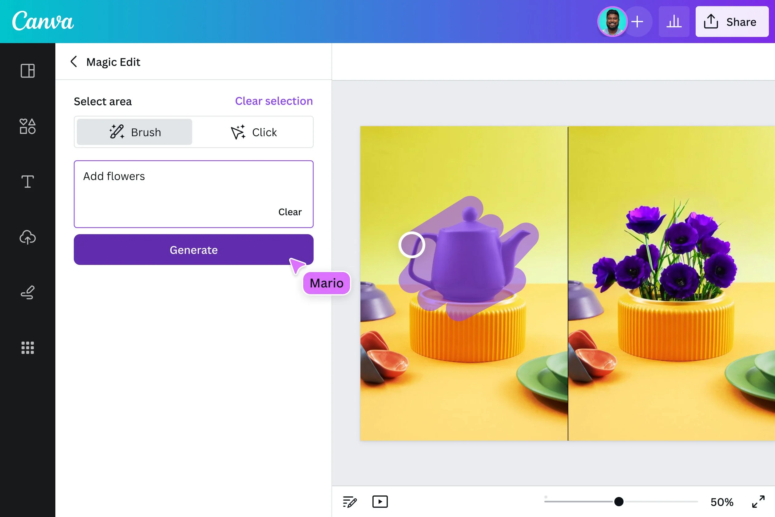
AI Tools Revolutionizing Brand Design
A host of AI-driven tools are already making waves in the design world, democratizing access to professional-level design. Tools like Adobe Firefly and Canva’s AI features enable both novice and professional designers to experiment with design elements like colors, typography, and layouts in real time. Looka, an AI logo design platform, allows users to create logos that fit their brand aesthetic in just a few clicks, using intelligent algorithms that adapt to user input.
These tools not only streamline processes but also give designers the creative freedom to focus on bigger-picture thinking while the AI handles the more repetitive aspects of design. Whether it’s generating mockups or automating the application of branding across multiple formats, AI tools are helping companies achieve consistent and impactful visual identities at scale.
Personalization and Dynamic Design Through AI
One of AI’s most exciting applications in brand design is its ability to create personalized, dynamic visuals. By analyzing user data, AI can tailor brand experiences in real-time to better match individual preferences. This means brands can deploy personalized content, from custom website designs to targeted email visuals, based on user behavior and engagement patterns.
This level of personalization fosters a deeper connection between the brand and its audience, improving engagement and loyalty. For instance, AI can help e-commerce platforms generate product recommendations that are reflected in personalized brand designs, ensuring customers see visuals that resonate with their tastes and needs. This dynamic approach makes the brand feel more responsive, relevant, and customer-centric.
Maintaining Creativity and the Human Touch
While AI has proven itself to be a powerful tool in the designer’s toolkit, it’s important to remember that it’s not a replacement for human creativity. AI can enhance efficiency and produce data-backed designs, but the human touch is still crucial to infusing authenticity and emotion into your brand.
To maintain the balance, brands should view AI as a complement to human creativity, not a substitute. While AI can generate a polished logo in minutes, it takes a designer’s artistic vision to ensure that the logo communicates the right message and aligns with the brand’s ethos. Incorporating AI into your workflow should free up time for more strategic, creative thinking rather than completely automating the creative process.
How to Stay Ahead of the Curve
So, how can you stay ahead in this AI-driven design revolution? Here are a few practical tips:
- Start Small: Introduce AI tools incrementally into your design process. Use them to optimize repetitive tasks like resizing visuals or applying brand guidelines across platforms.
- Keep Learning: AI tools are evolving rapidly. Stay updated on new AI-powered design platforms and features to keep your workflow cutting-edge.
- Blend Creativity with AI: Don’t rely entirely on AI for design. Leverage its strengths in efficiency while maintaining human creativity to ensure your brand remains authentic and original.
- Experiment with Personalization: Use AI to create dynamic, personalized visual experiences that engage your audience. The more tailored your content is, the more effective it will be.
Conclusion
The integration of AI into brand design is not just a trend—it’s the future. AI offers unparalleled speed, precision, and customization that allow brands to innovate and compete on a global scale. However, the key to leveraging AI successfully lies in balancing its technological strengths with the creativity and emotional intelligence only humans can provide.
By embracing AI-driven tools and staying informed on the latest innovations, brands can maintain a competitive edge while still delivering designs that are authentic, personal, and aligned with their values. The future of brand design is a partnership between human creativity and AI’s efficiency—one that, when done right, will allow brands to thrive in the evolving digital landscape. Contact us today to explore how AI-powered design can elevate your brand to new heights!