As brands expand their reach across borders, the challenge isn’t just going global—it’s staying cohesive while doing it. Because international growth doesn’t mean one-size-fits-all messaging. It means speaking directly to diverse audiences, in different languages, across different cultures—without losing what makes your brand recognizable.
The trick? Localization at scale: building systems that flex for regional nuance without fracturing your brand.
The Risks of Going Global Without a Strategy
We’ve seen it happen—fast-growing companies push into new regions, and suddenly their brand looks and feels different everywhere. The French website has a different tagline. The German social campaign uses off-brand colors. The APAC product sheet calls the same feature by a completely different name.
Without a defined localization strategy, global marketing becomes a game of telephone—with inconsistent messaging, diluted visuals, and confused customers.
The Brand Consistency Challenge
Brand consistency is about more than logos and fonts. It’s about:
- Unified messaging pillars
- A shared tone of voice
- Consistent product naming conventions
- Visuals that reinforce brand DNA across all platforms
But this consistency gets complicated fast when:
- Teams in different regions are working in silos
- Local agencies interpret branding through their own lens
- Translation is treated as a final step, not a foundational consideration
In short, global expansion without a system invites fragmentation.
A Framework for Scalable Localization
To scale localization without losing control, brands need a structured but flexible framework. Here’s how leading companies do it:
1. Centralized Brand Guidelines, with Built-In Flexibility
Develop a global brand system that clearly defines:
- Core identity elements (logo usage, typography, color palettes)
- Voice and tone rules
- Messaging frameworks and brand pillars
But don’t stop there—include examples of how these can adapt for cultural relevance in local markets.
2. Establish Global vs. Local Ownership
Clarify what’s owned centrally (like key messaging, product naming, or logo integrity) versus what can be modified regionally (like calls to action, visuals, or campaign headlines). This helps local teams move fast without violating global standards.
3. Build a Cross-Functional Governance Model
Set up a process where brand, regional marketing, and localization teams can collaborate, review creative, and ensure alignment across launches.
Cultural Relevance Is More Than Translation
Successful localization goes beyond language. It requires cultural fluency—understanding what resonates with each audience.
Consider:
- Adjusting tone and formality for regional expectations
- Rewriting—not just translating—taglines, CTAs, or value propositions
- Avoiding idioms, humor, or visuals that don’t translate across borders
The goal isn’t to replicate. It’s to reinterpret—in a way that maintains the core idea while landing more effectively in-market.
Creative + Operational Best Practices
Localization at scale requires both process and creativity. Here’s how to support both:
- Design reusable creative systems: Create modular templates for web, email, paid media, and social assets that local teams can customize within guardrails.
- Use a global content management system (CMS): A CMS that supports multi-language site versions helps centralize oversight while enabling regional flexibility.
- Invest in a DAM and translation management system (TMS): Organize brand assets and enable consistent translations that are version-controlled, searchable, and easily distributed.
- Train your teams: Provide onboarding and ongoing brand training for regional marketers, translators, and agency partners.
- Monitor and optimize: Use analytics to assess how localized content performed by region—and feed insights back into your system.
The Payoff: A Brand That Travels Well
When you balance consistency with cultural nuance, your brand becomes:
- More trustworthy – Familiarity builds credibility.
- More relatable – Regional teams feel empowered to connect with local audiences.
- More agile – Launches become faster and more repeatable, with fewer missteps.
It’s not just about protecting your brand—it’s about amplifying it across every market you touch.
Need a Global Brand That Feels Local Everywhere?
Bluetext helps brands develop scalable localization strategies that maintain identity while enabling adaptation. From building global campaign toolkits to implementing multi-language websites and brand governance systems, we help you stay consistent—without being rigid.
Contact us to learn how we can help your brand speak the local language, at scale.
Why getting B2G branding right in today’s contracting climate may dictate success or failure for years to come.
The beat of federal marketers has been a tad arrhythmic the past few months, as we seek to digest dramatic shifts in agency budgets, procurement and contracting, as well as reduced manpower. The old adage “nobody ever gets fired for buying IBM” has evolved in the current contracting climate to “explain why you bought IBM in the first place.”
And while the public face of DOGE may be moving on, its mandate endures through the Trump administration FYI 2026 budget proposal – which calls for expanding DOGE staffing by roughly two-thirds and more than doubling its budget. There are also few signs that hyper analysis of contracts with top revenue industry partners will ease. After targeting the top 10 consulting firms for contract cuts, GSA is now requesting justifications for services and pricing structures from 10 leading tech Value Added Resellers (VARs). Already this year, more than 11,000 contracts across 60 agencies have been nixed, totaling $33 billion.
All of these narratives were swirling on June 6th at FedPulse 2025: Turning Brand & Market Data into Competitive Advantage.

FedPulse is GovExec’s new brand and market intelligence platform designed to empower public sector marketers, business development, and sales leaders with real-time data and insights to drive smarter strategies and win market share.
Through a series of panels, CXOs, public sector unit leads and marketing executives from Intel, Dell, Carahsoft, SolarWinds, and GDIT discussed this tectonic shift in workforce dynamics – driven by an unprecedented shift in the public sector / administration “decision maker class” when it comes to contracting, procurement, and go-to-market strategies. The discussions were buoyed by new FedPulse data on Fed IT brand perception and what B2G marketing strategies resonate with agency customers AD (After DOGE) vs. BD (Before DOGE).
Props to GovExec for structuring one of the more insightful government marketing events I’ve attended when it comes to valuable market intelligence and panelists who were not just dispensing cookie-cutter insights and commentary, but instead offering blunt assessments on what it will take to succeed in the current environment.
Below are some data-driven takeaways from the event that public sector marketers and executives can consider as they navigate the contract landscape in 2025:
1. B2G Brands Must Re-Introduce Themselves To Decision Makers
FedPulse data shared by GovExec at the event affirms what government marketers already knew to be anecdotally true: Significant turnover amongst agency decision makers to those with fewer years of public sector experience and exposure to B2G brands. 44% of those surveyed have 10 years of experience or less as a government employee, down from 34% last year. This helps explain a four percentage point drop in those surveyed being “very familiar” with some of the top B2G brands included in FedPulse.
What does this mean for government marketers? As panelist Oliver Nutt, Vice President, Marketing and External Communications (U.S.) at GDIT shared, it becomes critical to re-introduce your brand to these new decision makers. They may know the name, but not fully grasp what you do and what you enable. Agencies are under massive pressure and they need to be able to communicate outcomes delivered, not just services you provide.
This is particularly urgent for these top consulting and services providers whose contracts are now under the microscope. Firms are being bucketed into general categories, and saying you do everything may not be the best path to preserve existing contracts and win new ones. Prioritization and differentiation must be communicated through clear branding, messaging, go-to-market and PR strategies.
Some prioritization opportunities are already emerging. During his 1×1 interview at the event, Craig Abod, President and Founder, Carahsoft, spoke of a “re-invigorated CMMC,” as DoD elevates security requirements for contractors and subcontractors – requirements such as CMMC compliance that may find their way into more contracts sooner rather than later.
2. Brands Must Re-Think How They Educate
Every B2G brand is now fully aware that decisions are being heavily driven by your ability to deliver operational efficiencies and cost reduction. These are now longer differentiator messages, but table stakes.
Abod outlined the stakes in even starker terms: Decision makers need to understand what would happen if the agency didn’t use your product or service. It’s not just re-introducing the brand, but you need to re-sell every deal. Because the question being asked isn’t “why should we buy your product/service” but “why did the agency buy it in the first place.”
How B2G brands must educate has changed. As referenced, agencies are buying outcomes so that impacts market messaging. Nutt added in later panel comments that it may not resonate to brand yourself as “the AI company” or “the digital transformation company.” If you are talking about digital transformation, connect it to specific use cases such as logistics to justify why these technologies matter.
For marketers, content assets such as case studies to show a track record of outcomes remain highly relevant, but it’s not an AI case study, or DT case study. The storytelling has to be outcome based with supporting data and compelling visuals.
The bottom line, as panelist Greg Clifton, General Manager – Defense & National Security Group, Intel added, is that you can’t assume agency decision makers know what you do. Educate yes, but there is a need to re-invent how you talk to customers. We make chips, great, but what emerging applications does this enable?
3. Non-Traditional Events & Networking Will Drive Deals
Relying exclusively on traditional marketing and branding channels will not get it done. This reality is a byproduct of where the new class of decision makers is consuming information and building relationships. Agency and industry events still hold value, but at the event GovExec CEO Tim Hartman discusses the fact that this is a relationship-driven Administration. B2G brands will need to engage in more advocacy and political events, and across all channels communicate how your solutions enable the agency – and political – mission.
4. Industry Collaboration
We spoke of a new contingent of agency decision makers; they are younger and many hail from silicon valley. Their worldview on technology development, adoption and implementation is driving a changing acquisition strategy. They don’t just want to acquire products and innovate piecemeal. More holistically, they want to build new technology stacks.
The Administration / DOGE message to vendors and contractors is clear, as Clifton detailed in his panel: You own a piece of our IT environment, but it is not in our best interests to try and go vendor by vendor in a siloed fashion. Instead, get together with other relevant vendors up and down the stack and give us an integrated strategy.
5. Your B2G Brand Must Stand Out, Not Fit In
A core Bluetext sweet spot is empowering government contractors and IT providers to re-shape an existing brand or re-brand to target government stakeholders and investors (PE firms, etc.). Whether that need is fueled by an acquisition, merger or pre-IPO planning, brand storytelling that pops raises enterprise value.
It’s why 82 of our clients have been acquired in the 24 months following a Bluetext engagement (see all the acquisitions here). We know how to build enterprise value across the B2G marketing stack – from branding, logo design, messaging & positioning, website design & development and naming to public relations, thought leadership, SEO, paid campaigns and social media.
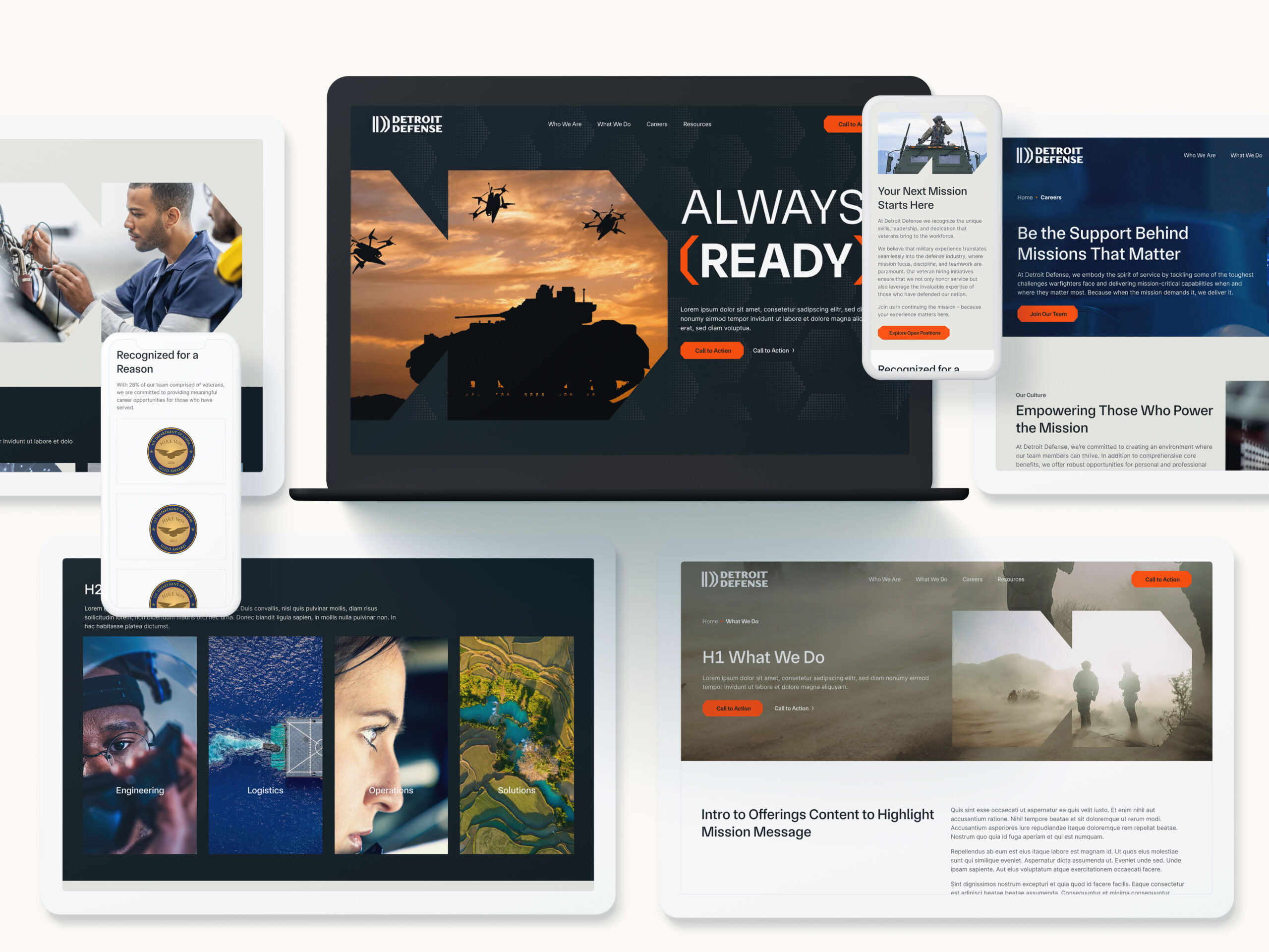
One recent project involved Ricardo Defense, which needed to transition into a fully U.S.-owned company and reintroduce itself to government and commercial partners. It turned to Bluetext to lead a comprehensive rebranding effort. The result: Detroit Defense—a new name and identity that reflects the company’s proud roots in Michigan’s defense innovation corridor and its strategic focus on U.S. national security.
At the FedPulse event, GovExec CEO Tim Hartman underscored how critical 2025 will be for B2G marketers, suggesting the next several months may well determine your public sector business trajectory for the next several years. You have to get it right. Click here to find out why Bluetext is the right B2G marketing partner to meet this moment, or contact us today to start the conversation.
In today’s marketing landscape, brands live and die by their digital visibility. But that visibility is increasingly out of marketers’ control. Algorithm changes tanking your social reach? Rising CPCs eating your paid media budget? Platforms limiting your access to your own followers?
It’s time to take back control. The most reliable path forward isn’t through rented digital real estate—it’s by investing in what you truly own.
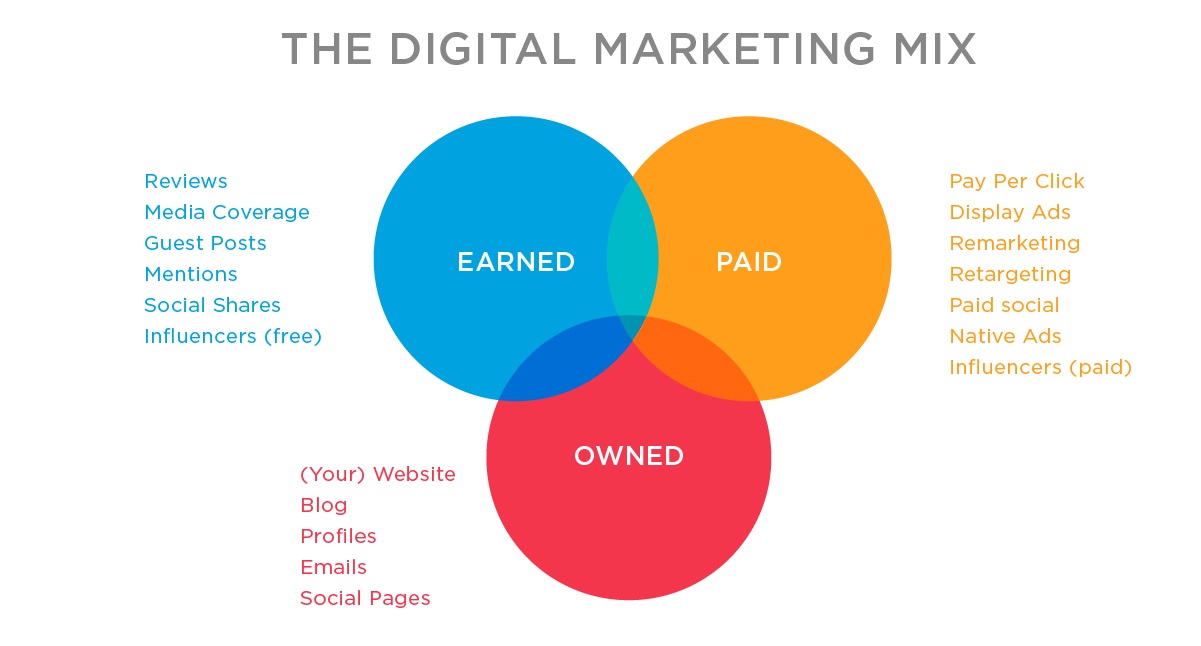
An owned media ecosystem gives you a direct line to your audience, without middlemen. It’s your brand’s strongest asset, and when built strategically, it becomes the engine powering long-term engagement, lead generation, and brand authority.
Why Owned Media Is More Important Than Ever
Social platforms shift constantly. Search engine algorithms evolve. Privacy regulations keep tightening. In this environment, leaning solely on third-party platforms to reach your audience is risky—and expensive.
Meanwhile, the cost of acquiring attention continues to climb, while engagement rates often fall. That’s why marketers are shifting focus toward owned media—channels they fully control, with data they own, and audiences they can access without paying for every touchpoint.
Owned media provides:
- Stability: You’re not at the mercy of a platform’s next update.
- Scalability: Evergreen content and SEO bring compounding returns.
- Trust: Branded environments build authority and credibility.
- Data: First-party insights inform smarter decisions and future targeting.
What Exactly Is an Owned Media Ecosystem?
It’s more than just having a blog and an email list. A true owned media ecosystem is an integrated network of digital properties that serve, engage, and grow your audience.
Key components include:
- Website: The cornerstone of your brand’s digital presence
- Blog or resource center: Drives SEO, thought leadership, and lead nurturing
- Email newsletter: Your most direct, algorithm-free communication channel
- Branded content hubs: Digital magazines, industry insights, or use case libraries
- Podcasts or video series: Long-form, high-value content that builds loyalty
- Mobile apps or customer portals: For deeper, sustained engagement
- Analytics dashboards: To monitor performance and capture first-party data
This ecosystem acts as your brand’s digital backbone—supporting every campaign, fueling SEO, and nurturing long-term relationships.
Building Your Owned Media Ecosystem: A Step-by-Step Approach
A successful owned media ecosystem isn’t built overnight. It takes intentional planning, strategic content, and sustained distribution.
Here’s how to get started:
1. Audit Your Current Assets
What owned channels do you already have? Review your website, blog, newsletter, gated content, and any branded experiences. Assess performance, gaps, and opportunities.
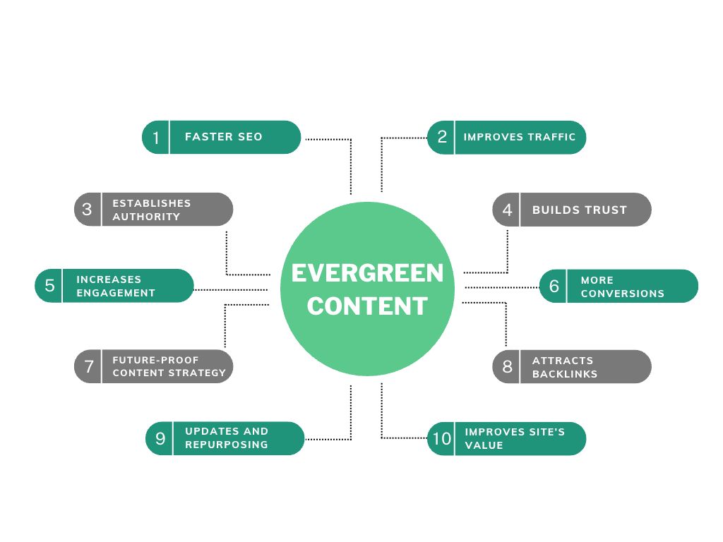
2. Invest in Evergreen, Value-Driven Content
Think long-form blog posts, how-to guides, explainer videos, and case studies. Content that solves problems, builds thought leadership, and remains relevant over time is key to sustained traffic and engagement.
3. Build for UX and SEO
Ensure your site and content hub are fast, responsive, and search-optimized. A great user experience keeps people engaged; smart SEO brings them in the door.
4. Grow and Nurture Your Audience
Make building your email list a priority. Offer valuable gated content, newsletters, or exclusive insights. Once you have subscribers, provide consistent, high-value touchpoints.
5. Connect Everything
Your owned media shouldn’t live in silos. Blogs should link to resources. Webinars should drive to whitepapers. Newsletters should surface new podcast episodes. Think ecosystem, not just assets.
How Owned Media Supports the Bigger Picture
Owned media doesn’t replace paid or earned—it strengthens them. Here’s how:
- Improved Paid Media Performance: Driving traffic to SEO-optimized, high-conversion landing pages boosts ROI.
- Trust-Building: When leads land on your content hub instead of a cold ad, your brand feels more credible.
- Resilience to Platform Shifts: If social reach drops or cookies disappear, you still have direct access to your audience.
In short, owned media gives your marketing strategy roots.
Final Thought: Your Digital Moat Starts Here
If you’re constantly chasing attention on rented platforms, you’re playing someone else’s game. Building an owned media ecosystem puts your brand back in control. It’s how you create durable engagement, scale trust, and grow on your terms.
Want to future-proof your digital strategy?
Contact Bluetext to design and scale a content ecosystem that’s built to last.
In today’s digital-first economy, brand perception can outweigh company size. Small and mid-sized enterprises (SMEs) often assume that building a strong brand requires deep pockets—but the truth is, creativity, consistency, and strategy matter more than budget. With the right approach, your business can craft a powerful brand identity that rivals enterprise competitors.
Here’s how SMEs can build a big brand without breaking the bank.
Why Brand Matters—Even for Small Businesses
Your brand is more than a logo—it’s the promise you make to customers, the emotions you evoke, and the personality you project. A strong brand:
- Builds credibility and trust
- Differentiates you in a crowded market
- Attracts the right customers and talent
For SMEs, brand equity is a critical asset—and one that can be cultivated on any budget.
Start with Strategy, Not Spending
Before designing a logo or printing business cards, clarify your brand foundation:
- Mission & Vision: Why do you exist? Where are you headed?
- Core Values: What principles guide your business?
- Brand Personality: Are you bold, approachable, disruptive, or traditional?
- Target Audience: Who are you speaking to, and what matters to them?
This internal clarity becomes the blueprint for every touchpoint that follows.
Build a Visual Identity with Budget-Friendly Tools
A professional appearance doesn’t have to be expensive. Free and low-cost design tools like Canva, Looka, or Figma make it easy to create:
- Logos
- Color palettes
- Typography systems
- Social media templates
Consistency is key. Develop lightweight brand guidelines so your visuals and tone are cohesive across platforms.
Leverage Low-Cost Digital Channels
Digital marketing levels the playing field for SMEs. Consider these cost-effective strategies:
- Organic Social Media: Focus on platforms where your audience spends time. Show behind-the-scenes content, customer spotlights, and thought leadership.
- Content Marketing: Start a blog and optimize posts for SEO. Share helpful, relevant content that positions your brand as a resource.
- Email Marketing: Use tools like Mailchimp or Brevo to build lists and nurture leads.
- Local SEO: Claim your Google Business Profile, encourage reviews, and optimize your site for local search.
Tell Stories That Stick
Big brands know that storytelling sells—and you can use the same strategy:
- Share your founder’s story to build authenticity.
- Highlight customer success stories to build social proof.
- Use video to humanize your brand without high production costs (hello, smartphone!)
Partner Up and Amplify
Tap into partnerships to increase your reach without increasing spend:
- Collaborate with other SMEs or local influencers
- Launch joint giveaways or events
- Encourage employee advocacy on social media
Know Where to Invest
While you can bootstrap many brand assets, some areas are worth the spend:
- A polished website: Often your first impression—make it count.
- Messaging and positioning: A strategic foundation can elevate all future content.
- Targeted campaigns: A well-placed ad or sponsored post can generate high ROI if your audience and creative are dialed in.
Build Bold on a Budget
You don’t need a massive budget to build a memorable brand. With strategic planning, consistent execution, and smart use of digital tools, SMEs can craft a presence that’s as compelling as the industry giants.
Ready to scale your brand without scaling your budget? Contact Bluetext to start building a brand that punches above its weight.
The High Stakes of Post-Merger Rebranding
Mergers and acquisitions are not just financial transactions—they’re brand-defining moments. A successful rebrand post-merger can help unify stakeholders, maintain customer trust, and lay the foundation for future growth. But without a thoughtful strategy, the process can create confusion, dilute brand equity, and hinder market momentum.
Audit and Align: Assessing Brand Assets and Equity
Before any design or messaging decisions are made, it’s critical to assess the existing brand assets of both companies. Conduct a brand equity audit to determine the value, recognition, and emotional resonance of each legacy brand. Identify what elements should be preserved, revised, or sunset to create a cohesive identity.
Logo, Name, and Visual Identity Decisions
Choosing whether to adopt a new name, keep an existing one, or create a hybrid brand is one of the most visible aspects of a rebrand. Logo redesigns and updates to visual identity systems (color palette, typography, imagery) should reflect the strategic direction of the combined entity while maintaining visual continuity where possible to avoid alienating loyal customers.
Messaging Overhauls and Cultural Integration
Messaging is the connective tissue of any brand. Merging two companies means merging two voices, two missions, and often, two company cultures. Develop a unified messaging framework that clarifies the brand promise, values, and tone of voice. This is especially important for internal communications, where cultural alignment can make or break integration success.
Stakeholder Rollout: From Employees to Customers
A phased and audience-specific rollout plan ensures each stakeholder group receives the right message at the right time. Internal audiences should be engaged early with clear rationale, brand education, and avenues for feedback. For customers, partners, and the public, a coordinated external launch should emphasize the benefits of the merger and demonstrate continuity.
Tools and Templates for a Smooth Rebrand
Brand guidelines, asset libraries, email signature templates, and branded presentation decks are essential tools for ensuring consistency across all touchpoints. Change management resources can support internal adoption and reduce friction during the transition.

Real-World Success: How Bluetext Supports M&A Branding Efforts
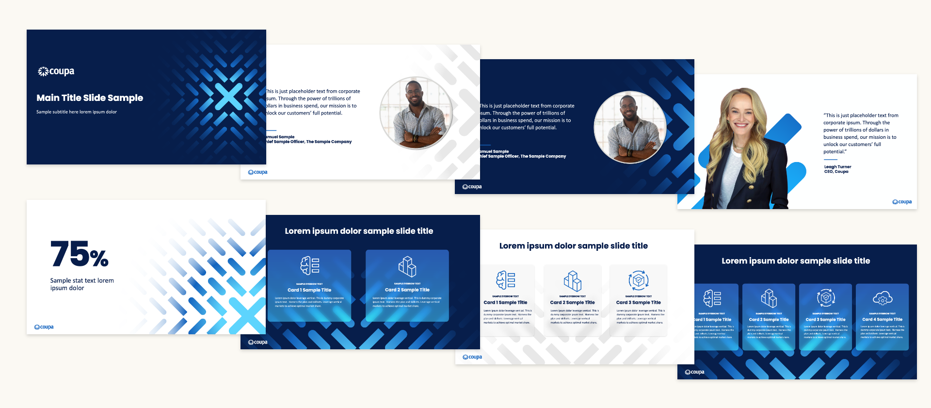
Bluetext has supported numerous organizations through the complexities of M&A branding. From building interim brand architectures to full-scale redesigns and brand launches, our team ensures that brand transitions are not only seamless but strategically sound. One standout example is our work with BlueHalo, where we unified several acquired entities under a single, future-focused brand identity. Following the launch, BlueHalo rapidly scaled—bolting on additional acquisitions, securing billion-dollar contracts, and ultimately being acquired by AeroVironment. It’s a testament to how the right brand strategy can fuel momentum and maximize enterprise value.

Ready for a Seamless Rebrand?
Partner with Bluetext to ensure your post-merger rebranding process is strategic, smooth, and successful. Contact us today.
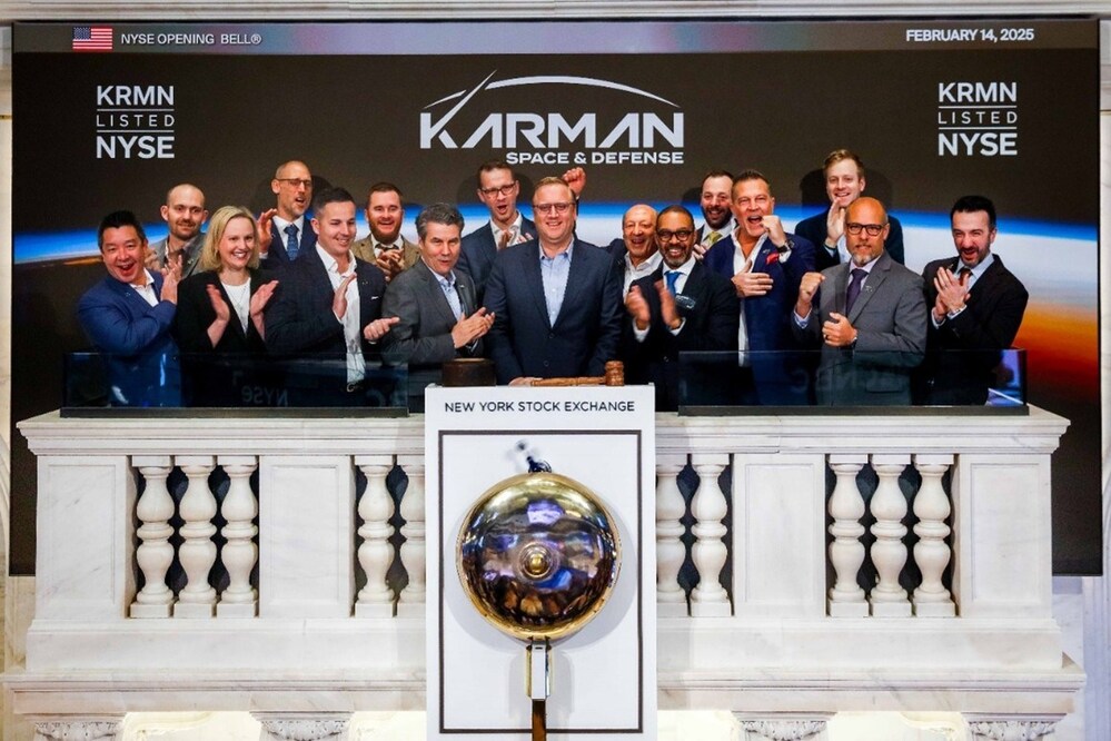
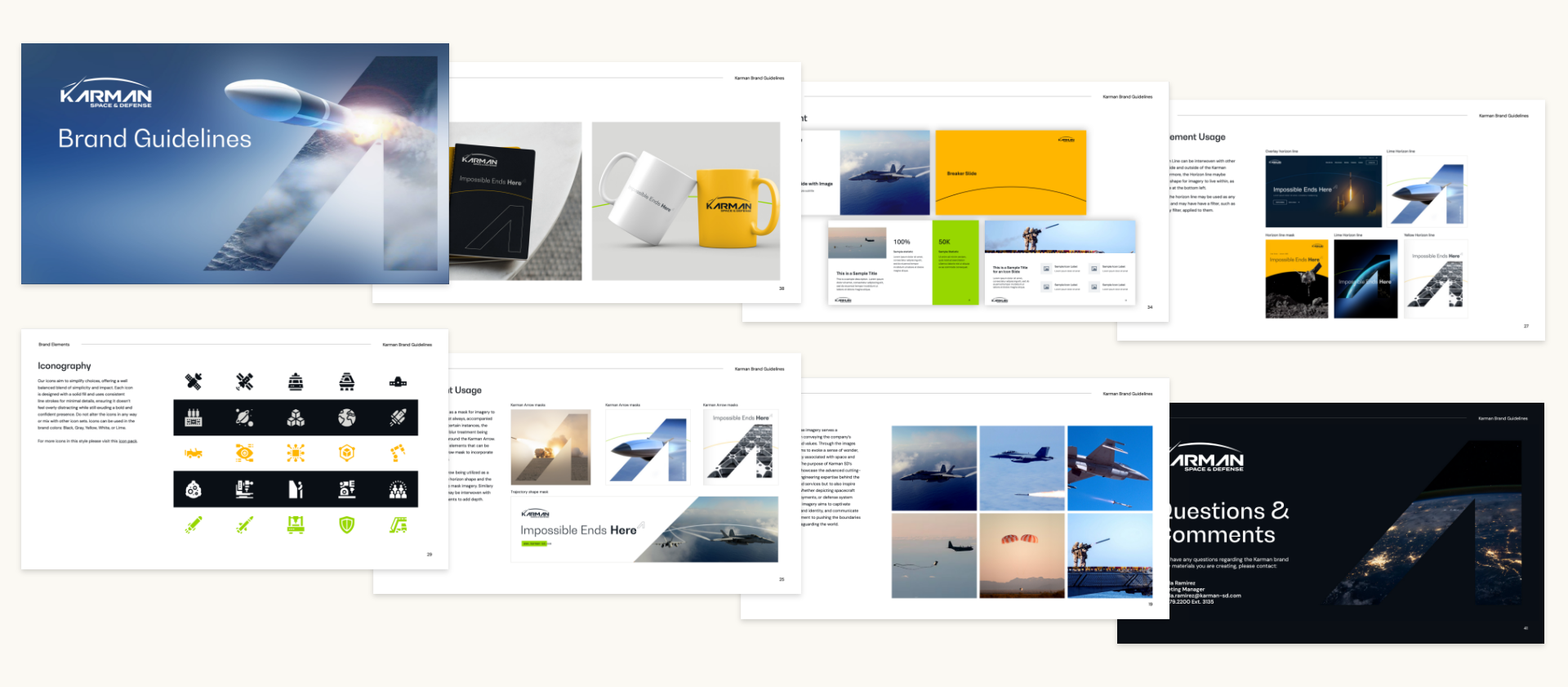
Karman Space & Defense recently achieved a major milestone in its growth journey: a successful IPO. This milestone is a testament to Karman’s technical prowess in the space industry, but it also reflects the power of strategic branding and digital marketing. The work Bluetext did in crafting Karman’s brand identity and digital presence helped position the company as an attractive investment opportunity, directly contributing to the IPO’s success.
At Bluetext, we worked closely with Karman to develop a clear brand message and a digital presence that conveyed their leadership in the space and defense sectors. The effort paid off: Karman’s IPO was met with significant success, drawing attention from the investment community and helping to drive the company’s growth.
This IPO marks the 81st time a Bluetext client has experienced an impactful financial event, whether it’s an acquisition, a merger, or going public. It highlights Bluetext’s proven track record in helping companies achieve key financial milestones through tailored branding and marketing strategies.
Bluetext’s Role in Shaping Karman’s Brand Identity
In an industry as competitive and complex as space and defense, Karman needed a strong brand identity that communicated their innovative spirit and cutting-edge capabilities. Bluetext’s approach to branding for Karman began with a deep dive into their mission, values, and market positioning.
By focusing on what makes Karman unique—its advanced technology, leadership in the space domain, and vision for the future—Bluetext developed a brand identity that was both compelling and clear. The goal was to create a brand narrative that would resonate with investors and customers alike, positioning Karman as a trustworthy and forward-thinking leader in the space industry.
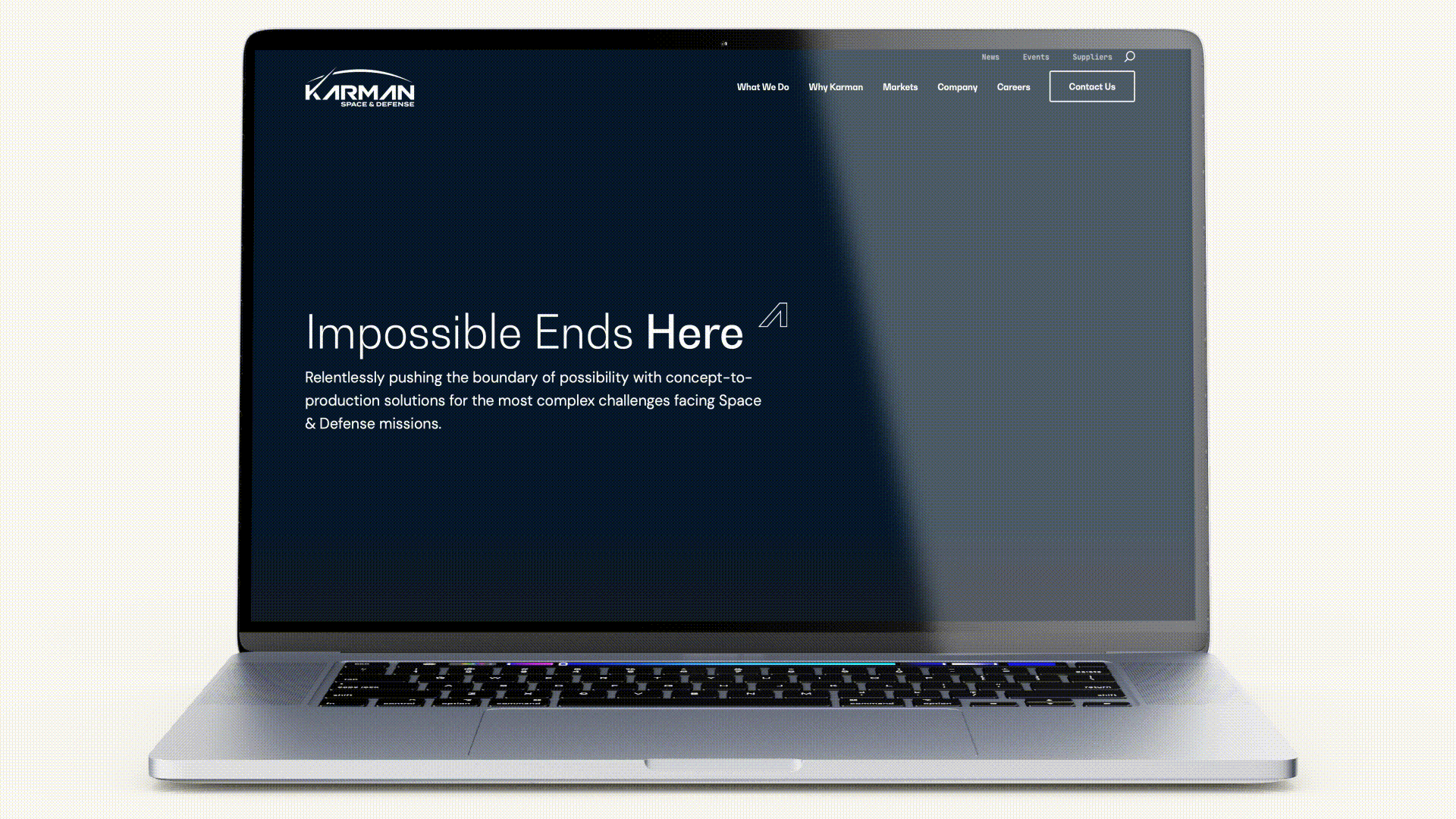
Developing Karman’s Digital Presence for Investor Confidence
A crucial aspect of Karman’s pre-IPO strategy was establishing a strong digital presence that would inspire confidence among investors. Bluetext focused on creating a digital ecosystem that effectively communicated Karman’s value proposition and technological leadership. This digital presence was key in helping Karman stand out in a competitive sector.
Website Development:
Bluetext designed and developed Karman’s website to showcase their technical expertise and provide a user-friendly experience for potential investors. The website needed to strike the perfect balance between professionalism and innovation, with a sleek design that reflected the company’s leadership in the space industry. The clean, responsive design allowed for easy navigation and ensured that visitors could quickly access the information they needed.
Content Strategy:
Alongside website development, Bluetext also crafted a comprehensive content strategy. The content we created for Karman communicated their achievements, vision, and future potential. By presenting complex technological concepts in a clear and accessible way, we helped investors understand Karman’s competitive advantages and long-term prospects.
Together, these digital assets positioned Karman as an attractive investment opportunity and ensured that their message reached the right audience at the right time—just ahead of their IPO.
Impact of Bluetext’s Work on Karman’s IPO Success
Karman’s successful IPO was not only a major achievement for the company but also a validation of Bluetext’s strategic approach to branding and marketing. The cohesive brand identity Bluetext developed gave Karman the foundation needed to gain investor trust and position themselves as an industry leader.
The IPO was completed with significant success, with Karman raising substantial capital to fuel its future growth. According to the PRNewswire announcement, Karman’s IPO represents an exciting new chapter for the company, which is backed by Trive Capital. The IPO marks a major step in Karman’s journey to expand its reach and capabilities in the space and defense sectors.
Bluetext’s work played a pivotal role in ensuring that Karman’s brand was aligned with the company’s growth trajectory, providing a professional, trustworthy image that appealed to investors. Our digital strategy ensured that Karman’s technical leadership and future potential were clearly communicated, ultimately contributing to the IPO’s success.
Why Bluetext’s Work Matters: 81 Companies, 81 Financial Milestones
Karman’s successful IPO is part of a larger pattern for Bluetext. With this IPO, Karman becomes the 81st company that has worked with Bluetext to experience a significant financial event—whether it’s an acquisition, merger, or public offering. This milestone further underscores Bluetext’s consistent ability to help companies position themselves for success in a competitive market.
From branding and messaging to website development and digital content strategies, Bluetext’s comprehensive approach to marketing has been a key driver in helping companies achieve their financial goals. This track record speaks volumes about the quality of work we provide and the impact our strategies can have on companies looking to make an industry splash.
Ready for Your Next Milestone?
The success of Karman Space & Defense’s IPO is a testament to the power of strategic branding and digital marketing in driving financial growth. Bluetext’s ability to craft compelling brand narratives and digital presences has helped many companies achieve similar milestones. Whether you’re preparing for an IPO, navigating a merger, or looking to raise your profile in a competitive industry, Bluetext has the expertise to help you succeed.
If you’re ready to take your brand to the next level and position your company for its own financial milestone, contact Bluetext today. Our strategic branding, marketing, and digital solutions can help you achieve the growth and success you’re striving for.
In today’s fast-evolving market, staying relevant means more than just keeping up—it requires transformation. Some of the most successful brands have undergone strategic rebrands to stay ahead of competition, adapt to changing consumer preferences, and realign with their core mission. Here are key lessons from successful brand evolutions and how to apply them to your strategy in 2025.
1. Understand the “Why” Behind Rebranding
A strong rebrand starts with a clear purpose. Whether due to mergers, market shifts, or outdated visuals, brands that successfully rebrand do so with a strategic vision. Take Airbnb’s 2014 brand transformation—its shift from a simple rental service to a community-driven experience was reflected in a fresh logo, new messaging, and an enhanced user experience.
Takeaway: Before launching a rebrand, assess the core reason behind it and ensure every aspect of the new identity aligns with business goals and customer expectations.
2. Maintain Brand Recognition While Innovating
Brands like Burger King and Mastercard have modernized their identities while maintaining recognizability. Burger King’s retro-inspired logo redesign in 2021 paid homage to its heritage while streamlining its aesthetic for digital platforms.
Takeaway: Balance innovation with familiarity. Retaining core elements, such as color schemes or typography, helps consumers transition smoothly to the new identity.
3. Align with Consumer Values
Brands that integrate cultural relevance and consumer values into their rebrands create stronger connections. Patagonia’s commitment to sustainability has been consistently reflected in its messaging and business decisions, reinforcing brand authenticity.
Takeaway: Listen to your audience and ensure your rebrand aligns with their expectations and values.
4. Invest in Digital-First Branding
A brand’s digital presence is just as crucial as its physical one. Companies like Instagram have evolved their logos and UX to better fit mobile-first experiences, emphasizing usability and engagement.
Takeaway: Design with digital platforms in mind, ensuring seamless integration across all channels.
5. Plan for a Seamless Rollout
A poorly executed rebrand can lead to confusion or backlash. Successful rebrands, like Dunkin’s transition from Dunkin’ Donuts, were accompanied by comprehensive marketing campaigns that educated consumers and generated excitement.
Takeaway: Plan a phased rollout, engage key stakeholders, and communicate changes effectively.
Transform Your Brand with Confidence
A strategic rebrand can revitalize your business and strengthen customer loyalty. If you’re considering a rebrand in 2025, contact Bluetext to craft a transformation strategy that drives results.
As digital platforms evolve, so do the ways brands connect with audiences. Visual storytelling is no longer a luxury but a necessity in a saturated market. Research shows that visuals are processed 60,000 times faster than text, making them a powerful tool for capturing attention and conveying complex narratives.
This blog delves into how visual storytelling can elevate your marketing campaigns in 2025, with actionable tips and trends to stay ahead.
The Power of Visuals in Modern Marketing
Visuals evoke emotions and make information more memorable. A strong visual narrative can:
- Enhance brand recall
- Drive engagement on social media
- Simplify complex ideas
Key Trends in Visual Storytelling for 2025
- Immersive Experiences
- AR and VR technologies are transforming storytelling. Brands can create virtual try-ons, 360-degree videos, and immersive brand experiences.
- User-Generated Content (UGC)
- Encourage your audience to share photos and videos that align with your brand story.
- Interactive Infographics
- Make data engaging by incorporating clickable elements, animations, and interactive charts.
- Micro-Moments
Building a Visual Storytelling Framework
- Define Your Narrative
- What story are you telling, and why does it matter to your audience?
- Invest in High-Quality Visuals
- Professional design and photography can elevate your content.
- Optimize for Each Platform
- Tailor your visuals for different platforms to maximize impact.
- Measure Performance
- Use metrics like click-through rates, shares, and time spent on content to evaluate effectiveness.
Crafting Stories That Resonate
Visual storytelling is an ever-evolving art that requires creativity and strategy. By embracing new technologies and focusing on authenticity, brands can create narratives that captivate and convert. Need help mastering visual storytelling? Contact Bluetext for expert guidance on crafting compelling brand narratives.
In an ever-evolving market, a static brand identity risks obsolescence. As industries innovate and consumer preferences shift, brands must adapt to stay relevant. Future-proofing your brand identity ensures you can evolve with the times without losing your core essence. But what does it mean to create a truly adaptable identity, and how can businesses position themselves for long-term success?
The Core Elements of a Timeless Brand
- Clear Purpose and Values: Your brand’s mission and values should anchor all decisions. A strong foundation ensures consistency amid change. These values act as a compass, guiding marketing strategies and fostering trust with audiences.
- Memorable Visual Identity: Logos, typography, and color schemes should be designed for adaptability while maintaining recognizability. A logo refresh or subtle updates can keep your visual identity modern without losing its essence.
- Consistent Voice: A defined tone and messaging style create familiarity, even as trends evolve. Whether it’s witty, professional, or empathetic, consistency in voice reinforces your brand’s personality.
Steps to Future-Proof Your Brand
- Embrace Flexibility: Build a brand style guide that allows room for creative interpretation. Include guidelines for updating visual elements, experimenting with new formats, and evolving content strategies.
- Stay Informed: Monitor industry trends and consumer behaviors to anticipate shifts. For example, as sustainability becomes a priority, integrating eco-conscious messaging into your branding can keep you aligned with audience values.
- Invest in Technology: Utilize tools like CRM systems or analytics platforms to track engagement and adjust strategies in real-time. Emerging technologies, like AI-driven content personalization, can also keep your brand ahead of the curve.
Evolving with Your Audience
A future-proof brand grows alongside its audience. Prioritize feedback and adapt offerings to meet changing needs. Engaging in two-way communication—through surveys, social media, or customer service—can provide valuable insights. Additionally, fostering a community around your brand creates loyalty that extends beyond specific products or services.
Branding for Longevity
Future-proofing your brand identity is an investment in your company’s resilience. By staying flexible and audience-focused, your brand can remain relevant and impactful for years to come. The ability to adapt, paired with a strong foundational identity, ensures your brand can weather industry disruptions while continuing to thrive. Reach out to Bluetext to learn how we can help you build a brand identity that stands the test of time.
Artificial intelligence has revolutionized marketing, offering tools that enhance efficiency, precision, and scalability. From chatbots to predictive analytics, AI has unlocked new ways to engage audiences and optimize campaigns. However, as brands embrace automation, there is a pressing challenge: maintaining an authentic, human connection. How can marketers strike the right balance?
The Power of AI in Marketing
AI streamlines complex processes like data analysis, content creation, and personalization. Tools powered by AI can segment audiences, recommend tailored content, and predict consumer behavior—saving marketers time and boosting ROI. Chatbots enable instant communication, while AI-driven ad platforms ensure campaigns reach the right audience at the right time.
Moreover, AI enables real-time decision-making. Marketers can adjust campaigns based on live analytics, ensuring that messaging remains relevant. For instance, AI can identify trending topics on social media, allowing brands to join conversations and stay culturally relevant. Beyond efficiency, AI also enhances creativity through tools that generate content ideas or even design assets.
The Risk of Losing Authenticity
While AI enhances efficiency, it can risk alienating audiences if overused or misapplied. Consumers value human touchpoints, especially in industries that rely on trust, like healthcare or financial services. Over-reliance on AI can make interactions feel impersonal, leading to disengagement.
Additionally, there’s a growing concern about the ethical use of AI. Missteps in personalization, such as overly invasive data tracking, can erode trust. Similarly, relying too heavily on automated responses can create frustration when customers encounter complex issues that require empathy and nuanced problem-solving. Striking a balance between automation and authenticity requires intentionality and foresight.
Striking the Balance
- Human-AI Collaboration: Use AI for data analysis but let humans craft messages that resonate emotionally. For instance, AI can analyze customer sentiment, but human marketers should interpret that data to create meaningful campaigns.
- Transparent Communication: Disclose when AI is in use, such as chatbots, to build trust. Transparency fosters a sense of honesty, helping audiences feel respected and valued.
- Periodic Oversight: Regularly review AI-driven campaigns to ensure they align with brand values and audience expectations. Conduct audits to identify areas where human intervention might enhance effectiveness.
Leveraging AI Responsibly
Brands should view AI as a tool to enhance, not replace, human creativity and connection. By establishing clear boundaries—such as reserving certain touchpoints for human interaction—marketers can maintain authenticity. Training employees to work alongside AI systems can also create a more cohesive strategy where technology and humanity complement one another.
A Future of Synergy
By blending AI efficiency with human creativity, brands can achieve authentic connections that resonate deeply with audiences. Striking this balance isn’t just a best practice—it’s essential for long-term marketing success. As AI continues to evolve, the brands that succeed will be those that use it to enhance—rather than replace—the human touch. Contact Bluetext today to explore how we can help you navigate AI-driven marketing strategies that balance innovation with authenticity.