In the fast-paced realm of public sector marketing, creating a robust online presence is essential for success. As government agencies and contractors increasingly rely on digital platforms to engage with stakeholders, mastering the nuances of DC web design becomes imperative. This guide explores the key elements of effective web design tailored for the public sector, providing actionable insights for marketing leaders aiming to enhance their digital strategies.
Understanding the Unique Needs of Public Sector Web Design
Public sector websites serve a diverse audience that includes citizens, businesses, and other governmental bodies. Unlike commercial websites, these sites must prioritize accessibility, transparency, and security. Ensuring compliance with regulations such as Section 508 for accessibility and the latest cybersecurity standards is crucial. This focus on inclusivity and protection helps build trust with users, an essential component for public sector entities.
Prioritizing User Experience and Accessibility
One of the core components of successful DC web design is a focus on user experience (UX). Public sector websites need to be intuitive and easy to navigate. Implementing a clean layout with clear calls to action ensures that users can quickly find the information they need. Additionally, incorporating responsive design elements is vital to accommodate a wide range of devices, from desktops to smartphones.
Accessibility is not just a legal obligation but a moral one. Ensuring that websites are navigable for users with disabilities involves careful consideration of color contrasts, text sizes, and keyboard navigation. By focusing on these elements, agencies can reach a broader audience and demonstrate their commitment to serving all citizens.
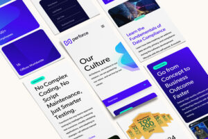
ROI starts with a message that people remember. Go inside how we reshaped Perforce’s brand.
Leveraging Content Strategy for Public Engagement
Effective content strategy is key to engaging the public and maintaining transparency. This involves not only providing comprehensive and up-to-date information but also presenting it in a way that is easy to understand. Utilizing infographics, videos, and interactive elements can enhance engagement and facilitate better communication of complex topics.
Moreover, integrating social media and other digital channels into the web design helps amplify the reach and impact of the content. This integrated approach ensures that the public sector can engage with its audience on multiple platforms, reinforcing its message and fostering community involvement.
Ensuring Robust Security Measures
Security remains a top priority for public sector websites. The sensitive nature of the information handled by these sites necessitates stringent security protocols to protect against data breaches and cyber threats. Implementing strong encryption methods, regular security audits, and user authentication processes are essential steps in safeguarding both the agency’s and the public’s data.
Staying updated with the latest security trends and technologies is critical. Collaborating with experts in cybersecurity and leveraging platforms designed for government use can help maintain a secure online environment. This proactive approach not only protects sensitive information but also enhances public trust in the institution.

Utilizing Data Analytics for Continuous Improvement
Data analytics play a pivotal role in refining web design and functionality. By analyzing user behavior and engagement metrics, agencies can identify areas for improvement and optimize their websites accordingly. This data-driven approach allows for continuous enhancement of the user experience, ensuring that the website remains relevant and effective.
Implementing tools for tracking website performance and user interactions provides valuable insights into what works and what doesn’t. Regularly reviewing these analytics ensures that the website evolves with changing user needs and technological advancements.
Partnering with Experts for Success
In the competitive landscape of public sector digital engagement, partnering with experienced professionals can make all the difference. At Bluetext, we specialize in crafting tailored web design solutions that meet the unique needs of government agencies and contractors. Our expertise in DC web design ensures that your online presence is not only functional but also impactful.
Ready to elevate your digital strategy? Contact us today to discover how we can support your web design, branding, and marketing needs, driving public sector success in the digital age.
As digital transformation continues to reshape industries, the future of website design and development is increasingly critical for B2B and B2G organizations. In today’s fast-paced digital landscape, a company’s website is not just a digital storefront but a powerful tool for engagement, conversion, and growth. For marketing leaders, understanding the evolving trends in website design and development is essential to staying competitive. This blog explores the future of web development and what B2B and B2G organizations need to know to remain at the forefront.
Embracing Responsive and Adaptive Design
The need for responsive and adaptive design has never been more pressing. With a growing number of users accessing websites via mobile devices, B2B and B2G companies must ensure their websites are fully optimized for all screen sizes. Responsive design ensures that a website’s layout automatically adjusts based on the user’s device, while adaptive design offers different layouts for different devices. These approaches improve user experience and increase engagement and conversion rates.
For organizations looking to optimize their digital presence, partnering with a leading website design agency can provide the expertise needed to implement these design strategies effectively.

Check out how we unified BigBear.ai’s brand identity
Integration of AI and Machine Learning
Artificial intelligence (AI) and machine learning are revolutionizing website design and development. These technologies enable personalization at scale, allowing websites to offer tailored content and experiences to individual users. AI-driven chatbots, predictive analytics, and dynamic content are becoming standard features that enhance user interaction and satisfaction.
B2B and B2G companies should consider integrating AI tools to analyze user behavior, predict future trends, and deliver a more customized experience. By leveraging these technologies, organizations can stay ahead of the competition and meet the ever-changing expectations of their audiences.
Prioritizing Website Security
With cyber threats on the rise, website security is a top priority for B2B and B2G entities. Secure Socket Layer (SSL) certificates, two-factor authentication, and regular security audits are essential components of a robust security strategy. Moreover, with increasing regulations such as GDPR, organizations must ensure compliance to avoid legal repercussions and build trust with their users.
Engaging with a specialized cybersecurity marketing agency can help organizations develop a comprehensive security framework that protects both the company and its clients.
The Rise of No-Code and Low-Code Platforms
No-code and low-code platforms are democratizing website development, allowing non-technical users to create and manage websites without extensive coding knowledge. These platforms accelerate the development process and reduce costs, making them attractive options for many B2B and B2G organizations.
While these platforms offer significant advantages, it’s crucial to evaluate their limitations and ensure they meet the specific needs of your organization. Collaborating with a professional Drupal development agency can provide the necessary expertise to balance ease of use with advanced functionality.
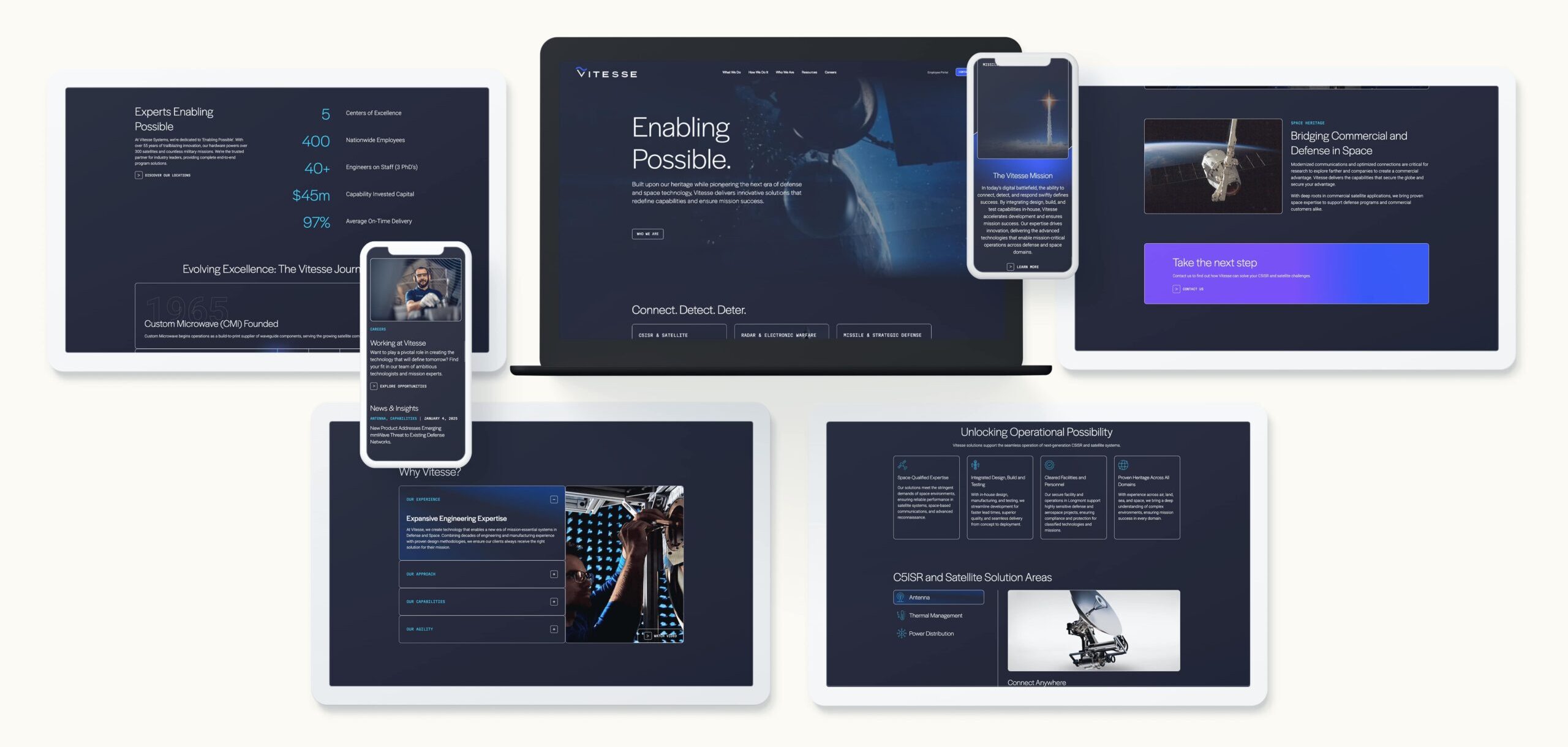
Dig into the work that helped Noblis own their space
Focusing on Accessibility and Inclusivity
Accessibility and inclusivity in web design are no longer optional; they are essential. Websites must be designed to accommodate users with disabilities, ensuring that all users have equal access to information and services. This includes implementing features such as screen reader compatibility, keyboard navigation, and text-to-speech options.
By prioritizing accessibility, B2B and B2G companies not only comply with legal requirements but also expand their audience reach. Engaging with an agency that understands the nuances of website localization and multilingual support can further enhance inclusivity and global reach.
The Importance of User Experience (UX) Design
User experience design is at the heart of successful website development. A well-designed UX can significantly impact user satisfaction and retention. This involves understanding user behavior, creating intuitive navigation, and ensuring fast load times.
For B2B and B2G organizations, investing in UX design translates into better engagement and higher conversion rates. Collaborating with a DC interactive web design firm can help refine the user experience, ensuring that websites are both functional and enjoyable to use.
Bluetext’s View
The future of website design and development is dynamic and filled with opportunities for innovation. B2B and B2G organizations that stay ahead of these trends will enhance their digital presence and drive business success. As technology continues to evolve, so too must the strategies employed by marketing leaders. For those looking to leverage the latest in design and development, partnering with experts is key. Contact Bluetext to explore how our strategic insights, branding expertise, and campaign support can elevate your organization’s digital strategy.
Public sector messaging is undergoing a transformation. The move to digital services, the rise of AI, an urgent push for cybersecurity, and growing expectations for transparency have changed how agencies communicate with citizens, industry partners, and internal stakeholders. In this climate, advertising agencies in Washington DC have become pivotal. They are translating complex policy goals into clear, measurable narratives that build trust and drive action across federal, state, and local audiences. For marketing leaders in B2B and B2G, understanding how these firms operate is essential for shaping strategies that resonate in a high-stakes, highly scrutinized environment.
Why the Capital Region Sets the Pace for Public Sector Marketing
Advertising agencies in Washington DC sit at the intersection of policy, procurement, and public perception. Proximity to decision makers matters because insights from Capitol Hill, federal agencies, think tanks, and contractors flow quickly into messaging strategy. The best advertising agencies in Washington DC leverage this access to anticipate shifts in budgets, compliance mandates, and citizen priorities before they hit the broader market.
Unlike traditional commercial campaigns, public sector communications must satisfy multiple constituencies at once. Leaders need language that aligns to legislative directives, speaks credibly to technical evaluators, and translates into accessible citizen experiences. Advertising agencies in Washington DC are uniquely adept at aligning these priorities, because they collaborate daily with legal, policy, and program offices alongside creative, media, and analytics teams.
For brands operating in the federal ecosystem, this context is not a nice-to-have. It is the difference between campaigns that are compliant yet forgettable and campaigns that are compliant and effective. That is why many enterprises and contractors partner with a DC advertising agency to ensure every message respects the process while still breaking through.

What Distinguishes Top Agencies Serving the Public Sector
Executive audiences often ask what sets advertising agencies in Washington DC apart from peers in other markets. Three qualities stand out. First is a deep literacy in procurement and acquisition models. Teams understand how communications support the full capture lifecycle, from market research to RFI to recompete. Second is fluency in mission language. Agencies know how to elevate outcomes like readiness, resilience, access, and equity without drifting into jargon. Third is a disciplined approach to risk. Advertising agencies in Washington DC build safeguards that respect appropriations rules, the Paperwork Reduction Act, Section 508, and privacy requirements while enabling modern creative and paid media.
These capabilities translate into superior orchestration. The better the grasp of stakeholders and statutes, the freer the creative team becomes to deliver powerfully simple stories. Advertising agencies in Washington DC ensure creative excellence is never decoupled from mission fidelity.
The highest performers also invest in strong partnerships across public affairs, program leads, and integrator teams. That collaboration speeds approvals and compresses timelines, a major advantage when announcements, policy windows, or budget cycles demand rapid response.
How Agencies Build Evidence-Based Messaging Frameworks
Public sector communication succeeds when every claim is traceable, defensible, and relevant to mission outcomes. That begins with research. Leading advertising agencies in Washington DC conduct structured stakeholder interviews, social listening, and voice-of-the-customer studies to surface real needs and barriers. They map procurement influencers and technical validators to avoid over-indexing on a single persona.
From there, teams develop a clear hierarchy of messaging: top-line narrative, mission and market proof points, and technical substantiation. This process ensures a single source of truth that can flex from federal CIO briefings to program-level landing pages and social posts. When a brand needs to evolve its foundation, proven partners provide a rigorous messaging and positioning engagement that delivers clarity and consistency across every channel.
Advertising agencies in Washington DC also pressure-test messages for plain language standards, accessibility, and inclusivity. The result is content that reads easily for citizens, yet satisfies experts who look for specificity. This dual-read approach allows communications to move seamlessly between public and policymaker audiences.
Omnichannel Strategies That Reach Decision Makers and Citizens
Federal audiences consume information differently than commercial buyers. They attend briefings, review technical documentation, and rely on earned media and trusted associations. Advertising agencies in Washington DC know how to orchestrate an omnichannel plan that places the right content in each context without diluting the core message.
Winning plans often combine targeted paid media on professional platforms, high-value content for search capture, tailored email sequences for industry partners, and video explainers for citizen education. Many initiatives also include thought leadership and program microsites to centralize resources. Skilled advertising agencies in Washington DC ensure channel roles are clear, budgets are prioritized by influence, and handoffs are tracked between awareness, consideration, and action.
For B2G brands and contractors, the same rigor applies. Teams create compliant capture support and digital nurture paths, then align assets across conference cycles and contracting milestones. When you work with B2G content and digital marketing experts, your programs move in lockstep with agency priorities and procurement calendars.

Creative That Inspires Within Policy Boundaries
Contrary to popular belief, constraints can unlock better ideas. Advertising agencies in Washington DC excel at turning rules into creative guardrails that sharpen the work. Mission-forward storytelling, empathetic visuals, and precise language often outperform splashy concepts when trust and credibility are on the line. Leaders must communicate urgency without sensationalism, innovation without overpromising, and outcomes without political coloration.
When an initiative requires cinematic storytelling or a high-impact launch, the right partner can still deliver. The key is a creative process that engages legal, privacy, and program teams early and iterates toward solutions that meet standards. Advertising agencies in Washington DC use modular frameworks that adapt quickly as guidance evolves, so momentum never stalls.
Measurement and Accountability Tailored to Government Goals
Public sector KPIs look different than consumer metrics. The aim might be program enrollment, partner engagement, FOIA burden reduction, or adoption of digital self-service. Advertising agencies in Washington DC design analytics architectures that map marketing inputs to mission outcomes, from reducing call-center load to increasing qualified industry conversations ahead of an RFP.
Dashboards highlight channel effectiveness, message resonance, and audience lift over time. Advertising agencies in Washington DC also align reporting frequency and format to government cadence so program offices can integrate insights into performance reviews and budget justifications.
Emerging Trends Reshaping Public Sector Messaging
AI and Personalization With Guardrails
AI is enabling scale without sacrificing quality. Predictive analytics inform content prioritization, while responsible automation accelerates production. Advertising agencies in Washington DC deploy AI to identify message themes that correlate with action and to personalize experiences for role, mission, or geography. Crucially, they implement governance to protect privacy and keep human oversight central.
Accessibility and Multilingual Reach as Strategy
Accessibility is now a strategic imperative, not a compliance checklist. Section 508, plain language, and inclusive design practices drive higher engagement from every audience. Leading advertising agencies in Washington DC also help agencies expand multilingual content, ensuring communities receive accurate information in formats they trust. This improves service equity and strengthens program outcomes.
Cybersecurity and Trust by Design
Every communication touchpoint is a trust opportunity. From domain hygiene to citizen data flows, trust is designed into modern campaigns. Advertising agencies in Washington DC partner with security teams to ensure landing pages, forms, and analytics scripts meet stringent standards, and to explain security controls in clear language that reassures users.

How to Choose the Right DC Partner for Public Sector Work
Selecting among advertising agencies in Washington DC requires more than a portfolio review. Ask how the team structures discovery with program leads, legal, privacy, and procurement. Probe how they translate mission context into creative criteria. Confirm that they treat accessibility, data governance, and measurement as core competencies rather than add-ons. Review examples of public sector marketing work to validate the approach across issues and audiences.
- Experience across B2G and B2B to connect agency needs with industry partner realities, a hallmark of top advertising agencies in Washington DC.
- Proven frameworks for narrative development, testing, and approvals that fit government cadence.
- Omnichannel planning that aligns with events, policy milestones, and contracting cycles.
- Analytics tied to mission outcomes with clear targets, not just impressions or clicks.
- Creative leadership that thrives inside compliance, turning constraints into distinctiveness.
Scalable Content Engines Built for Government and Industry
Public sector communication rarely ends with a single announcement. Programs require ongoing education, myth-busting, and partner enablement. Advertising agencies in Washington DC build content engines that deliver consistent value across long timelines. Editorial calendars layer explainer videos, FAQs, webinars, case vignettes, earned media, and SEO content to improve discoverability and comprehension.
For contractors and technology partners, the same engine supports pipeline growth and capture support. Content must speak to mission owners while proving technical depth to evaluators. Agencies orchestrate how-and-why storytelling so industry buyers and contracting officers find the right asset at the right time, no matter their level of expertise.
Search and Discoverability for Federal and Citizen Queries
Search behavior in government communications is specific and often intent-rich. Advertising agencies in Washington DC optimize for terms tied to policy guidance, funding mechanisms, and program names. They build content clusters that answer high-value questions concisely, then support those pages with multimedia designed for quick comprehension. Structured content and clean information architecture help users navigate quickly between overview, technical detail, and action steps.
On the industry side, ads and organic content target evaluators who search for standards, certifications, and interoperability. Advertising agencies in Washington DC balance thought leadership with practical implementation guidance so technical teams trust what they read and can act on it.
Integrated Campaigns That Respect the Evaluation Process
In the federal environment, messaging often becomes part of the evaluation context even when not explicitly scored. That reality drives a premium on clarity, consistency, and verifiable claims. Advertising agencies in Washington DC help clients develop integrated campaigns that carry a single throughline from speaking points to landing pages to social and earned media. Every asset uses the same narrative scaffolding, so nothing contradicts or confuses.
This alignment reduces risk and increases velocity. It also makes content repurposing more efficient, a vital consideration when budgets must stretch across long deliberation cycles and overlapping initiatives.
Proven Processes That Move at the Speed of Policy
One hallmark of advertising agencies in Washington DC is the ability to pivot without sacrificing quality. As policy guidance shifts, teams refresh message maps and creative toolkits rapidly. Preapproved content modules, design systems, and editorial guardrails let programs adapt without rework. Agencies also run governance playbooks that accelerate legal and accessibility reviews, shortening time to market and protecting consistency at scale.
For leaders managing multiple initiatives, this operational discipline is as valuable as the creative itself. It keeps workstreams on schedule and protects program credibility when timelines are tight and scrutiny is high.
When to Invest in a Full Rebrand vs. a Campaign Refresh
Leaders frequently ask whether their program needs a rebrand or a focused campaign. Advertising agencies in Washington DC evaluate mission evolution, stakeholder confusion, and performance data to make that call. If the brand story no longer matches program reality, a strategic refresh is in order. If the core is sound but awareness or engagement is lagging, a campaign tailored to new priorities may deliver faster impact. Either path benefits from a rigorous foundation and a clear creative idea supported by executional detail.
How Bluetext Helps Public Sector Leaders Win Hearts, Minds, and Metrics
As a partner to agencies, associations, and contractors, Bluetext brings the integrated strategy, creative, and analytics discipline that modern public sector work requires. Our teams have built mission-forward narratives, omnichannel plans, and accessible digital experiences that scale. For enterprise and B2G brands entering or expanding in the federal space, we align capture needs, partner enablement, and message governance so go-to-market stays streamlined and effective.
When your organization needs a full strategic reset, Bluetext delivers with proven frameworks and dedicated experts who design for both speed and rigor. To see the breadth of creative impact we can deliver, explore our advertising portfolio and imagine how a sharper story could elevate your next initiative.
The Bottom Line for Executive Marketers
The difference between a compliant message and a compelling message is not semantics. It is strategy, empathy, and operational excellence. Advertising agencies in Washington DC combine mission fluency with creative precision to help programs and partners communicate clearly, credibly, and at scale. They understand how narratives travel through policy windows and budget cycles and how to measure progress in terms that matter to leaders and citizens.
For executive teams planning the next fiscal year or preparing a major initiative, now is the time to pressure-test your narrative, refresh your channel strategy, and tighten your measurement architecture. Partner with an agency that treats your mission as its north star. Bluetext is ready to help you define your story, architect your omnichannel plan, and activate campaigns that move metrics and inspire action. Explore our capabilities and contact us to start shaping public sector messaging that earns trust and delivers results with the strength and sophistication you expect from advertising agencies in Washington DC.
Public sector leaders face an expectations gap. Constituents, businesses, and partner agencies expect personalized, transparent, and secure experiences that match the best of the private sector. Budgets, procurement, and regulatory constraints rarely make that simple. This is where brand strategy agencies step in. By fusing research, policy awareness, design systems, and measurable activation, these partners are redefining how agencies, authorities, and government contractors express mission, build trust, and drive engagement. For executive teams tasked with modernizing programs and attracting talent or investment, understanding what brand strategy agencies do and how they do it can be the difference between incremental change and meaningful transformation.
Why Public Sector Branding Demands a Different Playbook
Brand strategy agencies that work in the public sector understand that reputations are earned over long cycles, in complex stakeholder environments, and under constant public scrutiny. The brand is not only a promise but an operational framework for delivering equitable, accessible, and secure services. Unlike commercial rebrands that prioritize rapid market share, public sector branding must reconcile policy, mission, and accountability with modern usability and credible storytelling.
Brand strategy agencies navigate requirements like Section 508 accessibility, records retention, and chain-of-custody communications while still producing compelling creative. They translate legislation and program charters into simple narratives that a resident, a Hill staffer, and a systems integrator can each understand. That is not a cosmetic exercise. It is a strategic discipline that moves a mission forward.
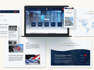
Invictus needed a brand that could scale. We built it.
What Do Brand Strategy Agencies Bring to Government and Quasi-Government Brands?
Brand strategy agencies bring the rigor of management consulting together with the agility of modern design and content practices. The result is a brand system that works from policy memo to website hero, from community briefing to trade show booth. The value shows up in four core areas.
Research That Reflects Reality and Builds Alignment
Brand strategy agencies invest in interviews, listening sessions, message testing, and competitive audits that respect the public record. By combining stakeholder interviews with sentiment analysis, they ensure the brand is grounded in facts and real-world perceptions. This creates alignment across political leadership, career civil servants, and external partners before creative decisions even start.
Messaging Architecture That Balances Mission and Outcomes
Brand strategy agencies craft narrative frameworks that connect mission, program outcomes, and citizen benefits in a hierarchy that works across channels. A strong messaging backbone clarifies what to say in a grant announcement, how to position a research program, or how to explain a cross-agency initiative in one page. For a deeper look at how this comes together in practice, explore Bluetext’s approach to messaging and positioning.
Visual Systems Built for Accessibility and Scale
Brand strategy agencies create visual identities that scale to thousands of pages, dozens of social channels, and many field teams. Color, typography, iconography, and photography choices must pass accessibility checks while remaining distinct and memorable. Templates and component libraries enable consistent execution whether a designer is in-house, at a contractor, or within an affiliated authority.
How Digital Trust and Cybersecurity Influence Brand Architecture
Trust is now the primary economic currency of public sector engagement. Brand strategy agencies integrate digital trust principles into brand architecture by aligning identity decisions with privacy policies, cyber posture, and data governance. That integration shows up in how a site handles consent, how a campaign promises data use, and how visual cues signal security without creating fear.
In an era of phishing and misinformation, brand strategy agencies audit the entire digital estate for consistency, appropriate use of seals and marks, and clear calls to action. They equip internal teams with playbooks that reduce risk. The result is a brand that reads as reliable because the experience is coherent, safe, and respectful of citizen data.

View the strategy behind Mantech’s brand transformation
How Brand Strategy Agencies Modernize Legacy Programs Without Losing Mission
Legacy brands often carry deep reservoirs of trust but struggle with fragmented visuals and outdated language. Brand strategy agencies diagnose which signals of continuity to retain and which components to modernize. That could mean preserving a seal while updating a wordmark, or keeping a recognizable tagline while evolving the narrative to emphasize outcomes and inclusion.
For federal contractors and state partners, brand strategy agencies also orchestrate co-branding frameworks that respect procurement rules and align with partner guidelines. The discipline prevents brand dilution and reduces review cycle time. Agencies that get this right shorten the path from idea to impact, especially when legislative or budget windows are tight.
What Metrics Matter for Public Sector Brand Performance
Executives need a pragmatic dashboard that moves beyond vanity metrics. Brand strategy agencies define and track indicators tied to mission and stakeholder behavior. Common metrics include:
- Message comprehension and recall across priority audiences
- Accessibility scores, task completion, and time to information on digital properties
- Trust and favorability measures among constituents and partners
- Application, enrollment, or participation rates for key programs
- Talent pipeline indicators, including qualified applicants for hard-to-fill roles
- Cost per qualified engagement for campaigns that drive public action
Brand strategy agencies use these metrics to calibrate creative, content, and media allocation. They also establish governance so insights flow back to leadership and inform policy communications, not only marketing outputs.
How AI and Data Are Reshaping Public Sector Brand Strategy
AI is changing the cadence of insight and execution. Brand strategy agencies deploy privacy-conscious methods to surface audience questions, simplify content, and test variations at scale. The goal is not automation for its own sake. The goal is clarity, speed to value, and compliance. Modern content operations pair human editorial oversight with AI-enabled taxonomy, entity recognition, and accessibility checks. The result is accurate, readable content that reaches people the first time they look for it.
Data-enabled brand governance also makes it possible to show which narratives drive trust and participation versus those that only generate clicks. Brand strategy agencies operationalize this feedback loop in editorial calendars, asset libraries, and training modules so every team communicates with consistency and purpose.
Procurement-Friendly Ways to Engage an Agency Partner
Working with brand strategy agencies does not require a complex megaphone contract from day one. Many public sector leaders start with a discovery sprint, a messaging workshop, or a visual refresh pilot. From there, they scale into content systems, digital experience design, and campaign activation. Phased scopes mirror the decision-making cadence of public organizations and create value early.
Brand strategy agencies also help structure documentation that supports budget requests and RFP development. A clear current-state analysis and future-state roadmap simplify vendor management and accelerate approvals. This disciplined approach keeps brand modernization on schedule even when leadership or legislative priorities evolve.
Case-Inspired Patterns That Work Across the Public Sector
Brand strategy agencies have seen what works across agencies, authorities, and government-adjacent organizations. Several patterns consistently deliver results:
- Mission-first messaging that translates policy into human outcomes
- Design systems that hard-code accessibility and provide flexible components
- Journey maps that connect awareness to action and reduce friction for citizens
- Training and governance frameworks that build internal capacity and continuity
- Measurement that ties storytelling to service delivery and talent attraction
To see how these elements come together in complex environments, review Bluetext’s public sector work and explore how narrative, visual systems, and digital experiences align to drive adoption and trust.

Pull back the curtain on Kratos’s brand transformation
How Brand Architecture Supports Cross-Agency Collaboration
Shared missions often require shared narratives. Brand strategy agencies build brand architecture that clarifies parent-child relationships, co-sponsorship guidelines, and naming for pilots or working groups. This structure reduces duplication, streamlines approvals, and prevents confusing overlaps when programs migrate or expand.
When a state agency collaborates with a federal initiative or a university consortium, brand strategy agencies create co-branding rules that maintain legal integrity while communicating a unified purpose. The audience sees one mission and one path to action, even if multiple partners are at work behind the scenes.
From Narrative to Experience: Closing the Loop in Digital
Modern constituent journeys begin in search, unfold on mobile, and conclude across channels. Brand strategy agencies align content design, IA, and performance SEO so the brand shows up where people actually look for information. They prioritize plain language, logical pathways, and structured data so that FAQs, forms, and eligibility criteria are easy to find and understand.
That same discipline extends to campaigns. Brand strategy agencies engineer landing pages, onboarding flows, and feedback loops that turn intent into completion. For inspiration on how identity and experience design connect, explore Bluetext’s portfolio of branding programs that integrate strategy with digital execution.
The Role of Storytelling in Policy Communication
Complex policy needs narrative, not spin. Brand strategy agencies transform technical language into stories about community impact, safety, resilience, and opportunity. These narratives help leaders explain trade-offs, invite collaboration, and show progress without overselling. They also equip spokespeople and program managers with consistent talking points that stand up under scrutiny.
When paired with well-designed visuals and data storytelling, these narratives turn dense reports into content people share and reference. That momentum improves the quality of dialogue between agencies, lawmakers, and the public.
Common Pitfalls Brand Strategy Agencies Help Avoid
Public sector transformations rarely fail because of a single decision. They stall when teams attempt to fix everything at once, overlook governance, or confuse internal enthusiasm with external clarity. Brand strategy agencies de-risk change by sequencing work, codifying standards, and validating messages with real audiences early. They also protect teams from scope creep by documenting principles and decision rights that hold up during leadership changes.
Another frequent pitfall is misaligning brand with recruiting. Brand strategy agencies convert mission language into a talent value proposition that appeals to engineers, analysts, and operators who could work anywhere. Clear EVP messaging shortens time to hire and lifts acceptance rates for priority roles.
Selecting the Right Partner for Your Mission
Choosing among brand strategy agencies requires criteria that look beyond portfolios. Evaluate partners on their ability to synthesize research into strategy, their fluency with public sector constraints, and their track record building systems that scale. Ask how they measure brand performance and how they enable your team to sustain the change. Look for a right-sized approach to discovery and a plan for rapid wins that build momentum.
Examine collaboration habits as well. Brand strategy agencies should integrate with policy, legal, IT, and communications, not only with marketing. They should speak the language of procurement and offer artifacts your organization can use immediately, such as message maps, design libraries, and training assets.
Why Bluetext for Public Sector Branding
Bluetext is a partner to leaders who need brand strategy that respects mission and delivers measurable outcomes. Our teams bring cross-disciplinary expertise that blends research, narrative, design, and activation. We understand the realities of government, from accessibility to approval workflows, and we design programs that adapt. Explore our perspective on brand strategy agencies and how the discipline is evolving to meet the needs of public organizations and the contractors that support them.
For agencies, associations, and integrators operating at the intersection of policy and technology, Bluetext develops systems that connect the dots. Our approach integrates strategy and creative with activation across content, search, and media. To understand the breadth of our capabilities in regulated and mission-driven industries, visit our public sector work and see how brand modernization moves from insight to implementation.
Practical Next Steps to Start Your Transformation
Successful change begins with focused action. Brand strategy agencies often recommend one or more of the following starting points:
- Message and narrative audit that clarifies strengths, gaps, and priorities
- Visual system refresh aligned to accessibility and contemporary use cases
- Stakeholder workshop to align leadership on purpose, proof, and priorities
- Content and IA blueprint that improves findability and task completion
- Campaign framework that drives a single, high-impact behavior
Each step generates assets your team can use right away, while building a foundation for a full transformation. Brand strategy agencies structure these initiatives to fit budget cycles and oversight requirements, which keeps momentum strong and measurable.
Connecting Brand Strategy to Growth in the B2G Ecosystem
Government contractors live in a hybrid world of commercial expectations and public accountability. Brand strategy agencies help contractors articulate differentiated value to program managers, contracting officers, and end users. Clear positioning improves win rates and accelerates teaming decisions. For organizations ready to expand their presence, partnering with seasoned public sector experts reduces brand risk and improves capture effectiveness across pursuits.
Brand strategy agencies also align brand with analyst relations, media, and trade show investments. Unified messages and systems create compounding effects across channels, which shows up in pipeline quality and the speed of stakeholder education.
The Path Forward
Public sector expectations are rising. Mission complexity is increasing. Budgets remain under pressure. Brand strategy is no longer a veneer but a core capability that aligns policy, service, and stakeholder experience. Brand strategy agencies provide the frameworks, assets, and training to make that capability operational. When leaders invest in this discipline, they unlock clarity, trust, and measurable progress that endures beyond a single campaign or administration.
If your organization is ready to clarify its mission, modernize its identity, and engage the audiences that matter, the next step is a conversation. Reach out to contact Bluetext to discuss how our team can help you plan, build, and activate a brand platform that advances your goals with speed and certainty.
Email is still the lowest-cost, highest-control channel in a complex B2B and B2G mix, but the difference between a pipeline engine and an ignored inbox often comes down to design. For executives accountable for revenue and reputation, email design is not only about visual polish. It is how your value proposition is packaged, prioritized, and delivered at speed across devices and contexts. The right partner brings UX discipline, data fluency, and creative rigor together to influence every micro-decision a buyer makes. That is why leadership teams increasingly evaluate whether an email marketing design agency can become a growth multiplier for account-based motions, partner ecosystems, and event-driven campaigns that demand precision and scale.
Why email design is a force multiplier for B2B growth
Great design accelerates comprehension. In B2B, where complex offerings span long sales cycles, email must guide attention from headline to call to action in seconds. Clear hierarchy, scannable structure, and credible visual identity build trust and reduce cognitive load. Strategic design also reinforces your differentiation across nurture streams, event follow-ups, and partner updates. When a brand commits to disciplined templates and modular content, it ships more messages with fewer errors and stronger performance. That level of operational consistency is a hallmark of a modern email marketing design agency, and it directly impacts lead quality and conversion velocity.
Design choices influence deliverability as well. Clean code, optimized image-to-text ratios, accessible color contrast, and spam-safe language make it easier for messages to reach the inbox. An email marketing design agency that pairs creative with technical governance can help you avoid the silent cost of soft bounces and junk-folder limbo. This blend of art and engineering supports both brand equity and pipeline growth, which is exactly what senior leaders need from a performance channel.
What design elements most reliably lift open, click, and conversion rates
There is no single magic element, but a consistent set of practices shifts results upward. Executive audiences respond to clarity, authority, and brevity. That starts before the body copy. From preheader to footer, every component should be intentional, testable, and reusable.
- Subject line and preheader pairs that tell a complete, outcome-oriented story
- Above-the-fold messaging that states value first and brand second
- Responsive layouts that prioritize legibility and thumb-friendly interactions
- Actionable CTAs with strong contrast and minimal competing links
- Credibility cues such as logos, certifications, or short proof points
- Dark mode and low-vision accessibility readiness to protect legibility
An experienced email marketing design agency will also calibrate tone and typography for senior buyers. That includes right-sizing headlines, using adequate line spacing, and limiting color usage so critical content stands out. The best teams convert long-form thought leadership into snackable modules that link to owned assets, which compounds SEO and demand capture across channels.
Discover how we reshaped Trawick’s visual identity
How modular design systems scale campaigns without sacrificing quality
Speed and scale do not need to dilute brand integrity. A modular email design system creates a library of on-brand blocks that can be mixed and matched to support launches, nurture, webinars, and ABM one-to-few programs. Each module is pre-tested for responsiveness, accessibility, and performance benchmarks. By separating content from layout, you allow marketers to assemble campaigns in hours instead of days. That agility is where an email marketing design agency proves its value, because governance is built into the components rather than enforced after the fact.
With a component library in place, your team can document usage rules: how many CTAs per scroll, image dimensions, hero copy limits, and approved variations. The playbook reduces rework and enables distributed teams to contribute without risking brand drift. As you add new modules, a mature email marketing design agency will evaluate them against KPIs and retire underperformers so the system gets sharper over time.
Designing for accessibility and compliance without slowing velocity
Accessibility is both a legal and commercial imperative. Buyers expect inclusive experiences that work for all users. Meaningful alt text, semantic code structure, high-contrast palettes, and clear focus states make your emails usable across assistive technologies. Government audiences often view emails through strict IT constraints, which magnifies the importance of lightweight code and minimal external calls. An email marketing design agency versed in public sector requirements can help you build accessible templates that pass automated checks and real-world testing.
Compliance also includes data privacy, consent management, and brand approval workflows. The right partner designs footers, preference centers, and progressive profiling elements that reduce friction while meeting regulatory requirements. By solving these constraints in the template, an email marketing design agency protects velocity for the campaign team and reduces legal review cycles.
Personalization that respects the buyer and protects your brand
Personalization only works if it improves the experience. Token stuffing or overly clever dynamic content can feel intrusive. Effective personalization in B2B often means role-based messaging, industry-specific proof points, and stage-aware CTAs. A disciplined email marketing design agency uses data to inform content decisions while maintaining a consistent visual system so the experience still feels like your brand.
Start with a content matrix that maps personas to pain points and proof. Then create a small set of dynamic modules that rotate headlines, customer quotes, or offers. When a reader recognizes their context in the first scroll, engagement rises. The benefit is compounding engagement across a nurture journey, which can be tracked to influence on pipeline. This is where aligning with a partner that understands enterprise data and creative is core to selecting an email marketing design agency.
Where email fits in an account-based strategy
Email is the connective tissue across ABM channels. It distributes high-value content, accelerates meeting follow-ups, and supports field marketing with regional relevance. Design choices influence how quickly executives can extract value from each touch. Concise narrative blocks, executive-ready visuals, and frictionless CTAs help convert interest into meetings. A specialized email marketing design agency will adapt templates for one-to-one and one-to-few programs without fragmenting your system.
For complex pursuits, integrate your ABM email strategy with sales enablement and retargeting. Shared design patterns reinforce recognition across LinkedIn, landing pages, and sales outreach. That brand repetition shortens the time from first contact to conversation. When supported by a mature lead management process, this is one of the fastest routes to measurable revenue impact from an email marketing design agency.

Uncover our strategy behind growing Coupa’s pipeline
The mobile-first and dark mode reality
Executives triage inboxes on mobile. That means 14px body copy, adequate line height, and buttons that pass a 44px tap target standard. It also means limiting hero image text that fails in dark mode. A serious email marketing design agency will preview and test creative across popular clients and color schemes. The goal is to ensure contrast, logo legibility, and CTA visibility hold up regardless of rendering quirks.
Do not forget load time. Images should be compressed, widths declared, and code cleaned of unnecessary comments. This protects the first paint and reduces unexpected layout shifts. Taken together, these choices keep emails usable under poor network conditions and locked-down government devices, which increases engagement across your most valuable audiences.
Testing frameworks that create compounding gains
Testing works when it is systematic. Start by defining hypotheses for high-impact elements: subject lines, headers, primary imagery, and CTA language. Use a clean experimental design that isolates one variable at a time. An expert email marketing design agency will build testing into the module library so variants can be toggled without recoding. Over time, your templates evolve into proven best performers rather than static assets.
For scaling programs, consider multi-armed bandit approaches to allocate more send volume to winners during a campaign window. Even if your martech stack does not include advanced experimentation, you can rotate proven variants by audience segment. A data-informed email marketing design agency will close the loop by documenting learnings in a shared playbook so teams do not repeat the same tests every quarter.
What to measure, and how to align KPIs to growth
Opens and clicks are useful directional signals, but growth requires deeper alignment. Track click-to-landing engagement, content consumption, meeting acceptance, and influenced pipeline. Build dashboards that compare performance by persona, stage, and offer. A disciplined email marketing design agency will help attribute impact across multi-touch journeys rather than over-crediting first or last clicks.
Translate insights into creative decisions. If a specific proof module drives high dwell time on the landing page, elevate it in templates. If a certain CTA underperforms on mobile, redesign it for contrast and copy length. The most valuable contribution from an email marketing design agency is the translation of data into design actions that compound results over time.
Operational excellence: governance, QA, and asset orchestration
Growth programs fail without strong operations. Governance ensures templates, tone, and compliance stay intact as volume rises. QA processes catch rendering issues before they reach your database. Asset orchestration keeps content current across regions and business units. An experienced email marketing design agency will codify these practices in a workflow that marketing, legal, and field teams can follow without friction.
Consider a tiered review model where high-risk sends receive deeper QA and low-risk sends move on a fast track. Standardize a pre-flight checklist that includes link validation, image alt text, UTM consistency, and unsubscribe placement. When you embed these checks into the template and the build process, you protect brand trust while accelerating throughput. For organizations seeking broader acceleration, partnering with a proven B2B marketing agency can align email operations with global campaign orchestration.
When to hire an external email partner
There are clear signals that it is time to bring in an expert email marketing design agency. If performance has plateaued despite frequent sends, if brand consistency erodes across business units, or if your martech investments are underutilized, a specialized partner can help. Rapid growth, M&A integration, and new market launches are also catalysts. An outside team accelerates the build of modular systems, aligns executive stakeholders, and trains internal teams to sustain momentum.
If you operate in regulated or public sector markets, choose a partner with domain expertise and accessible coding standards. A regional or vertical focus may also matter. For example, a DC email marketing agency understands the nuances of federal and state buyer environments and can tailor content and compliance accordingly. The core test is simple. Can the agency connect design choices to measurable pipeline and revenue outcomes for your specific audience and sales motion?

Review our GTM campaign strategy for DISCO
Integrating email with demand generation and content strategy
Email cannot carry growth alone. It performs best when connected to strong content and a clear demand strategy. Build editorial calendars that repurpose anchor assets into email modules. Sync launch plans so email supports pre-release interest, live updates, and follow-up nurture. An expert email marketing design agency will map your assets to journey stages and ensure frictionless paths to conversion. Aligning email with your demand and lead generation programs compounds the return on both.
Great design also amplifies thought leadership. Turn long reports into a sequence of executive-ready insights that drive to gated or ungated destinations depending on your objective. If your brand platform is evolving, coordinate email with messaging updates so headlines and proof align across channels. An experienced email marketing design agency mirrors brand voice while adapting layout and tone to the constraints of inboxes and mobile screens.
Brand and message discipline inside the inbox
Executives decide trust in seconds, and inconsistent branding wastes that window. Codify brand elements for email, not just for web and print. Define how logos scale in mobile headers, how photography style supports authority, and how proof points are structured. Ensure your email design system reflects your positioning and voice. A partner grounded in brand strategy will connect inbox experience to the larger narrative. This is an area where working with Bluetext’s branding experts alongside an email marketing design agency can keep every touch aligned to your differentiation.
Message architecture is equally important. Use an outcome-first headline, a credibility-boosting subhead, a concise body paragraph, and a single primary CTA. Avoid visual noise. Every element must earn its place by supporting comprehension and action. When teams follow a shared structure, performance gains are more predictable and repeatable, which matters for quarterly forecasts and board-level reporting.
How Bluetext helps leaders translate design into growth
Bluetext partners with growth-minded organizations to design, test, and scale email programs that move revenue. We bring creative direction, technical rigor, and data intelligence into one workflow so campaigns ship faster and perform better. Our approach combines discovery, modular system development, cross-client QA, and results-driven optimization. For organizations balancing commercial and public sector audiences, we align accessibility and compliance without sacrificing clarity or brand strength. The outcome is a durable engine that supports launches, ABM initiatives, events, and partner ecosystems. For leaders seeking a trusted email marketing design agency with deep B2B and B2G experience, Bluetext builds programs that your sales team feels and your board can measure.
Getting started: a practical 90-day roadmap
Executives often ask where to begin. The answer is to focus on the few steps that unlock momentum. A proven 90-day plan includes five workstreams owned by marketing and supported by an email marketing design agency.
- Audit and prioritize. Review recent sends, templates, deliverability, and rendering. Identify quick wins and structural fixes.
- Design the system. Build a modular component library aligned to persona journeys and ABM motions.
- Operationalize QA. Establish a pre-flight checklist, device matrix, and approval workflow with SLAs.
- Launch and learn. Ship two to three campaigns with defined tests for subject lines, hero treatments, and CTAs.
- Measure and adapt. Produce a concise dashboard tied to influenced opportunities and meetings set.
This plan avoids perfection traps and proves value early. It also sets the foundation for scale. With an experienced email marketing design agency on your side, the team can move from tactical fixes to compounding gains within a single quarter.
See the work, then plan the next move
If you are evaluating partners, examine portfolios for variety, accessibility rigor, and measurable results across verticals. Consistent excellence across complex buying committees is a key signal. Bluetext has delivered integrated programs for global enterprises and mission-driven organizations. Explore examples from our work portfolio to see how brand systems and campaign design translate into performance in the inbox and beyond. When you are ready to discuss goals, data constraints, and timelines, connect with us for a working session.
The bottom line for marketing leaders
Email remains a controllable, scalable lever in a noisy market. Design quality is the multiplier. It improves deliverability, comprehension, and action. It makes personalization useful and ABM credible. It reduces cost and risk through modular systems and strong governance. Most importantly, it connects creative decisions to pipeline impact that boards and investors recognize. If your program needs a reset or your growth goals require confident scale, consider a partnership with an email marketing design agency that treats design as a business discipline. Bluetext is built for that mandate. Contact our team to align brand, content, and campaigns for measurable growth through email and across your mix. Start the conversation on our contact page and put a proven team to work on your next quarter’s targets.
Winning digital growth in 2026 requires a site that anticipates intent, reduces friction, and proves brand credibility in every interaction. That is why marketing leaders are partnering with a website design firm that can merge brand strategy, UX, analytics, and modern engineering into one high-performing digital product. For B2B and B2G organizations with complex offerings and lengthy buying cycles, the right partner does more than refresh visuals. The best teams hardwire conversion strategy, accessibility, privacy, and performance into the experience so that traffic turns into pipeline and revenue. If you are evaluating a website design firm today, here is how top performers are redefining user experience and what that means for your roadmap.
What sets the user experience standard in 2026
The leaders in UX are building sites that feel faster, smarter, and more relevant with every click. A top website design firm defines success by tangible outcomes like qualified demos, RFP downloads, and sales velocity rather than pageviews alone. They align UX decisions to business goals and measure progress with product-grade instrumentation. That approach ensures a site that serves both the brand and its buyers.
In 2026, the gold standard looks like this:
- Speed that feels instant on any connection, with interaction latency under the threshold users can perceive.
- Adaptive navigation that streamlines journeys for new visitors, returning buyers, and public sector audiences with different compliance needs.
- Accessibility built in from design kickoff, not bolted on after launch.
- Privacy and data minimization that build trust while maintaining robust personalization.
- Experimental design culture that ships small improvements every week, not massive redesigns every few years.
Every website design firm that excels at UX now treats the website like a living product. That means a cross-functional cadence of research, design, content, and engineering that keeps pace with changing buyer behavior.
How leading teams use AI to personalize without crossing the line
Personalization has shifted from novelty to necessity, yet buyer trust is fragile. A top website design firm uses AI responsibly to enhance relevance while protecting privacy. The playbook includes first-party data, zero-party data from preference centers, and contextual signals that do not rely on invasive tracking.
Modern website personalization focuses on value and transparency. Visitors see curated content modules that match their industry, role, and lifecycle stage. Search is predictive, not static. Resource libraries surface the right case studies by problem area, not alphabet. Conversational interfaces help users navigate complex offerings faster than a traditional sitemap. With the right governance, AI reduces cognitive load while keeping experiences human and respectful.
The best website design firm will align personalization logic to your data policies, craft clear consent experiences, and ensure opt-out paths are visible. The result is a site that knows when to adapt and when to step back.
Accessibility, compliance, and trust as growth levers
Accessibility is not only a legal requirement. It is a commercial advantage. Inclusive design improves clarity and reduces abandonment for every user. A forward-looking website design firm will build to current WCAG standards and test with assistive technologies during development, not after launch.
For B2G and regulated industries, microcopy and visual hierarchy must guide users through secure content, gated downloads, and role-based portals without confusion. Expect your website design firm to integrate privacy-by-design patterns, clear consent flows, and secure forms that meet Section 508 and enterprise IT standards. Trust is the fastest path to conversion. It is also the strongest defense against brand risk.
Performance engineering and Core Web Vitals in an AI-rich world
AI capabilities can bloat sites if handled carelessly. The best teams design for performance first. A high-caliber website design firm optimizes Largest Contentful Paint and Interaction to Next Paint while balancing rich media and dynamic content. They deploy image CDNs, intelligent compression, code splitting, and edge rendering to keep sites responsive across regions and devices.
This engineering discipline is not just technical hygiene. It is conversion science. Faster sites lift SEO visibility, reduce bounce, and increase the rate at which evaluators become buyers. Every website design firm that treats speed as a feature will deliver an experience that feels premium without sacrificing maintainability.
Search experience optimization that meets buyers where they are
Executives, engineers, and procurement teams now expect answers in one or two clicks. That expectation extends from Google to your on-site search. A leading website design firm rethinks findability across both surfaces. They build for search engines and for human curiosity.
Search experience optimization starts with information architecture and is amplified by structured data, internal linking, and high-performance content templates. It ends with personalized on-site search that understands synonyms, acronyms, and intent. If your team needs a specialized partner to unlock this opportunity, review our search engine optimization approach for complex enterprise sites and content ecosystems.

See how our SEO strategy changed the game for Cority
Content design that makes complexity feel simple
B2B and B2G buyers are not looking for jargon. They are looking for proof. A sophisticated website design firm pairs strong messaging with content design that accelerates understanding. Clear value propositions appear above the fold. Use cases are framed by the pain they solve, not the features they offer. Pricing and packaging are transparent. Validation arrives quickly through recognizable logos, quantified outcomes, and third-party recognition.
Effective content design turns long white papers into short, scannable modules. It uses calculators, decision trees, and visual explainers to reduce risk for the buyer. This is where design, UX writing, and product marketing converge. A top website design firm will build these assets into conversion paths so that form fills and demo requests feel like the natural next step.
Navigation and IA that adapt to multiple audiences
Enterprise sites often serve many roles at once. CIOs, developers, program managers, and contracting officers all take different paths. The strongest information architecture recognizes this reality. A mature website design firm structures global nav, meganavs, and contextual CTAs so each persona reaches the right content fast.
Adaptive navigation is supported by progressive disclosure. New visitors see simple, high-value options. Returning users gain shortcuts to deep resources. The right website design firm implements breadcrumb systems, robust site search, and content tagging to keep growth from turning into clutter.
Platform choices that future-proof enterprise websites
Your platform decision shapes long-term agility. Whether you choose a headless architecture or a traditional CMS, the goal is the same. Editorial teams should move fast without breaking design. Developers should ship improvements without friction. A seasoned website design firm will align platform choice to your governance model, security posture, and content scale.
When speed-to-market, editor usability, and a vast plugin ecosystem are priorities, many teams lean on WordPress development services. When enterprise-grade security, structured content, and complex permissions are paramount, a Drupal development agency approach can be ideal. The decision is not ideological. It is operational. The best website design firm evaluates the tradeoffs in the context of your roadmap and team strengths.
Design systems, component libraries, and governance
Design systems have moved from nice-to-have to essential. They protect brand consistency, speed up production, and make A/B testing practical at scale. A rigorous website design firm will deliver a living component library with tokenized styles, accessible patterns, and clear contribution rules. This keeps the site flexible as new product lines, campaigns, or acquisitions come online.
Governance also matters. The right website design firm sets up content workflows, role-based permissions, and publishing SLAs. This prevents bottlenecks and reduces risk as more stakeholders touch the site.

Discover our approach to designing Inovalon’s new logo
Analytics that measure what matters
Pageviews are not a strategy. Modern analytics should capture full-funnel behavior and revenue impact. A strong website design firm defines the metrics that matter before designs begin. They map events to the funnel, create consistent conversion definitions, and build dashboards that sales and marketing leaders actually use.
Analytics maturity also means using experimentation. A thoughtful website design firm will institutionalize split testing for headlines, page layouts, and CTAs. They will triage insights quickly, roll out wins, and retire failing ideas before they drain spend. The result is a compounding effect where small gains add up to large outcomes.
Security, privacy UX, and data minimization
Trust is a design problem as much as an IT problem. Security notices, consent banners, and user permissions must be clear, concise, and action oriented. A top website design firm reduces form friction by asking only for what is required. Clear error handling, status messaging, and confirmation emails reinforce brand reliability.
For public sector buyers, trust signals like compliance statements, secure document portals, and data residency disclosures should be easy to find. The right website design firm ensures these elements are visible in relevant journeys without overwhelming the primary narrative.
How the best firms orchestrate launch and continuous improvement
Launch is not the finish line. It is the start of a new operating model. A high-performing website design firm will create a 30, 60, and 90 day post-launch plan with clear hypotheses, test schedules, and backlog grooming. They will also enable in-house teams with training, documentation, and shadow sprints so your team can sustain momentum.
Expect weekly releases that address copy refinements, navigation tuning, accessibility fixes, and performance optimizations. The most valuable outcome of your partnership with a website design firm is not just a beautiful site. It is a system for continuous learning that keeps you ahead of market shifts.
Uncover how we changed the trajectory for DISCO ahead of their IPO
Signals that a partner will deliver the outcome you need
Executive sponsors evaluate partners on more than portfolios. They evaluate operating models and cultural fit. When you assess a potential website design firm, look for these indicators:
- A discovery process that quantifies business goals and defines how UX will move those numbers.
- A content strategy that addresses both search intent and sales enablement gaps.
- Accessibility and performance requirements included in the initial scope, not as change orders.
- Component-driven design and a code architecture that your team can maintain.
- Analytics plans with clear conversion definitions and dashboards for executives.
- References from organizations with similar buying cycles, compliance needs, and scale.
These signals point to a website design firm that operates like a product team, not just a creative vendor. They also reduce execution risk across your build and beyond.
Where brand and UX meet to drive enterprise growth
Finally, remember that experience is your most visible expression of brand. Visual identity, messaging, and interaction design must connect. The right website design firm can translate brand strategy into component-level decisions that improve time on task, reduce confusion, and grow qualified pipeline. For organizations managing multiple audiences across commercial and public sector markets, this alignment is decisive.
If you are seeking a partner with both creative and technical depth, consider a website design agency model that owns outcomes across research, design, content, engineering, and analytics. This unifies responsibility and elevates accountability for performance.
Putting it all together: a pragmatic 90 day plan
Marketing leaders often ask what a practical first quarter looks like when engaging a website design firm. A focused 90 day plan can set the tone for the entire engagement.
Days 1 to 30: Align and architect
Kick off with measurable goals, audience prioritization, and content audits. Complete analytics and technical diagnostics. Define information architecture and component requirements. A disciplined website design firm will exit this phase with a clear roadmap, a test plan, and high-confidence wireframes.
Days 31 to 60: Design, content, and prototypes
Produce a component library, page designs, and copy for high-impact flows. Conduct moderated usability tests with target buyers. A mature website design firm will turn findings into rapid iterations, with development-ready specs and content templates for the initial build.
Days 61 to 90: Build, validate, and prep launch
Engineer core templates, integrate CMS, and wire analytics. Validate accessibility, privacy UX, and performance budgets. Soft launch to a controlled audience, then harden based on feedback. A performance-minded website design firm will also line up the first three A/B tests so the site starts improving on day one post-launch.
The bottom line for 2026
Buyers expect clarity and speed. Teams expect agility and governance. Executives expect measurable impact. The right website design firm delivers on all three. They combine brand, UX, content, analytics, and engineering into a single operating system that compounds value over time. If your current site leaves visitors uncertain or slow to act, now is the right moment to modernize.
Ready to elevate user experience, accelerate pipeline, and reduce digital risk with a partner who understands enterprise and public sector requirements? Contact Bluetext to connect with a team that brings strategy, branding, and campaign execution together with product-grade web design and development that performs.
Marketing leaders cannot afford a mediocre website in 2026. Buyers expect intuitive journeys, instantaneous load times, and content tailored to their needs. WordPress has evolved into a flexible, enterprise-grade platform that can deliver all three when architected correctly. The path to better outcomes starts with a disciplined plan and advanced execution. This article outlines how to enhance user experience this year using modern patterns, data, and governance supported by high-caliber WordPress development services. For organizations that compete in complex B2B and B2G markets, the stakes are even higher, and the payoff is faster, with stronger pipeline growth, higher public-sector engagement, and measurable ROI.
What does exceptional WordPress UX look like in 2026?
Exceptional UX is not a single feature. It is the coordinated outcome of architecture, content, design systems, performance engineering, and analytics. For B2B and B2G, that experience should deliver four capabilities on day one. First, speed that exceeds Core Web Vitals across devices and networks. Second, accessibility that meets WCAG 2.2 and Section 508 standards. Third, relevance through clear information architecture, smart search, and contextual personalization. Fourth, trust reinforced by secure engineering, transparent privacy practices, and clear governance. The right WordPress development services bring these pieces together in a way that business stakeholders can manage and scale.
When to choose headless, hybrid, or classic architecture
Architecture drives user experience more than any single plugin. Classic WordPress with modern block patterns remains the right answer for many marketing teams that need speed to market and streamlined authoring. A hybrid approach works when you need to keep the WordPress CMS but deliver select experiences with headless frameworks for dynamic catalogs, dashboards, or high-traffic landing pages. Fully headless shines for complex front ends, micro front ends, or multichannel delivery to kiosks and native apps. The best WordPress development services weigh traffic profiles, content complexity, editorial maturity, security posture, and budget, then recommend the lightest architecture that achieves performance and maintainability.
Discover how we brought Coupa’s vision to life
How the block editor powers consistency and scale
Gutenberg blocks and Full Site Editing support modular UX at enterprise scale. A robust block library translates your design system into reusable components with built-in accessibility, analytics events, and guardrails for content authors. Editors can assemble pages quickly without breaking layout or diluting brand standards. Advanced pattern locking prevents rogue formatting while enabling agility for campaigns. Investing in a block-driven design system is one of the highest ROI moves available through modern WordPress development services because it improves time to publish, reduces QA cycles, and protects user experience across the site.
Personalization that respects privacy and drives conversion
In 2026, personalization should be consent-aware, first-party data led, and fast. Segment by firmographics, user role, or referrer intent, then use lightweight decisioning at the edge to swap hero messages, resources, or CTAs. Server-side rendering keeps pages indexable and fast, while contextual blocks keep authoring simple. For B2G audiences, tailor content by mission area, procurement path, or compliance needs. For enterprise tech buyers, surface industry case studies and relevant integration guides. To go deeper on dynamic content, explore website personalization models that can be layered into your publishing workflow without adding fragility to the stack.
Accessibility and compliance as non-negotiable UX pillars
Accessibility increases reach, reduces legal risk, and improves usability for every visitor. Bake WCAG 2.2 AA standards into your components rather than auditing after launch. That means clear focus states, sufficient color contrast, structured headings, ARIA support only where appropriate, descriptive links, and consistent keyboard navigation. For B2G programs, align Section 508 requirements and create a Voluntary Product Accessibility Template that maps how the site meets criteria. Enterprise-grade WordPress development services include automated testing in CI, manual assistive technology testing, and governance checklists so accessibility remains a continuous practice, not a one-time task.
Performance engineering for Core Web Vitals
Speed is table stakes for user satisfaction and SEO. Start with a performance budget that sets strict weight targets per page type. Optimize the critical rendering path with server-side rendering, HTTP/3, and early hints. Adopt AVIF and WebP images with adaptive sizing, native lazy loading, and next-gen responsive attributes. Defer noncritical scripts, tree-shake unused code, and inline critical CSS. Use a CDN with edge caching and stale-while-revalidate strategies for resilience during traffic spikes. Measure with RUM data rather than synthetic tests alone. A mature approach from experienced WordPress development services correlates these improvements to engagement and conversion, not just Lighthouse scores.
Search that accelerates discovery
When prospects arrive with a specific problem, on-site search must deliver precise, ranked answers. Configure synonyms, business-rules boosting for product or solution pages, and scoping filters that match buyer language. Implement query understanding, typo tolerance, and guards against empty results. Expose search analytics to marketing and product teams so they can see what users cannot find and respond with new content or taxonomy tweaks. For enterprise catalogs and documentation, consider a headless search service with instant results and structured snippets. The most effective WordPress development services design search as a product with ongoing tuning, not a one-time widget.
Security and reliability that protect brand equity
Trust is an essential part of user experience. Harden WordPress with principle of least privilege, SSO for administrators, and scoped API keys. Enforce MFA, set strong content approval workflows, and log activity with anomaly alerts. Use a Web Application Firewall and rate limiting, and separate build, staging, and production environments. Automate backups and perform restore drills quarterly. For public-sector work, align to organizational policies and hosting controls that support compliance. Mature WordPress development services integrate these controls without slowing editors, which ultimately leads to a site that is both safer and more productive to operate.

Go behind our build for SecurityScorecard
Localization and multilingual experiences at scale
Global B2B brands and federal contractors need precise localization. Build a language architecture that supports shared components and localized content while preserving SEO via hreflang and localized sitemaps. Define translation workflows with glossaries, tone guides, and change tracking to maintain consistency. Prioritize market-specific content instead of 1:1 translation for every page. Ensure forms, PDFs, and error messages are all localized. Performance should remain stable despite added languages, which is why efficient media handling and caching strategies matter. WordPress development services that understand enterprise localization can reduce overhead and accelerate regional launches.
Data, analytics, and the feedback loop
Your analytics model should mirror your funnel and your navigation, not the other way around. Define clear events for micro conversions like resource downloads, email signups, search refinements, and product video views. Map content groupings to buyer stages and track scroll depth, dwell time, and click paths that predict conversion. Pipe events into your warehouse or CDP for audience building and nurturing. Maintain privacy-first consent management that toggles nonessential tags and keeps your audit trail clean. The most valuable output of advanced WordPress development services is a site that teaches you what to build next, every week.
SEO fundamentals that compound growth
UX and SEO are partners. Fast pages, structured content, strong internal links, and clear headings deliver a better experience and higher rankings. Use schema for products, FAQs, events, and reviews to earn richer results. Align pillar pages with solution areas, then cluster related articles and case studies. Control cannibalization with canonical tags and prune content that no longer serves intent. Redirect maps are essential during redesigns to preserve equity. If you need help modernizing your roadmap, our search engine optimization work demonstrates how technical and content improvements compound performance over time.
Migrations that protect traffic and improve UX
Replatforming is an opportunity to simplify, not simply to move. Start with a content audit to identify what to keep, consolidate, or retire. Rewrite information architecture based on real query data and stakeholder goals. Build migration scripts that normalize metadata, image alt text, and redirects. Validate at scale with automated link checking and manual QA on high-value flows like pricing, partner portals, and RFQ submissions. The best WordPress development services treat migration as an integrated product, not a bolt-on task, ensuring that launch day maintains search visibility while unlocking the new experience.
Governance, training, and design systems that last
UX fails when governance fails. Codify roles, editorial standards, and review workflows. Document what a good page looks like, with required components, quality bars, and accessibility checks. Tie the design system to a block library so teams work from one source of truth. Run enablement labs for marketers that simulate real publishing scenarios and reinforce good patterns. Governance also includes deprecation plans for content and components so the site gets leaner, not heavier, as it ages. Sustainable impact from WordPress development services depends on these human systems as much as the code.
Evaluating a partner for WordPress development services
Choosing the right partner is pivotal. Look for a track record delivering measurable outcomes in B2B and B2G, not just aesthetic redesigns. Ask for architecture rationales rather than tool lists. Review how they operationalize accessibility, Core Web Vitals, and security hardening within sprints. Inspect their block libraries and documentation quality. Confirm how they approach analytics, tagging, and experimentation from day one. Seek transparent roadmaps and change management plans. A seasoned WordPress development agency should align to your operating model and build your team’s capacity to sustain the site long after launch.
A 100‑day roadmap to elevate user experience
A disciplined 100‑day plan creates momentum and reduces risk. Days 1 to 30 focus on discovery and strategy: stakeholder interviews, analytics review, content inventory, technical audit, and an initial information architecture. Days 31 to 60 move into design systems and proofs of concept: component definitions, accessibility patterns, performance budgets, and search configuration. Days 61 to 90 shift to build and migration: block library development, page templates, integrations, and automated migration scripts. The final 10 days are for hardening and enablement: security reviews, load testing, accessibility manual testing, editor training, and go-live rehearsal. This is the cadence elite WordPress development services use to ship quality at speed.
Integrations that streamline buyer journeys
UX extends beyond pages. Map and integrate the systems that shape conversion. Connect CRM forms with progressive profiling, synchronize gated content with marketing automation, and trigger nurture flows based on on-site behavior. For customer portals, use SSO to reduce friction and tailor content for authenticated users. Align product feeds, partner directories, and event listings with structured data and caching. The most reliable WordPress development services do not treat integrations as afterthoughts. They model the data, design for failure states, and ensure the journey remains smooth even when an upstream system lags.

Read why LMI turned to Bluetext for a brand refresh
Content operations that keep sites fresh
Even the best UX decays without a healthy content engine. Establish an editorial calendar tied to audience needs, lifecycle stages, and key sales motions. Define reusable content types like solution briefs, implementation guides, and mission narratives for public-sector visitors. Automate related content modules and keep them tuned through analytics. Invest in clear, jargon-free copy and visual narratives that make complex topics digestible. Modern WordPress development services emphasize content operations because fresh, well-structured material is the fastest way to sustain rankings and conversions.
Proving value with metrics that matter
Executives need proof, not promises. Track a balanced scorecard that ties the experience to business outcomes. Leading indicators include Core Web Vitals, SERP visibility, on-site search success rate, and form completion rates. Lagging indicators include sourced pipeline, influenced revenue, and public-sector RFI engagement. Use cohort analysis to see how performance improvements correlate with conversion over time. A credible program for WordPress development services establishes these measures before the first line of code, then reports progress against them at each milestone.
Why Bluetext for enterprise-grade WordPress
Marketing and communications leaders choose partners who reduce complexity and deliver results. Bluetext brings strategy, design, and engineering together under one roof, with a focus on measurable outcomes in complex B2B and government markets. Our teams architect for speed, accessibility, security, and scale, then enable your editors to move faster with confidence. Learn more about our approach to WordPress development services and how we tailor each engagement to your governance model and growth objectives.
What success looks like
When organizations adopt the practices in this guide, the results are consistent. Bounce rates drop as pages load faster and navigation becomes clearer. Organic traffic rises as technical SEO aligns with authoritative content. Qualified conversions increase as personalization and frictionless forms meet buyers where they are. Public-sector engagement improves when accessibility and compliance are built in. Most importantly, marketing teams gain agility with a component system and analytics model that turn insights into action without long development cycles. These are the outcomes you should expect from advanced WordPress development services in 2026.
Next steps to move from vision to execution
If you are planning a replatform, consider a phased approach that addresses performance, accessibility, and architecture early. If your site is already on WordPress, start with a diagnostics sprint that benchmarks Core Web Vitals, accessibility, search, governance, and analytics. Use those findings to prioritize the highest-impact fixes and to roadmap future enhancements. Evaluate partners through pilot projects that prove value before full-scale commitments. The right investment in WordPress development services will reduce total cost of ownership, accelerate time to market, and elevate the user experience that drives growth.
Bluetext is ready to help you plan, build, and optimize a website that works as hard as your brand. Explore our capabilities as a WordPress development agency, see how personalization models can scale with your team, and bring your analytics to a level that informs every decision. To start a conversation about strategy, branding, or campaigns that connect, contact Bluetext and let’s design an experience your buyers will remember.
Video is now the most efficient way to compress complex ideas, proof points, and emotion into a format decision makers remember. For enterprise and public sector brands, the stakes are high and attention is scarce. Strategic video design services align creative storytelling with business goals to move audiences from awareness to action. When executed with rigor, these programs turn brand narratives into tangible outcomes, including pipeline growth, stakeholder trust, and accelerated consensus across buying committees.
Why video design services matter for B2B and B2G brands
Executives evaluate dozens of vendors, platforms, and policies every quarter. They need clarity, not clutter. Effective video design services map your value proposition to the moments that influence evaluation criteria and mitigate perceived risk. Instead of presenting features in isolation, the right narrative architecture positions a brand as a guide through industry change, regulatory complexity, and operational pressures.
For B2B organizations, video can unify the buyer’s journey across sales cycles that stretch for months. For B2G teams, video can clarify mission impact, security postures, and compliance readiness in formats that resonate without oversharing sensitive details. In both cases, integrated video design services reduce friction, align internal stakeholders, and create consistent visual language across channels.
What falls under modern video design services
Today’s video ecosystem spans far beyond basic filming and editing. Comprehensive video design services include narrative strategy, scripting, storyboarding, motion design, 3D visualization, live action direction, sound design, and post production optimization. The best programs connect each discipline back to brand standards and campaign objectives, ensuring stylistic choices support measurable outcomes.
Motion graphics simplify abstract concepts. 3D renders showcase products or architectures that are hard to film. Live action interviews and documentary-style content humanize leadership and customers. Animated explainers introduce platforms and workflows with clarity. Each of these formats benefits from video design services that standardize typography, iconography, color grading, and transitions, so the full library feels like a single brand system.

Watch what helped CBIZ stand out in a crowded market
Translating brand strategy into a visual narrative
Winning videos start with intentional story structure. A disciplined process grounds creative in business proof. High performing video design services typically follow this sequence:
- Brief alignment. Define audience, desired action, distribution channels, and success metrics. Validate the problem statement and any constraints.
- Message hierarchy. Distill three to five core points with supporting proof such as quantitative outcomes, security credentials, or third-party validations.
- Visual system. Establish motion rules, on-screen text styles, and graphic metaphors that connect back to the master brand.
- Storyboard and animatic. Pressure test timing, pacing, and comprehension before production investment.
- Production and post. Capture or create assets, design soundscapes, and refine edits against the original brief.
When video design services link narrative beats to specific viewer objections, the story anticipates questions that typically stall deals. This is especially valuable in consensus-driven sales where legal, finance, and IT each require different proof points.
Formats that perform across the funnel
Executives do not watch every video the same way, and distribution channels reward different lengths and hooks. A diversified plan for video design services improves reach and relevance across the full funnel.
- Brand anthem. A 60 to 90 second piece that articulates mission, market context, and differentiation. Ideal for site homepages, event openers, and board briefings.
- Product explainer. Two to three minutes using motion graphics or 3D to illustrate value drivers, integrations, and outcomes. Designed to shorten technical onboarding.
- Customer story. Two to three minutes mixing interview clips with b-roll and motion graphics to show before and after states. Prioritize metrics and decision rationale.
- Thought leadership. 30 to 90 second insights or longer-form moderated conversations that frame issues executives already care about, such as security resilience or AI governance.
- Social cutdowns. Six to 20 second teasers with bold typography and subtitles for autoplay-in-feed environments.
- Sales enablement snippets. 15 to 45 second clips tailored to common objections, sent by reps as follow-ups.
Strong video design services produce a master asset and a suite of derivatives so your team can test, learn, and personalize without starting from scratch for each channel.
How to optimize video for channel, search, and performance
Even the best creative underperforms if it is not engineered for each environment. This is where disciplined video design services prove their value. A channel-smart approach includes:
- Aspect ratios:16:9 for YouTube and web, 1:1 or 4:5 for LinkedIn and Facebook feeds, 9:16 for vertical placements.
- Silent comprehension: Use kinetic typography, iconography, and captions so the story lands without sound.
- Front-loaded value: State the problem and promise in the first five seconds to beat scroll fatigue.
- Metadata and structure: Title, description, chapters, and tags aligned to your message map and target queries.
- Calls to action: Clear, visual CTAs that reflect the next best step, such as booking a demo or downloading a brief.
For brands investing in search visibility, partner with a team that blends SEO with video design services. File naming conventions, schema markup, and structured chapters influence discoverability. On owned channels, tie video engagement to marketing automation, then segment follow-up based on viewing thresholds and topics viewed.
Measurement that proves business impact
Leadership teams want evidence. Go beyond vanity metrics to show contribution to growth. A mature analytics framework for video design services might include:
- Top of funnel: Reach by audience type, average watch time, and video completion rates by channel and topic.
- Mid funnel: Form fills, demo requests, meeting bookings, and content progression tied to specific videos.
- Bottom of funnel and post sale: Opportunity acceleration, influenced revenue, reduction in onboarding time, and customer education outcomes.
Dashboards should ladder up to quarterly objectives and budget accountability. With consistent tagging and UTMs, you can compare the efficiency of different formats produced under your video design services program.
Balancing quality, speed, and cost
Not every initiative requires cinematic production. The decision criteria should be strategic, not arbitrary. Build a tiered model for your video design services:
- Tier 1, Flagship. High production value for tentpole campaigns, product launches, and investor or mission communications. Longer lead times, complex motion design, and multi-day shoots.
- Tier 2, Core. Polished animated explainers, customer stories, and modular content with brand-consistent motion templates.
- Tier 3, Agile. Fast-turn clips, social teasers, and internal communications using approved graphics, music beds, and lower thirds.
This approach maximizes impact where it matters most while maintaining quality and speed across routine needs. It also ensures creative assets and templates from premium projects cascade into agile deliverables, improving return on your video design services investment.
Get the full story on our video work with Paya
Accessibility, compliance, and security for public sector work
Public sector communications require extra diligence. Ensure your video design services address accessibility with accurate captions, audio description when relevant, color contrast standards, and readable on-screen text. Compliance with Section 508 and WCAG prevents costly rework and expands audience reach. Security teams may also review storyboards and scripts to avoid sensitive details in b-roll or animations. A partner with public sector experience and a track record as B2G marketing experts can streamline approvals and protect program integrity.
Common pitfalls and how to avoid them
Consistent success depends on operational discipline. Look out for these traps when deploying video design services:
- Unclear brief: Without a crisp audience and action, teams create beautiful assets that do not move the needle.
- Script drift: Late-stage changes balloon timelines. Lock the message hierarchy early and test it with sales or program leads.
- Inconsistent visual language: Ad hoc styles dilute brand memory. Maintain a shared motion toolkit and typography rules.
- Excess length: Long is fine when it earns attention, but every second must carry value. Use chaptering and derivatives to respect time.
- Weak distribution: Even great work fails without a plan. Treat distribution as part of your video design services scope, not an afterthought.
How to select the right partner
Look for a team that fuses strategic rigor with creative excellence and operational reliability. Review their category fluency, from cybersecurity and AI to healthcare and federal. The most capable partners showcase a wide range of narratives and aesthetics in a single, coherent system. To see this in action, explore Bluetext’s video portfolio and broader our work in video to evaluate range and relevance across formats.
In addition, consider whether your agency can connect video to integrated programs that include PR, content, and demand generation. If your priority is a cohesive growth engine, partnering with a seasoned B2B marketing agency ensures your video investment is reinforced by supporting channels and analytics infrastructure.
View the video that helped SecurityScorecard stand out from the crowd
A proven workflow blueprint
Reliable delivery comes from a transparent process. Best-in-class video design services follow a repeatable blueprint that still leaves room for innovation:
- Discovery and alignment: Stakeholder interviews, audience analysis, and goal setting.
- Message and mood: Script drafting, tone alignment, and references that reflect brand voice and audience expectations.
- Visual development: Style frames, iconography, and motion tests to lock the look and feel.
- Storyboard and animatic: Narrative flow and timing validated before production.
- Production: Live action capture and asset creation with clear shot lists and contingency plans.
- Post production: Edit, motion builds, color, mix, and quality assurance, with checkpoints mapped to the brief.
- Localization and accessibility: Subtitles, translations, and compliance checks.
- Activation and measurement: Channel-specific versions, tracking, and performance dashboards.
This approach reduces risk, accelerates delivery, and ensures the final product fulfills the purpose of your video design services program.
Putting AI and new production models to work
AI and virtual production have expanded what teams can achieve on practical budgets. Style-consistent title cards, lower thirds, and transitions can be generated or versioned quickly with template-driven tooling. AI-assisted rough cuts shorten edit cycles, while 3D engines and LED volumes unlock environments that once required travel and permits. The key is governance. Responsible video design services deploy AI under clear brand and security guidelines, with human creative oversight to protect originality and accuracy.
Building a distribution plan from day one
Distribution planning should shape story structure and deliverables, not follow them. Align with sales enablement, channel leads, and PR early so the output of your video design services lands where it can drive action. A durable plan includes:
- Owned channels: Website hero placements, product pages, and resource libraries with SEO structured data.
- Paid amplification: Targeted campaigns to reach buying committees with tailored messages per role.
- Sales and partner ecosystems: CMS or DAM folders mapped to common objections and verticals.
- Events and briefings: Short openers and loopable interstitials that set tone and context.
When content is planned for repackaging, you can meet multiple channel requirements in one production run. This multiplies the value of your video design services and accelerates proof of impact.

Check out the visuals we created for Inovalon
A quick-start checklist for your next initiative
Use this summary to launch an efficient, high-impact program:
- Define the audience, the single action you want next, and how success will be measured.
- Select the format mix across funnel stages, with derivatives for social and sales enablement.
- Lock a message hierarchy that addresses stakeholder objections and proof points.
- Approve a motion and graphic system aligned to brand standards.
- Plan distribution, metadata, tracking, and accessibility from the start.
- Set tiered production levels to balance quality, speed, and cost.
- Instrument analytics to attribute influence on pipeline and retention.
When each step is owned and sequenced, your investment in video design services compounds across campaigns and fiscal years.
Why Bluetext
Bluetext pairs strategy, creative, and analytics to deliver video libraries that drive measurable growth for enterprise and public sector clients. Our teams understand complex categories, security requirements, and multi-stakeholder sales. We build systems that scale, from flagship brand films to agile social cutdowns, all anchored in rigorous message frameworks. For a preview of our creative range, you can also view our agency reel to see storytelling translated into outcomes across industries.
Move from story to impact
The brands that win in the next market cycle will communicate with speed and clarity, not just style. They will equip sales with precision videos that answer hard questions, energize employees with mission-first narratives, and help policy makers or procurement teams understand risk and reward. Strategic video design services make that possible. If you are ready to turn your brand story into business impact, contact Bluetext to discuss how our strategy, branding, and campaign teams can activate your narrative at scale with a system built for measurable results.
Marketing leaders in the nation’s capital face a unique mandate: deliver measurable growth while addressing complex buying committees, security expectations, and procurement rules. In this environment, web design in Washington DC is not a cosmetic exercise. It is a strategic lever that informs positioning, supports capture and growth, and turns complicated value propositions into clear actions. The organizations that treat their digital front door as a performance system, not an online brochure, gain an immediate edge over competitors who still design by opinion rather than evidence.
Why web design matters now for B2B and B2G growth
Decision cycles are faster, attention is scarcer, and expectations set by consumer platforms spill into enterprise and public sector journeys. Effective web design in Washington DC becomes the connective tissue between brand promise, thought leadership, and sales enablement. It fuels pipeline by clarifying value, proving credibility, and making the next step obvious. This is especially true across federal and regulated markets, where stakeholders must quickly confirm that vendors meet security, compliance, and mission needs. When your website removes friction and builds trust in the first 30 seconds, everything downstream gets easier.
What does high-performing web design in Washington DC look like?
High performers treat the site as a growth platform built around the buyer. Their web design in Washington DC is grounded in user research across key personas such as program managers, procurement officers, CISOs, CTOs, and business executives. These teams map questions to content, streamline pathways to conversion, and reinforce expertise with proof. The experience is fast, secure, accessible, and measurable. Every feature and pixel has a job to do, from navigation labels that mirror RFP vocabulary to performance budgets aligned to Core Web Vitals.

See how we partnered with Coupa
Trend 1: Personalization that respects privacy and accelerates clarity
Modern web design in Washington DC increasingly relies on modular content and light personalization to meet stakeholders where they are. A federal program manager might need contract vehicles and past performance, while a CTO wants architecture diagrams and integration specifics. Modular components allow the same page to adapt contextually based on referrer, industry, or user intent signals. The result is faster relevance without overwhelming visitors with irrelevant paths.
How to implement personalization without overreach
Adopt a consent-first, value-forward mindset. Begin with segment-level experiences that align calls to action with known priorities in Washington, such as mission outcomes, compliance, and risk reduction. Use progressive profiling in forms to reduce friction for repeat visitors. Make every personalized element explainable and genuinely helpful. The most effective web design in Washington DC balances helpful context with clear privacy controls, which is critical for public sector audiences.
Trend 2: Accessibility, compliance, and trust as design requirements
Accessibility is not optional in the capital. Successful web design in Washington DC meets WCAG standards, aligns to Section 508 where relevant, and treats inclusive design as both a moral and commercial imperative. Color contrast, keyboard navigation, semantic headings, and readable typography benefit all users while signaling quality. Compliance readiness, from privacy disclosures to content archiving practices, increases confidence among risk-conscious stakeholders who evaluate vendors on responsibility as well as capability.
Trend 3: Speed and Core Web Vitals as table stakes
Fast beats fancy. Sites that nail search visibility and engagement typically prioritize performance budgets, modern image formats, and lean, component-based front ends. Strong web design in Washington DC bakes Core Web Vitals into definition of done and continually monitors real user metrics. The payoff is immediate: faster page loads, higher organic reach, better conversion rates, and improved user satisfaction across mobile and desktop.
Trend 4: AI-powered findability and site search
Stakeholders expect precise answers fast. Enterprise-grade site search, improved taxonomy, and structured content allow users to self-serve with confidence. Leading web design in Washington DC now incorporates AI-assisted search that understands intent, ranks content by credibility, and suggests next steps such as booking a briefing or downloading a solution guide. When your website answers the top 20 buyer questions better than anyone else, you set the frame for every sales conversation that follows.
Trend 5: Security-first UX for public sector confidence
Security is both a technical and experience issue. Visitors take cues from execution details, such as clean form design, clear data practices, and minimal third-party bloat. Web design in Washington DC often integrates secure single sign-on for resource portals, uses content security policies, and limits unnecessary scripts that introduce risk. Trust badges and case evidence matter, but the frictionless, secure feel of the site communicates even more about how your team handles sensitive information.
How to align content with DC buyer journeys
For both commercial and government audiences, the shortest route to consideration is valuable content packaged for scan-ability. The best web design in Washington DC organizes content by use case, mission outcome, and role-based needs. Executive pages lead with outcomes and differentiation. Technical pages move quickly into architecture, integrations, and documentation. Procurement pages make contract vehicles, NAICS codes, and performance highlights easy to find. Clear, outcome-driven storytelling reduces cognitive load and raises the signal-to-noise ratio.

Take a look at what we built with Kratos
Search visibility remains the quiet force multiplier
Strong information architecture and technical SEO expand qualified reach. Optimize for topic clusters tied to your solutions and the language decision makers use, not just branded terms. Structured data, internal linking, and clean component-based templates improve crawl efficiency. Web design in Washington DC that treats organic search as a core channel often outperforms peers who rely too heavily on paid to mask discoverability gaps. Teams that integrate search engine optimization from the beginning avoid costly retrofits and ship faster-performing experiences.
Choosing the right CMS for scalability and control
Select a platform that matches governance, security, and speed requirements. For many organizations, WordPress balances ease of authoring with enterprise-grade performance through modern hosting and composable stacks. Others prefer Drupal for granular permissions and content modeling flexibility. The most effective web design in Washington DC adopts a CMS that enables non-technical teams to publish quickly while maintaining brand and security standards.
Platform guidance for DC-centric needs
Organizations that require rapid content updates and campaign agility often benefit from WordPress development services with a component library and robust role-based workflows. Enterprises and public sector teams with complex editorial and access control needs lean into Drupal development for its strength in structured content and governance. In both cases, build for performance from the outset and standardize reusable components to ensure consistency across campaigns.
Measurement: connect digital to pipeline and programs
Your website should prove its impact. High-performing web design in Washington DC defines a measurement model tied to sales stages, capture targets, and program goals. Track assisted conversions, content-influenced opportunities, and velocity. Combine product interest signals with account identification to surface relevant plays for business development. Dashboards that translate digital activity into revenue language give executives the clarity they need to invest confidently.
A 180-day roadmap to a high-performing redesign
Leaders often ask how to move fast without sacrificing quality. A disciplined, sprint-based approach allows teams to ship value early while laying a scalable foundation. The following blueprint has helped many organizations modernize web design in Washington DC on time and within budget:
- Weeks 1 to 3: Stakeholder interviews, competitive scan, analytics review, and buyer journey mapping. Define KPIs and success metrics.
- Weeks 4 to 6: Information architecture, content model, and component inventory. Prioritize templates for launch vs. backlog.
- Weeks 7 to 10: UX/UI design for core templates. Validate with rapid user testing that reflects DC personas.
- Weeks 11 to 16: Front-end build, CMS configuration, performance budgets, and content migration plan.
- Weeks 17 to 20: QA for accessibility, Core Web Vitals, and security controls. UAT with sales, BD, and compliance teams.
- Weeks 21 to 24: Content finalization, SEO readiness, and phased launch. Monitor and optimize against KPI dashboards.
Local context matters: why DC familiarity gives you an edge
Teams experienced in web design for government clients understand the cadence of the federal calendar, the importance of contract vehicles, and the expectations of technical buyers who manage risk at scale. They anticipate scrutiny around accessibility and privacy, reflect mission language accurately, and design proof points for complex procurements. This local fluency shortens cycles and prevents costly missteps that can stall launches or weaken credibility.
Integrating brand, messaging, and conversion paths
Design is the expression of strategy. The strongest web design in Washington DC is anchored in a clear positioning platform that scales across product lines, capture initiatives, and thought leadership. Messaging frameworks turn into page templates and component copy standards. Calls to action are specific to buyer stage, such as booking a demo, requesting a capabilities briefing, or downloading a contracting guide. Consistent brand execution reinforces authority, while conversion design turns that authority into meetings and revenue.
Get a closer look at our work with Hughes
Common pitfalls to avoid in Washington DC redesigns
Missteps are predictable and preventable. Resist the urge to design by internal preference rather than user evidence. Do not defer performance until the end. Avoid navigation labels that mirror your org chart instead of buyer language. Do not launch without a content governance model that keeps pages fresh and compliant. Above all, do not treat web design in Washington DC as a one-and-done project. Treat it as a living program that evolves with the market and your pipeline priorities.
Criteria for selecting a DC-ready web partner
Choosing the right collaborator can compress timelines and magnify outcomes. When evaluating partners, look for:
- Proven success delivering web design in Washington DC across B2B and B2G audiences.
- Expertise in accessibility, compliance, and performance monitoring.
- Demonstrated ability to translate complex value propositions into clear, modular content.
- SEO, analytics, and conversion optimization embedded in the process.
- A component-driven design system that accelerates future campaigns.
Local expertise is a differentiator. A DC digital web design agency understands the regional procurement landscape and can shape journeys that reflect how real stakeholders search, evaluate, and decide.
When to upgrade your web platform and design system
Signals include stagnant organic traffic despite content investments, rising paid media dependence to hit targets, dated templates that cannot express new offerings, or governance gaps that slow publishing. If your team cannot answer the top 20 buyer questions in two clicks or less, it is time to modernize. Strong web design in Washington DC closes these gaps with speed, structure, and credibility.
From traffic to trust: orchestrating the full journey
Websites do not win alone. Surround the experience with targeted demand programs that put the right people into the right paths. Integrate LinkedIn, ABM, and public sector events with landing pages that mirror campaign messaging. Nurture visitors with value-first follow-ups rather than generic blasts. The most effective web design in DC turns earned attention into confidence through consistent storytelling, fast answers, and frictionless conversion points.
Partnering with Bluetext for measurable outcomes
Bluetext helps brands translate complex stories into digital experiences that move markets. As a full-service website design agency, we build component-driven platforms that meet the demands of enterprise and public sector buyers. Our team aligns strategy, content, UX, and performance to the KPIs that matter: qualified pipeline, win rates, and time to value. For agencies and contractors that compete in government markets, our public sector digital marketing agency expertise elevates compliance and credibility from the first click.
Take the next step
If you are ready to transform web design in Washington DC into a competitive advantage, Bluetext can help. Whether you need a modernization roadmap, a component library that scales, or a full redesign anchored in measurable growth, our team is built for outcomes. Contact us to discuss your goals and see how an evidence-driven approach can accelerate your pipeline and brand authority. Reach out through our contact form to start the conversation.
Technology is rewriting the rules of market differentiation, sales velocity, and stakeholder trust. Strategy still determines where to play and how to win, but execution increasingly depends on data pipelines, connected platforms, and creative that adapts in real time. This is why Washington DC marketing firms have become catalysts for growth across B2B and B2G. They sit at the crossroad of policy, procurement, and product innovation, pairing enterprise-grade strategy with the tools to deliver measurable outcomes. For executive teams tasked with capturing share in complex ecosystems, Washington DC marketing firms like Bluetext offer a pragmatic path to align positioning, pipeline, and performance.
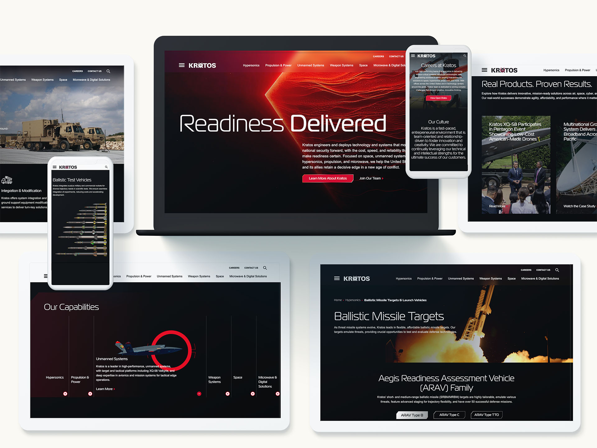
Check out our work with Kratos
What sets DC-based firms apart in B2B and B2G
While many agencies claim integrated capabilities, Washington DC marketing firms are built around realities that other markets rarely face. They operate in sectors where credibility is a currency, compliance is a given, and purchase decisions involve committees with technical, legal, finance, and mission stakeholders. That environment demands a discipline that blends category expertise, analyst-informed messaging, and marketing operations that can withstand scrutiny from procurement and security teams.
Proximity matters. Washington DC marketing firms track shifts in regulation, funding cycles, and agency priorities, then translate them into audience insights and demand plays. The result is strategy that connects big themes like modernization, cybersecurity resilience, or AI governance to tightly defined solution narratives and programs that move pipelines forward.
Understanding procurement cycles and buying committees
Federal and regulated market opportunities often move through long cycles with hard gates. Washington DC marketing firms design content, events, and outreach that match each step, from early market research and draft RFPs to post-award adoption. Instead of generic nurture, you get precise engagement plans aligned to program milestones, teaming dynamics, and influencer maps inside agencies or Fortune 1000 buyers.
Compliance, accessibility, and security by design
Trust is nonnegotiable in public sector and critical infrastructure. Leading Washington DC marketing firms build creative and digital experiences with accessibility and privacy in mind. That includes Section 508, WCAG conformance, data minimization, and tight governance for marketing tech stacks. Content is vetted for factual rigor and defensible claims, reducing risk while accelerating approvals.
Check out our work with Sabel Systems
How DC firms bridge technology and strategy
Bridging technology and strategy starts with the operating model. Washington DC marketing firms connect executive positioning with the pipelines, dashboards, and creative systems that turn strategy into outcomes. The work spans insight, architecture, activation, and optimization.
From data strategy to activation
Strong programs start with an evidence base. Audience segmentation leverages intent data, CRM signals, and program performance to isolate segments that match growth priorities. Washington DC marketing firms then map those segments to message frameworks, content architectures, and channel mixes. Activation plans coordinate paid, owned, earned, and field motions so each touch speeds consensus across technical and business buyers.
Integrating martech with sales orchestration
Campaigns perform when tech stacks are aligned. Washington DC marketing firms support their clients by standardizing taxonomies, defining UTM governance, and integrating marketing automation with CRM. That creates reliable attribution and shortens time to insight. The best partners can pivot budgets within a quarter based on real performance, feeding wins back into content and creative for compounding returns.
Check out our work with Frontgrade
Positioning that accelerates complex deals
In categories like cybersecurity, data platforms, logistics, healthcare, and national security, differentiation is not about louder claims. It is about clarity, use cases, and proof. Washington DC marketing firms develop messaging that speaks to mission outcomes and business impact, then show the math with case stories, demos, and third-party validation. Executives see the connection between the brand promise and pipeline progression in high-value accounts.
Thought leadership that earns trust
Senior audiences do not want product brochures dressed up as insights. Washington DC marketing firms build editorial programs that tackle policy shifts, technical tradeoffs, and operational realities. The approach often includes research-backed reports, C-level roundtables, and targeted media programs that position leaders as stewards of change. Over time, this thought leadership becomes a flywheel for account-based marketing and partner enablement.
Account-based marketing for enterprise and public sector
ABM succeeds when strategy, content, and operations move in unison. Washington DC marketing firms help their clients orchestrate tiered programs from one-to-one to one-to-few motions. Each account’s strategy aligns to the opportunity landscape, decision criteria, and competitive dynamics. Content is personalized at the problem level, not just the logo level, so every touch adds substance and momentum.
Field, events, and briefing centers
In-person engagement still drives trust in high-stakes markets. Washington DC marketing firms design executive briefings, roadshows, and tradeshow strategies that amplify thought leadership and turn meetings into next steps. Tight coordination with SDR and capture teams ensures fast, relevant follow-up. The output is pipeline, not just presence.

Search visibility as a revenue lever
Organic visibility is the first conversion for many decision makers. Washington DC marketing firms treat SEO and AEO as a strategic capability, not a checklist. Work includes intent-aligned keyword portfolios, technical audits, and content hubs that answer executive questions and practitioner needs. Measurement ties rankings and traffic to meaningful conversions and late-stage influence, not vanity metrics. For organizations investing in this capability, rigorous search engine optimization discipline becomes a compounding growth asset.
Digital experiences built for conversion
Websites must serve analysts, procurement officers, engineers, and C-level buyers at once. Washington DC-based marketing firms define information architectures that guide each visitor type to proof, demos, and next steps quickly. Design and copy collaborate to reduce friction across journeys. On the backend, experimentation frameworks validate changes with real data. A conversion-optimized foundation for website design and development often unlocks efficiencies across the entire funnel.
Measurement that earns board confidence
Executives need to see the line from investment to impact. Washington DC marketing firms implement measurement frameworks that segment outcomes by market, product line, and account tier. Multi-touch attribution is balanced with cohort analysis for long cycles. Dashboards roll up to a simple narrative: what worked, what did not, and what to do next. The precision helps marketing defend budgets and inform product, pricing, and route-to-market decisions.
Attribution in long buying cycles
Attribution is never perfect, but it can be fit for purpose. Washington DC marketing firms use hybrid models that weight executive content, events, and partner influence alongside digital conversions. The key is governance and consistency, so trend lines guide real budget shifts rather than opinion. Over time, the organization builds institutional memory that de-risks decisions.
Check out our work with Aechelon
How to evaluate Washington DC marketing firms
Choosing a partner is a high-stakes decision. Use this checklist to separate rhetoric from readiness.
- Category fluency: Ask for examples in your exact segment and buyer type. The best Washington DC marketing firms bring nuanced understanding of procurement, compliance, and competitive dynamics.
- Strategy-to-ops linkage: Look for teams that connect positioning to channel plans, content architectures, and sales orchestration. Ask how they will operationalize your story within your stack.
- Measurement plan: Require a clear methodology for targets, attribution, and reporting cadences. Washington DC marketing firms should define KPIs that the board respects.
- Security and compliance: Validate processes for accessibility, privacy, and data governance. Public sector and regulated buyers will ask. Your partner must answer.
- Change management: Assess how the firm leads workshops, aligns stakeholders, and trains your team. Great ideas die without adoption.
Common pitfalls to avoid
Even strong programs stall when basic risks are ignored. Washington DC marketing firms help clients avoid these traps, but internal alignment is still required.
- Strategy without enablement: Messaging guides nothing if sales and partners cannot use it. Build toolkits and train relentlessly.
- Content that misses the buyer: Executive priorities differ from practitioner needs. Segment topics, depth, and tone to match each audience.
- Fragmented data: Inconsistent taxonomies and loose tracking cripple insights. Establish governance on day one.
- Underpowered creative: Regulated markets do not require boring work. Washington DC marketing firms use bold but credible creative to break through safely.
- Short-term bias: Complex markets reward compounding investments. Balance demand sprints with brand and SEO programs that pay for years.
Emerging trends DC leaders are operationalizing
Marketing sits at the center of transformational themes. Washington DC marketing firms convert these trends into practical playbooks.
- AI augmentation: From audience modeling to creative iteration, AI speeds cycles and expands testing. Governance and human oversight keep outputs on brand and on brief.
- Privacy-centric growth: Signal loss requires new data strategies. First-party data capture and contextual programs replace over-reliance on third-party cookies.
- Accessibility as advantage: Inclusive design is both compliance and conversion. It increases reach while protecting the brand.
- Partner ecosystems: Alliances and integrators influence big deals. Programs must co-market and co-sell with clarity on joint value and pipeline impact.
The DC advantage for integrated campaigns
Integrated programs demand program management and creative agility. Washington DC marketing firms build strategies that mirror your operating model and run sprints with clear owners. They anticipate legal review cycles, compliance checks, and leadership visibility. Most important, they protect momentum by staging workstreams so creative, media, web, and sales enablement move in lockstep rather than wait on one another.
From brand to pipeline in one roadmap
Executives want both long-term brand value and near-term revenue. Washington DC marketing firms like Bluetext create roadmaps that start with positioning, then immediately translate the story into ABM plays, web upgrades, and media flights. This flow eliminates internal lags and produces early wins that fund further transformation.
Why partner with Bluetext
Bluetext has helped growth-stage innovators, enterprise leaders, and mission-driven organizations turn complex narratives into momentum. As a full-service B2B marketing agency that lives at the intersection of brand, demand, and digital, our teams bring the rigor of Washington DC marketing firms to every engagement. We pair research-driven messaging with creative that earns attention and operations that scale. Our specialists in B2G marketing understand the nuances of the public sector, while our digital teams deliver the platforms and workflows that convert.
Clients choose us for launch programs that reposition categories, ABM that moves enterprise deals, and digital ecosystems that align product, sales, and partner motions. Whether you need to modernize your web presence, unlock demand through media and content, or operationalize analytics across regions, we bring a playbook proven in the most demanding markets. If you want the strategic discipline and executional horsepower of Washington DC marketing firms in one partner, we are ready to help. Contact us to align your brand, campaigns, and digital experience around growth. Reach out to Bluetext to discuss strategy, branding, or campaign support that bridges technology and strategy and turns your goals into measurable results.