Winning digital growth in 2026 requires a site that anticipates intent, reduces friction, and proves brand credibility in every interaction. That is why marketing leaders are partnering with a website design firm that can merge brand strategy, UX, analytics, and modern engineering into one high-performing digital product. For B2B and B2G organizations with complex offerings and lengthy buying cycles, the right partner does more than refresh visuals. The best teams hardwire conversion strategy, accessibility, privacy, and performance into the experience so that traffic turns into pipeline and revenue. If you are evaluating a website design firm today, here is how top performers are redefining user experience and what that means for your roadmap.
What sets the user experience standard in 2026
The leaders in UX are building sites that feel faster, smarter, and more relevant with every click. A top website design firm defines success by tangible outcomes like qualified demos, RFP downloads, and sales velocity rather than pageviews alone. They align UX decisions to business goals and measure progress with product-grade instrumentation. That approach ensures a site that serves both the brand and its buyers.
In 2026, the gold standard looks like this:
- Speed that feels instant on any connection, with interaction latency under the threshold users can perceive.
- Adaptive navigation that streamlines journeys for new visitors, returning buyers, and public sector audiences with different compliance needs.
- Accessibility built in from design kickoff, not bolted on after launch.
- Privacy and data minimization that build trust while maintaining robust personalization.
- Experimental design culture that ships small improvements every week, not massive redesigns every few years.
Every website design firm that excels at UX now treats the website like a living product. That means a cross-functional cadence of research, design, content, and engineering that keeps pace with changing buyer behavior.
How leading teams use AI to personalize without crossing the line
Personalization has shifted from novelty to necessity, yet buyer trust is fragile. A top website design firm uses AI responsibly to enhance relevance while protecting privacy. The playbook includes first-party data, zero-party data from preference centers, and contextual signals that do not rely on invasive tracking.
Modern website personalization focuses on value and transparency. Visitors see curated content modules that match their industry, role, and lifecycle stage. Search is predictive, not static. Resource libraries surface the right case studies by problem area, not alphabet. Conversational interfaces help users navigate complex offerings faster than a traditional sitemap. With the right governance, AI reduces cognitive load while keeping experiences human and respectful.
The best website design firm will align personalization logic to your data policies, craft clear consent experiences, and ensure opt-out paths are visible. The result is a site that knows when to adapt and when to step back.
Accessibility, compliance, and trust as growth levers
Accessibility is not only a legal requirement. It is a commercial advantage. Inclusive design improves clarity and reduces abandonment for every user. A forward-looking website design firm will build to current WCAG standards and test with assistive technologies during development, not after launch.
For B2G and regulated industries, microcopy and visual hierarchy must guide users through secure content, gated downloads, and role-based portals without confusion. Expect your website design firm to integrate privacy-by-design patterns, clear consent flows, and secure forms that meet Section 508 and enterprise IT standards. Trust is the fastest path to conversion. It is also the strongest defense against brand risk.
Performance engineering and Core Web Vitals in an AI-rich world
AI capabilities can bloat sites if handled carelessly. The best teams design for performance first. A high-caliber website design firm optimizes Largest Contentful Paint and Interaction to Next Paint while balancing rich media and dynamic content. They deploy image CDNs, intelligent compression, code splitting, and edge rendering to keep sites responsive across regions and devices.
This engineering discipline is not just technical hygiene. It is conversion science. Faster sites lift SEO visibility, reduce bounce, and increase the rate at which evaluators become buyers. Every website design firm that treats speed as a feature will deliver an experience that feels premium without sacrificing maintainability.
Search experience optimization that meets buyers where they are
Executives, engineers, and procurement teams now expect answers in one or two clicks. That expectation extends from Google to your on-site search. A leading website design firm rethinks findability across both surfaces. They build for search engines and for human curiosity.
Search experience optimization starts with information architecture and is amplified by structured data, internal linking, and high-performance content templates. It ends with personalized on-site search that understands synonyms, acronyms, and intent. If your team needs a specialized partner to unlock this opportunity, review our search engine optimization approach for complex enterprise sites and content ecosystems.
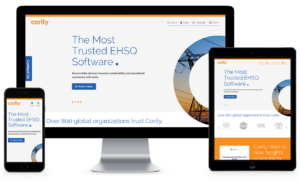
See how our SEO strategy changed the game for Cority
Content design that makes complexity feel simple
B2B and B2G buyers are not looking for jargon. They are looking for proof. A sophisticated website design firm pairs strong messaging with content design that accelerates understanding. Clear value propositions appear above the fold. Use cases are framed by the pain they solve, not the features they offer. Pricing and packaging are transparent. Validation arrives quickly through recognizable logos, quantified outcomes, and third-party recognition.
Effective content design turns long white papers into short, scannable modules. It uses calculators, decision trees, and visual explainers to reduce risk for the buyer. This is where design, UX writing, and product marketing converge. A top website design firm will build these assets into conversion paths so that form fills and demo requests feel like the natural next step.
Navigation and IA that adapt to multiple audiences
Enterprise sites often serve many roles at once. CIOs, developers, program managers, and contracting officers all take different paths. The strongest information architecture recognizes this reality. A mature website design firm structures global nav, meganavs, and contextual CTAs so each persona reaches the right content fast.
Adaptive navigation is supported by progressive disclosure. New visitors see simple, high-value options. Returning users gain shortcuts to deep resources. The right website design firm implements breadcrumb systems, robust site search, and content tagging to keep growth from turning into clutter.
Platform choices that future-proof enterprise websites
Your platform decision shapes long-term agility. Whether you choose a headless architecture or a traditional CMS, the goal is the same. Editorial teams should move fast without breaking design. Developers should ship improvements without friction. A seasoned website design firm will align platform choice to your governance model, security posture, and content scale.
When speed-to-market, editor usability, and a vast plugin ecosystem are priorities, many teams lean on WordPress development services. When enterprise-grade security, structured content, and complex permissions are paramount, a Drupal development agency approach can be ideal. The decision is not ideological. It is operational. The best website design firm evaluates the tradeoffs in the context of your roadmap and team strengths.
Design systems, component libraries, and governance
Design systems have moved from nice-to-have to essential. They protect brand consistency, speed up production, and make A/B testing practical at scale. A rigorous website design firm will deliver a living component library with tokenized styles, accessible patterns, and clear contribution rules. This keeps the site flexible as new product lines, campaigns, or acquisitions come online.
Governance also matters. The right website design firm sets up content workflows, role-based permissions, and publishing SLAs. This prevents bottlenecks and reduces risk as more stakeholders touch the site.

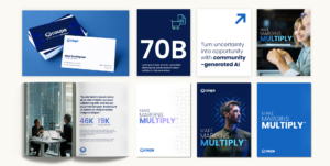
Discover our approach to designing Inovalon’s new logo
Analytics that measure what matters
Pageviews are not a strategy. Modern analytics should capture full-funnel behavior and revenue impact. A strong website design firm defines the metrics that matter before designs begin. They map events to the funnel, create consistent conversion definitions, and build dashboards that sales and marketing leaders actually use.
Analytics maturity also means using experimentation. A thoughtful website design firm will institutionalize split testing for headlines, page layouts, and CTAs. They will triage insights quickly, roll out wins, and retire failing ideas before they drain spend. The result is a compounding effect where small gains add up to large outcomes.
Security, privacy UX, and data minimization
Trust is a design problem as much as an IT problem. Security notices, consent banners, and user permissions must be clear, concise, and action oriented. A top website design firm reduces form friction by asking only for what is required. Clear error handling, status messaging, and confirmation emails reinforce brand reliability.
For public sector buyers, trust signals like compliance statements, secure document portals, and data residency disclosures should be easy to find. The right website design firm ensures these elements are visible in relevant journeys without overwhelming the primary narrative.
How the best firms orchestrate launch and continuous improvement
Launch is not the finish line. It is the start of a new operating model. A high-performing website design firm will create a 30, 60, and 90 day post-launch plan with clear hypotheses, test schedules, and backlog grooming. They will also enable in-house teams with training, documentation, and shadow sprints so your team can sustain momentum.
Expect weekly releases that address copy refinements, navigation tuning, accessibility fixes, and performance optimizations. The most valuable outcome of your partnership with a website design firm is not just a beautiful site. It is a system for continuous learning that keeps you ahead of market shifts.

Uncover how we changed the trajectory for DISCO ahead of their IPO
Signals that a partner will deliver the outcome you need
Executive sponsors evaluate partners on more than portfolios. They evaluate operating models and cultural fit. When you assess a potential website design firm, look for these indicators:
- A discovery process that quantifies business goals and defines how UX will move those numbers.
- A content strategy that addresses both search intent and sales enablement gaps.
- Accessibility and performance requirements included in the initial scope, not as change orders.
- Component-driven design and a code architecture that your team can maintain.
- Analytics plans with clear conversion definitions and dashboards for executives.
- References from organizations with similar buying cycles, compliance needs, and scale.
These signals point to a website design firm that operates like a product team, not just a creative vendor. They also reduce execution risk across your build and beyond.
Where brand and UX meet to drive enterprise growth
Finally, remember that experience is your most visible expression of brand. Visual identity, messaging, and interaction design must connect. The right website design firm can translate brand strategy into component-level decisions that improve time on task, reduce confusion, and grow qualified pipeline. For organizations managing multiple audiences across commercial and public sector markets, this alignment is decisive.
If you are seeking a partner with both creative and technical depth, consider a website design agency model that owns outcomes across research, design, content, engineering, and analytics. This unifies responsibility and elevates accountability for performance.
Putting it all together: a pragmatic 90 day plan
Marketing leaders often ask what a practical first quarter looks like when engaging a website design firm. A focused 90 day plan can set the tone for the entire engagement.
Days 1 to 30: Align and architect
Kick off with measurable goals, audience prioritization, and content audits. Complete analytics and technical diagnostics. Define information architecture and component requirements. A disciplined website design firm will exit this phase with a clear roadmap, a test plan, and high-confidence wireframes.
Days 31 to 60: Design, content, and prototypes
Produce a component library, page designs, and copy for high-impact flows. Conduct moderated usability tests with target buyers. A mature website design firm will turn findings into rapid iterations, with development-ready specs and content templates for the initial build.
Days 61 to 90: Build, validate, and prep launch
Engineer core templates, integrate CMS, and wire analytics. Validate accessibility, privacy UX, and performance budgets. Soft launch to a controlled audience, then harden based on feedback. A performance-minded website design firm will also line up the first three A/B tests so the site starts improving on day one post-launch.
The bottom line for 2026
Buyers expect clarity and speed. Teams expect agility and governance. Executives expect measurable impact. The right website design firm delivers on all three. They combine brand, UX, content, analytics, and engineering into a single operating system that compounds value over time. If your current site leaves visitors uncertain or slow to act, now is the right moment to modernize.
Ready to elevate user experience, accelerate pipeline, and reduce digital risk with a partner who understands enterprise and public sector requirements? Contact Bluetext to connect with a team that brings strategy, branding, and campaign execution together with product-grade web design and development that performs.
Marketing leaders cannot afford a mediocre website in 2026. Buyers expect intuitive journeys, instantaneous load times, and content tailored to their needs. WordPress has evolved into a flexible, enterprise-grade platform that can deliver all three when architected correctly. The path to better outcomes starts with a disciplined plan and advanced execution. This article outlines how to enhance user experience this year using modern patterns, data, and governance supported by high-caliber WordPress development services. For organizations that compete in complex B2B and B2G markets, the stakes are even higher, and the payoff is faster, with stronger pipeline growth, higher public-sector engagement, and measurable ROI.
What does exceptional WordPress UX look like in 2026?
Exceptional UX is not a single feature. It is the coordinated outcome of architecture, content, design systems, performance engineering, and analytics. For B2B and B2G, that experience should deliver four capabilities on day one. First, speed that exceeds Core Web Vitals across devices and networks. Second, accessibility that meets WCAG 2.2 and Section 508 standards. Third, relevance through clear information architecture, smart search, and contextual personalization. Fourth, trust reinforced by secure engineering, transparent privacy practices, and clear governance. The right WordPress development services bring these pieces together in a way that business stakeholders can manage and scale.
When to choose headless, hybrid, or classic architecture
Architecture drives user experience more than any single plugin. Classic WordPress with modern block patterns remains the right answer for many marketing teams that need speed to market and streamlined authoring. A hybrid approach works when you need to keep the WordPress CMS but deliver select experiences with headless frameworks for dynamic catalogs, dashboards, or high-traffic landing pages. Fully headless shines for complex front ends, micro front ends, or multichannel delivery to kiosks and native apps. The best WordPress development services weigh traffic profiles, content complexity, editorial maturity, security posture, and budget, then recommend the lightest architecture that achieves performance and maintainability.
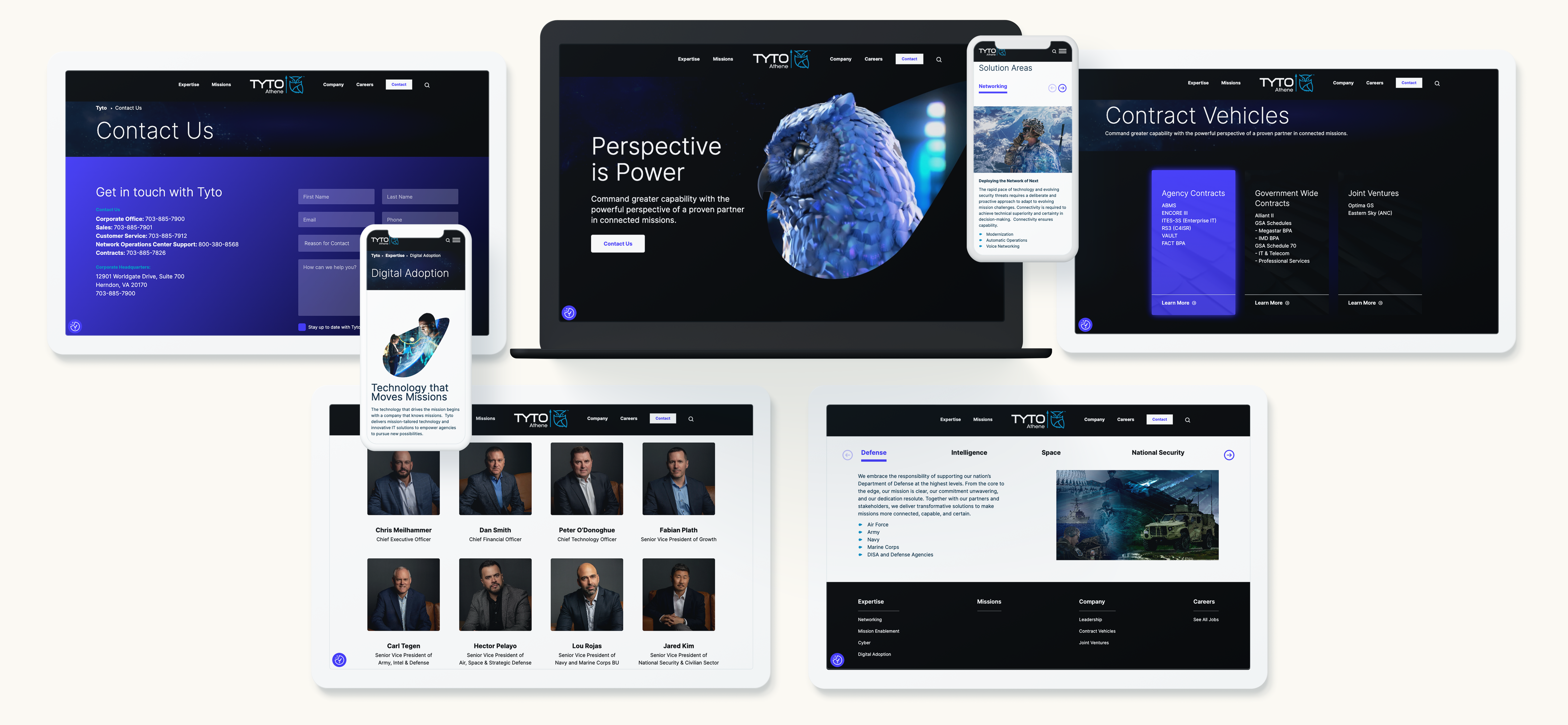
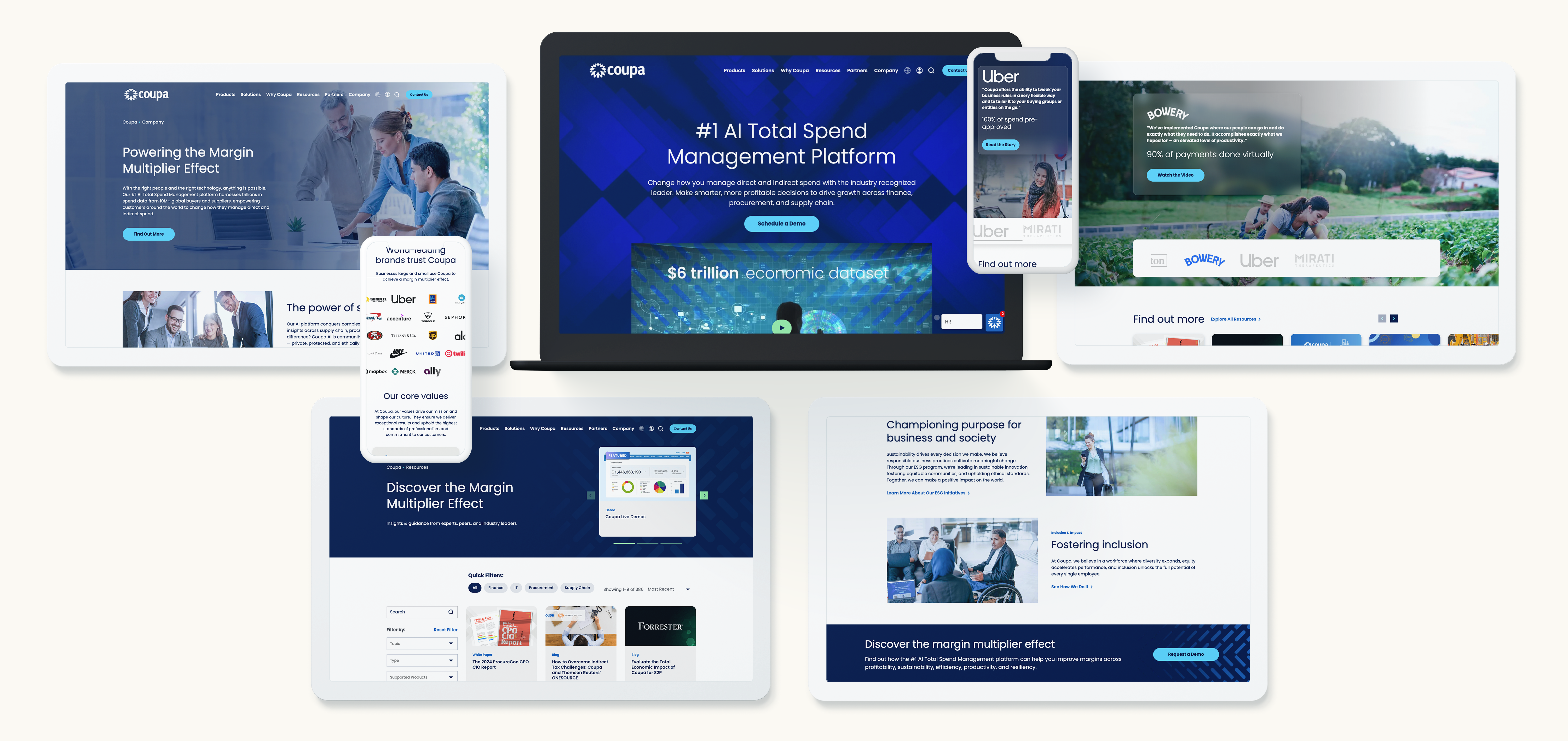
Discover how we brought Coupa’s vision to life
How the block editor powers consistency and scale
Gutenberg blocks and Full Site Editing support modular UX at enterprise scale. A robust block library translates your design system into reusable components with built-in accessibility, analytics events, and guardrails for content authors. Editors can assemble pages quickly without breaking layout or diluting brand standards. Advanced pattern locking prevents rogue formatting while enabling agility for campaigns. Investing in a block-driven design system is one of the highest ROI moves available through modern WordPress development services because it improves time to publish, reduces QA cycles, and protects user experience across the site.
Personalization that respects privacy and drives conversion
In 2026, personalization should be consent-aware, first-party data led, and fast. Segment by firmographics, user role, or referrer intent, then use lightweight decisioning at the edge to swap hero messages, resources, or CTAs. Server-side rendering keeps pages indexable and fast, while contextual blocks keep authoring simple. For B2G audiences, tailor content by mission area, procurement path, or compliance needs. For enterprise tech buyers, surface industry case studies and relevant integration guides. To go deeper on dynamic content, explore website personalization models that can be layered into your publishing workflow without adding fragility to the stack.
Accessibility and compliance as non-negotiable UX pillars
Accessibility increases reach, reduces legal risk, and improves usability for every visitor. Bake WCAG 2.2 AA standards into your components rather than auditing after launch. That means clear focus states, sufficient color contrast, structured headings, ARIA support only where appropriate, descriptive links, and consistent keyboard navigation. For B2G programs, align Section 508 requirements and create a Voluntary Product Accessibility Template that maps how the site meets criteria. Enterprise-grade WordPress development services include automated testing in CI, manual assistive technology testing, and governance checklists so accessibility remains a continuous practice, not a one-time task.
Performance engineering for Core Web Vitals
Speed is table stakes for user satisfaction and SEO. Start with a performance budget that sets strict weight targets per page type. Optimize the critical rendering path with server-side rendering, HTTP/3, and early hints. Adopt AVIF and WebP images with adaptive sizing, native lazy loading, and next-gen responsive attributes. Defer noncritical scripts, tree-shake unused code, and inline critical CSS. Use a CDN with edge caching and stale-while-revalidate strategies for resilience during traffic spikes. Measure with RUM data rather than synthetic tests alone. A mature approach from experienced WordPress development services correlates these improvements to engagement and conversion, not just Lighthouse scores.
Search that accelerates discovery
When prospects arrive with a specific problem, on-site search must deliver precise, ranked answers. Configure synonyms, business-rules boosting for product or solution pages, and scoping filters that match buyer language. Implement query understanding, typo tolerance, and guards against empty results. Expose search analytics to marketing and product teams so they can see what users cannot find and respond with new content or taxonomy tweaks. For enterprise catalogs and documentation, consider a headless search service with instant results and structured snippets. The most effective WordPress development services design search as a product with ongoing tuning, not a one-time widget.
Security and reliability that protect brand equity
Trust is an essential part of user experience. Harden WordPress with principle of least privilege, SSO for administrators, and scoped API keys. Enforce MFA, set strong content approval workflows, and log activity with anomaly alerts. Use a Web Application Firewall and rate limiting, and separate build, staging, and production environments. Automate backups and perform restore drills quarterly. For public-sector work, align to organizational policies and hosting controls that support compliance. Mature WordPress development services integrate these controls without slowing editors, which ultimately leads to a site that is both safer and more productive to operate.

Go behind our build for SecurityScorecard
Localization and multilingual experiences at scale
Global B2B brands and federal contractors need precise localization. Build a language architecture that supports shared components and localized content while preserving SEO via hreflang and localized sitemaps. Define translation workflows with glossaries, tone guides, and change tracking to maintain consistency. Prioritize market-specific content instead of 1:1 translation for every page. Ensure forms, PDFs, and error messages are all localized. Performance should remain stable despite added languages, which is why efficient media handling and caching strategies matter. WordPress development services that understand enterprise localization can reduce overhead and accelerate regional launches.
Data, analytics, and the feedback loop
Your analytics model should mirror your funnel and your navigation, not the other way around. Define clear events for micro conversions like resource downloads, email signups, search refinements, and product video views. Map content groupings to buyer stages and track scroll depth, dwell time, and click paths that predict conversion. Pipe events into your warehouse or CDP for audience building and nurturing. Maintain privacy-first consent management that toggles nonessential tags and keeps your audit trail clean. The most valuable output of advanced WordPress development services is a site that teaches you what to build next, every week.
SEO fundamentals that compound growth
UX and SEO are partners. Fast pages, structured content, strong internal links, and clear headings deliver a better experience and higher rankings. Use schema for products, FAQs, events, and reviews to earn richer results. Align pillar pages with solution areas, then cluster related articles and case studies. Control cannibalization with canonical tags and prune content that no longer serves intent. Redirect maps are essential during redesigns to preserve equity. If you need help modernizing your roadmap, our search engine optimization work demonstrates how technical and content improvements compound performance over time.
Migrations that protect traffic and improve UX
Replatforming is an opportunity to simplify, not simply to move. Start with a content audit to identify what to keep, consolidate, or retire. Rewrite information architecture based on real query data and stakeholder goals. Build migration scripts that normalize metadata, image alt text, and redirects. Validate at scale with automated link checking and manual QA on high-value flows like pricing, partner portals, and RFQ submissions. The best WordPress development services treat migration as an integrated product, not a bolt-on task, ensuring that launch day maintains search visibility while unlocking the new experience.
Governance, training, and design systems that last
UX fails when governance fails. Codify roles, editorial standards, and review workflows. Document what a good page looks like, with required components, quality bars, and accessibility checks. Tie the design system to a block library so teams work from one source of truth. Run enablement labs for marketers that simulate real publishing scenarios and reinforce good patterns. Governance also includes deprecation plans for content and components so the site gets leaner, not heavier, as it ages. Sustainable impact from WordPress development services depends on these human systems as much as the code.
Evaluating a partner for WordPress development services
Choosing the right partner is pivotal. Look for a track record delivering measurable outcomes in B2B and B2G, not just aesthetic redesigns. Ask for architecture rationales rather than tool lists. Review how they operationalize accessibility, Core Web Vitals, and security hardening within sprints. Inspect their block libraries and documentation quality. Confirm how they approach analytics, tagging, and experimentation from day one. Seek transparent roadmaps and change management plans. A seasoned WordPress development agency should align to your operating model and build your team’s capacity to sustain the site long after launch.
A 100‑day roadmap to elevate user experience
A disciplined 100‑day plan creates momentum and reduces risk. Days 1 to 30 focus on discovery and strategy: stakeholder interviews, analytics review, content inventory, technical audit, and an initial information architecture. Days 31 to 60 move into design systems and proofs of concept: component definitions, accessibility patterns, performance budgets, and search configuration. Days 61 to 90 shift to build and migration: block library development, page templates, integrations, and automated migration scripts. The final 10 days are for hardening and enablement: security reviews, load testing, accessibility manual testing, editor training, and go-live rehearsal. This is the cadence elite WordPress development services use to ship quality at speed.
Integrations that streamline buyer journeys
UX extends beyond pages. Map and integrate the systems that shape conversion. Connect CRM forms with progressive profiling, synchronize gated content with marketing automation, and trigger nurture flows based on on-site behavior. For customer portals, use SSO to reduce friction and tailor content for authenticated users. Align product feeds, partner directories, and event listings with structured data and caching. The most reliable WordPress development services do not treat integrations as afterthoughts. They model the data, design for failure states, and ensure the journey remains smooth even when an upstream system lags.

Read why LMI turned to Bluetext for a brand refresh
Content operations that keep sites fresh
Even the best UX decays without a healthy content engine. Establish an editorial calendar tied to audience needs, lifecycle stages, and key sales motions. Define reusable content types like solution briefs, implementation guides, and mission narratives for public-sector visitors. Automate related content modules and keep them tuned through analytics. Invest in clear, jargon-free copy and visual narratives that make complex topics digestible. Modern WordPress development services emphasize content operations because fresh, well-structured material is the fastest way to sustain rankings and conversions.
Proving value with metrics that matter
Executives need proof, not promises. Track a balanced scorecard that ties the experience to business outcomes. Leading indicators include Core Web Vitals, SERP visibility, on-site search success rate, and form completion rates. Lagging indicators include sourced pipeline, influenced revenue, and public-sector RFI engagement. Use cohort analysis to see how performance improvements correlate with conversion over time. A credible program for WordPress development services establishes these measures before the first line of code, then reports progress against them at each milestone.
Why Bluetext for enterprise-grade WordPress
Marketing and communications leaders choose partners who reduce complexity and deliver results. Bluetext brings strategy, design, and engineering together under one roof, with a focus on measurable outcomes in complex B2B and government markets. Our teams architect for speed, accessibility, security, and scale, then enable your editors to move faster with confidence. Learn more about our approach to WordPress development services and how we tailor each engagement to your governance model and growth objectives.
What success looks like
When organizations adopt the practices in this guide, the results are consistent. Bounce rates drop as pages load faster and navigation becomes clearer. Organic traffic rises as technical SEO aligns with authoritative content. Qualified conversions increase as personalization and frictionless forms meet buyers where they are. Public-sector engagement improves when accessibility and compliance are built in. Most importantly, marketing teams gain agility with a component system and analytics model that turn insights into action without long development cycles. These are the outcomes you should expect from advanced WordPress development services in 2026.
Next steps to move from vision to execution
If you are planning a replatform, consider a phased approach that addresses performance, accessibility, and architecture early. If your site is already on WordPress, start with a diagnostics sprint that benchmarks Core Web Vitals, accessibility, search, governance, and analytics. Use those findings to prioritize the highest-impact fixes and to roadmap future enhancements. Evaluate partners through pilot projects that prove value before full-scale commitments. The right investment in WordPress development services will reduce total cost of ownership, accelerate time to market, and elevate the user experience that drives growth.
Bluetext is ready to help you plan, build, and optimize a website that works as hard as your brand. Explore our capabilities as a WordPress development agency, see how personalization models can scale with your team, and bring your analytics to a level that informs every decision. To start a conversation about strategy, branding, or campaigns that connect, contact Bluetext and let’s design an experience your buyers will remember.
Video is now the most efficient way to compress complex ideas, proof points, and emotion into a format decision makers remember. For enterprise and public sector brands, the stakes are high and attention is scarce. Strategic video design services align creative storytelling with business goals to move audiences from awareness to action. When executed with rigor, these programs turn brand narratives into tangible outcomes, including pipeline growth, stakeholder trust, and accelerated consensus across buying committees.
Why video design services matter for B2B and B2G brands
Executives evaluate dozens of vendors, platforms, and policies every quarter. They need clarity, not clutter. Effective video design services map your value proposition to the moments that influence evaluation criteria and mitigate perceived risk. Instead of presenting features in isolation, the right narrative architecture positions a brand as a guide through industry change, regulatory complexity, and operational pressures.
For B2B organizations, video can unify the buyer’s journey across sales cycles that stretch for months. For B2G teams, video can clarify mission impact, security postures, and compliance readiness in formats that resonate without oversharing sensitive details. In both cases, integrated video design services reduce friction, align internal stakeholders, and create consistent visual language across channels.
What falls under modern video design services
Today’s video ecosystem spans far beyond basic filming and editing. Comprehensive video design services include narrative strategy, scripting, storyboarding, motion design, 3D visualization, live action direction, sound design, and post production optimization. The best programs connect each discipline back to brand standards and campaign objectives, ensuring stylistic choices support measurable outcomes.
Motion graphics simplify abstract concepts. 3D renders showcase products or architectures that are hard to film. Live action interviews and documentary-style content humanize leadership and customers. Animated explainers introduce platforms and workflows with clarity. Each of these formats benefits from video design services that standardize typography, iconography, color grading, and transitions, so the full library feels like a single brand system.

Watch what helped CBIZ stand out in a crowded market
Translating brand strategy into a visual narrative
Winning videos start with intentional story structure. A disciplined process grounds creative in business proof. High performing video design services typically follow this sequence:
- Brief alignment. Define audience, desired action, distribution channels, and success metrics. Validate the problem statement and any constraints.
- Message hierarchy. Distill three to five core points with supporting proof such as quantitative outcomes, security credentials, or third-party validations.
- Visual system. Establish motion rules, on-screen text styles, and graphic metaphors that connect back to the master brand.
- Storyboard and animatic. Pressure test timing, pacing, and comprehension before production investment.
- Production and post. Capture or create assets, design soundscapes, and refine edits against the original brief.
When video design services link narrative beats to specific viewer objections, the story anticipates questions that typically stall deals. This is especially valuable in consensus-driven sales where legal, finance, and IT each require different proof points.
Formats that perform across the funnel
Executives do not watch every video the same way, and distribution channels reward different lengths and hooks. A diversified plan for video design services improves reach and relevance across the full funnel.
- Brand anthem. A 60 to 90 second piece that articulates mission, market context, and differentiation. Ideal for site homepages, event openers, and board briefings.
- Product explainer. Two to three minutes using motion graphics or 3D to illustrate value drivers, integrations, and outcomes. Designed to shorten technical onboarding.
- Customer story. Two to three minutes mixing interview clips with b-roll and motion graphics to show before and after states. Prioritize metrics and decision rationale.
- Thought leadership. 30 to 90 second insights or longer-form moderated conversations that frame issues executives already care about, such as security resilience or AI governance.
- Social cutdowns. Six to 20 second teasers with bold typography and subtitles for autoplay-in-feed environments.
- Sales enablement snippets. 15 to 45 second clips tailored to common objections, sent by reps as follow-ups.
Strong video design services produce a master asset and a suite of derivatives so your team can test, learn, and personalize without starting from scratch for each channel.
How to optimize video for channel, search, and performance
Even the best creative underperforms if it is not engineered for each environment. This is where disciplined video design services prove their value. A channel-smart approach includes:
- Aspect ratios:16:9 for YouTube and web, 1:1 or 4:5 for LinkedIn and Facebook feeds, 9:16 for vertical placements.
- Silent comprehension: Use kinetic typography, iconography, and captions so the story lands without sound.
- Front-loaded value: State the problem and promise in the first five seconds to beat scroll fatigue.
- Metadata and structure: Title, description, chapters, and tags aligned to your message map and target queries.
- Calls to action: Clear, visual CTAs that reflect the next best step, such as booking a demo or downloading a brief.
For brands investing in search visibility, partner with a team that blends SEO with video design services. File naming conventions, schema markup, and structured chapters influence discoverability. On owned channels, tie video engagement to marketing automation, then segment follow-up based on viewing thresholds and topics viewed.
Measurement that proves business impact
Leadership teams want evidence. Go beyond vanity metrics to show contribution to growth. A mature analytics framework for video design services might include:
- Top of funnel: Reach by audience type, average watch time, and video completion rates by channel and topic.
- Mid funnel: Form fills, demo requests, meeting bookings, and content progression tied to specific videos.
- Bottom of funnel and post sale: Opportunity acceleration, influenced revenue, reduction in onboarding time, and customer education outcomes.
Dashboards should ladder up to quarterly objectives and budget accountability. With consistent tagging and UTMs, you can compare the efficiency of different formats produced under your video design services program.
Balancing quality, speed, and cost
Not every initiative requires cinematic production. The decision criteria should be strategic, not arbitrary. Build a tiered model for your video design services:
- Tier 1, Flagship. High production value for tentpole campaigns, product launches, and investor or mission communications. Longer lead times, complex motion design, and multi-day shoots.
- Tier 2, Core. Polished animated explainers, customer stories, and modular content with brand-consistent motion templates.
- Tier 3, Agile. Fast-turn clips, social teasers, and internal communications using approved graphics, music beds, and lower thirds.
This approach maximizes impact where it matters most while maintaining quality and speed across routine needs. It also ensures creative assets and templates from premium projects cascade into agile deliverables, improving return on your video design services investment.
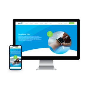
Get the full story on our video work with Paya
Accessibility, compliance, and security for public sector work
Public sector communications require extra diligence. Ensure your video design services address accessibility with accurate captions, audio description when relevant, color contrast standards, and readable on-screen text. Compliance with Section 508 and WCAG prevents costly rework and expands audience reach. Security teams may also review storyboards and scripts to avoid sensitive details in b-roll or animations. A partner with public sector experience and a track record as B2G marketing experts can streamline approvals and protect program integrity.
Common pitfalls and how to avoid them
Consistent success depends on operational discipline. Look out for these traps when deploying video design services:
- Unclear brief: Without a crisp audience and action, teams create beautiful assets that do not move the needle.
- Script drift: Late-stage changes balloon timelines. Lock the message hierarchy early and test it with sales or program leads.
- Inconsistent visual language: Ad hoc styles dilute brand memory. Maintain a shared motion toolkit and typography rules.
- Excess length: Long is fine when it earns attention, but every second must carry value. Use chaptering and derivatives to respect time.
- Weak distribution: Even great work fails without a plan. Treat distribution as part of your video design services scope, not an afterthought.
How to select the right partner
Look for a team that fuses strategic rigor with creative excellence and operational reliability. Review their category fluency, from cybersecurity and AI to healthcare and federal. The most capable partners showcase a wide range of narratives and aesthetics in a single, coherent system. To see this in action, explore Bluetext’s video portfolio and broader our work in video to evaluate range and relevance across formats.
In addition, consider whether your agency can connect video to integrated programs that include PR, content, and demand generation. If your priority is a cohesive growth engine, partnering with a seasoned B2B marketing agency ensures your video investment is reinforced by supporting channels and analytics infrastructure.
View the video that helped SecurityScorecard stand out from the crowd
A proven workflow blueprint
Reliable delivery comes from a transparent process. Best-in-class video design services follow a repeatable blueprint that still leaves room for innovation:
- Discovery and alignment: Stakeholder interviews, audience analysis, and goal setting.
- Message and mood: Script drafting, tone alignment, and references that reflect brand voice and audience expectations.
- Visual development: Style frames, iconography, and motion tests to lock the look and feel.
- Storyboard and animatic: Narrative flow and timing validated before production.
- Production: Live action capture and asset creation with clear shot lists and contingency plans.
- Post production: Edit, motion builds, color, mix, and quality assurance, with checkpoints mapped to the brief.
- Localization and accessibility: Subtitles, translations, and compliance checks.
- Activation and measurement: Channel-specific versions, tracking, and performance dashboards.
This approach reduces risk, accelerates delivery, and ensures the final product fulfills the purpose of your video design services program.
Putting AI and new production models to work
AI and virtual production have expanded what teams can achieve on practical budgets. Style-consistent title cards, lower thirds, and transitions can be generated or versioned quickly with template-driven tooling. AI-assisted rough cuts shorten edit cycles, while 3D engines and LED volumes unlock environments that once required travel and permits. The key is governance. Responsible video design services deploy AI under clear brand and security guidelines, with human creative oversight to protect originality and accuracy.
Building a distribution plan from day one
Distribution planning should shape story structure and deliverables, not follow them. Align with sales enablement, channel leads, and PR early so the output of your video design services lands where it can drive action. A durable plan includes:
- Owned channels: Website hero placements, product pages, and resource libraries with SEO structured data.
- Paid amplification: Targeted campaigns to reach buying committees with tailored messages per role.
- Sales and partner ecosystems: CMS or DAM folders mapped to common objections and verticals.
- Events and briefings: Short openers and loopable interstitials that set tone and context.
When content is planned for repackaging, you can meet multiple channel requirements in one production run. This multiplies the value of your video design services and accelerates proof of impact.

Check out the visuals we created for Inovalon
A quick-start checklist for your next initiative
Use this summary to launch an efficient, high-impact program:
- Define the audience, the single action you want next, and how success will be measured.
- Select the format mix across funnel stages, with derivatives for social and sales enablement.
- Lock a message hierarchy that addresses stakeholder objections and proof points.
- Approve a motion and graphic system aligned to brand standards.
- Plan distribution, metadata, tracking, and accessibility from the start.
- Set tiered production levels to balance quality, speed, and cost.
- Instrument analytics to attribute influence on pipeline and retention.
When each step is owned and sequenced, your investment in video design services compounds across campaigns and fiscal years.
Why Bluetext
Bluetext pairs strategy, creative, and analytics to deliver video libraries that drive measurable growth for enterprise and public sector clients. Our teams understand complex categories, security requirements, and multi-stakeholder sales. We build systems that scale, from flagship brand films to agile social cutdowns, all anchored in rigorous message frameworks. For a preview of our creative range, you can also view our agency reel to see storytelling translated into outcomes across industries.
Move from story to impact
The brands that win in the next market cycle will communicate with speed and clarity, not just style. They will equip sales with precision videos that answer hard questions, energize employees with mission-first narratives, and help policy makers or procurement teams understand risk and reward. Strategic video design services make that possible. If you are ready to turn your brand story into business impact, contact Bluetext to discuss how our strategy, branding, and campaign teams can activate your narrative at scale with a system built for measurable results.
Marketing leaders in the nation’s capital face a unique mandate: deliver measurable growth while addressing complex buying committees, security expectations, and procurement rules. In this environment, web design in Washington DC is not a cosmetic exercise. It is a strategic lever that informs positioning, supports capture and growth, and turns complicated value propositions into clear actions. The organizations that treat their digital front door as a performance system, not an online brochure, gain an immediate edge over competitors who still design by opinion rather than evidence.
Why web design matters now for B2B and B2G growth
Decision cycles are faster, attention is scarcer, and expectations set by consumer platforms spill into enterprise and public sector journeys. Effective web design in Washington DC becomes the connective tissue between brand promise, thought leadership, and sales enablement. It fuels pipeline by clarifying value, proving credibility, and making the next step obvious. This is especially true across federal and regulated markets, where stakeholders must quickly confirm that vendors meet security, compliance, and mission needs. When your website removes friction and builds trust in the first 30 seconds, everything downstream gets easier.
What does high-performing web design in Washington DC look like?
High performers treat the site as a growth platform built around the buyer. Their web design in Washington DC is grounded in user research across key personas such as program managers, procurement officers, CISOs, CTOs, and business executives. These teams map questions to content, streamline pathways to conversion, and reinforce expertise with proof. The experience is fast, secure, accessible, and measurable. Every feature and pixel has a job to do, from navigation labels that mirror RFP vocabulary to performance budgets aligned to Core Web Vitals.
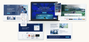
See how we partnered with Coupa
Trend 1: Personalization that respects privacy and accelerates clarity
Modern web design in Washington DC increasingly relies on modular content and light personalization to meet stakeholders where they are. A federal program manager might need contract vehicles and past performance, while a CTO wants architecture diagrams and integration specifics. Modular components allow the same page to adapt contextually based on referrer, industry, or user intent signals. The result is faster relevance without overwhelming visitors with irrelevant paths.
How to implement personalization without overreach
Adopt a consent-first, value-forward mindset. Begin with segment-level experiences that align calls to action with known priorities in Washington, such as mission outcomes, compliance, and risk reduction. Use progressive profiling in forms to reduce friction for repeat visitors. Make every personalized element explainable and genuinely helpful. The most effective web design in Washington DC balances helpful context with clear privacy controls, which is critical for public sector audiences.
Trend 2: Accessibility, compliance, and trust as design requirements
Accessibility is not optional in the capital. Successful web design in Washington DC meets WCAG standards, aligns to Section 508 where relevant, and treats inclusive design as both a moral and commercial imperative. Color contrast, keyboard navigation, semantic headings, and readable typography benefit all users while signaling quality. Compliance readiness, from privacy disclosures to content archiving practices, increases confidence among risk-conscious stakeholders who evaluate vendors on responsibility as well as capability.
Trend 3: Speed and Core Web Vitals as table stakes
Fast beats fancy. Sites that nail search visibility and engagement typically prioritize performance budgets, modern image formats, and lean, component-based front ends. Strong web design in Washington DC bakes Core Web Vitals into definition of done and continually monitors real user metrics. The payoff is immediate: faster page loads, higher organic reach, better conversion rates, and improved user satisfaction across mobile and desktop.
Trend 4: AI-powered findability and site search
Stakeholders expect precise answers fast. Enterprise-grade site search, improved taxonomy, and structured content allow users to self-serve with confidence. Leading web design in Washington DC now incorporates AI-assisted search that understands intent, ranks content by credibility, and suggests next steps such as booking a briefing or downloading a solution guide. When your website answers the top 20 buyer questions better than anyone else, you set the frame for every sales conversation that follows.
Trend 5: Security-first UX for public sector confidence
Security is both a technical and experience issue. Visitors take cues from execution details, such as clean form design, clear data practices, and minimal third-party bloat. Web design in Washington DC often integrates secure single sign-on for resource portals, uses content security policies, and limits unnecessary scripts that introduce risk. Trust badges and case evidence matter, but the frictionless, secure feel of the site communicates even more about how your team handles sensitive information.
How to align content with DC buyer journeys
For both commercial and government audiences, the shortest route to consideration is valuable content packaged for scan-ability. The best web design in Washington DC organizes content by use case, mission outcome, and role-based needs. Executive pages lead with outcomes and differentiation. Technical pages move quickly into architecture, integrations, and documentation. Procurement pages make contract vehicles, NAICS codes, and performance highlights easy to find. Clear, outcome-driven storytelling reduces cognitive load and raises the signal-to-noise ratio.

Take a look at what we built with Kratos
Search visibility remains the quiet force multiplier
Strong information architecture and technical SEO expand qualified reach. Optimize for topic clusters tied to your solutions and the language decision makers use, not just branded terms. Structured data, internal linking, and clean component-based templates improve crawl efficiency. Web design in Washington DC that treats organic search as a core channel often outperforms peers who rely too heavily on paid to mask discoverability gaps. Teams that integrate search engine optimization from the beginning avoid costly retrofits and ship faster-performing experiences.
Choosing the right CMS for scalability and control
Select a platform that matches governance, security, and speed requirements. For many organizations, WordPress balances ease of authoring with enterprise-grade performance through modern hosting and composable stacks. Others prefer Drupal for granular permissions and content modeling flexibility. The most effective web design in Washington DC adopts a CMS that enables non-technical teams to publish quickly while maintaining brand and security standards.
Platform guidance for DC-centric needs
Organizations that require rapid content updates and campaign agility often benefit from WordPress development services with a component library and robust role-based workflows. Enterprises and public sector teams with complex editorial and access control needs lean into Drupal development for its strength in structured content and governance. In both cases, build for performance from the outset and standardize reusable components to ensure consistency across campaigns.
Measurement: connect digital to pipeline and programs
Your website should prove its impact. High-performing web design in Washington DC defines a measurement model tied to sales stages, capture targets, and program goals. Track assisted conversions, content-influenced opportunities, and velocity. Combine product interest signals with account identification to surface relevant plays for business development. Dashboards that translate digital activity into revenue language give executives the clarity they need to invest confidently.
A 180-day roadmap to a high-performing redesign
Leaders often ask how to move fast without sacrificing quality. A disciplined, sprint-based approach allows teams to ship value early while laying a scalable foundation. The following blueprint has helped many organizations modernize web design in Washington DC on time and within budget:
- Weeks 1 to 3: Stakeholder interviews, competitive scan, analytics review, and buyer journey mapping. Define KPIs and success metrics.
- Weeks 4 to 6: Information architecture, content model, and component inventory. Prioritize templates for launch vs. backlog.
- Weeks 7 to 10: UX/UI design for core templates. Validate with rapid user testing that reflects DC personas.
- Weeks 11 to 16: Front-end build, CMS configuration, performance budgets, and content migration plan.
- Weeks 17 to 20: QA for accessibility, Core Web Vitals, and security controls. UAT with sales, BD, and compliance teams.
- Weeks 21 to 24: Content finalization, SEO readiness, and phased launch. Monitor and optimize against KPI dashboards.
Local context matters: why DC familiarity gives you an edge
Teams experienced in web design for government clients understand the cadence of the federal calendar, the importance of contract vehicles, and the expectations of technical buyers who manage risk at scale. They anticipate scrutiny around accessibility and privacy, reflect mission language accurately, and design proof points for complex procurements. This local fluency shortens cycles and prevents costly missteps that can stall launches or weaken credibility.
Integrating brand, messaging, and conversion paths
Design is the expression of strategy. The strongest web design in Washington DC is anchored in a clear positioning platform that scales across product lines, capture initiatives, and thought leadership. Messaging frameworks turn into page templates and component copy standards. Calls to action are specific to buyer stage, such as booking a demo, requesting a capabilities briefing, or downloading a contracting guide. Consistent brand execution reinforces authority, while conversion design turns that authority into meetings and revenue.
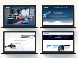
Get a closer look at our work with Hughes
Common pitfalls to avoid in Washington DC redesigns
Missteps are predictable and preventable. Resist the urge to design by internal preference rather than user evidence. Do not defer performance until the end. Avoid navigation labels that mirror your org chart instead of buyer language. Do not launch without a content governance model that keeps pages fresh and compliant. Above all, do not treat web design in Washington DC as a one-and-done project. Treat it as a living program that evolves with the market and your pipeline priorities.
Criteria for selecting a DC-ready web partner
Choosing the right collaborator can compress timelines and magnify outcomes. When evaluating partners, look for:
- Proven success delivering web design in Washington DC across B2B and B2G audiences.
- Expertise in accessibility, compliance, and performance monitoring.
- Demonstrated ability to translate complex value propositions into clear, modular content.
- SEO, analytics, and conversion optimization embedded in the process.
- A component-driven design system that accelerates future campaigns.
Local expertise is a differentiator. A DC digital web design agency understands the regional procurement landscape and can shape journeys that reflect how real stakeholders search, evaluate, and decide.
When to upgrade your web platform and design system
Signals include stagnant organic traffic despite content investments, rising paid media dependence to hit targets, dated templates that cannot express new offerings, or governance gaps that slow publishing. If your team cannot answer the top 20 buyer questions in two clicks or less, it is time to modernize. Strong web design in Washington DC closes these gaps with speed, structure, and credibility.
From traffic to trust: orchestrating the full journey
Websites do not win alone. Surround the experience with targeted demand programs that put the right people into the right paths. Integrate LinkedIn, ABM, and public sector events with landing pages that mirror campaign messaging. Nurture visitors with value-first follow-ups rather than generic blasts. The most effective web design in DC turns earned attention into confidence through consistent storytelling, fast answers, and frictionless conversion points.
Partnering with Bluetext for measurable outcomes
Bluetext helps brands translate complex stories into digital experiences that move markets. As a full-service website design agency, we build component-driven platforms that meet the demands of enterprise and public sector buyers. Our team aligns strategy, content, UX, and performance to the KPIs that matter: qualified pipeline, win rates, and time to value. For agencies and contractors that compete in government markets, our public sector digital marketing agency expertise elevates compliance and credibility from the first click.
Take the next step
If you are ready to transform web design in Washington DC into a competitive advantage, Bluetext can help. Whether you need a modernization roadmap, a component library that scales, or a full redesign anchored in measurable growth, our team is built for outcomes. Contact us to discuss your goals and see how an evidence-driven approach can accelerate your pipeline and brand authority. Reach out through our contact form to start the conversation.
Technology is rewriting the rules of market differentiation, sales velocity, and stakeholder trust. Strategy still determines where to play and how to win, but execution increasingly depends on data pipelines, connected platforms, and creative that adapts in real time. This is why Washington DC marketing firms have become catalysts for growth across B2B and B2G. They sit at the crossroad of policy, procurement, and product innovation, pairing enterprise-grade strategy with the tools to deliver measurable outcomes. For executive teams tasked with capturing share in complex ecosystems, Washington DC marketing firms like Bluetext offer a pragmatic path to align positioning, pipeline, and performance.
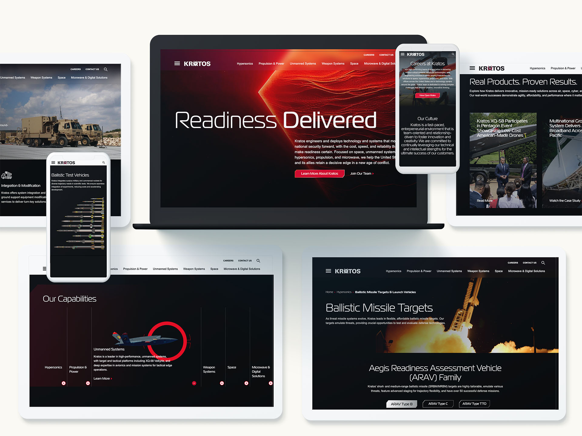
Check out our work with Kratos
What sets DC-based firms apart in B2B and B2G
While many agencies claim integrated capabilities, Washington DC marketing firms are built around realities that other markets rarely face. They operate in sectors where credibility is a currency, compliance is a given, and purchase decisions involve committees with technical, legal, finance, and mission stakeholders. That environment demands a discipline that blends category expertise, analyst-informed messaging, and marketing operations that can withstand scrutiny from procurement and security teams.
Proximity matters. Washington DC marketing firms track shifts in regulation, funding cycles, and agency priorities, then translate them into audience insights and demand plays. The result is strategy that connects big themes like modernization, cybersecurity resilience, or AI governance to tightly defined solution narratives and programs that move pipelines forward.
Understanding procurement cycles and buying committees
Federal and regulated market opportunities often move through long cycles with hard gates. Washington DC marketing firms design content, events, and outreach that match each step, from early market research and draft RFPs to post-award adoption. Instead of generic nurture, you get precise engagement plans aligned to program milestones, teaming dynamics, and influencer maps inside agencies or Fortune 1000 buyers.
Compliance, accessibility, and security by design
Trust is nonnegotiable in public sector and critical infrastructure. Leading Washington DC marketing firms build creative and digital experiences with accessibility and privacy in mind. That includes Section 508, WCAG conformance, data minimization, and tight governance for marketing tech stacks. Content is vetted for factual rigor and defensible claims, reducing risk while accelerating approvals.
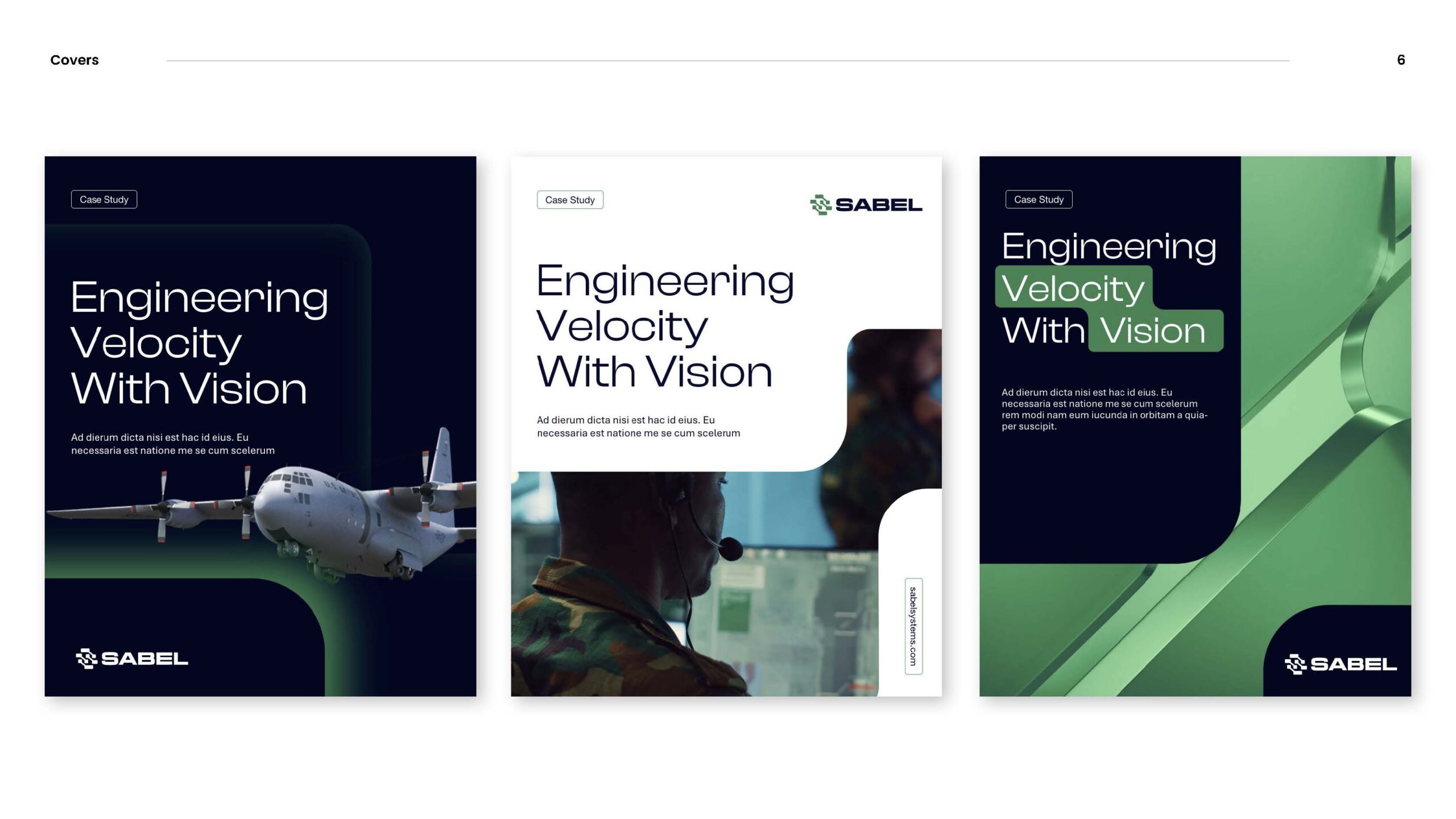
Check out our work with Sabel Systems
How DC firms bridge technology and strategy
Bridging technology and strategy starts with the operating model. Washington DC marketing firms connect executive positioning with the pipelines, dashboards, and creative systems that turn strategy into outcomes. The work spans insight, architecture, activation, and optimization.
From data strategy to activation
Strong programs start with an evidence base. Audience segmentation leverages intent data, CRM signals, and program performance to isolate segments that match growth priorities. Washington DC marketing firms then map those segments to message frameworks, content architectures, and channel mixes. Activation plans coordinate paid, owned, earned, and field motions so each touch speeds consensus across technical and business buyers.
Integrating martech with sales orchestration
Campaigns perform when tech stacks are aligned. Washington DC marketing firms support their clients by standardizing taxonomies, defining UTM governance, and integrating marketing automation with CRM. That creates reliable attribution and shortens time to insight. The best partners can pivot budgets within a quarter based on real performance, feeding wins back into content and creative for compounding returns.
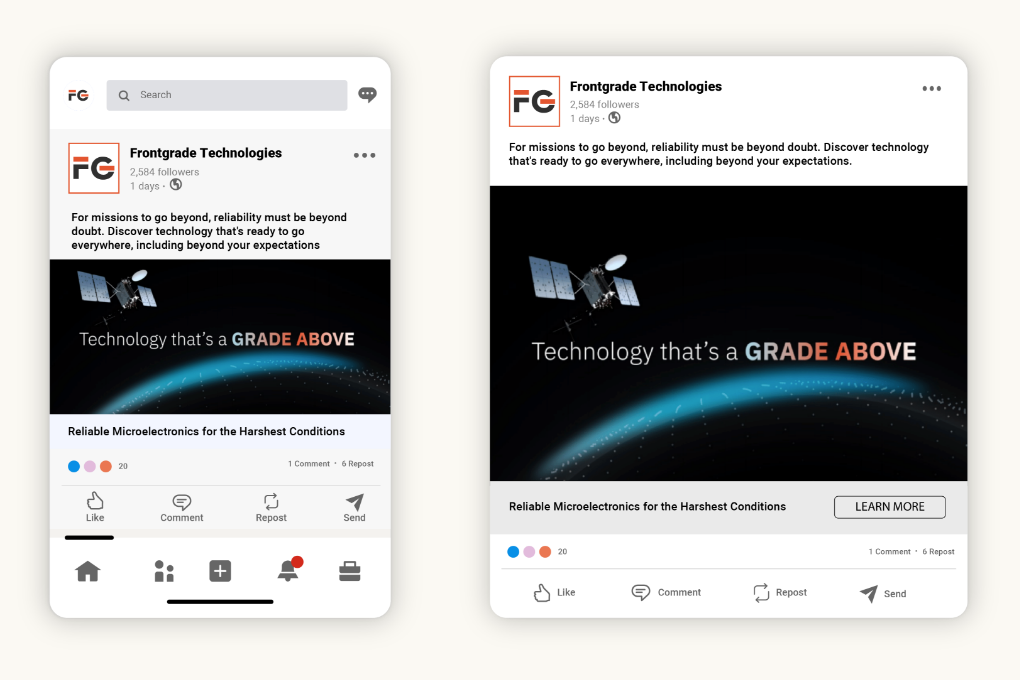
Check out our work with Frontgrade
Positioning that accelerates complex deals
In categories like cybersecurity, data platforms, logistics, healthcare, and national security, differentiation is not about louder claims. It is about clarity, use cases, and proof. Washington DC marketing firms develop messaging that speaks to mission outcomes and business impact, then show the math with case stories, demos, and third-party validation. Executives see the connection between the brand promise and pipeline progression in high-value accounts.
Thought leadership that earns trust
Senior audiences do not want product brochures dressed up as insights. Washington DC marketing firms build editorial programs that tackle policy shifts, technical tradeoffs, and operational realities. The approach often includes research-backed reports, C-level roundtables, and targeted media programs that position leaders as stewards of change. Over time, this thought leadership becomes a flywheel for account-based marketing and partner enablement.
Account-based marketing for enterprise and public sector
ABM succeeds when strategy, content, and operations move in unison. Washington DC marketing firms help their clients orchestrate tiered programs from one-to-one to one-to-few motions. Each account’s strategy aligns to the opportunity landscape, decision criteria, and competitive dynamics. Content is personalized at the problem level, not just the logo level, so every touch adds substance and momentum.
Field, events, and briefing centers
In-person engagement still drives trust in high-stakes markets. Washington DC marketing firms design executive briefings, roadshows, and tradeshow strategies that amplify thought leadership and turn meetings into next steps. Tight coordination with SDR and capture teams ensures fast, relevant follow-up. The output is pipeline, not just presence.

Search visibility as a revenue lever
Organic visibility is the first conversion for many decision makers. Washington DC marketing firms treat SEO and AEO as a strategic capability, not a checklist. Work includes intent-aligned keyword portfolios, technical audits, and content hubs that answer executive questions and practitioner needs. Measurement ties rankings and traffic to meaningful conversions and late-stage influence, not vanity metrics. For organizations investing in this capability, rigorous search engine optimization discipline becomes a compounding growth asset.
Digital experiences built for conversion
Websites must serve analysts, procurement officers, engineers, and C-level buyers at once. Washington DC-based marketing firms define information architectures that guide each visitor type to proof, demos, and next steps quickly. Design and copy collaborate to reduce friction across journeys. On the backend, experimentation frameworks validate changes with real data. A conversion-optimized foundation for website design and development often unlocks efficiencies across the entire funnel.
Measurement that earns board confidence
Executives need to see the line from investment to impact. Washington DC marketing firms implement measurement frameworks that segment outcomes by market, product line, and account tier. Multi-touch attribution is balanced with cohort analysis for long cycles. Dashboards roll up to a simple narrative: what worked, what did not, and what to do next. The precision helps marketing defend budgets and inform product, pricing, and route-to-market decisions.
Attribution in long buying cycles
Attribution is never perfect, but it can be fit for purpose. Washington DC marketing firms use hybrid models that weight executive content, events, and partner influence alongside digital conversions. The key is governance and consistency, so trend lines guide real budget shifts rather than opinion. Over time, the organization builds institutional memory that de-risks decisions.
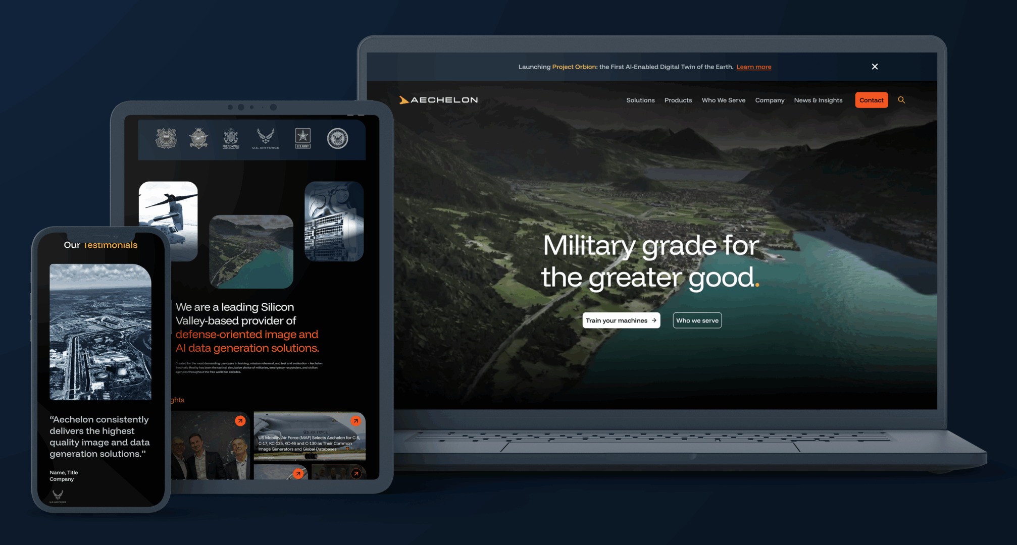
Check out our work with Aechelon
How to evaluate Washington DC marketing firms
Choosing a partner is a high-stakes decision. Use this checklist to separate rhetoric from readiness.
- Category fluency: Ask for examples in your exact segment and buyer type. The best Washington DC marketing firms bring nuanced understanding of procurement, compliance, and competitive dynamics.
- Strategy-to-ops linkage: Look for teams that connect positioning to channel plans, content architectures, and sales orchestration. Ask how they will operationalize your story within your stack.
- Measurement plan: Require a clear methodology for targets, attribution, and reporting cadences. Washington DC marketing firms should define KPIs that the board respects.
- Security and compliance: Validate processes for accessibility, privacy, and data governance. Public sector and regulated buyers will ask. Your partner must answer.
- Change management: Assess how the firm leads workshops, aligns stakeholders, and trains your team. Great ideas die without adoption.
Common pitfalls to avoid
Even strong programs stall when basic risks are ignored. Washington DC marketing firms help clients avoid these traps, but internal alignment is still required.
- Strategy without enablement: Messaging guides nothing if sales and partners cannot use it. Build toolkits and train relentlessly.
- Content that misses the buyer: Executive priorities differ from practitioner needs. Segment topics, depth, and tone to match each audience.
- Fragmented data: Inconsistent taxonomies and loose tracking cripple insights. Establish governance on day one.
- Underpowered creative: Regulated markets do not require boring work. Washington DC marketing firms use bold but credible creative to break through safely.
- Short-term bias: Complex markets reward compounding investments. Balance demand sprints with brand and SEO programs that pay for years.
Emerging trends DC leaders are operationalizing
Marketing sits at the center of transformational themes. Washington DC marketing firms convert these trends into practical playbooks.
- AI augmentation: From audience modeling to creative iteration, AI speeds cycles and expands testing. Governance and human oversight keep outputs on brand and on brief.
- Privacy-centric growth: Signal loss requires new data strategies. First-party data capture and contextual programs replace over-reliance on third-party cookies.
- Accessibility as advantage: Inclusive design is both compliance and conversion. It increases reach while protecting the brand.
- Partner ecosystems: Alliances and integrators influence big deals. Programs must co-market and co-sell with clarity on joint value and pipeline impact.
The DC advantage for integrated campaigns
Integrated programs demand program management and creative agility. Washington DC marketing firms build strategies that mirror your operating model and run sprints with clear owners. They anticipate legal review cycles, compliance checks, and leadership visibility. Most important, they protect momentum by staging workstreams so creative, media, web, and sales enablement move in lockstep rather than wait on one another.
From brand to pipeline in one roadmap
Executives want both long-term brand value and near-term revenue. Washington DC marketing firms like Bluetext create roadmaps that start with positioning, then immediately translate the story into ABM plays, web upgrades, and media flights. This flow eliminates internal lags and produces early wins that fund further transformation.
Why partner with Bluetext
Bluetext has helped growth-stage innovators, enterprise leaders, and mission-driven organizations turn complex narratives into momentum. As a full-service B2B marketing agency that lives at the intersection of brand, demand, and digital, our teams bring the rigor of Washington DC marketing firms to every engagement. We pair research-driven messaging with creative that earns attention and operations that scale. Our specialists in B2G marketing understand the nuances of the public sector, while our digital teams deliver the platforms and workflows that convert.
Clients choose us for launch programs that reposition categories, ABM that moves enterprise deals, and digital ecosystems that align product, sales, and partner motions. Whether you need to modernize your web presence, unlock demand through media and content, or operationalize analytics across regions, we bring a playbook proven in the most demanding markets. If you want the strategic discipline and executional horsepower of Washington DC marketing firms in one partner, we are ready to help. Contact us to align your brand, campaigns, and digital experience around growth. Reach out to Bluetext to discuss strategy, branding, or campaign support that bridges technology and strategy and turns your goals into measurable results.
Government contractors face a unique digital challenge: create an experience that checks every compliance box while still connecting with users. It’s a balancing act that requires more than just meeting federal standards—it demands thoughtful, human-centered design that engages stakeholders, builds trust, and supports mission delivery.
At Bluetext, we’ve worked with leading B2G organizations to tackle this challenge head-on. Here’s what it takes to align your UX with both federal requirements and user expectations.
The UX Landscape for Government Contractors
Unlike private sector sites that prioritize conversion funnels or sleek brand storytelling, digital platforms for government contractors must often serve multiple masters. They need to be:
- Compliant with strict accessibility and data security standards
- Clear and intuitive for a wide range of users, from contracting officers to program managers
- Aligned with the mission and values of the agencies they serve
Too often, this results in dense, overly technical websites that users find difficult to navigate. But poor UX doesn’t just frustrate visitors—it can undermine credibility, reduce engagement, and even impact contract wins. Great UX isn’t a luxury in the B2G space—it’s a differentiator.
Accessibility and Compliance: The Non-Negotiables
Section 508 compliance is the baseline for any government-facing digital experience. Alongside WCAG 2.1 guidelines, these standards ensure that websites are usable by people with disabilities, including those using screen readers, keyboard navigation, or alternative input devices.
But compliance doesn’t have to be a creativity killer. In fact, designing with accessibility in mind often leads to cleaner layouts, better content structure, and more usable interfaces for everyone.
Tools like Axe, WAVE, and Lighthouse can help identify issues early in the design process. Even more important is building accessibility into your workflow from day one—writing semantic HTML, designing for contrast and readability, and testing with real users when possible.
Compliance isn’t a one-time box to check. It’s an ongoing commitment that—when done right—enhances the overall experience.
Engagement Without Compromise
Just because your site has to follow the rules doesn’t mean it has to be boring. In fact, engaging design is often about doing more with less.
Here are a few UX principles that shine in the government space:
- Clarity over cleverness: Use plain language, intuitive labels, and clear visual hierarchy.
- Consistency builds trust: Standardize layouts, navigation, and interaction patterns to reduce friction.
- Guide the user journey: Employ subtle animations, progress indicators, and calls to action to keep users oriented and informed.
Small touches—like clean iconography, digestible content blocks, or a smart search function—can go a long way in making your digital experience more intuitive and user-friendly.
Building UX into the Proposal Process
UX shouldn’t be an afterthought—or an add-on once the development process is underway. Forward-thinking government contractors are baking user experience into their RFP responses, showing prospective clients how they’ll create usable, accessible solutions from the start.
This approach demonstrates not only technical know-how, but a genuine understanding of the agency’s end users and mission. By collaborating across design, development, content, and compliance teams early, contractors can avoid costly rework and deliver smarter, faster solutions.
Future Trends in Gov UX
The bar is rising for digital experiences—even in the public sector. Government buyers and stakeholders increasingly expect:
- Mobile-first functionality that works seamlessly across devices
- AI-enhanced interfaces for smarter content delivery and navigation
- Modular, design system-driven platforms that allow for scalable updates and consistency
- Human-centered cybersecurity, where secure doesn’t mean confusing
As these expectations evolve, the ability to deliver UX that’s both compliant and compelling will become a critical differentiator.
Partnering with Experts for Results
Designing UX for the government audience requires more than a basic understanding of Section 508. It requires an agency partner that understands the nuances of federal requirements, the strategic goals of B2G marketing, and the creative potential of great design.
At Bluetext, we specialize in creating digital experiences that meet the highest standards for accessibility and engagement—whether you’re responding to an RFP, redesigning a contractor portal, or launching a campaign microsite.
Is your digital presence working as hard as your proposal team? Contact Bluetext to build a UX that’s as smart, secure, and strategic as your business.
Accessible web design isn’t just a regulatory box to check—it’s a commitment to inclusivity that benefits all users. As digital experiences become central to daily life, designing for accessibility ensures your website serves the widest possible audience. Moreover, inclusive design fosters brand loyalty, enhances user satisfaction, and aligns with ethical principles. But what does it take to make a website truly accessible?
The Case for Inclusive Design
- Legal Compliance: Laws like the Americans with Disabilities Act (ADA) mandate accessible digital content. Non-compliance can result in lawsuits, fines, and reputational damage.
- Broader Reach: Over 15% of the world’s population lives with a disability. Accessible design ensures your brand includes everyone. Features like captions for videos or transcripts for audio content can significantly expand your audience.
- Enhanced UX for All: Features like alt text, proper contrast ratios, and keyboard navigation improve usability for all visitors, not just those with disabilities. Accessibility innovations often lead to cleaner, more intuitive interfaces that benefit everyone.
Best Practices for Accessible Design
- Use ARIA Labels: Provide screen readers with clear navigation cues. Proper labeling ensures assistive technologies can accurately interpret your site’s content.
- Test for Accessibility: Utilize tools like WCAG checkers to identify and fix barriers. Regular audits can help you stay compliant and user-friendly.
- Design with Flexibility: Ensure layouts adapt seamlessly to different devices and assistive technologies. Responsive design is crucial in today’s multi-device world.
Incorporating Accessibility into Your Workflow
Accessibility should be a priority from the start of any design or development project. Collaboration between designers, developers, and content creators is essential. Training teams on accessibility standards and testing tools ensures your website remains inclusive as it evolves.
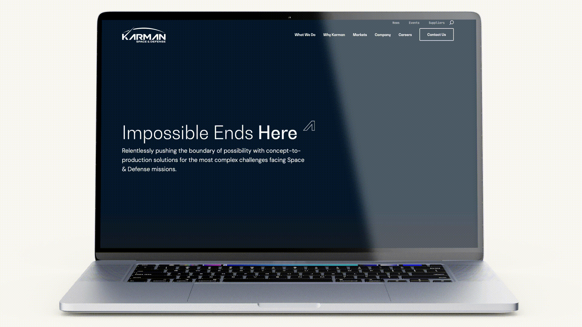
Accessibility as a Competitive Advantage
Brands that prioritize inclusivity demonstrate their commitment to diversity and equity. This not only enhances reputation but fosters deeper audience loyalty. Inclusive design signals that your brand values all users, creating emotional connections that drive engagement and retention.
Building a Better Web
Inclusive web design is essential for 2025 and beyond. By prioritizing accessibility, brands can create digital experiences that are not only compliant but meaningful for all users. Designing for inclusivity isn’t just about following rules—it’s about creating a better, more equitable digital world for everyone. Contact Bluetext to discover how we can help you design accessible, user-centric websites that stand out in 2025 and beyond.
Could the dark mode interface eclipse their light mode counterparts? Dark mode has seen a continued rise in popularity over the past few years following the 2019 release of Apple’s dark mode option alongside the iOS 13 update. Sometimes referred to as “Night Mode”, “Shadow Mode” or “Dark View”, this dark mode is a design term used to describe a low-light user interface that uses a dark color as the primary background color, reversing the default light-on-dark design that designers have used for decades.
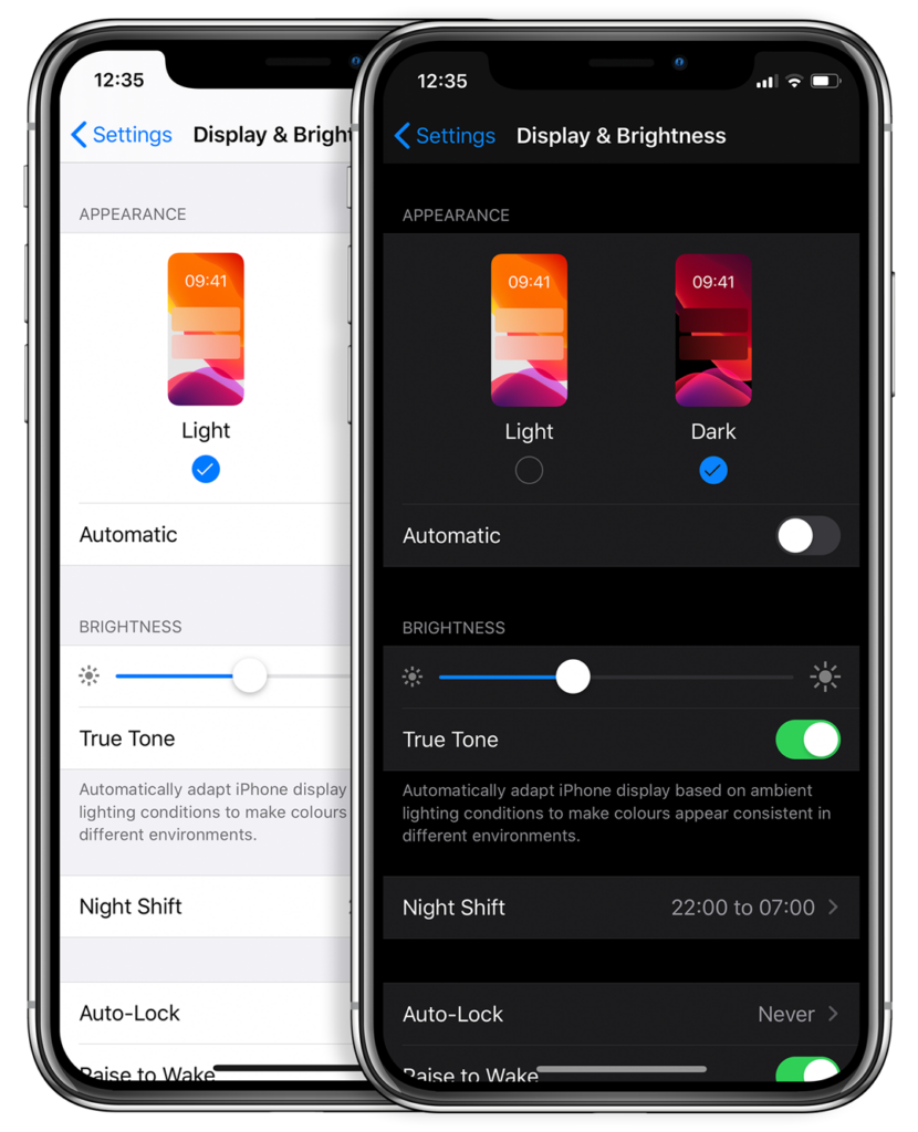
In response to increased user screen time across devices, this darker UI design trend has garnered immense popularity. Big-name brands like Facebook, Google, WhatsApp, Instagram, and Apple were all early movers in adopting dark mode interfaces and have influenced many others to follow in their footsteps. That being said, operating systems, browsers, and apps are not the only places dark mode is continuing to grow in its popularity — more and more website developers and designers are hopping on the dark mode train, opting for UX/UI designs that are dark as night with reasons why that are clear as day.
A “Site” for Sore Eyes, in More Ways Than One
It’s no secret that the aesthetics of a dark mode design can elicit powerful feelings and emotions from visitors. A dark color theme often conveys sophistication, edge, and modern elegance to users. Black is an especially dominant color, often used to create maximum color contrast when paired with whites or vibrant tones. Dark hues are often associated with style and power, which can add striking visual appeal and depth when used strategically as a website’s background. Dark mode is especially useful for image and video-heavy sites. The dark contrasts bright colors, making them look more compelling and instantly captures the audience’s attention. The more visually appealing users find your site, the more likely they are to engage with your content and remain on-page.
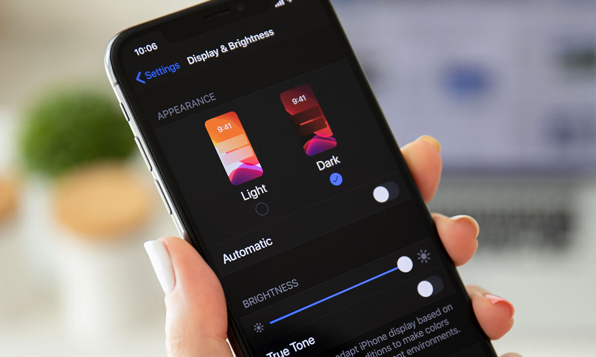
More than a Pretty (Inter)face
Aside from just looking easy on the eyes, dark mode can actually be easier on the eyes. Some studies show that dark mode can help reduce the sensation of discomfort that is sometimes felt by staring at websites with light backgrounds. It is especially preferable in low-light conditions where looking at bright white screens for long periods of time on any device can result in eye strain and fatigue. Reducing the pain associated with light-on-dark interfaces by switching to a dark-on-light display can help encourage users to stay on your site for longer.
If you’re a Spotify user, your eyes (and ears) have been benefiting from dark mode features for years.
Dark Mode Can Save Brain and Battery Power
UX research shows that dark backgrounds enhance page contrast, making visuals pop and easier for the users to focus on. If your site is imagery-heavy or puts an emphasis on visual or graphic content, dark mode will allow users to be more engaged and get through your site quicker and easier, retaining more content faster and leaving with a stronger impression of what you have to offer.
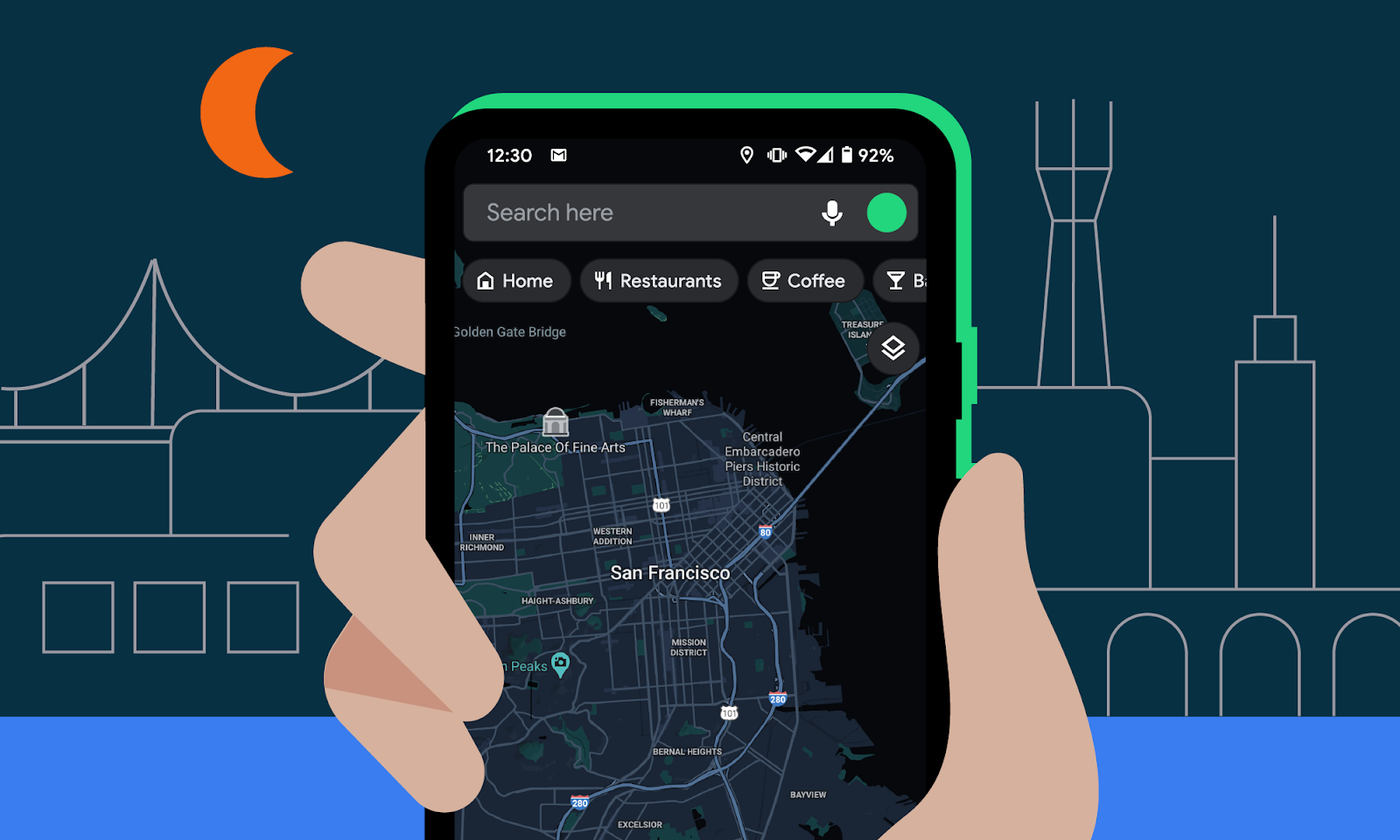
Dark mode can also save device battery life. Studies show a dark theme can reduce battery usage significantly, especially for users viewing your site on a mobile device. White pixels are more power-hungry than dark pixels, which allow devices to use less energy. In an era when users are glued to their screens, anything that can save device battery power is a win — and your website could be one of those things.
So Now You’re Interested in Dark Mode, but Don’t Know Where to Start?
Good thing Bluetext has got you covered. As a leading digital marketing agency in DC that specializes in website design and making powerful sites for clients all over the world, we’d like to offer up a few pieces of advice to consider when thinking about creating or adding dark mode to your site:
- Determine if dark mode is really right for your website content–and where. Dark mode is great for enhancing emotional branding, showcasing photos and graphics, and emphasizing visual content, but not so great for displaying big chunks of text. Light text on dark backgrounds can cause readability issues in practice, so portions of your website that are or will be pretty text-heavy, dark mode may not be the best choice to display your content. Consider reserving dark mode for a homepage, or flashy campaign landing page, but maybe not your product details.
- Make sure your brand colors can actually work well with a light-on-dark design (see tip #3). If not, but you’re still set on pursuing dark mode, consider going through a rebrand before implementing dark mode.
- Verify your light-on-dark color scheme meets accessibility color contrast standards.
- Dark backgrounds de-accentuate empty space, so limit the number of elements (lots of icons, buttons, and small images) used together within viewports to avoid looking cluttered.
- Make sure your design will work in both low-light and high-light environments.
- Use illumination over shadows to communicate depth.
- Avoid highly saturated colors.
- Leave room for a regular/light option and give users the ability to toggle back and forth as they desire.
- Work with an agency like Bluetext to ensure your dark mode website is sleek, powerful, on-brand, and communicates a strong and engaging message to your audience.
Learn more about dark mode and how Bluetext can help you take your website to the next level. Contact us today.
We’ve all heard about website accessibility, but what does it really mean, why does it matter, and how can we design and build accessible websites?
What is Web Accessibility?
Web Accessibility is the inclusive practice of making websites usable for all visitors, including those with disabilities such as blindness, low vision, learning and/or cognitive disabilities, deafness or hearing loss, speech disabilities, and physical disabilities. It’s important to be passionate about website accessibility because it allows equitable access and interaction to your site’s content and functionality.
To be as inclusive as possible (and avoid legal issues), ensure your website doesn’t prevent anyone from retrieving, navigating, or understanding the information and functionality your website shares. Luckily, there are established guidelines by WCAG (Web Content Accessibility Guidelines) to follow that can help your site’s accessibility.
Understanding WCAG Standards & Guidelines
The most recent WCAG 2.1 standards are based on four main guiding principles known by the acronym POUR: Perceivable, Operable, Understandable, and Robust. Each of these principles has web accessibility guidelines you should reference and apply on your site.
- Perceivable: Information and user interface components must be presentable to users in ways they can perceive. Perceive doesn’t mean just visually; uers who are blind often use screen readers which convert text into speech or braille. The most important and common applications of these guidelines include:
- Add text alternatives (aka alt text) on non-text items like images, videos, and audio content.
- Ensure high color contrast. There are free color contrast tools like Stark that check your contrast in Adobe XD before you get into the development phase.
- Structure content intuitively. Implement proper heading structure and ordered/unordered list elements in the html files.
- Provide transcripts for audio recordings and ensure video captions are in sync with the audio.
- Operable: User interface components and navigation must be operable.
- Make it keyboard friendly! Some users don’t use a mouse or touchpad, so all functionality of the content should be operable through just the keyboard. A great way to test this is by tabbing through your site. By tabbing through, you should have all items of the menu/navigation accounted for with focus states.
- Ensure there’s enough time for users to properly engage. If anything has a time limit, users should be able to extend or cancel it.
- Ensure it’s easily navigable with clear headings, labels, and page titles that relate to the on-page content. The page content should have focus states and navigate in an order that makes sense. The text for links should also make sense based on the context of the content. Breadcrumbs are also key in helping a user identify where they are within the site.
- Understandable: Information and the operation of the user interface must be understandable.
- Language should be obvious and programmatically determined.
- Implement secondary education reading level. In other words, make it easy to read. Avoid big, complicated words that some people might not know or some mechanisms might not be able to define/pronunciate/translate.
- Consistency is key. Implementing a consistent navigation structure and components with consistent functionality provides a consistent and expected user experience.
- Use error identifications. Ensure that if an input error is detected, that the item with an error is easily identified and described to the user in text. Labels should also be used when content requires user input.
- Robust: Content must be robust enough that it can be interpreted by a wide variety of user agents, including assistive technologies.
- The HTML should be clean enough to be parsed so assistive technologies can render its contents into a different format. Elements should have complete start and end tages, should not contain duplicate attributes, and should be appropriately nested.
WCAG is considered the go-to guide for building accessible websites for ADA (American Disabilities Act) or Section 508 compliance, but there are multiple levels of compliance to consider.
Accessibility Compliance Levels
There are three levels of compliance (level A, Level AA, and Level AAA). Level AA is the level that most developers aim to meet regardless of their industry. It is also the level that is legally required for certain sites when tasked with making a website accessible. For example, Section 508 of the Rehabilitation Act requires federal agencies to ensure that their information and communication technology (ICT) is accessible to people with disabilities. So government sites need to be at least Level AA compliant, ideally Level AAA, to avoid legal troubles.
When redesigning a website, it’s important to understand the level of compliance the site should have because it will impact the design and functionality. But remember, when in doubt, follow the guidelines for Level AA compliance.
At the end of the day, accessibility is subjective because no one cannot account for every design and development possibility. However, following the guidelines outlined by WCAG 2.1 gives your design and development team the best chance at creating an accessible website.
Web Accessibility Tools
There are many tools (many offering free scans and trials) available to check your accessibility and level of compliance. Some of our favorites include:
- WAVE – Web accessibility browser extension on Chrome, Firefox, or Edge.
- Siteimprove – Industry standard web accessibility checker, especially for OCR (Office of Civil Rights) compliance.
- AccessiBe – AI-powered web accessibility software with source code identification.
- Google Lighthouse – Automated web accessibility tool that runs with javascript.
Hopefully now you have accessed all the necessary tools to design and build an accessible and compliant website. If you want to learn more about accessibility or are looking to partner with a top-tier agency in creating a beautiful, best-practice, memorable, easy-to-use, and accessible website, contact Bluetext to get started.
Over 5 million searches happen on Google every minute. With so much valuable potential site traffic to capture, Search Engine Optimization (SEO) is one of the best ways to organically grow your brand exposure. Even if your site content is desirable and relevant, if content editors don’t consider key SEO tactics, your site could go unnoticed. Want to avoid being overlooked by Google’s search engine? Consider these 8 key elements of SEO structure to ensure that your content can be easily found by users in search of your solutions and expertise.
Customizing Title Tags
Title tags are brief, informative lines of copy that describe the page content of the URL shown in search engine results, social media posts, and browser tabs. Titles should include unique information about the page, targeted to one specific keyword (more than one keyword can make the title confusing for end users and can negatively impact search rankings).
How long should the page title be?
The title tag should be between 50-60 characters to avoid getting cut off when displaying in search results. If you’re struggling to fit your titles within this character count limit, try to avoid using uppercase letters (which take up extra space), consider removing your brand name from the title, or use symbols wherever possible to save space (i.e., “&” instead of “and”).
Have more questions about SEO Optimization? See our blog here – SEO Breakdown: How Exactly Does It Work?
Adding Keywords to Secondary Headings
While the highest heading on the page (H1) is most important to SEO crawlers, the secondary page headings can greatly improve SEO rankings if they are also optimized to include targeted keywords. H2s and H3s often get overlooked in optimizing SEO for pages, so they provide a great opportunity for your site to stand out to crawlers.
How many keywords can you optimize for on a single page?
When pages focus on a single topic instead of many, they’re more likely to get higher rankings for that topic. With this in mind, a page should have two or three primary keywords that are variations of the main topic for that page. Four or more keywords will be too many to succinctly fit into the title and headings on the page.
Crafting Rich Content
SEO-optimized content should be oriented toward answering the questions that users are posing to search engines. This content should include terms that are meaningfully related to the main topic of the page, and the copy should have an easy level of readability for accessibility and improved user experience.
What reading level should I write my site content for?
To ensure readability, if you write content in Microsoft Word, you can use the spelling and grammar check tool to access Flesch tests. Your site content should ideally score a 7.0-8.0 on the Flesch-Kincaid Grade Level scale, or between a 60-70 on the Flesch Reading Ease scale.
Specifying Internal Links with Anchor Text
When linking to other content on your site, ensure that the link text for CTAs is clear and incorporates target keywords or semantic terms, not just generic phrases like “Click Here” or “Learn More.” It is best practice to use verbs to indicate exactly what the user should expect to do when clicking the link.
Is it possible to have too many links leading to other pages on the site?
Having too many links could potentially make your page seem like spam, which can negatively affect rankings. From a user perspective, the journey and desired action on the page should be clear and not overwhelmed with choices. From an SEO perspective, links from authoritative sites (such as government sites, education sites, news sites, etc.) can help SEO rankings, but links from spammy sites can hurt rankings.
Validating E-A-T Standards
E-A-T, which stands for Expertise, Authoritativeness, and Trustworthiness, is part of Google’s Search Quality Evaluator Guidelines. Some ways to signal that your site has these qualities (to improve your SEO rankings) include showing more about the authors of your content, citing your materials by linking out to high-quality sources, and updating your content regularly.
How often should I be updating my site content?
At least once a month, content editors should review past content to look for opportunities to improve SEO or remove outdated information. Monthly check-ins should suffice to ensure that previous content still aligns with current business goals and SEO targets. For new content, it’s best to aim to add blogs or thought leadership pieces on a weekly basis to show that your business stays relevant in your industry.
Describing Imagery with Alt Image Text
Meaningful imagery can often provide some of the most important information on web pages. Whether the page features infographics, graphs, or impactful visuals, this information isn’t accessible to SEO or visually impaired users unless content editors are diligent about adding alt text to imagery.
Are there character limits to the length of alt text?
While there are not hard character limits to alt text, it is generally recommended not to exceed 100 characters. If the meaning of the image cannot be conveyed within that limit, then the description should be spelled out in on-page content or image captions for the best user experience.
Answering “People Also Ask” Questions and FAQs
Great content will need to anticipate the next questions that a user might ask after their initial query. For the keywords that you’re targeting, be sure to take a look at the SERPs to get an understanding of what related questions people are asking. To address these FAQs, you can add the question itself directly as a heading in your page content and answer the question clearly with a dedicated paragraph or bulleted list below the heading.
Can I use other types of content to answer the FAQs or PAA questions?
Most often, PAA results are text-based, like you would see in a standard WYSIWYG component. However, they can also include tables, graphics, or videos if that content could prove useful to the Google searcher. As long as your content is clearly and concisely answering the question posed, it’s worth including on the page.
Implementing Valid Schema Markups
Schema Markups are code snippets placed on a web page that allow Google search engines to serve items like rich cards, rich snippets, and the knowledge panel on SERPs. While there’s no proven correlation to SEO ranking improvement, including schema markup elements will allow searchers to find relevant information from your site more quickly and in a more stylized format, compared to the basic title tag and meta description displayed in listings.
Are most of my competitors using Schema Markups?
About a third of Google’s search results use rich snippets, while less than a third of websites use schema markup. This means that there’s ample opportunity to get your site’s content to display in the user-centric stylized formatting on SERPs to earn more site traffic.
SEO strategy can take time to strategically plan and develop relevant content, but a digital agency like Bluetext that specializes in SEO can provide the guidance you need to improve your page rankings. Contact us to learn more about how we can take your SEO practices to the next level.