In a world where businesses are constantly challenged by a sea of sameness, bold messaging and design are crucial pieces of a marketing strategy that can propel you to the forefront of your industry. Flashy websites and digital user experiences are often the first points of contact with target audiences and are rightfully prioritized to engage users and grow brand awareness.
However, when it comes to building a sustainable and scalable brand identity the buck doesn’t stop at those brand entry points – it’s just the beginning. The all-encompassing “content” is not just a hot industry term – it’s the substance that supports every claim you make and validates your brand identity, and the way that content is presented is just as important as that first brand impression.
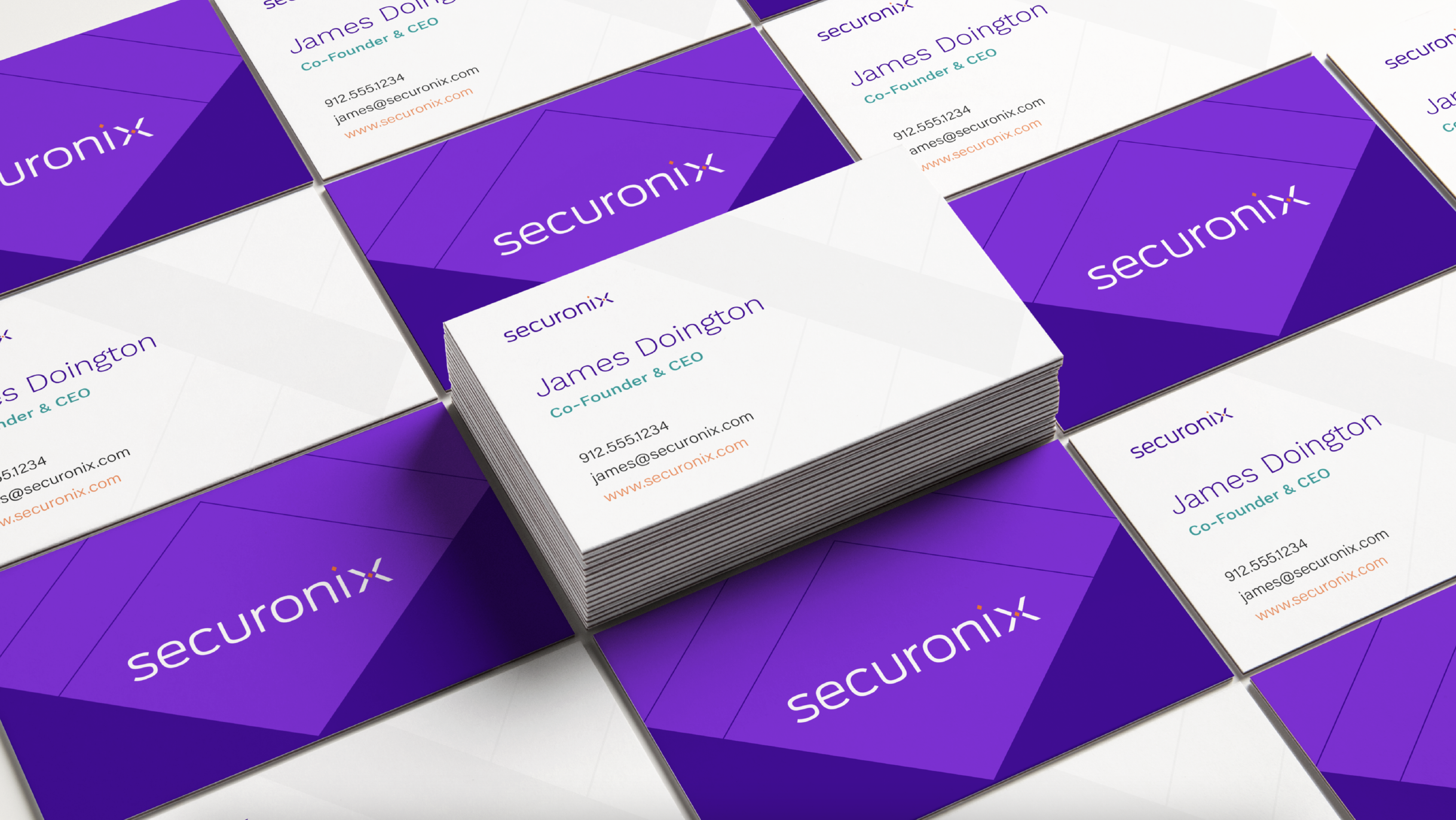
When it comes to presentation materials, collateral, stationery, and even internal communications, adhering to a thoughtful visual identity will go a long way in preserving and growing the value of your brand. Even non-marketing materials contribute to this. Content is essentially the foundation of your business, the legs of research and product information that your website or sales pitches stand on. Just as you wouldn’t want your home built with a hodgepodge of materials that don’t match in style and quality, you wouldn’t want your business coming across as disjointed and in-cohesive. Arm your employees with thoughtfully designed, professional-grade marketing and sales materials that continue your brand down the funnel.
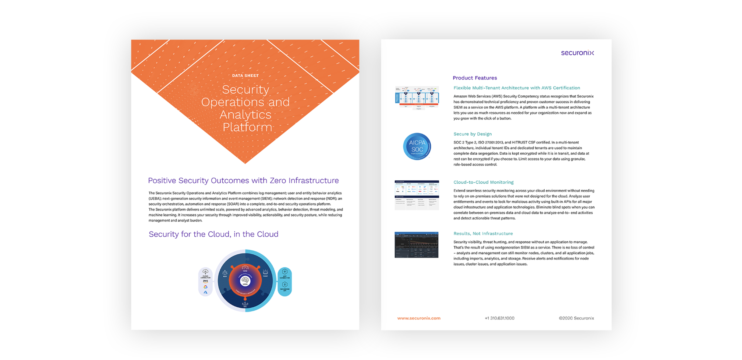
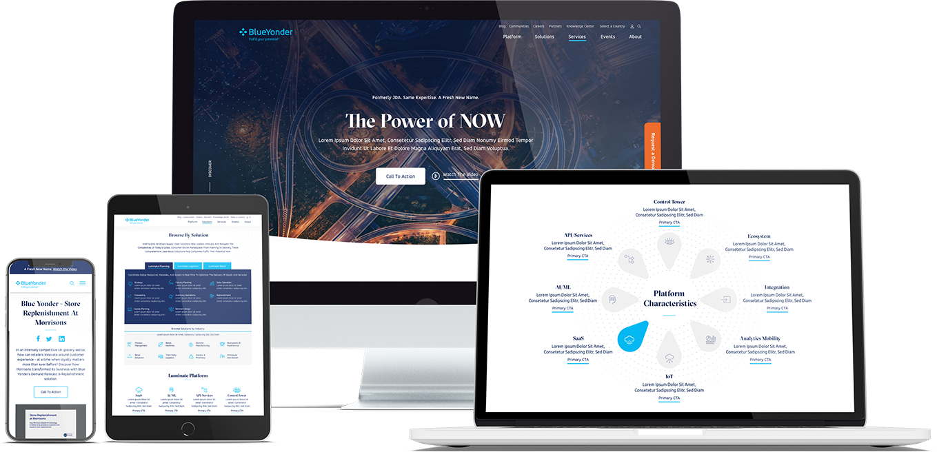
In a crowded market, thought leadership content is table stakes as a marketing and lead nurturing tactic. The way that thought leadership is presented, however, is an opportunity for your brand to stand out. Bluetext was tasked with the programming and design of the Securonix brand identity which included all collateral materials for future PowerPoints, data sheets, product sheets, case studies, white papers, and stationery.
Developing a system of materials connected by a strong brand identity allows that brand story to be carried through to even this lesser-highlighted audience touchpoint. The Securonix website and user experience make an exceptional first impression, but ideally, a user would travel past the homepage into a resource or gated download. If that lower-funnel touchpoint doesn’t resemble the sophistication of a user’s first impression they will naturally become confused or skeptical. If the saying ‘put your best foot forward’ resonates, be sure to keep up the impression at every next step.
That thoughtfulness of the brand messaging and the way it influences their visual identity is carried all the way through to the layout of a data sheet. This elevates content from being just words on a page to being a valuable piece of the greater brand.
In this digital-first landscape, the expectations of B2C and B2B organizations have never been so in sync. B2B audiences and stakeholders don’t just expect high-quality and accurate information, they also expect to be wowed by its presentation. Packaging impressive statistics or insightful thoughts on industry trends in a way that is consistent with your visual brand while also considering the optimal layout that makes that information most impactful is crucial in differentiating that content as well as maintaining your brand identity.
Content is one of your organization’s most valuable marketing and lead-nurturing tools – ensuring that it can stand out in the crowded market is critical in taking your business to the next level. Contact Bluetext if you’re interested in revamping your B2B content marketing strategy.
When strategizing and creating the UX of a B2B website, making informed and data-driven decisions can make or break the impact of your site. Getting the user to your site is the first step, but once they have arrived, your content and user experience are the only things standing between a standalone visit and a conversion.
Conversion Rate Optimization (CRO) is the process of strategically enhancing your website to grow conversions. Depending on your business, this could mean a variety of different things. A conversion is defined as the completion of the desired goal, and we all know goals are never one size fits all. A goal could be a form completion, direct product purchase, a resource download, or event registration. For most B2B businesses, lead generation is the top goal. This means any action on your website in which a user demonstrates interest and provides their information is a conversion. The importance of content and UX in terms of CRO cannot be overstated, and tools like A/B and multivariate testing can be leveraged to ensure all website elements are optimized for lead generation.
Types of Testing
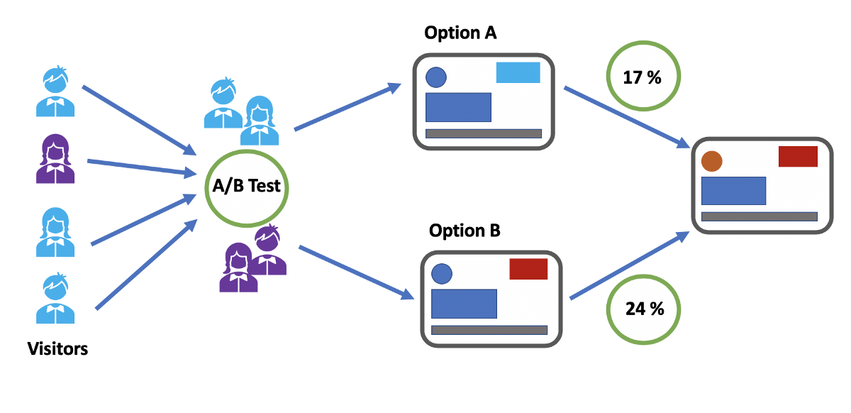
A/B testing allows you to test the impact of one specific variable (for example, CTA button placement, CTA copy, page heading copy) to determine the most effective version of the page content and user experience. It analyzes user action on the variable page (version B) against the control page (version A) and ideally results in statistically significant insights.
Multivariate testing, on the other hand, tests multiple pages and content variables against the control page. While A/B testing gives insight into the effect of variables on an individual basis, multivariate testing reveals the collective impact of those variables and how they work together in one page design against another.
Multi-page funnel testing is similar to the aforementioned test types, however rather than testing variables on multiple versions of just one page, multi-page testing evaluates the impact of variables across the full user journey. This is helpful information, specifically when it comes to lead generation. Finding the ideal user experience and user journey across multiple pages and having the ability to analyze user actions from top of funnel activity to conversion allows you to make the most informed and well-strategized decisions when it comes to page content. If increased conversion rates are your goal, you want to be able to set yourself up for success with a data-supported UX.
How to Conduct A/B and Multivariate Testing
It is highly recommended that you use a CRO tool (Google Optimize, for example) to conduct user testing to avoid any SEO issues that may be caused by just creating multiple pages with specified variables in your CMS and evaluating the results in Google Analytics. Using the right tool will not only help to ensure you don’t negatively impact SEO but will also allow you to differentiate results and insights that are statistically significant from those that occur by chance.
Our Tips for Split Test Execution:
- Determine the specific question you want the test to answer and form a hypothesis – An example of that question may be: Why are users not clicking the CTA on our product page? Your subsequent hypothesis will inform the type of testing you should conduct as well as the variables you should examine.
- Form a hypothesis – If your hypothesis to that question is “Users are not clicking the CTA because it does not visually stand out on the page.” The variable you could then analyze via an A/B test is making that CTA button a bolder, more eye-catching color on-page version B.
- Make sure you are using the right tools – accuracy and reliability are crucial when venturing into user testing. Setting up your test to yield clear and statistically significant results is the first and most important step in testing and CRO. Without establishing that foundation, you can end up with data that doesn’t tell you anything about user patterns but rather just a collection of events that occur by chance.
Consulting a B2B marketing analytics and intelligence company like Bluetext to guide you through strategizing and testing the many variables that come with creating a website. Reach out to learn how Bluetext can support your organization.
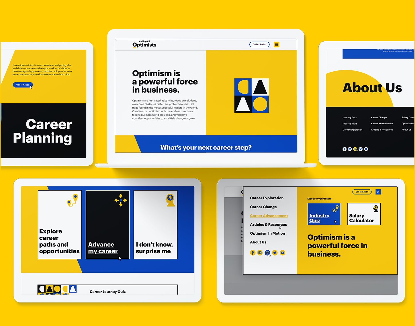
We’ve all heard the old adage “the medium is the message” – and that could not be more true in today’s vast media landscape where the majority of users are browsing websites on mobile devices. Knowing that users are visiting your website and often encountering your brand for the first time on a mobile platform, it is essential to thoughtfully design a mobile user experience that takes into consideration both the benefits and limitations of mobile devices as well as known user behaviors.
Mobile web design should not just be a narrowed version of the desktop experience, it should be a responsive design in and of itself that gives way to an intuitive user experience and easy navigation to the information the user is looking for. There are so many variables that can cause a user to leave a website. A slow-loading page or poor content layout can be enough to drive users away – don’t let a lack of forethought when it comes to the mobile user experience be a barrier between your audience and your website. By implementing the following best practices, you will be sure to create the best mobile experience for your users:
Ease of Click is Key
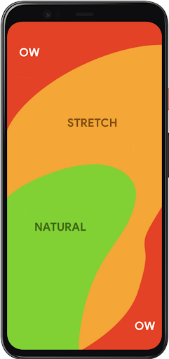
You should always keep in mind what we know about all users visiting your website – every action you ask them to take should be as easy and frictionless as possible. Before even considering the content that will go on a page, you need to consider where on page it will be most accessible. In 2011, Steven Hoober and Eric Berkman published a study called “Designing Mobile Interfaces” in which they coined the term “thumb zone.” This refers to the areas on mobile screens that are most easily reached by the users’ thumbs and therefore where all important clickable items should be placed. Placing important buttons and links in difficult-to-reach areas on screen can add barriers to content and therefore detract from the overall user experience.
Intuitive Navigation
Whether a user knows exactly what they’re looking for or they are purely just browsing on your site, the path to information should always be clear and natural. Creating the best navigation for your site requires thoughtfulness of content and consideration of your audience and the way they are used to maneuvering through a website. The navigation should make sense for the content you have to offer while also aligning with the organizational structure that your users are familiar with. There are many correct ways to layout the navigation of your website, you just need to find one that is the best fit for you and your audience. Employing intuitive navigation on your website is particularly important on mobile platforms because eliminating clicks to content while also having a well-organized site structure can assuage user frustration, encouraging them to stay on your site longer and to visit more pages. Solutions like hamburger menus help organize the menu in a way that the user isn’t overwhelmed by the menu items all at once when first arriving on the page while also mimicking the structure of the desktop site.
Cross-Device Consistency
While the mobile experience of a website should not just be a minified version of the desktop interface, keeping consistent UX design across desktop, tablet and mobile devices should always be a priority when creating your website. Responsive design across the board is crucial when trying to keep the user from disengaging from your site. Any inconsistency that arises when switching from one device to another can create confusion for the user and create the perfect opportunity for them to leave your website. Once again, it always comes back to making everything seamless and easy for your user. The mobile web design should be a full experience in and of itself that considers the intricacies of mobile user behavior while also mirroring the overall UX of the desktop interface. It is a delicate balance but is very worth it when done right.
Prioritization and Breakdown of Content
Simply due to the nature of mobile devices, there simply isn’t much space to fit content in one viewport. This means that in order to encourage your audience to 1) consume the content you write and 2) take away the most important points, you have to visually break up content to make it digestible while also pulling out the highlights as visually engaging elements on the page. Drawing users to your website is a challenge in and of itself – this is only compounded by the challenge of capturing enough of their attention so that they read a significant amount of content while on your site. The reality is you have a very short window to grab their attention and once you have it, concisely driving home the main takeaways is crucial. On mobile, in particular, breaking up content into chunks rather than overwhelming the user with massive blocks of text is a good way to make it all seem more approachable especially when you are trying to fit content into such a small screen. Highlighting specific points using statistics and images in a visually interesting way is a great way to also hold user attention.
Conclusion
Users have shown over a number of years now that the age of mobile device browsing is here to stay and if you choose to ignore it, you will get left behind. When designing for mobile devices, there is so much to be gained by considering what we know about users and the way they physically interact with their devices, and the way they consume content. Mobile web design principles center around the idea that users should always be presented with the path of least resistance when it comes to finding the information they need on your website as well as actually clicking the button to get there.
If your website needs a mobile makeover, contact Bluetext to learn about our website user experience design services.
When it comes to marketing, knowing your customer and their needs is crucial. To truly make an impact, ads need to be not only well-targeted but more importantly, meaningfully tailored to address specific customer needs at the right place and at the right time in their decision-making process. Effective advertising involves a keen awareness of the conversion funnel and customer considerations at every stage.
Ads have to first grab the attention of the target audience, but also communicate the customer value that the product or service delivers. The most impactful ads go beyond just stating customer benefits – they forge a connection between the customer and the brand that continues throughout the customer journey. Ideally, the ad captures enough attention to generate interest and sustains that interest to create longer-term loyalty. Meeting customers at the correct place and time while simultaneously delivering a meaningful and resonant message is a delicate balance. These nuances have propelled dynamic advertising automation to the forefront of advertising strategies across industries.

Anyone who regularly browses the internet is presumably familiar with personalized advertising. For example, if you decide to browse online for a new pair of sneakers, you likely are going to see ads for sneaker brands populating your browser soon after — it’s not a coincidence! Using automation to create “meaningful” ads goes a step beyond this kind of personalization. It culminates in advertising that acknowledges underlying customer values. For example, the sneaker ad and messaging might change based on whether the customer values a long-lasting and practical shoe or a sleek and fashionable one. How do we know these preferences? Well, maybe this customer has previously searched “highest rated sneakers” or “durable running sneakers”. This action signifies a preference for practicality, as opposed to a “sneaker trends 2021” search.
The automation of meaningful ads synthesizes customer behavior, customer preferences, and personal values to deliver a more effective and less bothersome version of the digital ads we’ve grown accustomed to seeing and often ignore. Advertising automation creates an experience that is helpful as well as enjoyable for the customer.
Conceptually, meaningful ads should be the answer many brands are looking for when trying to connect to their target customer, however, does it work in practice? According to this study, the implementation of meaningful ads caused purchase intent to increase by 15% and click-through rates to increase by 30%. So, not only does meaningful advertising forge stronger brand connections, it also yields tangible and quantifiable results. The same study also found that less than 6% of users had a negative reaction to the level of personalization used in these meaningful ads. This tells us that so long as the ad facilitates a helpful and positive brand experience, the customer will be happy to see their preferences reflected in your ads.
While this data is based on B2C customer behavior, the same mentality can and should be applied when considering B2B ad campaigns. In all cases, ads are speaking to human beings with the capacity to form emotional connections to brands, and the automation of meaningful ads allows that crucial process to occur at scale. All of these insights reinforce one consequential truth – knowing your customer, their needs, their values, and why that matters at each stage of the customer journey is the most important piece of the advertising puzzle. Automating meaningful ads puts that concept into practice and the results will speak for themselves.
Ready for quantifiable advertising success? The first step is analyzing your user personas and unique needs. A marketing analytics agency can help you identify these groups, and find critical insights into their online behaviors. A digital agency can then help turn those insights into actions, and place targeted advertisements that yield conversions.
Contact Bluetext if you’re interested in maximizing your advertising dollars towards real success.
Website trends come and go. From dark modes, to microinteractions and maxed out whitespace, it seems every browsing experience uncovers a new design or UX trend. But that’s the issue with trends: it is by definition a current style or preference. It’s inevitable new trends will emerge, while old trends may fade. So when considering your website design, it can be a challenge to determine what trends are worth investing in. While every company wants the latest and greatest in design in 2021, your website should be able to withstand the test of time with proven best practices. As a website design and user experience agency, Bluetext has some insider knowledge on what design and UX trends are here to stay and which will future-proof your site.
1.Design with your target audience in mind.
Virtually every online experience is personalized to keep users engaged and your website should be no different. Everything including the navigation, UX functionality, and the color palette should be carefully curated to meet the needs and behavior of the end-user.
2. A website’s visual design may initially grab the user’s attention, but the content is key to maintaining it.
At the end of the day, users are coming to your site to seek information and a website that lacks substance or relevance will fall short no matter how eye-catching it may be.
3. The path to information should be accessible and intuitive.
Having a clear and concise navigation reduces the amount of clicks it takes to reach the right content and drastically improves the user experience. The approach to web design should always be user-first, so think about what they are looking to gain from their experience on your website and make it as easy as possible for them to get it.
4. In a world where everyone is using a mobile device, websites must incorporate responsive design.
Creating a frictionless experience on mobile is just as important as desktop and testing to make sure it displays across platforms and devices is imperative. Rather than simply implementing a desktop design on mobile, the mobile design should be tailored to how users interact with that particular device.
5. Flexibility and adaptability are key ingredients to a website that aims to stand the test of time.
When it comes to predicting trends, the only certainty is that change will come eventually – website trends are no exception. Positioning yourself and your website to be adaptable to the needs of your users and their behavior will create the best website experience. User feedback is the best tool to leverage in the long term.
6. Give content room to breathe.
Using a minimal style is not only an aesthetic choice but also a functional one that lends itself to user behavior. As people are constantly consuming content, they aren’t likely to give their time and undivided attention to a long block of website text. Incorporating negative space can help make even the most overwhelming content more digestible.
7. Use motion and dynamic elements to create an interactive site.
Custom UX functionality can elevate a website and foster a more engaging experience. Even the most subtle movement can add interest and interactivity to the page.

Are you ready to future-proof your website design? Get in touch with Bluetext.