When we talk about motion in branding, we’re talking about a wide variety of creative approaches. From subtle homepage loading flourishes to complex, eye-catching 3D advertisements, animation can breathe new life into your brand. Today Bluetext will explore why motion design for logos is on the rise, when it’s best applied, and some of our favorite examples.
The digital landscape is crowded, to say the least. The average American spends a little over seven hours a day on the internet, and much of that time is spent surrounded by thousands of brands and advertisements. A well-done animation can help your brand stand out from the crowd and add essential layers of personality to your marketing collateral.
Whether your brand is neat and polished or playful and young, animation can reinforce those core characteristics without a single word. Picture the old Nickelodeon “splat” logo, for example. In 2009, a handful of disparate channels (TeenNick, Nick at Nite, etc.) were rolled into the Nickelodeon brand, and a new logo was unveiled to go along with the consolidation. The older logo’s animation had a younger, scrappier feel, while the current logo is much more refined, and gets at the large-scale, premium approach of Nickelodeon’s parent company, Paramount. These approaches are vastly different from one another, but there’s not one “right” answer when it comes to logo motion. Both animation styles are integral parts of the brand’s history and tell the story of a brand’s evolution. I’ve said it before and I’ll say it again: If a picture is worth a thousand words, an animation is worth a million.
![]()
Virtually any digital platform is an option when it comes to displaying an animated logo, but as they say, moderation is key. Instead of applying motion “just because,” it’s important to have intention behind the choice to display a static or animated logo. Here are a few of our favorite intentional applications of motion design in logos.
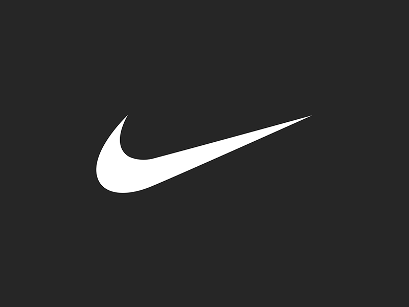
Use an animated logo when your space and time are limited
In cases where viewers may only see one or two components of an ad (scrolling quickly through a social feed, for example), you can convey more with an animated logo than you can with a static one. The key in these instances is to take up about the same amount of space and time as a static logo. This means your animation should be quick and to the point, like the example below from Nike. An added feature of Nike’s animation style is that they apply a different animation style depending on the audience and product, so each motion graphic feels uniquely suited to its context.
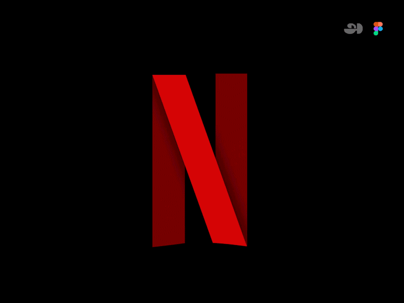
Amp up your site’s intro screen with logo motion
Along with the now-iconic “ta-dum” sound, Netflix’s loading visual is well-known and well-loved. Because the animation doubles as a loading screen, it doesn’t feel intrusive or overdone. It’s reminiscent of classic film grain, and it ensures that the Netflix visual identity is central to the viewer experience, regardless of whether the program is a Netflix original or not.
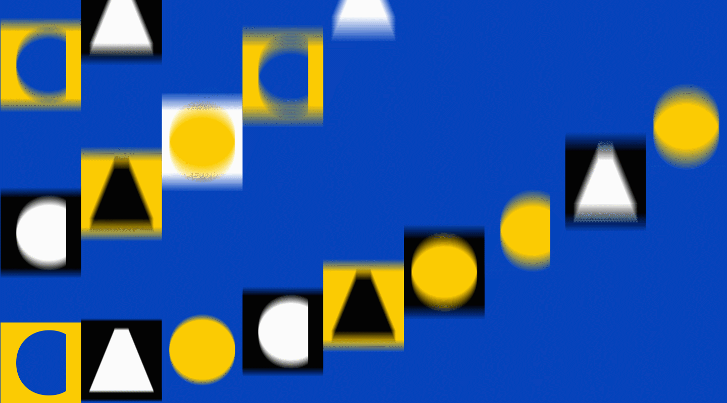
Animate your logo as part of a brand pattern
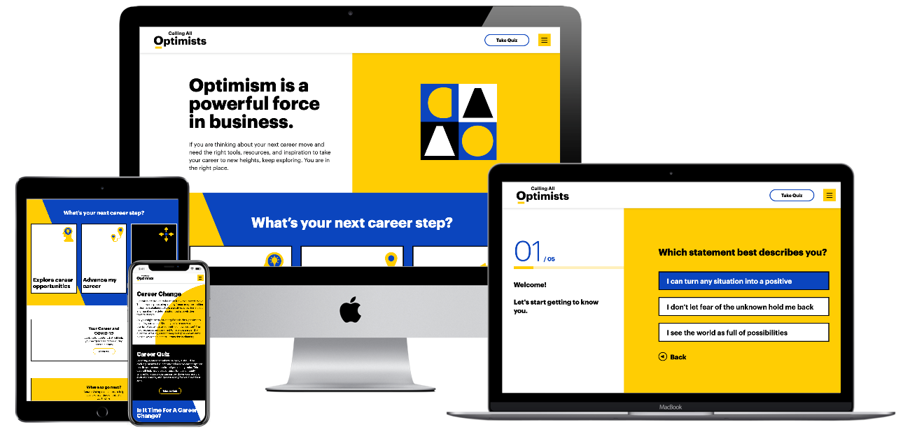
For Calling All Optimists, a GMAC brand, we developed an animated brand pattern using elements pulled directly from the brand’s logo. This is a handy asset in any brand’s toolbox, because it’s a custom element that can be used in place of stock imagery or generic graphics, and it can be front-and-center or fade into the background. You can explore our case study for Calling All Optimists here.
Tell a story about your brand using animation
Designtorget is a Swedish design house that sells all kinds of homewares, and their logo animation helps convey their line of business to unfamiliar customers. Using the “D” and “T” figures from their logo, shifting them around with other simple lines to portray things like a table and chairs and an abstract smiling person. This animation demonstrates the brand’s actual offerings while also presenting a playful, modern brand identity.
![]() Ready to explore how logo motion can boost your brand? Contact Bluetext to learn about our dynamic branding and motion design services.
Ready to explore how logo motion can boost your brand? Contact Bluetext to learn about our dynamic branding and motion design services.
Being a technology company can be tough, there is often pressure to appear futuristic, scientific, or impressively complex. The market often expects the latest and greatest features and widgets, especially in website UX and design. However, not every company is the space-age, robotics, AI-generated stereotype that comes to mind with “tech”. But across all technology companies, there is a shared level of expertise in software and computing that may not be found in the everyday website viewer. Technology companies can easily fall into the trap of flexing their brain power a little too strongly, and overachieving the “tech aesthetic”. And while there are a million ways to design an impressive website, there are a couple of practices that stand out as common pitfalls for technology companies. Bluetext recommends the following as what NOT to do in web design:
Too much content on one page
This is often the result of poor content planning. When a user is overwhelmed with animations, visuals, and walls of text, they lose interest quickly. Focus each page on answering a specific question or describing a specific product, and link out to additional information that you feel is relevant. If there is any “take it or leave it” language on the page, it might be best to leave it.
Too little content on one page
As the saying goes, too much of a good thing can be a bad thing. We appreciate minimal site design when it helps a user find exactly what they’re looking for, but barely-there content doesn’t help anyone. Each page should be thoughtfully designed and written and should provide a user with clear next steps in their journey on your website.
Jargon or unapproachable language
Messaging across the site ought to be crystal clear. Just like having too much content, using complicated language and jargon can deter a user from continuing on your site. We recommend tailoring your content to your audience by considering how they would speak during a conference—widely-understood industry terms are acceptable, but should be embedded within digestible, humanized language. When customers can easily understand your product language, they gain confidence in your brand.
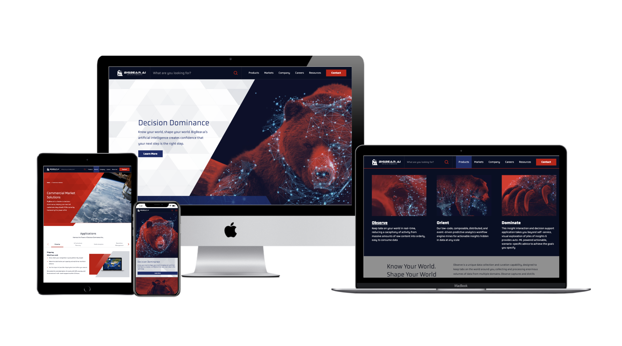
Recently, Bluetext partnered with BigBear.ai to develop a new messaging strategy that frames them as a leader in their field while explaining their highly-technical product with accessible language. As a result of this partnership, BigBear.ai is able to strike a balance between technical and approachable language, and build trust with its audience. To learn more about this project, click here.
Falling into the trap of trends
We see this most often when personal taste takes precedence over user experience. Some trends have staying power and can help you stand out from out-of-the-box websites. Some trends, though, are fleeting.
When adopting new web design styles, carefully consider the relevance of each trend to your brand and your users. More often than not, the best thing you can do for your users is to be consistent. They want to know what to expect from your website, so as you explore trends, it’s good to meet (or exceed!) those expectations.
No clear CTA
Each page on your site should provide clear, relevant next steps. This could take the form of related resources at the bottom of the page or quick links to associated product pages. Whichever next steps you choose to display, they should proactively provide the user with additional information related to the page they’re on. This practice is also helpful with interlinking content across your website, which can boost your search rankings.
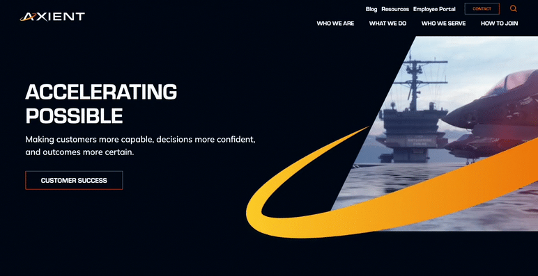
For a great example of CTA placement throughout a site, check out Axient’s website. Bluetext worked with Axient to devise a comprehensive website strategy that would optimize the user journey and maximize conversions. To read more about this project, click here.
Poor mobile experience
More than half of users will leave a page that takes more than a few seconds to load on mobile, according to Google. Given that mobile use is steadily increasing year-over-year, this means that the longer your site takes to load, the more users you could be losing to competitors.
One solution for the mobile-desktop conundrum, as recommended by Nielsen, is to have a mobile site separate from your desktop site. This will allow you to pare the mobile experience down by removing content and features that are only relevant to desktop users. To see how your site’s mobile experience stacks up, try out Google’s Mobile-Friendly Test.
At the end of the day, the best thing you can do for your website is to design and write with your end-user in mind. A site that works for them is a site that works for you.
To learn how Bluetext can help you avoid these mistakes, get in touch with our web design experts today.
The XXIV Olympic Winter Games have come and gone, in what felt like the blink of an eye. Even though the Games span only two weeks following the Opening Ceremony, there are years—and sometimes decades—put into their planning. A key piece of that planning is setting the visual identity of the Games, which is no small task. We all know the iconic five-ring emblem that symbolizes the union of international athletes, but each host city gets the opportunity to create its own unique logo. Olympic logos of the past have varied widely in color, type, and style, and each new logo is put to the test to tell a story not only about an Olympic season but about the host country itself.
A quick glance at all the different Olympic logos of the past makes it clear that there’s no clear-cut formula for an Olympic Games’ brand system (except the inclusion of the Olympic rings, according to the Olympic Charter). We’re going to take a look at the Olympic logos of yore and dissect our favorites and not-so-favorites through superlative-style judgment.
Best Abstract Use of the Olympic Rings — Atlanta 1996
Incorporating the Olympic rings is a requisite part of all Olympic logos, but that might get a little repetitive after over 50 Games. We appreciate the Atlanta 1996 logo’s integration of the rings with the column—the mark hints at the Olympics’ Grecian beginnings, the Olympic torch, and even manages to squeeze in the number ‘100,’ celebrating the centennial of the games.
![]()
Best Direct Use of the Olympic Rings — Innsbruck 1964
There’s something to be said for a simple, classic logomark like the Innsbruck 1964 logo. Using the coat of arms of the City of Innsbruck as a starting point, this logo features the rings prominently and uses an elegant typeface for the host city and year. We can’t think of a more classic, straightforward Olympic logo.
Best Out-of-the-Box Typeface — Rio de Janeiro 2016
The logo for the 2016 Rio de Janeiro Games feels like a celebration, exactly as its designers intended. This mark took inspiration from Carnival and uses organic forms and lettering to convey the energy of both Rio and the Olympic Games. This approach brilliantly tells a story while standing out from the crowd.
![]()
Best Out-of-the-Box Color — Sarajevo 1984
Working with the Olympic rings may feel constricting color-wise since there are already five colors to contend within a design. That didn’t stop the designers of the Sarajevo 1984 logo, who washed the whole logo in orange for the primary mark. This approach is particularly interesting because the logo was permitted to appear in any color so long as the entire mark appeared in a single color.
We’d be remiss to close this category without giving a nod to the London 2012 logo which, while controversial, was striking in its use of hot pink. They can’t all be winners, but we appreciate the bold approach.
Best Use of a Human Figure — Nagano 1998
In the Nagano 1998 logo, seven abstract human forms make up the petals of a flower, nicknamed the Snowflower. We like this mark not only because it defied expectations for a snowflake or other wintery symbol, but because it was the starting point of an environmentally-focused Olympic identity.
Best Minimal Logo — Tokyo 1964
Stunning in its simplicity and symbolism, the Tokyo 1964 logo is heralded as one of the all-time greats in Olympic logos. With the Olympic rings set in gold beneath a version of the Japanese national flag, this mark features traditional Japanese colors signifying peace and prosperity. Despite its minimalism, this logo manages to acknowledge the host country, the traditional Olympic identity, and the moral foundation of the Games.
![]()
Best Maximal Logo — Rome 1960
Poised between two relatively simple Olympic identities (Squaw Valley 1960 and Innsbruck 1964), this maximalist logo was an obvious pick in this category. In a departure from ‘60s graphic design trends, this mark harkens back to classical Roman motifs and styling. While it may not be everyone’s cup of tea, we admire the dedication to national legend.
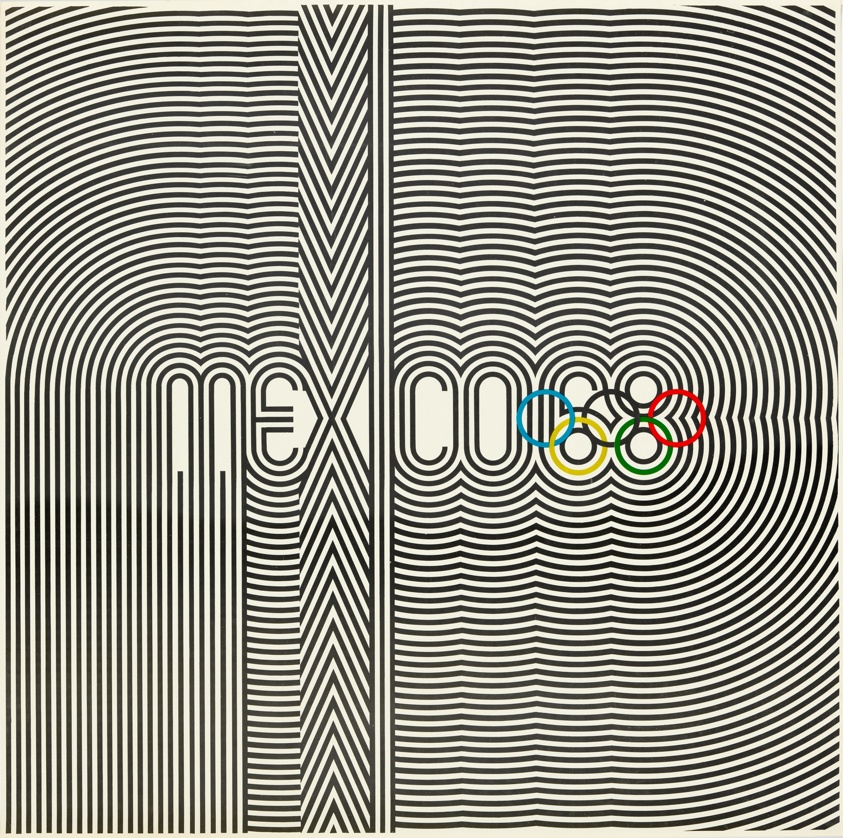
Best in Show: Summer — Mexico 1968
Our winner for Summer Games logos has to be Mexico 1968. Not only does the logo incorporate the rings creatively, but it’s also reminiscent of athletic uniforms and traditional Huichol art. This mark is the basis of a fascinating brand identity—for starters, the official Olympic poster looks like album art. Sure, this logo may be a little busy, but what it lacks in refinement, it makes up for in energy.
Best in Show: Winter — Sapporo 1972
We love the Sapporo 1972 logo because it’s unlike any other Olympic identity, and it was perfect for its time. With a Bauhaus feel, this mark features the rising sun symbol from the Japanese flag, a stylized snowflake, the Olympic rings, and a single line of text. Despite including only basic elements, the unique stacking and coloring of these elements make this logo one of our favorites.
Best Iconography — Tokyo 2020
The iconography that’s developed alongside Olympic identities changes with the logo, and we wanted to honor an icon system that we think was particularly elegant. The icon set for the Tokyo 2020 games included icons (or pictograms) for each sport, including the five new sports introduced to the Olympics that year. Each icon is skillfully-made and coincides beautifully with the 2020 Olympic logo.
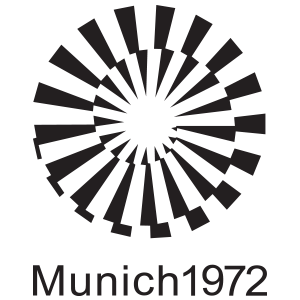
Judge’s Favorite — Munich 1972
A personal favorite that didn’t get identified in any of the above categories, the Munich 1972 logo’s name says it all—”Radiant Munich.” The abstract sunbeams are eye-catching, and the overall brand identity feels both joyful and serene.
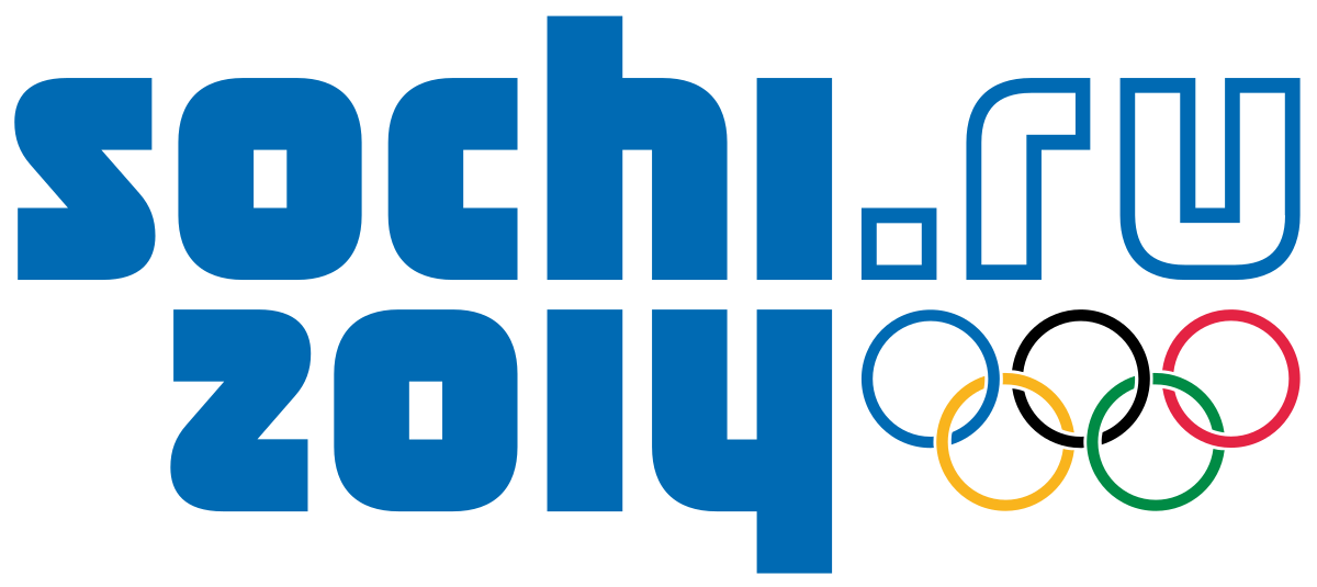
Judge’s Least Favorite — Sochi 2014
While this logo was meant to convey sentiments of modernity and the coming digital age, it misses the mark. Suffice to say, there’s a reason that no Olympic logos in the 8 years since have included a URL.
There you have it—our take on some of the best and worst Olympic logos to date. We encourage you to explore all of these logos yourself on the Olympic website, and to explore other opinions like Milton Glaser’s for AIGA.
The logos for the Paris 2022, Milano Cortina 2024, and LA 2028 Games have all been unveiled, but given the controversy over and subsequent redesign of the Tokyo 2020 logo, we’ll wait to grade those logos until their respective Games pass. In the meantime, if you’re in search of a new logo or brand identity, get in touch with the team at Bluetext to learn how we can team up and go for the gold.
New year, same buzzwords. We’re all familiar with the phrase “machine learning”, but finding a practical application for it that supports your business model is another story. The key to effective digital marketing campaigns is taking full advantage of emerging technologies, and if you’re looking to increase your marketing team’s productivity and efficacy, look no further than machine learning. From paid media campaigns to search marketing strategies, recent machine learning enhancements have skyrocketed its digital potential. As brand marketing becomes more closely integrated with performance marketing, introducing ML to your digital marketing strategy is an effective way to assist your team on both fronts.
According to Google’s Chief Search Evangelist, “The future of brand marketing is digital, and it’s automated. As a brand marketer, if you can start thinking like performance marketers when it comes to KPIs, measurement, and budgets, you’ll be poised to win.”
Looking for ways to get started with machine learning in your marketing processes? Here are a few ideas:
-
Introduce personalization at scale.
Personalized advertising is a tried-and-true success tactic, and machine learning makes personalization at scale easier than ever. Whether you’re personalizing for 100 users or 100,000, AI makes the process quick and effective. Better-targeted ads, personalized messaging, and individualized user journeys are just a few ways that ML can boost your brand. -
Leave the bidding to the machines.
Free up your team’s time by handing off PPC management to a tool like Google Smart Bidding. With automated bidding, your team can focus more on strategic planning and goal-setting instead of cent-by-cent differences. -
Implement a chatbot on your website.
Chatbots are simple integrations that can have a major impact on the conversion rate of your site. The best chatbots use AI to make the customer’s journey as simple as possible, guiding them to the right information or product with minimal back-and-forth. Trusona uses a pre-populated chatbot, so users don’t have to lift a finger to type a response; they can simply choose from the options presented. -
Iterate, optimize, and iterate again.
Iteration is one of the greatest strengths of processes that use machine learning; rapid analysis of digital performance means that your team can respond in real-time to shifting trends and interests. Ultimately, the introduction of machine learning to your brand’s marketing tactics will result in better products and better performance.
Implementation of machine learning could be the next major step in your brand’s growth. To learn more and see how Bluetext can partner with you in that growth, contact us.
Scroll-based animation offers all the benefits of on-page animation and more. Not only do pages with scroll-based animation engage users more effectively, but they can also tell more complex stories, improve page load time, and expand the capabilities of your brand identity.
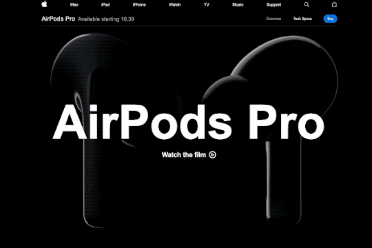
Some stories are best told visually, and scroll-based animation is an effective way to make complex stories simple and elegant. Designers can use animation to guide users as they scroll, catching their eye at exactly the right time and place. Apple incorporates subtle animations into its product pages to drive user focus toward key information they want to highlight.
Scroll-based animation can offload elements beneath the virtual “fold” from the initial loading process, decreasing overall load time. Elements above the fold are prioritized in the initial load, saving time on down-page items that are animated to appear as the user scrolls down.
Implementing scroll-based animation provides the opportunity to add animated elements to your brand. Whether they’re completely new, or existing pieces that have been updated with motion, animated elements can help bring your brand to life. Elements like a scroll-based footer or call-to-action can be used across a website to consistently call attention to key information about your brand.
Key Tips for Scroll-Based Animation
Getting started with scroll-based animation can be tricky, so here are a few pointers to keep in mind as you go.
- Timing is everything. The flow of the animations as a user scrolls down the page is key to maintaining their interest. As a user moves down the page, elements should naturally animate or appear, so there are no gaps in the experience. A simple, well-timed scroll-based animation is always better than a complex but awkward one.
- Added effects should emphasize key information, not detract from it. Keep in mind that the whole point of on-page animation is to make it easier for users to navigate your site and find what they’re looking for. Be sure that any effects or animations make their experience easier, not more difficult.
- Less is more. When in doubt, simplify. Avoid cluttering your site by animating every element on a page or by introducing particularly drawn-out animations for no reason. As a rule of thumb, smaller elements should have shorter animation cycles, and each animation should have a purpose in guiding the user experience.
Looking for inspiration?
Clarabridge’s animated homepage brings the brand to life and elevates the user experience. On-page effects guide the user through the homepage, emphasizing the strength and ease of Clarabridge’s solutions. Click here to read our case study on this project.
HuffPost’s interactive article, Chef Jose Andreas Embraces the Chaos, is an example of “scrollytelling,” which uses scroll-based animation to enhance a written story. Hand-drawn visuals appear as the reader scrolls through the story, adding a playful, personal feeling to the page.
For Calling All Optimists, Bluetext incorporated subtle scroll-based animations throughout the site to draw attention to key information or calls-to-action. Along with the brand’s playful shapes and colors, these animations reinforce the positive, dynamic qualities of the site. Click here to read our Calling All Optimists case study.
Ready to see how scroll-based animation can enhance your site? Contact Bluetext to learn about our motion design and interactive UX services.
Why animation?
As the saying goes, static doesn’t sell. According to research, animated banner ads are more than four times as effective as their static counterparts. More and more these days, users are expecting engaging, interactive content from brands at every point of contact. This goes for any platform—a website, an app, digital out-of-home, social platforms (yes, this means TikTok). Anything with a screen is an opportunity to shake up your brand with animation.
Say more with animated content
If a picture is worth a thousand words, an animation is worth a million. Animated content captures key messages in more ways than a static graphic, and injects any design with the personality of a brand. After all, motion draws out emotion. Whatever your brand wants to convey, animated content can sharpen and elevate that message.
Is your brand a subtle responsive animation kind of brand, or a claymation one? Maybe a blueprint-style animation speaks to your brand’s personality best, or perhaps a parallax effect is the best representation of your brand. However you choose to do it, you can get more out of your corporate visual identity with animation.
Getting started
When it comes to animation, the options are endless. Here are a few simple ways to get started, plus some examples produced by the team here at Bluetext.
1. Introduce an animated version of your logo or key brand assets.
An animated brand identity can be applied across any digital asset, as demonstrated by Octo’s identity in motion. The style of movement captures the ever-changing nature of the government technology market and communicates more about Octo than a static identity could.
2. Add subtle movement to some of the static content on your website.
This example from ScienceLogic is an elegant way to introduce movement to your website while incorporating visual elements like brand shapes and secondary colors. As the mouse hovers over images of the leadership team, the background pops with new colors and shapes to keep the viewer engaged with what they’re seeing.
3. Consider a moving graphic for your next ad placement.
4. Read some more tips on motion integration from Ale Hernandez, one of Bluetext’s web design and UX experts.
Easy animation with interactive AI
Animation is becoming so necessary for modern brands that designers have even begun to automate some of the process. This cutting-edge technology is making animation more cost-effective and efficient to produce, meaning that more and more brands will be able to build out animated identities. Now is the time to get an edge on your competition by debuting a signature animation style for your company’s offerings.
Want to go all-in on animation? Contact Bluetext to learn about our motion design and interactive UX services.