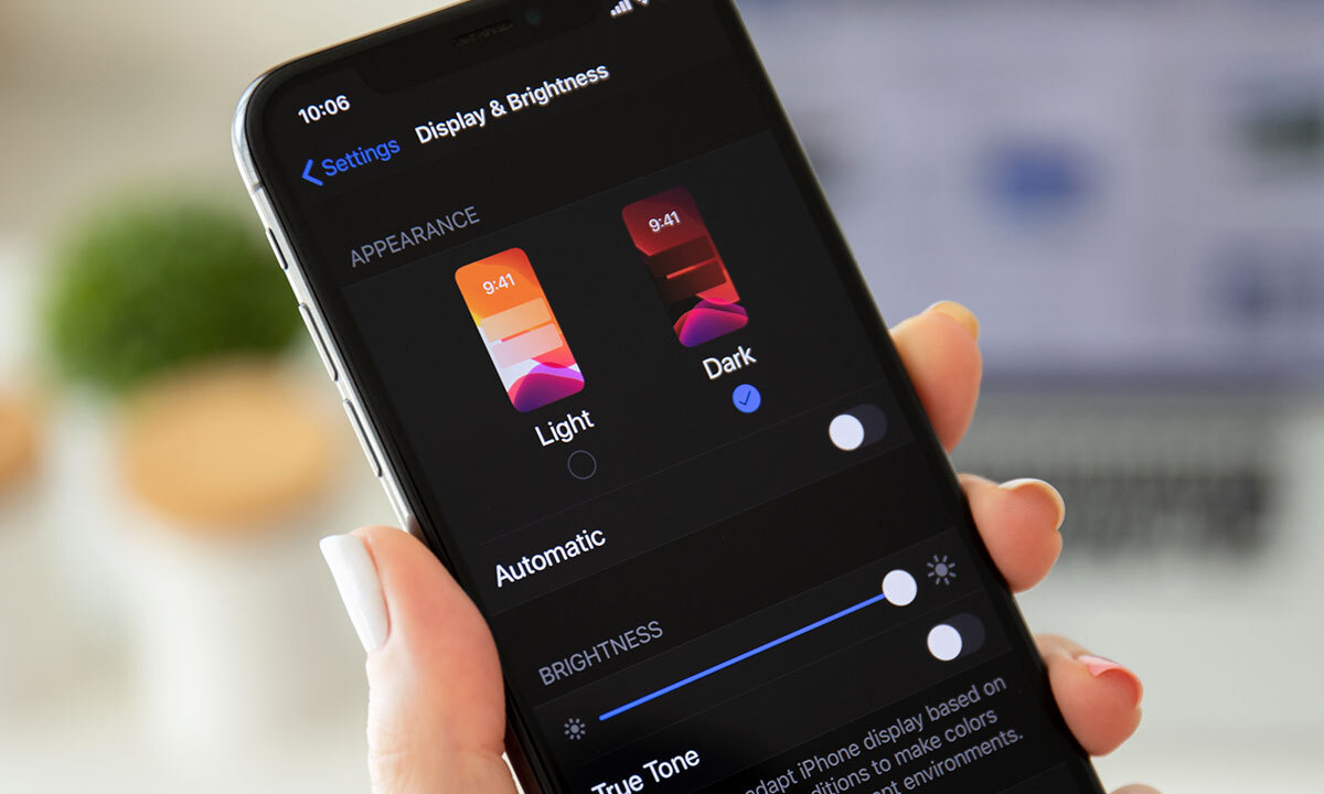
Could the dark mode interface eclipse their light mode counterparts? Dark mode has seen a continued rise in popularity over the past few years following the 2019 release of Apple’s dark mode option alongside the iOS 13 update. Sometimes referred to as “Night Mode”, “Shadow Mode” or “Dark View”, this dark mode is a design term used to describe a low-light user interface that uses a dark color as the primary background color, reversing the default light-on-dark design that designers have used for decades.
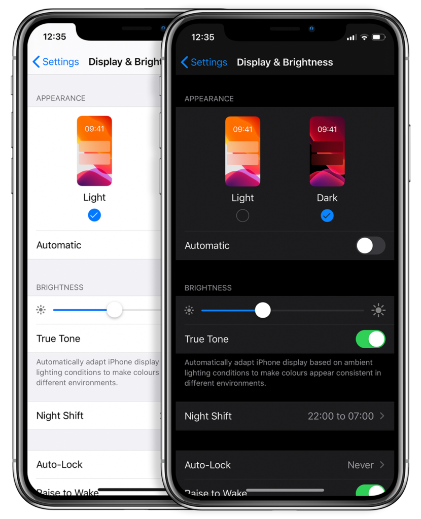
In response to increased user screen time across devices, this darker UI design trend has garnered immense popularity. Big-name brands like Facebook, Google, WhatsApp, Instagram, and Apple were all early movers in adopting dark mode interfaces and have influenced many others to follow in their footsteps. That being said, operating systems, browsers, and apps are not the only places dark mode is continuing to grow in its popularity — more and more website developers and designers are hopping on the dark mode train, opting for UX/UI designs that are dark as night with reasons why that are clear as day.
A “Site” for Sore Eyes, in More Ways Than One
It’s no secret that the aesthetics of a dark mode design can elicit powerful feelings and emotions from visitors. A dark color theme often conveys sophistication, edge, and modern elegance to users. Black is an especially dominant color, often used to create maximum color contrast when paired with whites or vibrant tones. Dark hues are often associated with style and power, which can add striking visual appeal and depth when used strategically as a website’s background. Dark mode is especially useful for image and video-heavy sites. The dark contrasts bright colors, making them look more compelling and instantly captures the audience’s attention. The more visually appealing users find your site, the more likely they are to engage with your content and remain on-page.
More than a Pretty (Inter)face
Aside from just looking easy on the eyes, dark mode can actually be easier on the eyes. Some studies show that dark mode can help reduce the sensation of discomfort that is sometimes felt by staring at websites with light backgrounds. It is especially preferable in low-light conditions where looking at bright white screens for long periods of time on any device can result in eye strain and fatigue. Reducing the pain associated with light-on-dark interfaces by switching to a dark-on-light display can help encourage users to stay on your site for longer.
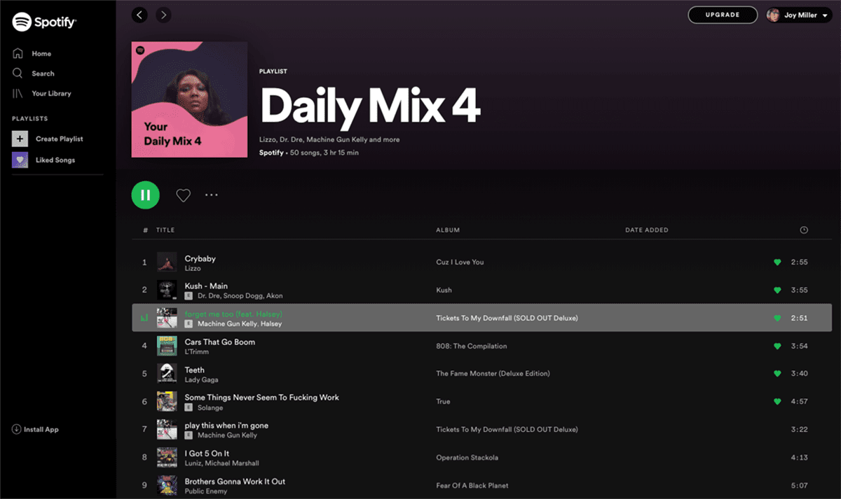
If you’re a Spotify user, your eyes (and ears) have been benefiting from dark mode features for years.
Dark Mode Can Save Brain and Battery Power
UX research shows that dark backgrounds enhance page contrast, making visuals pop and easier for the users to focus on. If your site is imagery-heavy or puts an emphasis on visual or graphic content, dark mode will allow users to be more engaged and get through your site quicker and easier, retaining more content faster and leaving with a stronger impression of what you have to offer.
Dark mode can also save device battery life. Studies show a dark theme can reduce battery usage significantly, especially for users viewing your site on a mobile device. White pixels are more power-hungry than dark pixels, which allow devices to use less energy. In an era when users are glued to their screens, anything that can save device battery power is a win — and your website could be one of those things.
So Now You’re Interested in Dark Mode, but Don’t Know Where to Start?
Good thing Bluetext has got you covered. As a leading digital marketing agency in DC that specializes in website design and making powerful sites for clients all over the world, we’d like to offer up a few pieces of advice to consider when thinking about creating or adding dark mode to your site:
- Determine if dark mode is really right for your website content–and where. Dark mode is great for enhancing emotional branding, showcasing photos and graphics, and emphasizing visual content, but not so great for displaying big chunks of text. Light text on dark backgrounds can cause readability issues in practice, so portions of your website that are or will be pretty text-heavy, dark mode may not be the best choice to display your content. Consider reserving dark mode for a homepage, or flashy campaign landing page, but maybe not your product details.
- Make sure your brand colors can actually work well with a light-on-dark design (see tip #3). If not, but you’re still set on pursuing dark mode, consider going through a rebrand before implementing dark mode.
- Verify your light-on-dark color scheme meets accessibility color contrast standards.
- Dark backgrounds de-accentuate empty space, so limit the number of elements (lots of icons, buttons, and small images) used together within viewports to avoid looking cluttered.
- Make sure your design will work in both low-light and high-light environments.
- Use illumination over shadows to communicate depth.
- Avoid highly saturated colors.
- Leave room for a regular/light option and give users the ability to toggle back and forth as they desire.
- Work with an agency like Bluetext to ensure your dark mode website is sleek, powerful, on-brand, and communicates a strong and engaging message to your audience.
Learn more about dark mode and how Bluetext can help you take your website to the next level. Contact us today.
They say that fashion cycles every twenty years. If you walked out onto the streets of any city or by any trendy clothing storefront today, you’d probably see a wide array of neon prints, baggy denim, and those teeny tiny sunglasses that will have you seeing flashbacks to 2002. But fashion isn’t the only arena in which Y2K inspiration is making a comeback. From interior design and entertainment to digital design and branding, nostalgic nods to the early 2000s are making a resurgence everywhere.
In this post, we’ll be diving into the influence Y2K trends are having in the creative digital design landscape today. We’ll highlight what 2000s inspiration consists of, why it works, and how Bluetext can help make any of your Y2K design dreams a reality.
Defining the Y2K Aesthetic
In contrast to the clean and sophisticated, “corporate” feel that has dominated digital design trends in recent years, the Y2K aesthetic has a notably less-polished look. This was initially a result of the technical constraints of the early 2000s. However, graphic designers today (with access to significantly more tools and advanced software) are able to mimic the same decades-old vibe with new-life designs that look both tastefully amateur and purposefully quirky.
The original Y2K design aesthetic was a mish-mash of decades and inspiration. Cues from the 60s and 70s nostalgia were paired with excitement about innovation in tech and the growth of the internet around the year 2000. The result: dynamic futurism and playful interpretation of retro style that we can all recognize today as the Y2K aesthetic.
Let’s take a look at some of the main elements that characterized Y2K design and the trends that are currently making a comeback:
UX/UI
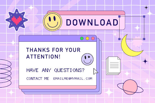
Asymmetrical designs with flat, analog user interfaces. Old-school-looking browser windows and translucent hardware. Deliberate glitches, pixelation, and an overall lo-fi look and feel.

Color Schemes
Metallics and icy blues and purples. Neons and bright retro colors like orange and lime green. Funky gradients and intentional color clashing.
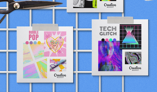
Iconography and Visuals
Use of low-res images. Decorative, clip art style icons and stickers. Pre-emoji emoticons and quirky 2D and 3D iconography.
Font
Free-flowing type design using italics and default fonts like Times New Roman and Comic Sans. Blocky text and bubble letters. 3D effects and loud, bold types with thick outlines and shadows.
These Y2K-inspired design trends are showing up across the digital landscape- whether serving as high-level inspiration for visual identity and logo designs or as fundamental elements of websites and rebrands.
Y(2K) it Works
It’s Everywhere
We aren’t just seeing this on our phones and computers – we’re seeing Y2K inspiration on our TVs, hearing it on our radios, seeing it in our homes and in art galleries. The cyclical nature of design is prevalent across all industries and trades, and when it’s everywhere, it’s trendy. This isn’t the first time our cultural zeitgeist is recycling trends of the past, either. Designers of past and present often draw inspiration from previous decades, reinventing them with contemporary, original qualities of their own.
It’s Familiar
Nostalgia (defined by the Oxford Dictionary as “a sentimental longing or wistful affection for the past, typically for a period or place with happy personal associations”) is a powerful and valuable design tool. For those around in the late 90s and early 2000s, Y2K design can evoke a sense of relatability, sentimentality, and longing in buyers nostalgic about the earlier days. Or, for younger generations, Y2K designs can appease their fondness for an era beyond their own experience. Perhaps not for your overall B2B brand, but certainly for new product logos, campaign themes, or landing pages a nostalgic visual identity can create emotional connections with your audience. In a sea of corporate sameness, nothing catches the eye of middle age business audience like a memorable flashback to their younger days.
So, are you ready to add some Y2K spunk to your next design project? As a full-service digital marketing agency specializing in everything from website redesigns to entire visual identity overhauls, Bluetext has got you covered. Contact us today to learn how we can bring nostalgic, early 2000s energy to your next project in 2022.
Or maybe, give us a ring to really embrace the Y2K spirit.

It’s no secret that any business striving for success has to find a way to differentiate themselves from their competition. The same goes for companies operating in the government contracting arena, where players big, small, old, and new, are all looking for ways to get their messages into the market uniquely.
I know what you’re thinking… so much easier said than done, right? Well, what if I told you that a solid and effective brand story is one of the most critical ingredients of a government contractor’s success? And, what if I told you that as a government contracting marketing expert that specializes in brand storytelling, Bluetext can help you significantly improve your market standing and brand goals?
Now that I’ve got your attention, keep reading to learn more about why brand storytelling is so critical in government contracting, and just what Bluetext can do for you.
So, why exactly should I care about brand storytelling?
The reality of the situation is that without a strong brand story, many government services providers look exactly alike. Strong brand storytelling can make a government contractor stand out and come to stand for something valuable to all of the stakeholders. In a trust-based industry like government contracting, a resonant message can both attract and motivate buyers to conduct business with your company.
In a world so focused on numbers, proposals, minimizing risk and technical requirements, it can be easy to forget that your buyers are still human! Yes, they want to understand your company, services, and products and see those fancy charts and data, but they also want to relate. Most proposals are going to have very similar data, and after so many they all seem the same. What won’t be the same is the emotion tied to your company‘s proposal — if you tell your story right. Customers need to recognize your brand and trust that you are the right organization to fulfill their contracts in the long term.
That’s where brand storytelling comes in to help.
Studies show that humans actually rely heavily on our subconscious feelings to make decisions and that we respond positively to the impact of stories. That’s why storytelling is such a powerful tool to help evoke positive emotions around your brand and facilitate connections with your audience. When your audience connects with your story, they will pay attention longer, want to learn more, and be more trusting of your brand.
Storytelling that is consistent with your brand allows your audience to see the how and why behind your products or services. It allows them to be enticed by your company without being explicitly aware that they were in a sales pitch. Across any industry, tolerance is low for gimmicky sales ploys. However, there is attention bandwidth to be gained for a corporate responsibility and clear values. Companies who get this right are companies who win government contracts.
Okay, I’m in. But how do I get my brand storytelling right?
Enter: Bluetext.
As a top brand development agency, we’ve worked across industries to learn the most effective ways to tell unique brand stories. We have worked with countless government contracting firms to help them tell their stories in a way that captivates audiences, leads to real, tangible business results, and establishes them as a trusted partner who can solve real-world problems.
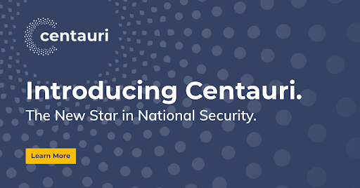
Check out a few of our favorite examples of storytelling in government contracting below:
 Convinced? Contact Us if you’re ready to work with a government contracting marketing firm to help tell your story.
M&As have long been a key strategy and source of growth for businesses around the world, with thousands of M&A transactions taking place each year. However, according to the Harvard Business Review, studies show the failure rate of mergers is somewhere between 70-90%. And while many factors can contribute to M&A failure, lack of stakeholder engagement and marketplace rejection are two of the major causes – both of which can be tied to brand decision-making (or lack thereof).
As such a critical factor in making or breaking success, it may come as a shock that branding is one of the most overlooked aspects of M&A planning. With the long list of considerations, leadership has to prioritize throughout the M&A process, branding decisions are often rushed or poorly planned, taking a back seat to financial, logistical, and operational concerns. Other times, rebranding takes place post-merger in response to already forming opinions, or as a way to deal with arising challenges instead of preventing them. In other words: it happens too late.
Just as figuring out how to best combine companies in order to create the most value possible is extremely important, so is making sure those synergies and strategic rationales are going to be believable to employees, investors, customers, and the outside world. That’s why it is crucial to prioritize branding early on in the M&A process. Having a clear brand strategy going into a merger helps promote unity, makes transitions smoother, and provides the opportunity to deliver a strong message, both internally and externally, about the value the newly combined entity will bring to all key stakeholders.
So, we’ve established why it’s so important to prioritize brand development in M&A planning, but how exactly do you get that branding right?
Well, that’s where Bluextext comes in.
Bluetext is a full-service marketing agency that specializes in digital branding and creative services. We have worked with leading M&A clients across the country, creating and elevating brands that set them up for success and put them in the position for continued growth. Especially in mergers & acquisitions, a professional branding agency is critical. A branding agency brings a neutral third-party perspective that eliminates the risk of brand cannibalization. Instead of stakeholders fighting to preserve remnants of their prior companies, an agency will recommend the right brand elements that unify all aspects of the merge.
Here’s how we do it:
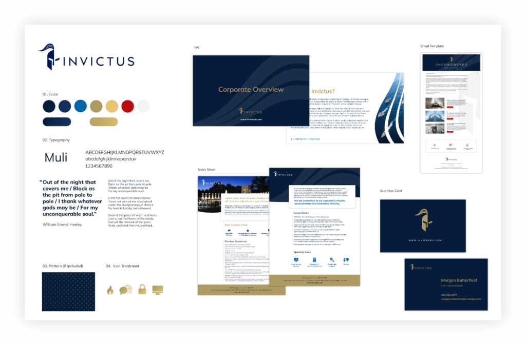
In-Depth Discovery
First, Bluetext engages in detailed discussions to learn more about the objectives, goals, and visions for your new brand. We perform extensive quantitative and qualitative research on your competitors, your key audiences, and their needs, take a deep dive into the current presence and state of your brand(s) and conduct countless stakeholder interviews. We synthesize all of our findings to form a clear vision and direction for the brand that’s both informed by data and supported by key stakeholders.
New Name, Logo, & Visual Identity Creation
Once a clear brand vision is in place, Bluetext moves into name, logo, and visual identity creation. We conduct a series of workshops to (1) come up with a name and logo that reflects the tone, attitude, and purpose of your brand, and (2) produce a visual brand strategy that will position your company for success in the markets you serve. The insights we pull from these sessions inform our creative direction and the moodboard that will serve to guide the visual brand identity, including colors, typography, iconography, and other identity system attributes.
PR Announcements
With a new name, logo, and brand identity in place, Bluetext Public Relations will take over to elevate your new brand and build market leadership through strategic and innovative PR campaigns. We’ll lock in on a story that conveys the reason this new entity exists and how it will have an impact, that resonates with all your key audiences, and that builds overall excitement for the brand.
Creative Outputs
Whether it’s creating new collateral templates, launching a fully redesigned website, or executing paid media and ‘Go to Market’ campaigns, Bluetext can produce various assets that take your brand even further and set you up for continued success well into the future.
Having the right branding provides a valuable opportunity to define and differentiate the identity of your newly combined entity in the market and will set the tone for what consumers can expect from your company moving forward. Working with a brand development agency like Bluetext early on in the process is critical to get that branding right and ensure your M&A success.
Want to learn more about our M&A success stories? Check out our work HERE.
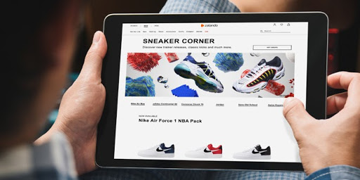
It’s no secret that mobile internet use has seen significant growth in the past few years. Over half of all web traffic now comes from mobile users, a majority of which are those using their smartphones to surf the internet.
However, with an installed base of over 190 million devices in the United States and counting, there’s a high likelihood that some of the mobile users visiting your site are doing so from a tablet device as well. It’s just as crucial for your website to look good and function properly on these devices as it is on laptops and smartphones, because in order to be relevant on the web today, your site must perform on all the devices that use the web.
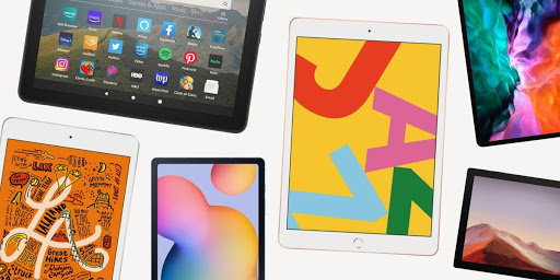
Thinking beyond the desktop
Unfortunately, standard desktop sites don’t have the best track record for working seamlessly on tablets on default. Even websites designed to be responsive in the transition from desktop to mobile face complications on unique tablet sizes. Oftentimes, a site may register a tablet as a mobile device, causing the font and buttons to be too small and intended for a small phone screen. On the contrary, if a site still displays the desktop version, the content becomes too close together, and many of the interactive functionalities just don’t work. While desktop sites are a great starting point, intentional design tweaks are needed to make your website tablet-friendly. Because, no matter what device your visitors are using, the goal is to give them all the best possible user experience on your site.
Luckily as a top website design agency, Bluetext has picked up several techniques over the years that make your user experience goals possible. Whether you’re starting to build a new effective tablet site or are looking to improve your current tablet user experience, here are 5 tips for tablet-friendly website design.
-
Increase font size, line height, and margins for legibility
Let’s be honest, we all know how annoying it is to have to consistently double tap or pinch your screen in order to read the content on a page. Avoid making tablet users do this on your site by bumping the font size up a few pixels, or to at least 16px, and use a line height of 1.5 for some extra breathing room between lines on text-heavy pages. To improve legibility even more, try increasing margins on pages and content blocks to add white space and reduce overall visual complexity, so your website’s content is easier for users to read and consume.

-
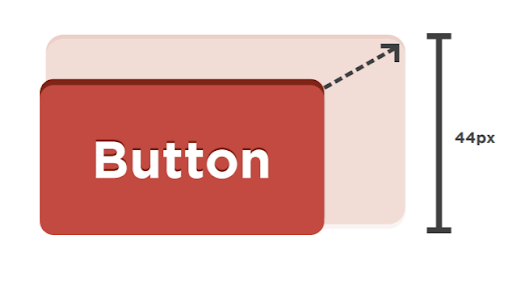
Improve finger-friendliness
Unfortunately, human fingers tend to be much less deliberate and a whole lot clumsier than the tiny point of a computer cursor. This means that anything you want a user to click on a tablet, whether that be buttons, menu items, or form fields, needs to be appropriately spaced and sized to allow room for our fingertips. Based on the average width of the index finger for most adults, a touch target of at least 44 pixels should allow a user’s finger to fit comfortably within the target. Additionally, increasing padding around touch targets by 5-10 pixels will improve user accuracy and reduce the frustration that often comes with unintended button-clicking and navigation.
-
…and make touch targets obvious
Not only should there be ample room to click on touch targets, but it should be very clear where and what those touch targets are. All buttons, CTAs, clickable links or elements should be large, bold, and stand out from the rest of their surrounding content. Hover states do not exist on a tablet, so styling with contrasting colors, underlines or shadows helps these touch targets to look tap-able. The more obvious CTAs are to your visitors, the more they’ll be able to navigate intentionally and with confidence.
-
Make people tap-happy
You don’t want to just design a website that’s easy to use, but one that’s pleasant and satisfying to explore! Keep in mind that a lot of your tablet visitors use that same device for personal entertainment and are used to clicking, swiping, sliding, and pinching their way through various apps. Creating visually enticing opportunities for tablet users to tap and engage with your site via unique interactive components like sliders, carousels, or accordions could not only help increase the amount of time they spend on your site, but make it more enjoyable.

-
Design & test on the most appropriate tablets
Lastly, it’s important to keep in mind where most of your visitors are coming from when designing and testing your tablet sites. There are dozens of different tablet makes and models out there today, with screen sizes anywhere from 7 to 12 inches wide. Unfortunately, it isn’t possible to test your website on every single one. This is where your website’s analytics come in handy; using tools like Google Analytics can help you determine which devices and browsers are most frequently accessing your website, so you can narrow your efforts on the tablets that make up a majority of your traffic and optimize for the greatest number of users.
Taking these steps and making these small changes can make a huge difference in the experience tablet users have on your website. Making it easy for them to read, navigate, click, and enjoy finding content or information on your site from all of their devices is crucial to keep visitors engaged and coming back for more.
Interested in tablet-proofing your website? Get in touch with Bluetext to see what our top visual designers can do for you.
Whether you are starting up a small blog or running the online presence of a multinational enterprise, analyzing, managing, and understanding website traffic data is crucial to the success of your business. From the perspective of a digital marketing agency, Google Analytics is one of the most powerful and accessible tools out there, with the wealth of free information that it offers. However, with all of that data at your fingertips, it can be easy to feel overwhelmed. Even if you know where to start, you may not be aware of all the many features available, or just how deep you can dig.
Over the years, Bluetext has learned several useful Google Analytics tips and tricks that have allowed us to glean even more valuable business insights for ourselves and our clients. Here are four easy ways you can do the same and dive deeper into your Google Analytics:
1. Automate Reporting Notifications/Set Up Custom Alerts
By default, Google Analytics will notify you of any unusual site activity. However, you can set up your own custom alerts so you don’t have to rely on Google to tell you when something important happens. Custom Alerts is a feature in Google Analytics that allows you to set custom parameters to monitor for unusual site activity and track changes in the metrics that are most meaningful to your business. Once configured, you can opt-in to have Google send you an email notification if a change triggers one of your custom alerts. What may be considered unusual? Say, for example, your site experiences a 200% increase in traffic on a given day. This initially sounds great, but be wary, this could be a bot attack!. If you have Custom Alerts set to notify you for traffic increases of higher than 50% in a day, Google Analytics would record the data surrounding this event and alert you to it.
While it can be tempting to create dozens of alerts to cover every possible anomaly in your traffic, you should focus on tracking information that is most closely related to your business’ top priorities and signals events on which decision-makers are likely to take action. Custom Alerts can be set up to monitor and notify you of things like:
- Analytics Flatlining
- Traffic Drops or Drops in Organic Traffic
- Increases in Referral Traffic/Conversions from Syndicated Content
- Drops or Spikes in Goal Completions
This is an extremely useful tool, because while automated notifications should never be a replacement for regular review of your KPI-based reports, Custom Alerts can assist you by proactively identifying any issues or opportunities, including those you may have missed otherwise.
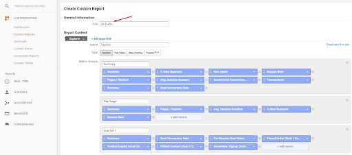
2. Create Custom and Advanced Visitor Segments
Custom segments are a powerful tool that allow you to dive deeper into your audiences and create reports within reports to gain information about how specific users are interacting on your site. Custom segmentation filters traffic based on particularly chosen criteria including dimensions or metrics, visit date, location, and more, so you can compare the performance and behavior of specific segments to the rest of your users. When implemented this can be used to gain valuable insight into how certain types of visitors behave in comparison to one another, rather than forcing you to make do with a broad overview of all pageviews or sessions.
There are many possible applications of custom segmentation, including:
- Tracking very specific groups of visitors, like male users aged 18-35 who have a strong interest in financial services, visited your site from a mobile device and are located in a particular region
- Identifying high-value customers by filtering for visitors within your target demographic whose sessions lead to a conversion
- Evaluating the performance of a given marketing campaign by identifying new users who that spent more than 20 seconds on your site during a specific time frame

Taking the guesswork out of the equation, custom segments enable you to gain valuable business insights and understand core audiences in a more robust way.
3. Utilize Annotations in your Custom Dashboards and Reports
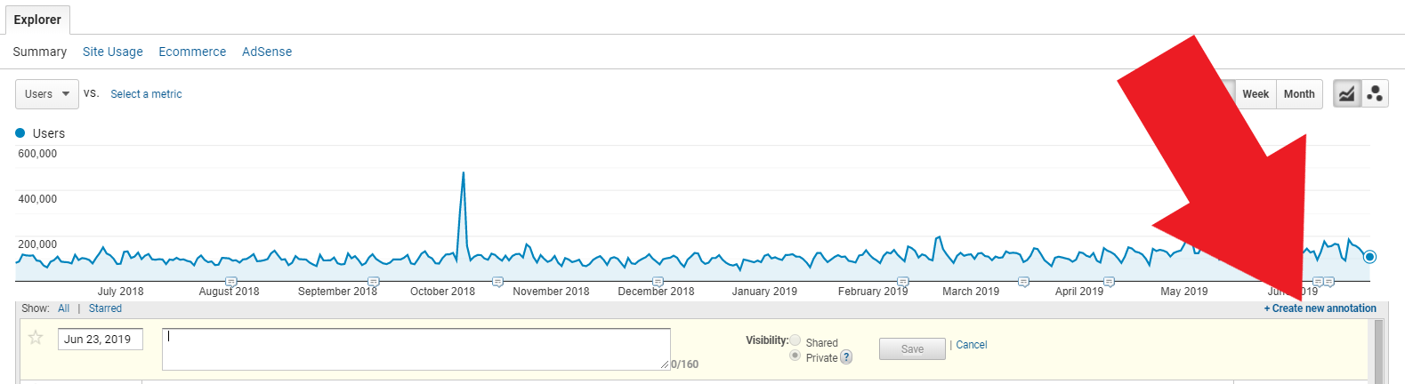
Google Analytics allows you to create custom dashboards and reports so you can quickly access the most valuable data and focus on the KPIs that are most pertinent to your business goals. These dashboards display critical information as they are specifically designed for your needs. However, perhaps you aren’t the only person responsible for looking at these custom dashboards and reports. Maybe you understand the reasons behind any spikes, drops, and other unusual events that appear in your reports, but need a way to keep tabs on why these things happened when. Enter: annotations.
Annotations are simple notes that appear as speech bubble icons along the bottom of an Analytics graph. They can be added by clicking the downward arrow tab icon immediately beneath the graph and then “+Create new annotation”. Aside from recording the note, annotations can also document the date created, the author’s email and be set to “Private” or “Shared” to control who can view the annotation.
 Whether you’re sharing a report with relevant stakeholders and need to explain a certain fluctuation in traffic, need to be reminded of when a content update was made when returning to a graph weeks later, or want make other account managers aware of a promotional campaign that launched on a given day, annotations are a great way to communicate anything of note directly within Analytics.
4. Analyze Behavior Flows to Optimize UX
One of the best ways to improve your user experience is to gain a deep understanding of how your users behave. How are they moving around your site? What pages do they visit, and in what order? Where are they coming from and when are they exiting? Where and when do they convert or drop out of the funnel? Answering these questions can help you discover potential opportunities or problem areas in the user journey, so that you can then prioritize and address them to optimize the user experience. Lucky for you, using Behavior Flow in Google Analytics can help you do just that.
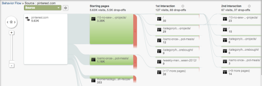
The Behavior Flow report visualizes the path a user follows from one page to the next or from one event to another. This report can give you insights on:
- The most common routes visitors take to get in and out of specific pages
- Pages that are bridges or areas of the site that are conversion hubs
- What content keeps users engaged with your site
- Potential content issues, confusing navigation, or misleading design
- If users are leaving the site when you want them to, like from a “Thank you” page, or right before they convert, indicating a poor customer journey
Additionally, by comparing Behavior Flows to Event tracking- which allows you to track anything and everything that a visitor or a user can click on like CTA buttons, downloadable items, ads or pop-up interactions- you can get a visualization of what within a user flow catches user attention, or not. Analyzing user behavior through Behavior Flows and other means will not only help to improve and optimize the user experience, but produce logical, easy steps that will encourage users towards conversions.
Conclusion
The possibilities are endless when it comes to Google Analytics. The real question is though, how can your business best analyze the data and turn it into actionable intelligence. Enter: a marketing analytics agency, such as Bluetext. A marketing analytics partner will help set up these custom dashboards, pinpoint the key metrics to pay attention to, and help set goals to reach your overall business objectives. Interested in seeing what Google Analytics insights can do for your business? Contact us today.