In a world where businesses are constantly challenged by a sea of sameness, bold messaging and design are crucial pieces of a marketing strategy that can propel you to the forefront of your industry. Flashy websites and digital user experiences are often the first points of contact with target audiences and are rightfully prioritized to engage users and grow brand awareness.
However, when it comes to building a sustainable and scalable brand identity the buck doesn’t stop at those brand entry points – it’s just the beginning. The all-encompassing “content” is not just a hot industry term – it’s the substance that supports every claim you make and validates your brand identity, and the way that content is presented is just as important as that first brand impression.
When it comes to presentation materials, collateral, stationery, and even internal communications, adhering to a thoughtful visual identity will go a long way in preserving and growing the value of your brand. Even non-marketing materials contribute to this. Content is essentially the foundation of your business, the legs of research and product information that your website or sales pitches stand on. Just as you wouldn’t want your home built with a hodgepodge of materials that don’t match in style and quality, you wouldn’t want your business coming across as disjointed and in-cohesive. Arm your employees with thoughtfully designed, professional-grade marketing and sales materials that continue your brand down the funnel.
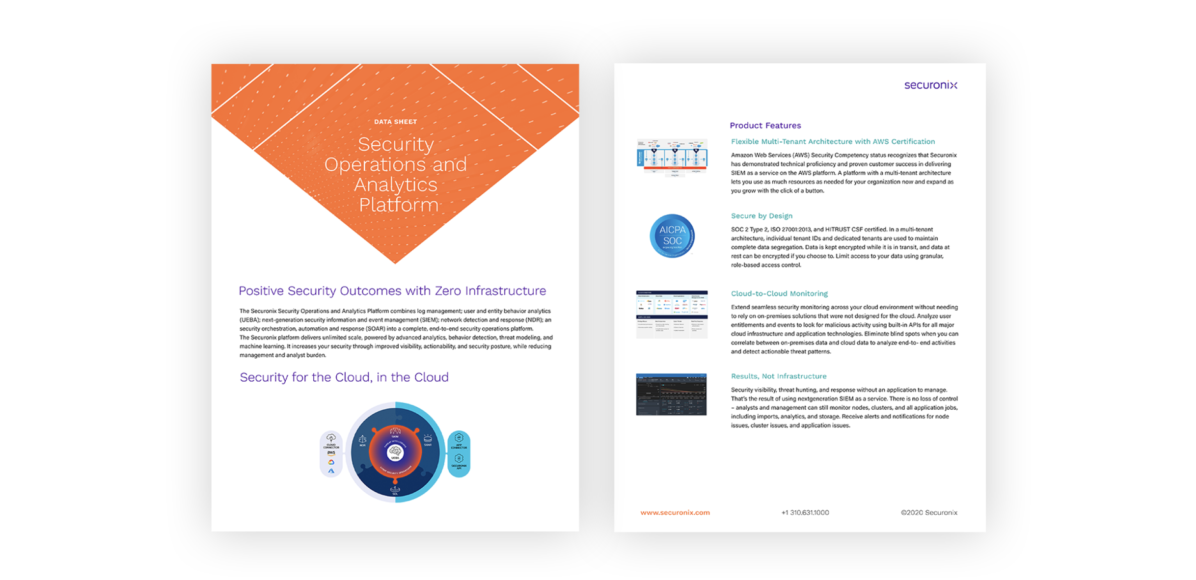
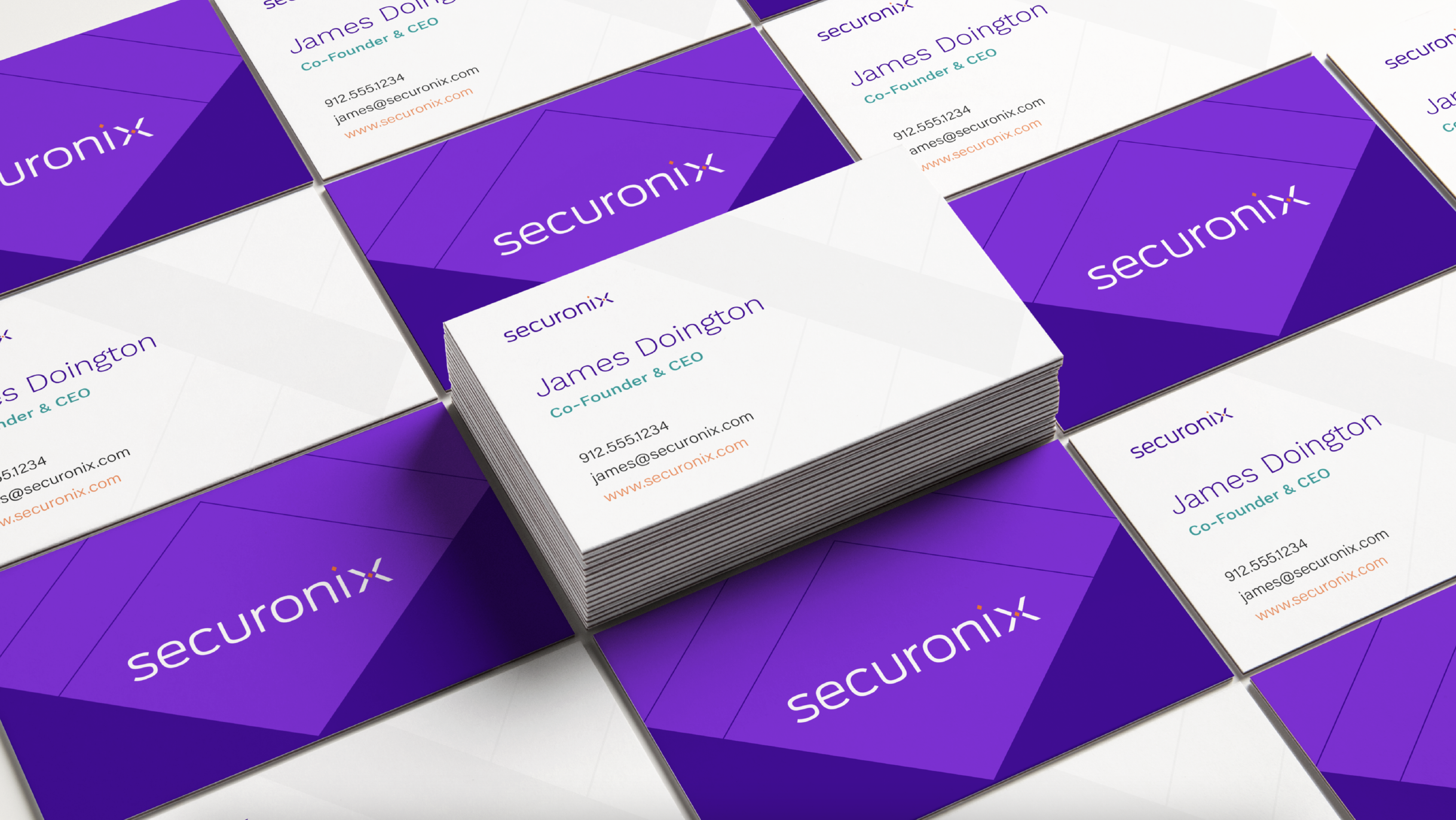
In a crowded market, thought leadership content is table stakes as a marketing and lead nurturing tactic. The way that thought leadership is presented, however, is an opportunity for your brand to stand out. Bluetext was tasked with the programming and design of the Securonix brand identity which included all collateral materials for future PowerPoints, data sheets, product sheets, case studies, white papers, and stationery.

Developing a system of materials connected by a strong brand identity allows that brand story to be carried through to even this lesser-highlighted audience touchpoint. The Securonix website and user experience make an exceptional first impression, but ideally, a user would travel past the homepage into a resource or gated download. If that lower-funnel touchpoint doesn’t resemble the sophistication of a user’s first impression they will naturally become confused or skeptical. If the saying ‘put your best foot forward’ resonates, be sure to keep up the impression at every next step.
That thoughtfulness of the brand messaging and the way it influences their visual identity is carried all the way through to the layout of a data sheet. This elevates content from being just words on a page to being a valuable piece of the greater brand.

In this digital-first landscape, the expectations of B2C and B2B organizations have never been so in sync. B2B audiences and stakeholders don’t just expect high-quality and accurate information, they also expect to be wowed by its presentation. Packaging impressive statistics or insightful thoughts on industry trends in a way that is consistent with your visual brand while also considering the optimal layout that makes that information most impactful is crucial in differentiating that content as well as maintaining your brand identity.
Content is one of your organization’s most valuable marketing and lead-nurturing tools – ensuring that it can stand out in the crowded market is critical in taking your business to the next level. Contact Bluetext if you’re interested in revamping your B2B content marketing strategy.
