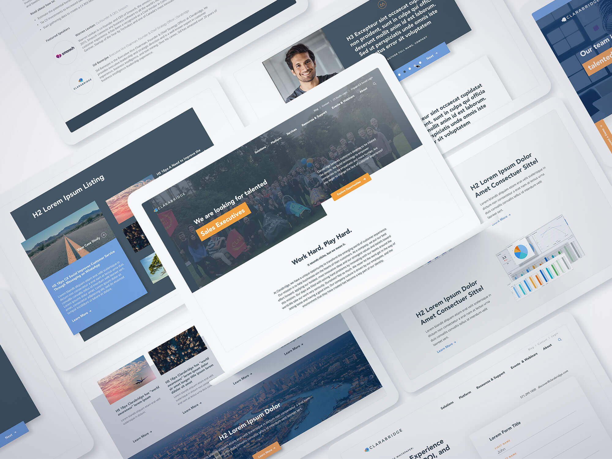
We designed a creative approach to transform the intangible brilliance of Clarabridge’s software into a tangible experience for target audiences. It was something they could see, and seemingly touch and feel, to carry that message throughout the website and convey the value it could bring to every brand’s customer engagement.
Creating a successful digital web design can mean the difference between growing your customers and losing them on your website doorstep. For Clarabridge, which delivers a better customer relationship platform for its clients by leveraging artificial intelligence to sort through complex data, providing clarity with its website was critical. It turned to Bluetext to unify its various website platforms into a single customer experience.
Clarabridge’s challenge was fairly straightforward: Its clients’ own customers constantly provide feedback through a wide range of information channels, from direct contact to social media and everything in between. Yet, that same explosion of these channels and the sheer volume of data creates significant challenges on how to make sense of it all. Telling that story on Claribridge’s digital platforms had been confusing. It needed a better way to tell its story.
To address the digital web design, Bluetext used digital storytelling, brand extension, a sophisticated user experience, and aggressive search engine optimization to deliver a new website that does what Clarabridge promises for its customers – turning complexity into clarity. You can view the website live here.

The digital website design begins at the top of the home page, with an engaging animation that represents the massive amounts of customer data and feedback flooding into their clients’ systems. Flowing down the page, moving through a funnel that sorts and selects the right information at the right time, the graphic turns the data into actionable snippets of intelligence that can be fed to executives, product managers, contact center teams, and frontline staff to better serve their customers.
The creative style of the digital web design pushes the boundaries to enable Clarabridge to stand out in a crowded industry, while the linear path of the video animation delivers the product messaging in a creative way that gets attention while taking audiences through the sales funnel. To see the design in action, visit our Bluetext Hall of Fame.
“Bluetext should be at the top of your list if you are in the market for a redesign.”
We’ll let our client speak for the project results:
“When we started our journey to build a next-generation digital platform we challenged BlueText to create a unique, engaging user experience that tells the Clarabridge story in an impactful way. Bluetext knocked it out of the park! It created a modern site design that breaks through the clutter in our crowded industry; an A/B homepage that greets new visitors with a video narrative providing a concise understanding of what Clarabridge does while recurring visitors receive a streamlined, mobile-optimized view of the site.
Beyond that, the custom backend CMS is beyond easy to understand, creating significant efficiencies for the Clarabridge team. Lastly, where they truly excelled and what I will miss most, is working with such a top-notch team of experts. Their customer service and ‘deep in the trenches’ support during the project was critical. This was hands down the smoothest site launch I have participated in. BlueText should be at the top of your list if you are in the market for a redesign.”
Carrie Marty Carroll
Vice President, Design (Brand.UI.UX)
Clarabridge