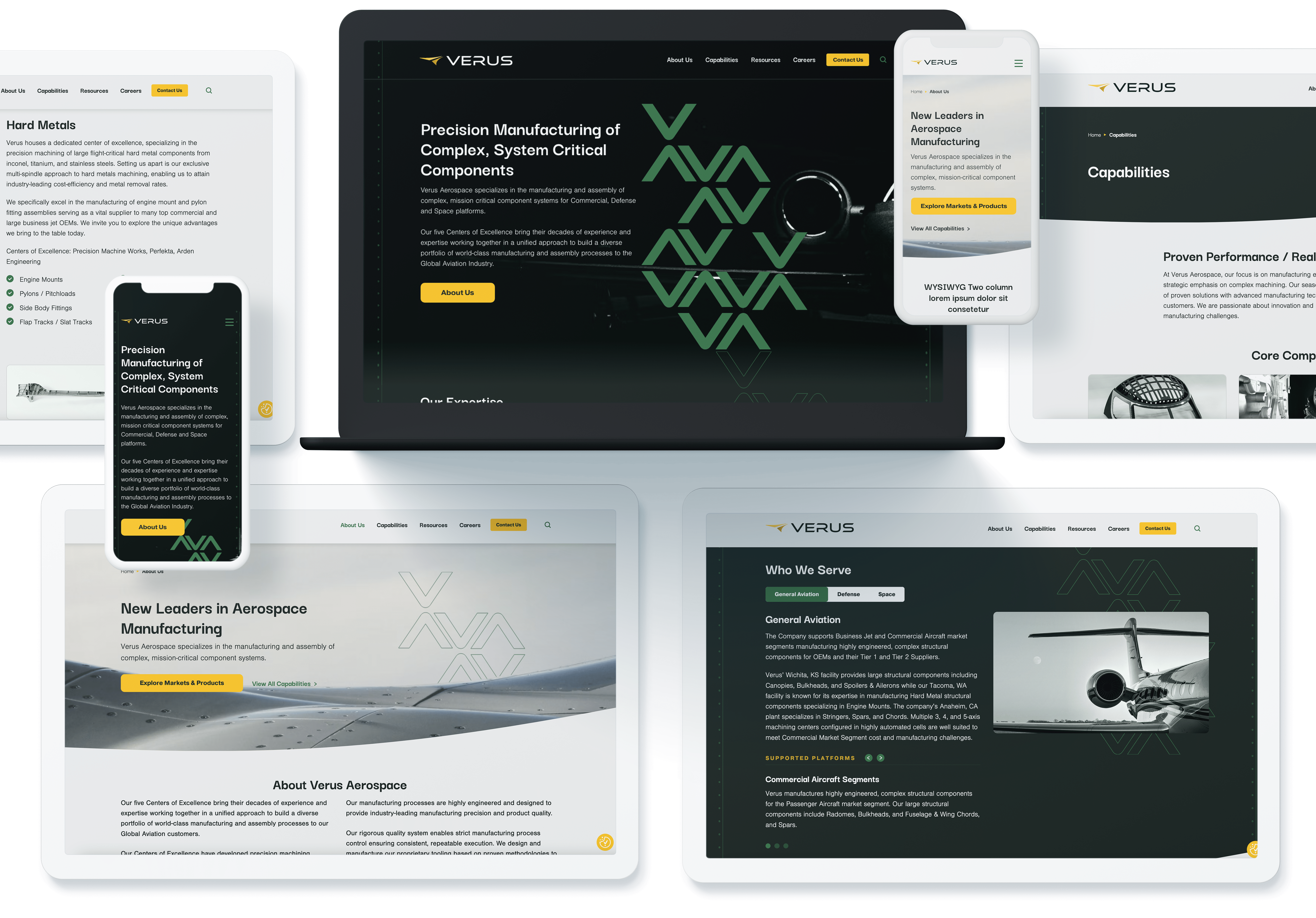

Re-Naming and Logo Creation for Verus
Bluetext explored names for Verus that would convey the idea of precision and exactness that is crucial in the aerospace manufacturing industry. Verus is a Latin adjective meaning true or real. It was chosen as a short, easy to remember brand story that speaks to the exacting performance and reliable partnership at Verus facilities.
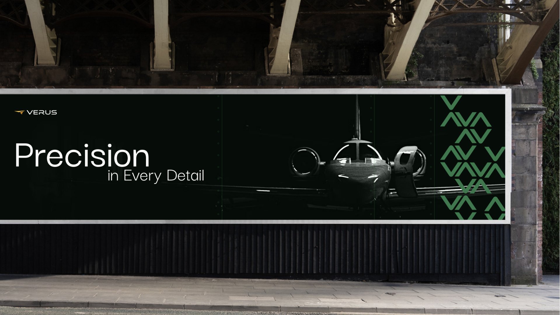
The Verus Aerospace icon was designed to emulate pillars of the Verus brand identity: precision, craftsmanship, and the sophistication inherent in intricate hard-metal and aluminum high-speed machining. Its contours subtly mirror the tail of an airplane, and the dynamic angles within the icon embody the continual progress and advancement of the Verus brand.
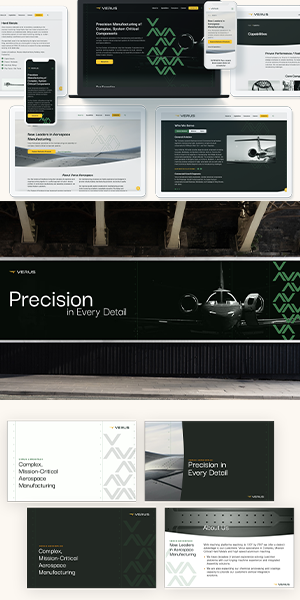
Custom Collateral for the New Brand
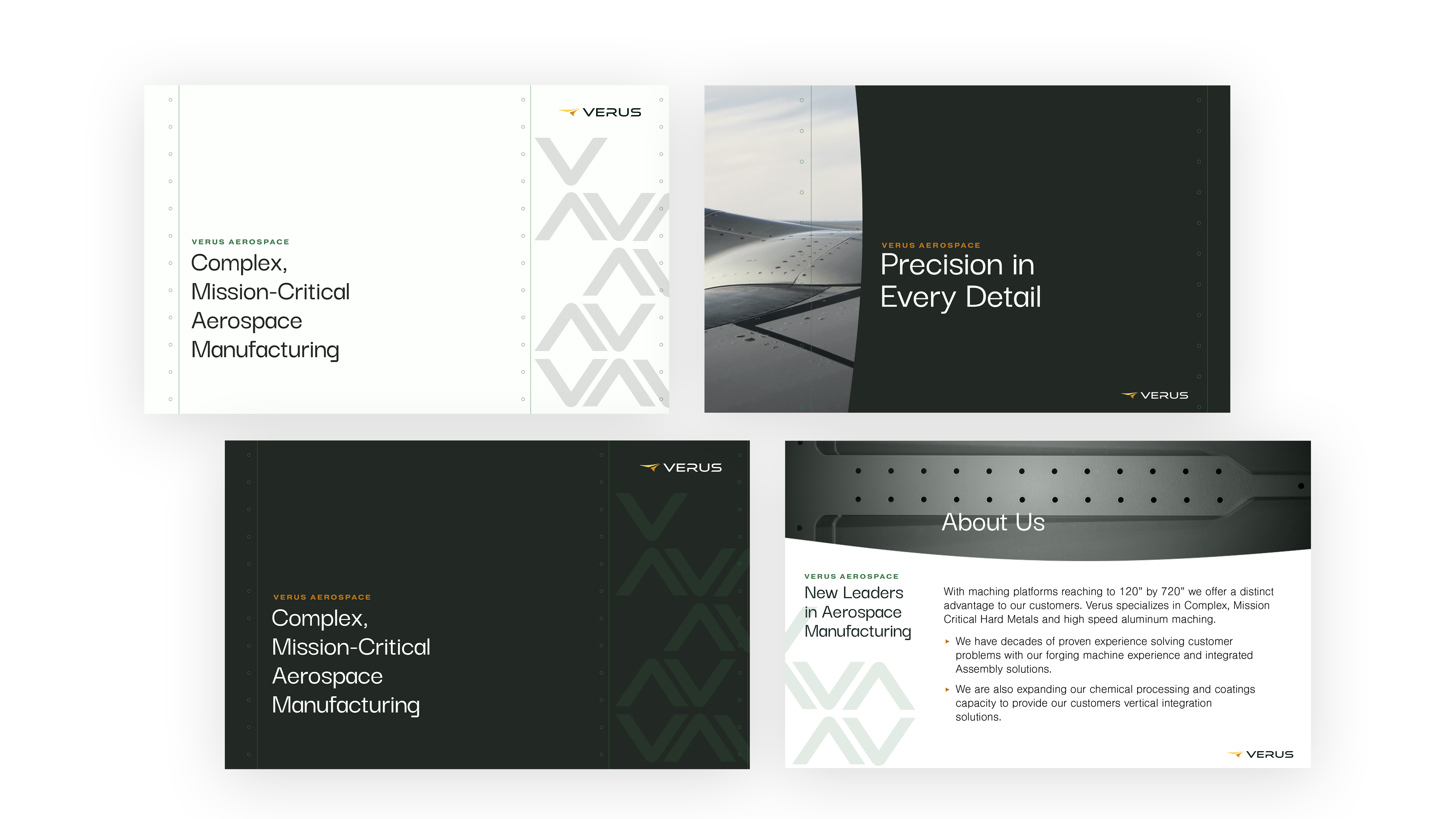
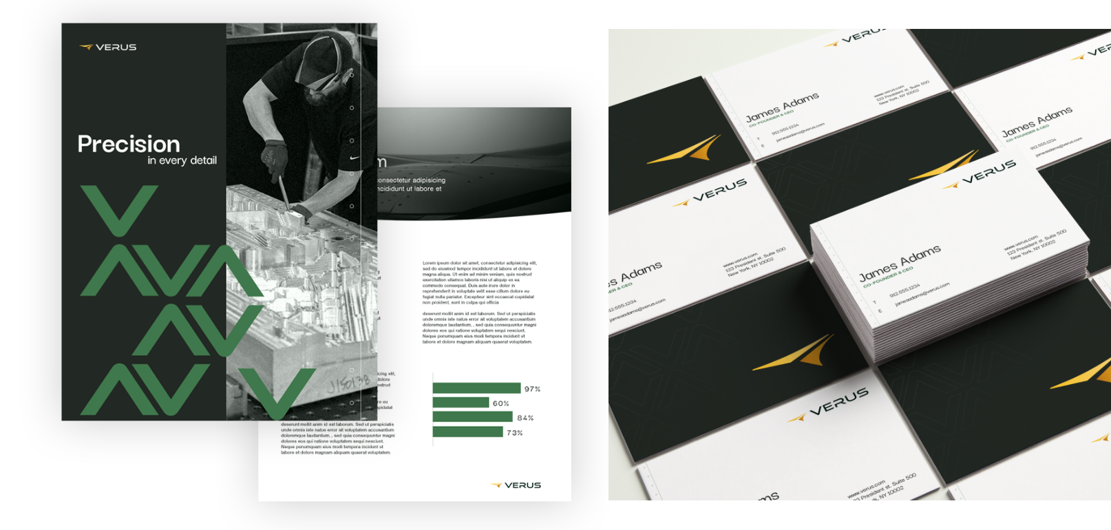
Bluetext created numerous collateral pieces that showcase the diversity in how the new Verus Aerospace branding can be applied. While the core pieces of the brand (the V pattern and the rivet pattern) are kept consistent in various applications, the brand identity also has the flexibility to be extended across varied digital and print assets.
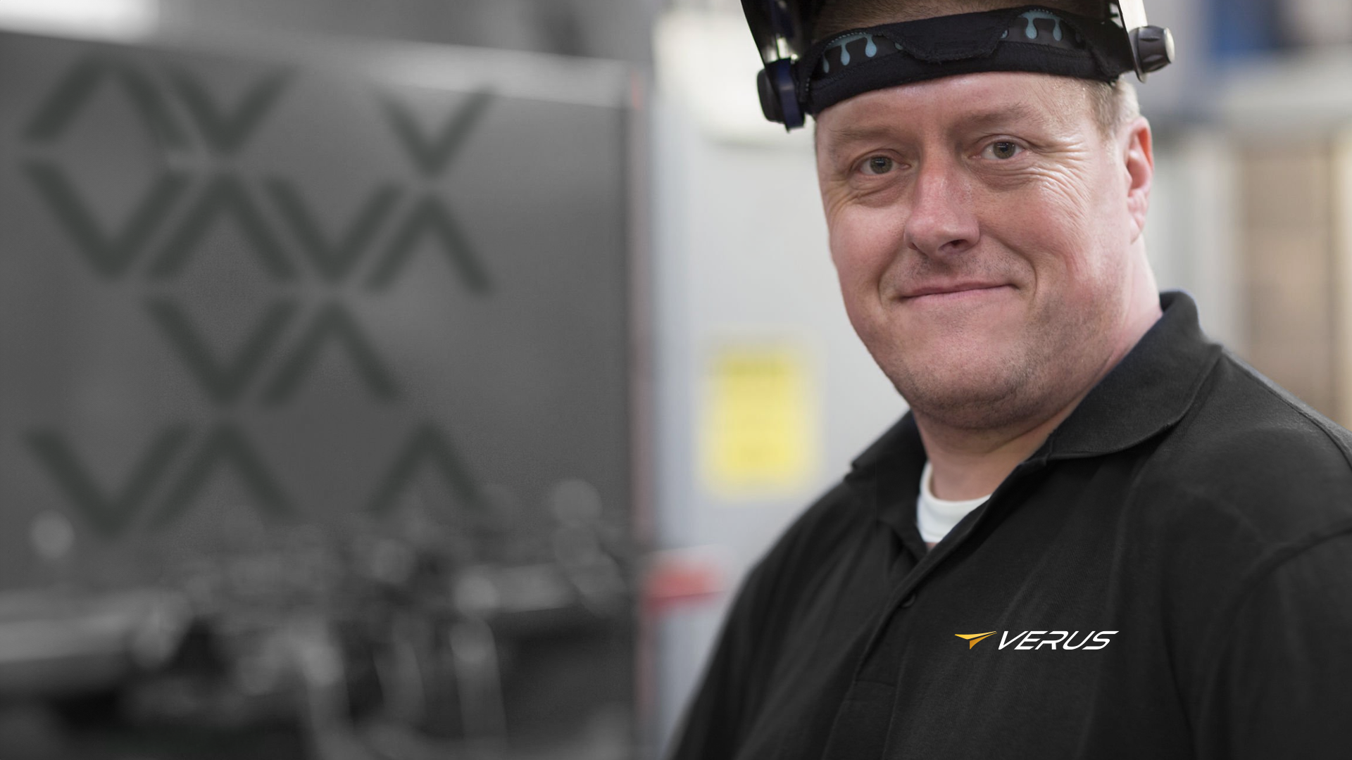
Each visual element relates back to the identity of the Verus brand within the aerospace manufacturing industry. The V pattern represents more figurative energy and connectedness of the Verus company while the rivet pattern is more literally derrived from the rivets found in aircraft structure.