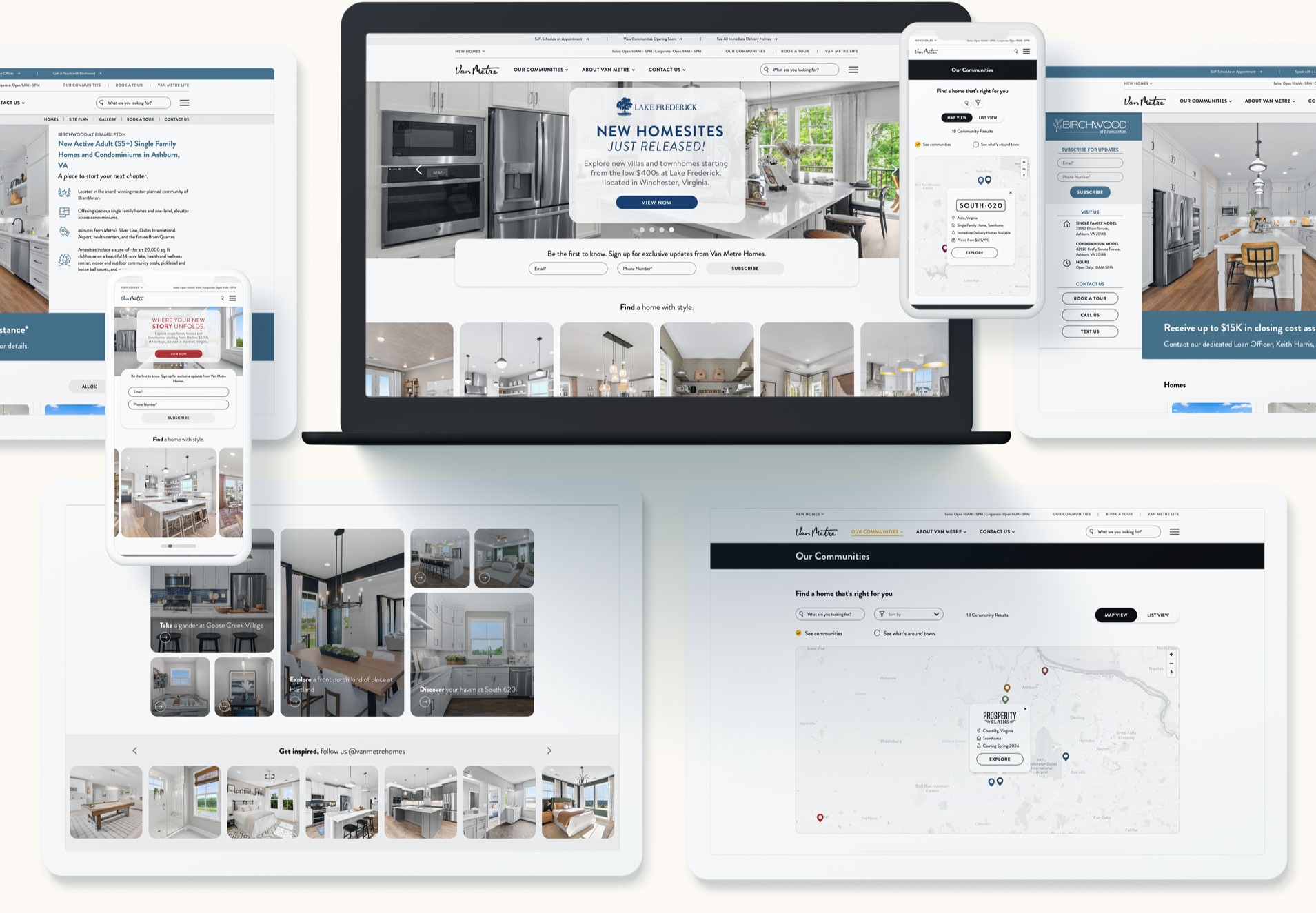

Responsive Design: A Mobile-First Experience
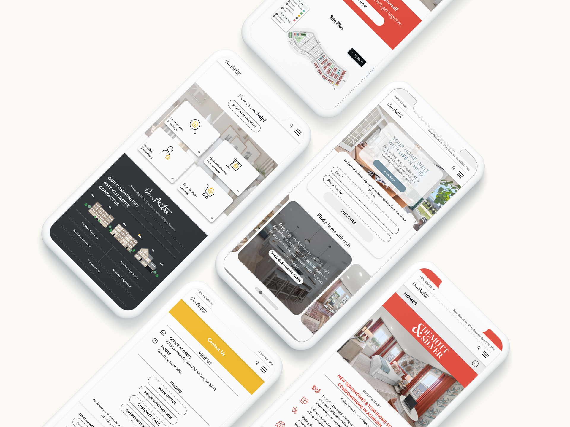
A major consideration for the Van Metre Homes website design was that a majority of their users browse the site from a mobile device. Bluetext worked closely with the Van Metre team to make improvements on existing designs to better serve the mobile user experience. Mobile interactions were considered in detail for every component, ensuring that the site is not just exciting to look at, but also easy for users to understand and navigate from a mobile device, given the depth of content on the site.


Showcasing Distinct Communities
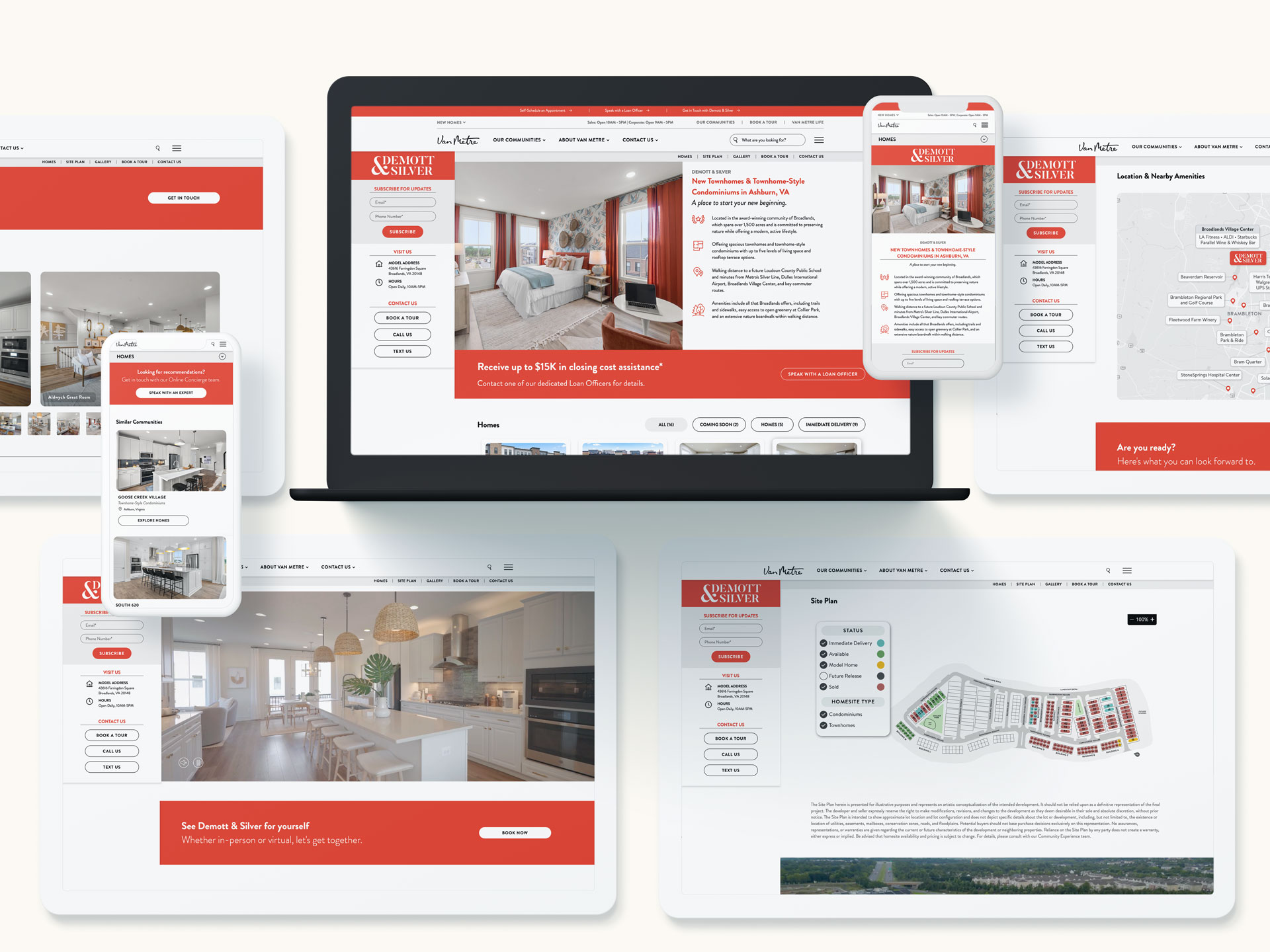
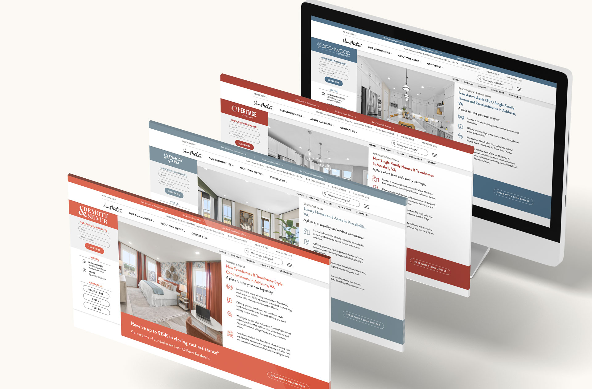
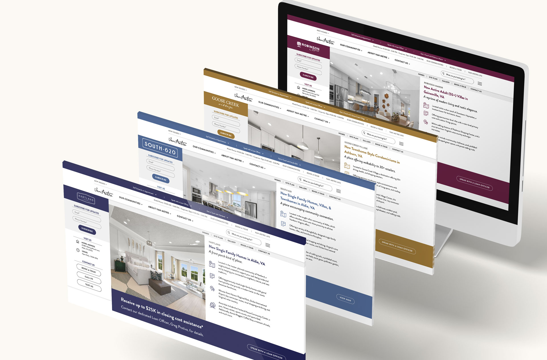
Each community is identified with its own unique brand color. With 18 communities managed by Van Metre Homes, Bluetext developed components to be highly flexible so that the background colors, CTA colors, and text colors could be individually adapted to suit the community, without breaking the consistency of the site design. The Bluetext team also worked alongside Van Metre designers to advise on how these colors could be adapted to meet accessibility standards.
The end result is a user-friendly website experience that includes informative color changes while maintaining a consistent user experience across communities.


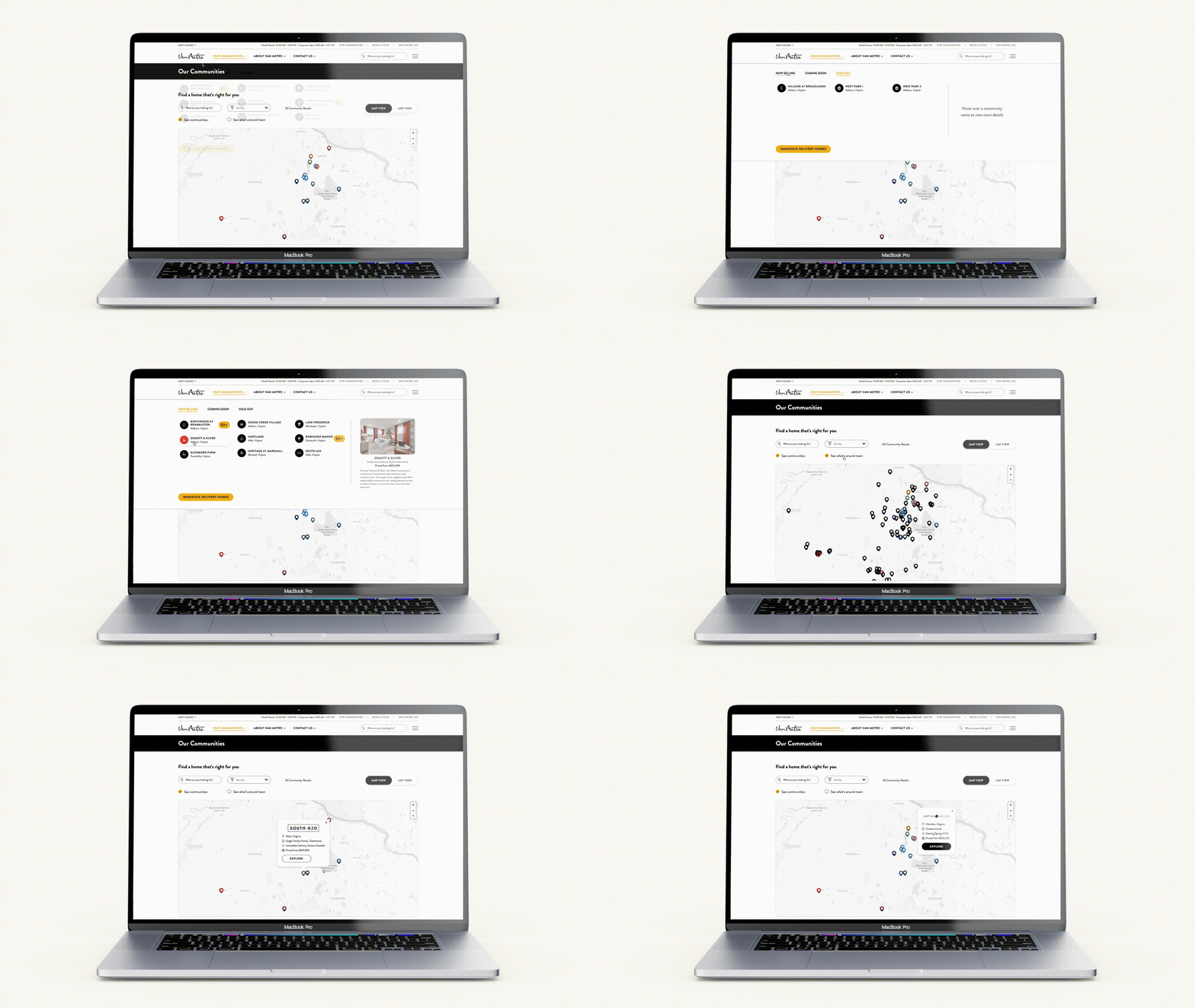
Interactive Map
Using an API integration, the Bluetext team was able to build this highly customized interactive map. With unique pin styling and filterable functionality, this map is highly useful for users and easy to maintain for site managers, as all the information updates dynamically when community information and points of interest are added to the site.
