
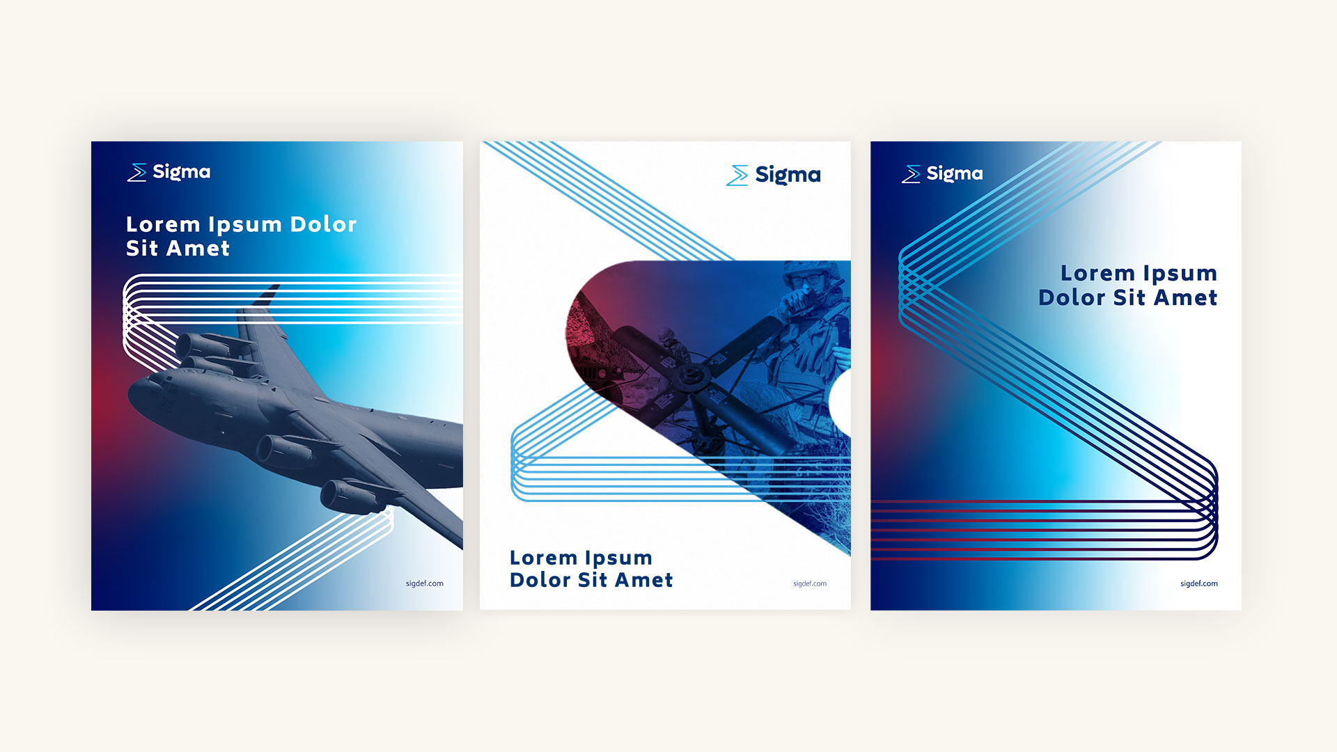
Brand Redesign
“Sigma” is the Greek letter meaning “sum of all parts”. The Bluetext creative design team came up with a modern new Sigma icon, seen in the company’s logo, that both looks like the Greek letter while also representing lines of communication. A key brand element, the line pattern that is at the heart of the new Sigma brand is derived from the sigma letter and coherent communication, connectivity, and progress.


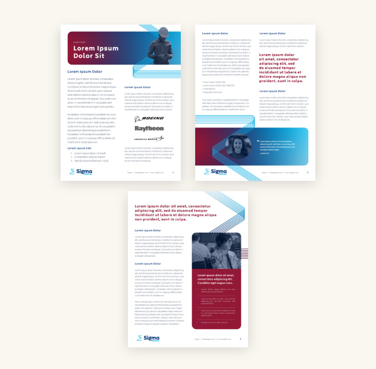
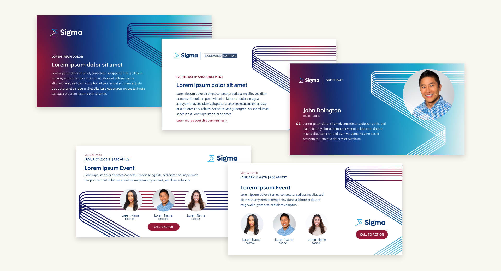


Content Collaboration
Sigma is a small team, so content creation for the new website was a challenge. Bluetext supported Sigma in the content review process to ensure that all content was on-brand, technically correct, and fit the website components. Collaboration across project teams was key in delivering this project ahead of schedule.


“As a result of Bluetext’s B2G domain expertise, our team was able to ramp up into the engagement fast. Harnessing the integrated capabilities of our team, we were able to provide Sigma Defense with a scaleable, ownable design system as they themselves grow as a business.”