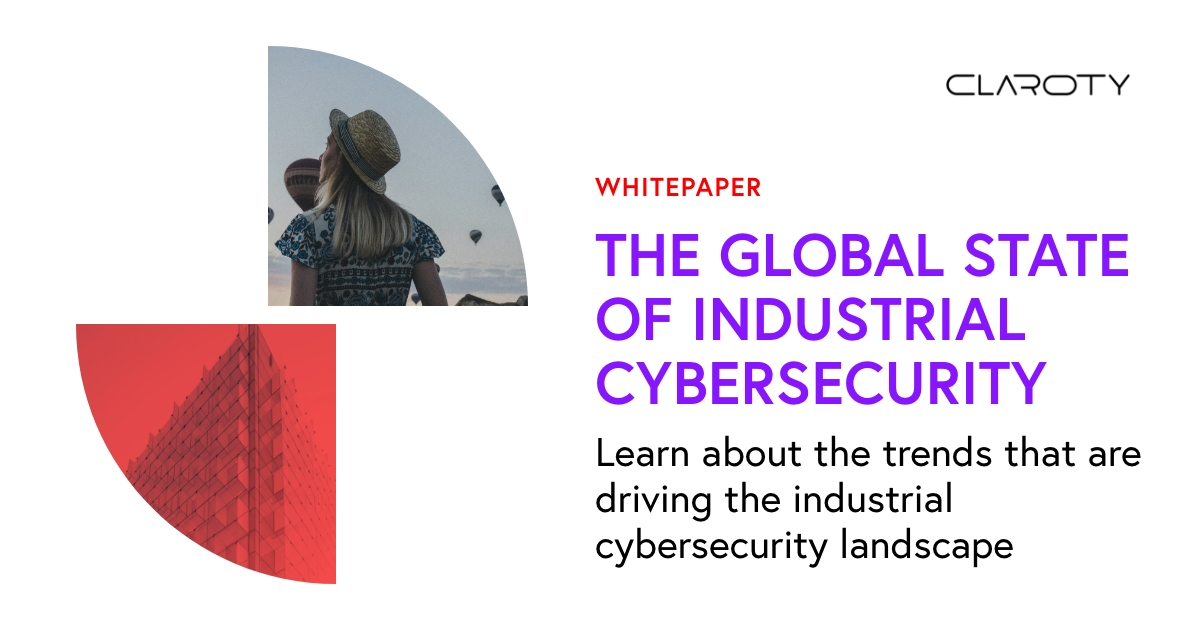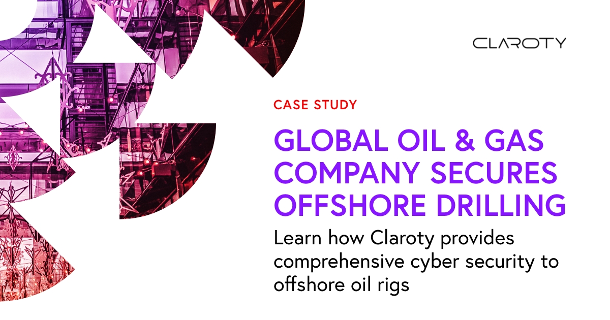

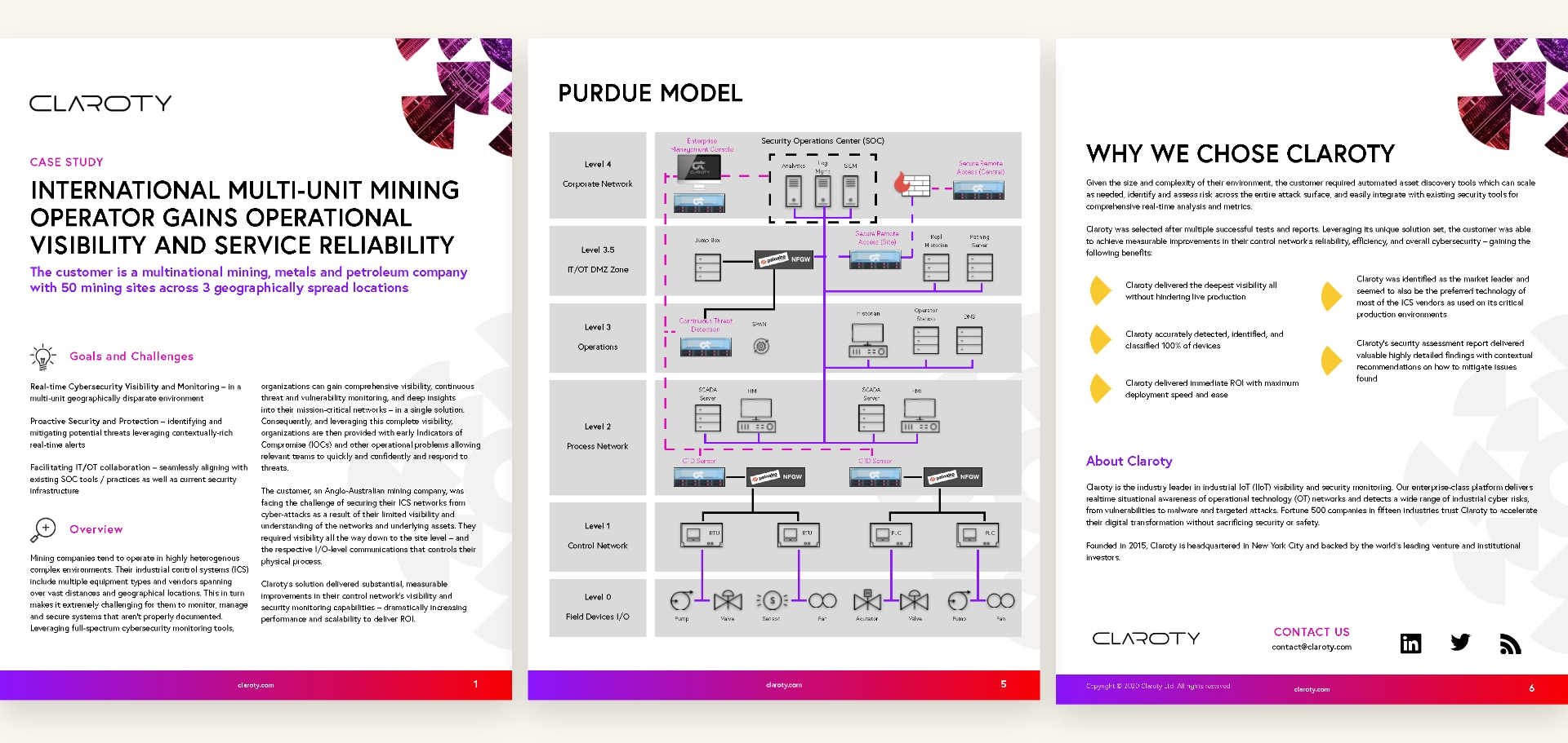
Revived, Radial Branding
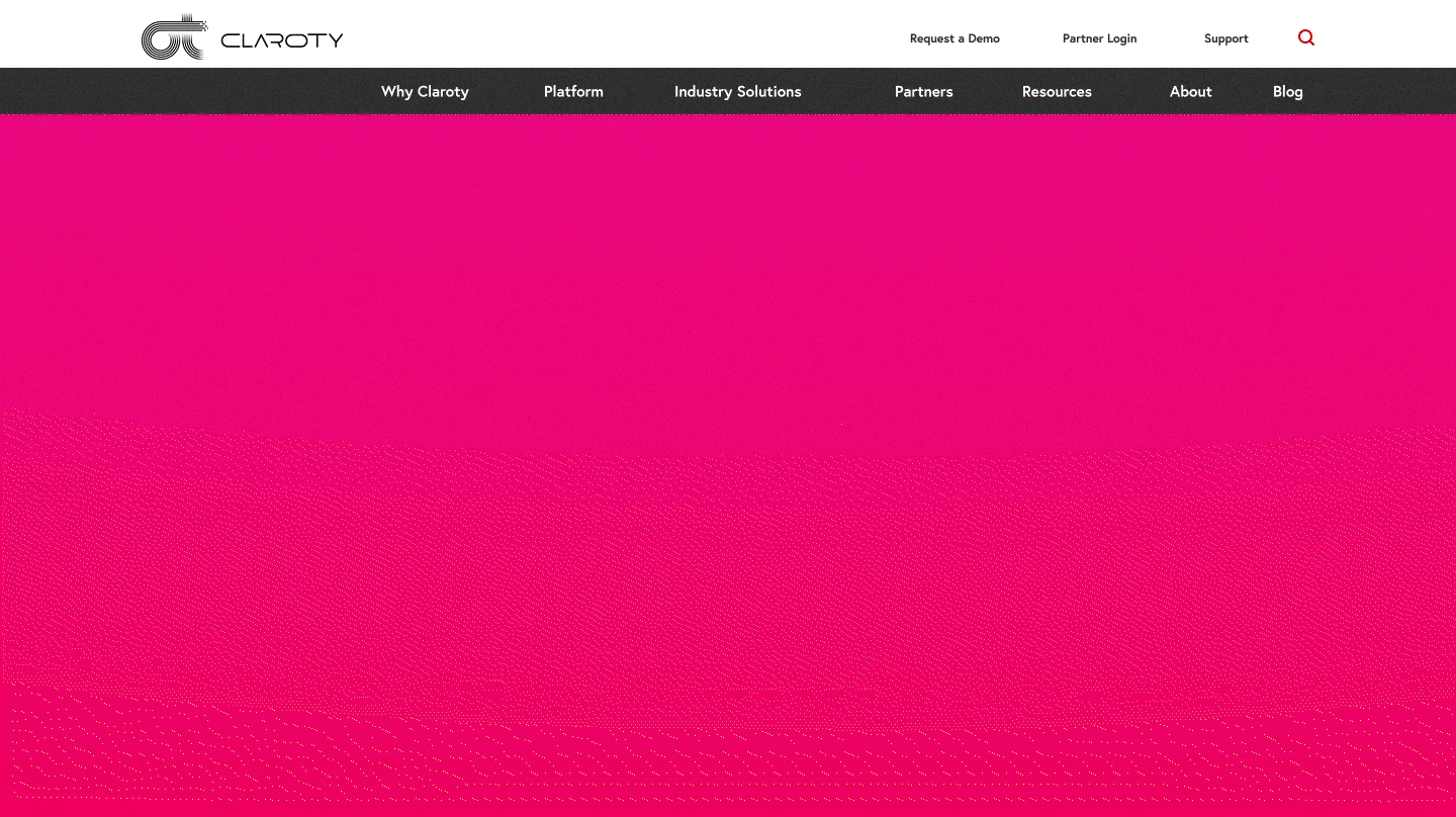
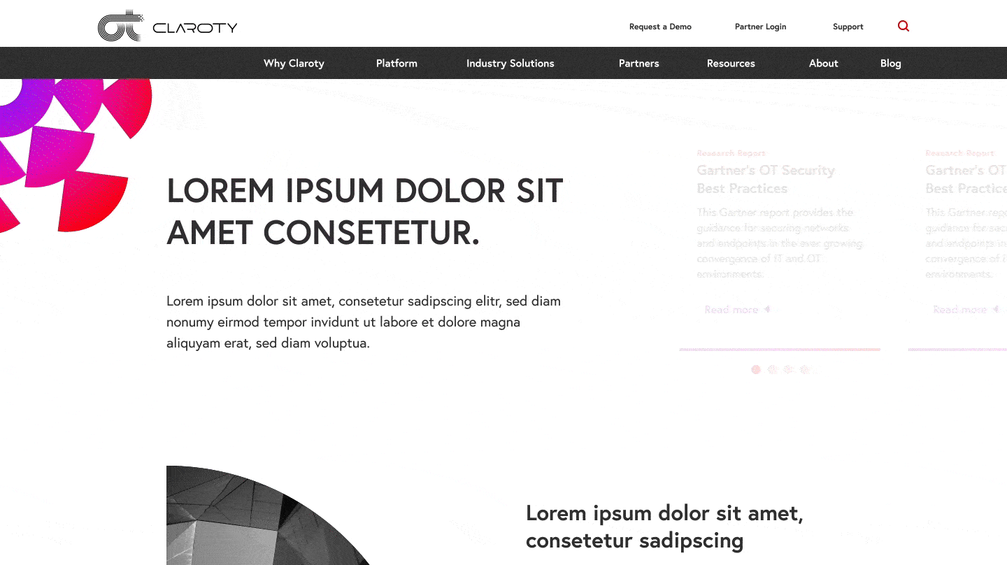
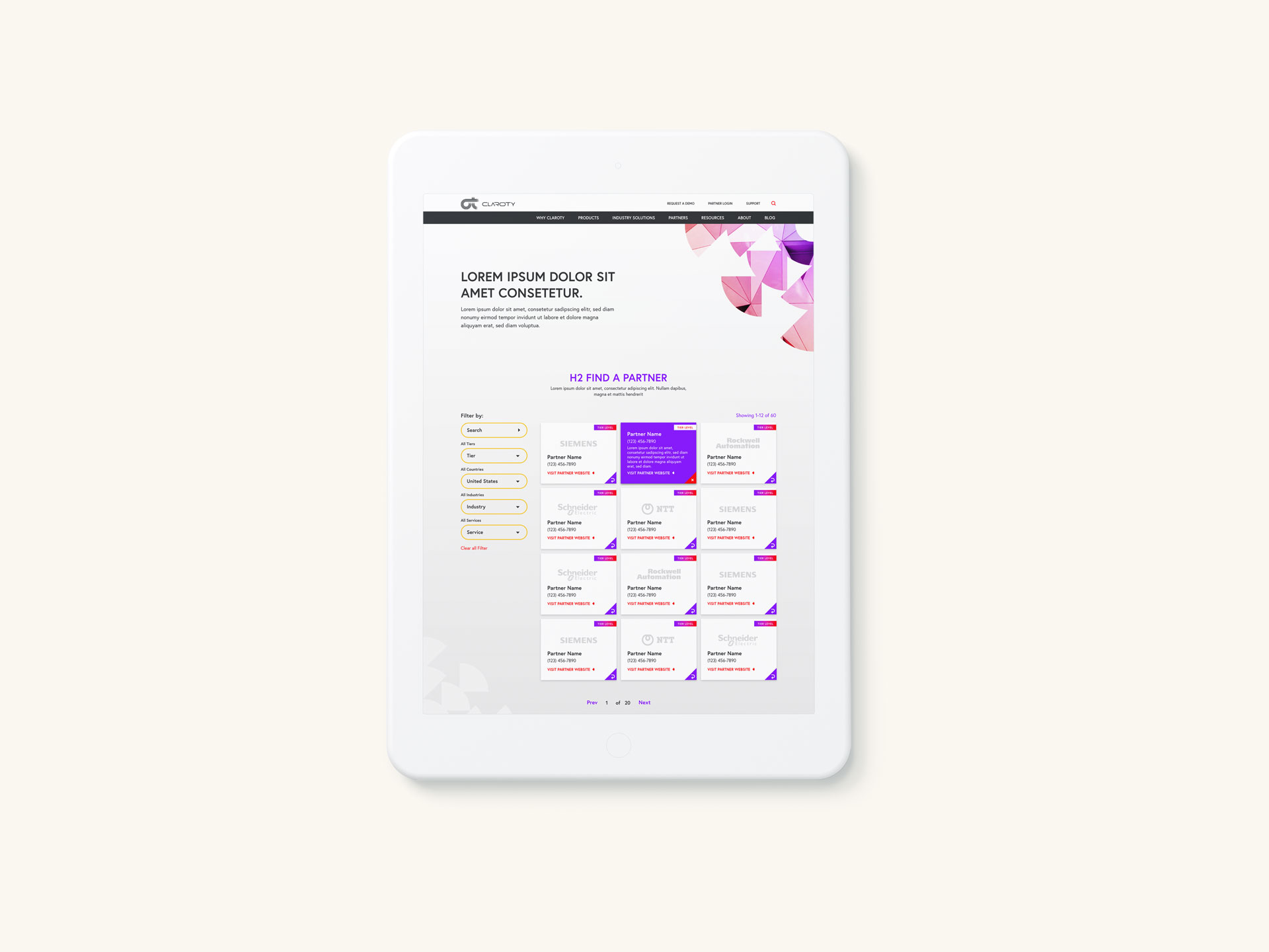
Inspired by the Claroty platform's full spectrum visibility, Bluetext created a revived brand identity centered around the radial designs and shapes of a kaleidoscope. A thoughtfully curated key art library was created to visualize detection from every angle of enterprise business. While the rest of the cybersecurity landscape plays in cool-toned blues, the Claroty brand features a vibrant warm palette of reds, yellows and purples. The red-to-purple gradient was leveraged across imagery, negative space, and key art assets.
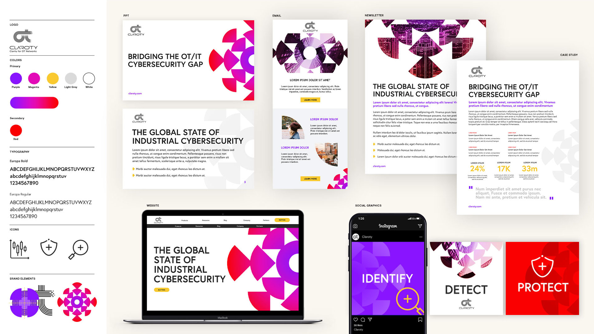
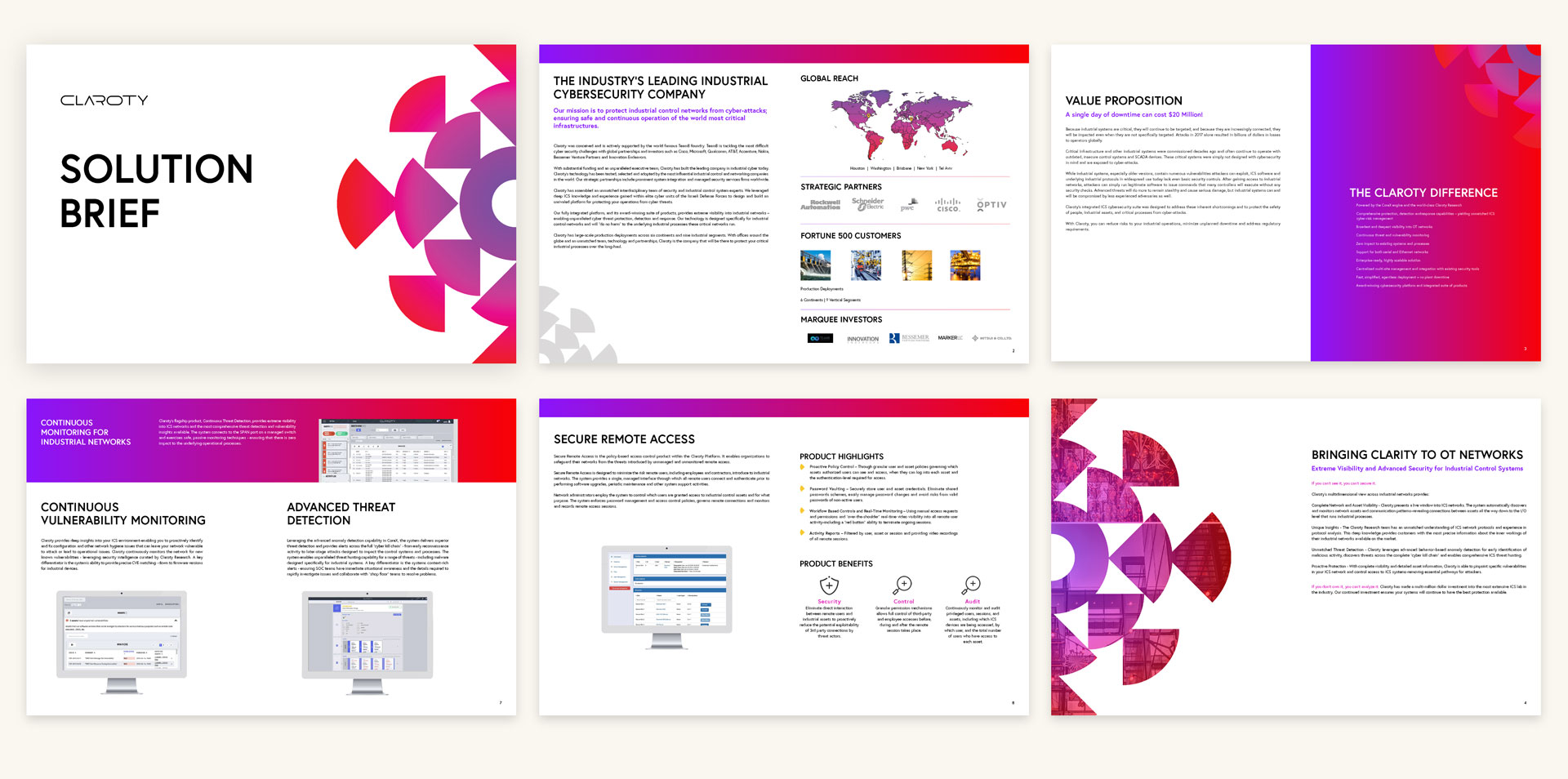
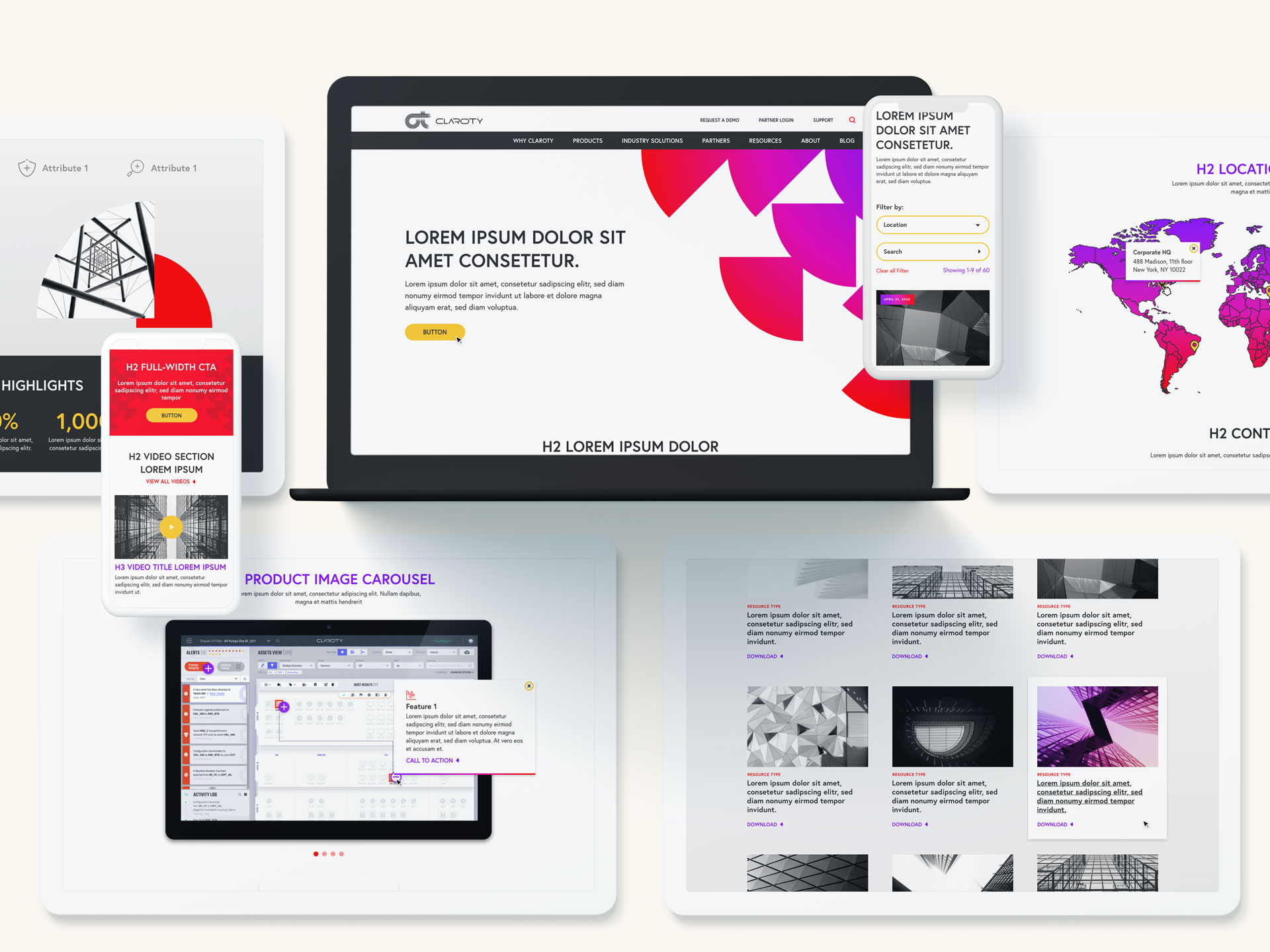
Motion Rich Website Design
With a revived brand identity, Claroty needed a new website design and functionality that reflected their breadth of solutions and level of expertise. Custom website templates were designed to highlight featured whitepapers and briefs in top hero zones, house interactive product feature sets, video assets, and color-changing hover states. The entire site was animated with sleek movement and encouraged user journeys toward key calls to actions, gated resources, and global partner locator. Developed with WPML compatibility, the entire site was also translated in multiple languages to reach global audiences.
Valued Resource Promotion