
Logo Design for Logistics
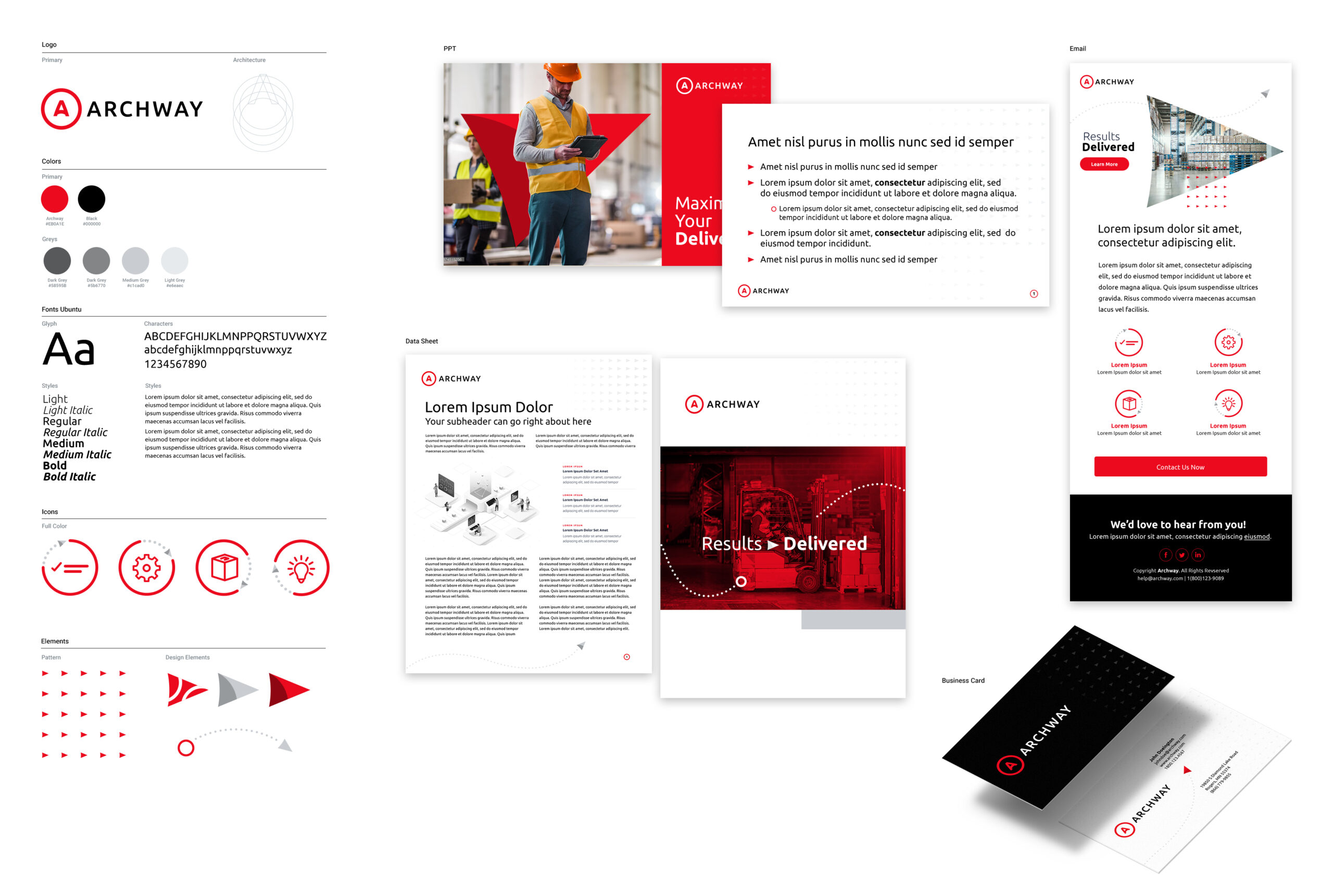
Bluetext analyzed the competitive space to identify opportunities for Archway’s brand to stand out. Since the vast majority of competitors leverage a cool, blue-centric color palette, the decision to embrace the red and black scheme from the old branding was obvious. Bluetext injected new life into the brand by brightening the Archway red and introducing a subtle change to the logo to incorporate an arch into the Archway ‘A’.
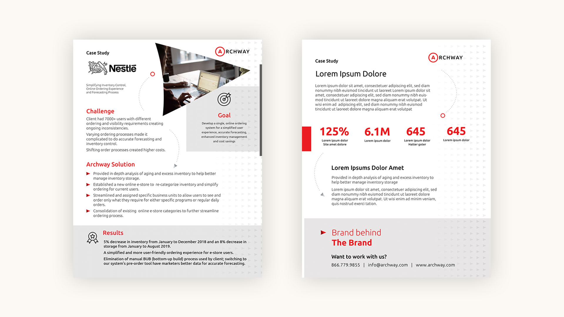
The Brand Behind the Brand
As a nod to the supply chain-related services Archway provides, the key elements of the new brand evoke a sense of linking steps in the process and forward progress. The arrow shape seen throughout collateral was developed based on the negative space in the new Archway ‘A’. This shape takes many forms: as an image mask, as bullet style, as a texture, and even as a standalone element.
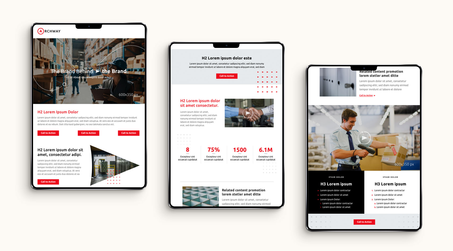
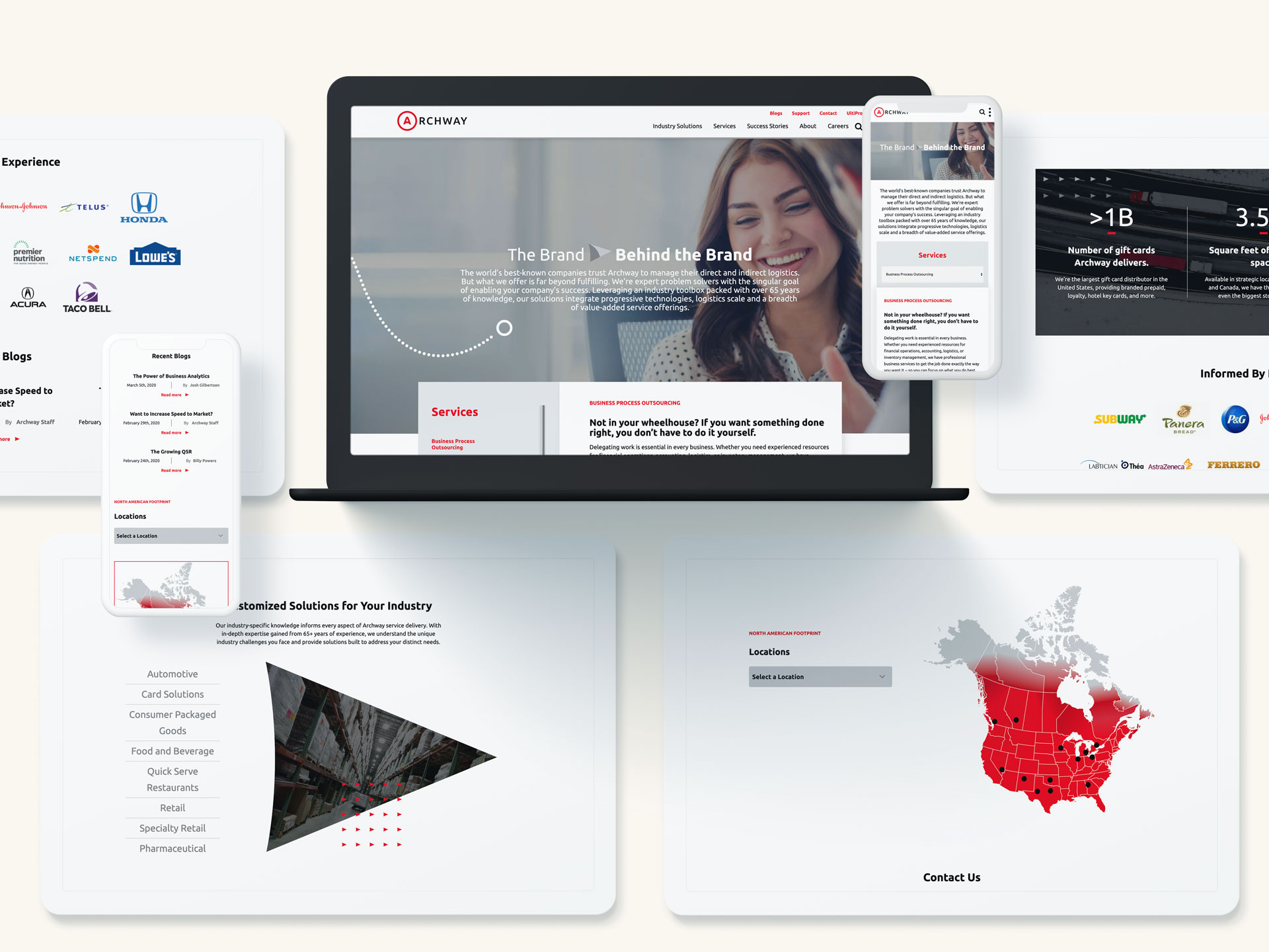
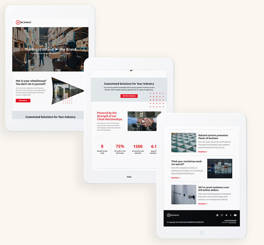
Revamped Website User Experience
Bluetext designed a top-of-the-line user experience for the new archway.com. The site was developed on a custom WordPress content management system (CMS), so it’s just as easy for Archway’s content editors to manage the site as it is for end users to browse the pages. The experience is 100% responsive, so all of the functionality—including an interactive map—is optimized for desktop and mobile devices alike.
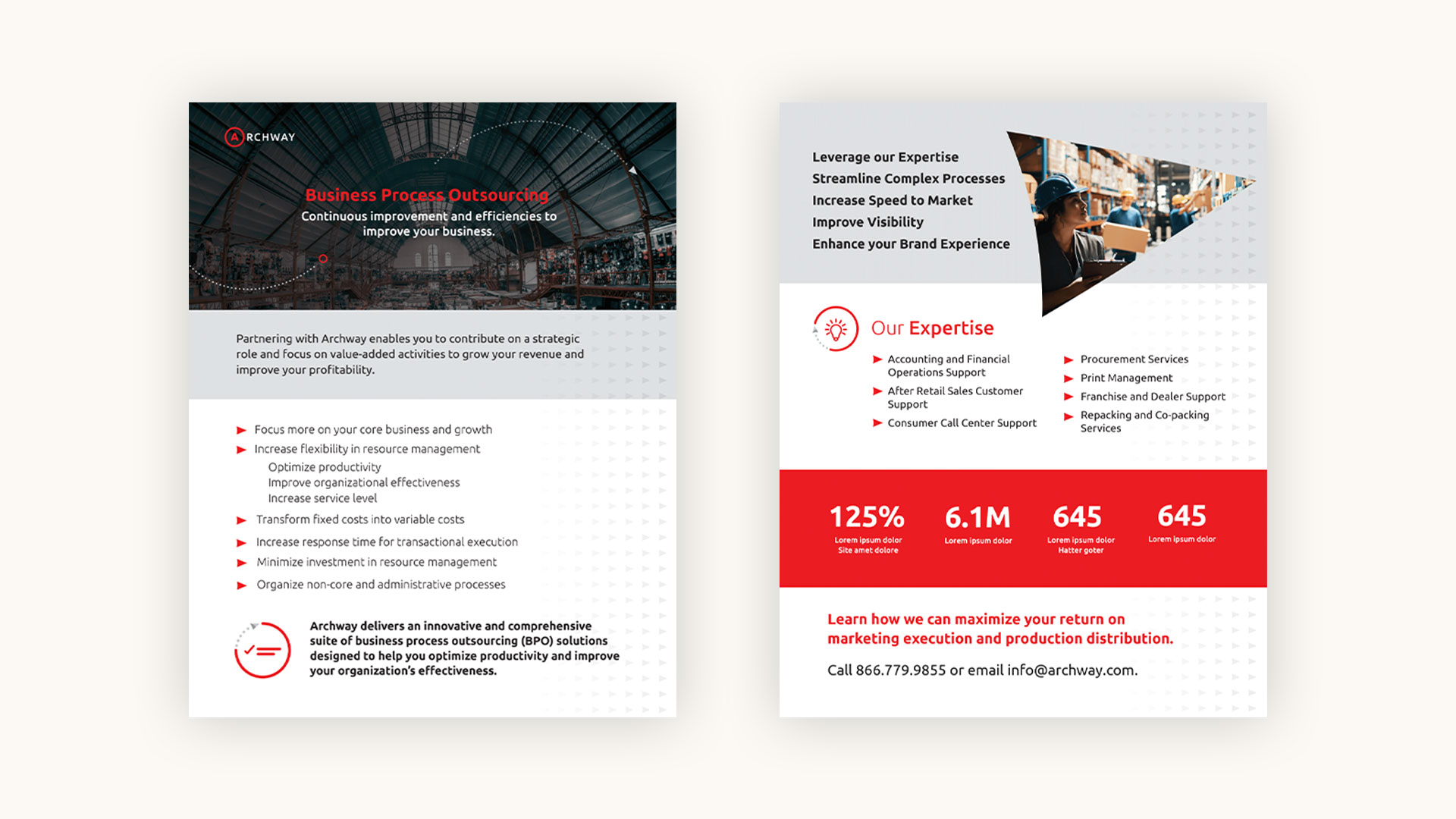
Go To Market Advertising