“Out with the old and in with the new” is our motto heading into 2024. Based on our UX and website design experience, we foresee static websites on a one-way train out. This trend has been long and coming, and it’s about time to improve your website user experience by incorporating more interactive design and animation to improve brand equity.
What is Interactive Content?
Interactive content can be seen as two-way content. Traditional written and video content is static, meaning website users passively consume information. Simple and straightforward, but limited. With static content, people can only engage with content by clicking, hovering, and answering questions.
Interactive content serves users relevant information in a process. One that can be made fun and engaging, without bordering on burdensome. You’ve already come across this type of content format on different websites. Some examples include calculators, quizzes, surveys and polls, interactive infographics, and interactive timelines.
Interactive Content Gives Value to Users in an Engaging Way
Interactive content makes your content easier to digest by taking difficult information and providing it in bite-sized pieces. It transforms their experience from boring to interesting.
When you leverage interactive content, you can personalize information for your users by incorporating quizzes or calculators and providing them with content that’s relevant to them.
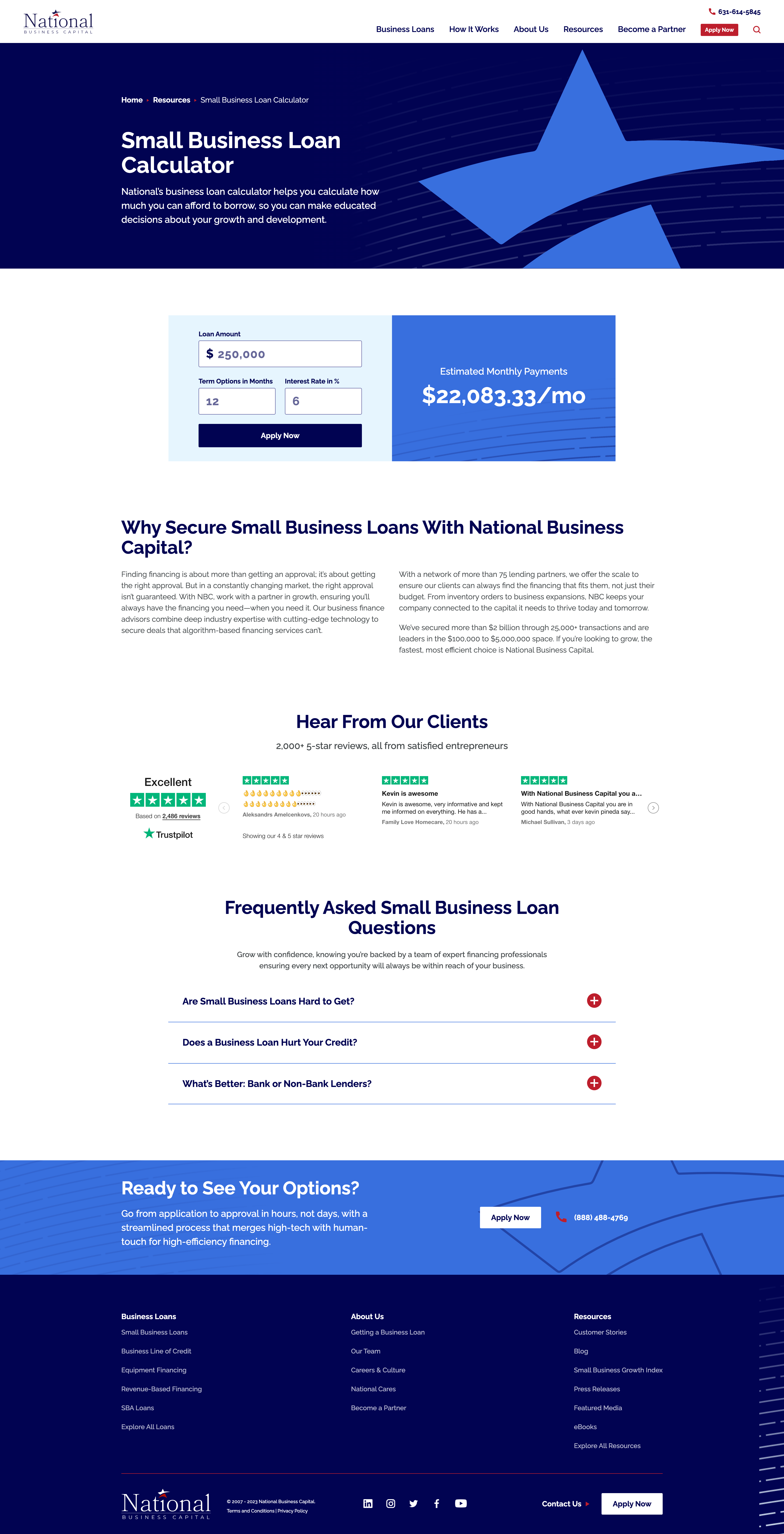
When National Business Capital turned to Bluetext, they sought an interactive calculator that would provide users a quick snapshot of their monthly payment if they chose National as their lending broker. The user simply needs to enter their loan amount, term length, and interest rate and the calculator provides an immediate estimate of their monthly payment. If they click “Apply Now”, that user’s information is captured and reduces the length of the application form, ultimately improving their experience.
Redefining Interactive with Animated Infographics
If you are looking for ways to improve the visuals on your website but can’t necessarily build out a fully interactive webpage, then you should consider animated infographics in your 2024 website redesign.
What exactly is an animated infographic? An animated infographic is a way of visualizing information using a combination of imagery, illustrations, charts, graphs, text, and other elements that are animated, to add movement.
When infographics first gained serious traction online, they started as static illustrations. They would often take the form of extremely long images you’d need to scroll through, but they had a certain charm to them. Shapes, colors, illustrations, and an easy-to-follow structure are big reasons why static infographics work. All that scrolling and slow uncovering of new information was exactly what made the experience enjoyable. It’s not about the destination, it’s about the journey. But here’s the catch, not everyone has time or attention for this long and leisurely road trip. Static-form infographics certainly have their strengths, but digital marketers must be wary of attention spans and the volume of information packed into one design.
An animated infographic will have a much better chance of being noticed, opened, and looked at. With today’s “snackable” content on social media, we need to improve the way users can digest this still somewhat “lengthy” content, and animation is a great way to do just that.
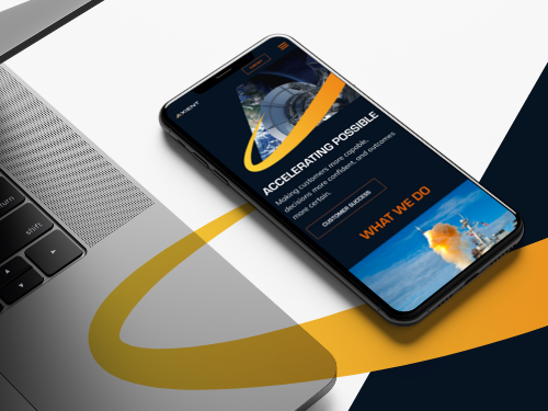
When Rithum™ turned to Bluetext to help bring their offering to life, Bluetext designed and developed a 3-D animated infographic that provided a memorable visual experience for the user, easily establishing and providing them with the information they need to understand the Rithum Network and Platform.
Interactive and Animated Content Will Make Your Brand Memorable
Remember, adding more colors to visuals increases readers’ attention span and recall by 82 percent. So, incorporating animated infographics into your existing content marketing strategy can yield great returns.
Ready to design and develop your next interactive or animated content? Contact Bluetext today.
Recent Posts
Bluetext’s Recent Work