The Bluetext Blog has been focusing on website design for the best user experience. In this post, we are examining five trends that companies need to understand as they examine the performance of their website design and whether it is delivering a successful user experience that is delivering results for the brand.
Cards are Taking Over. Card first became popular in consumer-focused social sharing sites such as Pinterest and Facebook for placing clusters of information – including text, photos, and links relating to one topic – in one place. For 2018, they are already gaining in popularity and offer a visually appealing way to organize and display larger data content in a smaller space. Cards also allow visitors to quickly assess the category of information and decide immediately whether they want to click on it or not. They are easy to manage and companies can select different arrangements and sizes to emphasize some types of content over others. Because of this obvious advantage, particularly on a smaller screen, cards are moving into the mainstream across all platforms.
Don’t neglect the touch. Mobile devices are physical objects that hit a number of our senses, most prominently sight and sound. But the feel is also important, and shouldn’t be neglected. Because of the small size of the screen, giving haptic feedback can be important and enhance the small-screen experience. Adding in well-tuned clicks as the viewer advances through a screen or a list of items also improves engagement. This is particularly true for sliders and similar types of horizontal navigation that takes viewers away from the downward scroll.
The sound and the fury. Some designers feel like sound should be an afterthought, and many find the auto-play functions that are so popular across Facebook and other social meid platforms more annoying than helpful. But when done right, sound layers will enhance the web design user experience on mobile devices. Subtle but pleasant sound layers can signal when a visitor is on the right page and can reinforce the buyer’s journey through the site. They can also add to the experience when a comment is placed, or even an emoji selected.
Video is replacing static images. We all know the appeal of video for communicating information about the brand and its products or services. As video and streaming capabilities continue to get more robust, and as screens themselves better display high-res video, it is quickly supplanting static images on mobile devices. It also better engages customers – after all, video clips are always visually more appealing than static images.
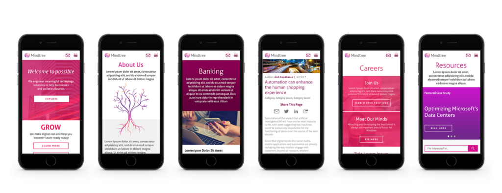
Colors and borderless display. As mobile screens, now including the Apple iPhone X, are moving their screens to be completely borderless, maximizing that display field is essential. To do that, vibrant colors are making a comeback. It was not too long ago that the trend was for muted and pale color combinations to accommodate the flat designs of mobile devices. Not only do more vibrant colors attract user attention, when used in combination with the borderless display, they allow website design to literally go outside the lines for a better user experience.