There’s no denying it. Our society is more digital now than ever. You, me, your neighbor, your neighbor’s neighbor… we are all online. Most importantly, your prospective clients are online and are ready to consume high-quality digital content.
Now is the time to invest in your website and make it more user-friendly for your audience. There is a lot of low-hanging fruit to improve your site, ranging from basic content updates like changing imagery and posting blog posts. Or investing in more impactful measures such as consulting top digital marketing agencies to understand the most cost-effective way to improve your website.
So what exactly will make your website user-friendly for today’s content consumers? Many UX designers will tell you that you should either keep your users either scrolling or clicking from one page to another within your site. So which is the better user experience? To scroll or not to scroll?
Keep reading (and scrolling) to understand why scrolling on a website is OKAY and why it is actually expected from the vast majority of online users.
Social Media
Today’s world is used to scrolling. Why? The never-ending social media feed.
Social media sites are designed with one thing in mind: to get users to consume as much content as possible. The best way to do this is to get them to continue to scroll so that they can consume infinite amounts of new content. Most social media platforms are best used on mobile devices, which are easy to use for scrolling through as the flick of a finger takes very little effort.
The Computer Mouse & Track Pad
Okay, so this may be a given… but you know that little roller ball on your mouse? Okay, wait. That may be a little archaic… Do you know that trackpad on your laptop? Well, that lovely thing is used to invite the user to scroll down a page. We know that webpages are going to be lengthy, so much so that the actual hardware we use to “surf the web” has adapted to allow us to do so.
Okay, pause. Those two reasons are only related to how the physical interface prompts a user to scroll. You may be asking, “What are the different types of scrolling that you can include on my website?”
1. The Subtle Scroll
Design the page so that it appears as though you are scrolling through one long piece of content. Maybe the background color stays the same, maybe it slowly changes color, as shown on Palantir’s About Page. Perhaps you’re experiencing parallax scrolling – which in and of itself invites the user to fixate on one piece of the webpage at a time. With this effect, the user barely notices the page length, as the seamless design shift keeps them engaged and focused on the story.
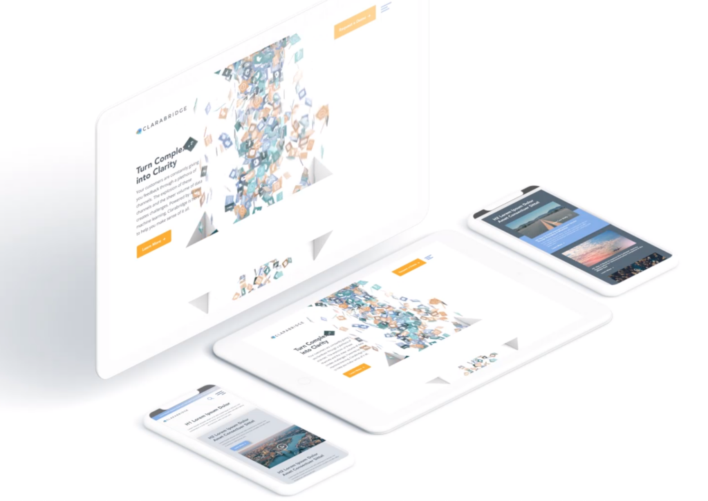
Check out how Bluetext implemented this type of scrolling on the homepage of the Clarabridge website. We designed a seamless animation that invited the user to continue scrolling through the homepage to better explain the technical and analytical power behind the Clarabridge platform.

2. Fixed Long-Scrolling
Instead of having the whole page scroll, fixed long-scrolling allows for specific aspects of the content to remain static while the rest of the content scrolls around it. You can also set up the scrolling to shift to a new section when the user reaches a certain point.
This is ideal if your website has important content or CTAs that should always be accessible to the user. For example, a sticky call to action button is often used to keep key conversion points always present and top of mind.
3. Infinite Scroll
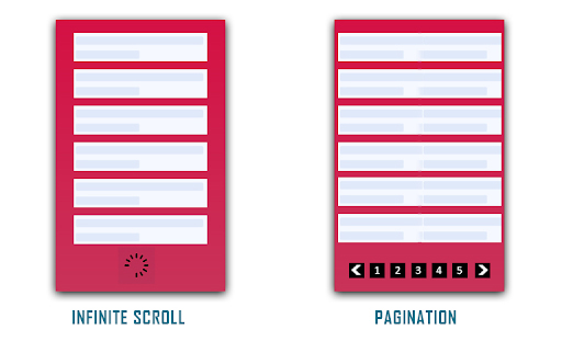
This is most similar to the type of scrolling shown in social media. Is your website a news site? Do you have blog content that you want your users to explore? Consider implementing infinite scroll on your listing pages, allowing posts to continue to load so that the page gives the appearance of infinite content. Of course, this can often be overwhelming for a user who is attempting to find something specific, so we invite you to consider including intuitive filtering so that users can self-select the types of content they are looking for.

(Photo Credit: knowband.com)
4. Parallax Scrolling
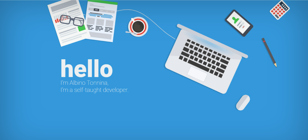
Parallax scrolling is different from the previous three types of scrolling as it invites the user to see new pieces of content and animations with every scroll. Check out how Bewegen invites the user to scroll through their home page and explore their main product. For a personal favorite, give a scroll through Albino Tonnina’s personal website.

Now that you have four great design options to incorporate into your website, it’s time for you to choose the right design for the content on your website. Top web design agencies like Bluetext are great resources for you to turn to in order to gain expert insights on what is best for you.

