Have you ever taken a placement quiz on a website to determine which Internet package was right for you? Have you completely filled in your LinkedIn profile to get rid of the accomplishment bar at the top? Have you found something unexpected on a website that caused you to spend more time browsing? If you answered yes to any of the above questions, you’ve experienced elements of “gamification” in web design.
What is Gamification?
Gamification is the act of taking a process that already exists (say, filling out a social media profile) and applying game mechanics to make it more engaging. Some examples of game mechanics frequently used in website gamification include:
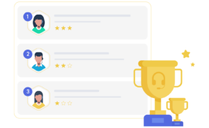
Points and Achievement – Usesf positive reinforcement that allows website users to set goals, earn badges, and “level up” or gain some sort of elevated status.
Rules of Play – games typically have set rules of play, including fast feedback (i.e. a star for a correct answer, or a slight change in color for a completed answer, etc.).
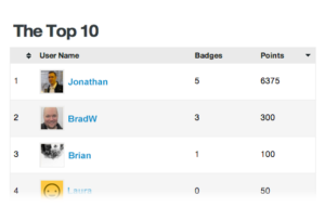
Competition/ Status – Competition between other users or to get a personal high score, is also a common aspect of gamification. Often, winning will confer some sort of elevated status on users (i.e. a top tier loyalty customer, etc.).
Self-expression – Social aspects or collaboration could also be considered aspects of gamification – a message board, for example, could be gamified.
You may be thinking, “my business is too serious for a silly game!” However, that’s not what we mean by “gamification”. Gamification is about increasing engagement for an existing process. You could use it for everything from encouraging customers to return to your site to onboarding new employees in a fun way that will stick with them.
Why Do People Use Gamification in Websites?
Gamification can have many examples for websites, including higher levels of adoption (for loyalty programs, for example), conversion increases, or decreases in time spent onboarding clients or employees. In fact, even just one element of interactivity on your site can encourage a deeper level of attention and participation from website users because users intrigued by one element of a site are more likely to search for more engaging content.
According to the Peak-End rule in modern psychology, content that sparks moments of joy or discovery, however brief, is much more memorable than other types of content. Gamification can spark these peaks – with something relatively simple like visual storytelling with minimal interactions (like on a marketing website for your complex product set) to a full-on competition with a leaderboard and diverse levels (like on a language learning website).
Gamification Guidelines
While gamification can be a great way to add interest and interactivity to your site, it also can increase the levels of expectation that users have for your site content and overall business. Here are some guidelines to consider when considering gamification in your web design:
Make it more than just a fun add on: Gamification methods can’t just be an add on. They must resonate with your business mission and strategy. Otherwise, they will take away from your site and business message.
Include a way out: Ensure your game elements don’t block users from engaging in other ways with your site. You should use gamified elements to enhance engagement, but make sure you have other options for those who might not want to play or who might be looking for information about you and your products faster.
Follow logic and keep it simple: Knowing basic psychology is important when adding game elements to a site. If these elements don’t make sense to users, the point of gamification is lost. In addition, you need to keep things simple. Remember, you’re not creating an entire game, just using aspects of games to accomplish a business goal. Sudden realizations (sparks of discovery) are better in progression – you shouldn’t expect your users to learn or retain too many things at once.
Gamification Ideas for Your Business
Everyone’s business is different and will have different possible ways to include gamification in their site. Here are a few for different types of businesses:
Quiz Mechanics: A quiz or game to figure out which of your products or packages is right for the user. This can teach the user more about what you do and the differences between your packages in a fun way that will be memorable.
Real-world example: TravelZoo’s literary map of the UK (to generate buzz for the different cities on the map)
Social Mechanics: A competition that displays rankings of different users so that more users complete reviews, order more, or come back to use your site or resource more often. A message board on your company website can also be implemented so that users can share good (and bad) experiences with friends and family.
Real-world examples: Citroen’s on-screen test to get users to scroll as fast as they can (to associate Citroen with speed and enjoyment)
Problem Solving: You provide users the tools they need to solve a problem that you pose to them. With more information, users receive more content and more control of the process. (To set up Vive’s VR headset, the company put a game on their site – upon completion of which, the headset will be ready).
Accomplishment and Completion: You encourage users to complete a task that is already halfway done by dangling an accomplishment. (LinkedIn uses a status bar when you’re filling out your profile to encourage you to fill it out more fully and to share on the platform with others).
BadgeOS
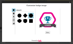
A great gamification WordPress plugin that we recommend our clients to consider is BadgeOS. BadgeOS is a fully customizable add-on, allowing you to define an unlimited number of types and customize them as much as you like. Utilizing BadgeOS, company’s can design their own badges, define required steps to achieving specific badges, track achievements via a leaderboard, allow users to share achievements via social media, and so much more.
We Won’t Play Games with Your Site – But We Can Gamify It
Want to explore gamification and its possibilities for your site, but don’t know where to start? We can help! Bluetext has a wealth of experience in creating engaging and successful sites, including gamification, from visual storytelling to quizzes, to choose-your-own-adventure experiences. We won’t play games with your site, but you can bet that we can gamify it.
With the start of the new decade, the digital marketing industry is abuzz with anticipation for 2020. Top interactive agencies are predicting big shifts in the upcoming year, in everything from engagement tactics to design and user experience. Bluetext, as one of Washington DC’s leading digital marketing agencies, has some 2020 predictions of our own.
In the upcoming year, trends in technology will alter and enhance how the world interacts with various media. Top interactive agencies are predicting massive growth in virtual reality digital marketing. The future will be filled with smart devices delivering increasingly insightful and interactive digital experiences. Recent innovations have allowed marketers to blend digital and physical realms to create an immersive world. Technology will enable expanded connections between sets of people, businesses, devices, content and services.
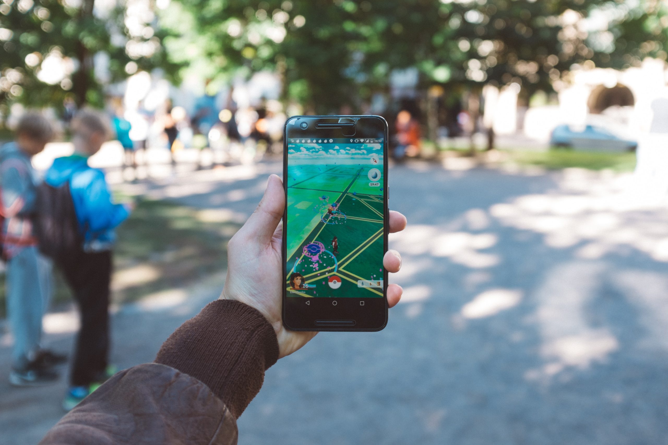
A top technology trend of 2020 will be virtual reality (VR) and augmented reality (AR). Virtual reality refers to any type of experience that places the user “in” another world or dimension. Augmented reality is a term for essentially placing virtual content “into” the real world by way of, for instance, your camera on your iPhone or an app. The most popular example of this is Pokémon Go.
Top interactive agencies have been demonstrating the power of VR to change how users perceive the world and creating a truly immersive experience. Virtual reality production companies are expecting the next generation of VR to be able to sense shapes and track a user’s position and mixed reality (augmented and virtual) will enable consumers to view and interact with the world.
Virtual and augmented reality have been around for years, however, many companies were hesitant to adopt due to a poor user experience. Through recent tech improvements and growing expertise of user experience & interface companies, such as Bluetext, AR and VR are expected to grow quickly. In the next two years, Gartner predicts “70% of enterprises will be experimenting with immersive technologies for consumer and enterprise use.” Google cardboard glasses are a popular —and inexpensive—method to distribute the virtual reality digital marketing experience.
A number of companies have already deployed innovative AR and VR experiences, especially in the B2C realm. Companies such as Sephora and IKEA are using augmented reality to allow consumers to preview and test products. While AR and VR lend well to the “try before you buy” sales strategy with enticing previews to persuade a final purchase decision, it has also been used in campaigns to turn heads. Burger King unveiled an AR experience that quite literally burned away the competitor. The fast-food chain encouraged app users to scan competitors’ ads, which would activate an augmented reality experience. As the competitor’s ad combusted, it was replaced with a Burger King ad and directed to the nearest restaurant to claim a free Whopper.
Top virtual reality digital marketing experts will tell you this tech trend is sweeping a variety of industries as a method of differentiation. Especially in the B2B market, virtual reality has proven to be an incredibly powerful marketing tool to help close a sale and drive conversion. A virtual reality experience can go in-depth to product specs and prove exactly why it’s superior. When designed by a top virtual reality video production company the experience can be like a trade show, a sales demo, and a marketing presentation in one. Industries like cybersecurity or manufacturing can truly benefit from immersive experiences. When products are shown through virtual reality, the viewer can demo a complex product with ease. Top virtual reality video production companies also stress the importance of standing out in saturated markets and hectic trade shows.
An effective and memorable AR or VR experience is an opportunity to capture physical attention and convert that to digital action. Interested in differentiating your company with next-generation digital tactics? Learn how Bluetext can bring your video and virtual reality ideas to life.
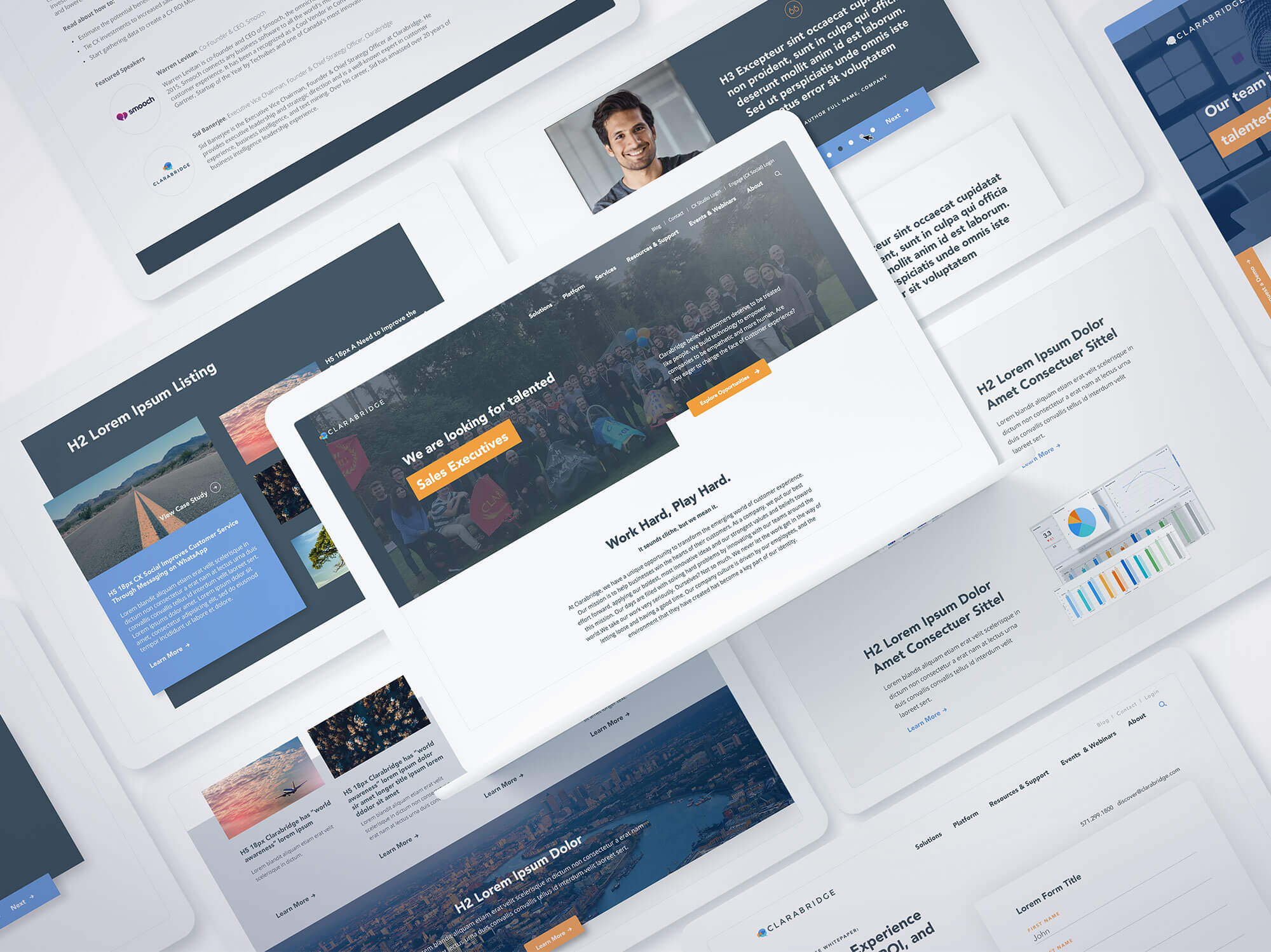
Creating a successful digital web design can mean the difference between growing your customers and losing them on your website doorstep. For Clarabridge, which delivers a better customer relationship platform for its clients by leveraging artificial intelligence to sort through complex data, providing clarity with its website was critical. It turned to Bluetext to unify its various website platforms into a single customer experience.
Clarabridge’s challenge was fairly straightforward: Its clients’ own customers constantly provide feedback through a wide range of information channels, from direct contact to social media and everything in between. Yet, that same explosion of these channels and the sheer volume of data creates significant challenges on how to make sense of it all. Telling that story on Claribridge’s digital platforms had been confusing. It needed a better way to tell its story.
To address the digital web design, Bluetext used digital storytelling, brand extension, a sophisticated user experience, and aggressive search engine optimization to deliver a new website that does what Clarabridge promises for its customers – turning complexity into clarity. You can view the website live here.
Clarabridge’s messaging was a key component of the digital web design: “Every call, every chat, every tweet, every post, every comment, every conversation, every sentence. EVERY WORD. Every customer interaction presents an opportunity; don’t miss a single one.”
We designed a creative approach to transform the intangible brilliance of Clarabridge’s software into a tangible experience for target audiences. It was something they could see, and seemingly touch and feel, to carry that message throughout the website and convey the value it could bring to every brand’s customer engagement.
The digital website design begins at the top of the home page, with an engaging animation that represents the massive amounts of customer data and feedback flooding into their clients’ systems. Flowing down the page, moving through a funnel that sorts and selects the right information at the right time, the graphic turns the data into actionable snippets of intelligence that can be fed to executives, product managers, contact center teams, and frontline staff to better serve their customers.
The creative style of the digital web design pushes the boundaries to enable Clarabridge to stand out in a crowded industry, while the linear path of the video animation delivers the product messaging in a creative way that gets attention while taking audiences through the sales funnel. To see the design in action, visit our Bluetext Hall of Fame.
“Bluetext should be at the top of your list if you are in the market for a redesign.”
We’ll let our client speak for the project results:
“When we started our journey to build a next-generation digital platform we challenged BlueText to create a unique, engaging user experience that tells the Clarabridge story in an impactful way. Bluetext knocked it out of the park! It created a modern site design that breaks through the clutter in our crowded industry; an A/B homepage that greets new visitors with a video narrative providing a concise understanding of what Clarabridge does while recurring visitors receive a streamlined, mobile-optimized view of the site.
Beyond that, the custom backend CMS is beyond easy to understand, creating significant efficiencies for the Clarabridge team. Lastly, where they truly excelled and what I will miss most, is working with such a top-notch team of experts. Their customer service and ‘deep in the trenches’ support during the project was critical. This was hands down the smoothest site launch I have participated in. BlueText should be at the top of your list if you are in the market for a redesign.”
When it comes to marketing and communications, government contractors and public sector IT providers face a set of unique challenges. For one, the customer base of Federal, state and local decision makers responsible for purchasing technology products and services – ranging from CIOs and CTOs to program managers, IT managers and procurement officers –represents a finite group that can be difficult to reach.
Compounding this predicament is the fact that government contractors must not only market their brand, product and services to these decision makers, but also time these marketing efforts strategically. This means building awareness far enough in advance of a contract award, and then sustaining marketing and PR efforts throughout what can be a multi-year process from pre-RFP to the contract award – and even beyond due to potential contract protests, delays and budgetary obstacles.
Marketing to agency decision makers is just one piece of the puzzle. For small to mid-sized contractors, marketing and public relations efforts must often extend to larger prime contractors in order to ensure these lesser-known firms are on the radar when Primes are assembling teams to pursue contracts. Large contractors, for their part, must also market needs and capabilities to smaller partners that might hold an elusive product/service, market expertise, status or agency relationship.
We have assembled 6 ways that forward-thinking contractors and IT providers can grow their business and contract opportunities by looking beyond traditional marketing, advertising and public relations tactics.
Leverage B2G responsive landing pages
Responsive design is a critical website approach for providing customers with a seamless experience across all device sizes. With a responsive website, government contractors and IT providers can be in front of buyers at every step of their online journey. A user viewing a website on the go via a mobile device can have the same powerful experience as when sitting in their office.
Responsive websites provide continuity between different viewing contexts, remaining completely agnostic to the type of device used and the size of the screen the user has. Responsive websites also rank higher in search engines’ rankings, as Google recommends responsive web design because having a single URL for desktop and mobile sites makes it easier for Google to discover content and for Google’s algorithms – which are constantly changing – to assign indexing properties to content.
It was the need for a responsive website that brought GovDelivery, which enables public sector organizations to connect with more people and to get those people to act, to Bluetext.
As the number one referrer of traffic to hundreds of government websites, including IRS.gov, SBA.gov, FEMA.gov, IN.gov, and BART.gov, the GovDelivery Communications Cloud is an enterprise-class, cloud-based platform that allows government organizations to create and send billions of messages to more than 60 million people around the world. Bluetext was hired by GovDelivery to help them reach public sector organizations that can benefit with tremendous cost savings while reaching more people, automating complex communications and driving mission value through deeper engagement with the public.
For this responsive design project, Bluetext conceived and designed a responsive landing page with an infographic demonstrating the benefits of using GovDelivery for government agencies as the centerpiece of the campaign. We also developed a responsive email template and infographic poster to be used across many marketing channels.
Extend reach and share budget with B2G partner campaigns
While going it alone from a marketing and public relations perspective provides a company with more control over a campaign, it also can be costly and restrict the reach and impact that could otherwise be achieved by aligning in an innovative way with industry partners.
Bluetext has worked on numerous occasions with industry partners that align around a specific campaign targeting government decision makers. Govplace, a leading enterprise IT solutions provider exclusively to the public sector, turned to Bluetext to develop FedInnovation, a destination designed to help government agency executives get the latest information on current technology challenges and solutions for big data, cloud, security, mobility and storage. Developed in conjunction with leading technology providers including Dell, Intel Security and VMWare, it includes exclusive content, videos, blogs, and real-time social feeds.
FedInnovation combines relevant, fresh content, complementary offers, and financial resources to deliver an educational platform to drive awareness and leads for Govplace across its target market. The development of platforms is a continued focus for Bluetext as we look to conceptualize, design and develop creative solutions that deliver measurable business impact for our clients. It is increasingly clear that customers of our clients demand unique experiences with premium content delivered in an easy to consume manner.
Another partner campaign targeting U.S. public sector executed by Bluetext was FutureAgency.com, a digital content experience effort on behalf of McAfee and Intel that depicted virtually a “future government agency.” For this project, Bluetext created a virtual experience around client subject matter experts in an effort to present content for government decision makers in a more engaging fashion. Rather than static white papers and marketing slicks that often go unread or unfinished, Bluetext created an experience whereby avatars of actual company thought leaders were created, and they delivered presentations on topics in a virtual conference environment. The clients found length and quality of site visitor engagement superior to that of traditional white papers and similar content.
Create compelling B2G digital experiences to reach decision makers
The web has become a go-to resource for decision makers to research products and services prior to purchase. Product sheets, white papers and other pieces of online collateral can be useful supporting resources for government decision makers, but will hardly help contractors stand out in a crowded marketplace.
Recognizing this, government contractors and IT providers are creating more dynamic, immersive digital experiences that can more effectively engage target constituencies and impact the decision making process. Additionally, these experiences are molded to be as valuable as any in-person interaction site visitors would have with products and services.
A recent Bluetext project showcases a forward-thinking technology provider, CSC, which was seeking to ensure prospective customers could have a similar experience as they would if they were physically at CSC’s corporate headquarters.
Bluetext designed and built CSC’s Digital Briefing Center, a virtual experience where clients and CSC’s entire ecosystem can come to learn about CSC’s key technology conversations across its target verticals.
Bluetext designed a virtual office building where each floor represents a specific vertical industry, and visitors can learn about CSC’s key solutions and experience across cloud computing, big data, applications, cyber security, and mobility. While not specific to the government market, it is indicative of how “stickier” digital experiences are reshaping how existing and prospective customers interact with content.
Highlight customer innovation
No matter how large or well-known a government contractor/Federal IT provider is, gaining approval from an agency to speak publicly about a technology project is often mission impossible. Agencies must be careful not to appear to endorse a specific vendor in public comments or a press release quote, and even when project leaders are amenable, the process often grinds to a halt with the more conservative public affairs officers.
As such, vendors often have their hands tied on how to showcase a successful project so that other agencies – or even other decision makers within the same agency – will take notice. An approach that can bear more fruit involves shining the spotlight on an agency leader or the agency itself through awards and speaking opportunities.
Multiple editorial publications and associations hold annual award programs that showcase outstanding IT projects and agency leaders at the federal, state and local government level. Agencies tend to be more open to sharing an IT story through an award because it demonstrates innovation and can assist with employee morale and retention.
Beyond award programs, there is also significant benefit in generating media coverage and awareness of state & local customer projects. These agency customers tend to be more amenable to participating in public relations campaigns, and the drawing attention to these projects can demonstrate capabilities to prospective Federal customers as well.
Develop targeted B2G campaign to pursue a specific contract
As contractors and IT providers know all too well, winning an agency contract requires a very different sales cycle than a small business user signing up online for Dropbox or a similar “as-a-Service” software offering.
At some level, there will always be marketing activities designed to reach decision-makers across multiple civilian or military agencies – and in some cases both segments. These external efforts may involve communicating product capabilities, service chops, or the expertise of the contractor’s team. But in today’s hyper-competitive market for agency contracts, developing innovative, targeted campaigns in pursuit of a specific contract or that are designed to reach decision makers at a particular agency, can make the difference between a game-changing contract win and a devastating loss.
Bluetext is increasingly tasked to partner with contractors in developing innovative branding and outreach campaigns around a specific contract pursuit. In early 2014, L-3 Communications, in partnership with Harris Corporation, hired Bluetext to help them pursue the Air Force’s $1B Satellite Control Network (AFSCN) Modifications, Maintenance & Operations (CAMMO) Contract.
Bluetext worked with the L-3/Harris Capture teams to develop a campaign strategy that would position them as a Prime by highlighting the many advantages they bring to the table. The overarching campaign theme Bluetext developed is:
“The Power of Partnership, From Vision to Reality”
The creative strategy of this project began with the core concept of the ad, “from vision to reality.” The left side of the ad is a wireframe representing the vision with the right side representing its reality. After the wireframe of the satellite was created, it was overlaid on top of the red diagonal to create a striking visual element to draw attention to the campaign. The first series of ads were placed in high visibility areas inside of Colorado Springs Airport, a key travel hub for Air Force brass. The media plan for the campaign also includes online, print and OOH media placed strategically to maximize reach and frequency throughout the entire contract RFP and award lifecycle.
Focus on agency challenge, not yourself
Dramatic changes in staffing and mission of government IT media outlets means that the days of getting a product reviewed or corporate profile written are for the most part a thing of the past. As such, contracts and IT providers must get far more creative when it comes to communicating capabilities.
Government IT press don’t want to hear about products. They want to hear about trends and challenges sweeping through agencies, and how contractors and IT providers are developing solutions to solve those challenges.
This was the backdrop for a media strategy Bluetext architected for Adobe Government. Over the past few years, government-wide budget cuts have been swift and relatively unsparing in their impact on agency in-person conferences and training events. This presented a significant challenge for agencies seeking to maintain the collaboration and education benefits these events delivered.
The challenge dovetailed with Adobe’s web conferencing solution Adobe Connect, which was seeing a rise in demand in the public sector due to pullbacks in physical, in-person conferences. Bluetext built a PR campaign around this angle that included a pair of thought leadership articles (one targeting the broad federal IT community and one targeting military decision makers), generating multiple articles around this topic in key federal, state and local media outlets, including:
Federal Computer Week – Budget cuts push conferences online
Reaching and impacting government decision makers requires government contractors and IT providers to push beyond the status quo and engage with partners able to help develop and deliver innovative campaigns to grow their business and increase contract opportunities.
MediaPost saw the need for an event focused solely on Augmented and Virtual Reality as these new mediums have taking the marketing world by storm. The event will explore how marketers can take Virtual and Augmented Reality from the novelty phase into an opportunity to enrich branding and deepen consumer relationships.
Jason will be part of a panel discussion titled “Retailers Follow Pokémon Go”, which will examine the overwhelming success and influence of Pokémon Go, and how retailers can learn from this case study and incorporate AR or VR experiences into their marketing strategy to appeal to in-store shoppers.
Other topics the event will cover include:
How different types of VR/AR experiences map against specific brand goals.
Where do you start…small?
How to distribute experiences efficiently and connect VR/AR campaigns to other marketing platforms and programs.
Who are the players and how should marketers and agencies vet them?
Storytelling in 360 degrees
Make sure to tune in for the conference live-stream on September 28th at 4:00pm EST here. And to learn more about Bluetext’s VR work, contact us today:
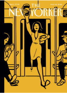
Anyone familiar with The New Yorker Magazine may have noticed an interesting cover on the May 16 edition—a two-color drawing of a women stepping onto a subway car. It seems somewhat simple—not particularly eye-catching. But download an app called Uncovr (developed for The New Yorker), hold it over the magazine’s cover, and the image comes to life in your smart phone’s screen. Buildings grow off the page in 3-D form, music plays, city blocks rise up into the air, cars move around the streets. You can bring it in closer to zoom in among the buildings and see more detail, or bring it farther away for an overhead view. As long as you keep the screen anchored to the cover, an eye-popping video experience unfolds for the viewer.
This is Augmented Reality at its best. This older cousin of Virtual Reality has paved the way for the more immersive VR technology experiences through a Google Cardboard or a more expensive set of VR goggles like Oculus Rift or the Samsung Gear.
Augmented Reality is a live view of the physical environment that is augmented by computer-generated visuals. Virtual Reality, by contrast, replaces the real world with a digitally created one. Yet for marketers, they can go hand-in-hand. We’re huge fans of VR for digital marketing, and have produced a number of high-end experiences that bring customers into a virtual demonstration using state-of-the-art cameras and video editing. But new and better ways of leveraging Augmented Reality can play well along side of a VR campaign.
For marketers, this can mean an engaging way to preview a Virtual Reality campaign that can scale to as large of an audience as needed. Where VR videos require a set of goggles, Augmented Reality only needs a still graphic to key off of and an easy app download.
In The New Yorker’s example, the distribution model was simply the cover of the weekly publication. For CMOs at our enterprise clients, it can be a mailed postcard or one-pager, or it can be conveyed through a digital graphic via social media or an email. The image essentially serves as its own bar-code or QR code, bringing the experience to life. But rather than an obscure set of black bars and white spaces, the newer versions of Augmented Reality can anchor to a graphic representation that is part of the visual display, and leverages the motion-detecting software in the phone for changing viewing angles or for zooming in and out.
Augmented and Virtual Reality together deliver an amazing immersive experience that sets a marketing campaign far apart from the other noise in the market.
We all remember playing the game Battleship as kids, where the goal was to sink your opponent’s fleet of ships by guessing where they were placed on a grid. The origins of this simple game actually goes back to World War I, when the Allied Navy had developed large artillery guns but didn’t have the technology—such as sophisticated Radar—to know where to aim. Just as in the real life naval battles of a hundred years ago, the game of Battleship involves a series of guesses.
So what’s that have to do with smart website design? Well, here’s an easy trick to remember if you want to win the game. Line up your entire fleet along the outer edges of the grid. While the mathematical odds of being sunk by your opponent are theoretically the same no matter where you place your ships, in fact recent research into human nature proves that our guesses aren’t truly random. Instead, we tend to adhere to predictable patterns when it comes to the focus of our attention on the grid, and the same preferences hold true in the digital world.
The trick in Battleship is to avoid the places that your opponent is most likely to look. In a 2009 study that looked specifically at where people are most likely to focus on a grid, a phenomenon known as “the middle bias” was identified. Put simply, our eyes are three times more likely to gravitate towards the upper middle section of a grid or screen than towards a random location. The top most frequently chosen spots are all clustered right around the middle. Anything on the outer edges is far down the list.
By now, I hope the implications have sunk in. If there’s important information you want a visitor to quickly find on your website, don’t hide it along the edges—take advantage of the “middle bias” where their attention will hit first. Like the game of Battleship, web screens are a highly visual medium, and as we continue to adapt our thinking and processing to the digital world, smart design and placement will continue to influence our visual habits, especially when it comes to what we notice and engage with online.
This is only one of the more recent findings that new research into human behavior is revealing when it comes to how people interact with their screens. In another study, researchers used eye-tracking technology to see how people made choices when a number of options were displayed across a web screen. The findings showed that where the subjects looked on the screen depended on how many options they had in front of them. The more options on the screen, the more that their eyes settled near the center of the display. Those first locations remained the most popular spots even when additional screens were shown with more options. Just as importantly, the study demonstrated that decisions about which options to choose were heavily influenced by where their eyes focused.
We like to imagine our choices as reflections of our conscious desires… But this data suggests that our choices are often shaped by the perceptual habits of the eye, which are drawn to certain items and areas of the screen. Sometimes, salience matters more than preference.
The results of this and similar studies is that subconscious preferences can play a larger role in shaping decisions on screen. Again, the implication should seem obvious: If you want a visitor to your home or landing page to make a particular selection from a range of options, place that option in the center of the selections and not on the edges.
At Bluetext, we spend a lot of time evaluating visitor preferences and habits to maximize their engagement when designing websites and digital marketing campaigns for our clients. As with all digital experiences today, our clients are competing for the attention of their target audiences, and understanding human nature can mean the difference between conversion and abandonment when it comes to their customers.
Google has done it again. It has quietly released yet another tweak to its search engine that will have a dramatic impact on how a company’s website performs when viewers are searching. The bottom line for organizations: The user experience is becoming more and more important to a site’s rankings.
If you’re a marketing executive who has devoted a lot of time and resources to improving your SEO, you may find that keyword analysis and other search engine techniques are no longer enough. While still important, other site attributes may play just as big a role in where your site ranks in search results.
You may recall the last significant adjustment from Google, dubbed in the media as “MobileGeddon.” That update simply noted that a user’s experience from a mobile device was important. If a website wasn’t appropriately mobile-optimized for viewers, its ranking would be lower when a visitor was searching from their mobile device, and sites that were mobile-friendly would rank higher. That version of the Google algorithm got a lot of attention.
This latest rev has been well under the radar screen. There were no announcements from Google. In fact, it only came to light after search engine aficionados began sounding the alarms in early May, when they noticed that some sites’ rankings were plummeting. Two weeks passed before Google gave any official acknowledgment of what the company simply calls its “Quality Update.” Search engine wonks have dubbed it the “Phantom Update.”
So what does it do?
“How Google assesses quality is sometimes a thing of mystery,” writes Thomas Smale of Entrepeneur.com, “but we do know that it wants to provide users the the best information possible.”
The new Google update rewards sites that have a good user experience in addition to what it considers quality content. Having high quality content is important, but it’s also about rewarding sites that deliver a better experience, and punishing those who don’t deliver a good experience. So while redundant and thin content will get dinged, so too will sites that have self-starting videos, banner ads, and 404 errors.Here are four ways to make sure your site delivers the type of user experience that will be rewarded by Google’s search engine:
1) Get Rid of Thin Content. According to Google, this can include automatically-generated articles, thin affiliate pages, thin content from other sources such as the “scraped” content of low-quality guest blog posts, and “Doorway” pages created to rank highly for specific search queries, which Google views as bad for users because they end up taking the user to essentially the same destination. These techniques don’t provide users with substantially unique or valuable content. As a result, Google has applied a manual spam action to the portions of a site that include this type of thin content.
2) Remove Any Auto-Play Videos. Like many disruptive ad formats these are seen as providing a bad user experience and are punished by Google.
3) Filter User-Generated Content. That means having a strong moderator function for user-submitted posts to make sure that any blatant self-promotion or answers that are too general to be useful aren’t marked as spam by Google.
4) Eliminate Annoying Ad Formats. If your site begins to attract enough visitors so that advertisers want to pay for that real estate, be cautious. Excessive and disruptive ad displays, including above-the-fold ads, pop-ups, and similar techniques, are viewed by Google as a bad user experience and treated accordingly.
Websites should be designed to do what they were intended for in the first place; delivering a high-quality experience to users. That’s what Google likes and rewards in the race for page rankings.
Trade associations that represent the interests of and provide services for their members, be they large companies and organizations or individuals, all face the challenge of retaining their current members every year, growing their member base and reaching non-members who may be involved in the policy or business arenas. Competition among associations is fierce. Even without competitive pressures, it’s not always easy to convince individuals, organizations, small business or large corporations to devote resources and pay fees to an industry association year-after-year. They not only have to see the value, they need to feel part of the group and believe that it is looking out for their interests and providing them the services they want.
With industry associations as with other organizations, the website is the hub of activity for members and others who want to know about the group and its issues. Too often, the hub is ignored because it’s not viewed as central to the mission of the group. We think a strong website is essential, because that is the first place that any target audience is going to look for information. Bluetext has helped dozens of industry and membership organizations leverage their web presence to better recruit and retain their members, grow their revenues and maintain a close relationship with their constituents. Here are our top five tips:
Make It Engaging. Compelling website design and graphics are extremely important to reach those key audiences and to keep them interacting with the site. First impressions are important, and if the design doesn’t resonate, the visitor may leave quickly without engaging. A tired or out-of-date design signals that the association may not have the resources or digital savvy to have a modern and fresh look and feel. The design should also allow the visitor to find a wide range of information that spans their interests. Visitors come to association sites not to purchase a specific product, but to learn about a variety of topics, policy issues, and services that are relevant to them. Burying that information under layers of tabs may lose the target audience. A responsive design is a must, as more and more individuals are accessing the sites through mobile and tablet devices. We also recommend longer scrolls as visitors swipe to navigate the screen, rather than waiting for a new page to refresh as they move about the site.
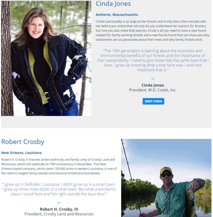
Make It Personal. This should be fairly obvious, but it is surprising how many membership organizations and trade groups fail to highlight their own members. Why is this important? Because individuals need to be able to relate to the other people in the organization, to understand the types of people who are also part of the group and what value they get from their dues. Not only does this draw in new members, but it also serves to “humanize” the organization by putting faces and stories on what otherwise might seem like a faceless group.
We recommend setting up a section on the website that is full of videos and scrapbook-type photos of members and their families. For Forest America, which represents the nation’s private forest owners, we set up a section called “Caretakers” on its website, with profiles of dozens of landowners and their families who are part of the organization. To capture the footage, we take a video crew to their annual meetings and film them during breaks telling their stories—with other family members at their side. We add in photos that they send us and any other materials that help tell a personal story. The Caretakers section serves three important functions:
1) It shows visitors to the site, including policymakers and other organizations, the human faces that comprise the organization;
2) It helps with recruitment, as other private forest landowners see that they can be part of the team; and
3) It energizes current members, who love to see their colleagues and friends—and their own families—in a scrapbook setting.
Give Them The Tools They Need. Members are busy, so any shortcuts that make their lives easier are welcome. For the Society of Human Resource Management, a membership organization that includes thousands of human resources executives, retention was suffering due to the economic downturn. HR directors needed an easy way to convince their CEOs that membership in SHRM paid valuable dividends in training and resources for their annual fees. Rather than their typical request for approval, which might be shuffled to the bottom of the in-box, we built a tool for members that with just a little bit of information would create a compelling brief presentation to be send to their top executives. The deck, which explains the value of joining or renewing their membership, was far more likely to get the attention and approval of the boss. After launching the new tool, SHRM saw its renewals increase dramatically.
Make It Easy. Not only do members appreciate better tools, they need easy ways to take action and interact with the organization. Having persistent Calls-To-Action across every page of the site is essential to get the type of engagement that demonstrates value for the organization. In some cases, those Calls-To-Action can be as simple as “Join Now.” But for advocacy sites, having a sophisticated application built-in that can send a tailored email or letter to a Member of Congress or a regulatory agency serves many purposes.
First and foremost, individuals will contact policymakers only if it’s a relatively simple process. Most do not have the time to write a note to their Congressmen, nor do they know the issues well-enough. In addition, they might have no idea how to find the right policy-maker and obtain their email or physical address. We have installed a number of effective applications for associations that take the burden off of the member. By filling out, for example, their zip code, these tools can auto-populate a letter with the correct Member of Congress and address, and offer a “Mad Lib” draft where certain fields can easily be completed.
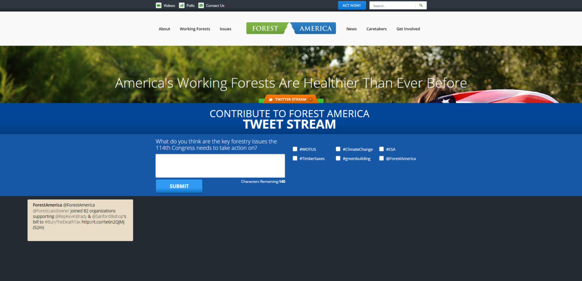
Build In Engagement. There are excellent new tools to engage visitors to the site. The first is obvious: Make social sharing persistent on every page and section of the site. Whenever a visitor sees anything they like—a position paper, an infographic, a video or a blog post—encourage them to push that around to their larger network.
Another tool that we have implemented in a number of sites is a Tweet-Builder—a tool that poses a topic and then invites the visit to complete a tweet, with recommended hashtags that can be included. That tweet then goes in real-time into the associations Twitter Stream.
The benefits of this tool are that it encourages the visitor to participate while helping to populate the social media arena. It also gives an incentive for that person to follow the group on social media, and to broadcast posts out to their larger community.
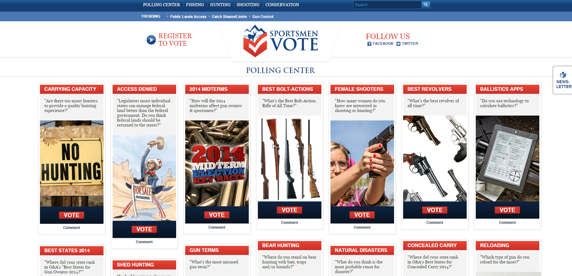
A third tool that we implemented is a polling functionality—that poses questions on the site in the form of polling questions, and then displays the results on that same page. Designed to resemble a Pinterest Page, polling tools invite participation and give the visitor a reason to keep coming back to the site. This is one that we built for a media company that publishes a variety of sportsmen-focused magazines.
What’s more valuable to a company? A visitor to its website who spends 15 minutes scanning a wide variety of pages, or a visitor who comes and goes in three minutes? The obvious answer is the first one, because as any marketing executive can tell you, “stickiness” and time on site are drivers for the website experience. But what if the first person is taking so long because they can’t find what they are looking for and the second person came and left quickly because they readily found the white paper they wanted or even transacted? The lesson here is not that time on site isn’t the only metric you should be evaluating. In fact, using metrics to evaluate the performance of your site may not be as straightforward as it looks.
Take the recent news about Instagram over-taking Twitter in terms of volume last year. “Instagram Is Now Bigger Than Twitter” was the headline everywhere from CNBC to Re/Code to the New York Times. But how meaningful is that comparison? Twitter has some 284 million active monthly users, Instagram more than 300 million. Yet, as an article in Slate describes it, the two are different: “One is largely private, the other largely public. One focuses on photos, the other on ideas. They’re both very large, and they’re both growing.”
Another metric that is often bandied about is unique monthly visitors. This measures the number of people that come to a site and discounts repeat visitors. Again, that might sound like the ultimate metric for evaluating the attention that a site is getting. Still, it doesn’t measure what those unique visitors are doing on the site. If it is a content-driven website, like the Huffington Post or Buzzfeed, a more important measure may be “total time reading.” There, the number of visitors who come and leave quickly isn’t very valuable to advertisers who provide the revenue for content-driven sites. Total time reading is far more important, and smart advertisers recognize the difference and factor that in accordingly.
A common measure reported on widely in the media when comparing different brands’ web traffic is the number of website visitors. This is frequently sourced to web measurement and analysis companies who make these types of evaluations. But even these can be highly misleading. First and foremost, according to a recent post in medium.com, the most widely quoted source of web traffic, Comscore Networks, only counts U.S. users. If a brand is global or operates overseas like a many government defense contractors, the metrics will not include that traffic in the totals. In addition, these reports are often based on sampling which can distort the actual numbers for smaller brands with a more limited number of visitors. It’s also not yet clear whether these services are including site traffic from mobile apps, which may be a very important measurement tool for many websites as more and more visitors use mobile devices to access information on the web.
So if the three most commonly-used metrics for measuring the success of a website—time on site, unique monthly visitors, and total traffic—all have their flaws, what is the best way to evaluate how a site is doing?
The answer is there is no best answer. All three of those key metrics are useful, but they need to be taken for what they are which is a set of imprecise and blunt tools.
A better way to look at the most effective mix of metrics is to find the best blend that will help evaluate “value.” Time on site is important, but only as an element in value. In reality, for media websites, advertisers don’t actually want a customer’s time, they want to make an impression that will lead to a transaction or buying decision. On the other hand, for an enterprise site offering IT solutions where the buying cycle is long and a visit to the website may be part of the research process, time is valuable as a measurement for a customer’s information gathering step in the cycle. Where they go on the site—to resources, for example—may say a great deal about where that customer is in the cycle and how to best to pursue him or her.
Where the visitor enters the site may be a key performance indicator for both organic search results or for a lead-generation driven campaign that takes the visitor directly to the intended content. Spending time on the blog page may be an indicator that the site’s content is fresh and engaging and is bringing target audiences back for more. Reading product and solutions pages may indicate a prospect that needs to be watched to make sure they are getting what they need to make a purchasing decision.
The right answer is that value has to be a combination of a number of factors, and using multiple metrics can help understand if the site is achieving its goal of providing that value. But no marketer should get too hung up on any single measurement.