The lowly infographic, once a novelty but more recently a must-have for markets trying to quickly a complicated message, seems to be in the twilight of its existence. What’s more properly referred to as a data visualization used to command the attention and admiration of marketing professionals everywhere. It wasn’t too long ago that such iconic and influential infographics as Aaron Koblin’s map of aircraft flights in the U.S. was dazzling us and pushing everyone towards this engaging new medium.
It’s easy to see why infographics became the darling of the marketing world. People like to be able to visualize complex issues. Our eyes are more comfortable scanning images than wading through data. And with the explosion of big data, making sense of all for that information through text alone can be difficult. We have worked with dozens of clients on ways to visualize and animate their complex data. The truth about infographics is that they are effective when done well, and will continue to be a valuable asset in the marketing toolkit.
Then why do they seem to be falling out of favor? Indeed, according to Sarah Rapp with the portfolio-sharing site Behance, “Infographic posting generally rose steadily from 2007 to 2012, where it peaked, and has begun to decline since then.”
As Fast Company contributor Mark Wilson wrote in a recent blog post, “A few years ago, the Internet was awash in groundbreaking data visualizations…Today, you’d be lucky to find a cheap knockoff in a world dominated by crappy promotional infographics churned out for viral attention.”
There are a few trends that help explain why infographics may seem like they are losing steam. One of the most obvious is the move to mobile, and as any reader of our recent blog post on the latest Google search algorithm change has learned, websites that aren’t mobile friendly are getting dinged in web searches. The reason is obvious—beautiful and intricate graphics typically do not translate to small-screen devices. If smartphones and tablets make up more than half of today’s web traffic, that’s a massive amount of viewers on which a sprawling data visualization would be lost.
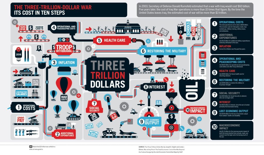
Another is more basic. Many infographics try to pack in so many details and so many data comparisons that they become incomprehensible. Rather than simplifying information, they end up confusing the viewer to the point of their eyes glazing over. Good designs are simple and eye-catching, not complicated and mind-numbing. Here’s an example of data overload:
Finally, as Mark Wilson notes, in many ways infographics have gone mainstream. “Once a playground for independent designers, data visualization has evolved into something more mature, corporate, and honest about its failings,” writes Wilson. “The quirky, experimental infographics that once peppered the Internet may be disappearing. But that’s only because data visualization, as a medium, has finally grown up and gotten a job.”
Bluetext comes at visualization from a different angle. We often work with our clients on what we call “StoryGraphics.” StoryGraphics, as the name suggests, tell a story rather than relying on comparative data to draw comparisons. In many cases, this is because the client may have key messages but not have data that lends itself to clever charts or graphs.
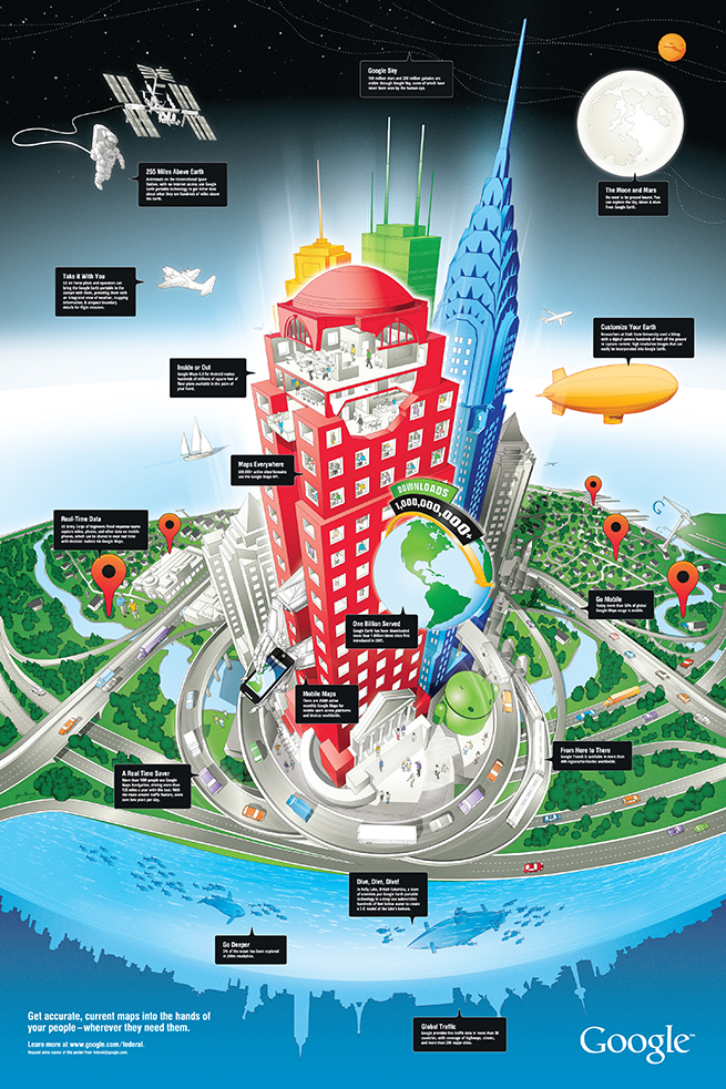
In a design we created for Google recently, the StoryGraphic tells how geospatial information can be used in space, for aviation, at all levels of commerce but also on the water and under the seas. A huge success for the Google enterprise team, this graphic would never have succeeded as a typical infographic.
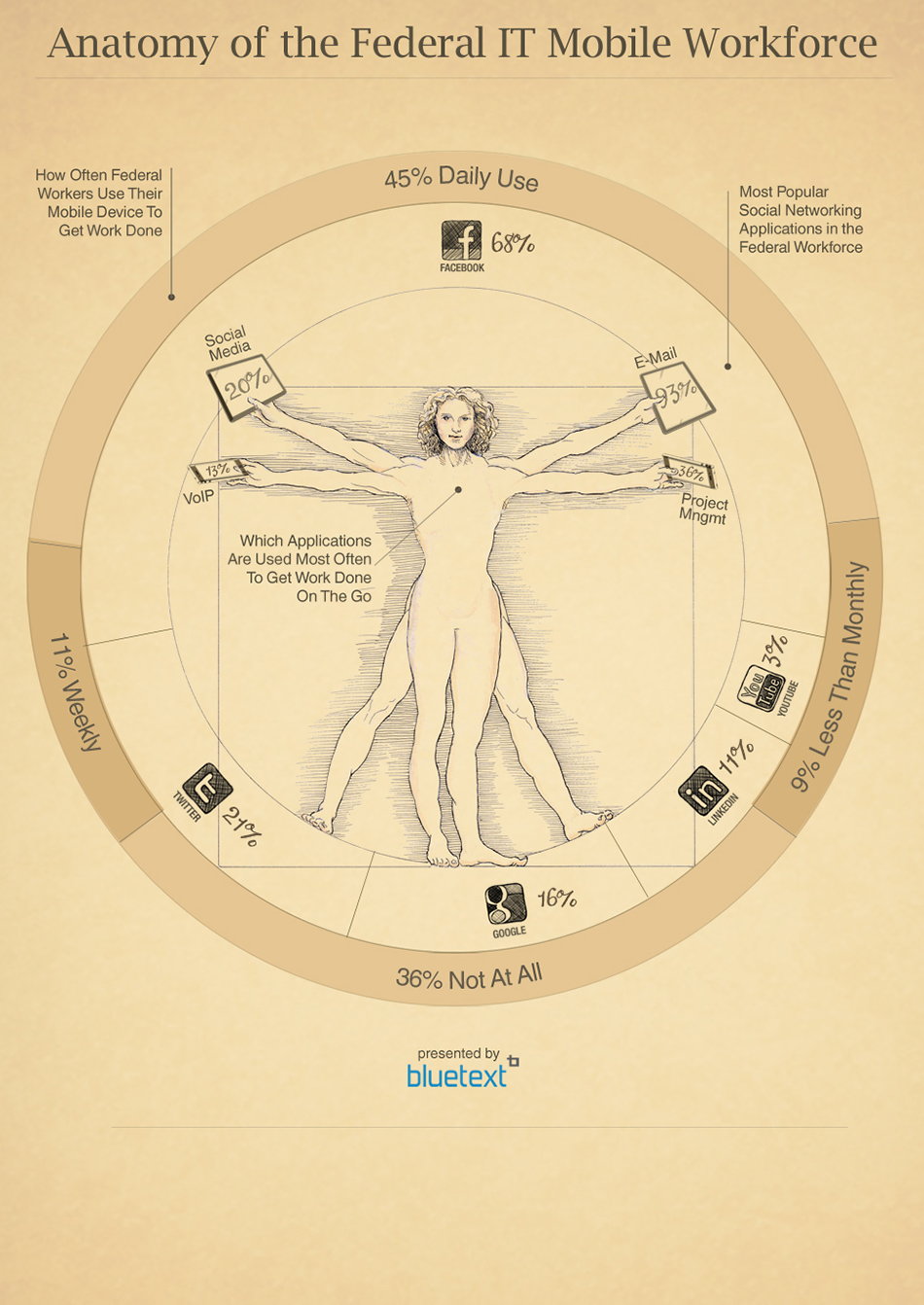
Another Bluetext example shows the move by Federal workers towards mobile devices. While data plays a role in the graphic, it leverages an iconic image to draw the viewer into the story that is being told.
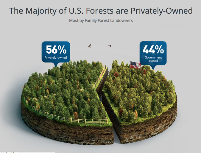
Some of our most compelling client examples do rely on comparative data, but focus on a limited number of statistics to more effectively tell the story. For a design for Georgia Pacific, one of the world’s leading wood products companies, we created a pie chart that took the form of a forest with just one cut down the middle to visualize the difference between government-owned and privately owned forests. The design instantly conveys the surprising fact that there are more private forests than government forests.
You can find compelling and intriguing examples of Bluetext StoryGraphics and infographics here in our portfolio. The bottom line is that marketers can turn to more sophisticated ways of using graphics to tell stories than a confusing jumble of facts and figures.
On November 7th, the IRS Design Office hosted the second Design in Government (DIG) meeting in the main IRS Auditorium, the only meeting gathering of federal graphic designers government-wide. The goal of the DIG meeting was to strengthen the federal graphic design community and to help build relationships across federal agencies to encourage networking and discuss innovation, design management and design complex issues in a collaborative way, during these difficult budget times. Partner Jason Siegel presented the following presentation with supporting videos.


