Google has done it again. It has quietly released yet another tweak to its search engine that will have a dramatic impact on how a company’s website performs when viewers are searching. The bottom line for organizations: The user experience is becoming more and more important to a site’s rankings.
If you’re a marketing executive who has devoted a lot of time and resources to improving your SEO, you may find that keyword analysis and other search engine techniques are no longer enough. While still important, other site attributes may play just as big a role in where your site ranks in search results.
You may recall the last significant adjustment from Google, dubbed in the media as “MobileGeddon.” That update simply noted that a user’s experience from a mobile device was important. If a website wasn’t appropriately mobile-optimized for viewers, its ranking would be lower when a visitor was searching from their mobile device, and sites that were mobile-friendly would rank higher. That version of the Google algorithm got a lot of attention.
This latest rev has been well under the radar screen. There were no announcements from Google. In fact, it only came to light after search engine aficionados began sounding the alarms in early May, when they noticed that some sites’ rankings were plummeting. Two weeks passed before Google gave any official acknowledgment of what the company simply calls its “Quality Update.” Search engine wonks have dubbed it the “Phantom Update.”
So what does it do?
“How Google assesses quality is sometimes a thing of mystery,” writes Thomas Smale of Entrepeneur.com, “but we do know that it wants to provide users the the best information possible.”
The new Google update rewards sites that have a good user experience in addition to what it considers quality content. Having high quality content is important, but it’s also about rewarding sites that deliver a better experience, and punishing those who don’t deliver a good experience. So while redundant and thin content will get dinged, so too will sites that have self-starting videos, banner ads, and 404 errors.Here are four ways to make sure your site delivers the type of user experience that will be rewarded by Google’s search engine:
1) Get Rid of Thin Content. According to Google, this can include automatically-generated articles, thin affiliate pages, thin content from other sources such as the “scraped” content of low-quality guest blog posts, and “Doorway” pages created to rank highly for specific search queries, which Google views as bad for users because they end up taking the user to essentially the same destination. These techniques don’t provide users with substantially unique or valuable content. As a result, Google has applied a manual spam action to the portions of a site that include this type of thin content.
2) Remove Any Auto-Play Videos. Like many disruptive ad formats these are seen as providing a bad user experience and are punished by Google.
3) Filter User-Generated Content. That means having a strong moderator function for user-submitted posts to make sure that any blatant self-promotion or answers that are too general to be useful aren’t marked as spam by Google.
4) Eliminate Annoying Ad Formats. If your site begins to attract enough visitors so that advertisers want to pay for that real estate, be cautious. Excessive and disruptive ad displays, including above-the-fold ads, pop-ups, and similar techniques, are viewed by Google as a bad user experience and treated accordingly.
Websites should be designed to do what they were intended for in the first place; delivering a high-quality experience to users. That’s what Google likes and rewards in the race for page rankings.
Innovation in content marketing is nothing new, but sometimes it takes well-known brands and how they drive their marketing operations to recognize what’s really valuable. We’ve gathered some top content marketing examples and tips from some of the most recognizable global companies. Some aren’t only about innovation, but rather they show companies sticking to what’s most important about that brand. Others are more on the cutting edge. Here are my four top picks:
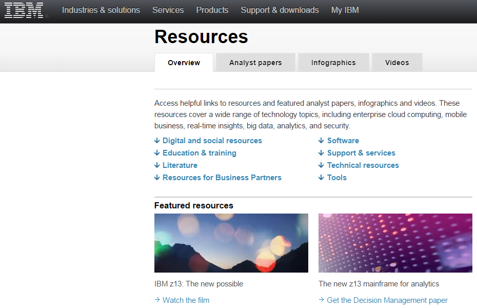
1) Pick a strategy that is core to your brand. IBM is known for three key assets: Its technical expertise, its role as long-time market leader, and its position as a respected source of IT information. To match its steady flow of content to its brand attributes IBM follows the same path. To uphold its reputation as a technology leader for more than a century, it has to produce authoritative content that underscores its thought leadership. Because the company is a technical powerhouse, it has to ensure that the content is technically authoritative. And because the company is trusted by millions to provide detailed descriptions of challenges and solutions, it has to make sure that its content is at an expert level. While trying to follow in IBM’s footsteps is not an easy task, it provides a strong lesson for how to approach your content. It should be well-written, possess authority, and have an expert voice. That’s what customers want and respond to.
2) Don’t be boring. This might sound obvious, but with many business-to-business or business-to-government solutions, it’s not always easy to sound interesting on technical topics. Resist the temptation to edit out content that might be fun and relevant, and that plays on popular topics or cultural experiences. Take Hootsuite as an example. There’s nothing very sexy about a tool that allows you to manage your social media posts. It’s mostly a dashboard with a number of useful applications tacked on. But Hootsuite rose to immense popularity by playing off a popular theme, the HBO television series “Game of Thrones.” It created a video called “Game of Social Thrones,” using graphics and music similar to the television show to demonstrate its capabilities. Each popular social platform has its own Game of Thrones city, and logos and images are cleverly used throughout. Timing is everything, of course, and the Hootsuite video garnered lots of buzz on YouTube. Hootsuite also makes sure that its content, even when serious, is fun, increasing its popular appeal. So while your brand or product may be technical and specialized, you can still write content with which your audience will identify on a popular level. The lesson: Don’t feel that you need to be serious all of the time. Create some fun, light content now and then.
3) Tell stories. It’s easy to fall back on technical explanations, and these are often important when conveying the value that a product or solution brings to the market. But telling a human interest story that illustrates what that technology brings to customers can be much more penetrating. Few do this better than Microsoft, whose “Stories” blog posts rarely even include the term software. Instead, they tell stories of how Microsoft technology has helped people, and in some cases changed their lives. In one example featuring sportscaster Daniel Jeremiah, the story is one of the human experience, of triumph, challenge and redemption. Daniel explains how as a scout for the Philadelphia Eagles, when he didn’t trust his instincts and the data at his disposal, he lost the opportunity to push for Seattle Seahawks superstar Russell Wilson. It’s a fun,personal and powerful story, and one that demonstrates Microsoft’s leadership not with a hard sell of its products, but with a tale that will stick in your mind.
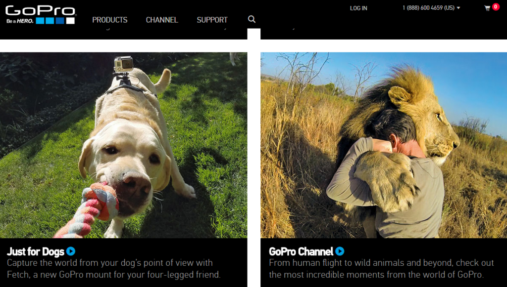
4) Go visual. Visual images draw attention, tell a story, and help illustrate a brand’s true value. The problem is, many companies, particularly in the technology space, don’t believe they have much they can show using photos or high-impact graphics. I’m going to put forward GoPro as a great example of a company that relies on the visual to tell it brand story. And yes, I recognize that it’s not a fair comparison—a company that sells action-oriented video equipment of course would have great videos to show off its products. But the thing about GoPro is that it almost never actually shows its cameras in its marketing efforts. Instead, GoPro focuses on its users. One of its leading cameras is called the Hero, and its campaign is to turn its customers into heroes. Much of its content is created by passionate users who are, in turn, becoming public heroes. Companies who aren’t in the video business can take a similar approach. Tell the story of your customers and end users using video and other visual assets to make them the heroes—for the challenges they are addressing and the problems they are solving. At the very least, use visual content and images to enhance your text-based content.
Taking an innovative approach to content marketing can pay off in spades for any brand willing to think creatively and act accordingly. But sticking to some basic truths about what customers want and expect will increase your brand footprint and drive market recognition and share.
The lowly infographic, once a novelty but more recently a must-have for markets trying to quickly a complicated message, seems to be in the twilight of its existence. What’s more properly referred to as a data visualization used to command the attention and admiration of marketing professionals everywhere. It wasn’t too long ago that such iconic and influential infographics as Aaron Koblin’s map of aircraft flights in the U.S. was dazzling us and pushing everyone towards this engaging new medium.
It’s easy to see why infographics became the darling of the marketing world. People like to be able to visualize complex issues. Our eyes are more comfortable scanning images than wading through data. And with the explosion of big data, making sense of all for that information through text alone can be difficult. We have worked with dozens of clients on ways to visualize and animate their complex data. The truth about infographics is that they are effective when done well, and will continue to be a valuable asset in the marketing toolkit.
Then why do they seem to be falling out of favor? Indeed, according to Sarah Rapp with the portfolio-sharing site Behance, “Infographic posting generally rose steadily from 2007 to 2012, where it peaked, and has begun to decline since then.”
As Fast Company contributor Mark Wilson wrote in a recent blog post, “A few years ago, the Internet was awash in groundbreaking data visualizations…Today, you’d be lucky to find a cheap knockoff in a world dominated by crappy promotional infographics churned out for viral attention.”
There are a few trends that help explain why infographics may seem like they are losing steam. One of the most obvious is the move to mobile, and as any reader of our recent blog post on the latest Google search algorithm change has learned, websites that aren’t mobile friendly are getting dinged in web searches. The reason is obvious—beautiful and intricate graphics typically do not translate to small-screen devices. If smartphones and tablets make up more than half of today’s web traffic, that’s a massive amount of viewers on which a sprawling data visualization would be lost.
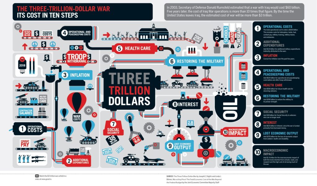
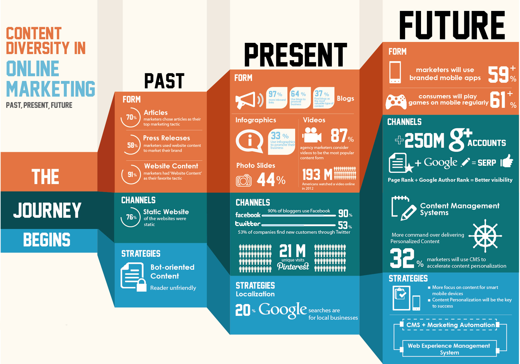
Another is more basic. Many infographics try to pack in so many details and so many data comparisons that they become incomprehensible. Rather than simplifying information, they end up confusing the viewer to the point of their eyes glazing over. Good designs are simple and eye-catching, not complicated and mind-numbing. Here’s an example of data overload:
Finally, as Mark Wilson notes, in many ways infographics have gone mainstream. “Once a playground for independent designers, data visualization has evolved into something more mature, corporate, and honest about its failings,” writes Wilson. “The quirky, experimental infographics that once peppered the Internet may be disappearing. But that’s only because data visualization, as a medium, has finally grown up and gotten a job.”
Bluetext comes at visualization from a different angle. We often work with our clients on what we call “StoryGraphics.” StoryGraphics, as the name suggests, tell a story rather than relying on comparative data to draw comparisons. In many cases, this is because the client may have key messages but not have data that lends itself to clever charts or graphs.
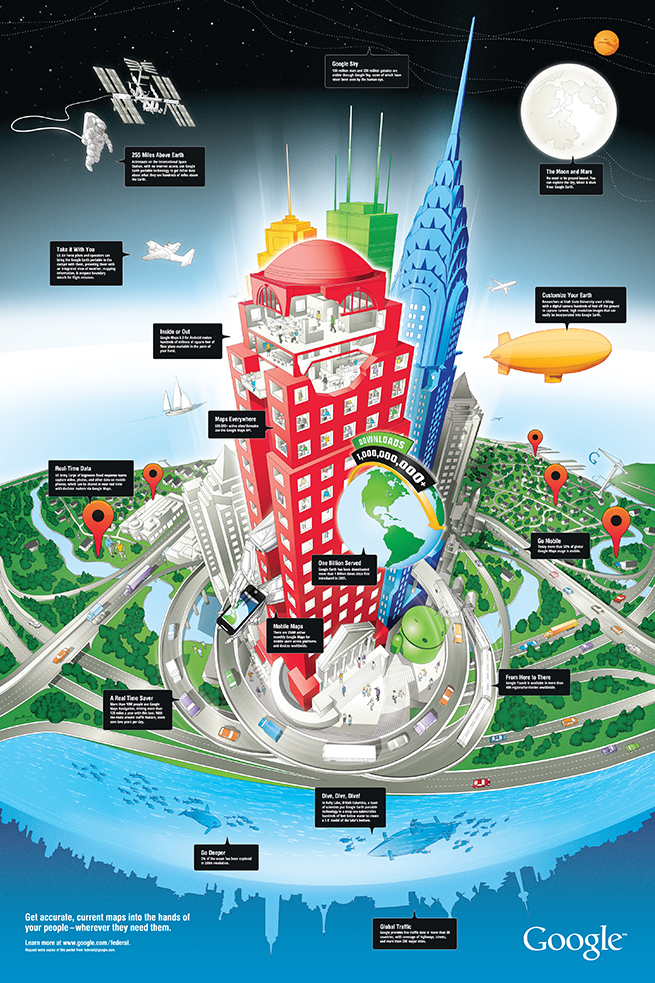
In a design we created for Google recently, the StoryGraphic tells how geospatial information can be used in space, for aviation, at all levels of commerce but also on the water and under the seas. A huge success for the Google enterprise team, this graphic would never have succeeded as a typical infographic.
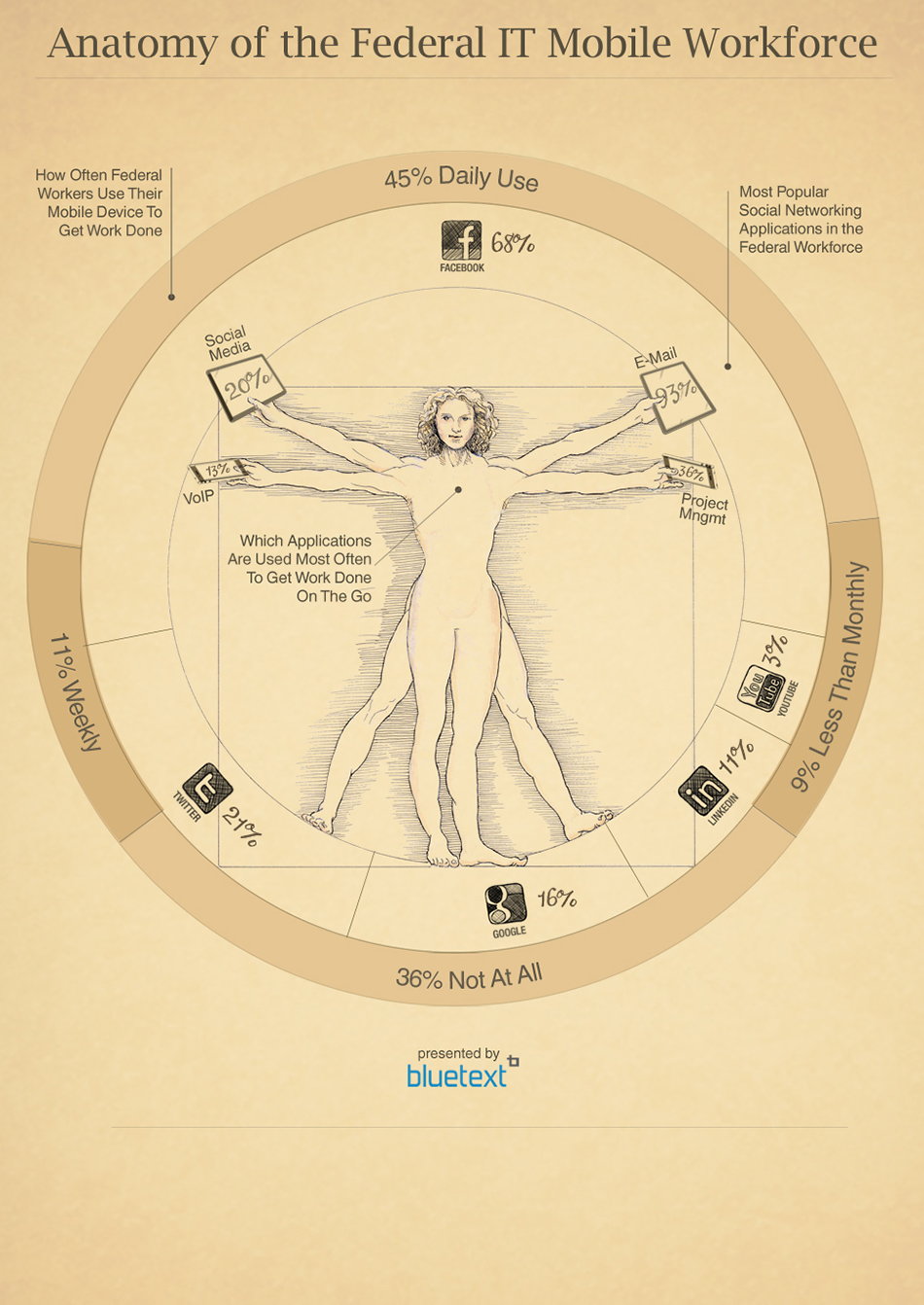
Another Bluetext example shows the move by Federal workers towards mobile devices. While data plays a role in the graphic, it leverages an iconic image to draw the viewer into the story that is being told.
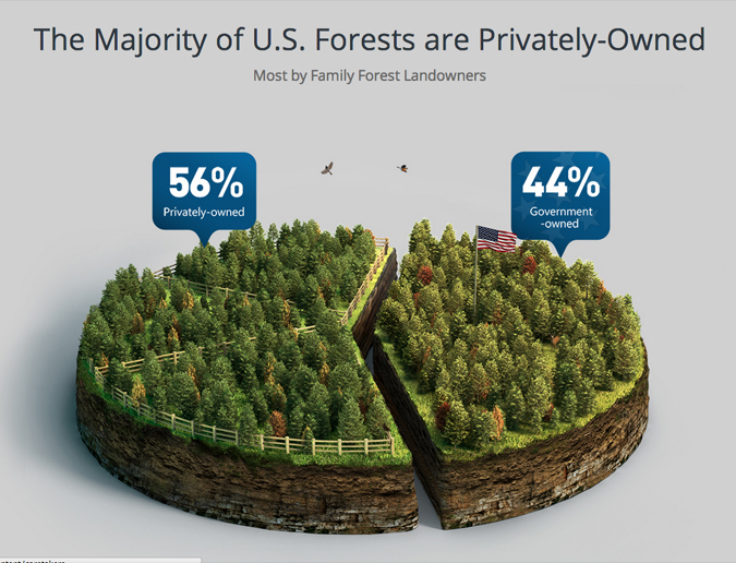
Some of our most compelling client examples do rely on comparative data, but focus on a limited number of statistics to more effectively tell the story. For a design for Georgia Pacific, one of the world’s leading wood products companies, we created a pie chart that took the form of a forest with just one cut down the middle to visualize the difference between government-owned and privately owned forests. The design instantly conveys the surprising fact that there are more private forests than government forests.
You can find compelling and intriguing examples of Bluetext StoryGraphics and infographics here in our portfolio. The bottom line is that marketers can turn to more sophisticated ways of using graphics to tell stories than a confusing jumble of facts and figures.
While it might seem like a bad movie plot, websites that aren’t friendly to mobile devices are about to be in for a rude awakening. In late February, one of Google’s top webmasters announced in a blog post that the dominant search engine was about to make a significant change to the way it ranks search results. Beginning on April 21st, its search algorithm would increase the weight it gives when returning search results to what it called “mobile friendliness.” Not only does that mean that mobile-friendly websites would enjoy better results, it also means that sites that don’t meet those standards will face the consequences. Some have already dubbed it “Mobilegeddon.”
The stampede from desktops to the wide variety of shapes and sizes now available as tablets, cell phones and even wearables—think Apple Watch—that has taken place over the past several years is only getting larger. A recent survey by ComScore Networks—a firm that analyzes internet traffic and trends—found that in the final three months of last year, desktop searches in the U.S. decreased, while the searches with smartphones jumped 17 percent. The volume of tablet searches increased 28 percent.
And while many of our clients have made this shift to mobile friendly, they are in the minority. A survey by Didit.com took a look the sites of the largest companies to see if they have adopted a mobile-friendly approach. Didit looked at the home pages of publicly-traded companies on the Standard & Poor’s top 100 list by checking them against Google’s “mobile-friendly test page.” The result—some 25 percent of those home pages failed the test, including the Walt Disney Company, a brand that is typically at the forefront when it comes to leveraging technology for visitors to its theme parks.
The Disney home page looks great on a desktop. But as the screen size gets smaller on table and mobile devices, the Google tool found that the text was too small, the links overlapped each other and the content was often wider than the mobile screen.
We’ve been working with our clients for the past four years to make the move to responsive designs that automatically resize their user interface depending on the size of the display screen. A responsive site takes a standard website and instructs the mobile device on how to display it properly. Responsive websites can handle any resolution with changes in CSS files, which affect how the elements on Web pages are presented. Computers, laptops, smartphones, and tablets will all display the website in the best way possible.
One of the reasons responsive design is so important is the “fat finger” problem—as menus shrink, it becomes nearly impossible to engage the functionality since our fingers are too big. Responsive designs shift the menus from ones that are driven by discreet buttons to larger options that are easier to see and easier to select. Without this type of design, visitors will be frustrated and leave the site in search of one that is user friendly.
This approach insures that the website appropriately presents itself on every size display, from the smallest to the largest. Another approach is to have a separate mobile website. Yet, since new devices in different sizes seem to hit the stores about every 10 minutes, this could be a large problem for websites, and certainly would not be cost-effective.
To put this in perspective, while this is a significant move by Google, it doesn’t mean you have to panic. Some of us have been advising our clients for several years that more and more users are accessing their websites via tablet and mobile devices. Google is simply responding to the shifting trends of how consumers are accessing the web. It will not unduly penalize a website that doesn’t immediately meet its requirements like it did in previous search changes—you can still make the move to a mobile-friendly site and see your rankings adjust accordingly. And if you haven’t been paying attention to the marketplace and to the shifting needs of your audiences, you may have a bigger problem than Mobilegeddon.
Are you planning to integrate or upgrade your content marketing into your online marketing strategy? Not sure where to begin? Here is a basic rundown of how to create an effective content marketing strategy.
1. Establish Your Conceptual Target
An effective content marketing strategy must begin with this first critical step. The goal is typically pursuing new customer opportunities while preserving your core customer base. Understanding who they are, where their interests lie and how to get them to take action and engage with your brand is key to developing your content strategy.
2. Don’t be a One Hit Wonder
As opposed to advertising – which is driven by “The Big Idea” – to stay fresh and engaging, your content marketing strategy needs to offer a variety of premium content on a number of contextually relevant topics When content marketing teams are under resourced, they tend to gravitate back to the big idea and get boxed into a an approach that’s not scalable long term.
3. Use an Editorial Approach
Too many content marketing programs fail in the planning phases of the program because the a long term content strategy has not been fully thought out – so the content being developed using a shoot from the hip approach tends to be more episodic than strategic. The most effective way to avoid failure is to identify specific themes for your content strategy that align with the cyclical business or personal needs of your target audience
4. Be Contextually Relevant
The content you develop must be interesting, engaging and above all else, relevant. Your conceptual target should be able to quickly connect the dots between his challenges and the capabilities you can offer to overcome them – the more contextually relevant your content is to them the easier they will be able to make that connection
5. Process Driven Approach
Since content marketing is still a relatively new approach, a lot of companies are not investing adequate resources or the defined process that planning, managing and publishing an adequate amount content requires. Building a solid content marketing workflow process, and investing in the necessary resources to implement it – whether internal or external – are critical to your success.
6. Collaboration is Key
As with any emerging marketing channel – and social media is a good example of this -there is an internal struggle over which department actually “owns” it. Until that’s figured out, many companies will make it a shared responsibility between their PR, Advertising and Creative departments – passing the content baton from one silo to the next with no clear strategy. If you must borrow the resources, make sure there is a coordinated effort to collaborate as a team on the themes, goals and structure of your content marketing program.
7. Cadence and Consistency
When creating your content strategy, be sure to decide on the frequency of your content marketing so that once your audience is engaged, they stay engaged. Having a consistent and predictable flow of content that your customer can rely on is critical to establishing brand credibility.
8. Use the Right Channels
Instead of hoping your audience stumbles upon you, be sure to publish your content where they already are – in their own environment where they will be more willing to engage. Consider promoting your content on broader social sites like Twitter can make it go viral. If the content is what readers are looking for, they won’t hesitate to share – and that’s the holy grail of content marketing.
9. Leverage SEO
A solid content marketing strategy geared toward the right audience is worthless if it doesn’t reach that audience one way or the other. One of the most effective ways to leverage that content is to employ a strong SEO strategy to incorporate keywords that your customers are using to search for the solutions you are ultimately trying to sell to them
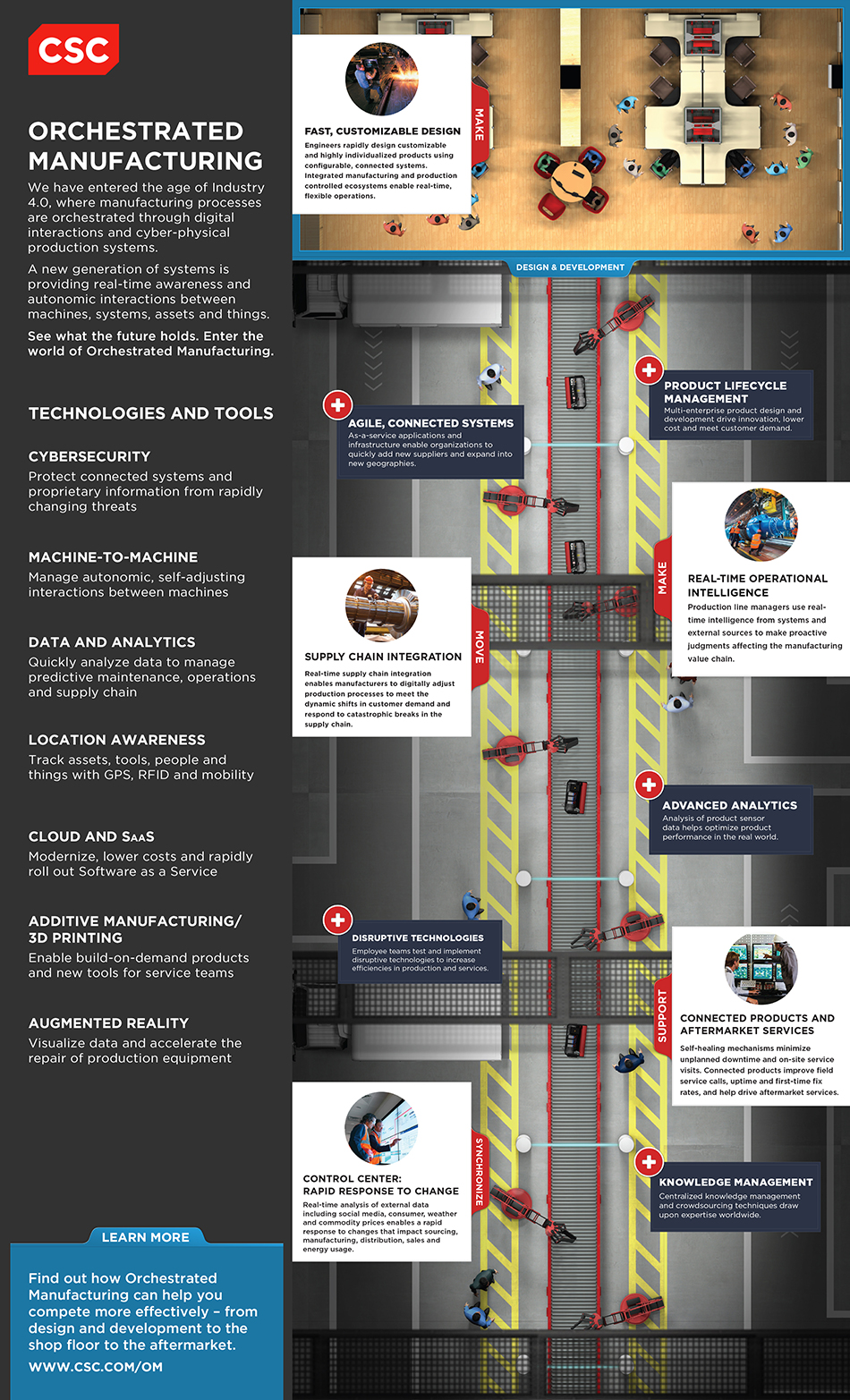
CSC turned to Bluetext to design and launch an industry-specific landing page around its approach to targeting the requirements of the manufacturing industry. CSC’s vision is called Orchestrated Manufacturing, and it represents an age where manufacturing processes are orchestrated through digital interactions and cyber-physical production systems. CSC is working with clients to implement advanced solutions that leverage a new generation of systems is providing real-time awareness and autonomic interactions between machines, systems, assets and things.
Bluetext worked with CSC’s digital brand marketing team, as well as their Manufacturing industry marketing team, to design a landing page unlike anything CSC has ever launched inside of its corporate domain. It includes a modern design with one long, scrolling page to showcase the vision and its practical application to the market, and then lead visitors to download key content and interact with CSC.
At Bluetext, we find that many large companies with diverse industry focuses and solution offerings sometimes make it hard for target audiences to find exactly what they are looking for. The idea behind Orchestrated Manufacturing is for CSC to tell its story in a unique way with an online and offline strategy to drive a consistent visual message into the market. The landing page is complemented with two videos that can be used by sales teams to succinctly tell the story, as well as a highly produced poster for sharing at events.
Please check it out at www.csc.com/om. We would love to hear about how you are designing landing pages targeting unique audience groups and what strategies you are finding work best.
