Prefer listening over reading? Check out the podcast version of this blog below and enjoy insights on the go!
A company website is an opportunity for a user to interact with the company’s brand, and the first impression that the site creates can make the difference between a user being an explorer or a deserter. An explorer is an intrigued, curious customer, digging through the site searching for relevant information, taking note of all the content they pass along the way. A deserter, on the other hand, is a bored user that is either underwhelmed with their user experience or overwhelmed by the copy and content to sort through, leading them to leave the page and making them less likely to return.
The ideal user experience on a website should keep users engaged and interacting with the site, begging even the most uninterested users to become avid explorers. Immersive scrolling is a recent trend in UX design that can stimulate this interactiveness by drawing users in and keeping them engrossed in the site content while directing them through information in a narrative format. Immersive scroll experiences use imagery, videos, graphics, or even sound design to pull users into the content and weave them through the information in a more dynamic way.
A site built with immersive scroll functionality should have unique elements that the user can click, drag, or zoom into. For example, read our blog on Designing Truly Immersive Websites.
In it, we explore the 2℃ Earth page example, which has an impressive number of unique immersive scroll elements, highlighted below:
1. Click to Enter – After landing on the site, the page initially loads a plain black screen, with a scrolling message encouraging the user to click anywhere on the page in order to unlock further content. This functionality creates a sense of intrigue and discovery, like unwrapping a present. Rather than overwhelming the user with content upon landing, the sleek, simple screen engages users with the invitation to search for more and gives them simple, clear directions on how to find it. 
2. Click & Drag Imagery Filters – Upon entering the site, the interactivity continues. In the hero image, the site has a click & drag functionality where users can apply a thermal imagery filter overtop of the image they’re seeing. This interactivity is novel, so it insights a feeling of awe in users, but it also is relevant to the messaging the site is trying to portray. Explained by the directions on the page, the imagery represents the past and future of a natural landscape – a before and after of the effects of global warming. This is a prime example of how the functionality on the site can be informative and impactful, in addition to being entertaining. 
3. Imagery Takes a Front Seat – On traditional sites imagery typically acts as supporting content for the copy. On a site with an immersive experience, however, the visual elements of the site are in the front seat; for example, you can see how the 2℃ Earth page displays large imagery (often expanding outside of a single viewport), and adds interesting micro animations or text overlays to keep the users focused on the images, front, and center. Where a traditional site would keep images static, 2℃ Earth instead has imagery expanding on scroll. This is a good alternative to video content, adding a splash of movement to the otherwise static image. 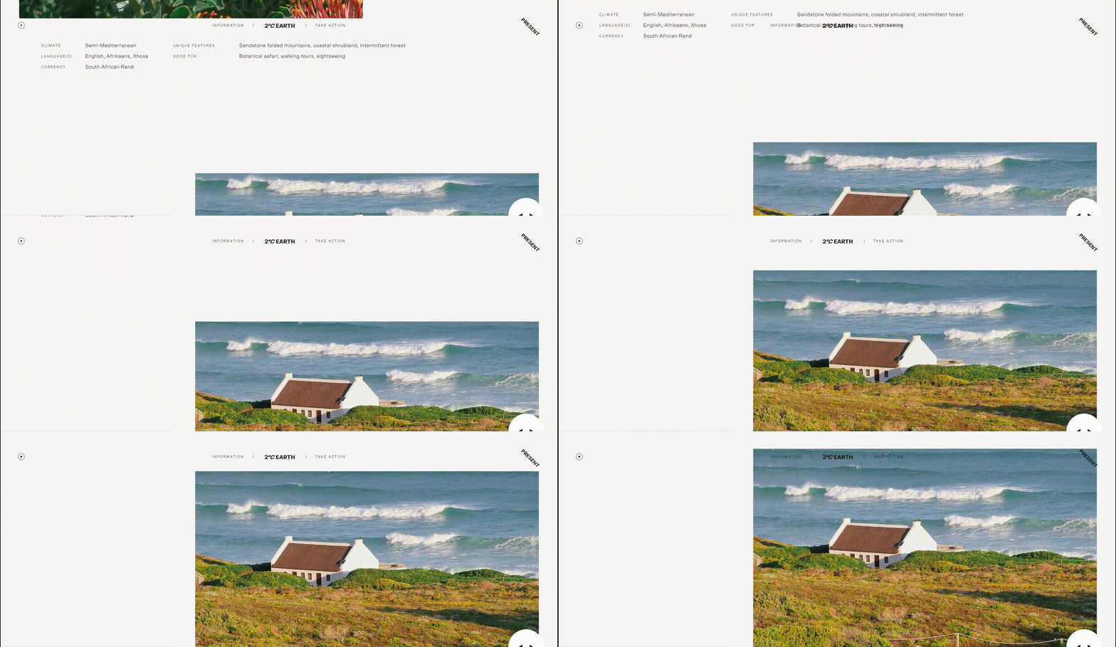
4. Variation in Content Layout – Throughout the page, the content alternates from full-width imagery to 50-50 imagery with text, to right-aligned imagery, to full-screen stylized text, etc. When viewing the page for the first time, the user cannot anticipate where to look next, so each new viewport is an exciting, surprising layout. Alternating the content and imagery placement, keeps the user on the edge of their seat, forcing them to reconsider and analyze the content on each new viewport, looking for nuggets of information or ways to interact with the page.
Here at Bluetext, we work to create website designs that are visually appealing, interactive, and intuitive. For example, see below for a breakdown of some of the immersive design elements we brought to the homepage of the Asimily website:
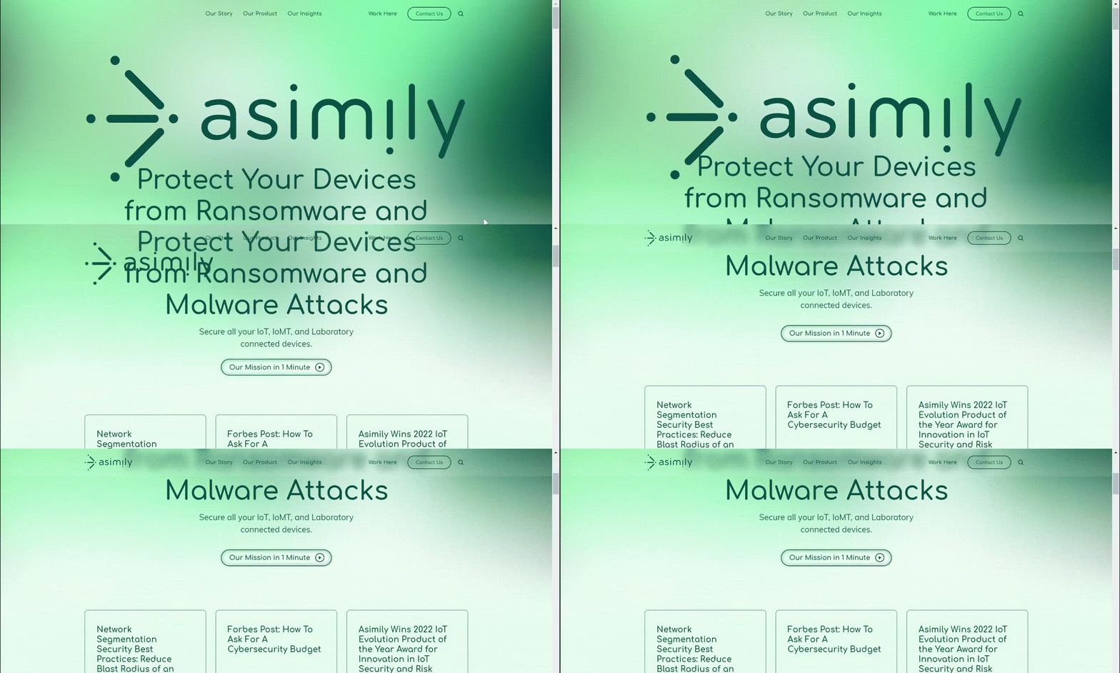
1. The logo moves into the navigation bar on scroll.
When first landing on the page, the Asimily logo appears full-width, almost filling the entire screen. This emphasis on the logo aids in brand awareness for users who have never visited the site before. However, as a user scrolls down, the logo shifts up to its spot in the navigation bar, where it remains on the page as a more of a background element, but still within sight.
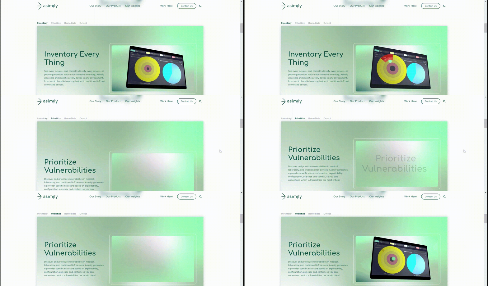
2. Scroll function allows shifting through tabs.
Rather than using a typical tabbed module (where a user must click different tab headings to navigate information), instead, we designed this unique component to shift to the next tab when the user scrolls down the page. This ensures that the user sees all of the information added to the page. A typical tabbed module, without this unique scroll immersion, would leave much information hidden, and unlikely to be explored by the user.
3. Highlighting snackable video content.
You’ll notice as you scroll through the page that there are many short snippets of videos included throughout the design. These shorter videos add visual intrigue and informational insights to the page content, while not expecting the user to sit through a full minute-long video all in one go.
Other examples of immersive scroll interactiveness from the creative minds at Bluetext can be seen in these elements of this campaign landing page we designed for Sectigo.
1. Circular scroll transition
To really capture the feeling of openness for this campaign, we designed a circular transition on this page, where the viewport is taken over by a white circle that envelops the background as the user scrolls down. The novelty of this action takes users by surprise and adds excitement to the meaning behind the openness theme.
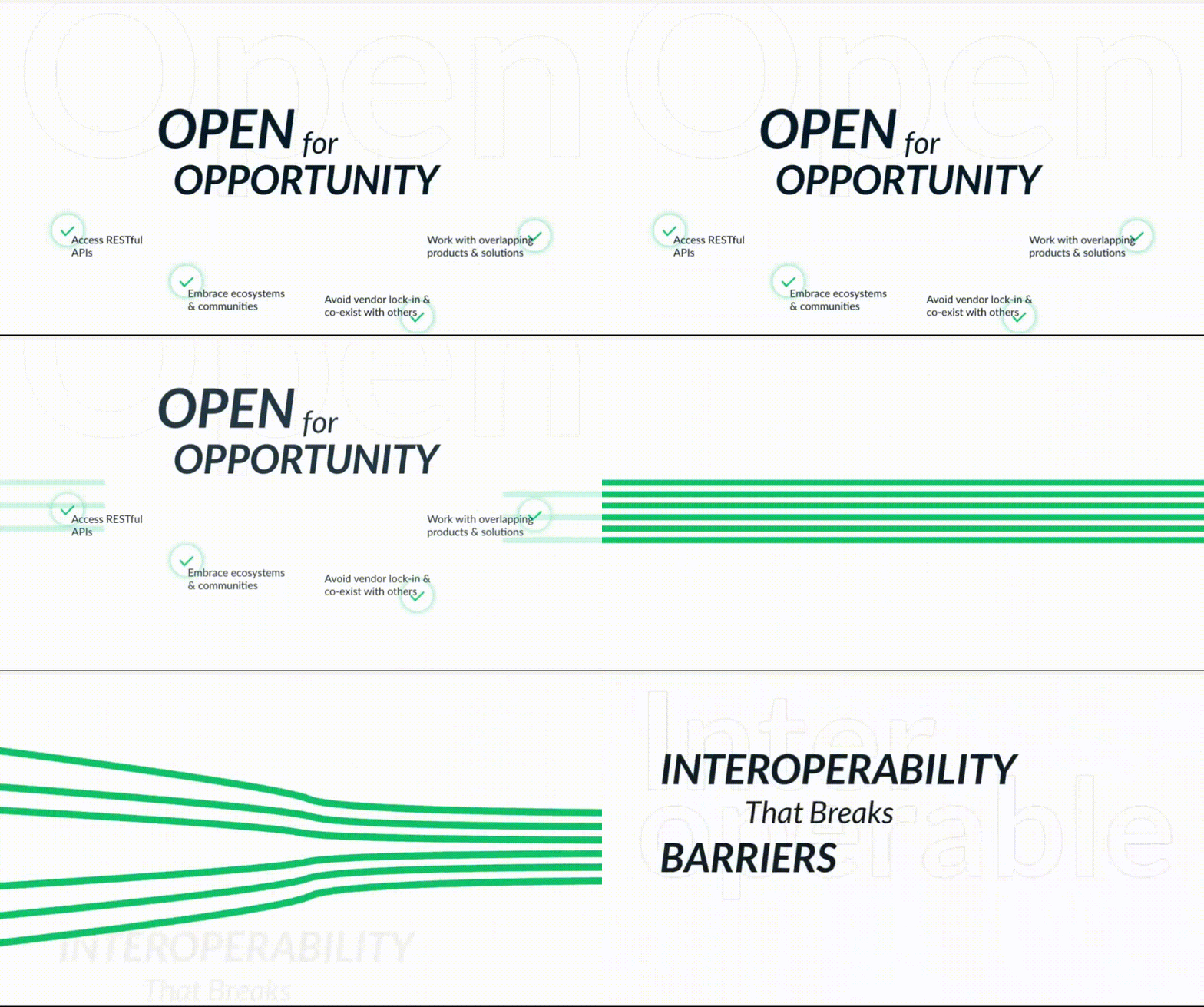
2. Horizontal line animation
As the user continues to scroll down the page, the green lines from the Sectigo brand cut across the screen horizontally. These lines then break open to reveal the next content, which leads perfectly into the message of how Sectigo’s platform interoperability breaks down barriers.
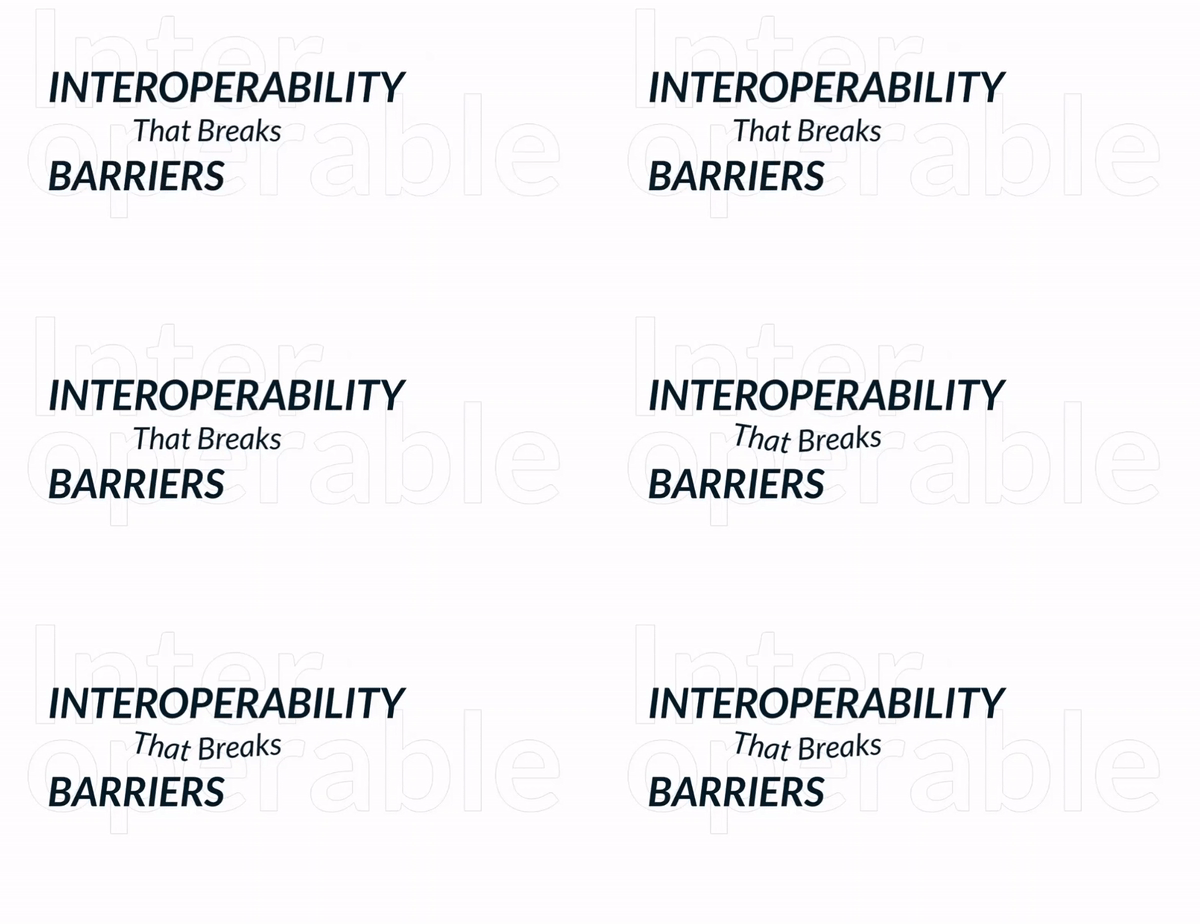
3. Small text animation
Animation was applied to the “That Breaks” text on this page to visually convey the meaning behind the words on the screen, rather than just feeding static copy to the users. These sorts of targeted animations/movements keep user attention trained to very specific areas on the page, which helps hold their attention while they scroll through the content.
Immersive scroll elements can be incorporated into an otherwise traditional site layout, but for the most impactful experience, the immersive experience should be considered from the beginning to the end of the user journey on the page. The following questions are especially relevant when deciding whether or not site content would be well-suited to an immersive experience:
- Is there a single key theme that this page can take users through, in a linear fashion? The immersive experience is bringing the user along throughout a story, which requires a clear direction and a logical, ordered approach to how information is presented.
- Are there exciting, high-quality visuals to accompany this story? Whether it’s imagery, illustrations, graphics, or video content, the immersive site more heavily relies on keeping the user visually engaged, so that they don’t lose interest or direction when navigating through numerous components of the page.
- What unique interactions could be designed for the user to play with the content in front of them? In the immersive scroll experience, users are not just viewers of the site, but participants in it. This type of UX design can have a largely gamified feeling, designed to have users navigate from point A to point B of their own accord, with a feeling of delight and wonder as they discover content in ways they didn’t expect it.
If you’re considering implementing an immersive scroll experience for your website, or you simply want to improve your website design and interactivity, contact Bluetext to learn about our UX design & development services.
