We’ve all been there – eagerly searching the internet for that piece of information we just can’t do without, only to encounter that dreaded message: “404 – Page Not Found.” It’s like hitting a brick wall in the digital world, right? But here’s the good news: a 404 error page is more than just a dead-end; it’s an opportunity for your brand to showcase its playful, fun, and creative side.
What’s a 404 Page, Anyway?
Before we dive into the whimsical world of fun 404 error pages, let’s get the basics straight. A 404 error page is a response code served by a web server when a user requests a web page that can’t be found. This can happen for various reasons, such as a broken link, a mistyped URL, or a deleted page. In essence, a 404 error page is like the “Sorry, wrong number” of the web world.
Key Elements of a 404 Page
A great 404 error page should do more than just apologize for the inconvenience. It should reflect your brand’s personality, engage the user, and steer them back on track. Here are some key elements to include:
- A Friendly Apology: Start with a warm, friendly apology for the inconvenience.
- Clear Navigation: Provide easy-to-find navigation options to help users find what they were looking for.
- Search Bar: Include a search bar to help users look for specific content.
- Contact Information: Add contact details or links to customer support for assistance.
- Branding: Ensure that the page design is consistent with your brand’s visual identity.
- Humor and Creativity: Inject some fun, humor, or creativity into the design or content to make users smile.
10 Examples of Fun and Creative 404 Pages
Now, let’s take a look at 10 examples of 404 error pages that have nailed the art of infusing brand personality into a potentially frustrating situation:
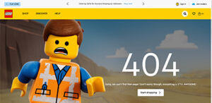
- Lego: True to their playful spirit, Lego offers a whimsical 404 page that features a construction worker diligently fixing the missing page.
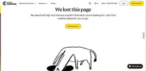
- Mailchimp: The folks at Mailchimp turn their mascot into a detective, ready to solve the mystery of the missing page.
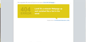
- IMDb: IMDb’s 404 page features a different quote every time you refresh the page, altering classic movie quotes to apply to your missing page.
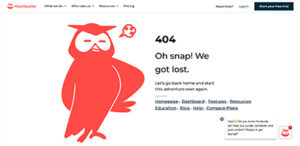
- Hootsuite: Hootsuite’s owl mascot consoles users while suggesting alternative ways to find what they need.
- HubSpot: They offer a cute 404 page with a graphic of a broken heart, a love-themed message, and lots of information on how to continue your journey.

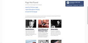
- NPR: National Public Radio offers links to find what you’re looking for, with a clever segue to some of their articles with the message, “stick around to browse through NPR stories about lost people, places and things that still haven’t turned up.”
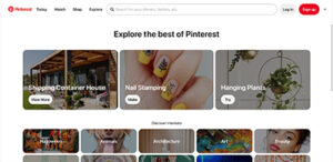
- Pinterest: Pinterest’s 404 page automatically redirects users to their “Ideas” landing page, allowing users to explore all that Pinterest has to offer.
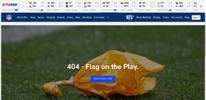
- NFL: The NFL throws a flag on the play to represent your lost page.
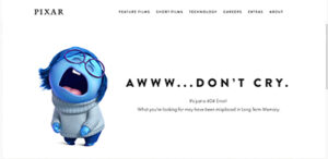
- Pixar: Pixar incorporates their well-known movie characters and movie references into their 404 page.
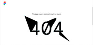
- Figma: Staying true to their design roots, Figma displays an interactive 404 graphic that allows the user to design their own 404 page.
Your 404 error page is more than just a dead-end; it’s a golden opportunity to leave a lasting, positive impression on your website visitors. So, why not have a little fun with it? Inject some personality, humor, or creativity, and turn that frustrating moment into a delightful one. After all, a little laughter can go a long way in making a user’s day better.

