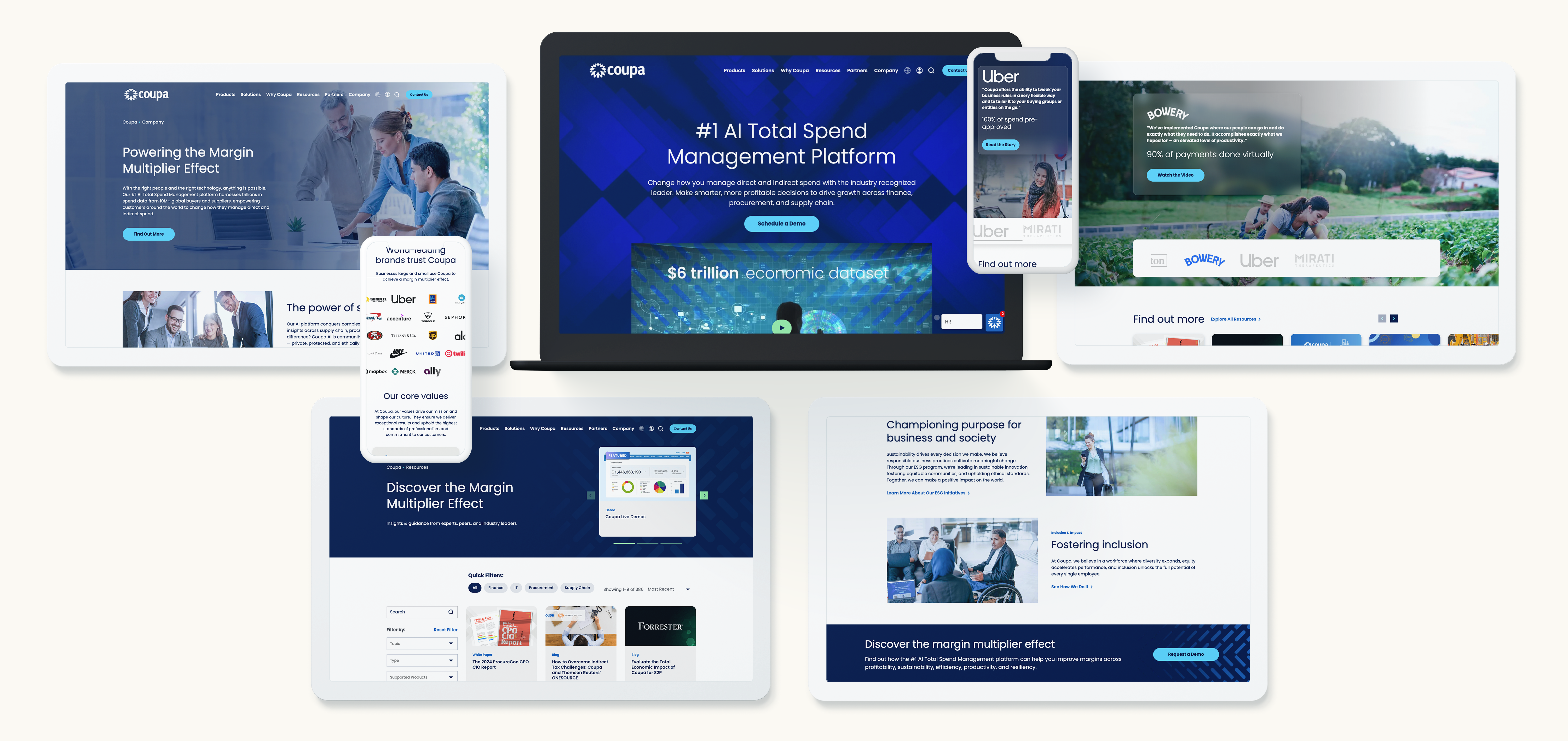
In the fast-paced world of digital marketing, first impressions are formed in milliseconds. These split-second judgments often determine whether a visitor stays on your site, explores your services, or leaves. People decide emotionally first and rationally second. That is why thoughtful design, including colors, shapes, and layout, is more than decoration. It is strategic.
Designing with emotion means intentionally crafting visual experiences that build trust, guide perception, and create urgency. When done well, it can subtly influence buyer behavior and move prospects from curiosity to conversion. Let’s explore how colors, curves, and layout psychology help brands connect, convince, and close deals.
The Psychology of First Impressions
Research shows users form opinions about a website in under a second. That first glance tells them if a brand is credible, professional, and worth their time. These impressions are emotional as much as they are visual.
Visual cues like color, contrast, and spacing communicate confidence, clarity, and competence. In B2B, where decisions are complex and high-stakes, a website that evokes trust and clarity can make the difference between a lost lead and a signed contract.
Design that resonates emotionally does more than look good. It persuades.
The Language of Color: Building Trust, Urgency, and Desire
Colors carry psychological associations that influence perception.
- Blue signals trust, stability, and professionalism. It works well for finance, tech, and telecommunications.
- Red creates urgency and draws attention, making it ideal for calls to action or limited-time offers.
- Green conveys growth, balance, and reliability. It is often used by sustainability-focused brands or B2B tech companies.
It is not just the choice of color, but how it is used. Contrast, saturation, and balance guide the eye and reinforce hierarchy. Choosing colors that align with your goals helps visitors feel confident, focused, and ready to take action.
The Science of Shape: Why Curves Feel Safer Than Corners
Shape psychology is powerful but often overlooked. Rounded edges and curves are perceived as approachable, friendly, and safe. Sharp angles communicate precision, assertiveness, or caution.
Buttons, icons, and content containers with curves can subtly encourage interaction. Tech companies like Apple and Google use rounded designs to suggest simplicity, reliability, and accessibility. Curves reduce friction and make digital experiences feel intuitive.
Layout, Space, and Flow: Designing for Calm and Clarity
Design is more than color and shape. Structure matters. White space, visual hierarchy, and symmetry guide attention and set emotional tone.
Cluttered pages can cause frustration. Balanced layouts signal professionalism and calm. Proper spacing highlights important content, guides the eye naturally, and makes your messaging easier to digest. Aligning layout with the buyer journey creates a subconscious flow that improves engagement.
Designing for B2B Audiences: Emotion Meets Authority
Some brands think emotional design only works for consumer audiences. The truth is decision-makers in B2B are human, and humans respond to emotion.
Subtle cues, like accent colors, consistent shapes, and clean layouts, communicate authority and reliability. For tech audiences, combining bold structures with approachable accents conveys professionalism while remaining human. Strategic emotion makes complex offerings feel accessible without reducing credibility.
From Aesthetics to ROI: Measuring the Emotional Impact of Design
Emotional design can be measured through engagement metrics. Key indicators include:
- Bounce rate and time on page
- Form submissions and content downloads
- Scroll depth and navigation patterns
- Brand recall from surveys or heat maps
User testing and analytics help validate which design choices foster trust and guide action. Well-crafted design becomes not just creative but an engine for conversion.
Designing with Emotion and Intention with Bluetext
Design that sells is intentional. Every color, curve, and layout choice should align with the emotions you want your audience to feel and the actions you want them to take.
At Bluetext, we combine behavioral insight, design strategy, and creative execution to craft experiences that engage emotionally and perform strategically. From color psychology to motion design, we help brands create digital experiences that look great and close deals.
Ready to design with purpose and emotion? Contact Bluetext to build experiences that inspire trust, guide perception, and drive measurable results.
Recent Posts
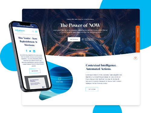
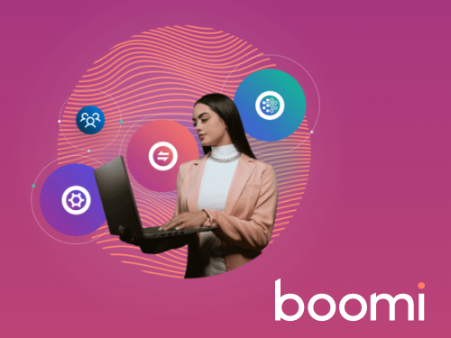
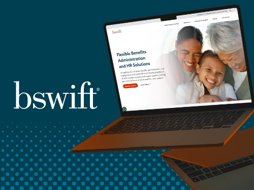
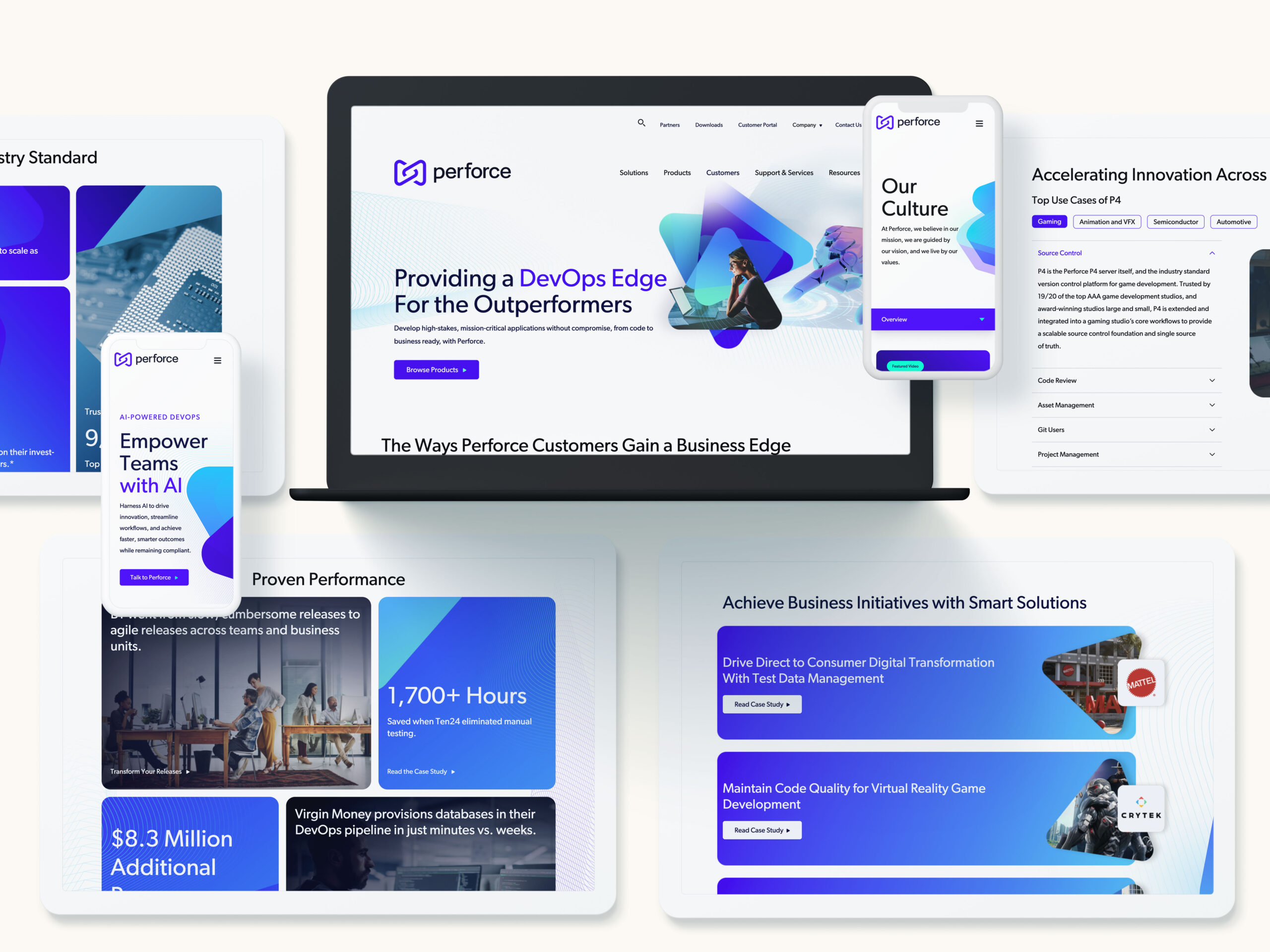
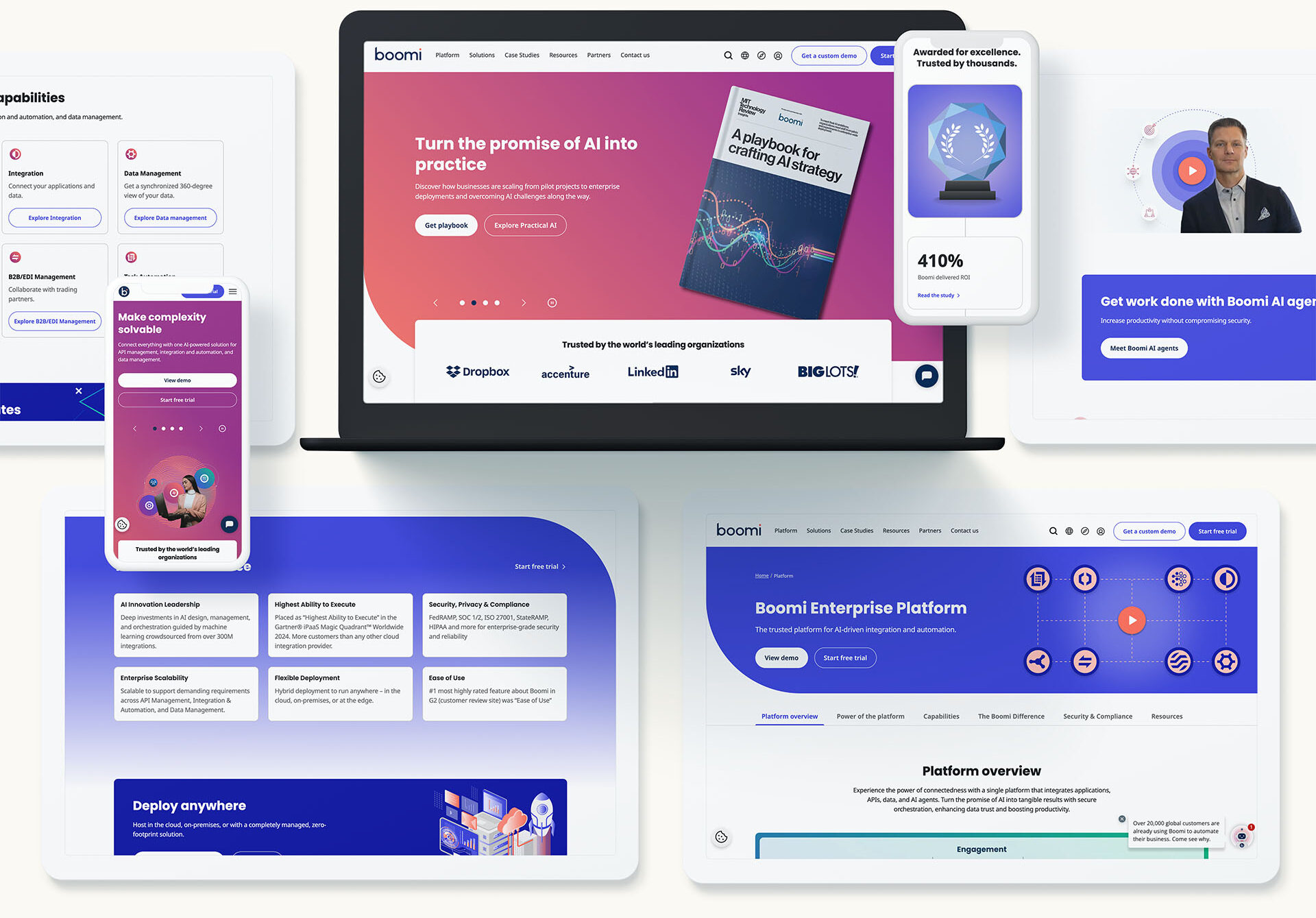
Bluetext’s Recent Work