Mergers and acquisitions occur every day, but are they setting their companies up for success? One of the challenges with M&As is ensuring your company’s values remain clear in your brand’s image. Customers need to be assured that their service won’t change, but rather improve. Bluetext, as a full-service marketing agency, has a proven track record of helping companies navigate complicated integrations while increasing their overall value.
So your company went through an acquisition, why should you rebrand?
In any acquisition, companies are left with the challenge of combining two or more entities with different brand values. While acquisitions often enable companies to expand or improve their service, customers will inevitably remain skeptical until they see their trusted service remains up to par. Bluetext has the acquisition marketing knowledge to guide your company through a successful acquisition. By focusing on marketing from the start of your acquisition, you can seamlessly align previous companies’ brand values to a new, better than ever entity.
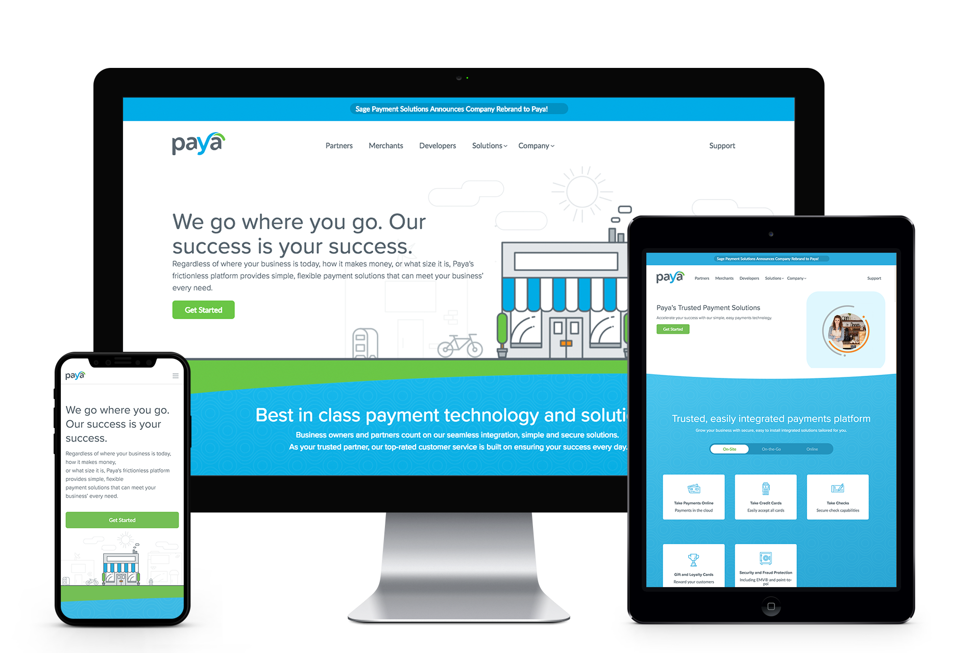
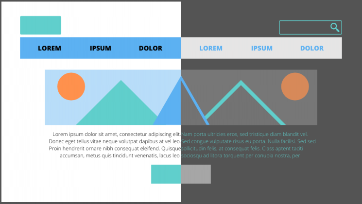
After the private equity firm GTCR acquired Sage Payments, they came to Bluetext to re-design and launch Paya, their joint venture. The initial launch was slated to create a simpler payment system for users but left much to be desired by their parent brand. Bluetext helped create a new corporate Visual Identity (CVI) that conveyed the essence of partnership. We conducted a logo study to find a logo that would convey the user-friendly nature of Paya while establishing it as a payment company. Additionally, by utilizing a dual-journey hero, we were able to satisfy two different customer needs while providing a unified site experience. Learn more about Bluetext’s brand development agency work in our Hall of Fame.
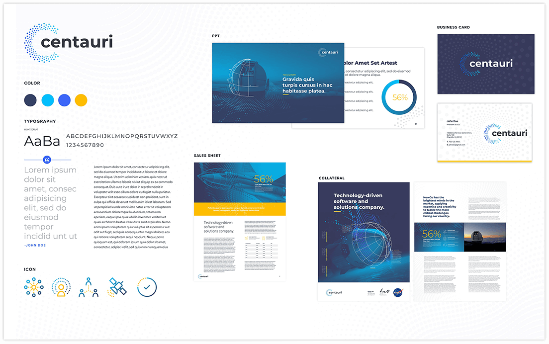
When Integrity Applications Incorporated was acquired by Arlington Capital Partners, they came to Bluetext as a trusted brand marketing agency to help launch their unified brand, Centauri. Opting for an approachable logo, we designed a custom lowercase typeface for Centauri that evokes a modern feel, complemented by a logo based on the Centauri constellation. Combining these visual elements helps establish Centauri as a trusted security company. To ensure all of this was successfully received by their customers, we launched a go-to-market campaign that encompassed PR, digital advertising, and social media.
How will new branding affect your business?
As with any change, it’s important to manage expectations. With our help, we can create a strategic plan to proactively reach out to your customers and explain any management changes at the brand launch. Set your customers’ minds at ease by letting them know what to expect from the merger. Energize your employees with the promise of the new brand, with everything from new corporate messaging to branded collateral. Geared with all the right communications tools, they can feel confident reaching out to customers and stakeholders on how the merger can benefit them. Beyond setting expectations, your new branding can build a stronger relationship with your customers. Kristopher Jones highlights the importance of leveraging your branding to connect with your customers on a more human level.
At the end of the day, change is tough — but necessary. To navigate a merger or acquisition successfully, partner with a digital branding agency that can guide you and execute your branding plan from day 1 through completion. If you want to minimize the growing pains and maximize the end results, get in touch with us to help develop your acquisition marketing strategy.
With a constantly increasing amount of online content being published each day, it is important to stand out in the search engines results. Social media does not directly contribute to your SEO ranking, however, it does have the potential to drive quality web traffic to your site. When links to blog posts, videos, podcasts, and more are shared, Google and other search engines use it to rank your website. The right strategy will allow you to increase overall brand awareness, improve traffic, amplify your audience, and overall benefit your SEO. Want to know how? Read further to learn more about four practical social media tips that will explain how these marketing channels will help you improve your site’s ranking.
1. Generate New Ideas
Whether it is for blog posts or Instagram captions, social media can help you generate new ideas. One way a social media post can generate content ideas is through user feedback. Oftentimes, followers post questions or topics they would like to hear more about in the comments section. Questions within your comment section can also provide great feedback regarding your content that may not be readily available on your social page or website. Using this process, you can use feedback from your followers to generate a list of ideas that will boost your site traffic.
2. Post Content Frequently
Search engines want to know if your company’s website is relevant for its users. Therefore, it is important to regularly post SEO-saturated content to ensure your business looks helpful to users and trustworthy. The more content you post on your website, the more social posts you can create to promote and boost that content. You can accomplish this by creating a social media schedule for each month to monitor the frequency of your posts as well as important analytics like traffic, engagement, etc.
3. Know Your Audience
One of the many benefits of social media is getting to know your audience segments. Social media insights and tools like Google Analytics can tell you where your audience interacts with your content most. This is helpful for improving your SEO ranking because it makes finding the right keywords to use throughout your website a much easier process, boosting your company brand recognition and improving your search engine optimization and page rank.

4. Use Keywords
It can’t be stated enough: using the right keywords is crucial. Start by making a list of crucial keywords for each page on your website and commit to using those keywords throughout the copy of those pages. It is important to keep in mind what your audience might be searching for to arrive at this post. Tools such as Semrush Keyword Research and Similar Web can be helpful resources for picking the right keywords.
The benefits of improving your SEO results are you can increase brand exposure, improve traffic, and amplify your audience. Therefore, it is an important part of your social media strategy. Contact Bluetext to learn more and about how we can boost your SEO results.
After crafting the perfect campaign, ad creative, and hook-worthy copy, there is nothing more frustrating than a user coming to your website only to leave after a few seconds.
In order to prevent those high bounce rates and low clickthrough rates, you need to set up engaging and informative landing pages that lead visitors to the actions you want them to take on your website. It’s not an easy task, but thankfully digital marketing agencies, such as Bluetext, have experience and tips to share. Let’s look at five ways you can master the art of the landing page.
1. Emphasize Calls to Action
As this Elementor article states, “Unlike most webpages, landing pages often actively discourage exploration in an attempt to push visitors toward the CTA.” The whole goal of your landing page will be to push your users to a certain action or link, so make sure you place CTAs throughout your landing page to encourage clicks as the user scrolls. Also, be certain the CTAs are the most prominent component of your landing page, by color, placement, or other characteristics, they need to stick out to grab visitors’ attention and entice click-throughs. Also consider adding sticky CTA menus that follow the user down the page, enticing them to click-through at any time during their experience with your site. Some top placements of sticky CTAs lock onto the right-hand side or directly under the main menu navigation.

2. Think Through Your First Viewport
When a user first appears on your landing page, they are looking for an immediate answer to their question. Every one of us has looked at a website for all of one second before exiting because we could not immediately find the information we wanted or perhaps there was too much text to read through.
Make sure that you use that first viewport wisely to start appealing to user needs. Have informative, relevant headlines, eye-catching images or video, and helpful secondary text. All of these pieces will go a long way in convincing your users to continue to scroll, and eventually click that CTA button.
3. Write Intriguing Copy
If you can grab your visitor with their first look at your landing page, you’ve already overcome a significant challenge of landing pages. However, now you need to sustain that attention. It’s a tricky maneuver, balancing providing immediate information while also ensuring they absorb additional details. Give everything away at once and the user never interacts further with your website, but tease it out too long and you risk users bouncing off the page. Digital marketers recommend to not overwhelm the user with small, dense text but instead offer answers to their questions. Additionally, psychological elements can be used to reach your visitors and convince them to use your CTAs. By the time someone finishes reading your landing page, they should have a clear idea of why your product or service will give them the best solution to their problem.
4. Optimize for Search Engines
You may have the most magnificent landing page in the world, but that does nothing if people can’t find it. Using keyword phrases and writing rich meta descriptions is an important part of SEO for a successful landing page. By getting to the top 20 results of Google (or in the first two pages of results), the chances of someone actually seeing and clicking on your landing page rise substantially.

5. Design with Your Users in Mind
As with any page, design can make or break your user experience. As you write copy, consider what information is most important to the user and needs to be emphasized in valuable H1’s and H2’s, think about which details could be shown in more interactive formats, and choose media that adds to instead of distracts from your main purpose. You also need to ensure that your landing pages are fully accessible for all your potential users.
A great example of a compelling, successful landing page comes from our campaign with Varonis. Bluetext worked with Varonis to create ads that drove viewers to landing pages and CTAs. By targeting the right audiences and leveraging intriguing copy, Bluetext helped Varonis grow its click-through rates above the industry benchmarks.
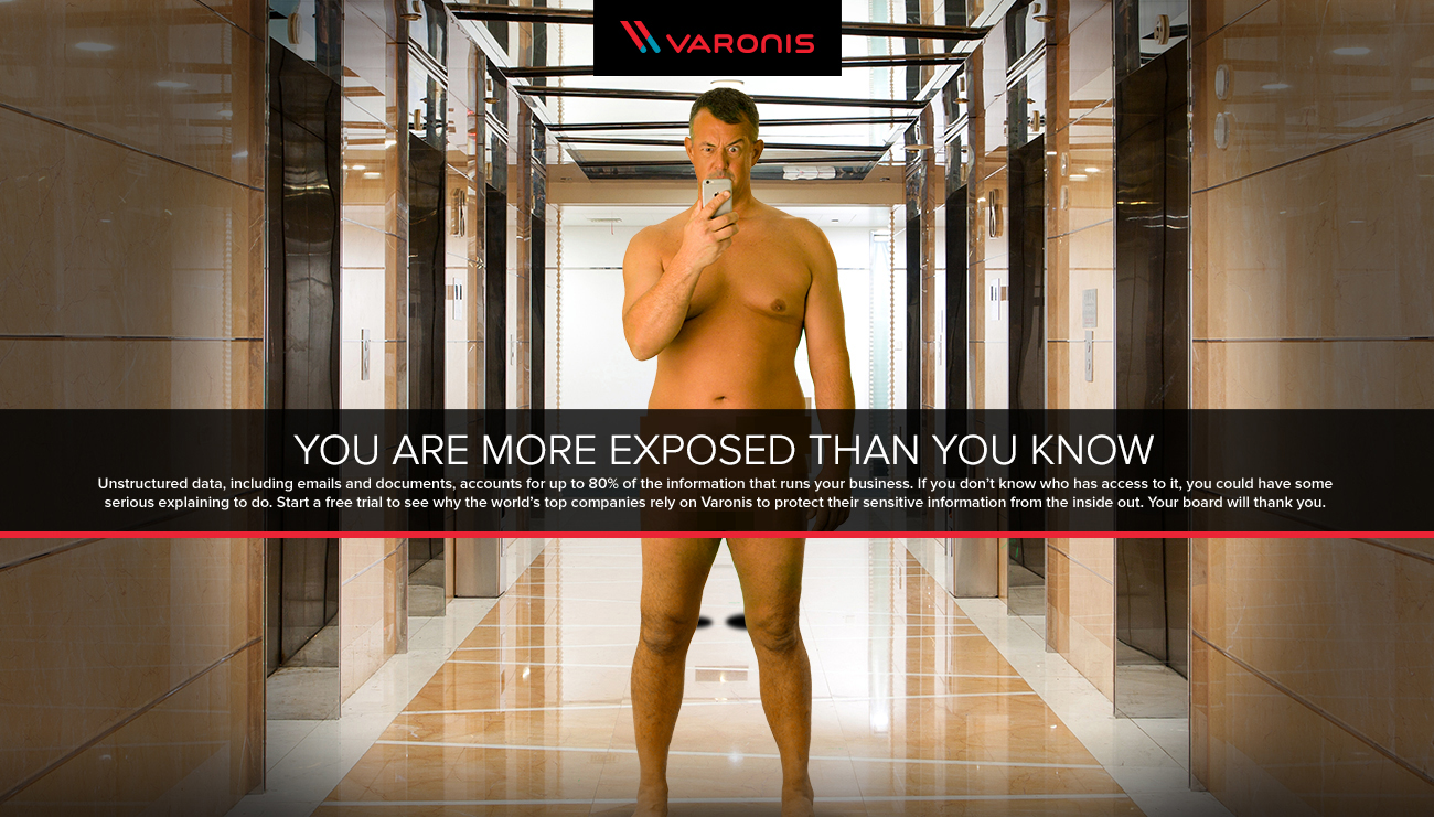
Want to learn more about creating successful landing pages or are interested in working with Bluetext to create a successful, data-driven landing page strategy? Contact us today.
Why animation?
As the saying goes, static doesn’t sell. According to research, animated banner ads are more than four times as effective as their static counterparts. More and more these days, users are expecting engaging, interactive content from brands at every point of contact. This goes for any platform—a website, an app, digital out-of-home, social platforms (yes, this means TikTok). Anything with a screen is an opportunity to shake up your brand with animation.
Say more with animated content
If a picture is worth a thousand words, an animation is worth a million. Animated content captures key messages in more ways than a static graphic, and injects any design with the personality of a brand. After all, motion draws out emotion. Whatever your brand wants to convey, animated content can sharpen and elevate that message.
Is your brand a subtle responsive animation kind of brand, or a claymation one? Maybe a blueprint-style animation speaks to your brand’s personality best, or perhaps a parallax effect is the best representation of your brand. However you choose to do it, you can get more out of your corporate visual identity with animation.
Getting started
When it comes to animation, the options are endless. Here are a few simple ways to get started, plus some examples produced by the team here at Bluetext.
1. Introduce an animated version of your logo or key brand assets.
An animated brand identity can be applied across any digital asset, as demonstrated by Octo’s identity in motion. The style of movement captures the ever-changing nature of the government technology market and communicates more about Octo than a static identity could.
2. Add subtle movement to some of the static content on your website.
This example from ScienceLogic is an elegant way to introduce movement to your website while incorporating visual elements like brand shapes and secondary colors. As the mouse hovers over images of the leadership team, the background pops with new colors and shapes to keep the viewer engaged with what they’re seeing.
3. Consider a moving graphic for your next ad placement.
4. Read some more tips on motion integration from Ale Hernandez, one of Bluetext’s web design and UX experts.
Easy animation with interactive AI
Animation is becoming so necessary for modern brands that designers have even begun to automate some of the process. This cutting-edge technology is making animation more cost-effective and efficient to produce, meaning that more and more brands will be able to build out animated identities. Now is the time to get an edge on your competition by debuting a signature animation style for your company’s offerings.
Want to go all-in on animation? Contact Bluetext to learn about our motion design and interactive UX services.
It’s not what you say, it’s how you say it.
You could have the best product in the world, but if your website’s user experience is not up to par, how will customers find and use your product? What’s in your website is important, but how your user interacts with it is even more essential. That is why it is so important to focus on UX when designing, or redesigning, your site.
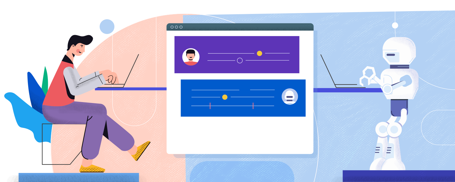
What is UX?
UX– or User Experience– is how your users interact with and experience your product. While UX can apply to any product or system, from making a call on a cell phone to standing in lines at Disney World, it is commonly associated with digital media. Everyone has had that moment where you can’t find what you need on a website because it is buried so far behind menu items and hyperlinks. With proper UX, though, your users will be able to find everything more easily and therefore be more satisfied with your overall product.
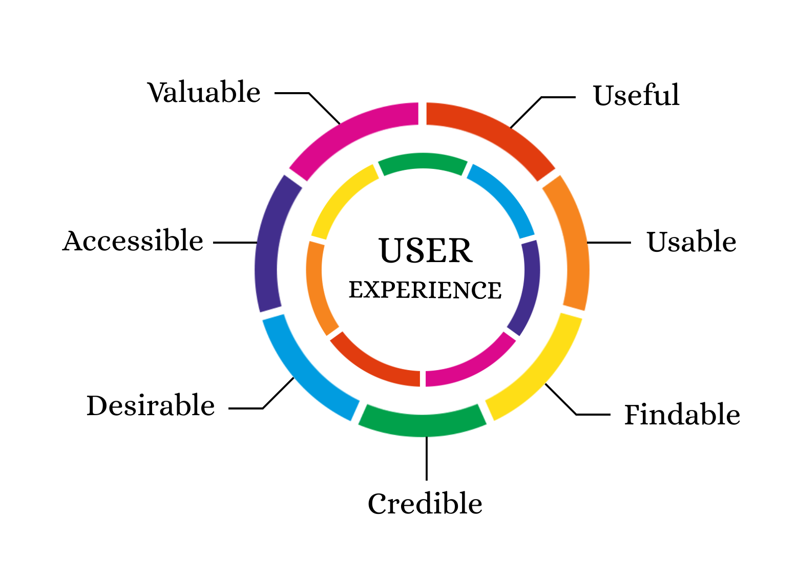
Why is UX Important?
UX is important for a client because it gives them easier access to your products. It is important for a business because happier clients are more likely to return to your business. According to this Inside Design post, “88% of online consumers are less likely to return to a site after a bad experience.”
Thinking specifically about your users’ experiences is also an initial step in helping as many users as possible succeed on your website. As the internet and computer technology have expanded, accessibility becomes easier to implement and more important than ever. Accessible UX will help everyone use your website better.
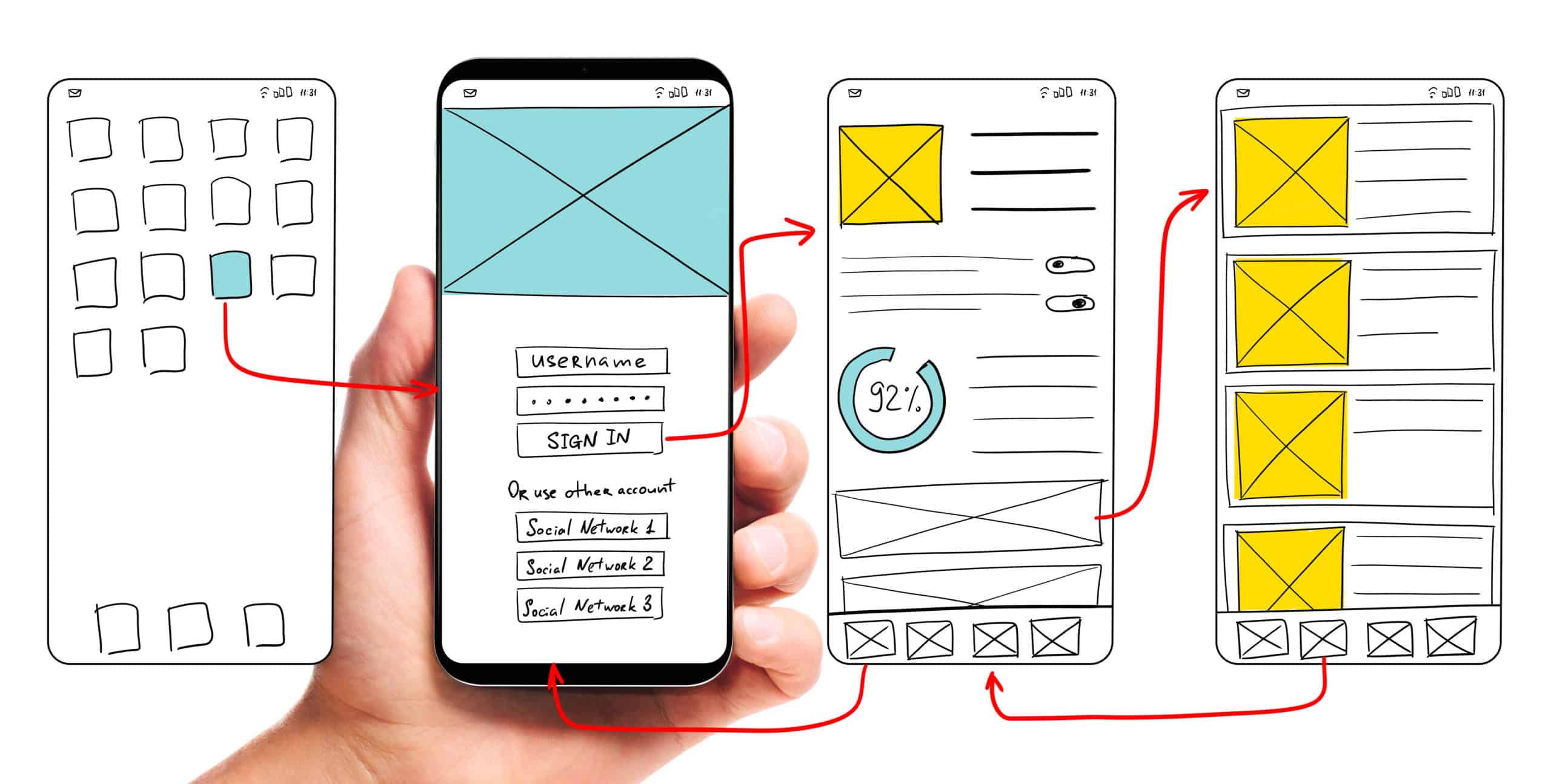
So how can my company find a way to use UX to the fullest?
The first step to any good user experience design is knowing and understanding your users. After you determine your users, or potential users, your most important task is researching how users interact with your website (or other products). What parts of your website make users love to visit the site and buy your products? What parts of your website are so challenging that users exit the page? How can you make the more challenging parts of your website better and easier for users? In your research about current users and website design, don’t forget to think about your content editors as well. How do your employees add content to the site? Does the backend need improvement as well?
After you have a good understanding of your current website’s strengths and weaknesses, you can move on to thinking about how to redesign your user experience and interface. Consistently refer back to your research to make sure that you are properly addressing user needs. Also, be sure to follow accessibility guidelines even if that did not come up in your specific research (Bluetext’s Aly Gumprich shares some great information about accessible design here!) While brand-new, complex designs might seem fun, it is important to make sure the website is functional and not just visually pleasing (although it should be both!).
Once you complete your redesign, make sure to test, test, test. The whole point of UX is to make sure your website is usable. Have as many people as possible test the website and provide feedback. As you get feedback, use it to make your website even more user-friendly.
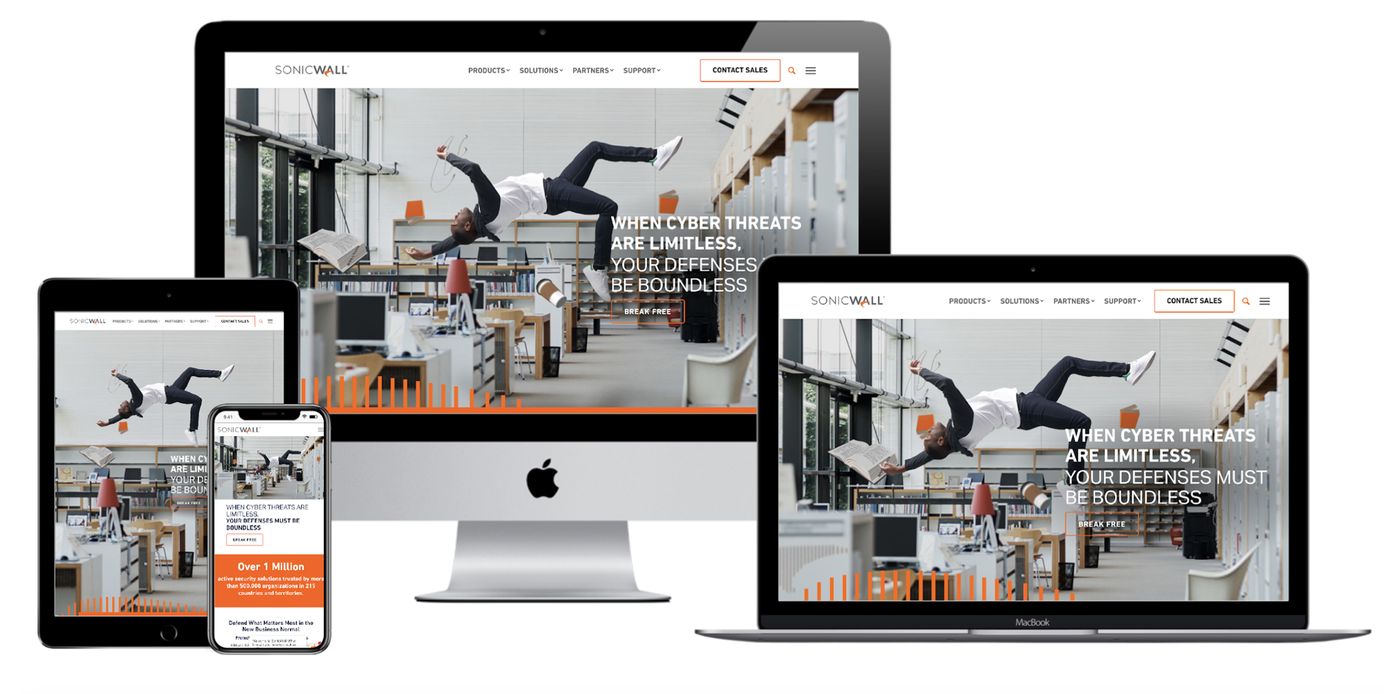
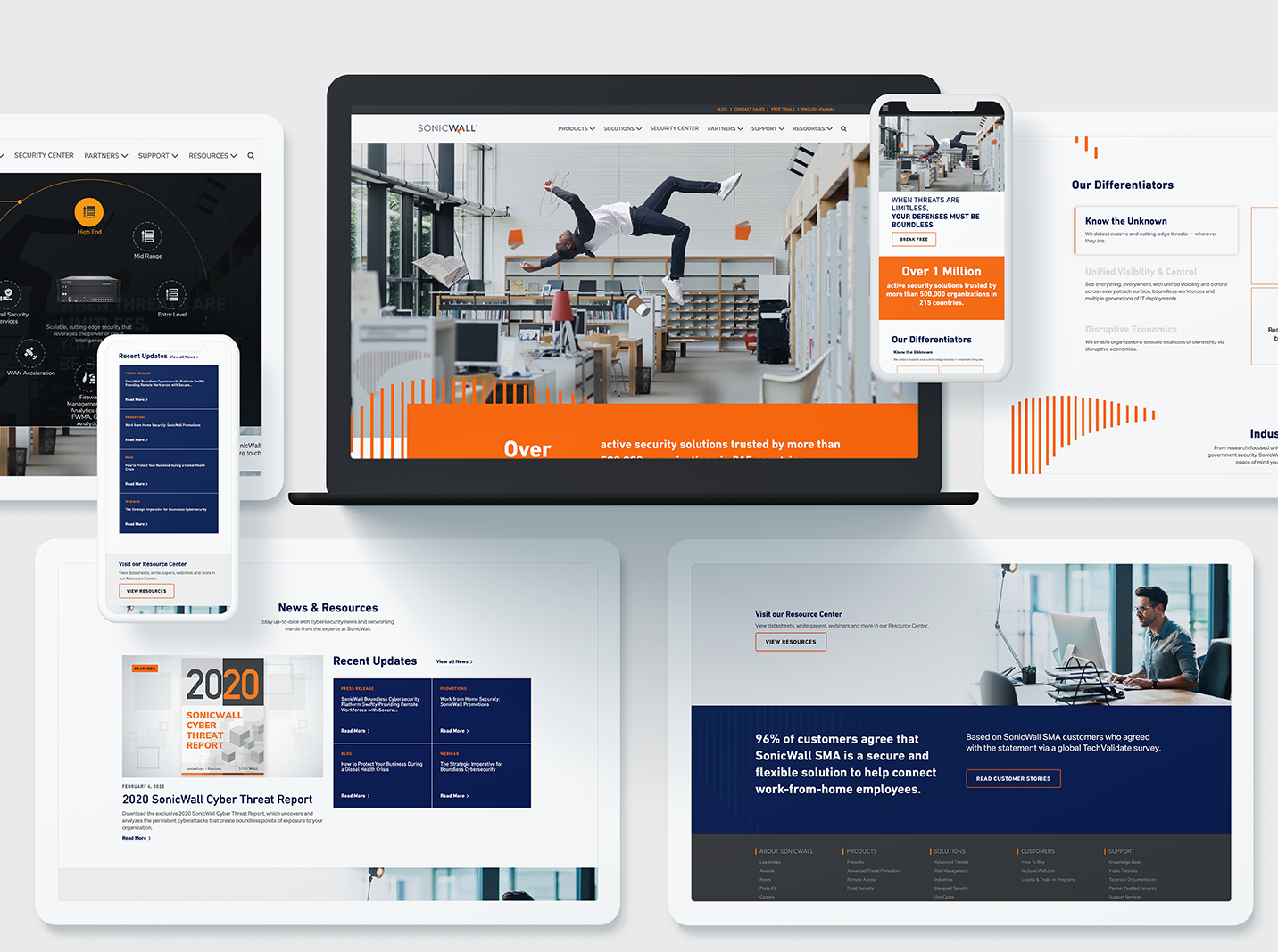
A great example of how to maximize innovative, clean design while still ensuring a seamless customer experience is Bluetext’s redesign of the SonicWall website. This redesign highlighted creative elements that matched SonicWall’s brand and mission, but Bluetext also made sure that the website streamlined product information to boost customer satisfaction and make researching and buying products easier. Bluetext also took care of all the details that make a user experience truly great–like fast website speed and an easy-to-use navigation system.
Whether you are updating a current website or completely redesigning, make sure you consider your user experience during every step of your design process to ensure the best site possible!
Need help? Contact Bluetext to get expert support in perfecting your user experience design.
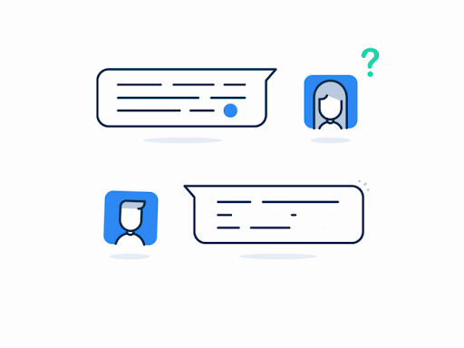
Have you ever navigated to a new website with a question, and spent too much time hunting for an answer? While companies spend large amounts of time developing and building out an information architecture for their user journeys, they may not always have the use case of each unique user in mind. To be fair, they aren’t mind readers! There are times when consumers may simply need to be guided to exactly what they’re looking for – and there is no better way to ensure that than with a chat experience integrated on your site.
As consumer behavior changes over time, it is important to be able to meet your user and provide a user experience that matches what they have become accustomed to. In the same way that it has become the norm to order a pizza online instead of calling into your neighborhood spot, the prevalence of 24/7 support and availability should be captured in the online experience.
With younger generations, in particular, an instant messaging option is a preferred way to communicate, and if companies can make it easier for their customers to get what they are looking for through a chatbot, this will pay off. A recent study found that up to 68% of respondents indicated that they are more likely to use a business that offers convenient communications if they have the option to choose where to make a purchase.
A seamless integration for a chat experience where a bot or a real person responds in real-time is critical. It can be extremely frustrating when users are waiting around for something that should warrant a quick response. Ever been stuck on the phone waiting for hours to get past automated messaging machines to ask a question? It’s incredibly frustrating and more often than not people get impatient and hang up. Online inquiries are no different, if you leave a user aimlessly browsing on their own and unsuccessful in finding their answer they will get impatient and bounce from your site. Installing an automated chatbot gives users a clear destination for their questions, and avoids the dead-end drop-off. While chatbots may not be real people, it gives users the illusion of a more personal experience and grows brand trust that your company is willing to solve their problems. Convenience is key in today’s society, and online browsing is no exception.
Online chatbots sound great in theory but can seem intimidating to execute. However, with the assistance of a website design and development agency, such as Bluetext, you can integrate a chat service into your current or new website design. The advantage of working with a full-service digital marketing agency is that they can analyze your search traffic patterns, help identify some common user journeys and pain points, but also style and develop a chatbot fit to your brand identity. This creates an even more seamless user experience on your site because the chatbot integrates and matches the current website, almost like a well-dressed store employee ready and able to answer any questions.
Is it time for your website to step up its support game? Consult Bluetext to find out what kind of chatbot or user experience modifications can improve your website.
Ever heard the phrase “if you’re not first you’re last”? A little extreme, but not untrue when it comes to search results. Businesses of every industry are scrambling to refine their content strategy in hopes of ranking within the first page of search results for relevant searches. However, the advice for how to do so is muddled by different strategies and outdated information. Keywords. Inbound links. Outbound links. Content velocity. Imagery alt text. Which one is it? Well, the simplest answer is all of the above…plus more. The truth is Google search algorithms are not completely transparent. If you feel like you’ve been shooting in the dark for a stronger search ranking, you’re not alone. Thankfully, Google does hint to what goes into its search algorithms and what search crawlers are prioritizing in rankings. And the latest news from the tech giant is the consideration of page experience.
Beginning mid-June, Google will be factoring Page Experience metrics into how they rank websites on the search engine’s results page. Is your website ready for this update? Before you panic over years of perfecting your organic search and content strategy, let’s break down exactly what Google means by “Page Experience”.
Despite the subjective phrase, Page Experience is actually dependent on measurable technical factors that affect how a website visitor interacts with your content. The latest update will concentrate on Web Core Vitals, but also include the following UX considerations, such as:
- Mobile-friendliness
- Safe-browsing
- HTTPS-security
- Intrusive interstitial guidelines
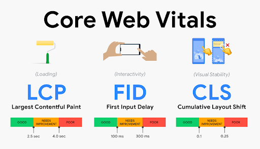
Breaking Down Core Vitals:
- Largest Contentful Paint: The time it takes for the main content (defined as “above the fold”, first viewport or hero zone) of a page to fully load. Websites should strive for a LCP measurement of 2.5 seconds or faster.
- First Input Delay: Reaction time of user’s first action (click, hover, tap). This measures the time it takes for a page to become fully interactive. An ideal measurement is less than 100 ms for 75% of pages.
- Cumulative Layout Shift: Time for all content on page to load and position correctly. This refers to the amount of unexpected layout shift of visual page content. For example, ever visiting a web page that loads, then jerks and shifts a couple seconds later? It’s a frustrating user experience, especially if you have begun reading or interacting with content. The ideal measurement for CLS is less than 0.1 seconds for 75% of pages.
75 and Sunny Rule
Each of these benchmarks have defined benchmarks that Google recommends for 75% of pages on a website. This is what Bluetext refers to as the 75 and Sunny Rule. Especially with an older website build, it may not be achievable to reach these metrics for every page. However, if you prioritize pages by traffic level or content hierarchy, you can isolate the 75% highest value pages that should reach these measures. With these prioritized pages in mind, site speed and page experience optimization can be made by website developers to meet Google’s recommended benchmarks.
There is even rumor of visual tags being implemented on Google search results to show which websites are meeting these Core Vital criteria. It’s likely that in the near future there will be no hiding whether or not your site meets these benchmarks.
How often do I need to check my core vitals?
Well, how often do you visit the doctor? Just like your health, your website’s Page Experience should be evaluated on a regular basis. You should be checking the pulse of your website every 3-6 months to ensure everything is running smoothly and not getting dinged by Google search crawlers. There are a number of site speed and page experience tools available, each providing varying levels of detail. Google PageSpeed Insights will most prominently display core vitals with lab data (measured by single, predefined device, location, and internet connection.), field data (aggregate measure of real time user experience), diagnostics and recommended solutions. However, use caution. This tool is not known for consistent accuracy. Most experienced website development agencies will cross check site performance across multiple tests, such as: Google Search Console, Lighthouse and GTMetrix.com. Consulting a website development agency offers many advantages in optimizing your website, as they are best equipped to diagnose a problem, address and resolve an issue and conduct regular maintenance to continue optimizations.
If you’ve been ignoring your site’s technical health, there is no better time than now to ramp up your site speed and site experience to give you a competitor an edge on the search engine results page. SEO is a marathon, not a sprint. A strong SEO strategy involves a multi-faceted approach to cover the bases across multiple fronts. Keyword strategy, site speed, page experience, mobile compatibility, and more still need to be considered to reach or maintain a top search ranking. As a digital marketing agency that specializes in website development and SEO content strategy, Bluetext understands the importance of page experience in both initial site build and ongoing maintenance.
Ready to be proactive and take the pulse of your website core vitals? Contact Bluetext for a website assessment and learn how we can optimize your site to meet Google’s – and your user’s – expectations.
Have you been searching for the best way to compete in the new frontier of web design? Do you need to stand apart from your competitors in a big and bold way? Well, here’s your answer: motion design.
Motion design refers to anything from an animated logo to subtle motion on a website. But why is it worth investing in? Let’s take a look at how custom animation can yield much stronger ROI than static graphic design or leveraging stock animations.
Motion is Memorable
People are more likely to remember something that moves. People spend 2.6 times longer on webpages that have videos than ones that don’t. Motion design is ideal for marketing because it’s design + messaging + memorable movement, all in one piece of content. It’s a golden trifecta for a brand’s first impression. Think kinetic typography in hero zones, micro-interactions in UI and CTA buttons, explaining your tagline through an animated logo, or even a full segmented-explainer-video-landing-page experience. These motion integrations will not only catch a user’s eye, but sustain their attention on page long enough to peak interest.
The PLASTICS Industry Association turned to Bluetext to develop a full new brand system for their triennial trade show, NPE®. Within the new CVI, Bluetext developed a logo animation that could be incorporated into the new video assets and onto the new website. The logo, which leverages a globe design, animates each individual element of the globe to form into one, highlighting how NPE brings together plastic industry professionals from around the globe.
Motion Helps Tell Your Brand Story
While, yes, motion design gets (and keeps) attention, it also tells a story. If a user is watching and absorbing, they are tangibly engaging in your message. A static design doesn’t allow you to express your brand to its fullest potential.
For SonicWall, Bluetext incorporated a parallax effect that follows the user’s cursor as they move it across the page. This subtle movement brings the visuals to life, making the focal point really feel like it’s floating, or in the case of SonicWall, boundless. SonicWall used this effect to bring their metaphor of Boundless Cybersecurity to life and fully engage users in a big way.
Motion Brings Your Brand to a New Level
Motion design brings your brand to life in ways you could never imagine. Take static brand elements and transform them into tools for storytelling. When Appgate turned to Bluetext to establish a new brand and help bring the company to market, we took their new brand and created a 30-second product video marked exclusively with animated brand elements. It was memorable, clean, and told the story of who Appgate is and where they are heading. Appgate truly got the most out of motion design by also integrating subtle animation into their website. Pairing a memorable and exciting video with recognizable animated elements on the website truly reinforces the branding and creates a memorable experience for the user.
Interested in getting the most out of motion? Contact Bluetext to learn more about our video and animation services.
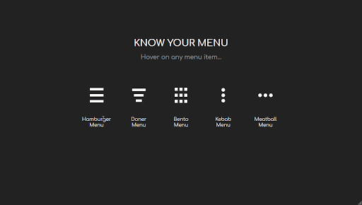
The hamburger, what’s not to love? No, not the American classic, but the navigation menu design. You know, the one with those three straight lines found in the top right corner of your screen. It’s an icon that hides a collapsible menu of possible link destinations, normally appearing on mobile designs. The hamburger menu is actually quite controversial in the UX design community. As such, Bluetext decided to break it down to deconstruct the user experience pros and cons of the hamburger menu.
Where does this funky food inspired design come from? The icon is actually a remnant of the 1980s, making it the perfect choice for retro embracing brands. The hamburger menu first debuted on Xerox copy machines, which had limited space and were therefore designed to be as simple as possible. The icon itself looked a lot like the menu that appeared when you clicked on it.
The design fell off designers’ radars for a few decades until a sudden resurgence in the mid-2000s. Why so? The emergence of mobile browsing had UX design teams more challenged to fit information on screens smaller than ever before. Facebook was one of the early adopters of the retro style and the design trend quickly caught on with many other websites and applications. 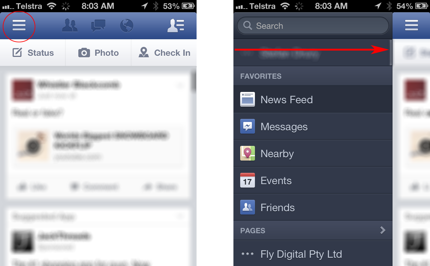
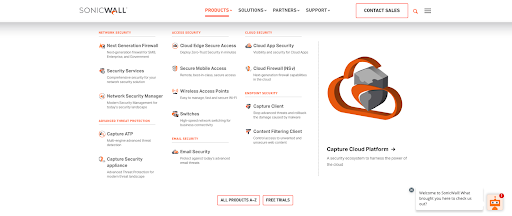
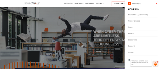
Larger websites have even adopted a hybrid approach, which uses both traditional top navigation and the hamburger even on desktops. Take the Bluetext client, SonicWall, for example. With a large number of products, solutions, and support resources to showcase, they needed a mega menu to encompass all links in an organized and interesting fashion. The top menu drops down to display page titles, short descriptions and even iconography for the high traffic areas of the website. To avoid overcrowding, other sections of the website are moved to a hamburger side menu for a cleaner user experience.
Some UX designers (vegans if you will) hate the hamburger menu. The main complaint with the design is that users can’t go anywhere or see anything without clicking the menu open. Many users expect immediate and obvious information, as seen in traditional top navigation designs. Many UX designers believe an intuitive navigation should obviously show two things: where a user currently is, and where they can go.
The hamburger menu has been the UX design go-to for years, but many companies are starting to debut some new menu items. For example the three dot approach often dubbed “the kebab”.
With mobile and tablet devices growing in popularity, there’s no doubt menu designs will continue to evolve in the future.
Does your website menu need a refresh? Contact Bluetext today to learn about our web and UX design services.
It’s no secret that after a year of virtual, well, everything, people have entered into a phase of “digital fatigue”. Dr. Alexander Aizman, a New York-based physician and surgeon has coined this term to describe “the physical discomfort that is experienced after prolonged exposure to a digital screen”. Ever been shocked when your iPhone sends your weekly screen time report? It’s no wonder people are growing weary of the time spent on digital devices…
When COVID-19 forced the world online a little over a year ago, device use increased as many calls, events, and other in-person interactions became video conferences. Everything from professional networking, to personal tasks like ordering groceries, quickly pivoted to digital platforms. With people rejecting increasing screen time and looking to alternatives that allow them to avert their eyes, designers must establish a way to create enticing experiences in the midst of digital fatigue.
Cut Down on Blue Light
One way to switch things up is to create an alternative, dark mode experience for users. Dark mode isn’t just a trendy aesthetic, it is actually backed by UX research and health studies to benefit users. The majority of websites we interact with on a daily basis leverage white or light color-dominant backgrounds and excessive exposure to this can cause eye strain, dry eyes, and even disrupt our sleep cycles.
Allowing users to choose their experience, or programming a design that is time responsive, and will automatically update to dark mode for evening and nighttime hours based on the user’s location, can provide a break from all of the white space.
To learn more about ways you could incorporate dark mode into your designs, read our previous blog post.
Break Up the Monotony
Spending the majority of the day on screens and devices of various sizes can become exhausting for a number of reasons. Particularly if you are reading large amounts of online text content. When designers approach a new interface or even just a new landing page, it’s important to always keep the audience, and the environment, in mind.
Think of a trip to the museum…it can be a great outing until the initial excitement wears off when each exhibit feels the same. Walking around and reading long content labels, in every roped-off section can only retain attention levels for so long. Yet when there is an interactive exhibit, the interest returns, and the learning and engagement experience offers a higher reward. The same concept applies to online businesses, websites that receive more engagement and interest offer a higher ROI.
Utilizing interactive content, whether it be diagrams, comparison tables, or even simple graphics, can break up long walls of text. Inviting users to interact with content and bringing in visual elements that convey information in easy to grasp and easy-to-understand ways will improve the users’ overall experience.
Introduce Motion and Movement
One notable way to make sure your users connect with content and accompanying design is to create experiences that introduce motion. Static content requires the user to continue scrolling or navigate to other pages and can quickly become repetitive and uninteresting. Incorporating movement into your design as users interact with the page can create a unique experience that will build interest and encourage interaction.
All of the techniques mentioned above bring exciting alternatives to custom designs, and avoiding digital fatigue will ensure users have positive online experiences.
If your website could benefit from a boost in online engagement and website interaction, you’ve come to the right place. Contact Bluetext to learn about our services in UX design, motion graphics and interactive website development.