Designing, developing and implementing a new website can be very rewarding, especially when design and functionality work together to deliver a great experience for your audience. But it’s not always easy. Understanding the audience, how it interacts with your site, how it likes to obtain information, and what it responds best to is complicated and takes a lot of insight and experience. We know. We do it for a living.
That’s why we are proud to show off our own new website here at Bluetext. We are not the cobbler’s kids who don’t have shoes. Our website has been a key element in our success, and we keep it both cutting edge and fresh. One of our key objectives is to show off the great work we have done for our clients.
For our regular visitors, you may not notice some of the new design changes. There are additional case studies, the information is laid out in a more logical manner, and you will see new graphics and promotions. But from the back-end, it’s a significant progression for us.
The site is hyper-optimized for search engines, leveraging the latest changes in the Google search algorithms to ensure that the site gets the most organic traffic. It is closely integrated into our analytics and marketing automation platforms so we can track how people are using and interacting with the site. It’s also focused on delivering a personalized experience so that visitors can quickly get to the content they want and don’t have to revisit the home page each time. We’ve improved the load times so that everyone should have a good experience on the site. This is partly in response to Google’s rewarding good user experience, including load times for images and videos, in its search results.
We’ve also focused heavily on mobile as more content and sites are optimized for a mobile-first experience. The site is fully responsive. The creative displays are better and will provide examples of our work in more categories so that visitors can quickly find exactly what they are looking for. We’ve also enhanced the blog for greater industry insights on trends and best practices that we are seeing in the market, and have included an Ideas and Resources section on the home page.
So check it out, take it for a test drive, bang on the doors and kick the tires. Let us know what you think, and ask us how Bluetext can help you achieve greater success for your brand.
Perhaps the most critical component of the dozen or so enterprise websites Bluetext currently has in development is personalization. This shift in focus to personalized customer experiences is becoming increasingly important for B2B companies because of the significant impact it can have on increasing engagement and conversion rates with your target audiences.
Website personalization allows companies to serve up a custom experience based on the characteristics, preferences, actions, and perceived intent of an individual or persona group. Personalization goes beyond simply accommodating a user with content we think they like, and if done right, establishes a relationship between you and the user to drive specific actions designed to achieve specific objectives for your business.
The drive to personalization is being accelerated by the fact that your B2B customers are also engaged in the B2C space, where they are active on highly personalized consumer sites like Amazon and Netflix. Because users of these sites have become accustomed – if not addicted – to the personalized content and buying recommendations these sites are known for, they are more likely to be responsive to B2B sites that deliver that same kind of personalized experience.
So just like their B2C counterparts, B2B companies are clamoring for personalization functionality because of the impact the increase in the relevance of content and calls-to-action have on their ability to attract and acquire customers. So as the expectations of B2C users increase – the more their B2B alter egos will expect websites to reflect their unique business preferences. However, this in turn will enable increased conversions by constantly meeting your customers’ expectations, building customer trust and loyalty, and making it easier for buyers to make purchasing decisions to acquire your products and services.
At Bluetext, our personalization process begins at discovery – segmenting your database according to target customers with similar qualities such as size, industry, revenue, and location. From there we develop buyer personas within those customer groups and customize calls-to-action for that persona at different stages in their buying journey to deliver the right message to the right person at the ideal time in the buying process.
It is clearly time for B2B marketers to get personal…
A few months ago my partner Don Goldberg got a Google Cardboard viewer and was showing it off around the office but was not getting much of a rise out of the team. Maybe we all thought Virtual Reality was too far out there and the hype of Oculus Rift was overblown. Fast forward to early November and I got a Google Cardboard viewer packaged with my Sunday New York Times at home (yes, we still get the Sunday Times!). I downloaded the app and was immediately transformed. Being in the visual storytelling business, I knew that a seismic shift was beginning. Video was no longer just video. VR transformed the story, brought the user (me) into the story, and created an experience that everyone in my family was amazed by. With the price point of the Cardboard viewers it would not create a barrier for marketers to reach their audiences, even in the b2b world.
To quote Google’s news release from October: “Google Cardboard is bringing virtual reality worldwide. Starting today, the Google Cardboard app is available in 39 languages and over 100 countries on both Android and iOS devices. Additionally, the Cardboard developer docs are now published in 10 languages to help developers build great VR experiences. With more than 15 million installs of Cardboard apps from Google Play, we’re excited to bring VR to even more people around the world.”
The conversations inside our agency quickly moved to figuring out how to make VR a reality for our clients. Virtual reality could be the next medium for us to do creative storytelling. As a company focused on visual storytelling married with advanced development (see our work for brands like Workday, Adobe, and Jones Lang LaSalle), it was the perfect storm.
Fast forward two months and today we are designing a digital briefing center in Virtual Reality. We are marrying up our creativity, advanced video capabilities, and cutting-edge app development to help an enterprise software company more effectively tell its story. We see virtual reality as more than games and entertainment. We see it as a platform to tell stories in a fun and engaging way.
From what I can tell there are very few agencies doing virtual reality. We are diving in headfirst. With the launch of Google Cardboard we have an opportunity to help our clients tell their story like never before. That is the business we are in and that is what sets us apart.
We all remember playing the game Battleship as kids, where the goal was to sink your opponent’s fleet of ships by guessing where they were placed on a grid. The origins of this simple game actually goes back to World War I, when the Allied Navy had developed large artillery guns but didn’t have the technology—such as sophisticated Radar—to know where to aim. Just as in the real life naval battles of a hundred years ago, the game of Battleship involves a series of guesses.
So what’s that have to do with smart website design? Well, here’s an easy trick to remember if you want to win the game. Line up your entire fleet along the outer edges of the grid. While the mathematical odds of being sunk by your opponent are theoretically the same no matter where you place your ships, in fact recent research into human nature proves that our guesses aren’t truly random. Instead, we tend to adhere to predictable patterns when it comes to the focus of our attention on the grid, and the same preferences hold true in the digital world.
The trick in Battleship is to avoid the places that your opponent is most likely to look. In a 2009 study that looked specifically at where people are most likely to focus on a grid, a phenomenon known as “the middle bias” was identified. Put simply, our eyes are three times more likely to gravitate towards the upper middle section of a grid or screen than towards a random location. The top most frequently chosen spots are all clustered right around the middle. Anything on the outer edges is far down the list.
By now, I hope the implications have sunk in. If there’s important information you want a visitor to quickly find on your website, don’t hide it along the edges—take advantage of the “middle bias” where their attention will hit first. Like the game of Battleship, web screens are a highly visual medium, and as we continue to adapt our thinking and processing to the digital world, smart design and placement will continue to influence our visual habits, especially when it comes to what we notice and engage with online.
This is only one of the more recent findings that new research into human behavior is revealing when it comes to how people interact with their screens. In another study, researchers used eye-tracking technology to see how people made choices when a number of options were displayed across a web screen. The findings showed that where the subjects looked on the screen depended on how many options they had in front of them. The more options on the screen, the more that their eyes settled near the center of the display. Those first locations remained the most popular spots even when additional screens were shown with more options. Just as importantly, the study demonstrated that decisions about which options to choose were heavily influenced by where their eyes focused.
Shlomo Benartzi, who chairs UCLA’s Behavioral Decision-Making Group in the Anderson School of Management, reaches this conclusion in his new book on web design called “The Smarter Screen: Surprising Ways to Influence and Improve Online Behavior:”
We like to imagine our choices as reflections of our conscious desires… But this data suggests that our choices are often shaped by the perceptual habits of the eye, which are drawn to certain items and areas of the screen. Sometimes, salience matters more than preference.
The results of this and similar studies is that subconscious preferences can play a larger role in shaping decisions on screen. Again, the implication should seem obvious: If you want a visitor to your home or landing page to make a particular selection from a range of options, place that option in the center of the selections and not on the edges.
At Bluetext, we spend a lot of time evaluating visitor preferences and habits to maximize their engagement when designing websites and digital marketing campaigns for our clients. As with all digital experiences today, our clients are competing for the attention of their target audiences, and understanding human nature can mean the difference between conversion and abandonment when it comes to their customers.
Innovations in real estate marketing can help drive a company’s ability to hit their desired Key Performance Indicators. Through Bluetext’s experience working with top real estate brands like JLL and Kettler we understand what drives integrated marketing and digital marketing results.
SPEED
Faster websites make more money for their companies. Fast includes how long it takes your real estate website to load, but also how long it takes the real estate website search engine to show the user the type of available product that matches their search. Some sites use real time API calls and tons of third-party data services that bog down a search performance. This performance hit hurts seo, conversion, and engagement metrics. The bottom line is performance matters. The relationship between performance and revenue has been shown over and over again. Here are just a few examples:
- Amazon loses 1% of sales for every 100ms it takes their site to load.
- Shopzilla reduced their loading time from 7 seconds to 2. This performance boost resulted in a 25% increase in pageviews and a 9.5% increase in revenue.
- Mozilla shaved 2.2 seconds off their landing pages and increased download conversions by 15.4%, generating millions of additional Firefox downloads every year.
Ways to speed up your website include:
- Enable CMS compression
- Optimize your images
- Move JavaScript files to the footer
- Merge CSS files – Inline small CSS files
- Use a Content Delivery Network
- Minimize the number of HTTP requests
- Fix your 404 errors
- Take care of your page size
- Reduce the number of API calls
LOCATION AWARE USER EXPERIENCES
The other innovation real estate marketing executive need to consider is launching location aware marketing platforms and tools. Along with the adoption of HTML5, the Geo-location API has become very powerful technology. This allows your site to receive geographic positioning information using JavaScript. Once you have a location aware site or app, you are able to provide more accurate and appropriate content for your visitors. This is called geo-marketing. Geo-marketing is a relatively new concept defined as:
- The integration of geographical intelligence into various aspects of marketing, including websites and sales and distribution.
Although a new term, the principle of geo marketing has been around for a while. Facebook has been utilizing this approach for some time. Facebook gathers location-based data (based on users’ IP addresses) then show advertisers appropriate content for that geographic region. Google and other search engines also use this functionality and include location based search results for their users.
Your real estate website should offer the ability to search where you are located to offer up products around you. Of course many people search for information in another region for relocation scenarios, but the majority are in market moves and these use cases need to be addressed with a fast geo-personalized user experience.
We’d love to talk to you about your real estate marketing need. Let’s chat:

At Bluetext we do a lot of branding and website design. It is a service area where we have achieved a lot of success for clients across many industries, effectively helping them leverage their brand and visual identity to more easily achieve their business goals through their digital platform.
For many of our clients branding and website go hand in hand. We either create a new logo and visual identity from scratch, or evolve a brand identity to update a design system that needs some love, and then design and launch a sophisticated website to bring the brand to life.
You never really know where this process will go until you immerse yourself in the client’s business, getting to know their leadership, sales teams, customers, partners, and other stakeholders that can add valuable perspective.
Over the last several months across a few major client initiatives some unique perspectives emerged that made me step back to think about some tenets of branding that continue to arise as best practices we preach.
1. Bigger is not always better. There is this false perception that the best way to represent the strength and boldness of a brand is to make the logo as big as possible on a website. This is simply not true. Rarely is the fix to a brand question to make the logo bigger. There is a trend toward simpler, smaller branding whereby companies let their logo breath. Beyond the fact that we are moving to a world with smaller screens and a reliance on mobile devices where icons need to stand on their own, bigger logos make it look like you are trying too hard and in fact make your business look smaller.
2. Stand Alone. If possible, a brand mark/icon should stand on its own. I was meeting with the CEO of a major corporate client recently as we were working through a very fast moving branding process. He looked at the simplicity of the Bluetext “BT” icon and said that he really wanted us to replicate that for his brand. While flattering, it is not always that easy. Corporate names can be clunky, but necessary. The Nike swoosh was not globally recognized when it was launched in 1971. So the best advice I can give here is to create a strategic plan for how long it may take for you to feel comfortable enough with brand recognition around your mark whereby people would recognize it without your company name attached to it. Creating an “iconic” brand does not happen overnight, but with careful planning and a commitment to success it is possible.
3. Be Simple. We are all visual storytellers, so if your brand mark can tell a simple story that is the ultimate success. The old adage a picture is worth 1,000 words is truer than ever. Look at how people consume content. Create a brand that simply explains who you are or what you do, or at a minimum provides a platform to easily explain your corporate story.
To learn more about the importance of a strong brand, read our latest blog post:

Over the past 5 years, Bluetext has designed over 100 enterprise websites, and over that time the CMS question has evolved – like most technologies – from what is the best CMS for my organization to which platform is most secure. Both open source and proprietary options can and do make a strong security argument, however for the most part the answer to the question lies completely outside of either platform.
The leading open source platforms – Drupal & WordPress – are developed by a community of thousands of developers around the world. And while the software code by its very nature is open and visible, vulnerabilities can be identified and corrected far more quickly due to the sheer number of developers testing it versus those in a closed source environment. The obvious downside being that these vulnerabilities also have the potential to be exploited by more unsavory characters for the short time they are exposed – which together with the number of prominent sites on the platform – works only to ensure a more secure code base.
On the other hand, from a closed source perspective, the platform is owned by a very small team of specialists who are developing code that the world has no visibility to. What this means is, that while best practices are put in place to protect against potential vulnerabilities, it is all done so in theory versus the perpetual vigilance of a global open source community. So, just because the code is developed in a closed environment, it doesn’t make it any more secure than it’s more open minded brethren.
From a global CMS perspective, it is impossible to claim definitively that one is more secure than the other due to all of the external variables they are exposed to during their lifecycle. The most critical path to optimal security is making sure the CMS software is well maintained well and kept up to date to ensure that no vulnerabilities are left open.
But as I suggested right up front, the majority of security challenges lie completely outside of the platform –the CMS is just one piece to the security puzzle – the user base it interacts with and the server environment it sits in everyday are the other external variables that will prevent any CMS from ever being completely secure – so there is no clear winner here.
Your organization’s ability to implement sound security practices globally will have a much greater impact on the security of your CMS than whether you are in an open or closed source environment. A strong digital agency partner can also help ensure that your CMS is tested and updated on a regular basis to provide optimal security across your digital enterprise.
Recently, Bluetext has been engaged to design and develop several global, enterprise class websites that have required a significant amount of user experience research. This more immersive step in the full lifecycle of our design process has become increasingly more critical given the role corporate websites play in the overall go to market strategy of any successful brand – and as such often begs the question – what is the difference between market and user experience research – and which is more important?
The short answer to the first question is that market research uses both qualitative and quantitative methods – focusing on a large sample size that verifies insights with large numbers – primarily to get an understanding of what people want to buy and why. User research is exactly the opposite – it’s not about demographics, markets, pricing or trends that capture generalizations – it’s about how your customer feels about using a product or service – preferable yours. User experience research is more valuable than its market brethren in that it provides direction about what aspects of your experience will meet your customers needs that we identify during the UX research process and answers the question of how and why they buy your product. User research helps us understand how your buyers live their lives, so that we can respond with an informed and inspired design strategy that creates a more direct and effective pathway to their innermost needs. And since we are creating design solutions for customers who are typically nothing like our clients – user research also helps them steer clear of their own biases
Because UX research isn’t interested in the statistical validity of large sample sizes, it focuses on smaller audiences to delve into the innate desires of the user to discover how your customer will actually engage with your product, providing us with the window to see what they actually do during that experience to uncover needs that could not otherwise be articulated.
We have discovered that research of any kind is far less about designing a product to address the demand of a specific market than it is about capturing deeper insight into the subconscious motivations of your buyer to create an experience that people actually want to use – before the market for it even exists. So if you want the answer to the second question – just ask Apple.
Spider Chart, Spider Chart,
Visualizes whatever a spider can
Spins a chart, any size,
Catches insights just like flies
Look Out!
Here comes the Spider Chart
A spider chart plots the values of each category along a separate axis that starts in the center of the chart and ends on the outer ring. These charts are great ways of visualizing the strengths and weaknesses of your current or future state website user experience. At Bluetext we have a deep focus on the science of user experience. After all, when you design and build sites for Fortune 500 companies, every fraction of a percent counts.
Bluetext likes to help visualize the various states of our analysis in spider graphs.
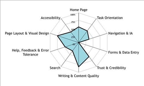
Competitive Analysis Visualization Through Spider Graphs
In today’s fast moving digital marketing world it’s critical to be a watchful eye for our clients to ensure they have a competitive advantage. A real time pulse and visualization of where they fall in the competitive marketplace can be very valuable. The below sample spidergraph can show a marketing leader where they stack in many categories. They can review these sequentially chronologically to see how they are progressing and ensure they have the best opportunity to capture and convert users across their desired journeys to achieve the key performance indicators the site is measured against.
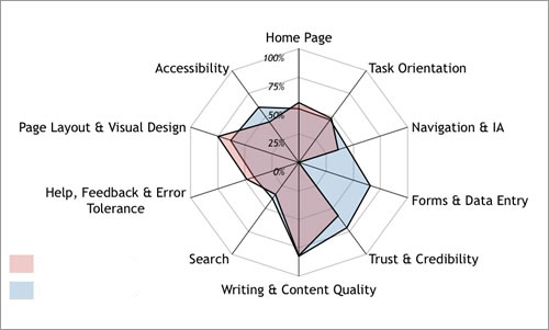
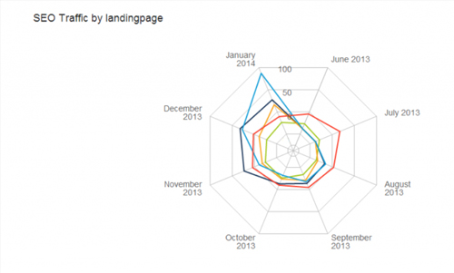
SEO and Landing Page Optimization Visualization Through Spider Graphs
If you really want to impress during a presentation, this is the chart for you. It allows you to display multivariate data easily while also impressing with the visual appeal of its radar shape. Check out the chart above which shows SEO traffic by landing page. This Spider Chart stylishly displays SEO traffic for each series of pages in a specific time frame. This kind chart allows you to easily see real SEO traffic rather than just keyword ranking reports like those from Google Analytics. At the end of the day, the quality and amount of traffic matters more than just keyword ranking. translations The Spider Chart can be used to hold the attention of your audience as you explain the insights you’ve discovered in a way which won’t scare them off.
These charts are just the tip of the data visualization iceberg. Talk to us at Bluetext about your story, brand, or data visualization needs.
Brand Strategy. Brand Presentation. Brand Delivery. Bluetext.
If anyone is looking for a strong example of the impact of website personalization, they don’t need to look any further than this year’s redesign of ESPN.com. ESPN’s move shouldn’t come as a surprise—after all, most enterprises redesign their websites every 18-to-24 months. But the reason that ESPN received so much attention is that it made one very significant strategic shift—its new website adapts to the person who is viewing it.
Some of the techniques that were built into the site allow it to reflect the location, preferences, interests and the device of each of its visitors. For example, it can predict (within reason-more on that later) your favorite team based on its best guess on your location. Once preferences are determined, it can prioritize relevant content every time you return to the site. That means the dynamic delivery of relevant content, a tailor-made river of information that is constantly updated.
ESPN certainly isn’t a pioneer in website personalization—after all, Amazon has been delivering that type of individualized content for years. But ESPN has figured out what every enterprise company needs to learn: Website visitors across all industries and sectors now expect at least some level of a customized experience. In fact, according to one recent survey, three-quarters of online consumers get frustrated when websites offer content that has nothing to do with their interests.
In other words, enterprise organizations that don’t start offering a more personalized experience will soon see their target audience abandoning their websites—resulting in lost opportunities for conversion, and, ultimately, lost revenues.
Here are four tips to help get you on your way to a better customized experience for your visitors:
Go Mobile First. This means installing technology that identifies the various devices that visitors use to view your content. First and foremost, Google rewards mobile-friendly sites in its page ranking, and is beginning to penalize those that aren’t. Viewers using their mobile devices need to be easily able to access content on those devices, and that requires a far different design than for a desktop or laptop.
Recognize the Buyer’s Journey. A first time visitor is going to need different types of content than someone who has already visited the site on several occasions. That means more general explanatory content for first-time visitors, with content moving towards specific questions and specifications as they move through the journey and towards a purchasing decision.
Use the Best Tools for Persona-based Content. Cookie technology is a necessity to understand and track where returning visitors have been on the site, what types of information they have sought, and what they might need next. Anticipating their needs and interests will result in a significant increase in conversion, and a decrease in frustration.
Allow Visitors to Contribute Their Own Personalization Settings. In the case of ESPN, it might seem obvious to assume that a visitor from Washington, D.C., was a Washington Nationals fan. translate But they could just as easily be a Baltimore Orioles lover. Checking in with that visitor directly will deliver better engagement, and better results.