As the world has changed in the blink of an eye, so has the way we market to consumers. Now, more than ever, your website exists as BY FAR THE MOST IMPORTANT doorway to your brand and your brand experience. While stores stay shut, and face-to-face interaction is vastly limited, brands will rely on reaching their target audiences via their websites. Therefore, your website is mission-critical to your success.
Bluetext has published a 5 part blog series to help you think about and pressure test if your website is the best it can be.
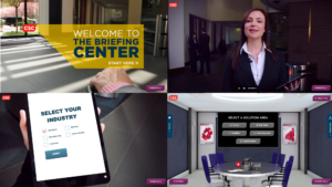
Virtual Executive Briefing Centers are a valuable resource for companies wishing to show customers and prospects their full range of solutions in action, especially new solutions that the partner may not have implemented yet in its own organization. Customized presentations, live demos and in-depth discussions can be arranged. VEBCs offer a lot of great benefits for organizations including:
- Present your brand in a very innovative way with the latest HTML5 and video technologies
- Reach a wider audience, save money and drive efficiencies by reducing travel costs to visit a physical center
- Get your thought leaders delivering their message to a wider audience than their physical weekly calendar allows
- Deliver vertical specific messaging and solutions in a customized fashion
- Personalize the experience based on the understanding of the audiences job title, history with the enterprise, and other components the digital environment can capture and feed into the site
- Juice up your SEO with a smart build and customer journey that enhances your SEO footprint
Bluetext has had a lot of experience designing and developing Virtual Briefing Centers. Here are just a few examples of the innovation we have helped drive for our clients:
McAfee and Intel Security’s Future Agency
McAfee and Intel turned to Bluetext to design a campaign to demonstrate the advancements in cyber security that the companies are driving across the Federal Government. Named The Agency of the Future and found on the web at futureagency.com, the solution integrates an interactive, 3D experience and a series of videos with lead generation integrated throughout. The experience was enhanced with a continuous monitoring webcast that targeted federal IT security experts and drew more than 3000 leads. The campaign won major kudos at McAfee corporate.
CSC’s Digital Briefing Center
CSC’s Digital Briefing Center is where customers, partners and prospects from across the globe can come to learn more about the key technology conversations and market shifts CSC is driving into the market.
The center is driven with immersive 3D video technology that is completely interactive through Html 5 overlays throughout the user journey.
Following launch, Bluetext’s collaborative creation with CSC’s Digital Marketing team became the top performing component of the csc.com global web presence, a huge feat for a Fortune 500 corporation.
Version 2.0 features new capabilities spanning:
-
Multi-floor scalability
-
Triple screen experience
-
Dynamic social media integration
-
Triggered infographic visualizations synched with briefing videos
-
Chaptered video interactivity
The following video of CSC’s head of global brand and digital marketing talks about this project:
TalkShop by Cooper Thomas
From corporate meetings to conferences and workshops, connecting with your workforce and customers is an essential element of business. Bluetext was hired by Cooper Thomas to help enhance their virtual training and meeting services and next-generation virtual platform that can help their customers get the most out of their customers’ virtual events.
With their virtual event platform, you can now connect with employees, customers, and clients conveniently and cost-effectively. The unique speaker-training program guides your presenters to deliver more effective and engaging virtual presentations. The speaker coaches provide focused support to help busy subject matter experts become polished presenters. They also provide project management and program support for events ranging from single training sessions to multi-day conferences, as well as on-site support for virtual and face-to-face events.
As the world has changed in the blink of an eye, so has the way we market to consumers. Now, more than ever, your website exists as BY FAR THE MOST IMPORTANT doorway to your brand and your brand experience. While stores stay shut, and face-to-face interaction is vastly limited, brands will rely on reaching their target audiences via their websites. Therefore, your website is mission-critical to your success.
Bluetext has published a 5 part blog series to help you think about and pressure test if your website is the best it can be.
In the avalanche of predictions for marketing teams, one that should be among the top is the need for consumer user-experience website design. In the consumer sphere, getting buyers to convert on a website takes much more information. It’s more likely you are going to explain a lot to get your buyers to convert into customers.
The higher and more complex the value of what you are selling, the more questions you will need to answer throughout your site. That makes information architecture essential to the success of the website, and a step in the process that demands significant attention. It’s easy to dismiss the effort by arguing that “our sales don’t take place on our website.” Marketers know that that attitude means falling behind the competition.
Give Consumers a Road Map. High-value products and services require in-depth information, including top-of-funnel messaging, mid-funnel details including video and other premium content, and bottom-funnel data sheets, pricing options and other data that will close the sale. As the buyer moves around the website, confusion about where they are and want to be will result in a frustrated visitor or is more likely to abandon your site for some other brand. There are ways to lessen the chances of a lost customer because of confusion. Here are some key best practices for a successful consumer user-experience website design that will meet your team’s expectations:
- Breadcrumbs – Breadcrumbs let your visitors know exactly where they are on your website, regardless of how they got there. It’s like having GPS navigation that has a path laid out that tells them how they got there. Whether location-, attribution- or path-based, breadcrumbs are a good option.
- Page headers – Make sure that the page header is similar to the copy of the navigation items or links that have been clicked. This is a good B2B user experience website design practice that has the added benefit of being good for SEO. If the page header of the page matches what the visitor clicked on, they will be reassured of their choices.
- Highlighting selected menu options – Keep the navigation highlighted when it is clicked. It can be bolded or underlined or have some other creative way of standing out and will give the visitor instant feedback about the menu options.
- Show progress bars – A progress bar that indicates page load time will let a visitor know what’s happening if taking an action on the website, whether downloading a white paper, loading a calculator widget, or processing a form submission.
- Thank You pages – These also give strong cues about the action taken. If a visitor subscribes to a webinar, downloads a pdf, or submits a request for information, confirms the action that was just taken.
We’ll be exploring more consumer user experience website design best practices in upcoming posts.
See how Bluetext can help deliver a successful user-experience website design.
As the world has changed in the blink of an eye, so has the way we market to consumers. Now, more than ever, your website exists as BY FAR THE MOST IMPORTANT doorway to your brand and your brand experience. While stores stay shut, and face-to-face interaction is vastly limited, brands will rely on reaching their target audiences via their websites. Therefore, your website is mission-critical to your success.
Bluetext has published a 5 part blog series to help you think about and pressure test if your website is the best it can be.
In a digitally-driven age, professionally designed websites have become the standard across any industry. Website aesthetics, functionality and navigability will make or break a business. Research has shown that 48% of people cited website design as the number one indicator of credibility. Designing a beautiful and functional website, however, is not as easy as it looks. While various content management systems (CMS), such as WordPress or Drupal, promise to deliver beginner-friendly DIY capability, website design is a trade best left to the experts. Here are Bluetext’s top five reasons for hiring a website design agency.
- Brand Consistency
You’ve likely invested a lot of time and money into developing a brand identity. Don’t let your digital brand style become muddled and mismatched across your website. A website design agency can ensure that font faces, sizing and color schemes remain consistent throughout the entire site. Not only does design consistency make a greater impact on brand recognition, but it will also improve readability and hold your audience’s attention for longer.
A website design agency will also build smart CSS into all of your digital ecosystem front end codebases. Agencies will consider organization and consistency when building out your CSS. Gone are the days where your headings are a disorganized range of sizes, font faces, and colors. Bluetext is a website design agency that provides clients with a web style guide, which translates all traditional brand style guidelines into digitally compatible requirements.
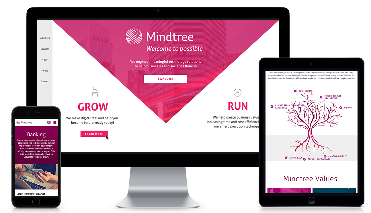
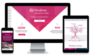
Before a Bluetext website redesign, the Mindtree homepage was inconsistent with no clear brand identity. Now the entire website follows a web style guidelines for on-brand font faces, sizing, and coloring.
- Resist Template Temptation
Because a CMS can offer an overwhelmingly wide variety of templates, it’s easy to be drawn toward super-stylized options. In practice, though, simplicity is key.
Overcrowding is the most common mistake made on webpages and is a leading cause of high bounce rates. An overly complex template will bog down your users with unnecessary functionalities, and cause slow loading times. You should first determine the purpose of each page and let that guide template choice, as aesthetic elements can always be added later by designers. A website design agency will be able to select the templates that best serve your business needs and flow into a seamless customer journey.
- Design Mobile-ly Minded
In web design, the user is king. The tell-tale sign of a sloppily designed site is an incompatibility with different browsers and screen sizes. With the millennial and Gen Z markets so dependent on mobile, your site needs to be mobile responsive, not just mobile-friendly.
Mobile-friendly designs will feature static content, typically with smaller image displays and simplified navigation. On the other hand, mobile-responsive websites will dynamically adjust content and images to different screen sizes by correcting the padding and condensing navigation. While web amateurs may be satisfied with mobile-friendly, any experienced design agency will develop a responsive site that projects credibility. An experienced website design agency will conduct thorough quality assurance (QA) across different browsers and devices to ensure the customer experience is kept consistent.
An agency can not only make your pages attractive on mobile but can also optimize the performance of your site. Using AMP (Amplified Mobile Pages), a website design agency will build an open-source, stripped-down HTML that accelerates page speed. AMP is like a secret weapon for mobile sites, but it requires expertise to properly implement strict HTML and tagging requirements.
To learn more about the benefits of AMP, check out this video:
- Easy navigation
Your site navigation should be simple and easy to use. If a user can’t quickly and easily find what they’re looking for, then you’ve got a problem. A concise but comprehensive menu bar will make all the difference. A website design agency can bring a new perspective to your sitemap and make recommendations that ensure navigation is intuitive to any new visitor.
Search functionality is also key to a great user experience. A website design agency can be trusted to tag your content and properly link any searched keyword to the correct site pages. With an easily accessible search bar, users can quickly navigate toward desired content. By working with a website design agency, you can also include top features, such as previous searches and suggested searches based on the user’s previous experience on the site, improving the overall user experience.
- Easy maintenance
So you’ve built your website, what’s next? Surely your business has growth in mind, and your site will need to keep pace. Using an agency can build flexible and adaptable web design, and help sustain your site for long term growth. With a website designed by experts, you will find it easier to maintain your website and update it with the newest and latest content.
Lesson Learned: Save the DIY motivation for home renovations. Building a website is best left to an experienced website design agency.
As the world has changed in the blink of an eye, so has the way we market to consumers. Now, more than ever, your website exists as BY FAR THE MOST IMPORTANT doorway to your brand and your brand experience. While stores stay shut, and face-to-face interaction is vastly limited, brands will rely on reaching their target audiences via their websites. Therefore, your website is mission-critical to your success.
Bluetext has published a 5 part blog series to help you think about and pressure test if your website is the best it can be.
With 57% of the world’s population now on the internet, promoting your business through a website has become even more critical. Additionally, over 50% of website traffic comes from mobile, and over 66 million American adults now own a smart speaker with digital assistant capabilities. Your website is where a potential customer will get their first impression of your business, and navigating the way website browsing behavior continuously evolves can be tricky. Because having a poorly designed website can be worse for your business than having no website at all, turning toward an expert website design agency can help you find the best website solution for your company. An agency can help you stay on top of the latest web design trends, and bring both your website and your business to the next level.
User experience (UX) is one of the most important things to consider when redesigning your new website. According to Jakob’s law, users spend most of their time on websites other than yours. This means that users prefer for your site to function in a similar manner to other sites they frequently interact with. Staying up-to-date with current web design trends is imperative to keep your users engaged.
Bluetext suggests considering the following seven trends when building your website to ensure that your site combines SEO functionality with the best UX, boosting your brand’s presence online.
1. Make Mobile a Priority
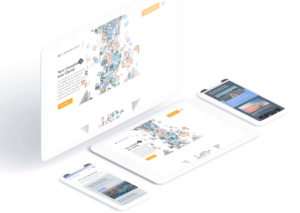
Over 50% of all website traffic comes from mobile. With a user-base continuously becoming more dependent on mobile, it is even more important for website designers to prioritize and optimize web experience for mobile devices. Designers must create a thumb-friendly design to not only make mobile navigation easier for the user but also create a seamless, visually-appealing design.
More than 60% of companies reported an increase in sales after designing mobile responsive platforms; however, approximately 40% of people will leave your website if it isn’t mobile-friendly. While simply having a mobile presence may seem good enough, optimizing this experience through design to cater to mobile users is the most important factor.
If these statistics aren’t convincing enough, it’s also important to keep in mind that Google gives priority to mobile-friendly sites by ranking them higher in search results, positively impacting your SEO. Lacking a mobile-friendly experience can negatively impact your website’s ranking, whereas sites that are mobile responsive will often receive a ranking boost, even for searches on a desktop.
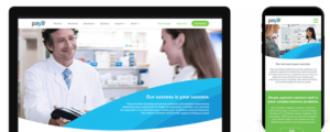
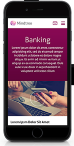
Check out some of Bluetext’s work on mobile with Paya and Mindtree.
2. Increase Page Speed
It takes users only three seconds to decide whether or not they want to stay on your website. These three seconds are crucial to your website’s dwell time (aka the time a user spends on your website before returning to the search results). Web design agencies can provide creative solutions to help engage your users within these three seconds. Additionally, web agencies know the best tactics for improving page speed, such as image compression. Image formats like JPEG 2000, JPEG XR, and WebP often provide better compression than PNG or JPEG, which means faster downloads and less data consumption.
The less time it takes your website to load, the better your SEO. Because of the Google Speed Update, Google won’t prioritize your website to users if it will take too long to load. Taking your site to a web design agency will ensure that your website is optimized for the user, while also ensuring that you have the best possible SEO ranking.
3. Optimize for Voice Search
Page speed is also becoming more important as the number of smart speakers and digital assistants continues to grow. Over 66 million American adults now have a smart speaker, and designing a website that capitalizes on Voice Search Optimization is the only way to ensure that those using smart devices for their searches will have access to your site. Voice search is meant to be a faster, more convenient way to get information, and if your website takes too long to load, it is less likely to be returned for a voice search result.
According to a PWC study, 71% of respondents would rather use their voice assistant to search for something than manually typing their query into a search engine. The differences between these spoken and typed searches may lead to different SERP results, and if your website is not properly optimized for vocal search, you may lose ground to your competitors. Because vocal searches only result in one top result, everyone is vying for this “ground zero” position. You can obtain this coveted position by gaining Google’s featured snippet spot, which aims to directly answer users’ questions. Voice searchers are also more likely to search in long-form questions as opposed to using shorter keywords, so it’s important to consider the types of questions your target audience may ask, and to position your website well to answer these searches.

4. SEO vs. SEM: Choose Wisely
How can you tell whether to focus your marketing efforts on SEO or SEM? Let’s return to square one: what’s the difference? Search Engine Optimization (SEO) was traditionally thought of as a component of Search Engine Marketing (SEM), which comprised of both paid and organic tactics. However, this language is shifting, with SEM now referring exclusively to paid search. SEO is a method to optimize your website to receive organic traffic, while SEM is a way to funnel in relevant traffic from search engines by buying paid or sponsored ad listings.
So which is better to focus on for your website? SEO allows your business to get more visibility, building brand awareness at a low cost. Choosing keywords that are relevant to your website can earn you a spot on the first page of the SERPs, automatically earning you credibility and trust from search users. In order to increase your website’s chances of making this first page, follow these simple steps:
- Use relevant keywords in the URL to describe the content of the page
- Use your main keywords in the beginning of the title tag of your page
- Use the right keywords in the meta description of your page and make sure it is enticing enough for users to click-through to your site
- Use your primary keyword(s) in the H1 tag of your page
- Use your main keywords along with related long-tail keywords in the first few paragraphs of the page
SEO will bring your website brand visibility at a lower cost, but it’s important to invest in researching which keywords will best optimize your website.
While SEO is typically more sustainable, turning to SEM can also do wonders for your website. SEM allows you to capture the attention of your target audience by claiming a spot above-the-fold of the SERPs. Sponsored listings also give you more control over the results you achieve; every element of the ad can be customized and tweaked to target your audience. SEM charges on a per-click basis, and while this may be more expensive, it allows you to achieve quick, measurable results without going through the trial-and-error process that SEO typically involves.
Both SEO and SEM have their pros and cons, and both may be right for your business at different times. Turning to an agency that specializes in SEO and SEM will help you choose the right tactic at every turn.
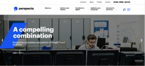
5. Hello, Homogenous Hero
The fast pace of modern life means that people have less time to spend on your website. When they enter your site, simple and intuitive web design will allow them to quickly find what they’re looking for. The use of minimal design allows for the rapid digestion of information and ultimately leads to more satisfied users.
The inability to spend endless time searching for information on a website also means that many web design agencies are moving away from the once-popular ubiquitous site, and shifting instead toward the homogenous hero. Instead of boldly featuring the headline in the center of the landing page, designers are opting instead to move the header and CTA to one side, with the image on the opposing side. This split-screen aesthetic also allows for easy conversion to mobile, providing a clear dividing line between the two content blocks.
Check out some of Bluetext’s latest homogenous hero designs through their work with Centauri and Perspecta.
6. Animate Your Site
The use of animation is an easy way to make your website appear polished and dynamic. Animation also helps bring your brand’s story to life, quickly engaging users and drawing more visitors to your homepage. When used as a tool to communicate complex messages easily, animation can reduce the time that a user must spend in order to understand your message, which enables them to spend more time exploring your website.
When adding animation and motion into your website design, it is important to consider web image optimization, which is the process of providing the smallest-sized images optimized in terms of quality, resolution, and format. With the rise of internet browsing on mobile, images and animations must be optimized to perform well on mobile. While animations are a fantastic way to engage your site visitors, they can also slow down your website load times and negatively impact your SEO. Let a professional website design agency like Bluetext help ensure that your website can support lively animation without dragging down your website load time.
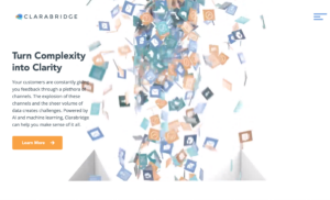
When Bluetext redesigned the Clarabridge website, we made sure to incorporate motion in a sophisticated way, making the UX come alive. We used motion throughout the homepage to engage the user and pull them further down the landing page. This design also quickly explains how Clarabridge works and allows a site visitor to visualize how they might best use Clarabridge’s services.
7. Incorporate More Video Content
Video content diversifies your web page, and also appeals to those fast-moving users who do not have the time to search through a lot of text. Videos are also a great way to make an emotional connection to your users and lead to a better overall website experience. By 2020, experts predict that 80% of online traffic will be video. Additionally, 72% of businesses say that video has improved their conversion rate, and 45% of people watch an hour or more of video per day.
While video content is clearly an important marketing tactic, 64% of marketers see video as the most difficult content to create. Not only do videos take time to plan, shoot, and edit, but it is also tough to decide exactly what type of content should be presented in your video. Because viewers’ attention starts to drop off after roughly two minutes, finding an expert who specializes in video content may be the best route for creating the perfect video for your website.
Not only will video content boost your website’s success, but it is also rewarded by Google. If your site includes video, it is 53X more likely to get a first-page spot in search results. Video improves SEO, which boosts your ranking. But if a short video is one of the first impressions a user will have of your business, how do you go about creating successful video content, and keep the user coming back for more? Many website design agencies have video specialists who can tell your story in a clear and powerful way. Check out Bluetext’s latest video work with Invictus.
Invictus Brand Essence Video, July 2019 from Bluetext on Vimeo.
As the world has changed in the blink of an eye, so has the way we market to consumers. Now, more than ever, your website exists as BY FAR THE MOST IMPORTANT doorway to your brand and your brand experience. While stores stay shut, and face-to-face interaction is vastly limited, brands will rely on reaching their target audiences via their websites. Therefore, your website is mission-critical to your success.
Website accessibility, or the practice of ensuring websites are available to everyone, regardless of their abilities, has always been a crucial part of website design and development. But as website accessibility gains momentum, meeting and exceeding accessibility standards has become even more top-of-mind. Website design and development agencies have begun to ingrain accessibility standards into their designs; meeting these requirements is no longer a “nice-to-have.”

Accessibility Requirements Are Legal Requirements
According to Dean Schuster, user experience design strategist, “In 2019, the United States Supreme Court upheld the notion that all sites conform to the W3C’s Web Content Accessibility Guidelines (WCAG) AA standard.” With these requirements now legal requirements, website design and development agencies have upped their game to ensure their websites are readily accessible to anyone who wants to browse.
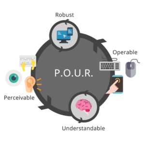
ADA compliance is now established legal precedent for U.S. websites. At a high level, accessibility regulations are broken out into four categories: Perceivable, Operable, Understandable, and Robust. In other words, all content must be “POUR”:
- Perceivable: Users must be able to perceive the information that is being presented. Perceivable guidelines include text alternatives for any non-text content, time-based media alternatives, adaptability, and distinguishability.
- Operable: Website components and navigation must be operable. These guidelines include keyboard accessibility, providing enough time for users to read and use content, providing navigable content, and providing input modalities.
- Understandable: Users must be able to understand the information and the operation of the user interface. Understandable guidelines include readability, predictability, and input assistance, or helping users avoid and correct mistakes.
- Robust: Content must be robust enough to be interpreted by a wide variety of users, including assistive technologies.
Ensuring your website is accessible can be overwhelming, which is where website design and development agencies come in. Building and maintaining an accessible website starts with the design and development process.
 Meeting Accessibility Standards Begins with Design
 Meeting Accessibility Standards Begins with Design
Ensuring website designs are accessible to all impacts the entire website design process; designers must think long and hard about the limitations of visual formats. Often, we deem the skills we learn within a certain context as “normal.” Increasingly stringent accessibility standards will require designers to step outside of their “normal” and rethink each design through the lens of a website user who may not be as abled as they are.
The transition from professional website designer to accessibility expert is well underway and this transition will only accelerate as 2020 progresses.
Website Development Impacts Accessibility at a Foundational Level
Website designers are not the only ones affected by stricter accessibility regulations – website developers will also be impacted at a foundational level. Developers must constantly work to maintain knowledge of the continuously evolving standards and best practices, accounting for practical use-cases within the disabled community while using caution when approaching newer programmatic technologies.
Website designers and developers who stay ahead of this trend and embrace website accessibility are positioned to deliver more accessible products. As standards and best practices continue to evolve, website design and development agencies must continue to meet the criteria necessary to ensure that their websites are accessible to everyone on the internet.
Use Your Online Presence to Empower the Disabled Community
When translating your business to the digital world, a lot of thought goes into making sure your business is represented correctly; between your corporate visual identity and the messaging that makes your business unique, each of these foundational building blocks come together to create a unified online presence. Your online presence should be accessible to everyone, including the 18.7% of Americans with a disability. Supporting these users and ensuring your website offerings are accessible to everyone on the internet should always be a top priority, regardless of the legal ramifications.
To learn more about our experience pertaining to accessibility, check out our case study featuring our work with Level Access, the leading provider of accessibility solutions and software.
When it comes to building or remodeling your company’s website, partnering with a top website design firm is essential. By hiring a leading website design firm, you get to work directly with experts, maximize the utility of your team’s resources, get access to the latest technology, and so much more. Having a professional, user-friendly website can make all the difference when it comes to acquiring new clients and retaining old ones. Prospective customers will appreciate an enhanced user experience and will be reassured by the legitimacy of your company. Read Bluetext’s top 4 reasons to work with an expert website design firm.
1. Make a Lasting First Impression
At Bluetext, each website we build or remodel goes through a strict quality assurance process to ensure every page functions properly and looks perfect. Our team of coders, developers, and designers evaluate both the UI and UX of the site, validate all links and forms within the site, and ensure that each page follows brand guidelines – but that’s just to name a few of the steps in our process.
When it comes to your website, we know that first impressions are incredibly important. In fact, it only takes users 50 milliseconds to form an opinion on your website and decide if they will stay or leave. Not to mention, over 35% of users will leave a website if they find it unattractive. With a leading web agency, you can rest assured that your website will not only look good but is also easy to use.

2. Optimize Your Website’s Loading Speed
One of the most essential ways to make a positive first impression on users is by having a website that loads quickly. As a website design firm, our team of web analysts will assist with file compression and code optimization, enhance time to first byte, evaluate HTTP requests, and everything else in between, ensuring that your site loads as fast as possible.
About half of web users expect websites to load in less than two seconds and will leave if a website takes any longer than three. If your website drives $100,000 in revenue per day, increasing your loading speed by one second could help increase your daily revenue by 7%. A leading web agency will ensure that no potential customers are lost due to site speed.
3. Ensure Your Site’s Accessibility
At Bluetext, all engagements go through our team of accessibility experts to ensure you are publishing in compliance with the newest WCAG AAA standards. With well over half of the world on the internet, it’s vital to ensure that there are no barriers to access your website for individuals with any disability.
4. Create a Successful Campaign
Through different channels such as social media, mobile applications, search engines, and display networks, businesses can get their names in front of countless users. Meeting the ever-changing requirements of those channels, however, has become increasingly difficult. Not to mention, most every country has different advertising requirements, adding another layer of complication for those interested in advertising outside of the United States.
A website design firm, like Bluetext, can not only help you run global ad campaigns but can help you build the perfect landing page for users to see when they click on your ads.

If you’re looking to hire a leading web agency, see what Bluetext can do for you.
Bluetext is honored to announce that Creative Director and Co-Founder Jason Siegel has been named a Judge for The FWA website awards, one of the oldest and most prestigious awards programs for website design in the industry. First launched in 2000 as the Favourite Website Awards in the UK, FWA has grown into the global leader in identifying and recognizing the best in website design. FWA remains an independent voice in the world of website design and build, recognizing the top talent across the globe and highlighting the trends and technologies that are driving website experience and results.
FWA’s Judges represent the top of the industry and come from more than 35 countries. As FWA explains on its website, “FWA is where you go to experience cutting-edge innovation in digital design and development. It’s a space that encourages the digital industry to push the boundaries of technology, to show people what is possible.”
For Bluetext’s clients, Jason being a part of the FWA Global Judge Panel means more access to the most cutting-edge designs and talent in desktop and mobile websites, mobile apps, virtual and augmented reality projects, and any creative work that pushes the boundaries.
Q&A
Why is website and UX design so important to brands and other organizations as part of their tools to build engagement with customers and other audiences?
JS: Website design and UX design is so important because it’s the #1 brand touchpoint for the customer. If done well, the digital channel, whether a responsive website, an app or an installation, can create the greatest upside with the customer and be a voracious capture-agent for user data.
What do you look for in websites that you are evaluating?
JS: In my role, I am looking for pixel-perfect execution and production consistently throughout the whole UX. I am looking for superb in-browser performance, mixed with lite-weight code, mixed with fantastical motion effects.
How should website designers weigh the look of a website versus its ability to convert visitors to customers? In other words, how do you balance style versus effectiveness?
JS: When brands live and die by their short-term conversion rates, it does allow them to stay alive and thrive while building a customer base. However, once a brand establishes itself and the many channels the brand lives on drive revenue and stabilize the brand for the long-term, it starts to get more interesting. We then look at richer experiences, more higher-level positioning, and deeper brand engagement. While this often doesn’t convert faster in the short term, it does position the brand in new pricing categories, more accurate market positioning, and greater revenues and market share overall.
2019 has been a big year for Bluetext full of limitless growth and many successful launches. As one of the top digital marketing agencies in the Washington, D.C. area, we are growing faster than ever in both size and knowledge.
As we look back on 2019, we can reflect on some of our major accomplishments. Partnering with impressive and innovative clientele gives our team the opportunity to push our creative boundaries and exceed client expectations.
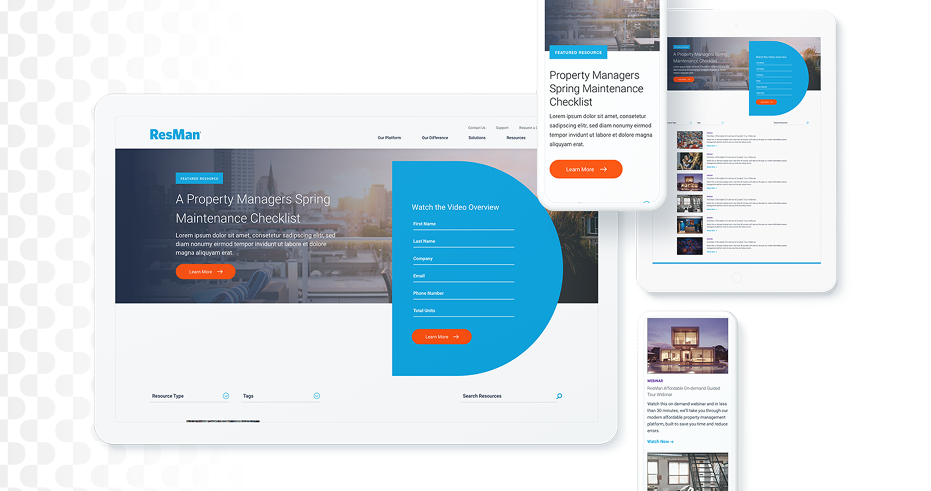
This past year, ResMan, a property management platform with a robust range of solutions, sought out Bluetext as a top marketing firm for their digital needs. With the introduction of a new suite of offerings and a more holistic platform, ResMan needed to repackage their solutions and relaunch their digital presence. ResMan brought in Bluetext to reinvigorate the ResMan brand with an updated website and CVI, while modernizing and streamlining their existing brand.
Bluetext took inspiration from Resman’s customer-centric philosophy and delivered on a request for external messaging and marketing efforts to reflect their goals as a company. Bluetext stepped up to the challenge and seized this project as an opportunity to enhance expertise as a top user experience agency. Resman’s request was met by a fully redesigned—and responsive—website, focusing on an enhanced UX that guides users with an intuitive website flow.
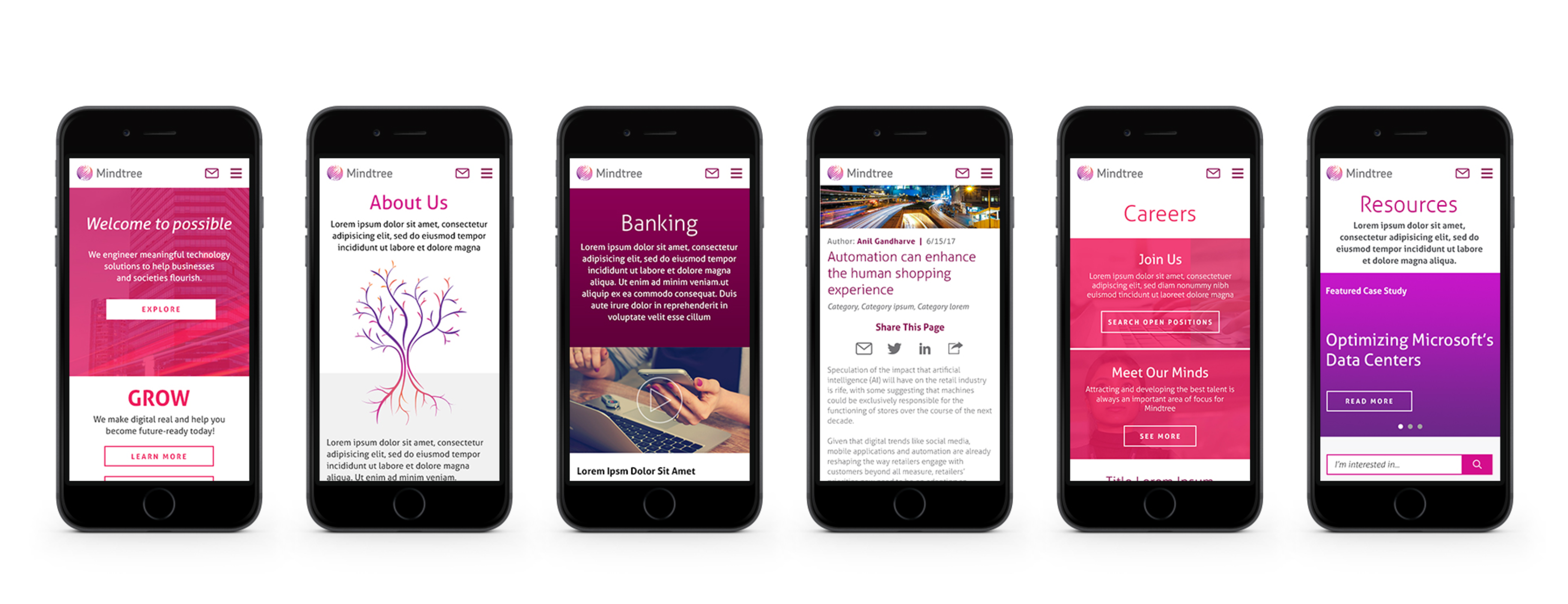
Similarly, Bluetext assisted in creating the new Mindtree.com, which offers an intuitive, fully responsive user experiences and personalization to serve relevant content to each user. As a leading global digital transformation and technology services provider, MindTree needed a brand and website that reflected their capabilities and future-focused customers. The website utilized Drupal 8 CMS platform to provide the utmost flexibility and scalability needed by such a large enterprise while allowing a design that reflects a vibrant brand and its employees. This improved user experience translated to measurable results, as the bounce rate decreased by 20% and website traffic rose 60% post-launch.
What does MindTree have to say about the experience? “Bluetext has been a tremendous digital agency partner to the Global Marketing Team at Mindtree. From digital brand strategy, to innovative user experience design, to enterprise Drupal content management implementation expertise… they were impressive every step of the way. Great collaborators with our in-house folks – I would strongly recommend the amazing team at Bluetext!”
Bluetext takes pride in offering exceptional client service and taking the time to learn a client’s distinct brand values and user needs. Bluetext has succeeded in bringing our client’s values to life through digital marketing and campaign deliverables. A portfolio of industry-leading clients has taught us to treat every new project as a two-sided relationship to grow and enhance both parties’ business value. Our efforts to work backward, prioritizing the end-user experience and ultimate brand goals have translated into the measurable success that we look forward to continuing into 2020.
According to a recent study, 48% of people believe website design is the leading factor in a company’s credibility. Based on this assumption, it’s clear that having a professional website is incredibly important. With content management systems like WordPress and Drupal, it can seem like hiring a leading web agency is unnecessary. However, agencies like Bluetext offer the expertise of top drupal consultants, WordPress design experts, and countless other web specialists to create a seamless, designed to spec, website. Needless to say, hiring a leading web agency is essential to your website development journey. Read our top 5 reasons to hire a web agency:
No Training Required
By hiring an agency, the added stress of finding, hiring, and onboarding new employees is eliminated. Often times, companies invest countless time, money, and energy to help train new employees, just to have them leave within a few years. By hiring a leading web agency, clients get a qualified and accomplished team ready to start working from day one and for years to come.
Work Directly with Experts
Agencies bring talent who have extensive knowledge and experience in different areas of web design. Unlike many businesses, agencies have access to a wide array of specialists like SEO experts, designers, researchers, and everyone in between. These experts can use their in-depth knowledge to help generate and report on results, guaranteeing the success of any website design and development project.
Get Access to the Latest Technology
Analytics and web development tools are costly to use for large and small businesses alike. With so many possibilities on the market, training employees to use these tools adds an unnecessary cost to any business. Working with a leading web agency can help increase efficiency and performance by gaining access to the latest tools, services, and software in the industry.
Outside Perspective
Employees within a company often find it hard to bring completely new ideas or concepts to the table. By hiring a leading web agency to help with web design, businesses get a fresh set of eyes and a unique perspective. Not to mention, agencies bring experience and data-driven results that show what works and what doesn’t to help meet the goals of businesses in any industry.
Positive Results
Agencies are constantly building and maintaining many different types of websites. From prior experience, a leading web agency will know from the very start what a website requires to generate quality results. Additionally, an agency can continue to update websites to ensure the best tools and assets are in place for long-term growth and success.
Hiring a web agency has many benefits for any business. It’s important to hire an agency that can help you meet all of your goals so your business can work more efficiently. Whether it’s to save time and money or to take advantage of the latest tricks and tools, there are countless reasons to hire a leading web agency.
If you’re looking to hire a leading web agency, see what Bluetext can do for you today. To learn more about our processes and to see our work, check out our website.
As we near the end of 2019, choosing the right technology implementation partner has never been more important. According to a recent Gartner study, through 2021, 90 percent of global organizations will rely on system integrators (SIs), UX design agencies and channel partners to design, build and implement their digital experience strategies.
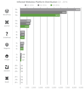
Before deciding on the right implementation partner, it’s integral to choose the right technology for that partner to implement. Drupal, an open-source technology option, is known for being the top choice for creating large, complex websites. Given today’s increasingly complex threat environment, Drupal is also a great technology option because of its built-in security protocols. According to a recent report, Drupal sites are some of the least hacked sites on the web. For large, security-conscious organizations, federal agencies and government institutions, look no further than Drupal.
Once you’ve made the decision to implement a Drupal site, the next question to ask yourself is who you should trust to design, build and implement your new site. That’s where a top DC UX design agency like Bluetext comes in.
Here are our top 5 tips for finding the right Drupal development agency:
Look for a Partner Who Thinks Beyond the Implementation
Having a partner who focuses on the big picture of your project is integral to the success of your initiative. These days, any developer with a laptop and an internet connection can set up a website, but having a partner with a perspective on how that website fits into the broader marketing ecosystem and vision for your company’s future growth is paramount. A Drupal development company like Bluetext, with full-service capabilities, can be that partner. Bluetext, leveraging experience as a top DC UX design agency, will assess the project from a wider viewpoint and offer tried and tested solutions to positively impact your revenue streams and improve overall customer loyalty.
For example, Bluetext partnered with Mindtree to develop the new Mindtree.com, which includes an intuitive, fully responsive user experience and leverages personalization to serve relevant content to each user. Powered by Drupal 8, the new website provides the flexibility and scalability a large enterprise needs to support its digital marketing efforts.
Is Your Team Ready for the Partner’s Style?
When working on a project, chemistry is everything. Your chosen partner might be the best in the business, but if they don’t wrap their processes around your needs, the entire engagement will be negatively affected on both sides of the table. Deadlines won’t be met, communication will feel forced and restricted, and overall, the project will suffer. Bluetext, one of the best DC UX design agencies, works closely with each client we partner with, making sure we understand internal processes, all design and functional requirements, and priorities for the given timeframe. Bluetext adapts our processes to operate how our clients work best, employing different applications and modes of communication to ensure every client is happy and the end-product achieves set goals.
Make Sure Your Teams Fully Understand Their Roles
The key to any project’s success is communication. It is never wise to assume a member of the team fully understands the objectives they are tasked to manage and deliver. An open-source application such as Drupal can be a challenging system to get used to. Having a leading web agency like Bluetext on your side can make any project run smoothly. From week one, Bluetext makes sure every member of the team, on both sides of the engagement, has a clear understanding of their role. This means putting in the effort to define clear project objectives per phase, roles and responsibilities, a communication structure and even informal expectations. Put the work in at the beginning of an engagement, and you will reap the benefits as you toast the launch of your new website.
A Higher Price Doesn’t Necessarily Mean a Higher Quality
When choosing the right technology implementation partner, the cost of the implementation is important. Understanding how and where your budget will be spent before making your choice will lower the chance of setbacks as the project moves from start to finish. The higher-priced implementation partner will often spend longer amount of time on a project and will bring too many unnecessary team members to meetings. Contrarily, the cheaper implementation partners often lack the skill to produce consistent, quality work.
At Bluetext, a leading web agency, we understand how ambiguous pricing may seem when it comes to implementing a new website. Bluetext is unique in our approach to pricing out technological implementations. Most digital web design agencies will conduct their business via an hourly billing budget. Bluetext ultimately views this process as inefficient and a hindrance to the client-agency relationship. Instead, we bill per deliverable, making our inefficiencies our problem. It doesn’t matter how many members of our team we bring to a client meeting or how many rounds of revisions a design takes to get right. The client always comes first and the work isn’t done until you are satisfied.
Past Track Record Counts
A company’s decision on which technology implementation partner to choose comes down to that partner’s previous experience. This makes sense, given that clients often look to case studies featuring previously executed work an example of what they can expect to receive at the end of the engagement. They also look to the reputation of agencies within their industry, so they know that that agency has knowledge of their industry and can get up to speed quickly. Bluetext, being a top UX & interface design company, has plenty of experience developing stunning, industry-leading, Drupal-based sites and has delivered on some of the most complex implementations to date.
For example, Bluetext partnered with XO on an enterprise-level Drupal 8 website deployment. Bluetext engineered a next-generation CMS re-platforming that included a first-time responsive website user-experience design. As XO’s SEO agency of record, Bluetext delivered a comprehensive SEO overlay as we dealt with the complexities of re-platforming, leveraging the Drupal content management capabilities to make XO.com an organic SEO over-achiever.
For more information on why Bluetext is one of the top DC digital web design agencies, check out our website, packed with examples of our work harnessing the power of Drupal.