There’s no denying it. Our society is more digital now than ever. You, me, your neighbor, your neighbor’s neighbor… we are all online. Most importantly, your prospective clients are online and are ready to consume high-quality digital content.
Now is the time to invest in your website and make it more user-friendly for your audience. There is a lot of low-hanging fruit to improve your site, ranging from basic content updates like changing imagery and posting blog posts. Or investing in more impactful measures such as consulting top digital marketing agencies to understand the most cost-effective way to improve your website.
So what exactly will make your website user-friendly for today’s content consumers? Many UX designers will tell you that you should either keep your users either scrolling or clicking from one page to another within your site. So which is the better user experience? To scroll or not to scroll?
Keep reading (and scrolling) to understand why scrolling on a website is OKAY and why it is actually expected from the vast majority of online users.
Social Media
Today’s world is used to scrolling. Why? The never-ending social media feed.
Social media sites are designed with one thing in mind: to get users to consume as much content as possible. The best way to do this is to get them to continue to scroll so that they can consume infinite amounts of new content. Most social media platforms are best used on mobile devices, which are easy to use for scrolling through as the flick of a finger takes very little effort.
The Computer Mouse & Track Pad
Okay, so this may be a given… but you know that little roller ball on your mouse? Okay, wait. That may be a little archaic… Do you know that trackpad on your laptop? Well, that lovely thing is used to invite the user to scroll down a page. We know that webpages are going to be lengthy, so much so that the actual hardware we use to “surf the web” has adapted to allow us to do so.
Okay, pause. Those two reasons are only related to how the physical interface prompts a user to scroll. You may be asking, “What are the different types of scrolling that you can include on my website?”
1. The Subtle Scroll
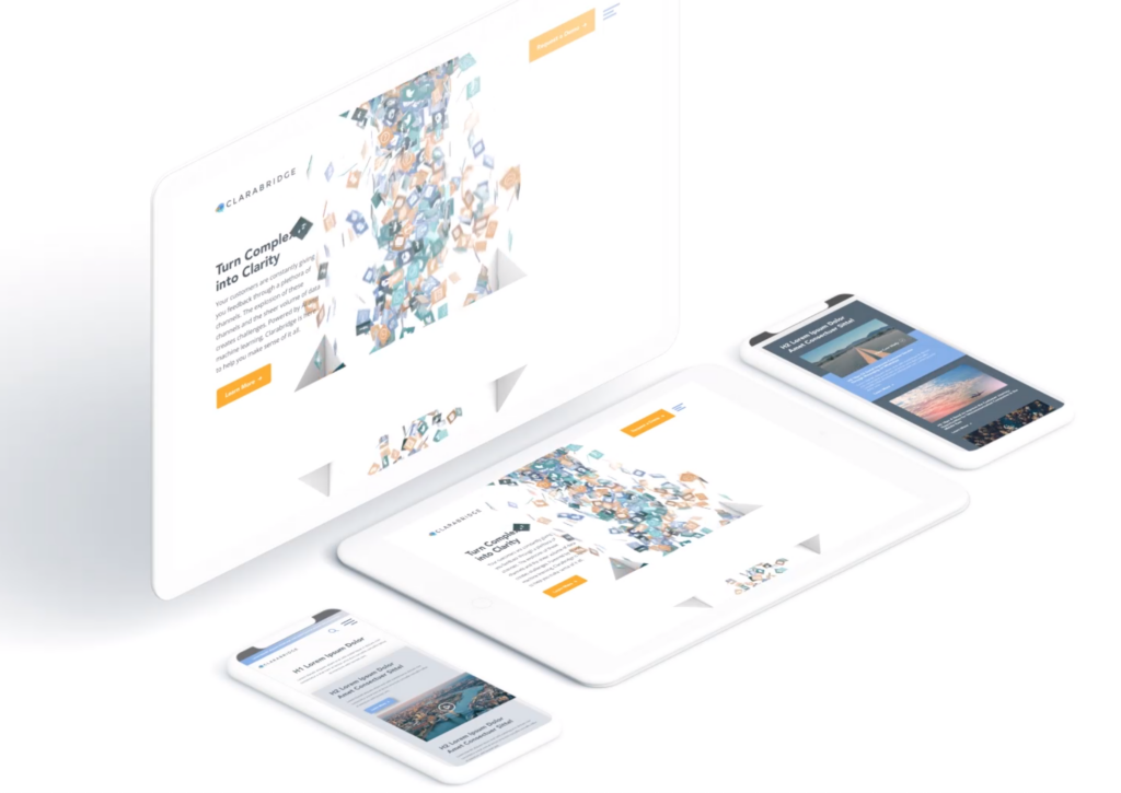
Design the page so that it appears as though you are scrolling through one long piece of content. Maybe the background color stays the same, maybe it slowly changes color, as shown on Palantir’s About Page. Perhaps you’re experiencing parallax scrolling – which in and of itself invites the user to fixate on one piece of the webpage at a time. With this effect, the user barely notices the page length, as the seamless design shift keeps them engaged and focused on the story.
Check out how Bluetext implemented this type of scrolling on the homepage of the Clarabridge website. We designed a seamless animation that invited the user to continue scrolling through the homepage to better explain the technical and analytical power behind the Clarabridge platform.
2. Fixed Long-Scrolling
Instead of having the whole page scroll, fixed long-scrolling allows for specific aspects of the content to remain static while the rest of the content scrolls around it. You can also set up the scrolling to shift to a new section when the user reaches a certain point.
This is ideal if your website has important content or CTAs that should always be accessible to the user. For example, a sticky call to action button is often used to keep key conversion points always present and top of mind.
3. Infinite Scroll
This is most similar to the type of scrolling shown in social media. Is your website a news site? Do you have blog content that you want your users to explore? Consider implementing infinite scroll on your listing pages, allowing posts to continue to load so that the page gives the appearance of infinite content. Of course, this can often be overwhelming for a user who is attempting to find something specific, so we invite you to consider including intuitive filtering so that users can self-select the types of content they are looking for.
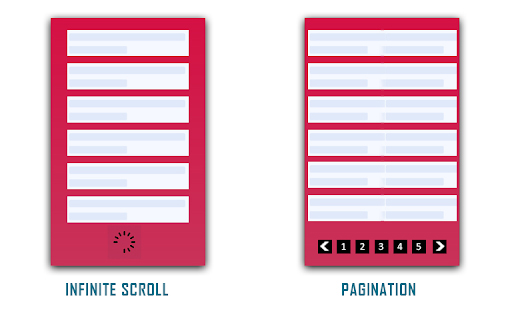
(Photo Credit: knowband.com)
4. Parallax Scrolling
Parallax scrolling is different from the previous three types of scrolling as it invites the user to see new pieces of content and animations with every scroll. Check out how Bewegen invites the user to scroll through their home page and explore their main product. For a personal favorite, give a scroll through Albino Tonnina’s personal website.

Now that you have four great design options to incorporate into your website, it’s time for you to choose the right design for the content on your website. Top web design agencies like Bluetext are great resources for you to turn to in order to gain expert insights on what is best for you.
Looking to begin your next website project? Contact Bluetext today for a consultation.
The recent COVID-19 outbreak has had ripple effects across almost every industry. Around the world, the global pandemic has altered the way we live, socialize and even conduct business. In this unprecedented scenario clouded with uncertainty we all, especially digital marketers, are wondering: What needs to change? And how drastically?
When it comes to search engine optimization strategies, digital marketing and content agencies are continually researching the latest trends and evolving best practices. In the current environment, the role of a top digital marketing agency is to keep a pulse on the present, while also looking forward to strategies that will drive long-term success. Here at Bluetext, our digital marketing analysts are harnessing a variety of tactics to support overall business goals and serve users the best we can during these uncertain times. Check out the top ways we’ve been monitoring and optimizing around current events.
Strength in Numbers
When in doubt, trust the data! Using top marketing analytical tools, such as SEMRush and Moz, one can track the aggregate behavior of online users. Gathering the most up to date data can be tricky, so don’t do it alone. The more expertise and tools, the better. Trust a marketing analytics agency to help break down the numbers into a comprehensible story of website traffic. Use professional tools, such as Google Analytics and Google Search Console, to monitor the recent fluctuations in your page traffic. Do a keyword analysis of your current keyword list to see if search volume has shifted. Google Trends page is a great tool to identify emerging patterns. Are there new phrases your customers are searching for? If the language has evolved, so should your SEO strategy. If you have chatbots for customer service transcripts, these can provide valuable insight into current needs.
In short, the data doesn’t lie. Businesses need to understand search traffic shifts to get as clear as possible a picture into whether to pivot your SEO strategy or not.

Content is King — Still
Ultimately any changes to your SEO strategy should be driven by your unique business needs. For example, a brick and mortar store will need to cater to how they can serve customers at home. If your business was already available online, you may be experiencing altered user behavior as people spend more time at home and online. Every business should ask: “Is the content relevant to current needs?” Your messages may need to shift in sensitivity to the current environment. A complete overhaul is not necessary, nor appropriate. However, if there are opportunities to generate new content that supports your users in a unique time, do so. And if your business is considered essential or has been significantly impacted, you should create a dedicated page to capture all relevant coronavirus traffic. Keep the page simple, focused and sensitive. Don’t try to provide the latest breaking news, but exactly what and how your company is doing. If your business has been minimally affected, perhaps there is an opportunity to contribute to emerging conversations. Exploding Topics is a valuable tool for up-to-date trends across search engines and social media mentions. At the end of the day, users are seeking timely and accurate information now and long after the dust has settled on this pandemic.
 Optimize Often
Search engine optimization is never a “one and done” task. Any digital marketing strategy requires upkeep as is the nature of the evolving industry. Now, more than ever, flexibility is paramount to staying afloat. Be proactive, be vigilant. SEO strategy will need re-evaluation in the upcoming weeks and months. No one can predict how long the pandemic will last so you must be ready to pivot to any new or resurging customer needs.
In an unpredictable environment, one thing is certain: this is our new (remote) reality. Don’t expect old strategies to work as they once did, and don’t expect this shift to “blow over soon”. Your business should be prepared to remain relevant now more than ever. There will likely be long term implications in behaviors and business operations. Get behind the shifts now and flex your agility. It will pay off in your long term business health.
If you’re looking to partner with an agency to pivot your SEO strategy, let us know.
It’s rare for a business to offer its services for free. The phrase “there ain’t no such thing as a free lunch” reigns true in most industries and all business decisions. Originating with early-century saloon owners marketing free, salty lunches as a way to entice beer drinking, even the etymology of the #TNSTAAFL phrase foreshadows the destiny of commerce itself – it’s impossible to get something for nothing.
So, what does a free ham sandwich in 1891 have to do with 2020 content marketers and gated thought leadership? Imagine your business is the bar and that hungry and thirsty passerby out front is the CMO searching for a way to convince their boss on more paid media dollars, or a CTO who needs a VPN alternative. You have something they could want – a delicious, frothy piece of premium content to quench their industry-specific questions. Post that “Free Lunch” sign, give them some snacks, and then charge them for the beer to wash it all down. You’ll have a bar full of returning customers every time.
You Want to Be a Thought Leader?
Let’s break it down. Businesses that are trying to establish themselves as thought leaders in their space usually have two types of content: Blogs and premium content. Typically, you want to spend your time on the premium content first and then chop it up into free digestible portions, which become your blogs. Since the blogs are free and busting at the seams with the same SEO juice that you prioritized in your premium content, both should come up as a result when someone is looking online for an industry-question you have the answer to.
Think about the last time you were researching B2B tactics. You wouldn’t hand over your email address to just anyone at the beginning of your research. You browsed around to see who knows what they’re talking about. Once you found a credible thought leader, then you actually started paying attention to what they were talking about.
Economy vs. Premium Content
According to content marketing agencies, balance is key. The trick is to walk the line between having free ungated blogs that are enticing and helpful to draw traffic but not too helpful and giving away a company’s expertise without gaining any leads. Save the premium advice and info for the premium content. Ask yourself, “Would someone reasonably pay for this service?”
Make it exclusive, insightful, and urgent. Typically, premium content are eBooks, courses, webinars, checklists, and sometimes videos. Those resources take a lot of effort to create, so you want to put them to work for you and your marketing team. This premium content comes with a price or a gate. The key to the gate and unlocking the juicy stuff is usually as harmless as an email.
As a top content marketing agency, Bluetext breaks down some do’s and don’ts behind gating the premium content.
Do Design Gated Content Conversions Using Ungated Content UX/UI
Make sure your tip top-funnel blogs feed into your top funnel gated content. A UX design company will engineer an ungated content user interface to drive invested leads to gated content. Dangle the carrot and then drive them down a rabbit hole of insights. If your resource page template’s layout has a related topic listing, you can get someone reading one blog to jump to the next, especially when you have click-worthy resource titles.
Create a clear, focused path to follow. Put an enticing CTA at every step of your ungated posts to draw them to the gated content. Theoretically, the user lands on a first blog post via Google search, they peruse 2-3 of your other blogs, and then they are a bit invested by the time they get to gated content. Long story short, using the Free Lunch scenario, clean up your bar so it looks inviting enough to have them buy a drink.
Don’t Forget to Design the Landing Page UX/UI for Conversion
At least make the gated content page template easy to use and worthy of personal info. Best practices for gated content landing page design include showcasing the product, talking about the benefits and insights they can learn, highlighting a quote from the piece, and ideally some social proofing or testimonials. A website design agency will be your best bet to formatting these nuggets of information in a clean, digestible fashion. Like any other business transaction, sell it with foreshadowing what they are about to invest in.
Do Add SEO Excerpt from Gated Content on the Landing Page
The Google Algorithm crawls ungated content, but while you will be losing out on SEO potential by putting keywords behind the gate, you can still put some of those keywords directly on the landing page. Think of it like a teaser, or a sample sip of the beer you want them to buy.
Don’t Miss Out on Capturing User Journey Clues Via CTA Pixel
If the user has followed the intended path laid out above, they have digested other information on the website before converting on the gated content. A digital marketing and analytics expert will implement Google Analytics or UTM parameters to track where users come from and behavioral trends. This is a critical insight that can help your sales and marketing team follow up and understand the lead without asking them. In fact, don’t ask them anything else besides their email (coming up next!).
Trusting a digital marketing and analytics agency to configure the UI/UX back end of your CMS to gather clues (via UTM or Google Analytics) will ensure these tools talk to your CRM when it passes over the lead. Your CRM can then organize to segment those leads into audience pools with the user journey info and UTM parameters. Did they arrive via Facebook or LinkedIn? Did they read about technology or marketing thought leadership? Did they visit SMB or Enterprise blogs before? Depending on what you want to do with the leads gathered from the gated content, a digital marketing agency can follow up with retargeting campaigns. By taking out the guesswork, digital marketing campaigns are then geared toward the topics and categories you know a specific user is interested in.
Don’t Over-Gate with Nosey Forms
Sometimes businesses want more defining characteristics of the user to help their follow up marketing to have some foundational info. Asking for an email is the easiest marketable piece of info you can gather – but should you want more, make sure the form is at least easy to use. For instance, free type is ok, but dropdown select from offers convenience. Ideally, if you need to ask for more info, triage that asks by making some questions optional so you don’t scare anyone away. Remember – you want them more than they want you at this point. You might be the third tab they have open in their research, so think twice if knowing their position is worth losing them to a competitor’s simpler gated content.
Do Gate Content. Don’t Gate Content.
We wish it were black and white, but the answer to the infamous To Gate or Not to Gate question comes down to the following:
- How exclusive is your offer?
- How easy is your form to fill out?
- How SEO friendly is your LP?
- How actionable is your CTA?
If you have your thought leadership on fleek from a UX/UI, SEO, and CMS perspective than you’re ready to start offering free lunches to any potential lead that comes into your digital business.
As the world becomes increasingly digital, having a professional, user-friendly website is now more important than ever. With countless options for building or overhauling a website, picking the right content management system or DC digital web design agency can seem overwhelming. Don’t panic, Bluetext is here to provide expert advice to all decisions that go into building your digital ecosystem. As a top DC digital web design agency, with teams of Drupal and WordPress development experts, Bluetext has worked with countless client’s to build high-quality, easy-to-navigate websites. Our teams of user experience and user interface specialists take many things into consideration when building a website; however, navigation is always a top priority. 94% of web users report easy navigation is the most important feature when evaluating a website. As an experienced DC digital web design agency, we’ve been able to test why and how logical website navigation is critical. Here are four ways to make sure your website is as intuitive as possible.
1. Keep Things Orderly
In creating a new website, the order of information on a page can make or break the user experience. People tend to best recall the first and last items in a series and forget the information in the middle – this is known as the primacy and recency effect. For this reason, the most important information should be included in the hero zone of a website. The hero zone, in other words, can be best equated to an elevator pitch – a short description of your idea, product, or company that briefly explains your concept in such a way that any viewer can quickly understand it.
2. Remain Consistent
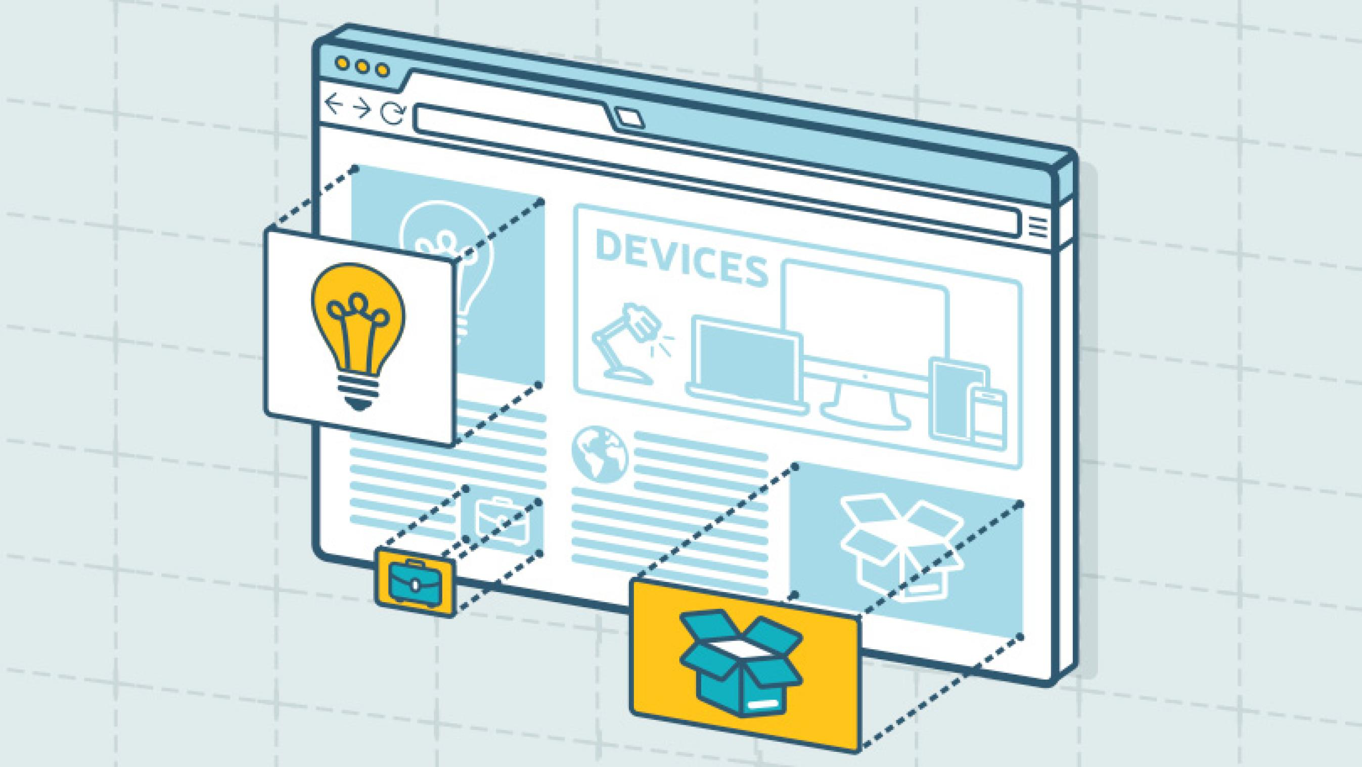
By 2027, there will be more than 41 billion IoT devices around the world. The increased volume of IoT devices means more individuals around the world will be accessing the web through a wider range of devices. As a DC digital web design agency, we’ve seen the increased importance of creating responsive websites that automatically scale to device type but remain consistent in general structure. Menu systems often become crowded and confusing as screen widths decrease to tablet and mobile devices. Digital design agencies can help overcome this obstacle by recognizing the critical breakpoints in your site’s design and implementing menu structures optimized for tablet and mobile screens of all generations. By keeping this consistency in structure and navigation across devices, users will become more familiar with and loyal to your website and brand.
3. Limit Menu Items
To ensure a website is easy-to-use and navigate, the structure is essential. For example, listing each page separately in a navigation header creates an overwhelming and near impossible user journey. Your sitemap should act as a foundation, with the most important items laying the building blocks for secondary pages. By systematically creating a logical sitemap utilizing primary and secondary navigation, you can create a fluid user experience that allows users to find exactly what they need with ease. As a DC digital web design agency, we have access to and frequently use site map testing tools, such as Treejack, to evaluate the findability of topics on a website. Not to mention, creating a logical, hierarchical sitemap makes it much easier to produce an XML sitemap, which is pivotal for SEO.
4. Test. Test. Test.
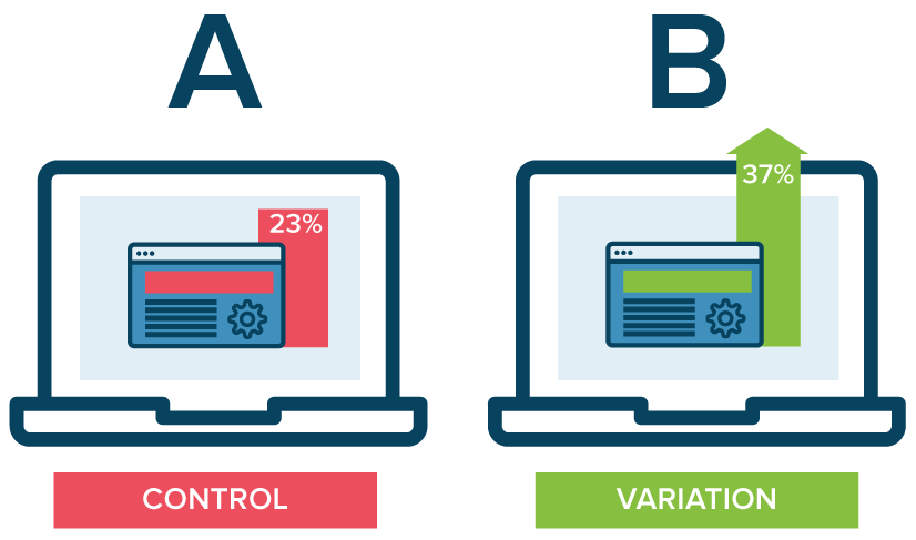
A/B testing website navigation is the only way to truly take the guesswork out of website optimization. As a DC digital web design agency, our Drupal and WordPress development experts have seen first hand the benefits of A/B testing. With proper testing, website navigation changes can be data-driven. Conversations surrounding those changes then shift from “I think” to “I know.” Although A/B testing can be employed to answer one-off questions, it should be continually used to improve metrics, such as conversion rate, over time.
In building or redoing a website, intuitive navigation design should always be a top priority to ensure users don’t require instruction or trial and error to move around the site. By using the navigation best practices mentioned above, you’ll have taken a great first step towards better engagement and higher conversion rates on your website by enhancing overall user experience. To learn more about our processes and to see our work, check out our case studies.
If you’re looking to hire a DC digital web design agency with Drupal and WordPress development experts, see what Bluetext can do for you.
Trends in website design are ever-evolving. It’s a fast-paced industry, but any business with a digital marketing presence should take efforts to stay informed and keep up with best practices. Just as you would ensure employees are helpful and informative to customers in a physical store, your users expect the same experience online. Here are three user experience trends that you should consider for your business’ website in 2020:
Design as a part of your business strategy.
A few years ago, chief executives might have excluded themselves from having a say in website design or functionality to focus on the bottom line. That being said, more and more companies have come to recognize the critical importance of a strong online presence. With the world participating in the digital-first movement, your website says a lot about the health of your business.
The future of the company often lies in the hands of top executives, as they typically establish the company culture and the goals with investors or the board of directors. Including top stakeholders in the design process is critical to get initial sign off and ensure their vision is incorporated. It is important to involve diverse perspectives into any web design, especially the ones writing the checks. These stakeholders offer a unique perspective in the current state and future aspirations of the company. Website strategists and UX designers should always include the top decision-makers in the room to make sure the website they are designing today aligns with the business strategy of the future.
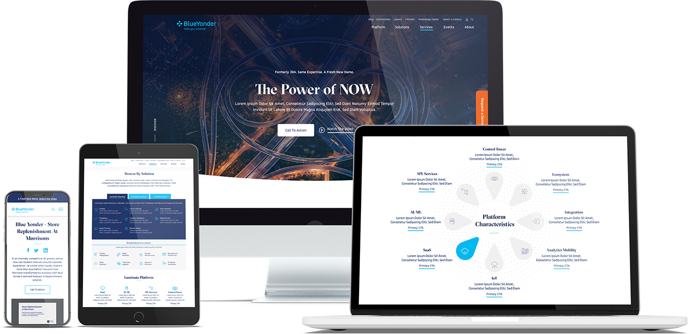
When Bluetext recently partnered with Blue Yonder (formerly JDA), the #1 supply chain management software company in the world, we made sure to include top decision-makers from the initial discovery session, all the way through to launch of their brand new website. You can view our work with Blue Yonder here.
Thumb-friendly design.
With over 50% of website traffic coming from mobile devices, responsive website design has become a top priority. Menu navigation and intuitive user journey has been and always will be a top design consideration, but recently there has been a shift in attention towards mobile menu design.
How do top UX design agencies optimize for user comfort as we design for mobile? We think about adding content and important elements to the “thumb-zone”.
The “thumb-zone” includes the area at the bottom of a mobile device and on the side opposite the thumb. Test it yourself by holding your mobile device. Where does your thumb naturally fall? User studies say that about 75% of user interactions are thumb-driven, so including navigational items and important content in this zone creates a simplified and more natural user experience. In 2020, you will likely notice a lot of websites start to move away from hamburger navigation on the left side of the screen. These are often replaced by navigation bars at the bottom of the screen, aka the thumb’s natural setting.
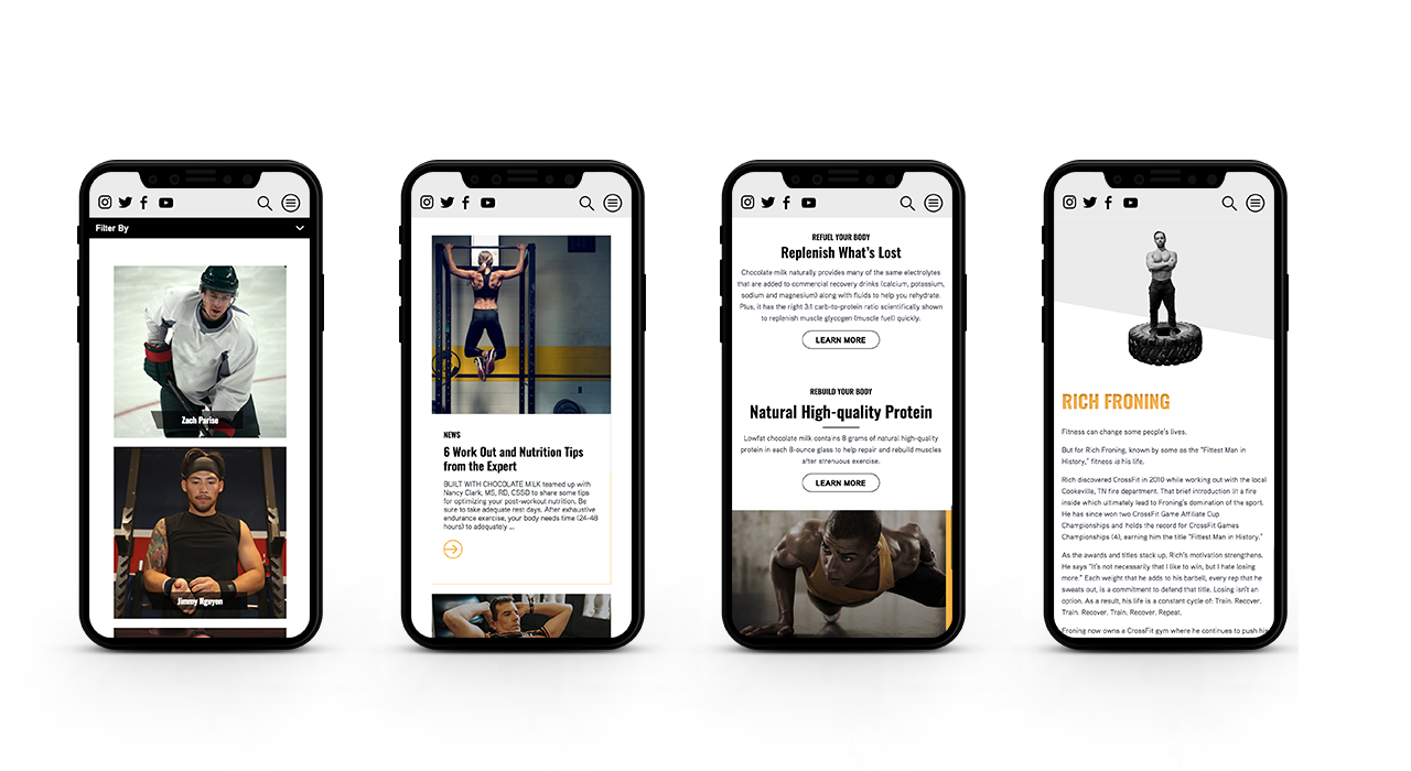
Bluetext designed a mobile-first website for Built With Chocolate Milk, an organization that promotes the benefits of chocolate milk as a natural recovery drink. Bluetext enhanced the user experience and overall engagement through a website redesign that emphasizes the science-backed benefits of chocolate milk and showcases Built With Chocolate Milk’s impressive partnerships with world-class athletes such as Klay Thompson of the Golden State Warriors.
Accessibility.
With the internet being a critical part of daily life and the rise of user-centric design, it is no surprise to see accessibility on the list. When thinking through how a user gets from point A to point B, UX designers should be inclusive of those people who may have a disability and use assistive technology.
One way of keeping accessibility top of mind is to develop separate personas for users that may have low vision, deafness, or other disabilities. Persona creation is a common exercise for top digital marketing agencies when beginning a website project. But thinking beyond the expected customer personas can open insight into a more inclusive and realistic set of potential web users. Having empathy for these personas while designing will help ensure little tweaks are made that allow them to equally experience your content. For example, ensuring text is large enough for users with low vision and inclusion of space for video transcripts are all UI elements that make the website more accessible to all. With the rise of imagery- and animation-heavy sites, adding alt text to all website imagery will allow screen readers to provide context to visually impaired users. Plus, this step will kill two birds with one stone by improving your site’s SEO ranking with keyword-rich descriptions.
Added bonus: Google prioritizes websites that are more accessible to more users, so if you want to boost your SEO rankings, keep accessibility top of mind.
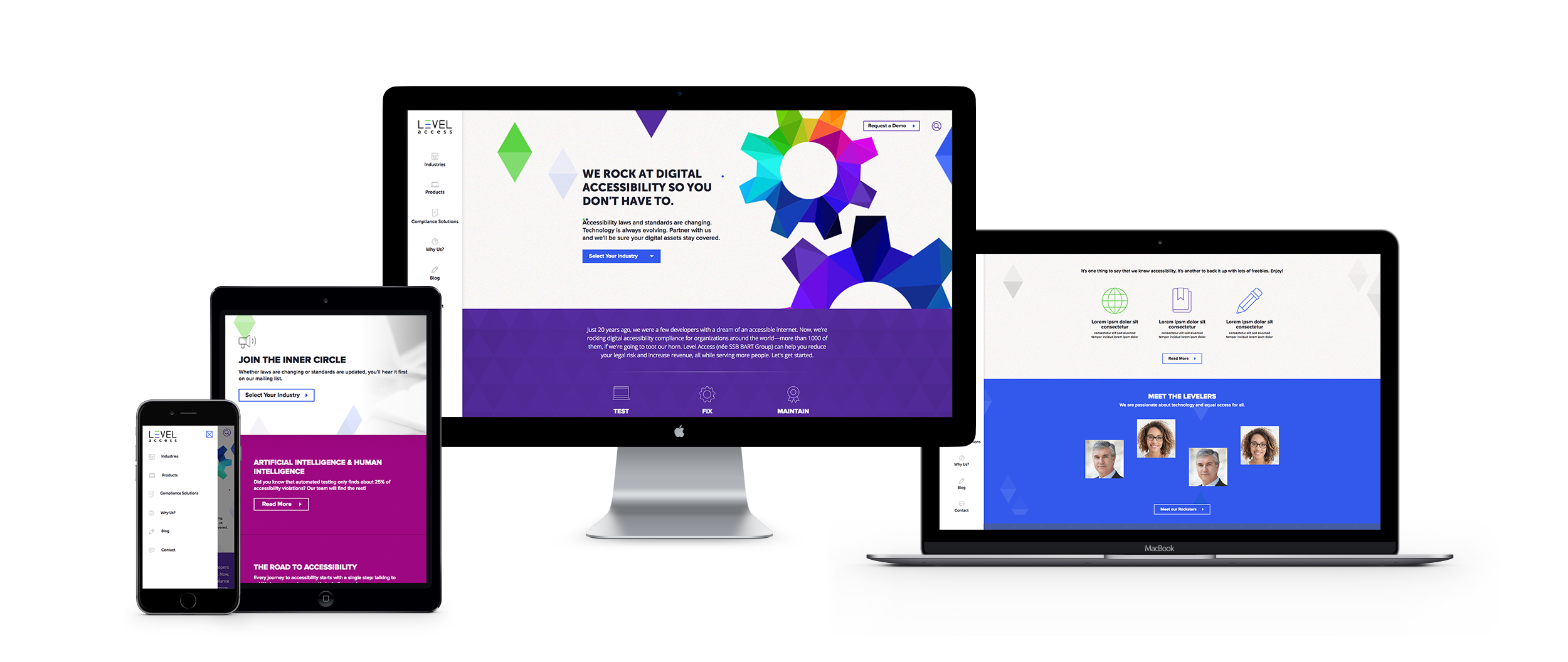
When the SSB Bart Group, the leading provider of accessibility solutions and software, needed a new brand to increase its market share and continue on its growth trajectory, it chose Bluetext to deliver a new name, brand, and website that would focus on its people and expertise. After a thorough discovery process, competitive review and market analysis, Bluetext proposed Level Access to simplify the brand and its promise to the industry. The new look and feel and how it is presented on the website reflects Level Access’ mission “to create a world where digital systems can be made readily accessible to users with disabilities—enabling digital technology to become a profound empowering force in their lives.”
Looking for more information about the state of web design and where we’re headed? Check out some more of our case studies.
A Google search of “cyber security companies” will return well over 700 million results. As a business becomes increasingly digital and transitions more operations into cloud-based tools, the data of both the business and its customers become increasingly vulnerable to cyber attacks. Cyber security companies are cropping up in response to growing demand across industries, but even the cyber security companies have to worry about protection, especially when it comes to their websites. As its digital storefront, any website is a critical place to ensure proper security measures are in place.
Here are the top five steps that cyber security companies themselves are taking to keep their websites protected.
1. Ensure CMS Security
The most cost-efficient way to build and manage a website is to leverage a popular content management system, but on their own these systems are often prone to attacks. To mitigate vulnerability, cyber security companies install a series of security plugins or modules, such as Securi for WordPress and Security Kit or Paranoia for Drupal.
Important Note: Simple installing the plugin or module is not sufficient. To protect your website and its data, webmasters must update and configure new releases in a timely manner. Website design and development agencies, such as Bluetext, can ensure your site security is always up to date.
When Bluetext partnered with ManTech to completely redesign their website, CMS security was a major concern. ManTech is a multi-billion-dollar public company that provides subcontracted technological services to the US Government. We outfitted their new Drupal website with the latest and greatest security plugins to ensure adequate CMS security.

2. Leverage Two-Factor Authentication
The content management system supporting a website needs to be easy-to-use, but not easy-to-access. Top cyber security companies (and the cyber security marketing firms who design and build their sites) ensure that only entrusted individuals can manage content on their sites by implementing two-factor authentication. When a content editor attempts to login in to update a page, they must validate their identity through a secondary step, such as a text message, phone call, or email. We often recommend Duo from Cisco, which integrates easily with most content management systems.
When CyberArk, a Goldman Sachs-backed, global cybersecurity technology company turned to Bluetext to redesign its brand comprehensively, we also launched a new responsive digital platform, complete with two-factor authentication. The new website addressed the needs of CyberArk’s global enterprise customer base.

3. Setup (BIG) Form Security
Web forms are valuable tools to digital marketers — and hackers! The potential for attacks initiated via a web form is BIG, hence they need big security. Cyber security companies, like many other industries, use web forms as a key lead-generation tool, but they know these forms are not something to be taken lightly. Any element on your site that allows for (and actively seeks) user input is susceptible to SQL injections or spam bots. (The tl;dr for those links: you do not want your website to suffer either fate.) The key IT stakeholder for any website should make form security a top priority, and work with the website development agency to select and implement the right technical measures.
When Finite State, an IoT-based cybersecurity company, came to Bluetext to expand its industry presence through a full website development and rebrand, we made sure that form security was paramount to the fully customized WordPress content management system platform.

4. Don’t Skimp on Hosting
While GoDaddy allows a company to save money, cyber security companies know that those savings come at an even higher cost in terms of security vulnerabilities. Though secure hosting providers come with a higher monthly bill, the long-term peace of mind in security far outweighs the short-term costs. These providers offer SSL certificates, CDNs, firewalls and more to ensure that websites can withstand malicious malware and attacks. Some of the top secure hosting providers recommended by top website development agencies include WP Engine and HostPapa.
Hosting security was top of mind for our client, PlanetRisk. When PlanetRisk, an enterprise risk analytics company, hired Bluetext to lead a comprehensive rebrand and new digital user experience and re-platform their content management system, we made sure that their updated website was fully secure, hosting-wise.
5. Take a Proactive Stance
Too often, website security measures are only implemented as a reactionary step following an attack. Cyber security companies know better. If a malicious attacker penetrates the website, they could irreversibly tarnish the brand. Cyber security companies make sure that the steps above are covered before an attack by configuring them before the website launches. Proactive protection can be a challenge if you don’t know what to expect, so be sure to consult an experienced website development agency to ensure your bases are covered with the most up to date security measures.
If you model your website security initiatives after the experts, you’ll be best set up to withstand attacks. Learn from the experience of a cyber security marketing agency—don’t skip these important steps!
Over the last couple of years, Bluetext has noticed a few key trends in what the C-Suite is asking for when kicking off a website project. Even if they don’t know much about what they’re asking for, or how to accomplish it, they have a keen sense of its importance. “Our competitors are doing it. Companies that we look up to are doing it. We need to do it too.”
Let us break down the 7 most common “needs”.
1. “We need to be seen as thought leaders.”
More and more, valuable website real estate is being dedicated to highlighting thought leadership content. Thought leadership is common on home pages and primary navigation items, especially as increased velocity benefits SEO. Blogs and other educational content are frequently cross-promoted throughout sites. Often, this content is displayed dynamically with custom logic based on publishing dates and category tags to keep pages current and relevant, and require less upkeep for page editing. Our clients recognize that users have come to expect this content, eager to consume and share.
When Bluetext launched the Arlington Capital Partners-backed Centauri, we designed and developed a fully integrated content marketing program to establish the brand in the market and increase word-of-mouth around the launch, prioritizing recruitment and a strong web presence.

2. “We need to tell our story.”
We have moved on from verbose descriptions of who we are and what we do in a home page. Users do not want to read; they want to experience. Today, companies are using “digital storytell” to express their value proposition. Visually stimulating, thought-provoking, and often interactive, digital storytelling creates an experience for the user unique to your company that holds attention to get a message across. Top digital marketing agencies like to think of digital storytell like those chicken nuggets with a secret serving of vegetables inside. The consumer enjoys what they’re eating, but you’re giving them what they need at the same time.
Take for example our work with Invictus. Invictus is a full-spectrum cyber technology and national security company dedicated to the protection of the nation’s security, global defense, and IT infrastructure. Invictus turned to Bluetext to embark on their next mission: grow from veteran-owned small business to big-time government contractor. With a fresh logo, reimagined corporate visual identity, and a modern website, Invictus is prepared to continue growth as a cyber-forward contractor for the federal government and commercial clients.
3. “We need to trim the fat.”
Less is more when it comes to content and choices. Users quickly get lost in antiquated sites with brochure-ware pages and deep menus. Content marketing agencies constantly hear from clients over how bloated their websites have become over time, and seek expert advice to tame its unruly junk drawers. A top digital marketing firm will tell you simplified information architecture can go a long way. Clear personas and usability testing can inform this crucial spout from which content strategy flows. Content should always be filtered for necessity, validated by the persona it serves, hole it fills, and value it adds. As attention spans wane, so must content.
Bluetext partnered with ManTech, a multi-billion-dollar public company that provides subcontracted technological services to the US government, to develop a fully responsive site with an enhanced user-experience. The intuitive, well-organized design drives users to their needs quickly and functions as a lead-generation tool. The new site also provides a new experience to recruits with a seamless integration of job application workflow, allowing prospects to quickly search and filter jobs relevant to their specific interests and experience.

4. “We need to personalize the experience.”
Personalization is no longer reserved for B2C websites. The B2B sales cycle is long, often requiring many interactions and engagements over time. Repeat users are an opportunity to speak on a more personal level. The more data we capture about a user, where they come from, how and with what they interact, the more we can adjust a web experience. From imagery, messaging, journeys, iterative forms, and specific calls to action, personalization lets the user know you understand them. Personalization is not a ‘set it and forget it’ initiative. It requires technology, data, and iterative support over time, making it a daunting undertaking but one with a huge potential for return.
When we partnered with the Graduate Management Admission Council, we re-designed their microsite, CallingAllOptimists.com. Through collaborative field studies and research, Bluetext engineered a unique digital experience in the form of a personalized 4-question quiz. The quiz seamlessly guided the user to customized messaging and content based on their answers, while simultaneously gathering actionable user-insight which integrated directly to GMAC’s marketing automation platform. Not only did this redesign improve the campaign’s functionality and awareness – it created a holistic brand ecosystem that drove both the user and the client to their desired goal.
5. “We need to stand out.”
Ultimately, every brand wants to look cool. Every B2B company wants people to land on their site and think, “wow.” The very first thing a user takes in is the design. As a top digital design agency, we are constantly asked to be innovative and deliver a unique design unmatched by competitors. Bluetext often creates custom animations, illustrations, fonts, menus, forms, and imagery for clients. It’s critical that, while we can wander far from inside the box, we remain true to the brand. The balance of brand consistency and digital creativity can create the award-winning masterpiece many of our clients are after.
When Bluetext partnered with Varonis, we launched the eye-catching “Exposure” advertising campaign, targeting C-Level executives who are unaware of the potential risk they are placing on their enterprises by not leveraging solutions to understand who has access to the unstructured and human-generated data that their enterprise relies on.

6. “We need to cover our…selves.”
The legal landscape of the web is constantly changing. From data protection to inclusiveness, the C-Suite is recognizing the need for compliance to sleep easy at night. Beyond legal safety, these new requirements should be pursued because these rights aim to protect end-users. Digital marketers have a responsibility to make the internet a space for all users to experience equal comfort and access. From 508 to GDPR, your digital marketing agency should proactively implement these requirements as guided by your legal team.
Take for example our work with Level Access. When the SSB Bart Group, the leading provider of accessibility solutions and software, needed a new brand to increase its market share and continue on its growth trajectory, it chose Bluetext to deliver a new name, brand and website that would focus on its people and expertise. The new look and feel and how it is presented on the website reflects Level Access’ mission “to create a world where digital systems can be made readily accessible to users with disabilities—enabling digital technology to become a profound empowering force in their lives.”

7. “We need to harness the full potential of our website.”
Websites have become full-fledged marketing and sales tools. One piece of a 360-degree user experience, websites are now a living, breathing, asset, working in tandem with other channels. Data should consistently inform website governance decisions and data from the website should be analyzed to inform other channels inversely. From tracking to chatting, integrations that connect websites to other marketing channels can exponentially augment what we know about our users. Our clients constantly ask how we can integrate with full-funnel efforts, from hosting events online to chatting with prospects in other languages, the potential is near limitless.
When Bluetext worked with ResMan, a property management platform, to invigorate their brand and redesign their website. ResMan charged Bluetext with repackaging their solutions into a strategic grouping that reflected the market’s needs. As a customer-centric brand, ResMan needed their external messaging and marketing efforts to reflect their goals as a company. Bluetext turned this request into a fully redesigned website, focusing on an enhanced UX that guides ResMan’s users through the site with an intuitive website flow.
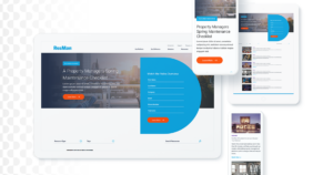
All of these “needs” are important to consider, but it’s tough to nail them yourself unless you have unlimited time and budget. An experienced website design and UX agency, such as Bluetext, should guide you through these conversations when beginning a website project to determine what makes sense for your business’ goals and resources. At Bluetext, our goal is that one day a CMO will point to your website in a project kickoff as the bar for their “needs.”
The decades-long reign of the PC is over, with mobile devices now making up more than 52% of all internet traffic. While plenty of people preach the importance of responsive website design, far fewer have articulated updated guidelines for the reality of today’s internet. Keenly aware of trends as ever, Google has continually refined its search algorithm to keep pace with increasingly mobile and untethered internet. Advertisers, marketers, and website owners alike need to be aware of what these paradigm shifts are, and how that could impact their sites’ SEO.
Cellphones’ bountiful data has empowered Google to enhance its search engine. Search results are more custom than ever before, incorporating key differentiating factors like time of day, weather, and geography. The search results for a morning bagel in Washington D.C. will look entirely different three hours later in San Francisco.
Optimizing for Local Search
More so than ever before, websites need to be local. Gone are the days of simply tacking on addresses and list of phone lines. To be competitive in 2020, websites need to address the mindset and inquiries of the region they serve, be it a street, coast, or country. A quintessential, doughy foldable New York slice is in stark contrast to a dense, deep-dish pie from Chicago. The top result for a pizza in Manhattan will not be wasting content on merely their cheese, sauce, and pepperoni, but rather what distinguishes their slice from their other New York brethren. Language, context, and local distinctions are now a mandatory part of website content strategy.

Dealing with Short Attention Spans
Major changes to search algorithms are only a handful of the changes introduced by the rise of mobile. Attention spans online are shorter than ever with the ubiquity of the internet and easily accessible information, even more so for mobile where screen size comes at a steep premium. Hero zones should be appropriately leveraged. Heroes should state the most important critical information concisely and contain a quick and simple CTA or takeaway. Organic visitors who cannot immediately find an answer to their search query after a glance and a few swipes will assuredly bounce away to a competitor.
Search and Virtual Assistants
Smartphones’ impact on websites has not just been limited to mobility and smaller screens. Virtual assistants like Amazon’s Alexa, Google Assistant, and Apple’s Siri fundamentally change how people browse the internet. For many on-the-go, the automated search functionality provided by these virtual assistants have all but replaced a typical Google search.
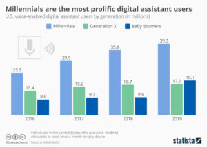
How Google and the other virtual assistants parse through webpages and present them for voice search is a complex topic, but the vital SEO fundamentals remain in place. Research demonstrates that people are unsurprisingly far more conversational in their wording versus a typed-in search. Optimized content thus needs to serve this need directly, often best served using blogs that cover such frequent, informal topics as “What is the best X” or “Y versus Z”.
Google has been increasingly leveraging its structured data for voice search results, largely due to its predictable format and parseable nature. For best results, website owners need to cross-reference website content and identify what data could be passed off to Google using structured data. Articles, menus, locations, events, and reviews are just a handful of the many structured data formats that Google accepts. Conveniently, Google now provides a simple tutorial for anybody familiar with HTML to get started on incorporating structured data and improving their site for voice search.
The shift to mobile devices has opened up new avenues for content creation and design. Location and voice were unheard of topics even a decade ago, but they are here to stay for organic search. It’s up to website owners and marketers whether they take advantage of these new strategies, or get left in the dust.
As the world has changed in the blink of an eye, so has the way we market to consumers. Now, more than ever, your website exists as BY FAR THE MOST IMPORTANT doorway to your brand and your brand experience. While stores stay shut, and face-to-face interaction is vastly limited, brands will rely on reaching their target audiences via their websites. Therefore, your website is mission-critical to your success.
Bluetext has published a 5 part blog series to help you think about and pressure test if your website is the best it can be.
Bluetext clients are often asking for our recommendations on the best content management system for their website, whether as a redesign or a re-platform for their business. We are a forward-thinking digital marketing agency that provides game-changing digital experiences for brands looking to make a difference in the market, and as such, we have always been a technology-agnostic company and supporters of the open-source community.
Over the years, we have helped countless clients identify the appropriate CMS to meet their specific use cases. We work with organizations of all sizes: from startups looking to launch their first website, to large, established organizations with complex business workflows and integrations and distributed teams. No matter where your company falls on this spectrum, we have proven guidelines for deciding on which CMS will be the most appropriate for your organization. Here are three key considerations to guide you through your CMS selection process to ensure you are set up for success for the next 3-5 years.
1. Determine Your Stakeholders and Their Needs
The first step in selecting the best content management system is to identify those individuals who have a stake in the redesign/re-platform and analyze their needs. To begin this process, take stock of who is involved with the current website (typically Operations (IT), Marketing and Executive Management). Depending on the size of your organization, there could be many additional stakeholder groups.
For each stakeholder group, take time to understand their specific needs for the new CMS and use these insights to develop KPIs for the platform:
- Operations (IT) – Your IT team is likely concerned about the technology stack (what can they support), where it lives (cloud, on-prem) and what their role will be in terms of ongoing maintenance.
- Marketing – The marketing team typically drives the website. They are likely concerned with the feature set: content management features, workflows, learning curve, marketing integrations, social sharing, etc.
- Executive Management – Most often, the executive team is focused on two things: cost and timeline. How much is this going to cost, and how long is it going to take to build?
It is important to conduct this step every time your organization goes through a redesign or re-platform, as structure, needs, and concerns evolve over time. For example, in recent years, day-to-day website ownership has generally shifted away from traditional operations/IT teams into the hands of marketing teams.
2. Outline Requirements
The next step in the process is to translate stakeholder needs into requirements. We recommend building a requirements matrix that outlines the full set of necessary features for the new CMS platform. Much of the matrix will consist of functional requirements, but it should also include cost, technology, and timeline constraints. A forward-thinking mindset must be applied when developing requirements. Consider feature sets that are planned for the next 2-5 years to ensure the selected CMS has the flexibility to accommodate business changes. To build an effective matrix, leverage the following strategy:
- Gather Requirements. Supplement and expand upon the needs of the stakeholders by gathering wholistic requirements from actual users. We recommend conducting workshops with each user group. In some organizations, the user groups may include the marketing, operations and sales teams. In other organizations, distinct business units or regional teams may make up other user groups. The workshops will result in pages and pages of notes, which should be consolidated into a set of functional requirements.
- Consolidate & Group into Usage Scenarios. Consolidating your requirements into high-level usage scenarios will help you, and your team, come to a consensus on critical functionality. During the CMS product demos, you will be armed with your list of usage scenarios and can ask specific questions regarding how the platform in question would handle such scenarios. Some possible usage scenarios could be:
- As a content editor, I want to be able to manage and reuse digital assets from within the CMS so that I do not need to re-upload items.
- As a content editor, I want to be able to manage content from my mobile device so that I can provide real-time updates from remote locations.
- As a content approver, I want the ability to review content before it is able to be published on the website.
- As a site administrator, I want the ability to update the menu links on the website when the organization decides to change the navigation of the website.
- As an IT Stakeholder, I want the CMS application to be built in PHP so that my existing team of developers can manage and support the website.
Creating a Prioritized Feature Matrix
Leverage the usage scenarios to develop your feature matrix and prioritize each requirement. What are the must-haves, nice-to-haves, and stretch features that you could live without? Prioritization is very important and should not be taken lightly. Be sure not to let your feature matrix get out of control. This should be a list of no more than 50 “features” that you need the new platform to provide.
The matrix will allow you to score the products against each other in a logical way and get a good idea of the product’s compatibility for your organization.
| Feature | Prioritization | Product 1 | Product 2 | Product 3 |
| Easily manage content |
5 |
3 | 4 |
3 |
| Easily manage content on mobile devices |
3 |
4 | 4 |
4 |
| Integrate with Product X |
4 |
3 | 3 |
3 |
| Integrate with Product Y |
2 |
1 | 1 |
5 |
| Strong Multilingual Support |
5 |
2 | 1 |
3 |
| Personalization Capabilities |
4 |
3 | 0 |
1 |
| …. | … | … | … | … |
Easy, right? Of course, gathering large groups of people for workshops is easier said than done! No matter the size of the organization, the scheduling for these types of workshops is a challenge, but ultimately, the work pays off. Skipping this step will, more often than not, result in the selection of a sub-optimal product and the need to rebuild the CMS again next year.
3. Market Research & Validation
Market research will help down the list of products available on the market to arrive at a “short-list” of candidates for consideration. There are several resources available to inform your research. Two of our primary sources of information come from top analyst companies Gartner and Forrester. Dries Buytaert put it beautifully in his blog post:”If you want to find a good coffee place, you use Yelp. If you want to find a nice hotel in New York, you use TripAdvisor. Similarly, if a CIO or CMO wants to spend $250,000 or more on enterprise software, they often consult an analyst firm like Gartner.”
To give a brief recap in case you are unfamiliar with how Gartner rates vendors, they look at two key, top-level criteria: Ability to Execute and Completeness of Vision. They rate vendors on their ability to deliver what they promise and their ability to stay ahead of market trends to provide a quality product to their customers.
While this is not a complete step-by-step guide to performing a CMS comparison audit, it should give you the tools you need to get it started. While every organization is different – wether it be organization structure, specific requirements or current marketing goals – utilizing these activities while performing your CMS selection will help ensure that you are setting your organization up for success.
Looking for help in determining what CMS is right for you? Let us help!
As the world has changed in the blink of an eye, so has the way we market to consumers. Now, more than ever, your website exists as BY FAR THE MOST IMPORTANT doorway to your brand and your brand experience. While stores stay shut, and face-to-face interaction is vastly limited, brands will rely on reaching their target audiences via their websites. Therefore, your website is mission-critical to your success.
Bluetext has published a 5 part blog series to help you think about and pressure test if your website is the best it can be.
Virtual Executive Briefing Centers are a valuable resource for companies wishing to show customers and prospects their full range of solutions in action, especially new solutions that the partner may not have implemented yet in its own organization. Customized presentations, live demos and in-depth discussions can be arranged. VEBCs offer a lot of great benefits for organizations including:
- Present your brand in a very innovative way with the latest HTML5 and video technologies
- Reach a wider audience, save money and drive efficiencies by reducing travel costs to visit a physical center
- Get your thought leaders delivering their message to a wider audience than their physical weekly calendar allows
- Deliver vertical specific messaging and solutions in a customized fashion
- Personalize the experience based on the understanding of the audiences job title, history with the enterprise, and other components the digital environment can capture and feed into the site
- Juice up your SEO with a smart build and customer journey that enhances your SEO footprint
Bluetext has had a lot of experience designing and developing Virtual Briefing Centers. Here are just a few examples of the innovation we have helped drive for our clients:
McAfee and Intel Security’s Future Agency
McAfee and Intel turned to Bluetext to design a campaign to demonstrate the advancements in cyber security that the companies are driving across the Federal Government. Named The Agency of the Future and found on the web at futureagency.com, the solution integrates an interactive, 3D experience and a series of videos with lead generation integrated throughout. The experience was enhanced with a continuous monitoring webcast that targeted federal IT security experts and drew more than 3000 leads. The campaign won major kudos at McAfee corporate.
CSC’s Digital Briefing Center
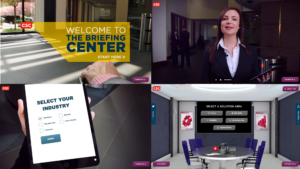
CSC’s Digital Briefing Center is where customers, partners and prospects from across the globe can come to learn more about the key technology conversations and market shifts CSC is driving into the market.
The center is driven with immersive 3D video technology that is completely interactive through Html 5 overlays throughout the user journey.
Following launch, Bluetext’s collaborative creation with CSC’s Digital Marketing team became the top performing component of the csc.com global web presence, a huge feat for a Fortune 500 corporation.
Version 2.0 features new capabilities spanning:
-
Multi-floor scalability
-
Triple screen experience
-
Dynamic social media integration
-
Triggered infographic visualizations synched with briefing videos
-
Chaptered video interactivity
The following video of CSC’s head of global brand and digital marketing talks about this project:
TalkShop by Cooper Thomas
From corporate meetings to conferences and workshops, connecting with your workforce and customers is an essential element of business. Bluetext was hired by Cooper Thomas to help enhance their virtual training and meeting services and next-generation virtual platform that can help their customers get the most out of their customers’ virtual events.
With their virtual event platform, you can now connect with employees, customers, and clients conveniently and cost-effectively. The unique speaker-training program guides your presenters to deliver more effective and engaging virtual presentations. The speaker coaches provide focused support to help busy subject matter experts become polished presenters. They also provide project management and program support for events ranging from single training sessions to multi-day conferences, as well as on-site support for virtual and face-to-face events.
 Optimize Often