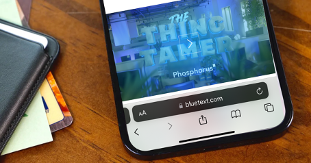
In late 2021, Apple released its iOS 15 update with a pretty drastic change in browser layout, creating a ripple effect in website UX design. The beloved search bar on Safari had been moved from the top of the screen to the bottom. Many users, who are less familiar with the thought process behind UX design were left with one question. Why?
Well, according to MacRumors, the move was more functional than aesthetic. Think about how one naturally holds and operates a smartphone; usually held within the palm of the hand and touchscreen controlled by your thumbs from the bottom corners. Therefore, controls brought to the bottom of the screen are easier to reach with one hand. This feature also creates more space for users to focus on the webpage’s content.
Research confirms that “75% of users touch the screen with one thumb.” This has led UX designers to favor a thumb-driven design, placing the most important and frequently-used features at the bottom of the screen. This ensures easy access with one thumb.
Traditionally, many website designers place navigation in the top corners of the screen. While that works with a desktop device, due to the greater range of motion coming from the computer’s mouse, it does not translate that effectively to a mobile device. With the navigation menu being placed on the top corners of the screen, the range of motion that the user’s thumb has can restrict easy access to that navigation menu. Especially as technology evolves and mobile screens grow in size, users find themselves having to reposition their hands. This in turn slows down the user’s ability to navigate webpages and ingest content.
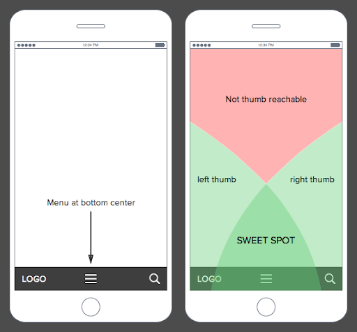
What’s the big deal? I just have to move my hand a little to be able to reach the top corner of my screen. The answer is simple: efficiency. Bottom menu navigation allows the user to accomplish tasks faster and with a greater level of comfortability, which really adds up considering that the average American spends 5.4 hours on their phones.
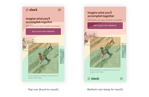
A lot goes into the design process, and it is not all about aesthetics. It’s about how the product functions. In today’s world, 55% of website traffic is generated using mobile devices, so functional and efficient mobile layouts for a website is imperative to the success of a brand. It is essential that UX designs make easy navigation a priority because the easier a product is to use the more often it will get used or recommended. That is why features like bottom navigation are so effective. Especially if it is designed in a streamlined way that makes content visible, clear, and simple.
As users experience the bottom menu trend, users will likely have to take some time to readjust. Looking ahead at UX design trends for 2022, there will be a continuation of the emphasis on overall usability, navigation, and aesthetics being driving forces for design. There is a desire to achieve a seamless experience, where user experience designers focus on the continuity and natural progression of connecting all the steps of finding a landing page to purchasing an item. It is imperative that functionality is favored, so it will be interesting to see more experimentation with navigation placement and overall screen flow on mobile devices in the future.
Does your website menu need a refresh? Contact Bluetext today to learn about our web and UX design services.
When strategizing and creating the UX of a B2B website, making informed and data-driven decisions can make or break the impact of your site. Getting the user to your site is the first step, but once they have arrived, your content and user experience are the only things standing between a standalone visit and a conversion.
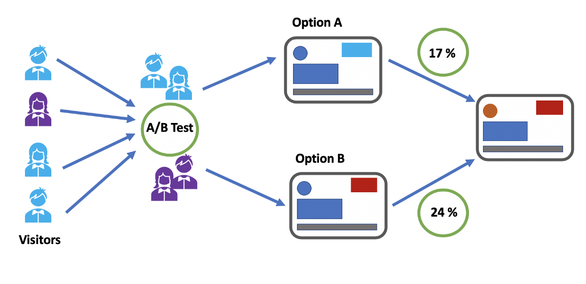
Conversion Rate Optimization (CRO) is the process of strategically enhancing your website to grow conversions. Depending on your business, this could mean a variety of different things. A conversion is defined as the completion of the desired goal, and we all know goals are never one size fits all. A goal could be a form completion, direct product purchase, a resource download, or event registration. For most B2B businesses, lead generation is the top goal. This means any action on your website in which a user demonstrates interest and provides their information is a conversion. The importance of content and UX in terms of CRO cannot be overstated, and tools like A/B and multivariate testing can be leveraged to ensure all website elements are optimized for lead generation.
Types of Testing
A/B testing allows you to test the impact of one specific variable (for example, CTA button placement, CTA copy, page heading copy) to determine the most effective version of the page content and user experience. It analyzes user action on the variable page (version B) against the control page (version A) and ideally results in statistically significant insights.
Multivariate testing, on the other hand, tests multiple pages and content variables against the control page. While A/B testing gives insight into the effect of variables on an individual basis, multivariate testing reveals the collective impact of those variables and how they work together in one page design against another.
Multi-page funnel testing is similar to the aforementioned test types, however rather than testing variables on multiple versions of just one page, multi-page testing evaluates the impact of variables across the full user journey. This is helpful information, specifically when it comes to lead generation. Finding the ideal user experience and user journey across multiple pages and having the ability to analyze user actions from top of funnel activity to conversion allows you to make the most informed and well-strategized decisions when it comes to page content. If increased conversion rates are your goal, you want to be able to set yourself up for success with a data-supported UX.
How to Conduct A/B and Multivariate Testing
It is highly recommended that you use a CRO tool (Google Optimize, for example) to conduct user testing to avoid any SEO issues that may be caused by just creating multiple pages with specified variables in your CMS and evaluating the results in Google Analytics. Using the right tool will not only help to ensure you don’t negatively impact SEO but will also allow you to differentiate results and insights that are statistically significant from those that occur by chance.
Our Tips for Split Test Execution:
- Determine the specific question you want the test to answer and form a hypothesis – An example of that question may be: Why are users not clicking the CTA on our product page? Your subsequent hypothesis will inform the type of testing you should conduct as well as the variables you should examine.
- Form a hypothesis – If your hypothesis to that question is “Users are not clicking the CTA because it does not visually stand out on the page.” The variable you could then analyze via an A/B test is making that CTA button a bolder, more eye-catching color on-page version B.
- Make sure you are using the right tools – accuracy and reliability are crucial when venturing into user testing. Setting up your test to yield clear and statistically significant results is the first and most important step in testing and CRO. Without establishing that foundation, you can end up with data that doesn’t tell you anything about user patterns but rather just a collection of events that occur by chance.
Consulting a B2B marketing analytics and intelligence company like Bluetext to guide you through strategizing and testing the many variables that come with creating a website. Reach out to learn how Bluetext can support your organization.
A compelling website is the backbone of a brand’s digital presence. A website serves as a channel for business by generating purchases, tracking sales leads, and raising brand awareness. The visual appearance of your website must promote the corporate visual identity and enhance the site’s functionality. Some basic design guidelines can be applied to ensure that the site is both aesthetically appealing and easy to navigate for users. The following 8 principles should be kept in mind when designing user-friendly, effective websites that direct users to the desired outcomes:
Create a Visual Hierarchy
Visitors to a site will skim content to find the information most relevant to them. The visual hierarchy created by typography styling and placement is key to directing their attention to the most crucial information on the site. Using a consistent hierarchy H1, H2, H3, etc. header style aids end-users, but also SEO engines. Google crawlers will look to these assigned hierarchies to identify organic search keywords and prioritize your website higher on search engine results (SERP) so a user can find your website in the first place. Each page should highlight the most important content and de-prioritize supporting information so that a user can more easily pick up on the big takeaways. Bluetext works with clients to identify the key actions or information that a site should showcase, and creates thoughtful designs to make those items stand out to users.
Use the Golden Ratio
The Golden ratio uses the number 1.618 to divide portions of the screen into sections that are visually appealing to users. Rather than dividing areas into equally measured sizes, the width or height of a section should be divided by 1.618 in order to create one larger section, and the remaining area is left in a smaller section. This proportion is easier for users to analyze, as it has a more classical and balanced appearance.
Avoid Possibility Paralysis
Giving users too many possibilities to choose from creates frustration and hesitancy in user actions. Think about the classic supermarket example. The decision between three types of peanut butter is far easier and faster than deciding between fifteen different types and brands. Discerning between choices and identifying the correct one requires a lot of energy from users when they’re bombarded with options. Limiting the choices presented to users eliminates distracting elements, and allows them to interact with the site more seamlessly.
Bigger Is (Often) Better
Larger items are simply easier for a user to find and click. For call-to-action (CTA) buttons, in particular, making those buttons larger will lead users to click those areas quicker and more often. Unusually large buttons might have the unintended effect of distracting or confusing the reader, but legible, noticeable designs can positively encourage user interaction. For other tips and tricks to designing CTAs, read our blog on the Guide to the Perfect CTA Button.
Consider Gestalt Principles
A website that exhibits well-executed design will help attract users’ attention before they dive into more detailed content. Overall design principles provided by Gestalt help creators build websites that visually appeal to users. For example, Gestalt’s law of closure ensures that users prefer designs that feel complete, rather than having gaps or empty spaces that break up the flow of the design. Considering users’ design preferences will help the audience feel more connected and engaged with the site. Poor designs could confuse users or distract them from important content.
Utilize Negative Space
Negative space is the open space created in a design where there is a lack of content. This clear area creates a natural breathing room and is essential to making the design appear clean and modern. A page that is cluttered with information can be overwhelming to users, and this can discourage them from exploring the content. A great example of maximizing whitespace for a clean website design is Bluetext’s work with Sonicwall, an innovative cyber-security company.
Acknowledge the F-pattern Rule
Eye-tracking studies have shown that users tend to scan screens in an F-shaped pattern, following from left to right across the top of the page, then just scanning down the left side of the page as they scroll lower. The F-pattern reinforces the idea that the most important text or imagery should be placed at the top of the page, or along the left margin. Placing crucial content in these areas will increase the likelihood of users noticing or absorbing this content.
Consistency is Key
Keeping consistency across design elements is crucial to creating visual cohesiveness across a site. Typography styling and content blocks should be recognizable across different pages. When designing websites, Bluetext developers help clients to create a dynamic component system, where the same components can be modified or rearranged on different pages throughout the site. This component system establishes regularity throughout designs that help users navigate the site more easily, recognizing familiar component structures.
Investing in your website’s design can drastically improve the user experience and lead to desired business outcomes, such as increased sales, lead generation, or overall awareness of your brand. Need help? Contact Bluetext to get expert support in perfecting your user experience design through thoughtful web design.
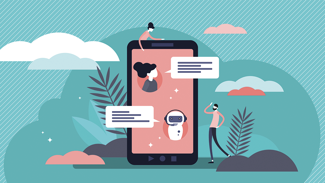
No matter what industry your company is in, or who your target market is, the goal of any customer interaction is to foster a relationship that converts to revenue. In today’s digital landscape, customers’ expectations have elevated to instant yet personalized feedback to their questions at the click of a button. While this seems like an impossibly daunting task, it has become an expected digital experience with the help of technology. Artificial intelligence-powered live chat, chatbots, and messaging apps have all helped companies achieve this blend of efficiency and customization. Below, we dive deep into the power of conversational marketing and how to implement the right strategy for your business.
What is Conversational Marketing?
In its essence, conversational marketing is a series of one-to-one interactions in real-time across multiple channels. Conversational marketing enables you and your team to foster relationships with both potential customers and existing customers, improving overall online customer experience and brand perception. A successful conversational marketing strategy ensures your customers feel satisfied and supported in all their questions, and trust your brand throughout every stage of the sales funnel. Additionally, as we know, data is a powerful tool, and utilizing conversational marketing technology can increase that amount of data allowing you to tweak your strategy and increase conversions. Every conversation could be considered a mini focus study and learning experience for how to continually improve your business.
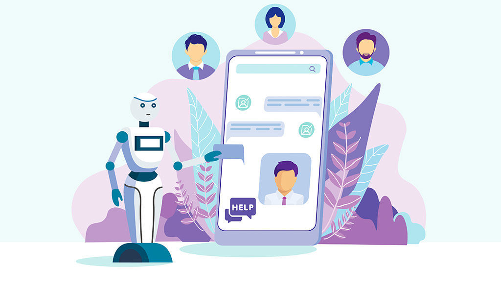
Chatbots
As your business scales up, so will the number of questions from prospective and existing customers. That being said, there will come a time when it is simply not feasible to increase the number of sales representatives you have to answer every question that comes in via your website. That’s where chatbots come in. Chatbots have become the go-to conversational marketing tool for a lot of businesses. Platforms like Drift, which integrate seamlessly with your existing website make chatbots a very easy and effective way to up your conversational marketing efforts. Chatbots are very effective when it comes to easing customer pain points quickly and provides a visual cue of reassurance upon landing on a web page that support resources are readily available. Pre-programmed answers to frequently answered questions allow you to talk to your customers, regardless of the time of day. This is especially beneficial for businesses with an international reach, as customers outside your local time zone will always feel supported. If the query is too unique to respond with a canned response, chatbots can connect the customer with a live representative who can better answer their questions. Plenty of conversational marketing platforms enable businesses to identify which leads are most likely to buy and then move them to the front of the line.
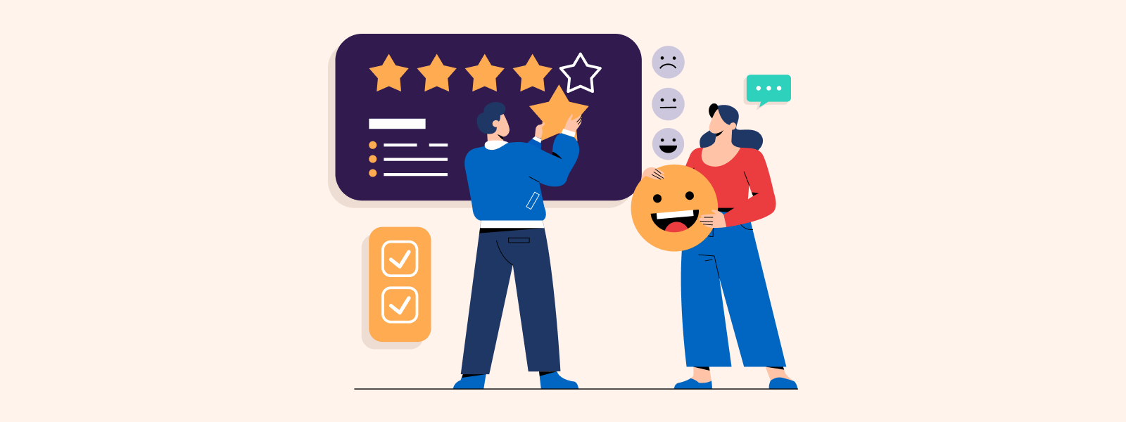
Customer Feedback
Pulling data from your chosen conversational marketing tool on customer engagement will only get you so far. At the end of the day, you’ll need to gather feedback from your customers, asking them their thoughts on how to improve the customer and prospect experience on your site. This will not just enable the customer to feel that they have a say but also will help in the optimization of the tools after some time. Adding a quick feedback survey to the end of a chatbot or live chat conversation will go a long way in improving customer satisfaction.
How to Get Started
Implementing a successful conversational marketing strategy starts by choosing the web pages where you want your conversational bot to engage with your visitors. Sometimes it makes sense to have a constant chatbot available on every page, at all times. Other times, and especially when utilizing live chat versus a chatbot, it pays off to choose the pages that get the most traffic, have the most conversion opportunities, or have visitors with a high intention of buying. This will help maximize the number of interactions you enter into, and the likelihood of success of those interactions. Now that you’ve decided where you want to speak to your customers on your website, it’s time to define what kind of information customers will ask for, and how in the simplest terms you can provide them with that information. As a general rule of thumb, try to keep the conversations simple. Your customers will expect the interaction with your company to be smooth and want to get answers and guidance quickly.
Regardless of the size of your company, having a conversational marketing strategy is key to increasing customer satisfaction and therefore revenue. Are you looking to begin your conversational marketing strategy but not quite sure where to start? Contact Bluetext and see how we can help.
Being a technology company can be tough, there is often pressure to appear futuristic, scientific, or impressively complex. The market often expects the latest and greatest features and widgets, especially in website UX and design. However, not every company is the space-age, robotics, AI-generated stereotype that comes to mind with “tech”. But across all technology companies, there is a shared level of expertise in software and computing that may not be found in the everyday website viewer. Technology companies can easily fall into the trap of flexing their brain power a little too strongly, and overachieving the “tech aesthetic”. And while there are a million ways to design an impressive website, there are a couple of practices that stand out as common pitfalls for technology companies. Bluetext recommends the following as what NOT to do in web design:
Too much content on one page
This is often the result of poor content planning. When a user is overwhelmed with animations, visuals, and walls of text, they lose interest quickly. Focus each page on answering a specific question or describing a specific product, and link out to additional information that you feel is relevant. If there is any “take it or leave it” language on the page, it might be best to leave it.
Too little content on one page
As the saying goes, too much of a good thing can be a bad thing. We appreciate minimal site design when it helps a user find exactly what they’re looking for, but barely-there content doesn’t help anyone. Each page should be thoughtfully designed and written and should provide a user with clear next steps in their journey on your website.
Jargon or unapproachable language
Messaging across the site ought to be crystal clear. Just like having too much content, using complicated language and jargon can deter a user from continuing on your site. We recommend tailoring your content to your audience by considering how they would speak during a conference—widely-understood industry terms are acceptable, but should be embedded within digestible, humanized language. When customers can easily understand your product language, they gain confidence in your brand.
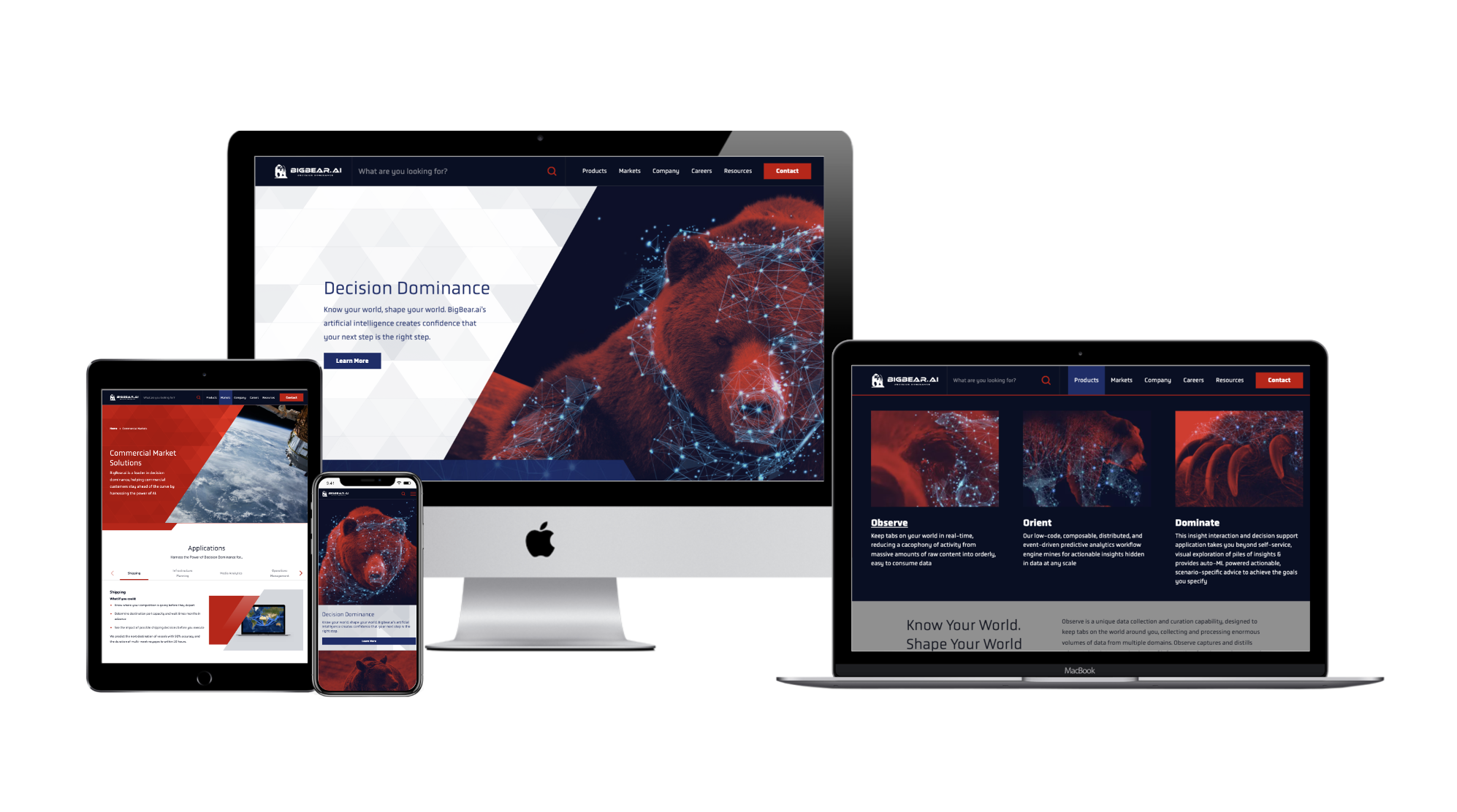
Recently, Bluetext partnered with BigBear.ai to develop a new messaging strategy that frames them as a leader in their field while explaining their highly-technical product with accessible language. As a result of this partnership, BigBear.ai is able to strike a balance between technical and approachable language, and build trust with its audience. To learn more about this project, click here.
Falling into the trap of trends
We see this most often when personal taste takes precedence over user experience. Some trends have staying power and can help you stand out from out-of-the-box websites. Some trends, though, are fleeting.
When adopting new web design styles, carefully consider the relevance of each trend to your brand and your users. More often than not, the best thing you can do for your users is to be consistent. They want to know what to expect from your website, so as you explore trends, it’s good to meet (or exceed!) those expectations.
No clear CTA
Each page on your site should provide clear, relevant next steps. This could take the form of related resources at the bottom of the page or quick links to associated product pages. Whichever next steps you choose to display, they should proactively provide the user with additional information related to the page they’re on. This practice is also helpful with interlinking content across your website, which can boost your search rankings.
For a great example of CTA placement throughout a site, check out Axient’s website. Bluetext worked with Axient to devise a comprehensive website strategy that would optimize the user journey and maximize conversions. To read more about this project, click here.
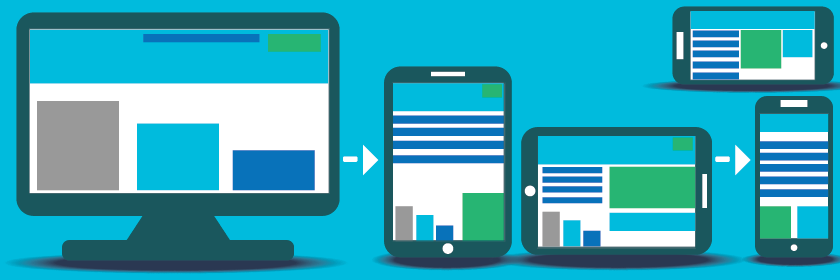
Poor mobile experience
More than half of users will leave a page that takes more than a few seconds to load on mobile, according to Google. Given that mobile use is steadily increasing year-over-year, this means that the longer your site takes to load, the more users you could be losing to competitors.
One solution for the mobile-desktop conundrum, as recommended by Nielsen, is to have a mobile site separate from your desktop site. This will allow you to pare the mobile experience down by removing content and features that are only relevant to desktop users. To see how your site’s mobile experience stacks up, try out Google’s Mobile-Friendly Test.
At the end of the day, the best thing you can do for your website is to design and write with your end-user in mind. A site that works for them is a site that works for you.
To learn how Bluetext can help you avoid these mistakes, get in touch with our web design experts today.
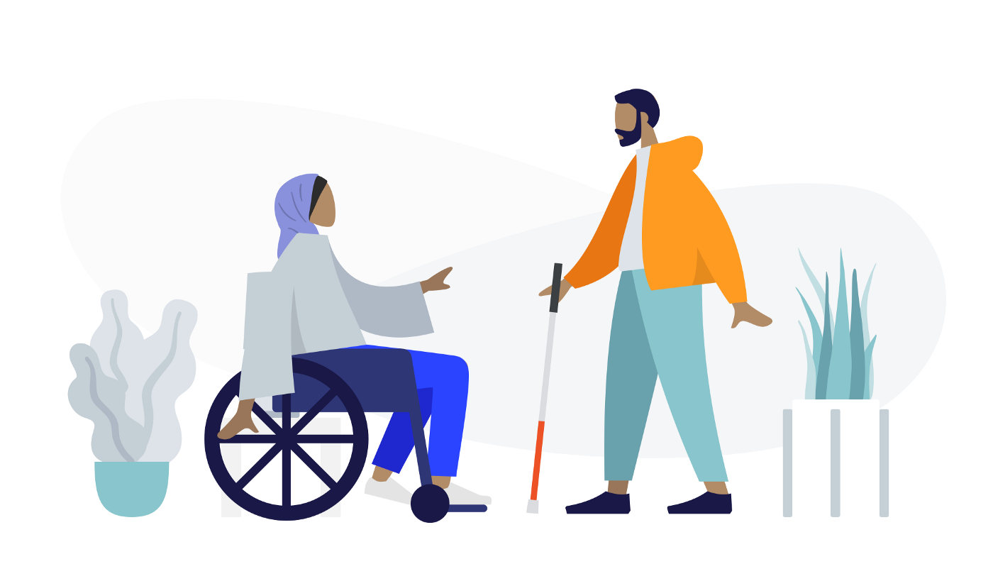
Whenever you add or change a feature on your website, you should consider the impact on the UX, or user experience. When you assess how users will interact with your website, it is important to consider users with differing abilities. Accessibility is a critical component of website design, not only for inclusivity but also because Google search crawlers reward websites that implement accessibility best practices.
Most websites don’t even realize that their content is not accessible to all users and use designs and visuals that create poor accessibility unintentionally. For example, you might like the relaxing feel of muted colors, but there needs to be enough contrast for users with visual impairments to read your content. If you use video content, be sure to include closed captioning to provide users who are deaf and hard of hearing the same access to information.
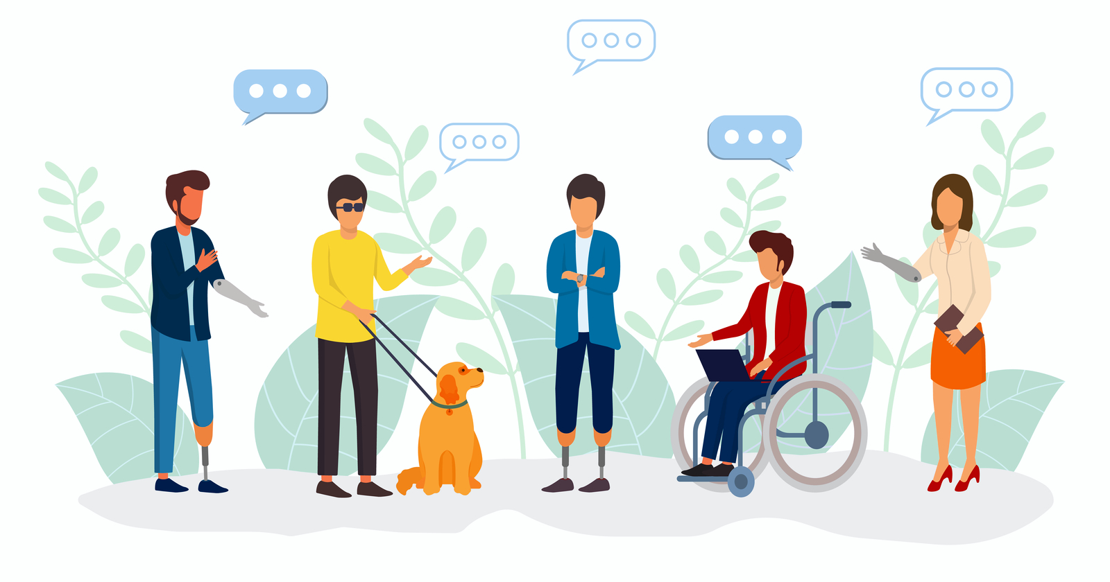
When thinking about accessibility, it’s also important to remember the universal benefit to every single user of your website. Too often, we think of accessibility as a way to benefit a small subset of users who need accommodations, but making your content more accessible actually helps everyone. If you’ve ever tried to watch a video on the metro, you know the benefit of closed captioning. On that day your mouse broke, you probably learned pretty quickly which websites you could access using a keyboard.
While there are many different ways you can improve accessibility, here are some great ways to start bettering your site.
Check Color Contrast
Run your website through a contrast checking tool (there are many free options online, such as a11y’s color contrast tool). This will help you spot any colors that might be difficult to read or view, so you can update text and CTAs to ensure that all your users interact more easily with your site.
Break Up Long Chunks of Text
While some areas of your site might require a long article when possible try to break up long periods of text with images or different types of components. This will make your content more accessible for neurodiverse users, and it will make important content more digestible for anyone who comes to your website.

Add Alternative Text for Images
Many content management systems will already ask you for alternate text for images, so this is an easy way to immediately make your website more accessible. This text does not need to be a detailed description of every single piece of the image but should be a few descriptive words that capture the main points of the image.
Make Menu Items Unique
Repeated menu items are confusing for everyone. If you have the same item under two different parts of the menu, it is difficult for users to tell which one has the information they need. It becomes more difficult to tell the difference when using a screen reader. Think through your menu, and choose the single most accurate spot for each menu item.
Improve Heading Hierarchy
Headings help you visually separate your content, and using the correct headings will help neurodiverse users and people using screen readers. Most websites use headings from <h1>, being the most visually impactful and important, to <h6>, being the least. As you write your content, think about where it makes sense to group content under a heading and what type of heading should be used. A major section of your page should not be delineated by <h6>, and a short paragraph should not use an <h1>.
Hopefully, these recommendations will help you as you begin creating a more accessible website. Reach out to Bluetext to dive further into accessibility and make sure every user has a great experience on your website.
Whether you’re a reader or a listener, we’ve got you covered! Listen to the podcast version of this post for a fresh take.
In any website design, call-to-action (CTA) buttons are key to highlighting the important actions available to users. Buttons make the difference between a general site visitor and a converting sales lead. Pointing out relevant information and next steps to the user can help them navigate your site with less friction, reducing decision fatigue and decreasing bounce rates. Here are six key questions you should consider when designing the CTA buttons to be used on your website.
Should the button style stay the same?
While it’s important for button styling to be consistent across a site, in some cases, there are multiple actions available to a user in a single viewport. To avoid overwhelming users with numerous identical buttons on the screen, you can use different styles to indicate a visual hierarchy. You’re already asking a user to make one decision, therefore, the UX should eliminate any additional, unnecessary decisions in what button to select. For actions that are top priority, bold-colored, solid buttons tend to draw a user’s attention first. Secondary and tertiary button styles should be less emphasized, with unfilled boxes or simply underlined text to indicate less important actions. The styles should be distinct but linked by common elements such as color or shape to make them easily recognizable. Try to use the primary button styling predominantly throughout the site, and avoid creating more than three distinct button styles.
What colors are best to use for CTA buttons?
When choosing the fill color of CTA buttons, it may be tempting to rely on your company brand color scheme. The button design shouldn’t diverge from the brand entirely, but the button color should stand out from the rest of the content on your site. Say you have a minimalistic black and white or muted color palette, you’d want your colors to pop against those backgrounds. Using the predominant brand color risks the button competing for user attention, leading to lower clickthrough rates. Color psychology also plays a key role in communicating the meaning behind buttons. It’s usually best to avoid red CTA buttons, because red buttons are associated with dangerous or harmful actions. Blue buttons, on the other hand, have positive connotations for users since blue text (the namesake of the Bluetext agency) has been used to indicate hyperlinks since the inception of the internet. Users are familiar and comfortable with clicking clue hyperlinked text, so why initiate a change? When choosing the color for a group of buttons on the site, assigning different colors to each action can create a higher cognitive load for users trying to distinguish between their choices. It’s best to use the same color for all the buttons in a group, so that users can focus on the text. However, you may want to consider indicating a default action to make one choice stand out, as discussed in the next section.
Should you highlight a default action?
If you are showing choices on a screen, and one of the choices presented is more likely to be the user’s preferred action, then it may be best to highlight that option to indicate it as the “default” to help users choose this option faster. However, if the choices are equal, then highlighting a default action could confuse the user or steer them to click the default choice rather than considering the options equally. When showing two choices next to each other, it’s also important to consider right and left hand placement. Showing an option on the right may make users more likely to choose it due to right hand bias, so it’s best to put the default option on the right. However, if the default action is something irreversible like “delete all,” it may be best to put that CTA on the left to force users to give more consideration to their decision. When presenting multiple options, just consider which option will be chosen the most often, and how quickly you want the user to navigate the decision.
Should icons be added to the CTA buttons?
Usually, text alone is enough to communicate clear actions to the user, but when buttons are grouped together, it may be harder for the user to distinguish the difference between the options presented. For example, if a new user on your site sees “Download” and “Contact Us” CTAs right next to each other, they might have to take a second to think about the difference between the two actions. In cases like this, icons can help users to discern the difference between the options faster. When assigning icons to the CTAs, make sure that the icon is helpful in communicating the meaning behind the text. If the icons themselves are too similar or generic, they may only lead to more user indecisiveness. Choosing the right icons can make all the difference in the user experience.
Should designers think “outside-the-box”?
The standard button styling is a rectangular box shape, with rounded corners. While designers could use colors and text styling to flex the brand, the overall button shape shouldn’t stray too far from the norm. The oblong-shaped CTA is emerging in popularity with more rounded, organic brands and is a great example of applying brand elements without feeling foreign. The goal of a CTA is to be instantly recognizable to the user, and in this case, thinking outside the box could lead to users being confused or less likely to interact with CTAs. One way of ensuring standardization across buttons is by adhering to the “common grid” measurements. The grid spacing ensures that buttons have adequate clear space around the text, making them easier for viewers to read and recognize the anatomy. Clean, simple designs also tend to be more palatable, as buttons with numerous effects applied can end up looking tacky and unprofessional.
What considerations should be in place for accessibility?
Accessibility is necessary for legal compliance, but it’s also recommended to ensure that designs are easy to read for all users. Font size and color contrast are two of the main considerations for button accessibility. Gradient treatments can also add complications to website accessibility, especially when overlaid with text. As a designer, it’s important to ensure that legibility is never sacrificed for aesthetics. The Importance of Website Accessibility doesn’t go ignored at Bluetext; read more about how we test for accessibility compliance to ensure that our sites are functional for everyone.
At Bluetext, when designing a site for a client, the number one priority is to ensure that the website will engage users in order to achieve business goals. Experienced designers know that CTA styling is key to capturing users and directing them to the most important content on the site. Thoughtful design can increase brand recognition, improve clickthrough rates, and remedy bounce rates for your site. Contact Bluetext to learn more about our services and how we can address all of your website design needs.
A crucial part of any successful website design is not only catching the attention of a target market but keeping that attention. Oftentimes, UX experts will achieve attention retention through eye-catching animations, clean layouts, and intentional content strategy. But in some industries where flashy design and lifestyle imagery isn’t relevant, this can be an intimidating challenge. As a B2B technology marketing agency, Bluetext has done a deep dive into some key elements to help give your B2B website the winning edge.
The Difference Between B2B and B2C Websites
When it comes to designing a website for a B2B versus a B2C audience, the design landscape and tone change in response to respective target audiences. Consumers are often online to fulfill an emotional need, such as instant satisfaction from a purchase. The B2B audience, however, tends to take more time examining all the information about the product before making a decision. Why is this important? Understanding the audience’s motivations is the first step to giving your B2B tech website a leg up in UX design.
Now that we have covered audience motivation, let’s discuss how this translates into web design. In a broad sense, UX experts recommend the key aspects of technology website should be: simple navigation, concise language, and responsive web design. In the market of technology, it is also important to emphasize successful security checks throughout the design of the site. Those are the core ingredients one would expect every website to contain, but below we explore three best practices to help B2B websites stand out against the pack.
Rely on Content
UX experts first and foremost rely on content. As we mentioned earlier, B2B audiences often have much higher stakes in their purchasing decision. Yes, it may be a sole individual making the decision but they are often selecting a product or solution that will impact many people and departments across their company. Therefore, the B2B target audience likes to know everything about the product before making their long-term purchase decision. A tech website design must accommodate large amounts of text to describe each product. Keeping this in mind, UX designers can implement specific modules for a site that best present large amounts of content in digestible chunks.
B2B tech websites’ extensive amount of content must also convey a professional tone. Most B2B site visitors are informed to some extent about the product or solution they are seeking. If a company cannot clearly explain its product in a professional and concise way, it will drive away sales. There is nothing more professionally relatable than a crunch for time, so a site should respect the user’s busy schedule and likely short-lived attention span for acquiring key details. Another common mistake for tech companies is not clearly explaining company messaging and why they stand out against their competitors at the forefront of their website. Upon first landing, a user should be able to tell what your company does, and why they should pay attention to it. The Bluetext messaging team uses a highly thought out process to make sure the tone of a brand addresses all competitors in the marketplace and stakeholders within a company.
Clear Call-to-Action
In the same vein of time awareness, B2B web designs must have a clear call to action. If you happen to capture a user’s attention enough to generate genuine interest, there needs to be a frictionless and obvious way for them to find and take the next step. Research has shown that a B2B audience is more likely to call to purchase a product than purchase online. Therefore, a website should address this pain point with live chat solutions, well-integrated contact forms, customer care information, telephone numbers, and more.
High-quality video and images
Along with the expectation of a professional tone comes a professional look. The first step is implementing high-quality videos and images onto the new site. Strong visual content can help break up the large blocks of content and avoid the risk of eye fatigue when scanning and reading lengthy text blocks. Videos are a useful and engaging way to provide a clear explanation of what the product can achieve. Coupling visual and audio elements increase the memorability of your brand and capture attention for much longer. Videos can also give a closer look at the company’s values as a whole. The Bluetext video team uses a strong brand voice, innovative animations, and professional editing to create persuasive and informative content for their clients.
Mobile Friendly
If you’re selling tech, you have to show you are tech-savvy and keeping up with the times. This should be a no-brainer, but too many technology websites across the web don’t take advantage of responsive design practices to ensure equitable desktop and mobile experiences. Bluetext implements this with well-thought-out wireframes addressing all content needs. One of the ways to best implement a strong user experience is keeping in mind the significance of a mobile-friendly design. With mobile traffic driving up to 40% of revenue, this design compatibility should never be ignored.
B2B differs from B2C in terms of their audience needs, wants, and decision-making processes. While some core differences set these types of websites apart, an informed UX and content strategy that matches audience needs is crucial to both. Consult a website design and UX agency like Bluetext so you can be sure that your website addresses the needs of your target audience, and formats content and visual components to convey a professional and interesting tone. Contact Bluetext to learn more about our services and how we can address all of your content and website design needs.
Since late last year, the technology industry has been alight with news and developments surrounding the Metaverse. Companies large and small are betting big on what is seen by many as the successor to the internet. Microsoft’s record-breaking acquisition of Activision Blizzard has been seen by many as a Metaverse play. The likes of Facebook have even restructured their entire organization and established a new parent company, Meta, named after the Metaverse.
But what exactly is the Metaverse? In simplest terms, “The ‘metaverse’ is a set of virtual spaces where you can create and explore with other people who aren’t in the same physical space as you.” If you’re still confused, that’s okay. The Metaverse is constantly evolving as more and more companies invest in the concept. Chances are you’ve already experienced flavors of the metaverse but may not have even realized it. To break it down, major players in the technology industry are looking at the Metaverse from a capabilities perspective for the likes of:
- Real-time 3D graphics
- Feature sets that overlap with real-world activities
- Personalized avatars unique to each user
- Person-to-person social interactions that are less competitive in nature and more goal-oriented compared to stereotypical games
- Designs best well-suited to virtual and augmented reality headsets
- Links with outside economic systems so people can profit from virtual goods

Regardless of how you feel about the Metaverse and its capabilities, there’s no denying that AR/VR is growing more popular. In 2021, it was estimated that approximately 85 million users experienced AR or VR at least once a month. Virtual reality headsets, which were originally intended for gamers back in the 1990s, have picked up momentum in the past decade as companies are releasing sleek, futuristic consumer headsets and applications. That userbase will only continue to grow as VR/AR devices become more accessible from a cost and usability perspective. Given the fluidity of the concept of the Metaverse, the marketing opportunities are truly endless at the moment. Below, we take a look at just a smattering of ideas for marketing in this next generation of the internet.
1. Gamifying your Brand
As we’ve discussed before, gamification is the act of taking a process that already exists and applying game mechanics to make it more engaging. Given the current state of the Metaverse and its existing uses, gamifying a brand is the first natural step we’ll see companies take as they expand their reach into this additional marketing channel. We’re already seeing some companies dive headfirst into brand gamification in the Metaverse. To promote the new Nike React Flyknit running shoe, Nike created its own virtual world, called Reactland, allowing users to create avatars of themselves and then navigate through the game’s forests and rooftops while jogging (in real life) on a treadmill for three minutes.

2. Parallel Metaverse Marketing within Real-Life Marketing
Just as we create physical manifestations of digital marketing campaigns, marketers need to be ready to expand their focus to the Metaverse as a third component of any future campaign. Campaigns targeting millennials and Gen-Z’ers will comprise the majority of initial Metaverse marketing campaigns, as these audiences are the predisposed primary users of the platform. Experiential marketing will also be a major component of any Metaverse marketing campaign, offering branded installations and events that users can interact with, as opposed to just placing simple ads.

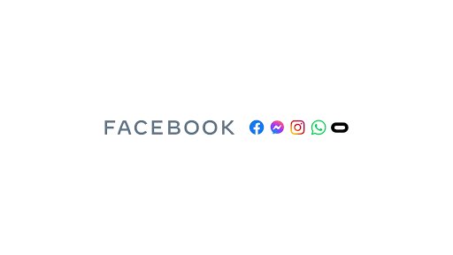
3. Harness the Power of Facebook’s Meta
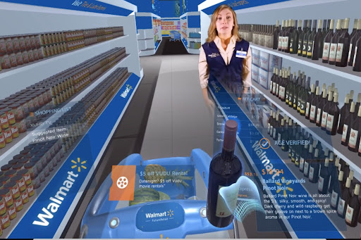
While Facebook is still in the early stages of rolling out its Metaverse to consumers, there’s a good chance that any experience will include digital advertising and in-experience transactions. Anything from building virtual stores, hosting immersive events, or creating Facebook Ads will no doubt be considered. Additionally, we’ll definitely see comparable offerings from other companies staking their claims in the Metaverse hype such as Walmart and Microsoft.
It’s fair to say that the Metaverse in its current state is filled with uncertainties. While many companies are pouring tons of capital into the space, no one knows what it will look like in five to ten years, let alone next year. That being said, it will be important for marketers to stay in the loop and decide when might be the best time to stake their own claim in the Metaverse. Interested to see how Bluetext is taking advantage of up-and-coming technologies on behalf of our clients? Contact us.
You don’t want your users to get an error page, but if they do, make sure it is a good one.
If someone finds a 404 page on your website, they are probably in the wrong place; your goal should be to make it as easy (and fun) as possible for them to find the right page. You need to make sure that your visitor can find a way back to their intended location, so it’s helpful to direct them to popular pages or a search feature. By giving your user some direction, you can make lost pages feel more like a detour than a dead end on your website.
While your primary focus should be to help your users find a new page to travel to, there is also a trend toward having more interesting and fun 404 pages. You want to keep any error pages within the realm of the company brand, but you should also see it as a chance to add some humor or engagement to your website. By infusing some witty text or a cool graphic into your 404 page, you help website visitors have a good experience on your site even when they face an error code. After all, the happier your website visitors are, the more likely they are to continue exploring the website, rather than exit out altogether.
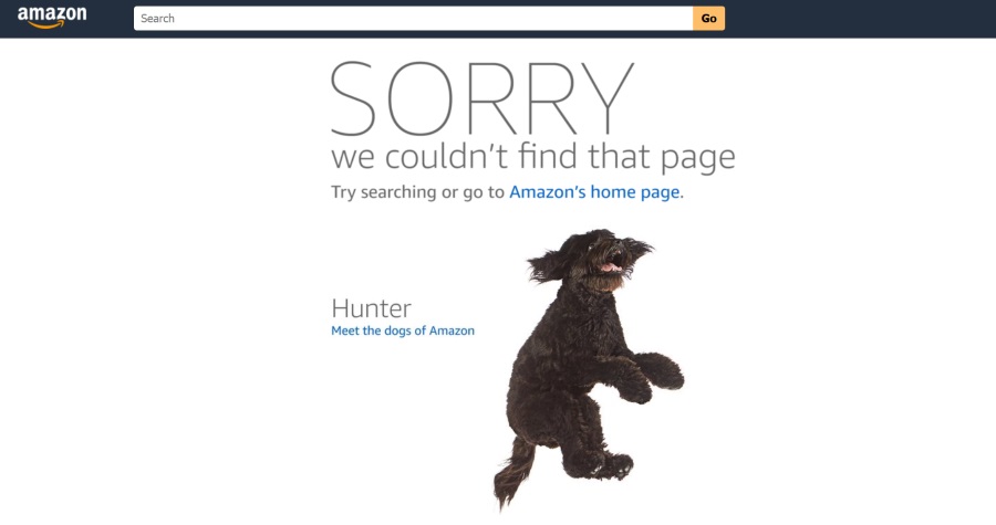
Take Amazon for example, when a page is lost users are shown a cute dog with redirection back home. Even better is that the dog photo changes each and every time to feature one of their 43 “Dogs of Amazon”.
Ceros has a great example of a fun and helpful 404 page. The company recently updated its 404 page to have an interactive wheel that leads users to random content. By encouraging interactivity as Ceros does, you can keep your users interested in your content even when they’ve lost what they are looking for. Engaging features like this motivate visitors to look beyond their original search and consider other areas of your website.
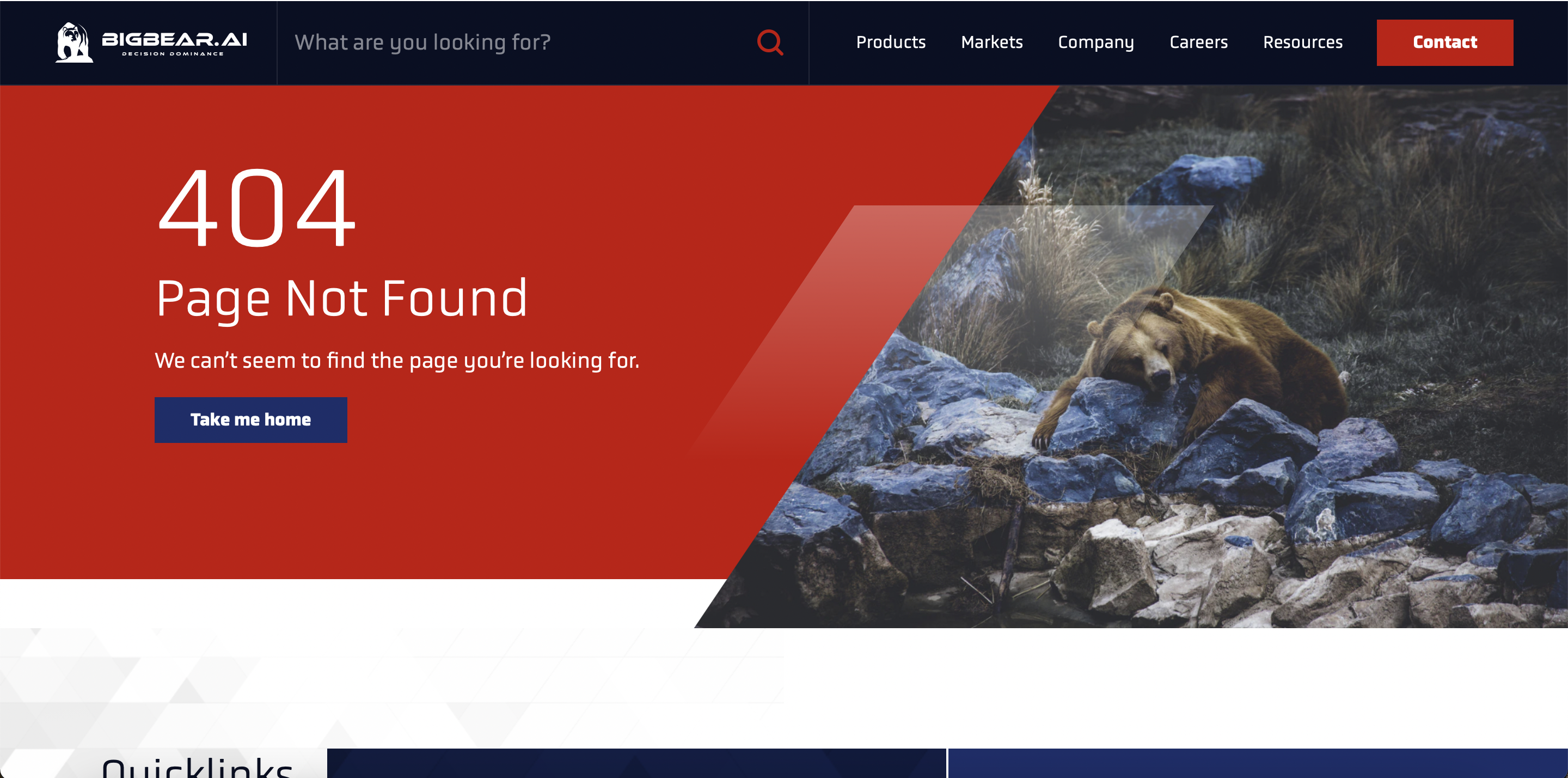
The new BigBear website, which Bluetext worked on, is another example of an excellent error page. On their 404 page, you can see a picture of a lost bear. This adds a little humor to the page while keeping the content on-brand for the company. The 404 page does not end there, though. It also has quick links to encourage visitors to continue interacting with the website.
Both of these examples illustrate the usefulness of having an informative but fun 404 page since the ultimate goal of any website is to keep visitors engaged! While a 404 error is never the ideal landing page for your website users, it is critical to prepare and design for this scenario. And by turning what was traditionally a dead-end into an interesting detour with clear next steps, you increase the chances of a positive user experience on your website.
If you need help setting up a new 404 page, reach out to our experts at Bluetext.