Although Hamlet was wrestling with things far deeper when he asked the infamous question “to be or not to be”, in today’s marketing landscape, there are questions we still wrestle with when it comes to an effective marketing strategy.
At Bluetext, we work with several clients whose paid media goals largely center around lead generation. However, what happens when form fill numbers are underperforming? People today are becoming increasingly reluctant to fill out online forms, in turn affecting lead generation opportunities.
Why the hesitancy to fill out forms?
- Privacy concerns: People are more aware of how their data is used or misused. Forms that ask for too much personal information without clear justification turn people away.
- Spam: There is a concern among users of inboxes being ‘spammed’ after giving their contact information.
- Friction in the user experience: Many online forms ask for too much information upfront. Users get overwhelmed or feel it’s not worth the effort.
- Perceived lack of value ie. “Why should I?”: Requiring a form just to view content (like PDFs or prices) can backfire — especially if competitors don’t.
Research shows that 61% of marketing professionals see obtaining leads as their most significant challenge. This brings us back to our burning question: to gate or un-gate your assets?
First off, when it comes to paid media lead generation it’s important to remember that 80% of new leads don’t convert to sales, and 63% of leads take over 3 months to convert. Simply gating assets like whitepapers, eBooks, or case studies won’t produce the results you might be hoping to achieve.
Let’s dive into some techniques that your company can layer on top of each other to build out a more robust strategy.

Lead Generation Tactics
Video CTAs
Create videos with embedded CTAs that appear at just the right time. Instead of gating the asset right away, you can gate the content after some values is shown, increasing trust. A bonus to this tactic – 91% of consumers want to see more videos from brands (the TikTok/Reels type of short form video content has become the preferred way to learn about brands).
Content Upgrades IN Blogs
Offer bonus content inline in your blog using click-triggered opt-ins. Your team can share the blog initially free of ask, but mid-way through the blog is an asset such as a “Free Checklist” where-in the reader needs to input their contact information in order to receive.
Offer Email-Only “Extras”
Position your newsletter or emails as the “ongoing value layer”. For example: “Liked this content? Get more updates we only send to subscribers”. The call-to-action comes after some piece of value has already been offered – in order for the audience to receive MORE, they will need to give us their information.
Gate the Convenience, Not the Content
This answers our Gated vs. Ungated question directly. Ungated content: Blogs, ebooks, videos.
Gated: Demos, case studies, calculators, product comparisons. The gated content should provide an added layer – something the audience can’t find for free by doing a simple google search.
Retargeting
Take the paid media campaigns you currently have running and create custom non-lead gen objective audiences ie. video viewers or brand awareness post engagers. Retarget the audience with gated content after they’ve already been exposed and introduced to your brand. After they’ve been warmed up, then you can ask for information.
Heat Mapping Landing Pages
Your web-team (or ours!) can conduct “heat mapping” on your landing pages. If your lead magnet is below the fold or in a cold zone, few will ever see it. Heat mapping can help identify where users are losing interest and your team can work to restructure the layout for optimal performance.
In Conclusion
One or all of these tactics can be used simultaneously to help strengthen your company’s lead generation results. If any of this sounds overwhelming or your team lacks the bandwidth to execute, Bluetext is here to help. Our paid media team is trained and tactical in all things lead generation – let’s get to work!
If you can’t measure it, you can’t manage it. Whether you are looking to drive brand awareness, drive qualified leads, or polish up your brand, there is always a goal in mind when hiring a marketing agency. At Bluetext, the goal that rises to the top is M&A. Many companies come to us because they want to go public, be acquired, or be acquisitive in the next 18-24 months.
We have a strong track record of helping clients achieve an M&A goal. Within 24 months of a Bluetext engagement, 47 of our clients have entered into a financial transaction. So what’s the secret? Unfortunately, there is no one size fits all recipe for a market-ready rebrand. However, Bluetext’s strategic approach to messaging, branding, campaign & website design tailored to specific client goals has had proven success in highlighting a company’s unique value to investors. Let’s take a look at the last 12 months of mergers and acquisitions for our clients.
JANUARY
Kicking off the new year with exciting news, Deloitte announced the acquisition of Bluetext client, R9B, a leading provider of advanced cyber threat hunting services and solutions. Following a PR engagement with Bluetext, R9B had earned a strong industry reputation and the attention of the leading global professional services giant. With the addition of R9B’s business, Deloitte’s Cyber Detect and Respond offering will continue to help clients gain a leading edge in cyber defense, integrate fragmented security toolsets, achieve efficiencies in security operations programs, accelerate response time to potential threats and provide data-driven threat insights.
FEBRUARY
The Bluetext team learned that long-time client, Perspecta, had been acquired by national security contractor Peraton in a deal worth $7.1 billion. This announcement followed a multi-year engagement with Bluetext that began with a merge of Vencore, and KeyPoint. These public sector businesses merged to form Perspecta, a government services provider with 14,000 employees and pro-forma revenues of $4.2 billion. The Perspecta team turned to Bluetext to develop a vibrant new brand and website that provided the flexibility and scalability needed to enter the market. The Perspecta brand proved to be an attractive investment to industry leader, Peraton. The combined company will create a government technology provider that delivers end-to-end capabilities in IT and mission support and serves as a strategic partner across a diverse array of U.S. government customers.

MARCH
Bluetext client Galois announced their spin-off company, MuseDev, had been acquired by supply chain management software leader Sonatype. The opportunity to pair Muse with Sonatype’s Nexus platform will dramatically expand its market reach to developers and deliver huge improvements to source code quality. Like MuseDev, all of Galois’ spin-outs focus on interesting and deep challenges in computer science, and Bluetext is excited to see what this company’s future may hold.
APRIL
AMETEK, Inc. announced a completed acquisition of Abaco Systems, Inc., a former Bluetext client and a leading provider of mission-critical embedded computing systems. Prior to this recent acquisition, GE and Veritas Capital engaged Bluetext to develop a new name and brand. Thus, Abaco Systems was born and the Bluetext team worked around the clock to create a unique new brand in less than a month. The newly formed company and brand identity hit the ground running, and developed a reputation that caught the eye of AMETEK, Inc. David A. Zapico, AMETEK Chairman and CEO, shares “Abaco’s market-leading computing and electronic solutions nicely complement our existing aerospace and defense businesses, expanding our positions across many attractive growth platforms.”
MAY
Arlington Capital Partners announced a completed acquisition of Triumph Group, Inc.’s composites business. Arlington Capital engaged Bluetext for a new brand, messaging, and website to position the company as a leader in aerospace composites. Under the bold new name Qarbon Aerospace, or QA, stands for ‘quality assured’, representing the company’s relentless pursuit of quality. Bluetext moved fast to create a brand that would make a lasting impression on the market. The logo showcases their commitment to quality, and nod to the industry through the shape of a plane that connects the QA within the logo. The new website included custom photography showing off Qarbon’s core capabilities, as well as a virtual tour that lets users explore Qarbon’s 1,650,000 ft² of state-of-the-art facilities. In a triumphant feat, the company went to market with a high caliber and professional image.

JUNE
Bluetext is pleased to announce the launch of Axient. The team at Axient came to us following a series of mergers and acquisitions for a new name, brand, and website. A rebranding announcement in June publicized the new company name, messaging and brand essence video with an interim landing page for the full website launch. A few months later, Bluetext launched the full Axient website, which united four prior companies’ capabilities. Learn more about our work with Axient.

JULY
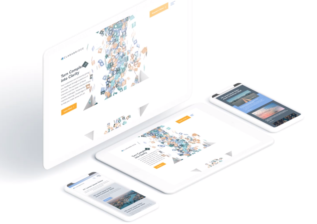
Where UX meets XM… In July, Qualtrics, the world’s #1 Experience Management (XM) provider and creator of the XM category, announced the acquisition of Bluetext client, Clarabridge, the leader in omnichannel conversational analytics, in a stock transaction valued at $1.125 billion. In a previous engagement with Bluetext, Clarabridge sought out a new brand and website experience to match their sophisticated AI-powered platform. Bluetext created a digital manifestation of the Clarabridge brand to engage site users and explain the technological and analytical power behind the platform. Through sophisticated 3D animation work, the user experience came alive and communicated Clarabridge’s value — to customers and investors alike!

AUGUST
KBR, Inc. announced a definitive agreement with Arlington Capital Partners , a Washington, DC-based private equity firm, to acquire Centauri, LLC. Bluetext developed and launched the Centauri brand, following Arlington Capital Partners’ acquisition of three leading companies in the national security sector. Looking to enter the market with a completely fresh start, the team turned to Bluetext to develop and launch a new unified brand from scratch. In less than 6 months, Bluetext launched the Centauri website with a cutting-edge look and feel that set them apart from the competition. The Centauri logo used a unique icon representing the stars that make up the Centauri constellation, to accentuate the new brand messaging “Brilliance when Great Minds Align”. Their website incorporated all of the brand’s new elements, with intentional design and user experience to prioritize recruitment and growth.
Bluetext client, SpaceIQ, announced a promising merger following strategic investments in the companies by global private equity firms Thoma Bravo and JMI Equity. SpaceIQ, a leading Integrated Workplace Management System (IWMS), space management, and employee experience provider, announced plans to combine forces with iOFFICE, an industry leader in work experience and asset management solutions. Together, the combined organization will address a rapidly growing market opportunity through the most complete offering of smart platforms for managing corporate real estate, physical assets, and workplace experience. Prior to this investment, Bluetext worked with SpaceIQ to launch a powerful new website that solidified a merger of three brands. The fully responsive and intuitive site was designed to showcase their breadth of offerings, multiple product lines and a united company mission. The new site ensured the three legacy brands’ relevant products were clearly identifiable, yet balanced by cohesive branding and streamlined user journey.
SEPTEMBER
This September, Panasonic announced the completed acquisition of Bluetext client, Blue Yonder, the leading end-to-end, digital fulfillment platform provider. This transaction, valued at $8.5 billion, intended to accelerate Panasonic’s and Blue Yonder’s shared vision for an Autonomous Supply Chain™. Months prior to this acquisition, Bluetext worked with BlueYonder to update their website to match the constantly evolving nature of their business. In the midst of a rebrand, Blue Yonder sought out Bluetext to help transform its brand in the digital space. In a feat of innovation and animation, the new website illustrated Blue Yonder’s new brand and potential investment value to all users.
NOVEMBER
Clearlake Capital announced the purchase of Bluetext client, Quest Software, for a reported $5.4B. Prior to this acquisition, Quest came to Bluetext looking for help in repositioning them in the market with new messaging and revamped corporate visual identity. After an extensive research process, Bluetext developed Quest’s new corporate positioning, and new tagline, “Where Next Meets Now” to represent how Quest can help you conquer your next challenge with confidence. New messaging complemented by a refreshed visual identity and website helped achieve a more modern, and approachable corporate visual identity. Shortly after this engagement, they were approached by Clearlake Capital with investment interest, and ultimate acquisition.
DECEMBER
Closing out the year on a high note, and celebrating 38 times now, a Bluetext client has been acquired or has announced a public offering following an engagement with us! Just days ago, Bluetext client, BigBear.ai, a leading provider of artificial intelligence (“AI”), machine learning, cloud-based big data analytics, and cyber engineering solutions, and GigCapital4, Inc, a Private-to-Public Equity (PPE)TM entity, announced the completion of their business combination. This big news coincides with BigBear.ai’s debut as a publicly-traded company. Commencing trading on the NYSE on December 8, 2021, under the new ticker symbols “BBAI” and “BBAI.WS,” this transaction values BigBear.ai at a $1.378 billion pro forma enterprise value.
What a year 2021 has been for Bluetext client success! Stay tuned to see what 2022 holds. And if your company is looking for a new brand or website in the new year, contact us to learn more. As the last 12 months have shown, repositioning yourself in the market can lead to major opportunities.
Now more than ever it’s important to understand and master the skills of remote client relations and project management tasks. Even though the pandemic will not last forever, we have the opportunity to take a look at lessons learned, opportunities created, and skills we’ve grown to use daily. Not only will this help make one a better and more flexible employee, but allow the opportunity for a digital agency to tackle a whole new client base. Let’s dive into some of the most important skills of remote client work.
Over-Communication
Striving to over-communicate with clients is always a good thing. Scheduling weekly status calls, both for the internal project management team and with the client, is great to keep a consistent base of communication and ensure that everyone is aware of where the project stands to date. These weekly calls can be used to review completed and upcoming deadlines, updates on various levels of project status, and resolve any questions in real-time. Having frequent touchpoints with the client helps reach deadlines successfully. If frequent phone calls and video conferences are not possible, never underestimate the power of an email! Digital project managers understand how busy schedules can get, and sometimes that meeting really could have been an email.

Patience
Patience and understanding is an extremely necessary skill for managing remote client work. Remember, no work-from-home situation is the same. Especially in the wake of COVID-19, many employees who were not prepared or planning to work from home are finding their kitchen table is doubling as their new conference room. Try to be understanding and empathetic with background noise, kids, or pets interfering during conference calls. Don’t get frustrated when someone experiences issues with virtual meetings or is having trouble with technical issues – instead, offer some assistance. Everyone’s circumstances and experience with remote work are different, so be as empathetic as you can.

Cross-Team Collaboration
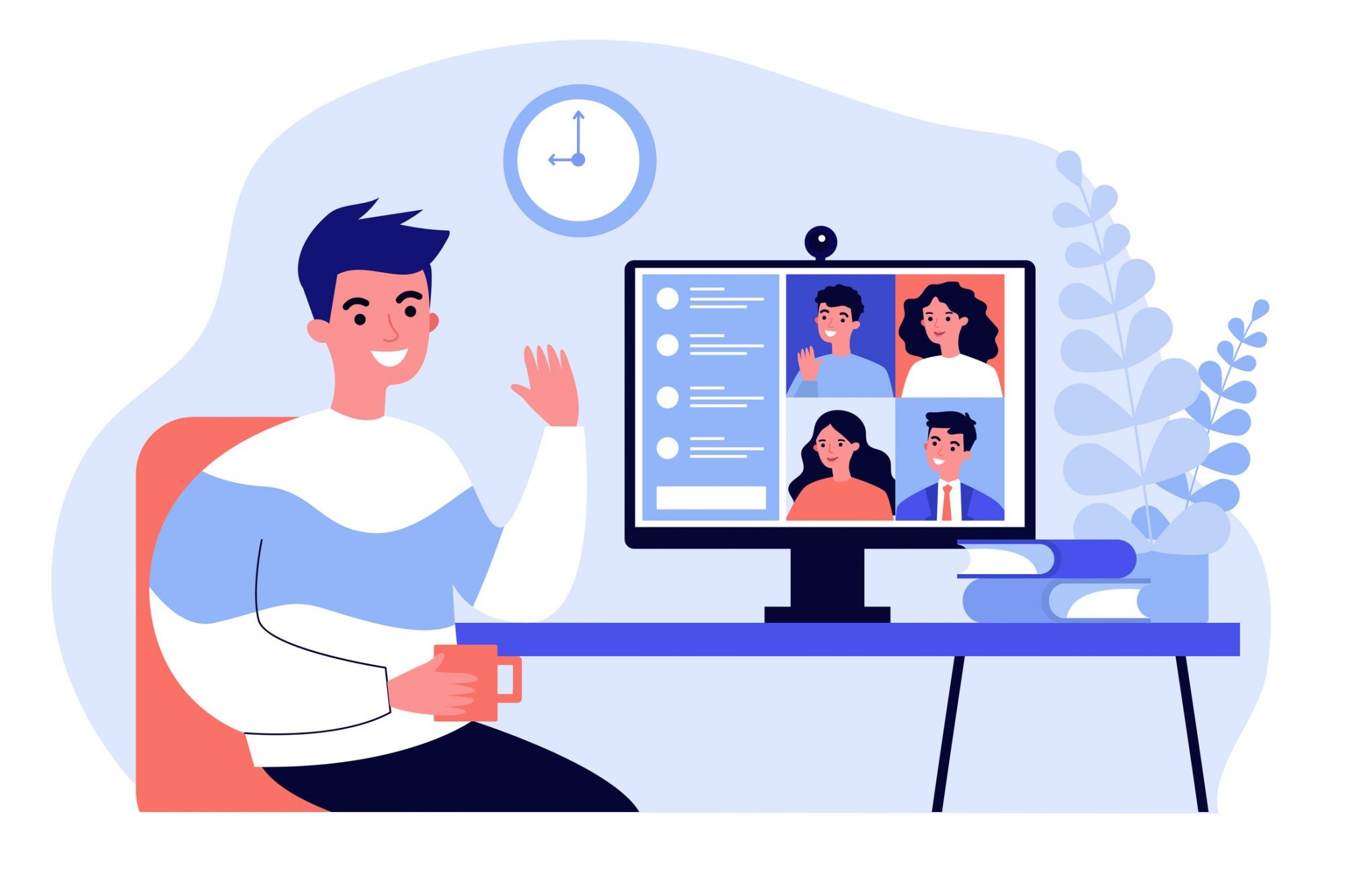
As a digital marketing agency, Bluetext offers a wide variety of services – which translates into a wide variety of roles and skillsets. Many client projects include multiple tracks of deliverables, such as messaging, branding, website design, and development. It is more important than ever in a remote workplace to keep the lines of communication across these tracks clear and consistent. While agencies might not have the luxury of gathering all creatives, copywriters, project managers, and developers in one room to brainstorm or ask one-off questions, it’s important to keep everyone on the account on the same page. Bluetext recommends setting up recurring scrum meetings to run through the statuses of all parallel tracks, or regular touch bases within the different departments. Online collaboration software, such as Slack or Teams, is a great place to facilitate conversation between groups for questions, blockers, or ideation.
Organization
Although organization is a keystone of regular client and project management, switching to remote work requires an even stronger set of organizational skills. Make sure you have a separate work space (that does not include your bed or the couch) where you can have a space to focus and create a productive working environment. This should be free of distractions and allow you to maximize your full potential. In addition, comprehensive project schedules, project trackers, to-do lists and conference reports help keep yourself, your team and your client organized with clear-cut deadlines, updates and project progress.
Time Management
When doing remote work, it can be difficult to differentiate between work-life and personal life. Sometimes, even just reminding yourself to take appropriate lunch breaks can make all the difference. Block chunks of time off on your calendar for lunch breaks and to tackle specific projects. This helps keep yourself accountable and make sure you’re accomplishing everything on your to-do list. In addition, prioritization of high-priority and low-priority tasks will help you be extremely successful. Identify the items on your to-do list that need to be tackled right away and which can wait. This better helps you manage your time as well as delivering items on deadline, which all leads to a more successful project.

Adaptability
Adaptability is one of the most critical skills for remote client and project management work. You must be willing to test out new tools, new applications and whatever can help you perform your job successfully. In a new environment, new tools are inevitable. Your client might even have their own favorite tools they want you to try out. Always willing to be adaptable and try out new things!
At Bluetext, we’re extremely dedicated to our work and our clients, remote or not. We have a variety of clients based outside of Washington, D.C., such as Wallix, based in France; AppGate, based in Texas; Citrix, based in New York City. We have the talent, skills, and resources to take your business to the next level, no matter where you are.
There’s no denying it. Our society is more digital now than ever. You, me, your neighbor, your neighbor’s neighbor… we are all online. Most importantly, your prospective clients are online and are ready to consume high-quality digital content.
Now is the time to invest in your website and make it more user-friendly for your audience. There is a lot of low-hanging fruit to improve your site, ranging from basic content updates like changing imagery and posting blog posts. Or investing in more impactful measures such as consulting top digital marketing agencies to understand the most cost-effective way to improve your website.
So what exactly will make your website user-friendly for today’s content consumers? Many UX designers will tell you that you should either keep your users either scrolling or clicking from one page to another within your site. So which is the better user experience? To scroll or not to scroll?
Keep reading (and scrolling) to understand why scrolling on a website is OKAY and why it is actually expected from the vast majority of online users.
Social Media
Today’s world is used to scrolling. Why? The never-ending social media feed.
Social media sites are designed with one thing in mind: to get users to consume as much content as possible. The best way to do this is to get them to continue to scroll so that they can consume infinite amounts of new content. Most social media platforms are best used on mobile devices, which are easy to use for scrolling through as the flick of a finger takes very little effort.
The Computer Mouse & Track Pad
Okay, so this may be a given… but you know that little roller ball on your mouse? Okay, wait. That may be a little archaic… Do you know that trackpad on your laptop? Well, that lovely thing is used to invite the user to scroll down a page. We know that webpages are going to be lengthy, so much so that the actual hardware we use to “surf the web” has adapted to allow us to do so.
Okay, pause. Those two reasons are only related to how the physical interface prompts a user to scroll. You may be asking, “What are the different types of scrolling that you can include on my website?”
1. The Subtle Scroll
Design the page so that it appears as though you are scrolling through one long piece of content. Maybe the background color stays the same, maybe it slowly changes color, as shown on Palantir’s About Page. Perhaps you’re experiencing parallax scrolling – which in and of itself invites the user to fixate on one piece of the webpage at a time. With this effect, the user barely notices the page length, as the seamless design shift keeps them engaged and focused on the story.
Check out how Bluetext implemented this type of scrolling on the homepage of the Clarabridge website. We designed a seamless animation that invited the user to continue scrolling through the homepage to better explain the technical and analytical power behind the Clarabridge platform.
2. Fixed Long-Scrolling
Instead of having the whole page scroll, fixed long-scrolling allows for specific aspects of the content to remain static while the rest of the content scrolls around it. You can also set up the scrolling to shift to a new section when the user reaches a certain point.
This is ideal if your website has important content or CTAs that should always be accessible to the user. For example, a sticky call to action button is often used to keep key conversion points always present and top of mind.
3. Infinite Scroll
This is most similar to the type of scrolling shown in social media. Is your website a news site? Do you have blog content that you want your users to explore? Consider implementing infinite scroll on your listing pages, allowing posts to continue to load so that the page gives the appearance of infinite content. Of course, this can often be overwhelming for a user who is attempting to find something specific, so we invite you to consider including intuitive filtering so that users can self-select the types of content they are looking for.
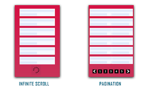
(Photo Credit: knowband.com)
4. Parallax Scrolling
Parallax scrolling is different from the previous three types of scrolling as it invites the user to see new pieces of content and animations with every scroll. Check out how Bewegen invites the user to scroll through their home page and explore their main product. For a personal favorite, give a scroll through Albino Tonnina’s personal website.

Now that you have four great design options to incorporate into your website, it’s time for you to choose the right design for the content on your website. Top web design agencies like Bluetext are great resources for you to turn to in order to gain expert insights on what is best for you.
Looking to begin your next website project? Contact Bluetext today for a consultation.
The recent COVID-19 outbreak has had ripple effects across almost every industry. Around the world, the global pandemic has altered the way we live, socialize and even conduct business. In this unprecedented scenario clouded with uncertainty we all, especially digital marketers, are wondering: What needs to change? And how drastically?
When it comes to search engine optimization strategies, digital marketing and content agencies are continually researching the latest trends and evolving best practices. In the current environment, the role of a top digital marketing agency is to keep a pulse on the present, while also looking forward to strategies that will drive long-term success. Here at Bluetext, our digital marketing analysts are harnessing a variety of tactics to support overall business goals and serve users the best we can during these uncertain times. Check out the top ways we’ve been monitoring and optimizing around current events.
Strength in Numbers
When in doubt, trust the data! Using top marketing analytical tools, such as SEMRush and Moz, one can track the aggregate behavior of online users. Gathering the most up to date data can be tricky, so don’t do it alone. The more expertise and tools, the better. Trust a marketing analytics agency to help break down the numbers into a comprehensible story of website traffic. Use professional tools, such as Google Analytics and Google Search Console, to monitor the recent fluctuations in your page traffic. Do a keyword analysis of your current keyword list to see if search volume has shifted. Google Trends page is a great tool to identify emerging patterns. Are there new phrases your customers are searching for? If the language has evolved, so should your SEO strategy. If you have chatbots for customer service transcripts, these can provide valuable insight into current needs.
In short, the data doesn’t lie. Businesses need to understand search traffic shifts to get as clear as possible a picture into whether to pivot your SEO strategy or not.

Content is King — Still
Ultimately any changes to your SEO strategy should be driven by your unique business needs. For example, a brick and mortar store will need to cater to how they can serve customers at home. If your business was already available online, you may be experiencing altered user behavior as people spend more time at home and online. Every business should ask: “Is the content relevant to current needs?” Your messages may need to shift in sensitivity to the current environment. A complete overhaul is not necessary, nor appropriate. However, if there are opportunities to generate new content that supports your users in a unique time, do so. And if your business is considered essential or has been significantly impacted, you should create a dedicated page to capture all relevant coronavirus traffic. Keep the page simple, focused and sensitive. Don’t try to provide the latest breaking news, but exactly what and how your company is doing. If your business has been minimally affected, perhaps there is an opportunity to contribute to emerging conversations. Exploding Topics is a valuable tool for up-to-date trends across search engines and social media mentions. At the end of the day, users are seeking timely and accurate information now and long after the dust has settled on this pandemic.
 Optimize Often
Search engine optimization is never a “one and done” task. Any digital marketing strategy requires upkeep as is the nature of the evolving industry. Now, more than ever, flexibility is paramount to staying afloat. Be proactive, be vigilant. SEO strategy will need re-evaluation in the upcoming weeks and months. No one can predict how long the pandemic will last so you must be ready to pivot to any new or resurging customer needs.
In an unpredictable environment, one thing is certain: this is our new (remote) reality. Don’t expect old strategies to work as they once did, and don’t expect this shift to “blow over soon”. Your business should be prepared to remain relevant now more than ever. There will likely be long term implications in behaviors and business operations. Get behind the shifts now and flex your agility. It will pay off in your long term business health.
If you’re looking to partner with an agency to pivot your SEO strategy, let us know.
PR and marketing have changed overnight. There is still a need to reach customers and prospects, but it goes without saying that priorities have shifted in the “new normal” brought on by COVID-19.
It is a challenging tightrope to walk; the news cycle is rightly dominated by the coronavirus pandemic, which means many narratives that resonated pre-coronavirus will struggle to reach your target audiences. For our technology clients selling to government and enterprise decision makers – as well as consumers – we’ve preached several key PR and marketing tenets.
Chief among them is “do no harm.” If we have a client that can offer valuable expertise and insights to advance the conversation and help individuals and organizations navigate the current climate while protecting consumers and businesses, we support those efforts. But you can’t force connections that aren’t there and detract from those better positioned to make a positive impact. In other words, don’t be an opportunist. Don’t be an ambulance chaser. Those efforts will backfire and damage your brand.
Bluetext Digital Briefing Centers
Second, clients and their PR/marketing agencies need to be measured, but also creative and nimble. A government contractor or enterprise software company that relied on physical conferences and in-person sales meetings to engage with customers and prospects must now turn more attention to digital strategies.
Check out how Bluetext has developed Digital Briefing Centers (DBCs) for clients needing a dynamic way to digitally showcase to customers and prospects their full range of solutions in action. Customized presentations, live demos and in-depth discussions can be arranged while offering a proven short-term alternative and long-term complement to physical, face-to-face environments.
PR In the Age of Telework

Businesses can’t just throw up their hands and wait it out; there is still a need for smart PR and marketing to grow or at least sustain sales for the near-term. Digital Briefing Centers address the fact that your website and digital presence is by far now the most important doorway to your brand and brand experience while traditional, physical doors remain closed.
On the PR side, the best way to illustrate how Bluetext thinks when it comes to remaining proactive and creative with clients is through a real-life case study. Transaction Network Services (TNS) is a leading global data services provider with a telecom unit that provides robocall detection technology to U.S. telecom providers. Recognizing that scammers seize on the fear, chaos and confusion caused by health crises, we knew this was an opportunity for TNS to share its important data to help protect consumers from risks to their savings and personal information. Coronavirus scams cost people $7 million in the first 9 days of April alone — so the stakes are high.
Bluetext worked with TNS to rapidly build a strategy to communicate the financial risk to citizens and analyzing data to determine which robocall scams were most prevalent in which parts of the country. Some of the media coverage generated in a two-week period is included below.

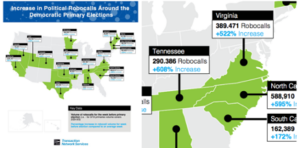
In addition to developing a rapid response strategy, we started to think longer-term about robocall risks in the coming weeks and months. First, we worked with the client to gather data on political robocallers who were capitalizing on confusion regarding postponed Democratic Primary dates in a way that could influence election outcomes – and ensuring the data could be easily visualized.
The bottom line is this: we are in an uncharted phase as a society, and it is a phase that may last for months and even years. The organizations able to adapt to the “new normal” will be those best positioned to support their customers, partners and employees.
If you are looking for a partner to better position yourself to support your customers, reach out to Bluetext.
It’s rare for a business to offer its services for free. The phrase “there ain’t no such thing as a free lunch” reigns true in most industries and all business decisions. Originating with early-century saloon owners marketing free, salty lunches as a way to entice beer drinking, even the etymology of the #TNSTAAFL phrase foreshadows the destiny of commerce itself – it’s impossible to get something for nothing.
So, what does a free ham sandwich in 1891 have to do with 2020 content marketers and gated thought leadership? Imagine your business is the bar and that hungry and thirsty passerby out front is the CMO searching for a way to convince their boss on more paid media dollars, or a CTO who needs a VPN alternative. You have something they could want – a delicious, frothy piece of premium content to quench their industry-specific questions. Post that “Free Lunch” sign, give them some snacks, and then charge them for the beer to wash it all down. You’ll have a bar full of returning customers every time.
You Want to Be a Thought Leader?
Let’s break it down. Businesses that are trying to establish themselves as thought leaders in their space usually have two types of content: Blogs and premium content. Typically, you want to spend your time on the premium content first and then chop it up into free digestible portions, which become your blogs. Since the blogs are free and busting at the seams with the same SEO juice that you prioritized in your premium content, both should come up as a result when someone is looking online for an industry-question you have the answer to.
Think about the last time you were researching B2B tactics. You wouldn’t hand over your email address to just anyone at the beginning of your research. You browsed around to see who knows what they’re talking about. Once you found a credible thought leader, then you actually started paying attention to what they were talking about.
Economy vs. Premium Content
According to content marketing agencies, balance is key. The trick is to walk the line between having free ungated blogs that are enticing and helpful to draw traffic but not too helpful and giving away a company’s expertise without gaining any leads. Save the premium advice and info for the premium content. Ask yourself, “Would someone reasonably pay for this service?”
Make it exclusive, insightful, and urgent. Typically, premium content are eBooks, courses, webinars, checklists, and sometimes videos. Those resources take a lot of effort to create, so you want to put them to work for you and your marketing team. This premium content comes with a price or a gate. The key to the gate and unlocking the juicy stuff is usually as harmless as an email.
As a top content marketing agency, Bluetext breaks down some do’s and don’ts behind gating the premium content.
Do Design Gated Content Conversions Using Ungated Content UX/UI
Make sure your tip top-funnel blogs feed into your top funnel gated content. A UX design company will engineer an ungated content user interface to drive invested leads to gated content. Dangle the carrot and then drive them down a rabbit hole of insights. If your resource page template’s layout has a related topic listing, you can get someone reading one blog to jump to the next, especially when you have click-worthy resource titles.
Create a clear, focused path to follow. Put an enticing CTA at every step of your ungated posts to draw them to the gated content. Theoretically, the user lands on a first blog post via Google search, they peruse 2-3 of your other blogs, and then they are a bit invested by the time they get to gated content. Long story short, using the Free Lunch scenario, clean up your bar so it looks inviting enough to have them buy a drink.
Don’t Forget to Design the Landing Page UX/UI for Conversion
At least make the gated content page template easy to use and worthy of personal info. Best practices for gated content landing page design include showcasing the product, talking about the benefits and insights they can learn, highlighting a quote from the piece, and ideally some social proofing or testimonials. A website design agency will be your best bet to formatting these nuggets of information in a clean, digestible fashion. Like any other business transaction, sell it with foreshadowing what they are about to invest in.
Do Add SEO Excerpt from Gated Content on the Landing Page
The Google Algorithm crawls ungated content, but while you will be losing out on SEO potential by putting keywords behind the gate, you can still put some of those keywords directly on the landing page. Think of it like a teaser, or a sample sip of the beer you want them to buy.
Don’t Miss Out on Capturing User Journey Clues Via CTA Pixel
If the user has followed the intended path laid out above, they have digested other information on the website before converting on the gated content. A digital marketing and analytics expert will implement Google Analytics or UTM parameters to track where users come from and behavioral trends. This is a critical insight that can help your sales and marketing team follow up and understand the lead without asking them. In fact, don’t ask them anything else besides their email (coming up next!).
Trusting a digital marketing and analytics agency to configure the UI/UX back end of your CMS to gather clues (via UTM or Google Analytics) will ensure these tools talk to your CRM when it passes over the lead. Your CRM can then organize to segment those leads into audience pools with the user journey info and UTM parameters. Did they arrive via Facebook or LinkedIn? Did they read about technology or marketing thought leadership? Did they visit SMB or Enterprise blogs before? Depending on what you want to do with the leads gathered from the gated content, a digital marketing agency can follow up with retargeting campaigns. By taking out the guesswork, digital marketing campaigns are then geared toward the topics and categories you know a specific user is interested in.
Don’t Over-Gate with Nosey Forms
Sometimes businesses want more defining characteristics of the user to help their follow up marketing to have some foundational info. Asking for an email is the easiest marketable piece of info you can gather – but should you want more, make sure the form is at least easy to use. For instance, free type is ok, but dropdown select from offers convenience. Ideally, if you need to ask for more info, triage that asks by making some questions optional so you don’t scare anyone away. Remember – you want them more than they want you at this point. You might be the third tab they have open in their research, so think twice if knowing their position is worth losing them to a competitor’s simpler gated content.
Do Gate Content. Don’t Gate Content.
We wish it were black and white, but the answer to the infamous To Gate or Not to Gate question comes down to the following:
- How exclusive is your offer?
- How easy is your form to fill out?
- How SEO friendly is your LP?
- How actionable is your CTA?
If you have your thought leadership on fleek from a UX/UI, SEO, and CMS perspective than you’re ready to start offering free lunches to any potential lead that comes into your digital business.
As the world has changed in the blink of an eye, so has the way we market to consumers. Now, more than ever, your website exists as BY FAR THE MOST IMPORTANT doorway to your brand and your brand experience. While stores stay shut, and face-to-face interaction is vastly limited, brands will rely on reaching their target audiences via their websites. Therefore, your website is mission-critical to your success.
Website accessibility, or the practice of ensuring websites are available to everyone, regardless of their abilities, has always been a crucial part of website design and development. But as website accessibility gains momentum, meeting and exceeding accessibility standards has become even more top-of-mind. Website design and development agencies have begun to ingrain accessibility standards into their designs; meeting these requirements is no longer a “nice-to-have.”
Accessibility Requirements Are Legal Requirements
According to Dean Schuster, user experience design strategist, “In 2019, the United States Supreme Court upheld the notion that all sites conform to the W3C’s Web Content Accessibility Guidelines (WCAG) AA standard.” With these requirements now legal requirements, website design and development agencies have upped their game to ensure their websites are readily accessible to anyone who wants to browse.
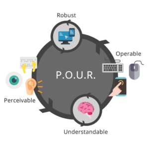
ADA compliance is now established legal precedent for U.S. websites. At a high level, accessibility regulations are broken out into four categories: Perceivable, Operable, Understandable, and Robust. In other words, all content must be “POUR”:
- Perceivable: Users must be able to perceive the information that is being presented. Perceivable guidelines include text alternatives for any non-text content, time-based media alternatives, adaptability, and distinguishability.
- Operable: Website components and navigation must be operable. These guidelines include keyboard accessibility, providing enough time for users to read and use content, providing navigable content, and providing input modalities.
- Understandable: Users must be able to understand the information and the operation of the user interface. Understandable guidelines include readability, predictability, and input assistance, or helping users avoid and correct mistakes.
- Robust: Content must be robust enough to be interpreted by a wide variety of users, including assistive technologies.
Ensuring your website is accessible can be overwhelming, which is where website design and development agencies come in. Building and maintaining an accessible website starts with the design and development process.
 Meeting Accessibility Standards Begins with Design
Ensuring website designs are accessible to all impacts the entire website design process; designers must think long and hard about the limitations of visual formats. Often, we deem the skills we learn within a certain context as “normal.” Increasingly stringent accessibility standards will require designers to step outside of their “normal” and rethink each design through the lens of a website user who may not be as abled as they are.
The transition from professional website designer to accessibility expert is well underway and this transition will only accelerate as 2020 progresses.
Website Development Impacts Accessibility at a Foundational Level
Website designers are not the only ones affected by stricter accessibility regulations – website developers will also be impacted at a foundational level. Developers must constantly work to maintain knowledge of the continuously evolving standards and best practices, accounting for practical use-cases within the disabled community while using caution when approaching newer programmatic technologies.
Website designers and developers who stay ahead of this trend and embrace website accessibility are positioned to deliver more accessible products. As standards and best practices continue to evolve, website design and development agencies must continue to meet the criteria necessary to ensure that their websites are accessible to everyone on the internet.
Use Your Online Presence to Empower the Disabled Community
When translating your business to the digital world, a lot of thought goes into making sure your business is represented correctly; between your corporate visual identity and the messaging that makes your business unique, each of these foundational building blocks come together to create a unified online presence. Your online presence should be accessible to everyone, including the 18.7% of Americans with a disability. Supporting these users and ensuring your website offerings are accessible to everyone on the internet should always be a top priority, regardless of the legal ramifications.
To learn more about our experience pertaining to accessibility, check out our case study featuring our work with Level Access, the leading provider of accessibility solutions and software.
Interactive content is here to stay. Just take a look at the 96% completion rate on BuzzFeed quizzes. Even more, a 2016 Content Marketing Institute (CMI) study found that just over 80% of marketers say that interactive content is more effective than static content when it comes to grabbing consumers’ attention.
Well, what even is interactive content, anyway? Interactive content is “content that requires the participants’ active engagement — more than simply reading or watching. In return for that engagement, participants receive real-time, hyper-relevant results they care about.”
Digital branding agencies, such as Bluetext, will ensure you are leveraging all that interactive content has to offer. Here are the top 3 types of interactive content to look out for in 2020.
Quizzes and Assessments
Quizzes and assessments are pieces of interactive content in which the user provides answers to a few questions in order to receive insights based on them. They are fun for the user to complete, and if the results are what they were looking for, they will help you build trust with your audience.
This type of interactive content doesn’t only boost engagement — they also help you get to know your audience. So when you plan to incorporate quizzes or assessments into your content plan, seek out a brand strategy agency to help you develop your content and ask yourself: What do I want to know about my audience? You may discover something new and gain some essential insights that can help you tailor your marketing efforts to be more effective.
Bluetext, a leading branding company, worked with the Graduate Management Admissions Council (GMAC) to develop a microsite to invite top-of-funnel business school candidates to learn about what is available to them in the world of graduate business schools. The introduction page on the website is an interactive quiz that helps direct users to content specifically geared toward them based on where they fall in the business school process.
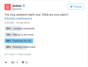
Polls
Polls are the easiest and simplest way to introduce interactive content to your marketing plan. They provide a quick way to get in touch with your audience and allow you to build a genuine connection with your followers.
The most straightforward way to use polls is to ask your audience for opinions on your content, service, or product. This not only helps you drive engagement online but gives you great insight into how your audience is feeling about your brand.
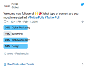
You can also invite your audience to interact with your profile by asking fun, light-hearted questions that invite them into learning more about what your company has to offer.

Contests
According to the CMI report, marketers believe that contests are the most effective type of interactive content you can use, especially in the early stage of the buyer’s journey.
Contests can include traditional raffles or giveaways. They can offer the chance to win a prize if they refer a friend to your company’s offerings. You can even introduce photos or hashtag contests where you invite your audience to submit their own user-generated content.
We have seen a rise in these types of hashtag contests and challenges across all social media platforms, especially on TikTok. The platform allows companies to leverage a hashtag to promote their brand, and users are eating it up.
Guess was the first brand in the US to release a marketing campaign as an official partner with TikTok. They ensured that every time a TikTok user opened the app, they were directed to the #InMyDenim hashtag challenge. Since its launch, videos with the hashtag have garnered over 38 million views and introduced the Guess brand to young Millenials and Generation Z.

Contests are great at bringing out people’s natural curiosity and competitive spirit, so encourage them to participate by providing an engaging contest.
Interactive content that is engaging and personalized provides your audience with a new way to engage with your brand and can build trust with your audience. Learn how Bluetext can help you leverage interactive content in your content marketing plan here.
For a top marketing agency, trade shows are essential events to attend to learn all the tricks of the trade. It is usually a one time a year event where all the major industry players convene to learn about new products, network and promote their brands. It brings back old notions of experiential event marketing, but in 2020, brands are adding a digital twist. Now more than ever, companies are pairing their physical trade show presence with huge digital thumbprints, from hyper-targeted ads to Micro-Moments.
National Retail Federation (NRF) and their annual Big Show is a great example of how to do a trade show right. NRF’s Big Show is the largest retail conference and expo event, gathering over 40,000 attendees and 18,000 retailers from over 99 countries under one roof. Big Show capitalizes on Micro-Moments both before and during the show. By analyzing these tactics, we can learn how important Micro-Moments are for users and how to properly utilize them.

So what is a Micro-Moment? A Micro-Moment is an intent rich moment when an attendee uses their device to act on a need, including to know, to go, and to buy. The brilliance behind micro-moment marketing is that in the world today, consumers are bombarded by content everywhere they turn. Inc.com says the industry has reached a point of “content shock” where consumers are oversaturated and cannot consume any more content than they already are. Consumers spend an average of 4.7 hours each day on their smartphones, continually distracted and overstimulated. This only escalates the challenges marketers face to achieve consumers’ attention.

To combat the new challenges encountered with fragmented media interactions, top digital marketers have adopted a new mentality. This new philosophy zeroes in on distinct moments in the consumer buying process. The I-want-to-know moment, the I-want-to-buy moment and even the I-want-to-go moments.
Before the Show, NRF was strategic in focusing on the Micro-Moments of their target audiences’ “I-want-to-know” and “I-want-to-buy” moments through the use of various paid media tactics. Through the use of paid social, NRF increased brand awareness and utilized the “I-want-to-know” moment of users. Before driving users to register for the event, it’s crucial to make them aware of the brand, educating them about the event, as well as driving upper funnel traffic down the line. Paid display is where lower funnel traffic acts upon the “I-want-to-buy” moment. Paid display not only helps to generate qualified leads but also drives registrants.

During the Show, the various speakers and topics expanded upon Micro-Moments as well. A huge focus of sessions was on how to drive better experiences, better content and better strategy for consumers. There are various innovative technologies and solutions companies can utilize, as seen in the Innovation Lab and Startup Zone, that can help improve the user experience for customers in every stage of their individual Micro-Moments. Opening speaker, Satya Nadella, CEO of Microsoft, expanded upon this during his keynote session on the first day of the show. Nadella focused on how companies need to focus on the future of the retail industry, upcoming trends and how to utilize technology to transform how companies operate, are marketed and relate to consumers. By doing so, these Micro-Moments for users will be more memorable and excite consumers to change from “I-want-to-know” to “I-want-to-buy.” To see the full list of speakers, visit the NRF Speakers Page and check out the NRF Big Show 2020 recap for a full list of articles, videos, session presentations and more.
A key takeaway from NRF’s Big Show 2020 was the importance of personalizing and concentrating the customer experience in the digital era. Staying true to the NRF Vision, the National Retail Federation has acted as the eyes and ears of the retail industry. For over 100 years they have brought together important leaders from top retail companies and are the only organization committed to bringing critical foresight and insight to leaders, movers and makers.

Leading by example is an understatement, as the organization itself has been ahead of the curve in their paid media tactics and lead generation strategy. To learn more about the NRF media strategy, check out their Bluetext Hall of Fame.
 Optimize Often
 Meeting Accessibility Standards Begins with Design