As a digital design agency, we know that the average person spends 3 – 5 hours a day on their mobile device! Over 20% of people check their phones every few minutes and over 50% of users look at their phones a few times an hour. Ever advancing apps and functionality are allowing people to transition almost any aspect of their life into digital devices. Order takeout? Sign a document on the go? Even adjust your thermostat. As a digital design agency, we’ve seen the increasing need for mobile-first web design. As mobile usage spikes by the day, hour, and even minute, a seamless mobile experience has become increasingly critical.
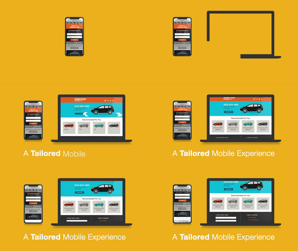
Responsive text is a no-brainer, your website copy will need to reformat to be visible and easily readable. But, to add a layer of complication to web design, images and illustrations must also work across all types of devices. With this in mind, designing websites and illustrations often turn into a puzzle, where elements must shift from wider pages to fit skinnier pages and vice versa. Before diving into a few of the benefits of mobile-optimized websites and illustrations, it’s important to first understand the two main ways you can build your site to work for multiple devices.
Responsive Design vs. Adaptive Design
Simply put, adaptive web design relies on static layouts that detect the size of the target screen and load the appropriate layout for it. We typically recommend designing adaptive sites for six common screen widths: 320, 480, 760, 960, 1200, 1600. However, technology companies are always debuting new devices with new screen sizes. Conversely, responsive web design is a dynamic design method that adapts to whatever screen – no matter the size – an individual is using. More specifically, responsive design uses CSS queries to change screen width, height, display type, etc. to adapt to the needs of a target device. As a digital design agency, we recommend a responsive design for a more fluid user experience.
Now that you have a better understanding of the main ways to adapt your site to multiple devices, keep reading to understand a couple of benefits you may not expect of mobile-optimized websites and illustrations.

SEO Benefits
Many familiar with Google’s SEO practices know that there are three major steps to how it’s algorithm works: Crawling, Indexing, and Ranking. While all three are incredibly valuable components to understand, indexing is the most relevant for the purpose of this conversation. In short, indexing is Google’s process of storing the information and content they’ve deemed relevant for users. Since Google recognizes that most of its users are on mobile devices, they have shifted toward mobile-first indexing, which means Google ranks pages, structured data, and snippets from mobile pages of websites instead of desktop pages.
A key part of this process involves images and illustrations. In the past, many websites have blocked certain illustrations from showing on non-desktop devices. Therefore, Google can’t index these illustrations as valuable content to a user. However, as a digital design agency, we know that Google’s algorithm wants to see and categorize images and illustrations. By having a responsive web design, your website’s images can display on any device, making it easier for your website to rank in Google’s top organic search results.

Visual Triggers
For better or for worse, a large percentage of people comprehend and perceive images faster than words. Generally speaking, people are better able to perceive visual marks and process data when transformed into images. Additionally, almost 80% of users scan any new page they encounter, whereas 16% read word-for-word. Whether users are scanning or reading word-for-word – images, illustrations, and infographics are incredibly important. Not to be cliché, but a picture truly can be worth a thousand words.
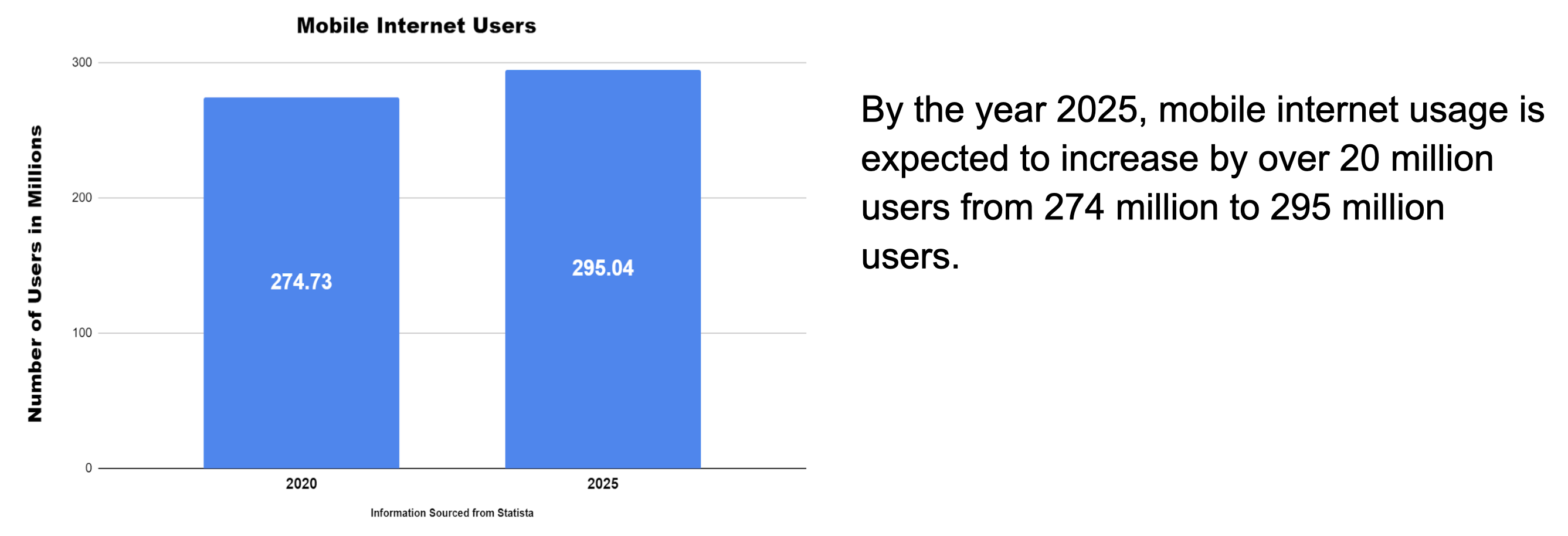
When viewing the information above, which drew your eye first, the graph, or the block of text? This question should always be asked when formatting content on a webpage, as we know that the user’s eyes are more easily drawn to illustrations than words. However, it’s important to note that images can be overdone. Adding too many images can be counterproductive, as it can create visual overkill. An experienced digital design agency, like Bluetext, can help make sure your images are helpful, relevant, and transferable between device types.

Conclusion
Images, illustrations, and infographics all visually communicate ideas and leave cumulative impressions on visitors to your website. By using them, you can create an immersive, empathetic, and humanized sense of context for users. An immersive experience can truly set your company apart from competitors and should be available to a user regardless of the viewing device. With mobile making up almost 60% of internet traffic, mobile-optimized sites and illustrations are necessary to ensure the user experience is fluid, attractive, and usable, no matter the device a visitor is using.
Interested in working with a digital design agency to help with your mobile experience? Contact Us!
Looking to jazz up your website? One of the hottest website design trends in recent years has been on page animation. But like any design decision, there are pros and cons. Bluetext top website user experience designers weigh in on the debate on how far you should go in injecting motion to your website.
To animate or not to animate?
Animation enthusiasts recommend adding motion to create a dynamic and flowing user experience. Not to mention, animation has been a major web design trend over the last few years, meaning your visitors are accustomed to seeing it on competitor sites and therefore expect a comparable experience on your pages. The opponents, or static supporters, on the other hand, will argue that animation is distracting and can seem unprofessional in certain industries. For example, B2B has traditionally been a strictly static and straightforward approach to website design, leaving the flashy frills to more consumer-based websites. However, having an interactive animated website could be a valuable point of differentiation. So what do the experts recommend?
Truth be told, animation can be a wonderful addition to a website’s aesthetic and functionality, but only when executed in the right way to fit your broader business goals. Careless integration of animations into your web design scheme can be a real eyesore and have negative impacts on site speed, SEO, and user experience. Weighing these pros and cons carefully, Bluetext website user experience designers recommend subtle animation and keeping in mind the following considerations.
Not all animations were made equal! Motion design spans a wide breadth of categories. Bluetext recommends the following types for a professional, yet modern feel to your site.
1. Loading Animations
Loading animations can be used as an effective way to engage users from the get-go. Since it only takes a user 3 seconds to abandon a page if the content doesn’t load, the use of loading animations offers content right from the start. Animated typography, countdowns, or a simple animated logo allow users to have fun watching while waiting for the site to load.
2. Micro-Interactions
Taking a cue from the mega “micro” trend sweeping the digital marketing industry (microtargeting and micro-moments sound familiar?)This effect is one of the hottest trends of website design. These are used to make small interactions (such as clicking a button) quick and clear for the user. Hover effects are one of the most well-known examples of micro-interactions. Certain page elements, such as navigation buttons, CTAs, or linked images, are the ideal canvas for mico animations.
3. Page Transitions
Subtle animation can be purposefully to ease the navigation from one component to another and between pages. Arrows, background scrolling, load bars, or any component that offers directionality to the user are great opportunities to use this effect.
4. Parallax Scrolling
Using full-width imagery, this effect takes the user on a cohesive journey as they move down the page. By definition, the background moves at a different speed to the foreground elements, creating a visually stunning effect on either full-page backgrounds and strips. While this is sure to give a wow-factor to your main website, it’s important to remember this effect is not available on mobile devices.
5. Decorative Delights
While these effects do not offer any functional benefits, they can be used to add more interest to the page. While it might be difficult to imagine serious B2B websites using these layouts, this might be exactly what your site needs to spice up drier content sections. Especially when placed near elements intended to draw attention, such as new messages, lightboxes, key CTA buttons, this turns aesthetic pop into actionable results.
With so many options for website motion, it can be tempting to want to do it all. However, top website designers have one golden rule: moderation is key. This rule doesn’t just apply to junk food, overdosing your site on fun animations can overwhelm the viewer and distract from the most important aspect: the content! Use animation sparingly and strategically. Before you fall in love with a beautiful design, consider the practicality. There are instances when animation could actually detract from your site, for example, if it hinders a user’s ability to read important messages or complete a conversion. For instance, you shouldn’t add animation to text paragraphs because it will make reading them much harder. You also would not want to add animations to fields where visitors enter their own content (such as a contact form or comments), because it would distract them from completing the task. When considering embedding motion effect, pressure test your decision against these questions:
- Does the site’s movement guide the viewer when to scroll and where to click?
- Does the animation support brand storytelling by gradually revealing information?
- Does the animation help a viewer visualize your product or service’s impact?
- Does this effect break up static scroll?
If you can answer yes to these questions, feel free to act on your motion goals! As long as you consider functionality first, animation can be a powerful visual tool to capture your audience and drive them deeper down the sales funnel.
Are you looking to drive users to your website using animation, but don’t know where to begin? Get in touch with Bluetext.
There’s no denying it. Our society is more digital now than ever. You, me, your neighbor, your neighbor’s neighbor… we are all online. Most importantly, your prospective clients are online and are ready to consume high-quality digital content.
Now is the time to invest in your website and make it more user-friendly for your audience. There is a lot of low-hanging fruit to improve your site, ranging from basic content updates like changing imagery and posting blog posts. Or investing in more impactful measures such as consulting top digital marketing agencies to understand the most cost-effective way to improve your website.
So what exactly will make your website user-friendly for today’s content consumers? Many UX designers will tell you that you should either keep your users either scrolling or clicking from one page to another within your site. So which is the better user experience? To scroll or not to scroll?
Keep reading (and scrolling) to understand why scrolling on a website is OKAY and why it is actually expected from the vast majority of online users.
Social Media
Today’s world is used to scrolling. Why? The never-ending social media feed.
Social media sites are designed with one thing in mind: to get users to consume as much content as possible. The best way to do this is to get them to continue to scroll so that they can consume infinite amounts of new content. Most social media platforms are best used on mobile devices, which are easy to use for scrolling through as the flick of a finger takes very little effort.
The Computer Mouse & Track Pad
Okay, so this may be a given… but you know that little roller ball on your mouse? Okay, wait. That may be a little archaic… Do you know that trackpad on your laptop? Well, that lovely thing is used to invite the user to scroll down a page. We know that webpages are going to be lengthy, so much so that the actual hardware we use to “surf the web” has adapted to allow us to do so.
Okay, pause. Those two reasons are only related to how the physical interface prompts a user to scroll. You may be asking, “What are the different types of scrolling that you can include on my website?”
1. The Subtle Scroll
Design the page so that it appears as though you are scrolling through one long piece of content. Maybe the background color stays the same, maybe it slowly changes color, as shown on Palantir’s About Page. Perhaps you’re experiencing parallax scrolling – which in and of itself invites the user to fixate on one piece of the webpage at a time. With this effect, the user barely notices the page length, as the seamless design shift keeps them engaged and focused on the story.
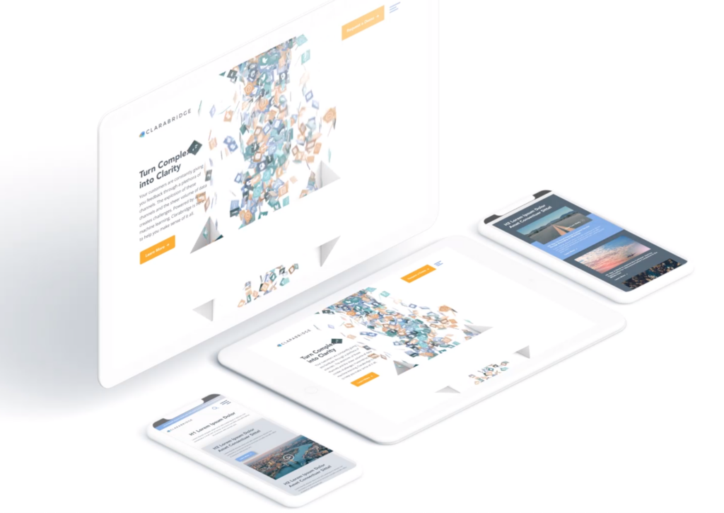
Check out how Bluetext implemented this type of scrolling on the homepage of the Clarabridge website. We designed a seamless animation that invited the user to continue scrolling through the homepage to better explain the technical and analytical power behind the Clarabridge platform.
2. Fixed Long-Scrolling
Instead of having the whole page scroll, fixed long-scrolling allows for specific aspects of the content to remain static while the rest of the content scrolls around it. You can also set up the scrolling to shift to a new section when the user reaches a certain point.
This is ideal if your website has important content or CTAs that should always be accessible to the user. For example, a sticky call to action button is often used to keep key conversion points always present and top of mind.
3. Infinite Scroll
This is most similar to the type of scrolling shown in social media. Is your website a news site? Do you have blog content that you want your users to explore? Consider implementing infinite scroll on your listing pages, allowing posts to continue to load so that the page gives the appearance of infinite content. Of course, this can often be overwhelming for a user who is attempting to find something specific, so we invite you to consider including intuitive filtering so that users can self-select the types of content they are looking for.
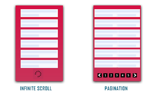
(Photo Credit: knowband.com)
4. Parallax Scrolling
Parallax scrolling is different from the previous three types of scrolling as it invites the user to see new pieces of content and animations with every scroll. Check out how Bewegen invites the user to scroll through their home page and explore their main product. For a personal favorite, give a scroll through Albino Tonnina’s personal website.

Now that you have four great design options to incorporate into your website, it’s time for you to choose the right design for the content on your website. Top web design agencies like Bluetext are great resources for you to turn to in order to gain expert insights on what is best for you.
Looking to begin your next website project? Contact Bluetext today for a consultation.
The recent COVID-19 outbreak has had ripple effects across almost every industry. Around the world, the global pandemic has altered the way we live, socialize and even conduct business. In this unprecedented scenario clouded with uncertainty we all, especially digital marketers, are wondering: What needs to change? And how drastically?
When it comes to search engine optimization strategies, digital marketing and content agencies are continually researching the latest trends and evolving best practices. In the current environment, the role of a top digital marketing agency is to keep a pulse on the present, while also looking forward to strategies that will drive long-term success. Here at Bluetext, our digital marketing analysts are harnessing a variety of tactics to support overall business goals and serve users the best we can during these uncertain times. Check out the top ways we’ve been monitoring and optimizing around current events.
Strength in Numbers
When in doubt, trust the data! Using top marketing analytical tools, such as SEMRush and Moz, one can track the aggregate behavior of online users. Gathering the most up to date data can be tricky, so don’t do it alone. The more expertise and tools, the better. Trust a marketing analytics agency to help break down the numbers into a comprehensible story of website traffic. Use professional tools, such as Google Analytics and Google Search Console, to monitor the recent fluctuations in your page traffic. Do a keyword analysis of your current keyword list to see if search volume has shifted. Google Trends page is a great tool to identify emerging patterns. Are there new phrases your customers are searching for? If the language has evolved, so should your SEO strategy. If you have chatbots for customer service transcripts, these can provide valuable insight into current needs.
In short, the data doesn’t lie. Businesses need to understand search traffic shifts to get as clear as possible a picture into whether to pivot your SEO strategy or not.

Content is King — Still
Ultimately any changes to your SEO strategy should be driven by your unique business needs. For example, a brick and mortar store will need to cater to how they can serve customers at home. If your business was already available online, you may be experiencing altered user behavior as people spend more time at home and online. Every business should ask: “Is the content relevant to current needs?” Your messages may need to shift in sensitivity to the current environment. A complete overhaul is not necessary, nor appropriate. However, if there are opportunities to generate new content that supports your users in a unique time, do so. And if your business is considered essential or has been significantly impacted, you should create a dedicated page to capture all relevant coronavirus traffic. Keep the page simple, focused and sensitive. Don’t try to provide the latest breaking news, but exactly what and how your company is doing. If your business has been minimally affected, perhaps there is an opportunity to contribute to emerging conversations. Exploding Topics is a valuable tool for up-to-date trends across search engines and social media mentions. At the end of the day, users are seeking timely and accurate information now and long after the dust has settled on this pandemic.
 Optimize Often
Search engine optimization is never a “one and done” task. Any digital marketing strategy requires upkeep as is the nature of the evolving industry. Now, more than ever, flexibility is paramount to staying afloat. Be proactive, be vigilant. SEO strategy will need re-evaluation in the upcoming weeks and months. No one can predict how long the pandemic will last so you must be ready to pivot to any new or resurging customer needs.
In an unpredictable environment, one thing is certain: this is our new (remote) reality. Don’t expect old strategies to work as they once did, and don’t expect this shift to “blow over soon”. Your business should be prepared to remain relevant now more than ever. There will likely be long term implications in behaviors and business operations. Get behind the shifts now and flex your agility. It will pay off in your long term business health.
If you’re looking to partner with an agency to pivot your SEO strategy, let us know.
- The COVID-19 Pandemic has expanded the “stay at home” audience for B2C businesses.
- The consumer sector has seen changes in how audiences are reacting to content and consuming media.
- Capturing these audiences will require businesses to adapt content and tactics to the current climate.
Over the past few months, we have all adjusted to new living and working environments. This means varying working hours, virtual gatherings and different web surfing, streaming and social networking habits. These changes have shifted the traditional marketing audience profile.
If your business is B2C, you should be aware of these audience changes and adapt your marketing tactics to keep up with the current trends. Here are a few ways that you can make sure your message doesn’t fall flat with the new “stay at home” audience.

The concept of a “stay at home” audience is not new. The number of remote workers in the U.S. economy has grown steadily over the past several years. Online graduate and undergraduate programs have grown more popular, and the number of parents staying home with new children was rising even before the pandemic hit. Not to mention the number of companies adopting a digital-first approach and offering remote positions. However, this pandemic has rapidly expanded the “stay at home” audience beyond traditional groups.
It is crucial that all businesses hit the right tone with messaging during the pandemic. This is a different, uncertain and potentially difficult time for everyone, so brands should adjust their tone to one of encouragement and solidarity. No one wants to see pure sales messages at this time. Potential customers need to feel supported and confident that every purchase is essential for them.
Content
There are a few ways that businesses can cater to new stay at home audiences, one of which is content. One way to show solidarity with customers that may be struggling is by providing giveaways or special promotions that you normally wouldn’t – so that customers think of you again when more normal times return. Another way to build a loyal customer base could be to utilize user-generated content. Social proof is powerful, and often someone else’s high opinion of your product or service can make the difference between a static audience and gaining new customers.
It’s a myth that content management can be intensive or even a time burden. Updating your content could be as simple as shifting your product or service message slightly to be more specific to the audience’s changing needs. Some common threads throughout this pandemic are self-care, virtual everything (happy hours, games, workouts, entertainment), home cooking and other hobbies, home design, athleisure, online learning, DIY, gaming and financial services. Even if one of these threads doesn’t match up to your business or services, try to find a way for your business to make home life easier. Stuck on how to adapt your content to resonate with consumers? Consult a content marketing agency, such as Bluetext, to identify trending but relevant topics to focus on.

Shifting Media Channels
Another way you can make sure you’re capturing your audience is shifting the channels you’re using. While traditional channels (including out of home, print and radio) have decreased significantly, digital channels have seen a large boom. According to Nielsen, media consumption rises by as much as 61% when consumers stay at home. This media consumption includes display media, social media, and all forms of TV, including traditional, CTV and OTT.
Recently digital media (and TV) channel inventories have been higher due to increased numbers of people streaming. Like a simple supply and demand equation, this leads to lower-cost opportunities to get in front of your audience. Paid search impressions are decreasing, but digital marketing analysts are seeing higher CTRs and lower CPCs, leading to more efficient media campaigns.
Target Audience Hours
The current pandemic has altered the where and when work takes place. With children home from school and most people working remotely, we’re seeing more employees working outside of 9 to 5 business hours. For consumer-focused businesses, this might mean shifting typical 9-5 workday restrictions so that your campaigns run all day instead of just non-work hours.

While no one is positive how long the effects of this pandemic will last, it is clear that the stay at home orders are changing how both consumer and business audiences are consuming media. Businesses must adapt to these changing audience behaviors and characteristics, not only to survive now but to better understand and cater to their target customers in the future. Need help capturing your changing audience? Call Bluetext.
As the world becomes increasingly digital, having a professional, user-friendly website is now more important than ever. With countless options for building or overhauling a website, picking the right content management system or DC digital web design agency can seem overwhelming. Don’t panic, Bluetext is here to provide expert advice to all decisions that go into building your digital ecosystem. As a top DC digital web design agency, with teams of Drupal and WordPress development experts, Bluetext has worked with countless client’s to build high-quality, easy-to-navigate websites. Our teams of user experience and user interface specialists take many things into consideration when building a website; however, navigation is always a top priority. 94% of web users report easy navigation is the most important feature when evaluating a website. As an experienced DC digital web design agency, we’ve been able to test why and how logical website navigation is critical. Here are four ways to make sure your website is as intuitive as possible.
1. Keep Things Orderly
In creating a new website, the order of information on a page can make or break the user experience. People tend to best recall the first and last items in a series and forget the information in the middle – this is known as the primacy and recency effect. For this reason, the most important information should be included in the hero zone of a website. The hero zone, in other words, can be best equated to an elevator pitch – a short description of your idea, product, or company that briefly explains your concept in such a way that any viewer can quickly understand it.
2. Remain Consistent
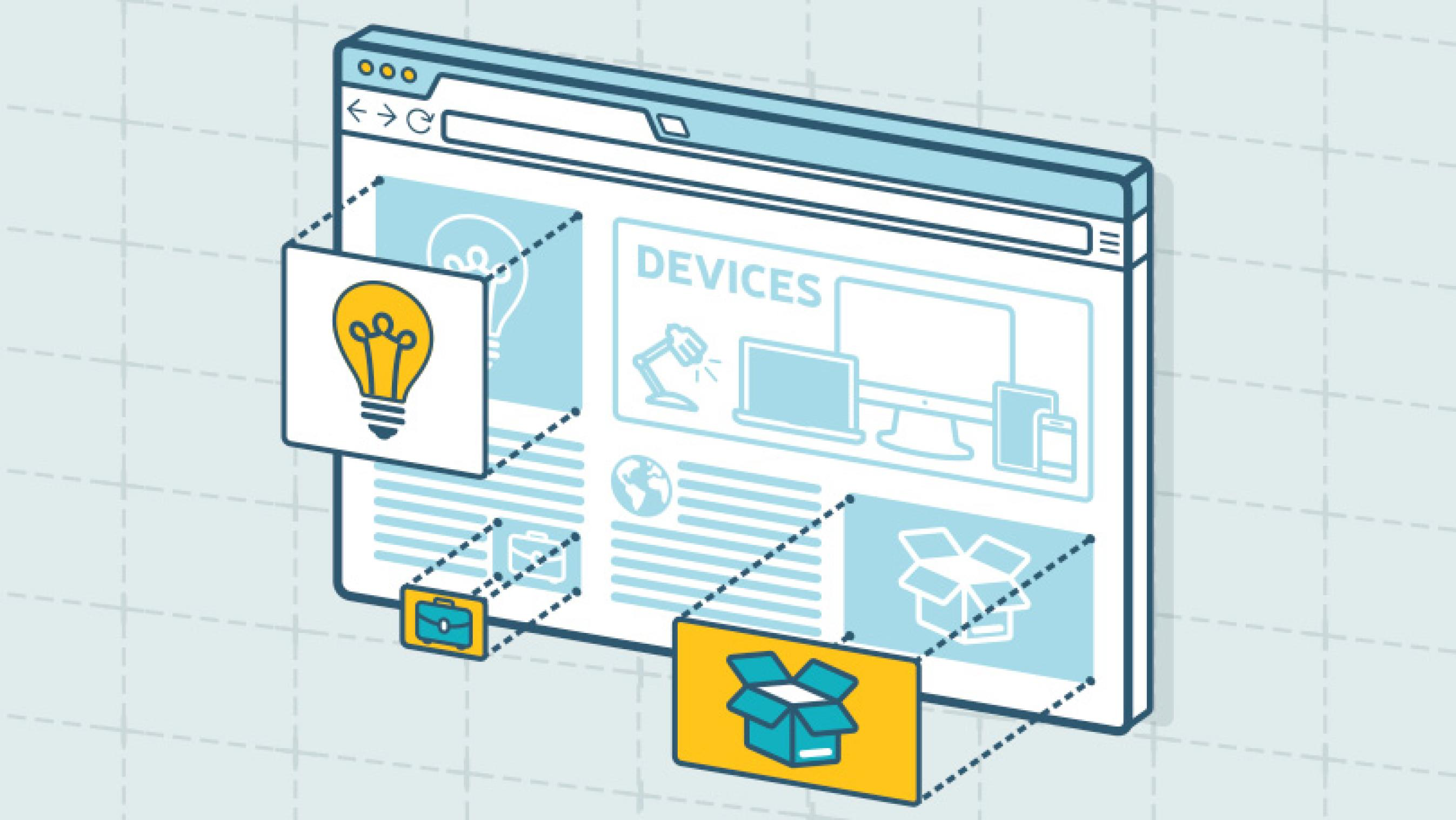
By 2027, there will be more than 41 billion IoT devices around the world. The increased volume of IoT devices means more individuals around the world will be accessing the web through a wider range of devices. As a DC digital web design agency, we’ve seen the increased importance of creating responsive websites that automatically scale to device type but remain consistent in general structure. Menu systems often become crowded and confusing as screen widths decrease to tablet and mobile devices. Digital design agencies can help overcome this obstacle by recognizing the critical breakpoints in your site’s design and implementing menu structures optimized for tablet and mobile screens of all generations. By keeping this consistency in structure and navigation across devices, users will become more familiar with and loyal to your website and brand.
3. Limit Menu Items
To ensure a website is easy-to-use and navigate, the structure is essential. For example, listing each page separately in a navigation header creates an overwhelming and near impossible user journey. Your sitemap should act as a foundation, with the most important items laying the building blocks for secondary pages. By systematically creating a logical sitemap utilizing primary and secondary navigation, you can create a fluid user experience that allows users to find exactly what they need with ease. As a DC digital web design agency, we have access to and frequently use site map testing tools, such as Treejack, to evaluate the findability of topics on a website. Not to mention, creating a logical, hierarchical sitemap makes it much easier to produce an XML sitemap, which is pivotal for SEO.
4. Test. Test. Test.
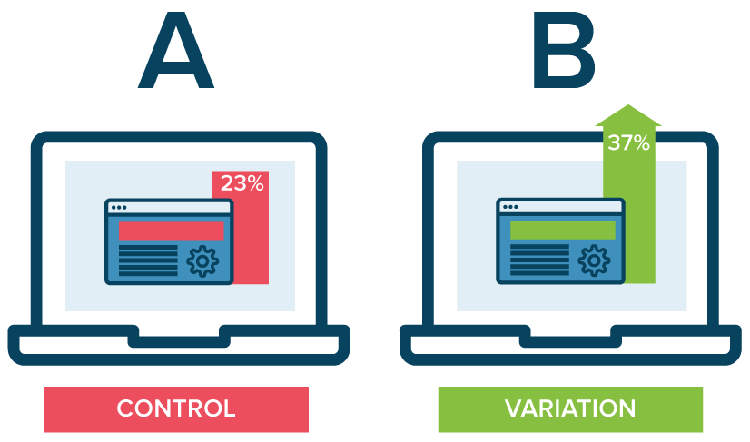
A/B testing website navigation is the only way to truly take the guesswork out of website optimization. As a DC digital web design agency, our Drupal and WordPress development experts have seen first hand the benefits of A/B testing. With proper testing, website navigation changes can be data-driven. Conversations surrounding those changes then shift from “I think” to “I know.” Although A/B testing can be employed to answer one-off questions, it should be continually used to improve metrics, such as conversion rate, over time.
In building or redoing a website, intuitive navigation design should always be a top priority to ensure users don’t require instruction or trial and error to move around the site. By using the navigation best practices mentioned above, you’ll have taken a great first step towards better engagement and higher conversion rates on your website by enhancing overall user experience. To learn more about our processes and to see our work, check out our case studies.
If you’re looking to hire a DC digital web design agency with Drupal and WordPress development experts, see what Bluetext can do for you.
The decades-long reign of the PC is over, with mobile devices now making up more than 52% of all internet traffic. While plenty of people preach the importance of responsive website design, far fewer have articulated updated guidelines for the reality of today’s internet. Keenly aware of trends as ever, Google has continually refined its search algorithm to keep pace with increasingly mobile and untethered internet. Advertisers, marketers, and website owners alike need to be aware of what these paradigm shifts are, and how that could impact their sites’ SEO.
Cellphones’ bountiful data has empowered Google to enhance its search engine. Search results are more custom than ever before, incorporating key differentiating factors like time of day, weather, and geography. The search results for a morning bagel in Washington D.C. will look entirely different three hours later in San Francisco.
Optimizing for Local Search
More so than ever before, websites need to be local. Gone are the days of simply tacking on addresses and list of phone lines. To be competitive in 2020, websites need to address the mindset and inquiries of the region they serve, be it a street, coast, or country. A quintessential, doughy foldable New York slice is in stark contrast to a dense, deep-dish pie from Chicago. The top result for a pizza in Manhattan will not be wasting content on merely their cheese, sauce, and pepperoni, but rather what distinguishes their slice from their other New York brethren. Language, context, and local distinctions are now a mandatory part of website content strategy.

Dealing with Short Attention Spans
Major changes to search algorithms are only a handful of the changes introduced by the rise of mobile. Attention spans online are shorter than ever with the ubiquity of the internet and easily accessible information, even more so for mobile where screen size comes at a steep premium. Hero zones should be appropriately leveraged. Heroes should state the most important critical information concisely and contain a quick and simple CTA or takeaway. Organic visitors who cannot immediately find an answer to their search query after a glance and a few swipes will assuredly bounce away to a competitor.
Search and Virtual Assistants
Smartphones’ impact on websites has not just been limited to mobility and smaller screens. Virtual assistants like Amazon’s Alexa, Google Assistant, and Apple’s Siri fundamentally change how people browse the internet. For many on-the-go, the automated search functionality provided by these virtual assistants have all but replaced a typical Google search.
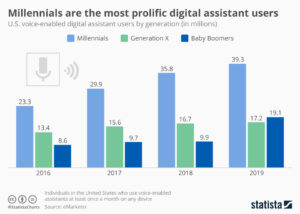
How Google and the other virtual assistants parse through webpages and present them for voice search is a complex topic, but the vital SEO fundamentals remain in place. Research demonstrates that people are unsurprisingly far more conversational in their wording versus a typed-in search. Optimized content thus needs to serve this need directly, often best served using blogs that cover such frequent, informal topics as “What is the best X” or “Y versus Z”.
Google has been increasingly leveraging its structured data for voice search results, largely due to its predictable format and parseable nature. For best results, website owners need to cross-reference website content and identify what data could be passed off to Google using structured data. Articles, menus, locations, events, and reviews are just a handful of the many structured data formats that Google accepts. Conveniently, Google now provides a simple tutorial for anybody familiar with HTML to get started on incorporating structured data and improving their site for voice search.
The shift to mobile devices has opened up new avenues for content creation and design. Location and voice were unheard of topics even a decade ago, but they are here to stay for organic search. It’s up to website owners and marketers whether they take advantage of these new strategies, or get left in the dust.
As the world has changed in the blink of an eye, so has the way we market to consumers. Now, more than ever, your website exists as BY FAR THE MOST IMPORTANT doorway to your brand and your brand experience. While stores stay shut, and face-to-face interaction is vastly limited, brands will rely on reaching their target audiences via their websites. Therefore, your website is mission-critical to your success.
Bluetext has published a 5 part blog series to help you think about and pressure test if your website is the best it can be.
With 57% of the world’s population now on the internet, promoting your business through a website has become even more critical. Additionally, over 50% of website traffic comes from mobile, and over 66 million American adults now own a smart speaker with digital assistant capabilities. Your website is where a potential customer will get their first impression of your business, and navigating the way website browsing behavior continuously evolves can be tricky. Because having a poorly designed website can be worse for your business than having no website at all, turning toward an expert website design agency can help you find the best website solution for your company. An agency can help you stay on top of the latest web design trends, and bring both your website and your business to the next level.
User experience (UX) is one of the most important things to consider when redesigning your new website. According to Jakob’s law, users spend most of their time on websites other than yours. This means that users prefer for your site to function in a similar manner to other sites they frequently interact with. Staying up-to-date with current web design trends is imperative to keep your users engaged.
Bluetext suggests considering the following seven trends when building your website to ensure that your site combines SEO functionality with the best UX, boosting your brand’s presence online.
1. Make Mobile a Priority
Over 50% of all website traffic comes from mobile. With a user-base continuously becoming more dependent on mobile, it is even more important for website designers to prioritize and optimize web experience for mobile devices. Designers must create a thumb-friendly design to not only make mobile navigation easier for the user but also create a seamless, visually-appealing design.
More than 60% of companies reported an increase in sales after designing mobile responsive platforms; however, approximately 40% of people will leave your website if it isn’t mobile-friendly. While simply having a mobile presence may seem good enough, optimizing this experience through design to cater to mobile users is the most important factor.
If these statistics aren’t convincing enough, it’s also important to keep in mind that Google gives priority to mobile-friendly sites by ranking them higher in search results, positively impacting your SEO. Lacking a mobile-friendly experience can negatively impact your website’s ranking, whereas sites that are mobile responsive will often receive a ranking boost, even for searches on a desktop.
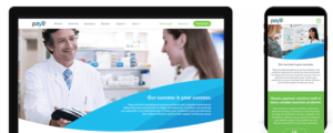
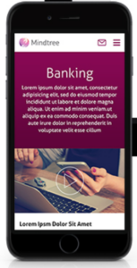
Check out some of Bluetext’s work on mobile with Paya and Mindtree.
2. Increase Page Speed
It takes users only three seconds to decide whether or not they want to stay on your website. These three seconds are crucial to your website’s dwell time (aka the time a user spends on your website before returning to the search results). Web design agencies can provide creative solutions to help engage your users within these three seconds. Additionally, web agencies know the best tactics for improving page speed, such as image compression. Image formats like JPEG 2000, JPEG XR, and WebP often provide better compression than PNG or JPEG, which means faster downloads and less data consumption.
The less time it takes your website to load, the better your SEO. Because of the Google Speed Update, Google won’t prioritize your website to users if it will take too long to load. Taking your site to a web design agency will ensure that your website is optimized for the user, while also ensuring that you have the best possible SEO ranking.
3. Optimize for Voice Search
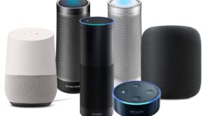
Page speed is also becoming more important as the number of smart speakers and digital assistants continues to grow. Over 66 million American adults now have a smart speaker, and designing a website that capitalizes on Voice Search Optimization is the only way to ensure that those using smart devices for their searches will have access to your site. Voice search is meant to be a faster, more convenient way to get information, and if your website takes too long to load, it is less likely to be returned for a voice search result.
According to a PWC study, 71% of respondents would rather use their voice assistant to search for something than manually typing their query into a search engine. The differences between these spoken and typed searches may lead to different SERP results, and if your website is not properly optimized for vocal search, you may lose ground to your competitors. Because vocal searches only result in one top result, everyone is vying for this “ground zero” position. You can obtain this coveted position by gaining Google’s featured snippet spot, which aims to directly answer users’ questions. Voice searchers are also more likely to search in long-form questions as opposed to using shorter keywords, so it’s important to consider the types of questions your target audience may ask, and to position your website well to answer these searches.
4. SEO vs. SEM: Choose Wisely
How can you tell whether to focus your marketing efforts on SEO or SEM? Let’s return to square one: what’s the difference? Search Engine Optimization (SEO) was traditionally thought of as a component of Search Engine Marketing (SEM), which comprised of both paid and organic tactics. However, this language is shifting, with SEM now referring exclusively to paid search. SEO is a method to optimize your website to receive organic traffic, while SEM is a way to funnel in relevant traffic from search engines by buying paid or sponsored ad listings.
So which is better to focus on for your website? SEO allows your business to get more visibility, building brand awareness at a low cost. Choosing keywords that are relevant to your website can earn you a spot on the first page of the SERPs, automatically earning you credibility and trust from search users. In order to increase your website’s chances of making this first page, follow these simple steps:
- Use relevant keywords in the URL to describe the content of the page
- Use your main keywords in the beginning of the title tag of your page
- Use the right keywords in the meta description of your page and make sure it is enticing enough for users to click-through to your site
- Use your primary keyword(s) in the H1 tag of your page
- Use your main keywords along with related long-tail keywords in the first few paragraphs of the page
SEO will bring your website brand visibility at a lower cost, but it’s important to invest in researching which keywords will best optimize your website.
While SEO is typically more sustainable, turning to SEM can also do wonders for your website. SEM allows you to capture the attention of your target audience by claiming a spot above-the-fold of the SERPs. Sponsored listings also give you more control over the results you achieve; every element of the ad can be customized and tweaked to target your audience. SEM charges on a per-click basis, and while this may be more expensive, it allows you to achieve quick, measurable results without going through the trial-and-error process that SEO typically involves.
Both SEO and SEM have their pros and cons, and both may be right for your business at different times. Turning to an agency that specializes in SEO and SEM will help you choose the right tactic at every turn.
5. Hello, Homogenous Hero
The fast pace of modern life means that people have less time to spend on your website. When they enter your site, simple and intuitive web design will allow them to quickly find what they’re looking for. The use of minimal design allows for the rapid digestion of information and ultimately leads to more satisfied users.
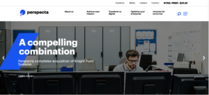
The inability to spend endless time searching for information on a website also means that many web design agencies are moving away from the once-popular ubiquitous site, and shifting instead toward the homogenous hero. Instead of boldly featuring the headline in the center of the landing page, designers are opting instead to move the header and CTA to one side, with the image on the opposing side. This split-screen aesthetic also allows for easy conversion to mobile, providing a clear dividing line between the two content blocks.
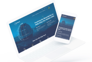
Check out some of Bluetext’s latest homogenous hero designs through their work with Centauri and Perspecta.
6. Animate Your Site
The use of animation is an easy way to make your website appear polished and dynamic. Animation also helps bring your brand’s story to life, quickly engaging users and drawing more visitors to your homepage. When used as a tool to communicate complex messages easily, animation can reduce the time that a user must spend in order to understand your message, which enables them to spend more time exploring your website.
When adding animation and motion into your website design, it is important to consider web image optimization, which is the process of providing the smallest-sized images optimized in terms of quality, resolution, and format. With the rise of internet browsing on mobile, images and animations must be optimized to perform well on mobile. While animations are a fantastic way to engage your site visitors, they can also slow down your website load times and negatively impact your SEO. Let a professional website design agency like Bluetext help ensure that your website can support lively animation without dragging down your website load time.
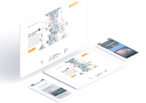
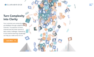
When Bluetext redesigned the Clarabridge website, we made sure to incorporate motion in a sophisticated way, making the UX come alive. We used motion throughout the homepage to engage the user and pull them further down the landing page. This design also quickly explains how Clarabridge works and allows a site visitor to visualize how they might best use Clarabridge’s services.
7. Incorporate More Video Content
Video content diversifies your web page, and also appeals to those fast-moving users who do not have the time to search through a lot of text. Videos are also a great way to make an emotional connection to your users and lead to a better overall website experience. By 2020, experts predict that 80% of online traffic will be video. Additionally, 72% of businesses say that video has improved their conversion rate, and 45% of people watch an hour or more of video per day.
While video content is clearly an important marketing tactic, 64% of marketers see video as the most difficult content to create. Not only do videos take time to plan, shoot, and edit, but it is also tough to decide exactly what type of content should be presented in your video. Because viewers’ attention starts to drop off after roughly two minutes, finding an expert who specializes in video content may be the best route for creating the perfect video for your website.
Not only will video content boost your website’s success, but it is also rewarded by Google. If your site includes video, it is 53X more likely to get a first-page spot in search results. Video improves SEO, which boosts your ranking. But if a short video is one of the first impressions a user will have of your business, how do you go about creating successful video content, and keep the user coming back for more? Many website design agencies have video specialists who can tell your story in a clear and powerful way. Check out Bluetext’s latest video work with Invictus.
Invictus Brand Essence Video, July 2019 from Bluetext on Vimeo.
Interactive content is here to stay. Just take a look at the 96% completion rate on BuzzFeed quizzes. Even more, a 2016 Content Marketing Institute (CMI) study found that just over 80% of marketers say that interactive content is more effective than static content when it comes to grabbing consumers’ attention.
Well, what even is interactive content, anyway? Interactive content is “content that requires the participants’ active engagement — more than simply reading or watching. In return for that engagement, participants receive real-time, hyper-relevant results they care about.”
Digital branding agencies, such as Bluetext, will ensure you are leveraging all that interactive content has to offer. Here are the top 3 types of interactive content to look out for in 2020.
Quizzes and Assessments
Quizzes and assessments are pieces of interactive content in which the user provides answers to a few questions in order to receive insights based on them. They are fun for the user to complete, and if the results are what they were looking for, they will help you build trust with your audience.
This type of interactive content doesn’t only boost engagement — they also help you get to know your audience. So when you plan to incorporate quizzes or assessments into your content plan, seek out a brand strategy agency to help you develop your content and ask yourself: What do I want to know about my audience? You may discover something new and gain some essential insights that can help you tailor your marketing efforts to be more effective.
Bluetext, a leading branding company, worked with the Graduate Management Admissions Council (GMAC) to develop a microsite to invite top-of-funnel business school candidates to learn about what is available to them in the world of graduate business schools. The introduction page on the website is an interactive quiz that helps direct users to content specifically geared toward them based on where they fall in the business school process.
Polls
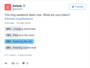
Polls are the easiest and simplest way to introduce interactive content to your marketing plan. They provide a quick way to get in touch with your audience and allow you to build a genuine connection with your followers.
The most straightforward way to use polls is to ask your audience for opinions on your content, service, or product. This not only helps you drive engagement online but gives you great insight into how your audience is feeling about your brand.
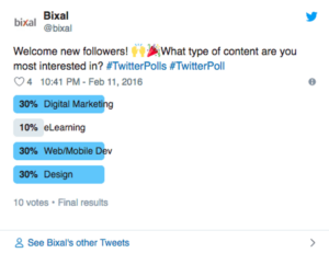
You can also invite your audience to interact with your profile by asking fun, light-hearted questions that invite them into learning more about what your company has to offer.

Contests
According to the CMI report, marketers believe that contests are the most effective type of interactive content you can use, especially in the early stage of the buyer’s journey.
Contests can include traditional raffles or giveaways. They can offer the chance to win a prize if they refer a friend to your company’s offerings. You can even introduce photos or hashtag contests where you invite your audience to submit their own user-generated content.
We have seen a rise in these types of hashtag contests and challenges across all social media platforms, especially on TikTok. The platform allows companies to leverage a hashtag to promote their brand, and users are eating it up.
Guess was the first brand in the US to release a marketing campaign as an official partner with TikTok. They ensured that every time a TikTok user opened the app, they were directed to the #InMyDenim hashtag challenge. Since its launch, videos with the hashtag have garnered over 38 million views and introduced the Guess brand to young Millenials and Generation Z.

Contests are great at bringing out people’s natural curiosity and competitive spirit, so encourage them to participate by providing an engaging contest.
Interactive content that is engaging and personalized provides your audience with a new way to engage with your brand and can build trust with your audience. Learn how Bluetext can help you leverage interactive content in your content marketing plan here.
For a top marketing agency, trade shows are essential events to attend to learn all the tricks of the trade. It is usually a one time a year event where all the major industry players convene to learn about new products, network and promote their brands. It brings back old notions of experiential event marketing, but in 2020, brands are adding a digital twist. Now more than ever, companies are pairing their physical trade show presence with huge digital thumbprints, from hyper-targeted ads to Micro-Moments.
National Retail Federation (NRF) and their annual Big Show is a great example of how to do a trade show right. NRF’s Big Show is the largest retail conference and expo event, gathering over 40,000 attendees and 18,000 retailers from over 99 countries under one roof. Big Show capitalizes on Micro-Moments both before and during the show. By analyzing these tactics, we can learn how important Micro-Moments are for users and how to properly utilize them.

So what is a Micro-Moment? A Micro-Moment is an intent rich moment when an attendee uses their device to act on a need, including to know, to go, and to buy. The brilliance behind micro-moment marketing is that in the world today, consumers are bombarded by content everywhere they turn. Inc.com says the industry has reached a point of “content shock” where consumers are oversaturated and cannot consume any more content than they already are. Consumers spend an average of 4.7 hours each day on their smartphones, continually distracted and overstimulated. This only escalates the challenges marketers face to achieve consumers’ attention.

To combat the new challenges encountered with fragmented media interactions, top digital marketers have adopted a new mentality. This new philosophy zeroes in on distinct moments in the consumer buying process. The I-want-to-know moment, the I-want-to-buy moment and even the I-want-to-go moments.
Before the Show, NRF was strategic in focusing on the Micro-Moments of their target audiences’ “I-want-to-know” and “I-want-to-buy” moments through the use of various paid media tactics. Through the use of paid social, NRF increased brand awareness and utilized the “I-want-to-know” moment of users. Before driving users to register for the event, it’s crucial to make them aware of the brand, educating them about the event, as well as driving upper funnel traffic down the line. Paid display is where lower funnel traffic acts upon the “I-want-to-buy” moment. Paid display not only helps to generate qualified leads but also drives registrants.

During the Show, the various speakers and topics expanded upon Micro-Moments as well. A huge focus of sessions was on how to drive better experiences, better content and better strategy for consumers. There are various innovative technologies and solutions companies can utilize, as seen in the Innovation Lab and Startup Zone, that can help improve the user experience for customers in every stage of their individual Micro-Moments. Opening speaker, Satya Nadella, CEO of Microsoft, expanded upon this during his keynote session on the first day of the show. Nadella focused on how companies need to focus on the future of the retail industry, upcoming trends and how to utilize technology to transform how companies operate, are marketed and relate to consumers. By doing so, these Micro-Moments for users will be more memorable and excite consumers to change from “I-want-to-know” to “I-want-to-buy.” To see the full list of speakers, visit the NRF Speakers Page and check out the NRF Big Show 2020 recap for a full list of articles, videos, session presentations and more.
A key takeaway from NRF’s Big Show 2020 was the importance of personalizing and concentrating the customer experience in the digital era. Staying true to the NRF Vision, the National Retail Federation has acted as the eyes and ears of the retail industry. For over 100 years they have brought together important leaders from top retail companies and are the only organization committed to bringing critical foresight and insight to leaders, movers and makers.

Leading by example is an understatement, as the organization itself has been ahead of the curve in their paid media tactics and lead generation strategy. To learn more about the NRF media strategy, check out their Bluetext Hall of Fame.
 Optimize Often