Top branding agencies are always looking for new and refreshing approaches to logo designs that resonate with customers. Every designer’s dream is a new logo that is memorable and unique. But customers react to logos that interesting and different, but not too different. If a logo adheres to a style that is out-of-date or too far out of the mainstream, it may stick out from the crowd, but it won’t generate the positive feelings that it would if it were within the boundaries of the top logo trends that are hitting the market. With that in mind, here are six top logo trends that we are seeing both with our clients and across the industry:
- Flat Designs Retain Their Strength. When Microsoft released its latest new logo, the design was flat with no shading or 3-dimensional effects. The result is a logo that is straightforward, maintains its integrity and brand equity, and looks good across all channels and in all sizes. It’s also easy to print and reproduce. A flat design shows off the brand and colors well and shows off the brand in its simplest form.

- Negative Space is Your Friend. Pinterest, Instagram, Toyota and scores of other iconic brands all use negative space – sometimes with hidden shapes and symbols includes. As an article in Lifebuzz.com reveals, the three ellipses in the Toyota logo represent the heart of the automobile, the technology, and the customer. More importantly, negative space can draw attention to the brand in a way that is memorable and different.

- Stacking is Back. For many years, the logo with letters had to be simple initials in a simple design. But as a way to grab attention in a way that stands out and is easy to see and absorb, stacking can be a strong alternative – often with different fonts for each word. This offers a solid way to highlight different fonts to challenge viewers while giving them something they can quickly comprehend. Here’s an example of a recent refresh (minus the different fonts) from the American Library Association.
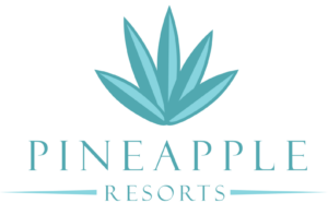
- Turning a Flat Logo Up a Notch. One recent trend is taking otherwise flat logos and adding a two-tone approach to add depth to the color but also to give it a hint of three-dimensionality. Dividing symmetrical images into two “zones” of shading gives depth and visual interest to a flat design. It can also add a symbolic touch to convey the brand’s core mission and direction. Check out how Pineapple Resorts turned its logo up a notch to make it more distinctive.
- Go Wide. Shapes that elongate from right to left are thought to be more recognizable for humans that narrow, tall images. With online platforms (such as websites and social media) favoring a wide design, strong brands are turning to this approach with their logos. When combined with contemporary fonts and colors, it can also convey a brand that is on the move and ready to dominate its market.


Want to explore how to apply top logo trends to your brand? Bluetext can help.
As every top branding agency knows, the brand style guide is a key component in a brand’s visual identity. It sets out how brand elements, including color palette, imagery, iconography, and layout should be incorporated into every piece of collateral or content that represents the brand. In essence, it’s the brand bible for every designer and marketer in the organization.
Yet, for a typical top branding agency, it’s often an afterthought. Only after the new brand elements are designed, options are provided to the client, the visual identity is applied to the website, collateral templates, and signage, and all is approved, does the team turn to the style guide. And even then, it is often lacking in the type of detail and content that will make it useful for more than a brief period. It needs to be thorough and future-proof.
Let’s face it: The brand style guide isn’t the sexy or fun part of the project. Oftentimes, it’s delivered as a thinly printed document and other times as a PDF with limited detail. We understand that digging through a lengthy document to find out precisely how to use the logo, fonts, and imagery can be frustrating. Here, then, is the Bluetext guide to a good – and useful – brand style guide.
- Make sure the style guide is comprehensive. The goal of the guide is consistency, in how the brand is represented regardless of platform, outlet or venue. It will be used by a wide variety of people, ranging from employees to partners to media. This doesn’t mean it has to cover every random or infrequent scenario, but more detail works in your company’s favor.
- Go deep in coverage. Even the term “brand guide” is sometimes misleading. While it is important to include details on the specific usage of a creative asset, such as how much white space needs to pad a logo or how a logo should play out depending on the background color, this should be only a part of the what the guide includes. Don’t neglect core brand-building guidelines, such as what the organization’s tone and voice need to be in different contexts, or how employees should use branded imagery on social media. Provide enough detail so that anyone reading the brand guide from cover to cover will feel like an expert on every aspect of the brand.
- Update the guide on a regular basis. With the prevalence of eBooks, articles, and infographics, brands are experiencing a faster rate of evolution than ever before. That means it is important to do a regular review of the guide to keep it up to date.
- Make it easy to find, share, and update. Many style guides look great in a printed, bound volume. But those are hard to find, hard to distribute, and really hard to keep updated. And if the brand guide requires time and money to update, executives will be reluctant to refresh the guide to match their evolving brand until they absolutely have to.
Our recommendations as a top branding agency: Make the style guide a dynamic window to your brand. Include intangible elements that come from the brand’s core message platform, like tone, voice and the types of language to use. Use a digital platform that is easy to share and easy to update. Make it comprehensive. And make sure you review it at least once a year.
Style Guide Examples:
Learn How Bluetext Can Help With All of Your Branding Needs!
There are many reasons to go through a rebranding exercise. Most common among them are a merger or acquisition, change in corporate direction, desire to change a negative attitudes about your brand, or simply start over and hope to convince the market that something is different. All of them can be very valid and create a great opportunity to go through the exercise to create a logo, visual identity, new corporate name, positioning statement or color palette. As all companies are different, there is no one size all fits approach. There is one thing, however, that can really derail the process. That is losing sight of the original goals for going through this exercise. A rebranding exercise is not a cure all to solve a company’s problems. It should be done swiftly with clear goals and responsibilities so it does not get in the way of your business to execute. If something is not working, it is unlikely that a rebrand will fix it. That is why keeping your goals in mind and pressure testing every step in the process against them is so critical.
Here are five recommendations to ensure that you don’t lose sight of your goals to ensure a successful rebranding process:
- Focus on the big picture in terms of messaging and meaning. No external audience will spend as much time as you or your management team thinking through the machinations of the messaging and meaning. Customers and prospects will often ask once but then will go back to focusing on your product, service and delivery.
- A great logo and corporate visual identity can go a long way toward sending a strong message to the market. It is a design driven world, so don’t spend so much time focused on the message and lose sight of a great logo and corporate visual identity. Visual storytelling through a simple yet powerful logo with the right color palette, right imagery, right iconography, and right fonts can make a major impact for a brand to create the right position in the market.
- Branding is a team effort. Get your employees involved. They are the ones out delivering your message and brand to the market. If employees fell invested in the branding process they are much more likely to help you sell the new name, brand and message to the market.
- Don’t Do It Halfway. Once you commit to launching the new brand, ensure that your old logo does not show up anywhere. Assuming that the corporate website is the first place where the new brand shows up, ensure that the new branding is quickly rolled out at events, tradeshows, office locations, ppt templates, ad campaigns, etc. Your audience can only be as committed to your brand as you are. Take the time and spend the money to do it right.
- Don’t let the process drag. Remember, a rebrand will not automatically fix your problems. You have a business to run and marketing campaigns to execute. The market is not going to wait for you take your time. Competitors will seize the opportunity if there is a market void.
At Bluetext, we have a proven process to ensure that every attitude and viewpoint is considered. But we follow the recommendations outlined above. We often rebrand companies in a timely manner, helping them focus on their goals to ensure they can focus on corporate priorities. From logo development to corporate visual identity to responsive web design to trade show booths and new collateral, we have the resources and expertise ready to tackle whatever challenge you are facing with your brand.
With the housing market climbing back up again, it’s hardly the time for real estate developers to sit back and coast. With a rising market comes increased competition, a savvy customer base, and a real need to use great creative approaches to attract the right buyers. Here are eight tips for making sure you reach customers with the right messages to make the sale:
1) It’s about telling a story. The home buyer doesn’t want a bunch of facts and figures, he or she wants to know why it is essential that they live in that development in that community. Rather than showing floor plans and materials, demonstrate how that space will work for your customers. Use visual story-telling to communicate what your developments are really about.
2) Compelling creative is more important now than ever. With the decline in traditional print media, the first impression that your development will make is online. At a time when your competition may be simplifying their message and not trying as hard as they should, you have the opportunity to build the emotional connection that will deliver the sale. The online experience needs to show that your brand is unique, creative and meets the needs of its audience.
3) Understand the trends. As buyers age, they often want smaller footprints, even at a time when they could most afford the larger models. Anticipate these trends and use your digital assets to explain why your houses meet their evolving needs.
4) Analyze your data. Many developers have no real idea how and why their prospects land on their website. What brought them there in the first place? It is essential to closely monitor your web traffic and recognize how your target audiences are reaching your site. That allows the right allocation of resources into the channels that are delivering the most results.
5) Make it easy on your customers. Don’t force them to do all of the leg work and research. Determine what your prospects want to know and proactively deliver that across all of your digital platforms. This will attract buyers and promote social sharing, and grow your reputation in the process.
6) Give your prospects a reason for returning. Once a potential buyer has hit your digital properties, keep your developments top of mind with ad retargeting that promotes your latest blog post or a new look at your inventory. Not only does that keep them interested, but if the content is good, they may share it with friend who may also be in the market. Let referrals drive more audience and conversion.
7) Keep your social media active. Yes, it takes work and time to be active in social media, but it will pay off with prospect engagement. Don’t single track through one platform, like Twitter or Facebook. It is important that a number of platforms are leveraged, with Pinterest leading the way for the real estate industry. Paid Facebook, Twitter and LinkedIn ads can micro-target prospects by location, interests and even job title.
8) Mobile is a must have. While prospects may do their primary research from a laptop or desk-top, more and more internet access is via mobile devices. In addition, buyers by definition are mobile when they are looking at properties, and won’t have their large screens with them. It’s an absolute requirement that you have a responsive design for your website that makes mobile access simple and easy.
How do you show passion?
I was in a pitch with a very high profile prospect last week and when we asked him what he was looking for in a digital branding partner his response was not uncommon – he said he wanted to work with an agency passionate about his brand.
Makes sense, right? But then you go back to the shop and have to put together the proposal, and you ask yourself how can we showcase our passion in a proposal? Do we sing out front of his building with a big sign saying to hire us? Do we jump out of a cake? As a services business we don’t have the luxury of creating the next gadget that wows an audience – it is our people, our process and our work that showcases our passion.
We showed the amazing work we are doing for our clients. We walked through our process, and we shared how excited we would be to take on this assignment through the lens of other work we have done. But still, I scratch my head sometimes and wonder how to showcase passion. Think about this the next time you have to give someone a written response – how do you showcase passion?