But here at Bluetext, our feet were getting a little chilly. For more than 11 years, Bluetext has designed amazing brands and websites for world-class clients across all industries. Our team has helped more than 50 clients get acquired within two years of starting an engagement with us. We are performing at top levels for our clients, helping raise enterprise value and brand visibility.
A few months ago, we pulled up our website and felt it was time to treat ourselves like a client. We put our heads together to reimagine our brand and our position.
We have re-launched the Bluetext brand and website with 150+ success stories and 1000+ thought leadership pieces to provide a sense of what we could do for your organization. This debut goes a step beyond showcasing what we can do, but truly exemplifies who we are. Our team has evolved significantly since our founding, reaching unimagined heights, and, simply put, outgrowing the previous brand. From positioning to branding to websites to go-to-market lead generation campaigns, our team is eager to tackle any challenge across any industry for any size organization. Our services are wide and varying, but our mission remains focused: push creative boundaries, deliver real results, and most importantly enjoy every moment of it.
Bluetext is more diverse, nimble, and passionate than ever, and reenergized with our latest brand, logo, and website evolution. Stay tuned for our case study series on the creative process behind the Bluetext brand.
Why animation?
As the saying goes, static doesn’t sell. According to research, animated banner ads are more than four times as effective as their static counterparts. More and more these days, users are expecting engaging, interactive content from brands at every point of contact. This goes for any platform—a website, an app, digital out-of-home, social platforms (yes, this means TikTok). Anything with a screen is an opportunity to shake up your brand with animation.
Say more with animated content
If a picture is worth a thousand words, an animation is worth a million. Animated content captures key messages in more ways than a static graphic, and injects any design with the personality of a brand. After all, motion draws out emotion. Whatever your brand wants to convey, animated content can sharpen and elevate that message.
Is your brand a subtle responsive animation kind of brand, or a claymation one? Maybe a blueprint-style animation speaks to your brand’s personality best, or perhaps a parallax effect is the best representation of your brand. However you choose to do it, you can get more out of your corporate visual identity with animation.
Getting started
When it comes to animation, the options are endless. Here are a few simple ways to get started, plus some examples produced by the team here at Bluetext.
1. Introduce an animated version of your logo or key brand assets.
An animated brand identity can be applied across any digital asset, as demonstrated by Octo’s identity in motion. The style of movement captures the ever-changing nature of the government technology market and communicates more about Octo than a static identity could.
2. Add subtle movement to some of the static content on your website.
This example from ScienceLogic is an elegant way to introduce movement to your website while incorporating visual elements like brand shapes and secondary colors. As the mouse hovers over images of the leadership team, the background pops with new colors and shapes to keep the viewer engaged with what they’re seeing.
3. Consider a moving graphic for your next ad placement.
4. Read some more tips on motion integration from Ale Hernandez, one of Bluetext’s web design and UX experts.
Easy animation with interactive AI
Animation is becoming so necessary for modern brands that designers have even begun to automate some of the process. This cutting-edge technology is making animation more cost-effective and efficient to produce, meaning that more and more brands will be able to build out animated identities. Now is the time to get an edge on your competition by debuting a signature animation style for your company’s offerings.
Want to go all-in on animation? Contact Bluetext to learn about our motion design and interactive UX services.
M&As have long been a key strategy and source of growth for businesses around the world, with thousands of M&A transactions taking place each year. However, according to the Harvard Business Review, studies show the failure rate of mergers is somewhere between 70-90%. And while many factors can contribute to M&A failure, lack of stakeholder engagement and marketplace rejection are two of the major causes – both of which can be tied to brand decision-making (or lack thereof).
As such a critical factor in making or breaking success, it may come as a shock that branding is one of the most overlooked aspects of M&A planning. With the long list of considerations, leadership has to prioritize throughout the M&A process, branding decisions are often rushed or poorly planned, taking a back seat to financial, logistical, and operational concerns. Other times, rebranding takes place post-merger in response to already forming opinions, or as a way to deal with arising challenges instead of preventing them. In other words: it happens too late.
Just as figuring out how to best combine companies in order to create the most value possible is extremely important, so is making sure those synergies and strategic rationales are going to be believable to employees, investors, customers, and the outside world. That’s why it is crucial to prioritize branding early on in the M&A process. Having a clear brand strategy going into a merger helps promote unity, makes transitions smoother, and provides the opportunity to deliver a strong message, both internally and externally, about the value the newly combined entity will bring to all key stakeholders.
So, we’ve established why it’s so important to prioritize brand development in M&A planning, but how exactly do you get that branding right?
Well, that’s where Bluextext comes in.
Bluetext is a full-service marketing agency that specializes in digital branding and creative services. We have worked with leading M&A clients across the country, creating and elevating brands that set them up for success and put them in the position for continued growth. Especially in mergers & acquisitions, a professional branding agency is critical. A branding agency brings a neutral third-party perspective that eliminates the risk of brand cannibalization. Instead of stakeholders fighting to preserve remnants of their prior companies, an agency will recommend the right brand elements that unify all aspects of the merge.
Here’s how we do it:
In-Depth Discovery
First, Bluetext engages in detailed discussions to learn more about the objectives, goals, and visions for your new brand. We perform extensive quantitative and qualitative research on your competitors, your key audiences, and their needs, take a deep dive into the current presence and state of your brand(s) and conduct countless stakeholder interviews. We synthesize all of our findings to form a clear vision and direction for the brand that’s both informed by data and supported by key stakeholders.
New Name, Logo, & Visual Identity Creation
Once a clear brand vision is in place, Bluetext moves into name, logo, and visual identity creation. We conduct a series of workshops to (1) come up with a name and logo that reflects the tone, attitude, and purpose of your brand, and (2) produce a visual brand strategy that will position your company for success in the markets you serve. The insights we pull from these sessions inform our creative direction and the moodboard that will serve to guide the visual brand identity, including colors, typography, iconography, and other identity system attributes.
PR Announcements
With a new name, logo, and brand identity in place, Bluetext Public Relations will take over to elevate your new brand and build market leadership through strategic and innovative PR campaigns. We’ll lock in on a story that conveys the reason this new entity exists and how it will have an impact, that resonates with all your key audiences, and that builds overall excitement for the brand.
Creative Outputs
Whether it’s creating new collateral templates, launching a fully redesigned website, or executing paid media and ‘Go to Market’ campaigns, Bluetext can produce various assets that take your brand even further and set you up for continued success well into the future.
Having the right branding provides a valuable opportunity to define and differentiate the identity of your newly combined entity in the market and will set the tone for what consumers can expect from your company moving forward. Working with a brand development agency like Bluetext early on in the process is critical to get that branding right and ensure your M&A success.
Want to learn more about our M&A success stories? Check out our work HERE.
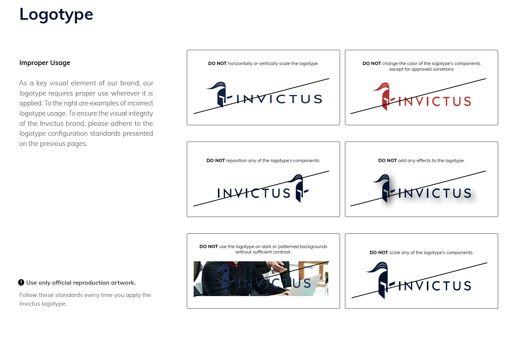
A style guide is a fundamental apparatus for building up brand character. A brand style guide establishes your brand identity and is an extraordinary resource for making on-brand, consistent content.
The style guide is crucial in communicating your brand and design standards. Not only does this help maintain consistency with your company’s brand, but it also helps other key members of your team, such as writers, project managers and developers by serving as a solid point of reference.
Style guides should include examples of brand messaging, headlines and overall themes. This is significant in that it sets up a solid brand voice that reverberates with the crowd, which is a key driver for building brand mindfulness. Overtime, that mindfulness and consistency creates trust with your audience. This ensures every time someone experiences your brand, they’re experiencing the same underlying elements and traits.
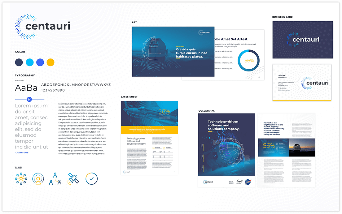 So what should go in a style guide? Typically, you want to include a logo, tagline, typography, color palettes, messaging guidelines and imagery guidelines. A more robust style guide can include things like the company overview, brand attributes, brand elements, iconography and more. While you provide specific guidelines on how to apply the brand, it’s important to also provide examples of how not to use the brand. This can include improper logo usage, incorrect use of design elements, messaging to avoid, and imagery to steer clear from. It’s important to be as clear and comprehensive as possible.
Remember: this style guide is a living document! You should expect your style guide to change as your brand evolves over time. It’s important to keep it updated as rules and guidelines change. Just like a living, breathing organism, your brand will continually be adapting, evolving and changing.
Style guides shouldn’t just be used by large well-known companies. Every company should have one – no matter the size. This will not only help members of your internal team in staying consistent with the branded artifacts they produce, but it will also help ensure your company is seen as a cohesive and trustworthy entity. The more credible you are seen with your customers and your audience, the more positive they will feel about you.
Interested in a style guide and how it can transform your business? Bluetext can help. Contact us today.
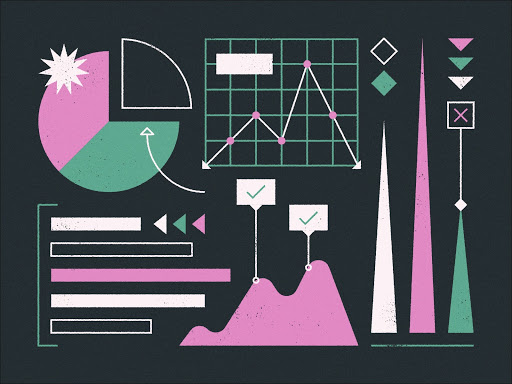
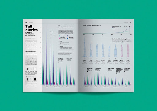
As a top digital design and branding agency, Bluetext is familiar with the common client concern, “how can I tell my company’s story with data?”. Recent studies have shown that consumers follow directions and digest information with text and illustration over 300% better than when presented solely with text. It’s true; a picture can tell 1,000 words — and often better. Infographics, statistics, charts, and data visualization design can seem daunting. Whether working with complex or diverse data sets, the design process can often feel overwhelming and messy. Bluetext sat down with our veteran Design Lead, Augusto Pagliarini, to discuss the do’s and don’ts for creating captivating infographics that speak louder than words.
At Bluetext, upon receiving a creative brief, user experience designers dig to research and assess the UX best practices. When designers work with project managers, they like to review research –which is leveraged to show the client examples and directions that might inspire our infographic. This could, for instance, include exploring two options, to see how we can show their data in a multitude of interesting ways.
For research, some of the preferred design resources include Adobe’s Behance, Dribbble, and Pinterest. These websites are great places to discover good layout inspiration and to see what is trending in the design world.
Infographic design is both an art and data science. One of the most important steps in the creative process is wiring and sketching out the infographic, rather than jumping straight into color. Bluetext design best practices start with a sketch to get the client’s reaction. Graphic designers will draw shapes and lines, all with pen and paper. Efficiency is king, it can be a waste of time to create initial sketches in a high-fidelity format such as XD.
Bluetext is a data-driven agency- so our primary focus is looking at the data first, then designing around it. The next step typically involves using Adobe Illustrator, which allows for creating a vector format. These designs allow for infinitely scalable vectors, so our user experience design team can swap out sizes with relative ease.
It’s important to know the end-user and the audience. User personas are the base of creative style and direction. Some questions our team considers are should the infographic be playful, or serious in tone? More illustrations, 3D isometric style, or photo-realistic? When it comes to the high fidelity designs, our design team considers if the infographics need to use the client’s branding, working off a set style guide to avoid common pitfalls in infographic design such as using too many fonts and colors. Another key focus is on accessibility– all audiences need to be able to read these items, so a lot of thought is put in at the frontend of the design process to make sure it’s legible, and that the data flows well.
It’s critical to cite your sources and ensure that the design allows for that. This enables our clients to showcase their credibility – whether it be in disclaimer text or link if it is a digital asset.
Top Tips to Follow:
- Know your audience and end goal
- Keep design simple
- Show, don’t tell
- Follow style and brand guidelines (where appropriate)
- Do your research!
Faux Pas to Avoid:
- Overcomplicating things
- Designs that are hard to read or follow
- Having no flow or hierarchy
- Hierarchy: In this sense, it is guiding users on what to look at first, what are the supporting points of the infographic, are there too many colors that catch my eye?
- Having no flow or hierarchy
- Too much variety in colors, fonts, and textures
- Too many colors, fonts, and treatments create a lack of uniformity in the entire design. Sticking to a style guide can keep infographics digestible and visually appealing.
Catch the highlights and additional insights in the podcast edition of this post. Just hit play below!
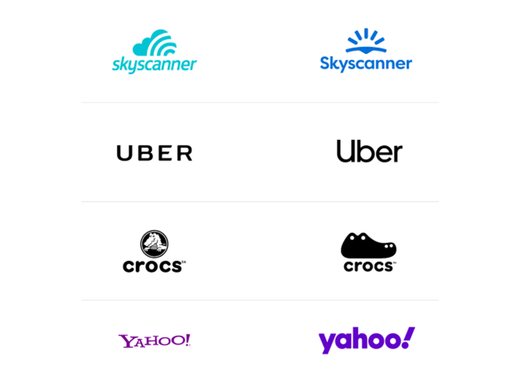
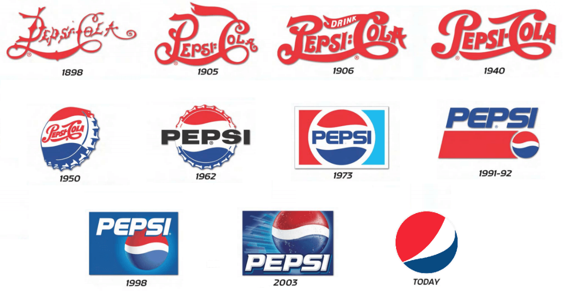
Simplification is one of the strongest trends we’ve seen as a top design agency in recent years. With such growing popularity, it shows no sign of stopping. So why are brands dialing back on designs for a more minimalistic logo? Top graphic design and rebrand experts at Bluetext are debunking this design trend to explain why it’s a wise choice. For one, minimalist logo designs are easily recognizable and memorable, which is key to successful branding. This is why many up and coming companies prefer simplification over other artistic techniques. Similarly, established brands are stripping their logos of excessive details to add more weight to the brand promise. Uber, Yahoo, and Mailchimp have all recently released logos with cleaner, rounded lines to feel more approachable and user friendly.
 Why are these well-known logos going back to basics? We consulted our top graphics designers here at Bluetext, to get their take on the trend. Below are some of the most popular reasons for logo redesigns:
Complex and Cluttered Digital Environments
With nearly all companies moving to some sort of digital presence, users are constantly bombarded and overwhelmed with content to digest. Embellished logos only add to that already exhausted attention span, requiring time and concentration that people simply don’t have to spare. Cluttered online environments have trained us to scan, filter, and repeat — leaving little bandwidth to notice or appreciate fine detail.
User Consideration
Especially when coupled with features like dark mode, we are seeing brands designing more and more with user experience and comfort in mind. Darker screens and simplified details are easier on the eyes. Reduced eye strain and saved battery life is an added benefit that shows users you care, especially in a pandemic environment where almost all interactions have become virtual and vastly increased average screen time.
Mixed Mediums
Another key consideration for any brand is where your logo will be applied. On your website for sure, but what about printed materials? Perhaps corporate giveaways, like coffee mugs or canvas totes. Logo designs need to accommodate all of these possibilities and easily adapt to any medium. Thus, to save time and resources, companies opt for a clean and crisp logo that they are confident will crisply stand out on any medium and in any size.
Shrinking Screens
It seems every few months or so Apple unveils smaller and smaller iPhone models. And this product design trend isn’t limited to just mobile devices! Laptops, tablets, and even desktops have been consistently shrinking in size as users opt for more streamlined and portable devices. To future proof your brand or website it’s important to consider small screens and how your logo will display. If your design is riddled with lines and textures it may compromise readability on these devices. Instead of reverse engineering your logo to accommodate unique layouts and breakpoints, it’s far more efficient to begin with a simplified, and digitally conscious design.
Botox for B2B
Why do people get Botox? To smooth out those fine lines and wrinkles and look younger! The same principle applies to mature and established brands. In order to get a digital facelift and appear fresh and modern, experienced brands are smoothing out the details of their logos and brand graphics. Simplification of logos gives your company a rejuvenated update, while still preserving the established brand reputation.
Simplicity Inspires Confidence
Less is more. A strong and simpler logo exudes an air of confidence that your brand knows what it’s doing, and lets the reputation speak for itself. Brands should consider a logo as a signature, rather than the story. Your logo should be a quick snapshot of your brand that triggers a memory of your product or service, not an attempt to illustrate your offerings. A simplified logo, especially in a wordmark format amplifies your brand and creates a distinctive presence.
The Verdict
The verdict on logo simplification? Cleaning up design elements not only offers immense brand value and memorability but also has numerous digital benefits. As a top digital marketing and user experience agency, we encourage clients of any industry to always be thinking about the future first. With an inevitable shift toward more digital-based lifestyles, smaller screen sizes, and user considerations it is a wise investment to reinvigorate your brand with a timeless logo design.
Considering simplifying your company’s logo? Trust Bluetext for all of your digital marketing and design needs.
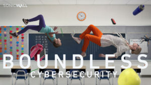
A fantastical idea, a powerful pitch, and energetic enthusiasm from all sides of SonicWall stakeholders. Only one task remaining: execution of the over the top Boundless Campaign.
SonicWall came to Bluetext with one main objective: bring their Boundless Cybersecurity campaign to life. As such, the SonicWall team needed creative assistance in bringing the campaign visuals up to par with their brand value. The Bluetext team was asked an age-old question of B2B companies, “How can we make this campaign memorable?”
Especially in the saturated cybersecurity market, it can be challenging to differentiate from strong competitors and help visual abstract brand promises. So the Bluetext team presented a thought-provoking approach to the campaign’s new creative and campaign taglines.
“When cyber threats are limitless, your defenses must be Boundless.” Break free with SonicWall Boundless Cybersecurity.
To communicate and contextualize this message, Bluetext presented a creative direction that would showcase the end-user in a gravity-free surrealist state, which literally breaks free of the constraint of cyber threat. The creative would be scaled across main industry verticals in order to personalize and target advertisements. The idea was over the top, innovative, and ambitious but well-received with client buy-in. Next came the challenge of execution, which was overcome using a custom photoshoot complete with realistic costumes, props, and even a trampoline. In order to achieve the effect of floating in an anti-gravity state, professional ballet dancers were hired to jump on the trampolines. Photographers captured the dancers posing mid-air, then flipped the photo 180°.


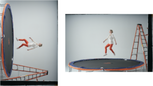

Once the in action shots were captured, the images were edited to remove the backgrounds and impose on industry-specific scenes. Related props were also imposed onto background images to make the scene appear as if person and objects had been magically released from the pull of gravity while the world remains grounded around them.
 At the time of the new Homepage and campaign landing page launch, these static images truly came to life with a subtle parallaxing effect.
To drive users to these newly premiered pages, SonicWall needed eye-catching advertisements that viewers would — no pun intended — gravitate to. Bluetext designed a variety of verticalized static banner ads and further animations to drive page traffic.
- The COVID-19 Pandemic has expanded the “stay at home” audience for B2C businesses.
- The consumer sector has seen changes in how audiences are reacting to content and consuming media.
- Capturing these audiences will require businesses to adapt content and tactics to the current climate.
Over the past few months, we have all adjusted to new living and working environments. This means varying working hours, virtual gatherings and different web surfing, streaming and social networking habits. These changes have shifted the traditional marketing audience profile.
If your business is B2C, you should be aware of these audience changes and adapt your marketing tactics to keep up with the current trends. Here are a few ways that you can make sure your message doesn’t fall flat with the new “stay at home” audience.
The concept of a “stay at home” audience is not new. The number of remote workers in the U.S. economy has grown steadily over the past several years. Online graduate and undergraduate programs have grown more popular, and the number of parents staying home with new children was rising even before the pandemic hit. Not to mention the number of companies adopting a digital-first approach and offering remote positions. However, this pandemic has rapidly expanded the “stay at home” audience beyond traditional groups.
It is crucial that all businesses hit the right tone with messaging during the pandemic. This is a different, uncertain and potentially difficult time for everyone, so brands should adjust their tone to one of encouragement and solidarity. No one wants to see pure sales messages at this time. Potential customers need to feel supported and confident that every purchase is essential for them.
Content
There are a few ways that businesses can cater to new stay at home audiences, one of which is content. One way to show solidarity with customers that may be struggling is by providing giveaways or special promotions that you normally wouldn’t – so that customers think of you again when more normal times return. Another way to build a loyal customer base could be to utilize user-generated content. Social proof is powerful, and often someone else’s high opinion of your product or service can make the difference between a static audience and gaining new customers.
It’s a myth that content management can be intensive or even a time burden. Updating your content could be as simple as shifting your product or service message slightly to be more specific to the audience’s changing needs. Some common threads throughout this pandemic are self-care, virtual everything (happy hours, games, workouts, entertainment), home cooking and other hobbies, home design, athleisure, online learning, DIY, gaming and financial services. Even if one of these threads doesn’t match up to your business or services, try to find a way for your business to make home life easier. Stuck on how to adapt your content to resonate with consumers? Consult a content marketing agency, such as Bluetext, to identify trending but relevant topics to focus on.

Shifting Media Channels
Another way you can make sure you’re capturing your audience is shifting the channels you’re using. While traditional channels (including out of home, print and radio) have decreased significantly, digital channels have seen a large boom. According to Nielsen, media consumption rises by as much as 61% when consumers stay at home. This media consumption includes display media, social media, and all forms of TV, including traditional, CTV and OTT.
Recently digital media (and TV) channel inventories have been higher due to increased numbers of people streaming. Like a simple supply and demand equation, this leads to lower-cost opportunities to get in front of your audience. Paid search impressions are decreasing, but digital marketing analysts are seeing higher CTRs and lower CPCs, leading to more efficient media campaigns.
Target Audience Hours
The current pandemic has altered the where and when work takes place. With children home from school and most people working remotely, we’re seeing more employees working outside of 9 to 5 business hours. For consumer-focused businesses, this might mean shifting typical 9-5 workday restrictions so that your campaigns run all day instead of just non-work hours.

While no one is positive how long the effects of this pandemic will last, it is clear that the stay at home orders are changing how both consumer and business audiences are consuming media. Businesses must adapt to these changing audience behaviors and characteristics, not only to survive now but to better understand and cater to their target customers in the future. Need help capturing your changing audience? Call Bluetext.
- The COVID-19 Pandemic has expanded the “stay at home” audience for B2B businesses.
- The commercial sector has seen changes in how audiences are reacting to content and consuming media.
- Capturing these audiences will require businesses to adapt content and tactics to the current climate.
Over the past few months, we have all adjusted to new living and working environments. This means varying working hours, virtual gatherings and different web surfing, streaming and social networking habits. These changes have shifted the traditional marketing audience profile.
If your business is B2B, you should be aware of these audience changes and adapt your marketing tactics to keep up with the current trends. Here are a few ways that you can make sure your message doesn’t fall flat with the new “stay at home” audience.
If your business is more B2B and your target audience is a specific position type in a company, your audience might have shifted even more than a typical consumer audience. Now, instead of doing research at work, many employees are browsing, doing research and consuming media at all hours at home. This can make it more difficult to target by company IP address, for example, but can make it more likely that you get valuable leads from social media sites like Facebook and LinkedIn.
The common threads that businesses are searching for during this time are supply chain management, eCommerce, website tips and management, point of sale transactions and financial support. Focus not only on your value add for customers, but also on the unique ways you’ll support them during this time.
Lift the Gate!
Just like consumer-focused businesses, it’s a good idea to offer some sort of additional value for business customers. It can be a draw for businesses to find free thought leadership content or resources on your site – even if it’s content that you would normally have gated.
Shifting Media Channels
For B2B businesses, digital media channels are seeing a serious uptick in volume and inventory. This shift may be an even greater shift for B2B industries as channels are seeing more traffic from business-people who would normally not be as active on social media in the middle of the day.
Another result of this pandemic is that trade shows and conferences have been canceled or are going virtual. With 53% of B2B marketers considering in-person events and tradeshows an effective channel for driving conversion according to eMarketer, this can be an important change to take advantage of. Many businesses (28% according to Smart Insights) are putting a positive spin on this shift and reinvesting trade show budgets into digital advertising.

Target Audience Hours
The shift to remote work has made it more likely that employee’s hours will shift from the traditional 9-5. This provides a unique opportunity for hour extensions for both B2C and B2B campaigns.
While no one is positive how long the effects of this pandemic will last, it is clear that the stay at home orders are changing how both consumer and business audiences are consuming media. Businesses must adapt to these changing audience behaviors and characteristics, not only to survive now but to better understand and cater to their target customers in the future. Need help capturing your changing audience? Call Bluetext.
Interactive content is here to stay. Just take a look at the 96% completion rate on BuzzFeed quizzes. Even more, a 2016 Content Marketing Institute (CMI) study found that just over 80% of marketers say that interactive content is more effective than static content when it comes to grabbing consumers’ attention.
Well, what even is interactive content, anyway? Interactive content is “content that requires the participants’ active engagement — more than simply reading or watching. In return for that engagement, participants receive real-time, hyper-relevant results they care about.”
Digital branding agencies, such as Bluetext, will ensure you are leveraging all that interactive content has to offer. Here are the top 3 types of interactive content to look out for in 2020.
Quizzes and Assessments
Quizzes and assessments are pieces of interactive content in which the user provides answers to a few questions in order to receive insights based on them. They are fun for the user to complete, and if the results are what they were looking for, they will help you build trust with your audience.
This type of interactive content doesn’t only boost engagement — they also help you get to know your audience. So when you plan to incorporate quizzes or assessments into your content plan, seek out a brand strategy agency to help you develop your content and ask yourself: What do I want to know about my audience? You may discover something new and gain some essential insights that can help you tailor your marketing efforts to be more effective.
Bluetext, a leading branding company, worked with the Graduate Management Admissions Council (GMAC) to develop a microsite to invite top-of-funnel business school candidates to learn about what is available to them in the world of graduate business schools. The introduction page on the website is an interactive quiz that helps direct users to content specifically geared toward them based on where they fall in the business school process.
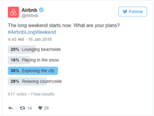
Polls
Polls are the easiest and simplest way to introduce interactive content to your marketing plan. They provide a quick way to get in touch with your audience and allow you to build a genuine connection with your followers.
The most straightforward way to use polls is to ask your audience for opinions on your content, service, or product. This not only helps you drive engagement online but gives you great insight into how your audience is feeling about your brand.
You can also invite your audience to interact with your profile by asking fun, light-hearted questions that invite them into learning more about what your company has to offer.

Contests
According to the CMI report, marketers believe that contests are the most effective type of interactive content you can use, especially in the early stage of the buyer’s journey.
Contests can include traditional raffles or giveaways. They can offer the chance to win a prize if they refer a friend to your company’s offerings. You can even introduce photos or hashtag contests where you invite your audience to submit their own user-generated content.
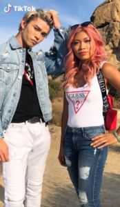
We have seen a rise in these types of hashtag contests and challenges across all social media platforms, especially on TikTok. The platform allows companies to leverage a hashtag to promote their brand, and users are eating it up.
Guess was the first brand in the US to release a marketing campaign as an official partner with TikTok. They ensured that every time a TikTok user opened the app, they were directed to the #InMyDenim hashtag challenge. Since its launch, videos with the hashtag have garnered over 38 million views and introduced the Guess brand to young Millenials and Generation Z.
Contests are great at bringing out people’s natural curiosity and competitive spirit, so encourage them to participate by providing an engaging contest.
Interactive content that is engaging and personalized provides your audience with a new way to engage with your brand and can build trust with your audience. Learn how Bluetext can help you leverage interactive content in your content marketing plan here.