PR professionals are often required to transform subject matter experts – scientists, academics, researchers – into effective messengers. These experts possess deep knowledge in their respective fields, but they often struggle to articulate complex concepts in a way that’s easy for the general public to understand. Bluetext believes three key strategies help SMEs share their knowledge in a manner that captivates their audience.
Encourage them to Tell Stories and Use Analogies
Our brains are wired for stories. While facts and figures are crucial within academic or scientific circles, only standout statistics engage wider audiences. Individual stories and relatable analogies make the nuances of an expert’s work more tangible.
PR professionals must encourage experts to transform their knowledge into stories. Analogies, for example, can break down complex topics into familiar concepts that audiences can understand and connect with. It’s about presenting information in a way that is not just intellectually digestible, but also emotionally resonant.
Below, the technical explanation gives accuracy at the expense of comprehension, while the analogy aids understanding and relatability.
Before: “Solar panels convert the sun’s energy into electricity through photovoltaic cells. When photons hit the cells, they knock electrons free from atoms. If conductors are attached to the positive and negative sides of a cell, it forms an electrical circuit. When electrons flow through such a circuit, they generate electricity.”
After: “Think of a solar panel as a plant in your garden. Just as a plant uses sunlight for photosynthesis to produce food, a solar panel uses sunlight to produce electricity. The ‘leaves’ of our solar panel – the photovoltaic cells – catch the sunlight and kickstart a process that generates electricity for your home.”
Don’t Dumb it Down, Balance it Out
It’s crucial not to dumb down complex concepts when training SMEs as effective messengers. The goal is to respect the audience’s intelligence while ensuring comprehension. This balance is best achieved by delving into specifics when necessary and providing a general overview where it isn’t.
For instance, when discussing an advanced software tool, an expert might briefly explain its mechanics, then elaborate on the real-life scenarios where it could enhance work productivity.
Before: “We use a high-transmittance, anti-reflective glass, encased with anodic oxidation aluminum alloy frame for our solar panels. These are embedded with mono-crystalline silicon solar cells, which are highly efficient.”
After: “High-transmittance, anti-reflective glass allows a lot of light to pass through and reduces light reflection, which is ideal for solar panels. Anodic oxidation aluminum alloy is a sturdy, corrosion-resistant material used to frame the panels, and mono-crystalline silicon solar cells are highly effective cells made from a single crystal structure that converts sunlight into electricity,
Above, the ‘before’ message is laden with technical terms that a non-expert may not understand. In the ‘after’ message, the expert takes a more balanced approach by explaining these terms in easily understood language that identifies each material’s role in the system.
Practice with the Expert
As with any skill, effective messaging needs practice. Before an interview or presentation, PR professionals should work with the expert to define their key messages, prepare responses to likely questions, and identify topics to avoid.
Practice sessions serve dual purposes. They help experts gain confidence in delivering their messages and also assist them in refining their responses. Through iterative practice, experts can identify and focus on the most important elements of their responses, ensuring they deliver succinct, impactful answers when interacting with reporters or audiences.
Training experts to be effective messengers isn’t always a straightforward task. But by encouraging storytelling, balancing technical information, and emphasizing key messages, you can help them communicate their knowledge in a way that resonates with a wider audience. The transformation from expert to an engaging speaker is well worth the effort and maybe the difference between just getting an interview and receiving airtime, or even better – an invite back.
Take a look at some of Bluetext’s past work to see how client subject matter experts have been able to unlock their knowledge for a wider base and deliver powerful messages to the audiences that need to hear them most. Are you in need of a marketing and public relations agency with the skills to bring out those messages and take them to market? Contact us today.
For the majority of December 2022 and into January 2023, the world has been captivated by the recently uncovered conspiracy of the nepotism baby, or nepo baby for short. In a nutshell, nepo babies are children of Hollywood industry insiders who likely benefitted from their family connections in the launching of their own careers. For example, “Emily in Paris” star Lily Collins, is the daughter of musician Phil Collins. Or “Stranger Things” star, Maya Hawke, who is the daughter of Ethan Hawke and Uma Thurman.

In today’s Bluetext blog, we’ll uncover the role nepotism plays in the world of sub-brands and product suites. We’ll discuss when it may be right to reference a parent brand and act as a branded house, and when it makes sense to market your solutions separately under distinct brands and operate as a house of brands.
The Case for the Branded House
The most common form of brand architecture for brands big and small, a branded house operates as a set of sub-brands housed underneath a core, parent brand. A house of sub-brands benefits companies that offer multiple services or products, especially when a parent brand provides solid brand recognition and visibility. To the consumer, it is very clear that these offerings all come from the same parent company.
From a marketing perspective, a branded house operates under one marketing strategy and avoids confusion in the marketplace regarding who owns the sub-brand. This strategy typically works best when each sub-brands target audience share commonalities. A similar industry or job function, or perhaps the sub-brands are compliments with bundling potential. A branded house is recommended if the parent brand has an established positive reputation with consumers.
Google Workspace
The Google Workspace is perhaps the world’s most famous branded house today. The goliath product suite houses Gmail, Sheets, Docs, Calendar, Meet, Drive, and so much more. As soon as you see the simplistic style and elementary school scheme of one of these sub-brand logos, you know it’s Google baby. With a staggering 3 billion users worldwide, Google takes up a vast majority of the work app ecosystem and certainly benefits from architecting its business as a branded house. Their brand recognition is strong and Workspace apps are seamlessly integrated, allowing customers direct ease of use.
Adobe Creative Cloud
Another of today’s tech giants, Adobe, launched Creative Cloud in 2011 featuring known and loved standalone applications such as Photoshop, Lightroom, Acrobat, After Effects, XD, and Illustrator in one package. The logos for each app offer a periodic table-inspired collective look and feel that tells the user it is an Adobe product and part of a branded house. These products are designed to serve separate functions but complement and strengthen each other. Therefore making the case to bundle or purchase the entire ‘Cloud’…because if you’re going to rent most rooms you might as well buy the house right?
Sourcefire
Sourcefire hired Bluetext to reimagine its product architecture and create a branded house that would sit underneath the main SourceFire brand. Their suite of products, Snort, AMP, Immunet, and Firepower were great standalone applications but lacked a cohesive story that would tie them to Sourcefire. Bluetext renamed the products FirePower, FireSight, FireAMP, and FireCloud, taking inspiration from the Sourcefire name and perceived recognition in the market. Bluetext was also able to sunset Sourcefire’s famed, “Snorty the Pig” gracefully as part of the rebrand, shifting the brand perception from startup to global leader. For Sourcefire, having a branded house of products aligned its marketing strategy and increased its overall brand perception. Following, the successful rebrand, the company was acquired by Cisco for $2.7 billion.


The Case for the House of Brands
A house of brands is remarkably different from a branded house, where each brand has its own unique brand identity and marketing strategy usually dictated by the target demographic. The major benefit to operating as a house of brands is the ability to service a diverse set of target markets and create economies of scale for the parent brand. On the other hand, a house of brands can be a complex system to run, and maintaining each brand’s success may be almost impossible.
Procter and Gamble
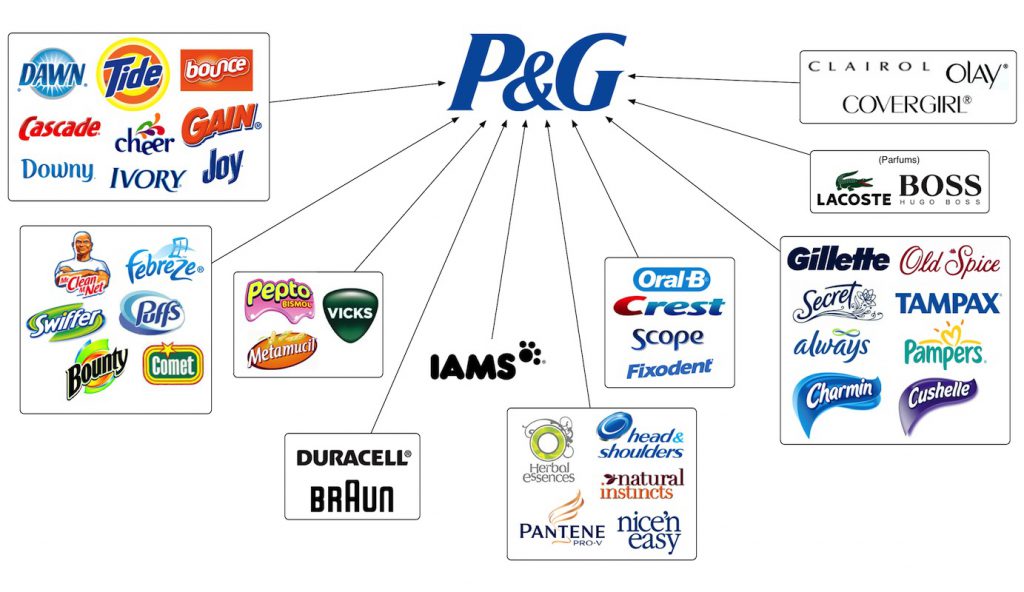
For over 180 years, Procter and Gamble has specialized in a variety of products across a wide range of target markets. Chances are, you’ve used a P&G product without even knowing it. Have you brushed your teeth with Crest toothpaste? Washed your hair with Head & Shoulders shampoo? Cleaned your clothes using a Tide POD? P&G probably wasn’t the first association you made with this experience. All of these brands and so many more are the product of a successful house of brands.
That being said, the company has gone through a reshuffle in recent years. As of 2014, Procter and Gamble decided to retire or sell close to 100 of their existing brands, leaving just 80 brands that made up 95% of their profits. This is a classic example of a house of brands getting too big (and too expensive) to manage and needing to cut costs. Nonetheless, this is a great move by P&G, allowing the company to adapt and support their profit-making brands, and reallocate spend to develop new, innovative products that will pay dividends in the future.
Unilever
British consumer goods company, Unilever, has been in business for just under 100 years and has grown to operate in over 190 countries around the world. Unilever specializes in products related to food, cleaning products, toothpaste, and beauty products, and they are the largest producer of soap in the world. Did you use Dove soap this morning? Spread some Hellman’s mayonnaise on your sandwich at lunch? Snack on a pint of Ben & Jerry’s ice cream last night? All of these brands operate under the Unilever house of brands. Unilever’s success derives from operating multiple brands in the same category targeted at unique demographics. The same consumer doesn’t buy both Dove and Suave soap, but both are owned by Unilever. This allows the company to target as much of the market as possible, all through the power of branding.

General Motors
GM is the largest automaker in the United States, operating brands including Chevrolet, Buick, GMC, and Cadillac. General Motors is possibly the perfect example of a house of brands that operates at all levels of the market to reach as many consumers as possible. A prospective car buyer is not in the market for either a Chevrolet or a Cadillac. Each brand represents a segment of the market and positions itself accordingly from a price, performance, and look and feel perspective. GM has positioned itself as a brand with potential to truly appeals to everyone by offering distinct models to just about every price range, catering to wide range specific preferences.
GM has also expanded outside of the US market, competing in Europe with its brands Opel and Vauxhall, and in China with its brands Baojun and Wuling. General Motors has also been very successful in its brand consolidation efforts. For example, the company bought Hummer in 1998 and discontinued the brand in 2010. A Hummer EV pickup truck and an SUV are now in the works and will be marketed under the GMC brand. Another example of brand consolidation under GM was the acquisition of the Yellow Cab Manufacturing Company, which produced cars for the Yellow Cab company in New York City. General Motors acquired a controlling stake in the company in 1925 and bought the business entirely in 1943. Following the complete acquisition, the company was absorbed into its brand, GMC.

With brand perception under constant scrutiny, brand architecture is an important consideration in today’s marketing world. For many companies, a branded house is the best structure as it allows them to operate under a core, leading brand and logo, focusing on one market strategy. For others who are targeting multiple market segments in the same category, a house of brands is the correct choice as it allows them to compete at as many levels of the market as possible. Not sure which strategy is the right one for your company? Speak with the experts at Bluetext today.
B2B marketing has gone through numerous shifts in the past few years, but perhaps one of the most significant is the emergence of demand generation. While lead generation used to be the name of the game and dominated sales and marketing strategies, companies have come to realize higher ROI can be found with alternative methods. Enter the wave of demand generation. The name alone sounds strong, confident, and a surefire way to efficiently move customers through the sales funnel. So let’s break down the core differences in both strategies, and perhaps why you should consider a pivot to a demand gen mindset.
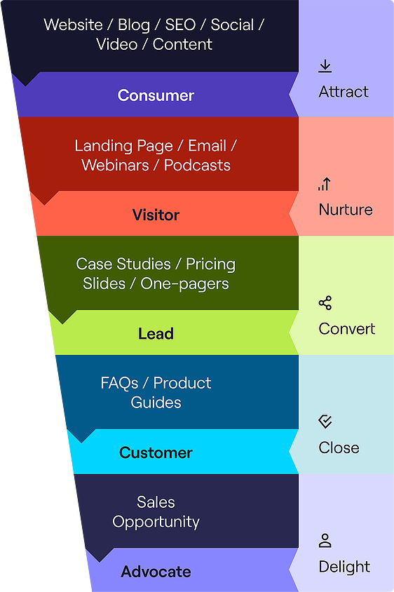
Lead generation is the well-known start of the traditional marketing funnel, which typically transverses the customer through the attract, nurture, convert, close and delight stages. The first stage is Attract, where an anonymous customer first engages with your brand through your website, content marketing, or ad. If relevant and of interest, they may engage and share contact information in exchange for more information. If they continue to engage, they become a qualified lead in the eyes of the sales team, who begin outreach with the goal of converting to a customer and hopefully an eventual advocate for your business.
Sounds simple enough right? It’s a tried and true traditional strategy for a reason, but it’s far from perfect. For one, it’s not entirely efficient. It takes considerable time and resources to sort the potentially high-quality leads from prospects who aren’t interested in your product. It often casts too wide of a net to include people who are not interested in your product and therefore will never convert. Secondly, it’s a very impersonal approach. With recent waves of personalization, many businesses are beginning to phase this approach out so that customers feel more attended too and therefore more loyal.
Introducing a new marketing mindset: demand generation. This prioritizes direct intent to avoid moving uninterested audiences into your sales funnel. So while prior lead generation focused on gating content to capture as much information about any engaged user, new demand generation takes the opposite course. But this does not mean giving away all your valuable content, but rather recategorizing based on the buyer stage. So some content, like basic product information testimonials or video snippets, may be tagged as bottom-of-the-funnel materials and used as ungated or paid social promotion that allows friction-free engagement. The users that interact with this content the most are then retargeted with specific information based on their interests, pain points and desires. As they continue to engage your team builds insights into what and where prospects consume and share information. This entails some close attention to optimizing content, which has multiple benefits. Consider A/B testing your ads and landing pages, and optimizing around the messages and keywords that get the most traction. This will effectively flip the funnel to put the customer at the top of the funnel, driving a more data-driven marketing approach that will be laser-focused on the customer and their needs. Demand generation marketing means sometimes planning your content calendar on the fly based on trending topics or new data findings, but this in turn creates more relevant and desired content you can be more confident your ICP (ideal customer persona) would be interested in. The more helpful and relevant your business presents itself, the more customers will come to you with the direct intent to contact sales teams and request demos or trials themselves. These inbound leads are much more valuable for short-term sales and long-term customer growth.
In order to implement this approach your business does need to shift prior practices and adopt a more agile mindset. This involves a considerable appetite for experimentation on both topics and channels that your high-intent customers are using. So for example starting from the broadest bottom of the funnel, you could create a webinar series on a larger topic, then create more specific video snippets on specific topics to use as ungated, organic promotional material on different social channels. Assess what topics and placements work best and continue to optimize around those insights. Perhaps retargeting engaged users with case studies or free tools related to the topics they interacted with. Be sure to include contact forms on all landing pages for an effortless way to express demand, but don’t require this information to be shared just yet. These direct intent leads are much more valuable because they want to have conversations with your business, and the sales cycles tend to be much shorter.
Overall, the marketing landscape is in constant flux. Customers may be swarmed by a sea of sameness, have ever-diminishing patience and attention spans, and always looking for new ways to bring value to their own company. With that said, to keep up with these shifts and get the most out of your marketing efforts it pays to be attentive and adaptable. The one size fits all lead generation model may not be the most efficient method for meeting your conversion and revenue goals. A more personalized demand generation approach that puts a little more effort upfront may result in simpler sales cycles and much higher conversion rates.
Considering a shift in your marketing strategy? Get in touch with Bluetext, an experienced content marketing agency that can prescribe the right approach and implementation strategy unique to your business.
In a time of economic uncertainty, it’s more important than ever to stay ahead of the curve as well as the competition. Stale digital marketing strategies simply won’t make the cut. Here at Bluetext, we’re committed to providing our clients with the latest and greatest when it comes to up-and-coming marketing strategies and trends. In this blog, we’ll look at five key predictions to bolster your marketing strategy in 2023.
Content Marketing in 2023
Gone are the days of strict, professional content and messaging for companies. In 2023, consumers are looking for you to empathize with them, breaking down the traditional walls that separated corporate from compassion. Lean into emotive content filled with transparency, empathy, and relatability. Your customers want to know they can trust you, especially in times of economic uncertainty when every penny counts. Ditch the sales-based pitch in your content and speak to your customers as if they were your friends.

Short-Form Video
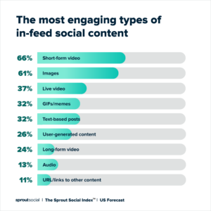
In today’s culture, TikTok is all the rage. The average user now watches 19 hours of video content every week, and a lot of that is happening on their mobile devices, accounting for 80% of all mobile data traffic. In other words, short-form video is huge and should be taken seriously by companies heading into 2023.
Producing content specifically for TikTok, Instagram Reels, and YouTube Shorts also lends itself well to companies, as shorter content takes less time and effort to produce. Additionally, viewers are more likely to engage with a shorter video that gets straight to the point versus a video they have to sit through for 30 minutes.
Augmented Reality
Using AR in marketing campaigns was certainly on the rise in 2022 and will continue to grow in both capabilities and use as we get into 2023 and beyond, with the global AR market expected to reach $28 billion by 2028. While AR may seem to be only available to large companies with large marketing budgets like Ikea, there are opportunities for smaller companies to lean into the augmented reality trend. Even something as simple as adding augmented reality functionality to your business card could be a great way to set yourself apart from the competition. You could add buttons to text or call, include a pop-up video showing off your product, and more.

Artificial Intelligence
Although the technology behind artificial intelligence is still maturing and a sound business case is still being developed, that doesn’t mean you’re not able to jump ahead of the curve. It is predicted in 2023 that the science behind marketing data analysis will benefit greatly through AI with tools such as TensorFlow and Gretel, allowing your company to glean more information from your data than ever before and drive higher profitability.
The power of conversational AI will also continue to grow (looking at you, Chat GPT) on the back of terabytes of data, enhancing your ability to actively engage with your customers on a personalized level. Tools like Campfire and Kore are making it easier for businesses to take advantage of the power of artificial intelligence with their platform-based solutions.

Metaverse
The metaverse was certainly a trending topic throughout 2022 and will continue to make headlines into 2023 and the future. According to a recent study, 59% of consumers are excited about transitioning everyday activities to the metaverse, with a similar number of metaverse-aware companies (57%) already adopting the concept. In 2022, we saw a variety of events being hosted in the metaverse, a trend that will continue into next year via virtual tradeshows, customer experiences, and facility tours. We’ll also see an increase in metaverse use for internal business processes such as employee onboarding, training, and even company happy hours.
Advertising in the metaverse will also continue to rise in popularity as the metaverse itself continues to grow. In order to align with the metaverse ethos, ads will need to be immersive and complement the user experience, allowing advertisements to become part of the gameplay and establish meaningful engagement with users.

You may already be aware of these upcoming trends and the implications they could have for your business but unsure of how to start addressing them. Bluetext has the expertise and industry experience to help you grow your brand and implement effective changes to your marketing strategy. To learn more about our offerings, contact us today.
Product-led growth (PLG) strategy is at the forefront of a massive shift in the software purchasing process. Read our most recent blog in this series, PLG Series: Product User POV, to determine if your company is ready to put end users in the driver’s seat. For companies looking to make this shift, consider the steps it will take to get there, which will require two major stages of transformation: the evolution of the product, and the evolution of the organization.
Steps to Becoming a PLG Company
Evolution of the Product
PLG strategy hinges on end users being thrilled by the product the company offers. How can organizations create a thrilling software experience? While it may seem like an oxymoron, thrilling software is possible. It starts with prioritization of design, empathy, and frictionless touchpoints with a combination of user journey mapping, user testing, and intelligent data implementation. The end-user experience is what sets a working product and a great product apart. The product needs to serve as a solution to the user’s troubles, not just a jumble of benefits and features. The user journey is top of mind for pioneering PLG-focused companies, rather than the specs and selling points of the product itself.
A good example of this is the onboarding process for new users. In demonstrating software products, the demo should be focused on helping the user achieve their goals, not showing off features of the software it’s trying to sell. Product-led growth really means user-led: anticipating their needs, reducing their friction, and providing ongoing support to create a joyful, exciting user experience with the product. In the PLG model, product enjoyment leads to subscription sales, additional referrals, and customer retention. When shifting to a product-led growth strategy, companies must create sticky products, which capture user interest by delivering consistent value and compel users to use them more regularly.
Evolution of the Organization
To become a PLG company, the organization must first be willing to turn away from sales-led and marketing-led growth strategies. Instead, the business structure has to support the ability to move faster, more collaboratively, and with more complex dynamics. Collaboration and inclusivity are more than industry buzzwords; they actually can make or break internal strategies. To pull off the rate of product improvement necessary to keep pace with competitors, a PLG-focused company has to run as a democracy, taking input from a diverse group of stakeholders from a variety of different teams. Marketing, sales, CS, design, and engineering teams, for example, will all need to weigh in to make decisions that result in the best product and end-user experience.
The resulting company structure is often at first more difficult and complex than legacy structures, but it has proven the best way to organize a company that prioritizes the quality of the product for the consumer experience. When scaling, the first thought may be to attempt to grow teams through hiring to accommodate for better, quicker, product improvements. That process tends to be time-consuming, costly, and inevitably leads companies to fall behind their faster, leaner competitors who are prioritizing employee growth, flexibility, and collaboration. As a step toward this organizational transformation, it’s important to break down silos to stay communicative, informed, and aligned across teams.
After going through the transitional phases outlined above, the real work of a product-led growth company begins in harnessing value from the Freemium to Premium chain.
Capitalizing on the Freemium to Premium Chain
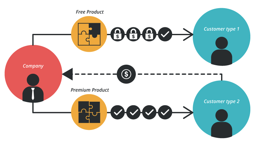
For a PLG-focused enterprise, after creating the best possible product and putting the organizational systems in place to support the development of increasingly spectacular products, the value in the product-led growth model comes from encouraging the following: Product adoption, Customer Loyalty, and Advocacy. This growth can be reaped from the Freemium to Premium chain, composed of three stages:
A frictionless entry point for users, leading to customer acquisition.
The user’s first interaction with the product should be personalized, delightful, and convincing. A free trial or demo experience allows users to self-educate about the benefits of the product and its ability to solve their needs, rather than having to deal with a salesperson or middleman to handle the transaction. This freemium experience can come in a couple of different forms: a reduced features version, a reduced capacity or usage version, or a reduced support version.
There are a few reasons as to why the free trial method is the best entry experience for customers seeking software solutions. First, the software is an intangible object and can be difficult to adequately describe with marketing lingo; it’s better to give users a hands-on experience that shows (rather than tells) the product’s benefits. Second, free trials reduce the fear of committing to a purchase, so users can explore the software offerings without concerns about getting locked into a subscription. Lastly, observing or collecting data during a demo experience allows you to gain valuable feedback on the product at hand. By seeing how end users experience the product designed for them, you can get a realistic sense of their positive reactions and friction points in order to continue improving the product offering.
Features located behind a paywall, leading to expansion.
The free trial leads the process by introducing the user to a must-have technology (where they’re reaping actual value), and the paywall follows by scaling up the pricing for the software as usage or benefits increase. After an opt-in free trial, a good conversion rate should be around 25%, and that rate jumps to 60% for opt-out free trials.
The product-led growth strategy for conversion is simple: freemium users are enticed to subscribe to premium accounts when they enjoy the product. To encourage subscriptions, it’s important to remind users of the benefits and product features. In addition, putting a clear time limit on the length of the trial creates a sense of urgency for freemium users to switch to premium subscriptions. Trial period expirations can help push users to take action, for fear of losing out on the benefits that they’ve come to appreciate while utilizing your software throughout the demo period.
Valuable integrations, leading to retention.
While gaining initial subscriptions is important, PLG strategy necessitates that these users continue coming back to the product. Ideally, each time the user utilizes the product, they should have a better and better experience. The PLG model will not work successfully if the company’s product becomes outdated or uncompetitive. Users must not only fall in love with the product but stay enamored. This can be done by continually improving the existing user experience, or by building out additional features and benefits to the product. However, if exploring the latter, keep the user journey segmented so that different audiences are still able to find the most relevant solutions quickly. As the product grows to encompass more features, the UX designers should ensure that the additional capabilities don’t cloud the interface to make it confusing or overwhelming.
For companies in the software technology space, shifting to a product-led growth strategy could lead to a better experience for customers and keep the enterprise at the front of the competitive edge. If you are interested in learning more about how Bluetext could use marketing tactics to help reposition your brand as a PLG-focused business, contact us.
The way that users engage with technology has dramatically changed in the last decade. As SaaS companies are stepping up their game to meet these demands, users are met with an abundance of software available at their fingertips to fulfill their every need. Tech-savvy people are seeking software that is more beautiful, more powerful, and more affordable than ever before. The patience for dealing with clunky designs or a challenging user experience has completely dissolved. Now more than ever, businesses are recognizing the value of leading with a great product and user experience in order to generate growth. Enter Product Led Growth.
Product Led Growth
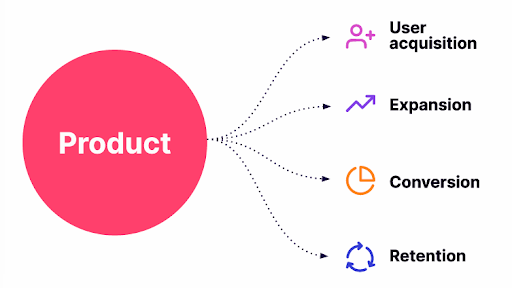
Product Led Growth is a business strategy for companies to use their product as the primary driver for customer acquisition, retention, and expansion. Imagine a pancake house that is famous for its pancakes. You hear about the pancakes, try them, love them, and tell all of your friends to try them as well; thus, the cycle repeats itself. The restaurant’s main goal is to create an unforgettable pancake that keeps customers coming back; they don’t have to prove or tell anyone that they have amazing pancakes because the product speaks for itself. Businesses that have adapted Product Led Growth strategies are thinking about how they can put their product at the forefront of every step of the customer journey–the foundation is having an amazing product with exceptional focus on the user. People hear about it, they test it out, they start using it, and all of a sudden it becomes a necessity to run their business. This type of strategy fosters company-wide alignment across teams around the product as the single most important source of long-term, scalable business success.
Product Led Growth allows for a significantly lower cost to acquire customers because existing users are promoting and selling the product simply by enjoying using it. Unlike sales-led businesses, which aim to get a customer from point A to point B in a sales cycle, product-led businesses turn the typical sales paradigm on its head by allowing customers to try their product for free, through a freemium or free trial that eventually becomes a subscription or an add-on purchase. Some of the most successful companies implementing the Product Led Growth approach are Slack, Dropbox, and Zoom, just to name a few.
Slack
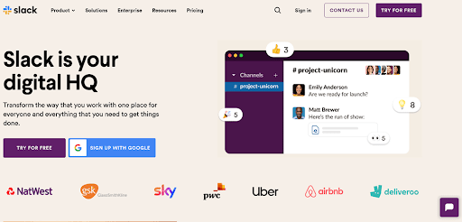
Perhaps one of the greatest examples of a company that has mastered the PLG strategy is Slack. By creating a completely new way for teams to communicate with each other, Slack leads with a product that is widely beneficial to almost any business, unique in its offerings, and initially free. Customers start with a free sign-up process with frictionless onboarding and are met with a superior customer experience throughout usage. Slack swiftly slides in premium plans for users to expand the scope of the platform after they’ve already started using it.
The company boasts over 12 million active daily users, with 156,000 businesses subscribing to the app and a profit of $292 million in 2021. They’ve also uniquely branded themselves with quirky and fun features that cannot be found on traditional messaging or communication platforms. By bridging the favored aspects of modern communications, like the iPhone emoji, the swift speed of the classic IM, and even conferencing abilities of Zoom, they’ve made a one-of-a-kind product that adopters find irreplaceable. It’s the kind of app that sells itself; you hear about it, you try it, and soon enough you’re using it every day. Slack is an excellent example of a company that leverages product features and usages as its main driver for acquisition and retention.
Dropbox
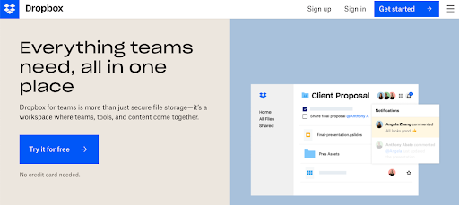
Next up, we have Dropbox. With sales that have surpassed $1 billion in less than ten years, Dropbox has a clear and undeniably successful product-led growth strategy. Dropbox’s product-led strategy succeeds in two crucial areas. First, Dropbox has developed a user-friendly product that satisfies market demands by making file sharing simple and convenient for end users. For users, the platform is intuitive and easy to set up, and accessible for recipients regardless of subscription status. Second, the platform encourages users to convert non-users by passing along a referral link that subsequently increases their storage credit. This recommendation strategy has allowed Dropbox to gain new clients while improving the satisfaction of current ones.
Zoom
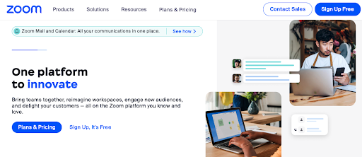
Last but certainly not least, we have Zoom. Unbeknownst to us at the time, a global pandemic created the ideal environment for Zoom’s product strategy to become a master class of the Product Led Growth model. Zoom continues to distinguish itself from its well-known competitors by putting the needs of its clients first and keeping its promise to offer a straightforward connection. By expanding on its PLG model, Zoom makes many of its essential capabilities freely accessible, putting Zoom in the hands of millions of customers who connect for work meetings, educational purposes, workout classes, and book clubs. Other premium features are further accessible through a paid subscription.
The bottom line is, Product Led Growth strategy is here to stay. It is challenging the traditional sales-driven growth model of software companies and transforming the way customers are acquired and retained. If you are interested in learning more about how Bluetext could use marketing tactics to help reposition your brand as a PLG-focused business, contact us.
There are no written rules when it comes to determining how to efficiently increase your company’s enterprise value. Unfortunately, there is no one-size fits all formula for enterprise success. Simply put, the strategy will vastly differ for every industry, sector, and individual company. That being said, marketing has been proven as a cornerstone of any effective business strategy and critical in raising enterprise value.
Your marketing strategy dictates the overall market’s understanding of what your business brings to the table, how you differ from your competition in the eyes of customers and investors, and perhaps most importantly, what the future holds for your business and how you intend to evolve as both the market and overall economy change. Whether your ultimate goal is to take your company public or take on capital investment in the near future, marketing will play a significant part in how you succeed. In this blog post, we’ll discuss tips on putting together a sound marketing strategy and how this can lead to an increase in enterprise value.
Understanding the Current Market and Its Needs
As you know, the competitive landscape is constantly shifting, and any dramatic change in the competition calls for change in your strategy. The first step to putting together an effective marketing strategy is to understand your company in its position within the current market. Customer tastes and expectations are constantly evolving, so being able to adapt to current market conditions is critical in today’s economy. It’s important to ask yourself: What is your value proposition against your competitors? Are you where you need to be to maximize value? Can customers quickly get the information they need and are questions and service issues resolved promptly? Ensuring you’re meeting your customer’s needs will set you up for long-term success and increase your value as not only a supplier but also in the eyes of any potential investors.
When Government technology giants Octo and Sevatec decided to merge, they tapped Bluetext to guide them through a brand evolution, aligning both company brand identities into a new cohesive corporate visual identity. We worked hard to understand both companies’ positions in the market and design a message and visual identity that aligned Octo and Sevatec’s legacies under one united mission from both an internal and external perspective, increasing the combined entity’s enterprise value.
Future-Proofing Your Marketing Strategy
While it’s important to understand the current needs of your customers, it’s equally important to take a look in the mirror and focus your marketing strategy on your company’s future goals, both in the short- and long-term. What are your business goals and objectives? Do you anticipate a significant capital investment raise in the next 2 years? Or 5 years? It’s imperative to make conscious, strategic decisions by beginning with the end in mind instead of simply letting tactics evolve.
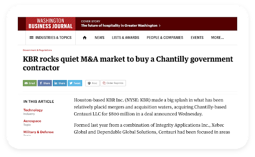
When Arlington Capital Partners acquired three leading companies in the national security sector, they turned to Bluetext to develop and launch a new unified brand from scratch. In less than six months, Centauri was born. Following the launch of the brand and a successful integrated go-to-market strategy that included PR, digital advertising, and social media, the firm went on a contract-winning spree and in less than two years, was acquired by industrial engineering juggernaut, KBR, for $800m. With an understanding of Arlington Capital’s goals from the outset, focused on raising the enterprise value of a combined entity, Bluetext was able to build a comprehensive marketing strategy that achieved the PE firm’s wildest dreams.
In Marketing, ROI is Everything
Let’s be clear, marketing can be an expensive undertaking. When you think about the various marketing tactics you can choose to include in your marketing strategy, consider every channel including but not limited to: direct marketing, public relations, digital marketing, advertising and promotion, and trade shows. While it would be great to put a significant budget toward each of these channels, that just isn’t feasible for the majority of companies out there. Just like you would diversify your stock portfolio, you should also diversify your marketing efforts, especially when starting out. Be smart about where you decide to invest your marketing dollars but don’t be afraid to commit to a research-driven marketing strategy.
Discuss internally the pros and cons of each channel, especially in the context of your competitors, industry, and customers, both existing and future. Additionally, determine if you can handle the execution of these marketing channels in-house, or if it may make sense to hire a marketing agency like Bluetext to take some of the load off of your internal team. Most importantly, however, is to establish clear metrics designed to capture ROI for each channel you decide to invest in and keep your internal and external teams accountable to them. Diversifying your marketing mix is the best way to ensure you’re increasing your brand awareness across a variety of customer-facing touchpoints, which will lead to an effective increase in perceived enterprise value from an investor perspective.
In Conclusion
There is no one-size-fits-all approach to marketing. That being said, having a strong understanding of your market, customer base, and short- and long-term business goals will strongly inform your marketing strategy and put you in the best position to succeed in increasing brand awareness, customer acquisition, and overall enterprise value. If you’re in need of support in putting together a comprehensive marketing strategy or a marketing partner to execute an already determined strategy, consider contacting Bluetext. For more than a decade, Bluetext has helped companies and private equity firms raise enterprise value. We specialize in planning, developing, and executing effective brand transformations to exceed business goals, with our clients benefitting from our deep creative expertise, seamless strategy, and innovative way of problem-solving.
“Should I use infinite scrolling versus pagination on this website?” is a question that many UX designers will ask themselves when starting a new project. Of course, the answer is “It depends.” This article explores the pros and cons of infinite scrolling and pagination to give you the context on when to use each in website design.
Infinite Scrolling
Infinite scrolling is a technique that allows users to scroll through a massive chunk of content with no finish line in sight. The page essentially refreshes as you continue scrolling, making it feel as if there is an infinite amount of content available. There are certainly some contexts for which this works very well but naturally, it does not suit each use case.

Pro #1: User Engagement
Infinite scrolling is best suited for instances where users are in “discovery mode”. When the user does not search for something specific, they need to see a large number of items to find the one thing they like.
The best examples of this are on social media, when users scroll through Facebook or Instagram they are excited to see what the next piece of content has to offer. Infinite scrolling affords exposure to as much information as possible at once, which means more information is consumed. The higher the exposure (in other words, impressions and reach), typically the higher the engagement is.
Pro #2: Scrolling Takes the Cake Over Clicking
Designing for users to click rather than scroll can cause a much longer user experience journey. Depending on the instance, we typically like to see scrolling used for quick actions that should be seamless for the user. For example, if you are looking to employ a tutorial for your new mobile app, you should consider a vertical or horizontal scroll experience to allow a seamless, one-page experience for your user. Clicking will impede their ability to quickly navigate through the tutorial and get to your app. Scrolling allows us to keep the user experience to remain easy-to-use and navigate.
Pro #3: Scrolling is Mobile-Friendly
Infinite scrolling is most frequently used on mobile devices where the screens are smaller. The smaller the screen, the smaller amount of information users can see within one viewport, which provides an excellent use case for infinite or long scrolling.
Con #1: Page Performance
Infinite scrolling requires the page to constantly “refresh” at the bottom to display more content. This scrolling undoubtedly affects your page speed and load time. Various research studies have shown that slow load times result in people leaving your site or deleting your app which results in low conversion rates. For that reason, it may be best to leave the long scroll at the door if you are looking to keep your website ranking high in SEO performance.
Con #2: Item and Search Location
For those looking to shop online or look for a specific resource, infinite scrolling doesn’t provide them the visual cue for where to find the item later. There is no ability to truly “bookmark” their place on the page, which can cause frustration if they go back later to find the same post.
Con #3: Scroll Bar Provides No Context
The scroll bar becomes irrelevant when you employ infinite scroll in your user experience. Users see the scroll bar and assume they’re close to the end of the page when in reality, the page will keep updating to show more content and there is no end in sight. It can be very misleading when users attempt to estimate the amount of data there is to surf through, which can cause frustration for the user and can lead them to leave your site.
Con #4: Absence of a Footer
With infinite scrolling, users will never reach the end of the page. This makes it difficult for them to ever find the footer, where important information and navigation links typically reside. Some ways around this are to make the footer sticky and always visible or collapse the footer into a sidebar. Alternatively, user experience designers can introduce a “load more” button that provides users with the ability to take control of their own experience on the site.
Pagination
Pagination is a user interface pattern that divides content into separate pages. If you see a row of numbers or pagination dots at the bottom of a page, then you are experiencing a site’s pagination.

Pro #1: Good Conversion
Pagination is great for an instance where users are looking for something specific. As we saw before, scrolling is perfect for discovery mode—now’s the time for a solution for identification mode. “Scrolling is a continuation while clicking is a decision” (Joshua Porter)
Pro #2: Control and Item Location
Providing pagination within your website’s user experience, users instantly have a sense of control over the information they are browsing. Providing numbers or icons to click on gives users the sense that they are making a decision for themselves.
In addition, pagination affords users the ability to remember an item’s location and navigate back to it at any time. For example, if you are on your favorite e-commerce website looking for the right sweater to buy this fall and you find one you like but aren’t quite ready to buy, you can take note of which page you viewed it on—maybe you even bookmark it since the URL has the exact item location within the page. Pagination gives us this opportunity to take control of our usage of the website and gives a sense of authority to the user.
Con #1: Clicking Means Extra Actions
When you require your users to click to see more information, you’re requiring them to take an extra step. One way to make this less cumbersome is to allow users to dictate how many items appear within each page so they can scroll through more content up front and then navigate to the next page.
Recap
When considering user engagement within website design, user experience designers should consider the end goal of the user. Are they looking to find a specific piece of content that they can easily refer back to? If so, pagination may be the best option for your website. But if you simply are looking for endless discovery and providing your end user with as much new information as possible, then infinite scrolling may be the best for you.
In the end, it is best to consult a UX design agency, like Bluetext, to recommend the best approach for your business.
Looking for a UX design agency to partner with for your next website? Contact Bluetext today.
In late 2021, Apple released its iOS 15 update with a pretty drastic change in browser layout, creating a ripple effect in website UX design. The beloved search bar on Safari had been moved from the top of the screen to the bottom. Many users, who are less familiar with the thought process behind UX design were left with one question. Why?
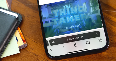
Well, according to MacRumors, the move was more functional than aesthetic. Think about how one naturally holds and operates a smartphone; usually held within the palm of the hand and touchscreen controlled by your thumbs from the bottom corners. Therefore, controls brought to the bottom of the screen are easier to reach with one hand. This feature also creates more space for users to focus on the webpage’s content.
Research confirms that “75% of users touch the screen with one thumb.” This has led UX designers to favor a thumb-driven design, placing the most important and frequently-used features at the bottom of the screen. This ensures easy access with one thumb.
Traditionally, many website designers place navigation in the top corners of the screen. While that works with a desktop device, due to the greater range of motion coming from the computer’s mouse, it does not translate that effectively to a mobile device. With the navigation menu being placed on the top corners of the screen, the range of motion that the user’s thumb has can restrict easy access to that navigation menu. Especially as technology evolves and mobile screens grow in size, users find themselves having to reposition their hands. This in turn slows down the user’s ability to navigate webpages and ingest content.
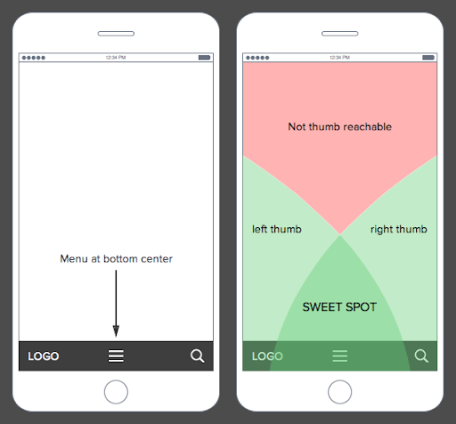
What’s the big deal? I just have to move my hand a little to be able to reach the top corner of my screen. The answer is simple: efficiency. Bottom menu navigation allows the user to accomplish tasks faster and with a greater level of comfortability, which really adds up considering that the average American spends 5.4 hours on their phones.
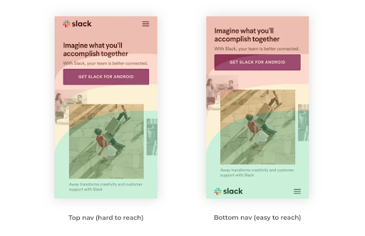
A lot goes into the design process, and it is not all about aesthetics. It’s about how the product functions. In today’s world, 55% of website traffic is generated using mobile devices, so functional and efficient mobile layouts for a website is imperative to the success of a brand. It is essential that UX designs make easy navigation a priority because the easier a product is to use the more often it will get used or recommended. That is why features like bottom navigation are so effective. Especially if it is designed in a streamlined way that makes content visible, clear, and simple.
As users experience the bottom menu trend, users will likely have to take some time to readjust. Looking ahead at UX design trends for 2022, there will be a continuation of the emphasis on overall usability, navigation, and aesthetics being driving forces for design. There is a desire to achieve a seamless experience, where user experience designers focus on the continuity and natural progression of connecting all the steps of finding a landing page to purchasing an item. It is imperative that functionality is favored, so it will be interesting to see more experimentation with navigation placement and overall screen flow on mobile devices in the future.
Does your website menu need a refresh? Contact Bluetext today to learn about our web and UX design services.
When we talk about motion in branding, we’re talking about a wide variety of creative approaches. From subtle homepage loading flourishes to complex, eye-catching 3D advertisements, animation can breathe new life into your brand. Today Bluetext will explore why motion design for logos is on the rise, when it’s best applied, and some of our favorite examples.
The digital landscape is crowded, to say the least. The average American spends a little over seven hours a day on the internet, and much of that time is spent surrounded by thousands of brands and advertisements. A well-done animation can help your brand stand out from the crowd and add essential layers of personality to your marketing collateral.
Whether your brand is neat and polished or playful and young, animation can reinforce those core characteristics without a single word. Picture the old Nickelodeon “splat” logo, for example. In 2009, a handful of disparate channels (TeenNick, Nick at Nite, etc.) were rolled into the Nickelodeon brand, and a new logo was unveiled to go along with the consolidation. The older logo’s animation had a younger, scrappier feel, while the current logo is much more refined, and gets at the large-scale, premium approach of Nickelodeon’s parent company, Paramount. These approaches are vastly different from one another, but there’s not one “right” answer when it comes to logo motion. Both animation styles are integral parts of the brand’s history and tell the story of a brand’s evolution. I’ve said it before and I’ll say it again: If a picture is worth a thousand words, an animation is worth a million.

Virtually any digital platform is an option when it comes to displaying an animated logo, but as they say, moderation is key. Instead of applying motion “just because,” it’s important to have intention behind the choice to display a static or animated logo. Here are a few of our favorite intentional applications of motion design in logos.
Use an animated logo when your space and time are limited
In cases where viewers may only see one or two components of an ad (scrolling quickly through a social feed, for example), you can convey more with an animated logo than you can with a static one. The key in these instances is to take up about the same amount of space and time as a static logo. This means your animation should be quick and to the point, like the example below from Nike. An added feature of Nike’s animation style is that they apply a different animation style depending on the audience and product, so each motion graphic feels uniquely suited to its context.

Amp up your site’s intro screen with logo motion
Along with the now-iconic “ta-dum” sound, Netflix’s loading visual is well-known and well-loved. Because the animation doubles as a loading screen, it doesn’t feel intrusive or overdone. It’s reminiscent of classic film grain, and it ensures that the Netflix visual identity is central to the viewer experience, regardless of whether the program is a Netflix original or not.

Animate your logo as part of a brand pattern
For Calling All Optimists, a GMAC brand, we developed an animated brand pattern using elements pulled directly from the brand’s logo. This is a handy asset in any brand’s toolbox, because it’s a custom element that can be used in place of stock imagery or generic graphics, and it can be front-and-center or fade into the background. You can explore our case study for Calling All Optimists here.

Tell a story about your brand using animation
Designtorget is a Swedish design house that sells all kinds of homewares, and their logo animation helps convey their line of business to unfamiliar customers. Using the “D” and “T” figures from their logo, shifting them around with other simple lines to portray things like a table and chairs and an abstract smiling person. This animation demonstrates the brand’s actual offerings while also presenting a playful, modern brand identity.
 Ready to explore how logo motion can boost your brand? Contact Bluetext to learn about our dynamic branding and motion design services.