In the dynamic and competitive landscape of B2B marketing, the ability to leverage data effectively has become a key differentiator between success and failure. While creativity and intuition still play crucial roles in content marketing, it’s data-driven insights that provide the foundation for informed decision-making, enabling marketers to create content that is not only engaging but also highly effective in driving business outcomes.
The Evolution of Data in B2B Content Marketing
The use of data in marketing is not a new concept, but the way it’s applied has evolved significantly over the years. In the early days, data was primarily used for basic demographic segmentation and campaign reporting. However, with advancements in technology and analytics, the scope of data usage has expanded dramatically. Today, B2B marketers have access to a wealth of data points, from website behavior and social media interactions to CRM data and third-party research.
This evolution has transformed the content marketing landscape. No longer are marketers left to rely on broad assumptions about their audience. Instead, they can tap into detailed insights that reveal specific preferences, behaviors, and pain points. This shift towards data-driven content marketing allows B2B companies to create highly targeted and personalized content that resonates deeply with their audience.
The Role of Data in Crafting B2B Content Strategies
Data is the linchpin that holds together a successful B2B content strategy. It informs every stage of the content lifecycle, from planning and creation to distribution and optimization. Here’s how data-driven insights can elevate your content marketing efforts:
- Audience Segmentation and Profiling: Understanding your audience is the first step in creating relevant content. Data-driven audience segmentation goes beyond basic demographics. It involves analyzing behavioral data, such as how different segments interact with your content, what topics they engage with most, and how they progress through the buyer’s journey. This deeper level of segmentation allows you to create content that speaks directly to the specific needs and challenges of each group, increasing the likelihood of engagement and conversion.
- Content Ideation and Creation: Data can be a powerful tool in the ideation phase of content creation. By analyzing search trends, social media discussions, and competitor content, you can identify gaps in the market and uncover topics that are highly relevant to your audience. Additionally, insights from previous content performance can guide the creation of new content, helping you to focus on formats and themes that have proven successful in the past.
- Personalization at Scale: Personalization is no longer just a buzzword; it’s a critical component of effective B2B content marketing. Data-driven personalization enables you to deliver tailored content experiences at scale. By leveraging data such as past interactions, purchase history, and content preferences, you can create personalized email campaigns, dynamic website content, and targeted social media ads that resonate with individual prospects and customers. This level of personalization can significantly enhance the effectiveness of your content, leading to higher engagement rates and stronger customer relationships.
- Predictive Analytics for Proactive Content Strategy: One of the most powerful applications of data in content marketing is predictive analytics. By analyzing historical data, predictive models can forecast future trends, behaviors, and needs of your audience. This foresight allows you to be proactive rather than reactive in your content strategy. For example, if predictive analytics indicate that a particular industry is about to experience a surge in demand for a specific solution, you can create content that addresses this need ahead of time, positioning your brand as a thought leader and a go-to resource.
- Content Performance Measurement and Optimization: The ability to measure and analyze content performance is essential for continuous improvement. Data provides insights into how your content is performing across different channels and audience segments. Key metrics such as engagement rates, time on page, conversion rates, and social shares can reveal what’s working and what’s not. Armed with this information, you can make data-driven decisions to optimize your content strategy, such as adjusting your content formats, refining your messaging, or reallocating resources to high-performing channels.
- Optimizing Content Distribution: Even the best content won’t deliver results if it doesn’t reach the right audience. Data-driven insights are invaluable in optimizing your content distribution strategy. By analyzing data on where and when your audience is most active, you can strategically distribute your content across the channels that are most likely to drive engagement. This could involve refining your email marketing strategy, choosing the optimal times to post on social media, or identifying niche industry platforms where your content can gain traction.
- Enhancing User Experience with Data-Driven Design: Data isn’t just useful for content creation; it also plays a critical role in enhancing the overall user experience (UX) on your digital platforms. By analyzing user behavior data, such as click paths, bounce rates, and heatmaps, you can gain insights into how users interact with your content. This information can inform the design and layout of your website, ensuring that your content is easy to find, read, and engage with. A seamless UX, supported by data-driven design, can greatly enhance the effectiveness of your content marketing efforts.
Turning Data into Actionable Insights
The use of data-driven insights in B2B content marketing is not just a trend; it’s a necessity in today’s competitive landscape. By harnessing the power of data, B2B companies can create more targeted, personalized, and effective content strategies that resonate with their audience and drive meaningful business results.
At Bluetext, we understand the critical role that data plays in content marketing success. Our team of experts specializes in helping B2B companies unlock the full potential of their data to create compelling content that drives engagement, builds trust, and converts leads into customers. Whether you’re looking to enhance your content strategy, improve your content distribution, or leverage predictive analytics for proactive planning, Bluetext has the expertise and tools to help you achieve your goals.
Ready to take your content marketing to the next level? Contact Bluetext today to learn how we can support your data-driven content marketing efforts and help you stay ahead of the competition. Let’s turn your data into actionable insights that drive real results for your business.
Prefer listening over reading? Check out the podcast version of this blog below and enjoy insights on the go!
In the ever-evolving landscape of social media, staying ahead of algorithm changes is essential for marketers, business owners, and content creators alike. Social media algorithms dictate what content users see, and understanding these algorithms is key to maximizing your content’s reach and engagement. At Bluetext, we believe that a well-informed strategy is the foundation of success in digital marketing. This blog post will guide you through the intricacies of social media algorithms and provide actionable strategies to optimize your content for greater visibility across various platforms.
Understanding Social Media Algorithms
What Are Social Media Algorithms?
Social media algorithms are complex systems that determine which content is shown to users, based on various factors like engagement, content type, recency, and user behavior. Each platform—whether it’s Facebook, Instagram, Twitter, LinkedIn, or TikTok—has its own unique algorithm, designed to enhance user experience by showing them the most relevant content.
Key Factors Influencing Algorithmic Ranking:
- Engagement Rates: Likes, comments, shares, and other forms of interaction play a significant role in determining the visibility of your content.
- Content Type: Videos, images, text posts, and other formats are weighted differently across platforms. Understanding what type of content each platform favors can significantly impact your reach.
- Recency: Fresh content is often prioritized, but the longevity of a post’s engagement can also influence its continued visibility.
- User Behavior: Algorithms consider individual user behavior to tailor content. For instance, users who frequently engage with video content are more likely to see similar content in their feed.
Platform-Specific Strategies
Facebook & Instagram:
- Leverage Stories, Reels, and Carousels: These formats are highly favored by the algorithms on both platforms. Stories and Reels, in particular, allow you to stay top-of-mind with your audience through creative and engaging content.
- Encourage Interaction: The more engagement your post receives, the more the algorithm will favor it. Ask questions, create polls, and encourage users to like, comment, and share your posts.
Twitter:
- Consistent Posting: Twitter’s fast-paced environment requires regular posting to stay visible. Aim to tweet multiple times a day to maintain a presence.
- Use Hashtags and Engage with Trending Topics: Hashtags are critical for discoverability. Engaging with trending topics can also boost your visibility, as Twitter’s algorithm favors content that is timely and relevant.
- Maximize Retweets and Replies: The more your content is retweeted or replied to, the better it performs in the algorithm. Foster conversation by asking questions and engaging with your audience directly.
LinkedIn:
- Professional Content Matters: LinkedIn favors professional and industry-related content. Utilize LinkedIn Articles and videos to share in-depth insights that resonate with your network.
- Engagement is Key: Comments and interactions with your network can amplify your content’s reach. Take time to reply to comments and engage with posts from others in your network.
TikTok:
- Create Trend-Focused Content: TikTok’s algorithm heavily favors content that aligns with current trends. Participating in challenges and using trending sounds can greatly enhance your visibility.
- Timing and Frequency: Posting at times when your target audience is most active and maintaining a consistent posting schedule can help your content perform better.
Content Creation Techniques
To optimize your content for social media algorithms, consider the following techniques:
- Tailor Content to Each Platform: Each social media platform has its own preferences. Craft content that aligns with these preferences to increase the likelihood of it being seen.
- Storytelling and Visual Appeal: Compelling stories and visually appealing content are more likely to capture attention and encourage engagement.
- Call-to-Action: A strong call-to-action (CTA) can drive user engagement and signal to the algorithm that your content is valuable.
Staying Updated with Algorithm Changes
Algorithms are constantly evolving, which means your social media strategy needs to be adaptable. Stay informed about changes by following industry news, participating in relevant forums, and using tools that monitor algorithm updates. This proactive approach will help you adjust your content strategy as needed, ensuring your content remains visible and engaging.
Measuring Success
Tracking the right metrics is crucial to understanding the effectiveness of your social media strategy. Key metrics to monitor include:
- Engagement Rates: Track likes, shares, comments, and other interactions to gauge how well your content is resonating with your audience.
- Reach and Impressions: Monitor how far your content is spreading and how many times it’s being seen.
- Conversion Rates: Measure how well your social media efforts are driving desired actions, such as clicks, sign-ups, or purchases.
Regularly reviewing these metrics will allow you to refine your strategy, ensuring continuous optimization and improvement in your content’s reach and impact.
Understanding and optimizing for social media algorithms is no small task, but with the right strategies, you can significantly boost your content’s visibility and engagement. At Bluetext, we’re dedicated to helping you navigate the complexities of digital marketing. If you’re ready to take your social media strategy to the next level, reach out to us for a consultation. Let’s work together to create content that not only meets but exceeds algorithmic expectations.
Take this blog post on the go! Listen to our podcast version for a convenient way to stay up-to-date on marketing trends and strategies.
Search engine optimization (SEO) has come a long way from its early days of keyword stuffing and link farming. As search engines have become more sophisticated, so too have the strategies needed to achieve high rankings. The evolution from keyword-centric SEO to a more nuanced approach that prioritizes semantic search and intent matching reflects the growing importance of understanding not just what users are searching for, but why they are searching for it.
At Bluetext, we recognize that staying ahead of these changes is crucial for brands that want to maintain a competitive edge. In this blog, we’ll explore the shift from traditional keyword-based SEO to the more advanced techniques of semantic search optimization. We’ll also provide actionable strategies for creating content that aligns with user intent, earns featured snippets, and ranks well in voice search results.
The Shift to Semantic Search
In the past, SEO was largely about identifying the right keywords and using them in the right places on a webpage. While keywords are still important, search engines like Google have advanced to the point where they can understand the context and meaning behind those keywords. This is known as semantic search.
Semantic search focuses on understanding the intent behind a user’s query and delivering results that are contextually relevant. For example, a user searching for “best running shoes” might be interested in different things depending on whether they’re a casual jogger or a marathon runner. Search engines now aim to understand these nuances and provide results that are more aligned with the user’s intent.
Understanding User Intent
User intent is the underlying goal a user has when they type a query into a search engine. There are generally four types of user intent:
- Informational Intent: The user is looking for information on a particular topic. Example: “How to train for a marathon.”
- Navigational Intent: The user wants to find a specific website or page. Example: “Nike running shoes.”
- Commercial Intent: The user is doing research on a particular product. Example: “Nike running shoe review.”
- Transactional Intent: The user is ready to make a purchase or take a specific action. Example: “Buy best running shoes for marathon.”
Understanding user intent is key to creating content that not only ranks well but also meets the needs of your audience. Instead of simply targeting keywords, focus on the intent behind those keywords and create content that satisfies that intent.
Strategies for Semantic SEO
To optimize for semantic search, consider the following strategies:
- Create Content Clusters: Organize your content around key topics or themes rather than individual keywords. For example, if your main topic is “running shoes,” create clusters of content that cover related subtopics like “types of running shoes,” “how to choose the right running shoes,” and “running shoe reviews.” This approach helps search engines understand the context of your content and boosts your chances of ranking for a wider range of related queries.
- Use Natural Language: Write your content in a way that mimics how people naturally speak and search. This is especially important for voice search optimization, where queries are often longer and more conversational.
- Answer Questions Directly: Featured snippets are often triggered by questions, so focus on providing clear, concise answers to common queries in your content. Use headings, bullet points, and tables to make your answers easy to find and understand.
- Optimize for Voice Search: With the rise of smart speakers and virtual assistants, voice search is becoming increasingly important. To optimize for voice search, focus on long-tail keywords and natural language queries. Also, consider the types of questions people might ask out loud and provide direct answers in your content.
Earning Featured Snippets
Featured snippets are the short answers that appear at the top of Google’s search results, often in response to a question. Earning a featured snippet can significantly boost your visibility and click-through rates. Here’s how to increase your chances:
- Identify Snippet Opportunities: Use tools like Ahrefs or SEMrush to find keywords that trigger featured snippets and are relevant to your content.
- Format Your Content for Snippets: Structure your content in a way that makes it easy for Google to extract a snippet. Use headings, lists, and tables to organize information clearly and concisely.
- Provide Comprehensive Answers: Featured snippets often pull from content that provides a thorough answer to a query. Make sure your content is detailed and covers all aspects of the topic.
The evolution of SEO from keywords to semantic search and intent matching represents a significant shift in how brands need to approach their digital marketing strategies. By focusing on user intent and creating content that aligns with that intent, brands can not only improve their search rankings but also deliver a better experience for their audience.
At Bluetext, we’re committed to helping brands navigate this ever-changing landscape. Whether you’re looking to optimize for semantic search, earn featured snippets, or rank well in voice search results, we have the expertise to help you succeed. Let’s work together to take your SEO strategy to the next level.
In today’s digital marketplace, trust is a key factor in driving sales. With countless options at consumers’ fingertips, establishing credibility is essential for any brand looking to stand out. One of the most effective ways to build this trust is through social proof. By leveraging testimonials, reviews, and case studies, you can create a compelling narrative that resonates with potential customers and drives conversions. In this post, we’ll explore how to effectively use social proof to enhance credibility and boost sales.
What is Social Proof?
Social proof is the psychological phenomenon where people look to the actions and opinions of others to determine their own. In the context of marketing, social proof involves showcasing positive feedback from customers, experts, or influencers to reassure potential buyers of your product’s value. This validation from others helps reduce skepticism and fosters a sense of trust.
The Power of Testimonials
Testimonials are personal endorsements from satisfied customers, and they can be incredibly persuasive. Here are a few ways to make the most of testimonials:
- Authenticity is Key: Ensure that testimonials are genuine and relatable. Authentic testimonials resonate more with potential customers than overly polished or generic statements.
- Highlight Specific Benefits: Encourage customers to focus on specific benefits or results they experienced. This provides concrete examples of how your product or service can solve problems or improve lives.
- Use Multiple Formats: Incorporate testimonials in various formats, including text, video, and audio. Video testimonials, in particular, can be very impactful as they convey emotion and authenticity more effectively.
- Feature Diverse Voices: Showcase testimonials from a diverse range of customers to appeal to different segments of your audience. This inclusivity can help more people see themselves benefiting from your product or service.
Leveraging Reviews
Online reviews are another powerful form of social proof. Here’s how to leverage them effectively:
- Encourage Reviews: Actively encourage satisfied customers to leave reviews on platforms like Google, Yelp, and industry-specific sites. More reviews increase credibility and visibility.
- Respond to Feedback: Engage with both positive and negative reviews. Responding to feedback shows that you value customer opinions and are committed to improving your products and services.
- Highlight Key Reviews: Feature positive reviews prominently on your website and marketing materials. Use quotes or ratings from well-known review platforms to enhance credibility.
- Use Aggregate Ratings: Display aggregate ratings (e.g., 4.8 out of 5 stars) to provide a quick snapshot of overall customer satisfaction. This can be especially persuasive for new visitors.
The Impact of Case Studies
Case studies offer an in-depth look at how your product or service has helped specific customers achieve their goals. They provide detailed narratives that can be incredibly convincing. Here’s how to create compelling case studies:
- Tell a Story: Craft case studies that tell a compelling story with a clear beginning, middle, and end. Highlight the challenges faced by the customer, the solution provided by your product, and the positive outcomes achieved.
- Use Data and Metrics: Include concrete data and metrics to quantify the success. Statistics and measurable results add credibility and help potential customers understand the tangible benefits.
- Incorporate Quotes and Testimonials: Enhance your case studies with quotes and testimonials from the featured customer. Personal anecdotes add a human touch and make the case study more relatable.
- Focus on Various Use Cases: Create case studies that cover different use cases and industries. This diversity demonstrates the versatility and wide-ranging benefits of your product or service.
Building Trust Through Influencers
Influencer endorsements are another form of social proof that can significantly impact consumer trust. Collaborating with influencers who have a loyal following can help amplify your message and reach new audiences. Here’s how to leverage influencer partnerships:
- Choose the Right Influencers: Partner with influencers who align with your brand values and have an engaged audience that matches your target demographic.
- Create Authentic Content: Work with influencers to create authentic content that showcases their genuine experiences with your product. Authenticity is crucial for maintaining credibility.
- Leverage Multiple Channels: Utilize various platforms, such as Instagram, YouTube, and blogs, to reach a broader audience. Different channels can offer unique ways to showcase your product.
- Measure Impact: Track the performance of influencer campaigns through engagement metrics, traffic, and sales. Use this data to refine your strategy and maximize ROI.
Conclusion
Incorporating social proof into your marketing strategy is essential for building trust and driving sales. By effectively using testimonials, reviews, case studies, and influencer endorsements, you can create a persuasive narrative that resonates with potential customers and boosts credibility. At Bluetext, we specialize in helping brands leverage social proof to achieve their marketing goals.
Ready to harness the power of social proof? Contact us today to learn how we can help you build trust and drive sales through powerful social proof strategies.
In today’s competitive job market, attracting and retaining top talent is more critical than ever. A strong employer brand not only draws the best candidates but also fosters a sense of pride and loyalty among current employees. At Bluetext, we believe that a well-crafted employer brand is a powerful tool that aligns with your company’s values and culture. Here, we discuss strategies for building an employer brand that stands out.
Understanding Employer Branding
An employer brand is the perception of your company as a place to work. It encompasses your company’s mission, values, culture, and the employee experience. A strong employer brand communicates to potential employees why they should choose your company over others and reassures current employees that they made the right choice.

Strategies for Building an Attractive Employer Brand
1. Define Your Company Values and Culture
Start by clearly defining your company’s core values and culture. What makes your company unique? What do you stand for? Ensure these values are not just words on a website but are actively reflected in your day-to-day operations. Conduct surveys and focus groups with your employees to understand their perspective on the company’s culture and values.
2. Craft a Compelling Employee Value Proposition (EVP)
An Employee Value Proposition (EVP) is a clear statement that outlines the benefits and opportunities employees can expect from your company. It should include aspects like career development opportunities, work-life balance, company culture, and rewards. Make sure your EVP is aligned with the values and culture you want to promote.
3. Showcase Employee Stories
One of the most effective ways to build an authentic employer brand is by sharing real stories from your employees. Create videos, blog posts, and social media content featuring employees discussing their experiences, growth, and what they love about working at your company. These stories provide a genuine glimpse into your company culture and can be a powerful recruitment tool.
4. Optimize Your Online Presence
Your company website and social media profiles are often the first points of contact for potential employees. Ensure that your careers page is up-to-date and visually appealing, highlighting your company’s culture, values, and employee benefits. Use social media to showcase your workplace culture, employee achievements, and company events.
5. Invest in Employee Development
Top talent is attracted to companies that invest in their growth and development. Offer training programs, mentorship opportunities, and clear career progression paths. Encourage continuous learning and provide resources for professional development. When employees see that you are committed to their success, they are more likely to stay and thrive within your company.
6. Foster a Positive Workplace Environment
A positive workplace environment is crucial for retaining top talent. Promote a healthy work-life balance, recognize and reward employee achievements, and create an inclusive and supportive culture. Address any issues or concerns promptly and ensure that all employees feel valued and heard.
7. Leverage Employee Advocacy
Your employees can be your best brand ambassadors. Encourage them to share their positive experiences on social media and professional networks. Implement an employee referral program to incentivize them to bring in new talent. When employees genuinely advocate for your company, it enhances your employer brand’s credibility and reach.
Measuring the Impact of Your Employer Brand
To ensure that your employer branding efforts are effective, it’s important to measure their impact. Track metrics such as employee retention rates, the quality of job applicants, employee satisfaction scores, and social media engagement. Regularly solicit feedback from employees and new hires to identify areas for improvement.
Conclusion
Building a strong employer brand is not a one-time effort but an ongoing process that requires commitment and consistency. By defining your values, crafting a compelling EVP, showcasing employee stories, optimizing your online presence, investing in employee development, fostering a positive workplace environment, and leveraging employee advocacy, you can create an employer brand that attracts and retains top talent.
At Bluetext, we specialize in helping companies build and enhance their employer brands. Contact us today to learn how we can help you attract the best talent and build a workplace culture that aligns with your company’s values and vision.
In the dynamic world of government contracting, the key to success lies in understanding and effectively targeting the Ideal Government Persona (IGP). At Bluetext, we recognize that this approach not only optimizes marketing efforts but also maximizes the potential for winning contracts. Here’s how you can refine your strategy to connect with the right government audience.
Understanding the Ideal Government Persona (IGP)
The Ideal Government Persona (IGP) represents a composite profile of your target decision-makers within government agencies. These personas are crafted based on extensive research, including demographic data, job responsibilities, challenges, goals, and preferences. By honing in on the IGP, your marketing efforts can become more precise and impactful.
Steps to Identifying Your IGP
1. Research and Data Collection
Begin with thorough research. Utilize available data sources such as agency reports, market research, and industry analysis. Key information includes:
- Agency size and structure
- Roles and responsibilities of decision-makers
- Budget cycles and procurement processes
- Current pain points and needs
2. Segment Your Audience
Government agencies vary widely, from federal to state and local levels, each with distinct characteristics. Segment your audience based on criteria such as agency type, size, location, and specific operational needs.
3. Create Detailed Personas
Develop detailed profiles for your IGPs. These should include:
- Demographics: Age, education, job title, and career background
- Goals: What they aim to achieve in their roles
- Challenges: Key issues and pain points they face
- Influence: How they influence purchasing decisions and the buying cycle
- Communication Preferences: Preferred channels and content types (e.g., white papers, webinars, social media)
4. Map the Buyer’s Journey
Understand the journey your IGP takes from awareness to decision-making. Map out the stages and identify the touch points where you can engage effectively. This helps in creating targeted content and campaigns that align with their needs at each stage.
Crafting Your Messaging
1. Address Their Pain Points
Tailor your messaging to address the specific challenges and pain points of your IGP. Highlight how your solutions can alleviate these issues and contribute to the agency’s success.
2. Showcase Value and ROI
Government decision-makers are often driven by budget constraints and accountability. Clearly articulate the value and return on investment (ROI) your solutions offer. Use case studies, testimonials, and success stories to build credibility.
3. Use Government-Friendly Language
Speak the language of your audience. Use terminology and references familiar to government officials. This not only establishes rapport but also demonstrates your understanding of their environment.
4. Leverage Thought Leadership
Position your brand as an industry thought leader. Share insights through blogs, white papers, webinars, and speaking engagements. Providing valuable, relevant content builds trust and positions your company as a go-to resource.
Optimizing Your Channels
1. Government-Specific Platforms
Utilize platforms frequented by government officials, such as GovLoop, GSA’s eBuy, and FedBizOpps. Participate in industry conferences and government procurement events to increase visibility.
2. Social Media Engagement
Engage on social media platforms like LinkedIn and Twitter, where many government professionals are active. Share informative content and participate in relevant discussions to expand your reach.
3. Email Campaigns
Develop targeted email campaigns with personalized content tailored to your IGPs. Ensure your emails provide valuable insights and solutions, not just promotional material.
4. Search Engine Optimization (SEO)
Optimize your online content for search engines to ensure your materials are easily discoverable by government officials searching for solutions. Use relevant keywords and phrases that align with their search behavior.
Measuring Success
Track the effectiveness of your IGP-targeted campaigns using metrics such as engagement rates, lead generation, and conversion rates. Regularly review and adjust your strategies based on data insights to continually improve your targeting and outreach efforts.
Conclusion
Targeting the Ideal Government Persona is a strategic approach that can significantly enhance your success in the government contracting arena. By understanding and engaging with your IGP, you can create more meaningful connections, provide relevant solutions, and ultimately win more contracts. At Bluetext, we’re here to help you navigate this complex landscape and achieve your government contracting goals. Contact us today to learn more about our tailored marketing solutions for government contractors.
In today’s highly competitive market, brand strength is more than just a logo or a catchy slogan; it’s a powerful asset that can significantly enhance a company’s value. At Bluetext, we understand that building a robust brand is essential not only for customer engagement but also for driving substantial financial performance, especially in the context of private equity. In this blog post, we’ll explore how enhancing your brand can directly correlate to increased value and positively impact private equity returns.
The Power of a Strong Brand
A strong brand differentiates a company in the marketplace, creating a lasting impression and fostering loyalty among customers. But beyond these qualitative benefits, a well-established brand translates into tangible financial gains. Here’s how:
- Market Perception and Customer Loyalty: A compelling brand narrative and consistent messaging build trust and loyalty. Customers are more likely to purchase from a brand they recognize and trust, which leads to higher sales and repeat business. This loyalty also allows companies to command premium pricing, further boosting revenue.
- Competitive Edge: In industries saturated with similar products and services, a strong brand stands out. This differentiation can lead to increased market share and better margins. For private equity firms, investing in companies with a clear and distinct brand can mean a more secure investment and a quicker path to profitability.
- Attracting Talent: Top talent is drawn to companies with strong, positive brand identities. High-caliber employees drive innovation and efficiency, improving overall business performance. This is particularly important for private equity-owned firms where operational improvements can lead to significant value creation.
- Customer Acquisition Costs: A recognizable brand can reduce marketing and customer acquisition costs. When a brand is well-known and trusted, word-of-mouth and organic growth through repeat customers become powerful tools, lowering the overall expenditure on marketing efforts.
The Impact on Private Equity Performance
Private equity (PE) firms seek investments that promise substantial returns, and brand strength is a critical factor in achieving this. Here’s why:
- Valuation Multiples: Companies with strong brands often command higher valuation multiples. During the acquisition phase, PE firms can justify paying a premium for a company with a robust brand because of the long-term value it promises. When it’s time to exit, these same firms can sell the brand for a higher multiple, ensuring a lucrative return on investment.
- Faster Time to Exit: A company with a strong brand can achieve growth milestones quicker, making it an attractive acquisition target or IPO candidate. The enhanced market perception and customer loyalty contribute to a faster and more profitable exit strategy for PE firms.
- Risk Mitigation: A strong brand can act as a buffer during economic downturns. Loyal customers are less likely to switch to competitors, providing a more stable revenue stream. This stability reduces the investment risk for PE firms, making strong brands a safer bet.
- Operational Efficiency: As mentioned earlier, attracting top talent is easier for well-branded companies. Skilled employees drive operational improvements, which can be critical in the high-stakes environment of private equity. These operational efficiencies translate to improved margins and higher overall company value.
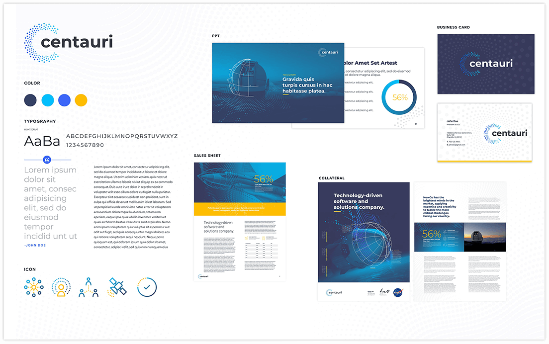
Conclusion
Building a strong brand is not merely a marketing exercise; it’s a strategic investment that can drive significant financial performance and enhance private equity returns. At Bluetext, we specialize in creating compelling brand stories that resonate with customers and drive business growth. By focusing on brand strength, private equity firms can unlock new levels of value and achieve exceptional performance in their portfolios.
Whether you’re a business looking to attract investment or a private equity firm seeking to enhance your portfolio’s performance, investing in your brand is a critical step towards success. Contact Bluetext today to learn how we can help build your brand and, in turn, build your value.
In the fiercely competitive landscape of private equity, standing out from the crowd is not just desirable; it’s essential. With a multitude of firms vying for attention and investor trust, the challenge of differentiation looms large. However, mastering the art of branding can set your private equity firm apart, creating a compelling identity that resonates with investors and stakeholders alike. At Bluetext, we understand the importance of crafting unique and impactful branding strategies tailored specifically for private equity firms. Let’s delve into the nuances of this art form and explore how your firm can leverage branding to carve out its niche in the market.
Embrace New Trends in Branding
In today’s fast-paced digital landscape, staying ahead of the curve means embracing new trends in branding. From immersive experiences and interactive content to personalized marketing automation and influencer partnerships, there are countless opportunities to elevate your brand and engage with your audience in meaningful ways. By keeping a finger on the pulse of emerging trends and technologies, your firm can stay relevant and capture the attention of investors in an increasingly crowded market.
Roll Up Brands into One Cohesive Narrative
For private equity firms with multiple portfolio companies, creating a cohesive brand narrative can be a powerful branding strategy. By aligning the values, messaging, and visual identity of each portfolio company under a single overarching brand narrative, your firm can strengthen its position in the market and create synergies across its investment portfolio. Whether it’s through a shared mission or a unified brand story, rolling up brands into one cohesive narrative can help differentiate your firm and maximize the impact of your investments.
Harness the Power of Naming
In the world of branding, a name can make all the difference. A distinctive and memorable name can help your firm stand out in a sea of competitors and capture the attention of investors. Whether it’s a bold and innovative name that reflects your firm’s forward-thinking approach or a timeless and classic name that evokes trust and reliability, choosing the right name can set the tone for your brand and shape how it is perceived by others. Invest time and resources into selecting a name that not only differentiates your brand but also resonates with your target audience and aligns with your firm’s values and vision.
Define Your Value Proposition
At the heart of every successful brand lies a clear and compelling value proposition. For private equity firms, this means articulating what sets you apart from the competition. Whether it’s your specialized expertise in a particular industry, your track record of successful investments, or your unique approach to value creation, your value proposition should resonate with your target audience and clearly communicate the benefits of partnering with your firm.
Establish Your Brand Personality
Just like individuals, brands have personalities that shape how they are perceived by others. For private equity firms, cultivating a strong brand personality can help humanize your firm and foster deeper connections with investors. Whether you want to be seen as innovative and forward-thinking, trustworthy and reliable, or bold and dynamic, your brand personality should be consistent across all touch points, from your website and marketing materials to your interactions with clients and stakeholders.
Leverage Thought Leadership
In an industry driven by expertise and insights, positioning your firm as a thought leader can be a powerful branding strategy. By sharing your knowledge and perspectives through thought leadership content such as whitepapers, articles, and webinars, you can demonstrate your firm’s expertise, build credibility with investors, and differentiate yourself from competitors. Thought leadership also provides an opportunity to showcase your unique approach to investing and value creation, further reinforcing your brand identity.
Cultivate a Strong Visual Identity
In the world of branding, first impressions matter. A strong visual identity not only helps your firm stand out visually but also communicates important aspects of your brand personality and values. From your logo and color palette to your website design and marketing collateral, every element of your visual identity should be carefully crafted to reflect your firm’s unique identity and resonate with your target audience.
Foster Authentic Relationships
At its core, branding is about building relationships – with investors, with stakeholders, and with the broader community. For private equity firms, fostering authentic relationships is crucial for establishing trust and credibility in the market. Whether it’s through personalized communication, transparent reporting, or active engagement in industry events and networking opportunities, investing in relationships can pay dividends in building a strong and resilient brand.
Prioritize Brand Consistency
Consistency is key to building a strong and recognizable brand. Ensure that all aspects of your brand – from messaging and visuals to tone of voice and customer experience – remain consistent across all channels and touchpoints. This includes your website, social media profiles, marketing materials, and even internal communications. Consistency breeds trust and familiarity, making it easier for investors to connect with your brand and understand what you stand for.
Tell Compelling Stories
In a world inundated with information, storytelling can be a powerful tool for capturing attention and making an emotional connection with your audience. Share compelling stories about your firm’s journey, successes, and the impact of your investments. Highlighting real-world examples of how your firm has added value to portfolio companies and helped them achieve their goals can showcase your expertise and differentiate your brand in a meaningful way.
Monitor and Adapt
The branding landscape is constantly evolving, and what works today may not necessarily work tomorrow. Stay vigilant and monitor industry trends, market dynamics, and shifts in investor preferences. Be prepared to adapt your branding strategies accordingly, whether it’s updating your messaging to reflect changing market conditions, refreshing your visual identity to stay relevant, or pivoting your thought leadership efforts to address emerging topics and concerns. By staying agile and responsive, your firm can remain competitive and continue to stand out in a rapidly changing environment.
In conclusion, the art of differentiation is a nuanced and multifaceted endeavor, but with the right branding strategies in place, private equity firms can elevate their presence in the market and attract the attention of investors and stakeholders. By embracing new trends in branding, rolling up brands into one cohesive narrative, harnessing the power of naming, defining a clear value proposition, and establishing a strong brand personality, your firm can carve out its niche and thrive in the competitive landscape of private equity. At Bluetext, we’re here to help you navigate this journey and unlock the full potential of your brand. Contact us today to learn more.
In the fast-paced world of private equity investments, the journey from acquisition to exit is akin to navigating a complex maze with countless opportunities and challenges. At the heart of this journey lies the potential for brands to not only survive but thrive under new ownership. As a leading marketing agency specializing in guiding businesses through this transformative process, we understand the critical role that effective branding plays in maximizing value and ensuring a successful exit strategy.
Acquisition: Setting the Stage for Growth
Acquisition marks the beginning of a new chapter for any brand. Whether it’s a strategic move to expand market share or a bold venture into new territories, the initial phase sets the stage for future growth. This is where our expertise comes into play. By conducting in-depth market research and analysis, we identify key opportunities and develop tailored strategies to position the brand for success in its new environment. From refining brand messaging to optimizing digital presence, our comprehensive approach lays the foundation for sustained growth and value creation.
Adaptation: Staying Agile in a Dynamic Landscape
In the dynamic landscape of private equity investments, the ability to adapt and evolve is paramount. Market conditions can change rapidly, and brands must stay agile to seize new opportunities and mitigate risks effectively. Through ongoing monitoring and optimization, we ensure that brands remain responsive to emerging trends, allowing them to pivot strategies and capitalize on evolving consumer preferences. By staying ahead of the curve, brands can maintain a competitive edge and drive sustainable growth throughout the investment lifecycle.
Maximization: Enhancing Brand Visibility and Engagement
As the investment horizon progresses, our focus shifts towards maximizing brand visibility and engagement to enhance market penetration and drive revenue growth. Leveraging a mix of traditional and digital marketing channels, we create integrated campaigns that resonate with target audiences and reinforce brand loyalty. By fostering meaningful connections and delivering compelling brand experiences, we help brands stand out in crowded marketplaces and unlock new avenues for growth.
Value Creation: Strategizing for a Successful Exit
However, achieving a successful exit requires more than just strong branding. It demands a strategic approach to value creation and investor relations. Our team works closely with brands to identify areas of opportunity and implement initiatives that enhance shareholder value. Whether it’s through strategic partnerships, product innovation, or geographic expansion, we leverage our expertise to position the brand as an attractive investment opportunity with significant growth potential. By aligning business objectives with investor expectations, we pave the way for a seamless exit that delivers maximum returns for stakeholders.
Navigating the Journey of a PE Investment
In conclusion, navigating the journey from acquisition to exit in private equity investments requires a strategic and proactive approach to branding. As a leading marketing agency, we are committed to helping brands maximize their potential and achieve their business objectives. From refining brand positioning to driving revenue growth, our comprehensive suite of services is designed to deliver tangible results at every stage of the investment lifecycle. With our expertise and dedication, we empower brands to thrive in the dynamic world of private equity investments and emerge as market leaders in their respective industries.
Interested in partnering with us to maximize your ROI? Contact us.
As the seasons change, it’s the perfect time to breathe new life into your social media strategy. With platforms like LinkedIn, Instagram, TikTok, and Reddit constantly evolving, staying ahead means adapting and refreshing your approach. In this comprehensive guide, we’ll explore 15 dynamic ways to revitalize your social media presence across these diverse platforms. From tailoring your profile for each audience to embracing the latest trends and features, let’s dive into how you can embrace the spirit of renewal and rejuvenate your online presence this spring.
- Tailor Your Profile for Each Platform
Customize your profile on LinkedIn, Instagram, TikTok, and Reddit to resonate with the unique audience and features of each platform. From professional snapshots on LinkedIn to visually captivating content on Instagram, ensure consistency while adapting your narrative to suit the platform’s tone and audience expectations. - Cross-Platform Consistency
Maintain a consistent brand identity across all platforms while adapting to their respective nuances. Harmonize visual aesthetics, tone, and messaging to foster recognition and trust among your diverse audience base. Seamlessly integrate your contact information across platforms for streamlined communication and accessibility. - Revitalize Your LinkedIn Showcase Pages
Take advantage of LinkedIn Showcase Pages to spotlight specific aspects of your business or offerings. Refresh these pages with engaging content, including product updates, industry insights, and thought leadership articles. By curating compelling content, you enhance brand visibility and attract targeted audiences within the professional realm. - Elevate Your Instagram Stories
Make a statement with vibrant and dynamic Instagram Stories that captivate your audience’s attention. Utilize features like polls, quizzes, and countdowns to encourage interaction and feedback. Showcase behind-the-scenes glimpses, product demonstrations, or user-generated content to foster authenticity and engagement. - TikTok Trends and Challenges
Stay abreast of trending topics and challenges on TikTok to capitalize on viral content opportunities. Experiment with creative storytelling formats, catchy music, and engaging visual effects to resonate with the platform’s youthful audience. Embrace authenticity and humor to forge authentic connections and drive engagement. - Engage with Reddit Communities
Immerse yourself in relevant Reddit communities (subreddits) to foster meaningful discussions and connections. Participate in AMAs (Ask Me Anything), share valuable insights, and respond to inquiries to establish credibility and rapport within the community. Avoid overt self-promotion and prioritize adding value to the conversation. - Combat Bot Followers Across Platforms
Identify and remove bot followers across LinkedIn, Instagram, TikTok, and Reddit to cultivate an authentic and engaged audience. Regularly audit your follower lists and cleanse them of suspicious or inactive accounts. By prioritizing genuine interactions, you enhance credibility and foster organic growth on each platform. - Harness LinkedIn Live for Engaging Content
Harness the power of LinkedIn Live to broadcast live events, Q&A sessions, and industry discussions to your professional network. Leverage this feature to humanize your brand, share valuable insights, and engage directly with your audience in real time. Amplify reach by promoting upcoming broadcasts across other social media channels. - Instagram Reels for Creative Expression
Embrace Instagram Reels as a versatile tool for creative expression and storytelling. Experiment with short-form videos to showcase your brand’s personality, highlight product features, or share educational content. Leverage trending audio tracks, effects, and hashtags to maximize discoverability and engagement. - TikTok Influencer Collaborations
Forge strategic partnerships with TikTok influencers to amplify your brand’s reach and relevance. Collaborate on engaging challenges, branded content, or sponsored posts tailored to resonate with the influencer’s audience. Leverage their authenticity and influence to enhance brand credibility and drive user engagement. - LinkedIn Articles for Thought Leadership
Establish thought leadership on LinkedIn by publishing insightful articles that showcase your expertise and industry insights. Share actionable tips, case studies, or research findings to provide value to your professional network. Engage with comments and discussions to foster meaningful connections and expand your influence. - Instagram IGTV Series
Create episodic IGTV series on Instagram to deliver long-form content and storytelling to your audience. Develop thematic series around product launches, customer testimonials, or behind-the-scenes glimpses into your brand. Encourage audience interaction and feedback to foster a sense of community and connection. - TikTok Duet and Stitch Features
Leverage TikTok’s Duet and Stitch features to collaborate with users, respond to trends, and engage with the community creatively. Seamlessly interact with user-generated content by adding your unique twist or commentary through duets and stitches. Embrace spontaneity and authenticity to resonate with TikTok’s vibrant user base. - Reddit AMA Sessions
Host Reddit Ask Me Anything (AMA) sessions to directly engage with your audience, address inquiries, and share insights about your brand or industry. Provide candid responses, anecdotes, and insider perspectives to enrich the discussion and foster genuine connections. Leverage AMA sessions to humanize your brand and build trust within the Reddit community. - Curate Reddit Community Threads
Curate and contribute to relevant Reddit community threads to establish your brand as a valuable contributor and industry authority. Share informative articles, answer questions, and participate in discussions to showcase your expertise and thought leadership. Respect subreddit guidelines and etiquette to foster positive interactions and community goodwill.
Embrace the spirit of renewal this spring by revitalizing your social media presence across LinkedIn, Instagram, TikTok, and Reddit. Implement strategic initiatives tailored to each platform’s unique features and audience dynamics to maximize engagement, foster authenticity, and drive meaningful connections.
