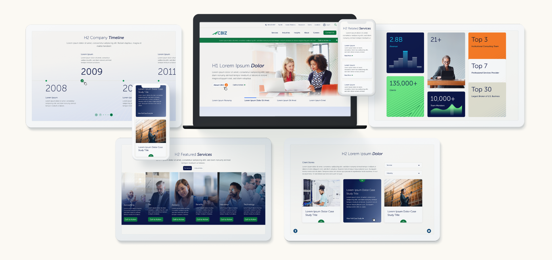
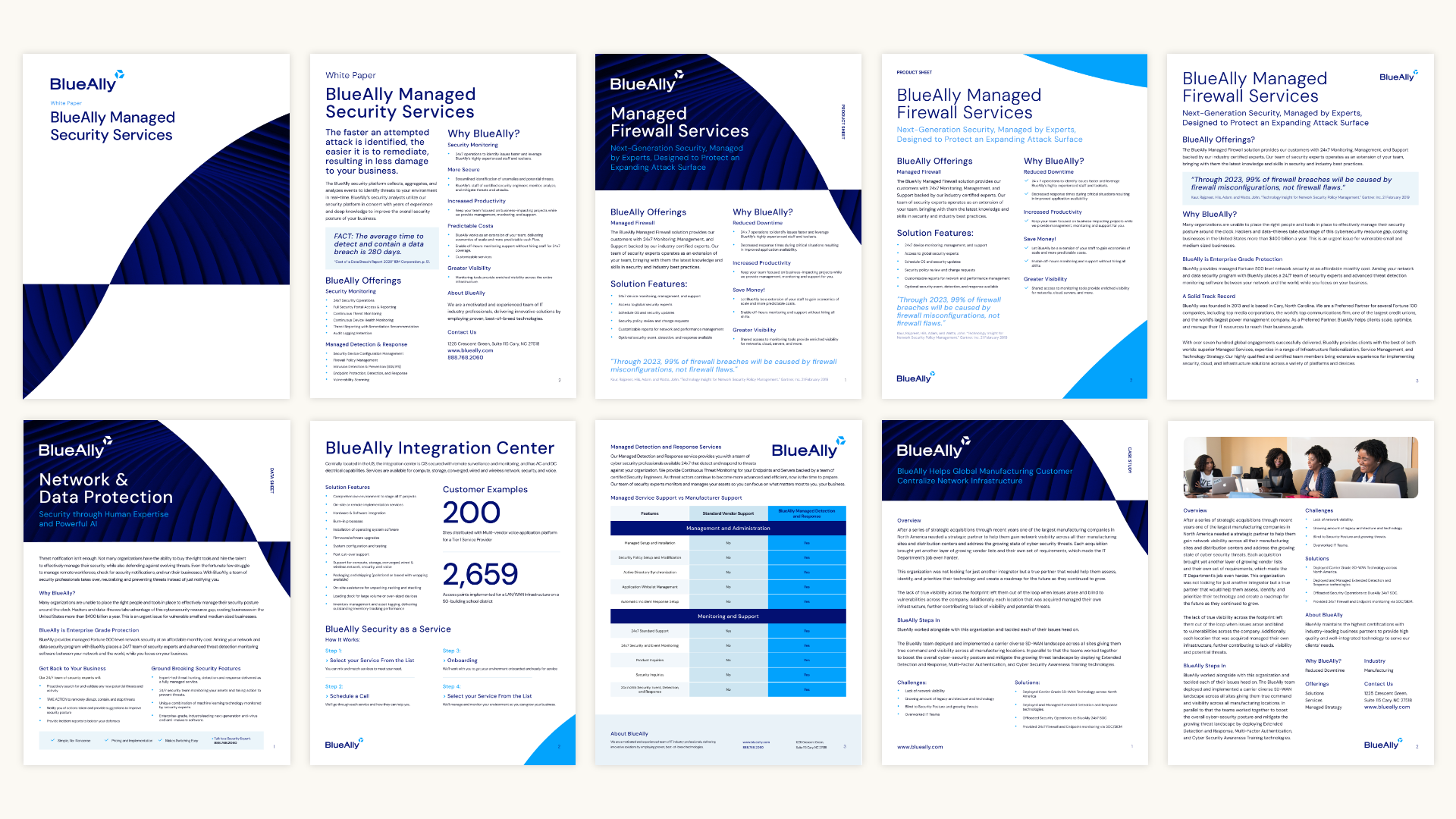
In an ever-evolving market, a static brand identity risks obsolescence. As industries innovate and consumer preferences shift, brands must adapt to stay relevant. Future-proofing your brand identity ensures you can evolve with the times without losing your core essence. But what does it mean to create a truly adaptable identity, and how can businesses position themselves for long-term success?
The Core Elements of a Timeless Brand
- Clear Purpose and Values: Your brand’s mission and values should anchor all decisions. A strong foundation ensures consistency amid change. These values act as a compass, guiding marketing strategies and fostering trust with audiences.
- Memorable Visual Identity: Logos, typography, and color schemes should be designed for adaptability while maintaining recognizability. A logo refresh or subtle updates can keep your visual identity modern without losing its essence.
- Consistent Voice: A defined tone and messaging style create familiarity, even as trends evolve. Whether it’s witty, professional, or empathetic, consistency in voice reinforces your brand’s personality.
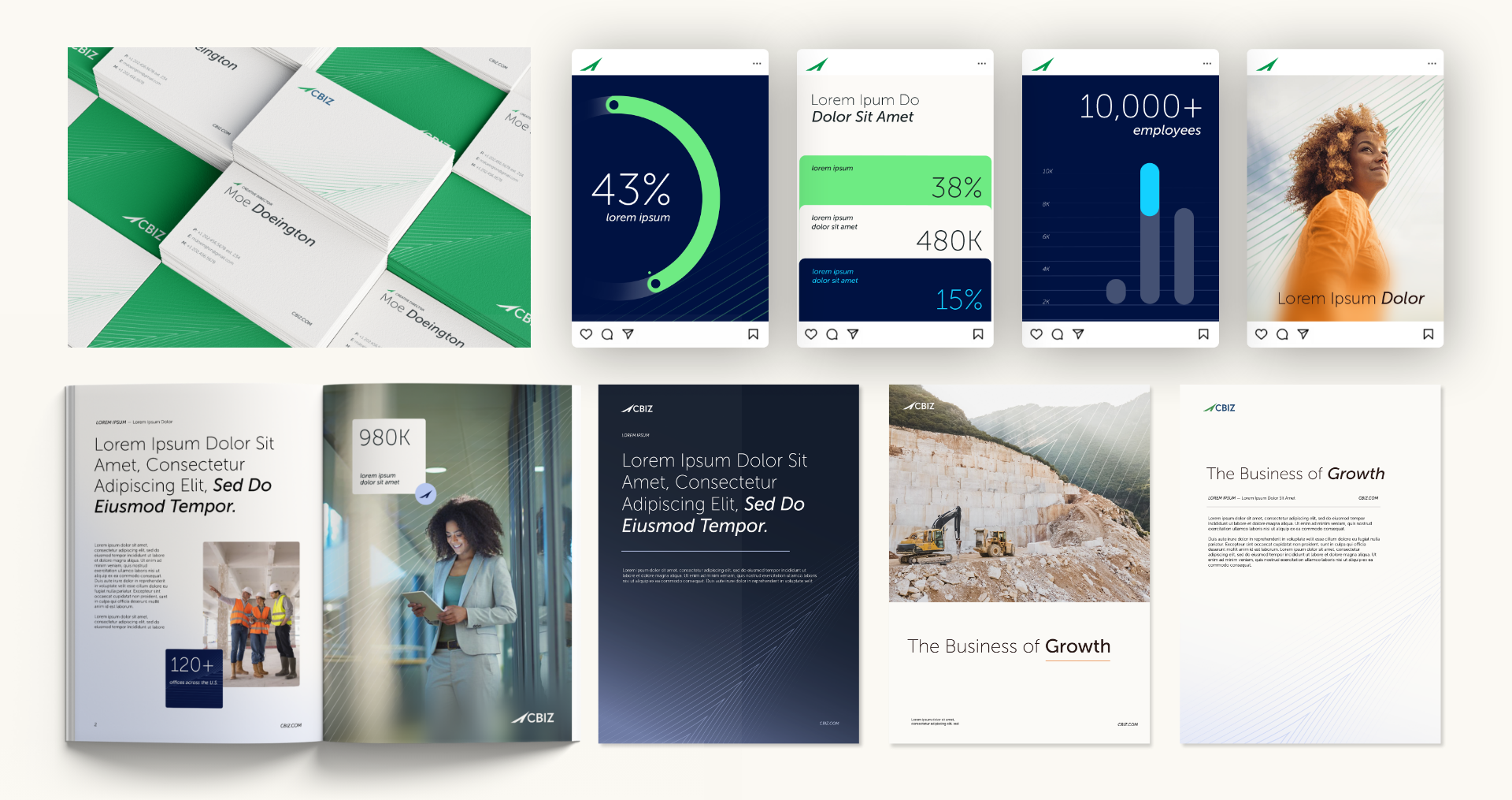
Steps to Future-Proof Your Brand
- Embrace Flexibility: Build a brand style guide that allows room for creative interpretation. Include guidelines for updating visual elements, experimenting with new formats, and evolving content strategies.
- Stay Informed: Monitor industry trends and consumer behaviors to anticipate shifts. For example, as sustainability becomes a priority, integrating eco-conscious messaging into your branding can keep you aligned with audience values.
- Invest in Technology: Utilize tools like CRM systems or analytics platforms to track engagement and adjust strategies in real-time. Emerging technologies, like AI-driven content personalization, can also keep your brand ahead of the curve.

Evolving with Your Audience
A future-proof brand grows alongside its audience. Prioritize feedback and adapt offerings to meet changing needs. Engaging in two-way communication—through surveys, social media, or customer service—can provide valuable insights. Additionally, fostering a community around your brand creates loyalty that extends beyond specific products or services.
Branding for Longevity
Future-proofing your brand identity is an investment in your company’s resilience. By staying flexible and audience-focused, your brand can remain relevant and impactful for years to come. The ability to adapt, paired with a strong foundational identity, ensures your brand can weather industry disruptions while continuing to thrive. Reach out to Bluetext to learn how we can help you build a brand identity that stands the test of time.
In today’s crowded digital environment, where countless brands vie for consumer attention, fostering loyalty is more challenging—and more crucial—than ever. Building strong brand loyalty is no longer just about having a good product; it’s about creating meaningful, personalized connections with your audience. A loyal customer base not only ensures repeat purchases but also acts as an advocate for your brand, amplifying your message organically. Here are the strategies brands must embrace to inspire loyalty and stand out in a competitive digital landscape.
The Power of Personalization
Consumers expect brands to know who they are and what they want. Personalized experiences—whether through tailored email campaigns, custom product recommendations, or localized content—show customers that you value their individuality. Advanced tools like AI and data analytics can help brands analyze consumer behavior and deliver content that resonates on a personal level. For example, Netflix and Spotify use AI-driven algorithms to curate individualized experiences, creating a strong bond between the user and the platform.
Personalization isn’t just about using someone’s name in an email; it’s about anticipating their needs, solving their problems, and delivering value at every touchpoint. Brands that master this approach stand out as trusted partners in their customers’ journeys.
Community-Building as a Loyalty Driver
Building a sense of community around your brand fosters emotional connections that go beyond the transactional. By creating spaces for customers to engage—whether through online forums, exclusive social media groups, or user-generated content campaigns—you can cultivate a loyal following that feels part of something bigger. Brands like Peloton have excelled by fostering a tight-knit community of users who motivate and support each other.
Strong communities also drive word-of-mouth marketing, amplifying your reach organically. When customers feel they’re part of a movement, they’re more likely to share their experiences with others, extending your brand’s visibility.

Consistency is Key
Consistency in messaging and tone across all platforms reassures customers of your reliability. Whether it’s your website, social media, or in-person events, ensure your brand’s values and personality shine through. A cohesive presence builds trust, and trust is the cornerstone of loyalty.
Moreover, consistency extends beyond aesthetics to include the quality of your products, services, and customer support. Regularly meeting or exceeding expectations reinforces your brand’s credibility and keeps customers coming back.
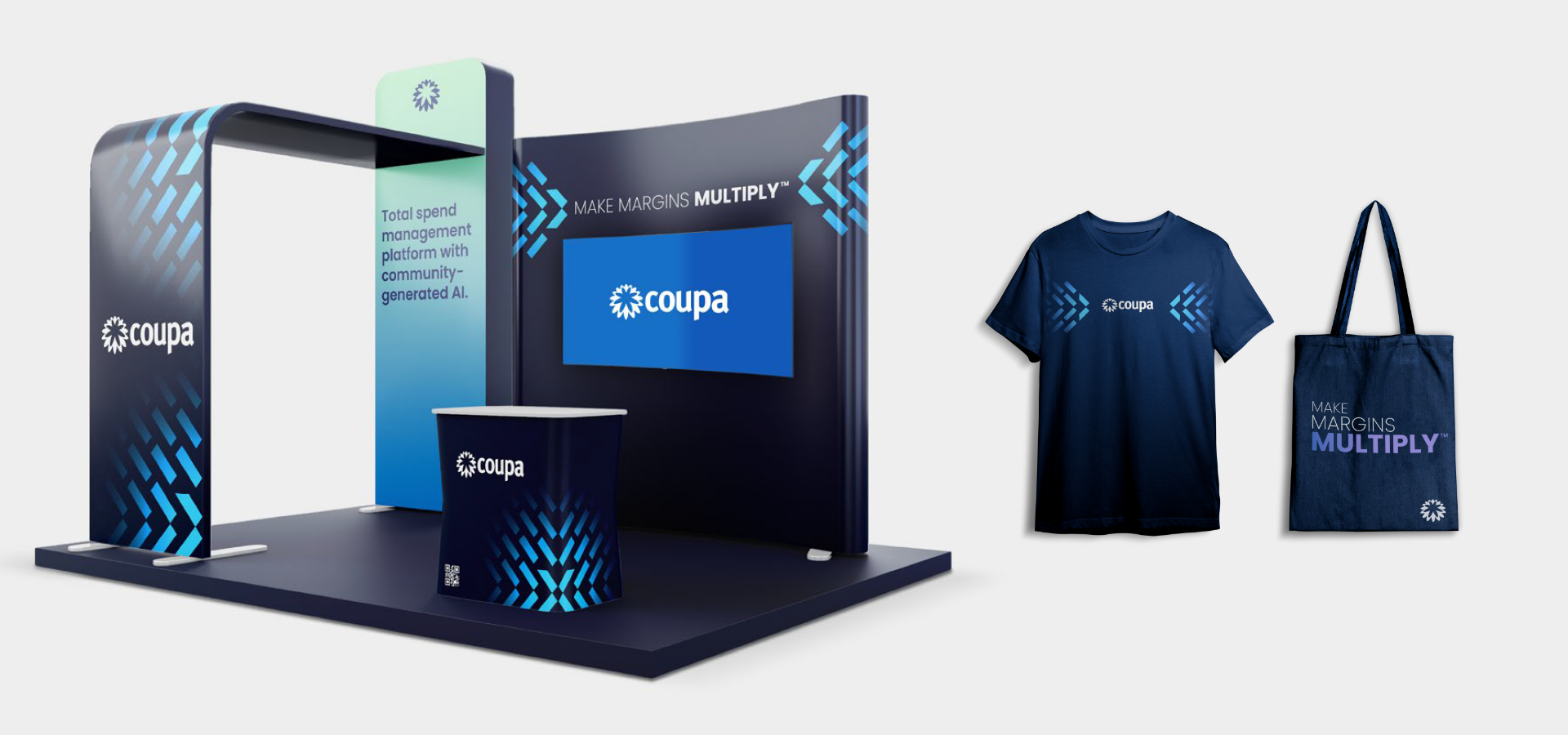
Rewards and Recognition
Implementing loyalty programs that offer tangible rewards or exclusive experiences incentivizes repeat purchases and strengthens customer relationships. Beyond discounts, consider offering early access to new products, behind-the-scenes content, or VIP events that make your most loyal customers feel valued.
Recognition also matters. Celebrate your customers’ milestones, such as birthdays or anniversaries with your brand, through personalized messages or offers. These small gestures can make a big impact on customer sentiment and loyalty.
Social Responsibility and Authenticity
Consumers increasingly align themselves with brands that share their values. Highlighting your commitment to sustainability, inclusivity, or community outreach can deepen loyalty. For example, Patagonia’s dedication to environmental causes has cemented its reputation as a brand with purpose.
However, authenticity is critical—performative actions can backfire and erode trust. Your brand’s values must be reflected not only in your marketing but also in your business practices.
The Long-Term Vision
Fostering loyalty is a marathon, not a sprint. By investing in personalized experiences, building strong communities, and staying true to your brand’s values, you’ll create a foundation for enduring relationships with your customers, even in a fiercely competitive digital world. Loyal customers are your most valuable asset—they’re your advocates, your ambassadors, and your most dependable revenue stream.
Ready to build lasting brand loyalty? Contact Bluetext today to discover how we can help you create personalized experiences, consistent messaging, and community-driven strategies that resonate with your audience.
Winning government cybersecurity contracts is no small feat. With the rise of cyber threats targeting national security, public infrastructure, and sensitive data, government agencies are actively seeking private-sector partners to bolster their defenses. However, for cybersecurity firms targeting business-to-government (B2G) opportunities, standing out in a crowded field requires more than just cutting-edge technology—it demands a strategic approach to marketing. This guide explores the essentials of marketing for cybersecurity firms aiming to secure government contracts, with a focus on compliance, communication, and effective messaging.
Understanding the Regulatory Landscape
Compliance is the foundation of marketing for government cybersecurity contracts. Federal, state, and local agencies operate within strict regulatory frameworks, including standards like:
- NIST Cybersecurity Framework: A cornerstone for ensuring secure systems and processes.
- FedRAMP Certification: For firms offering cloud services to government agencies.
- DFARS Compliance: Relevant for working with the Department of Defense.
Your marketing materials and messaging must demonstrate your firm’s ability to meet these requirements. Incorporate proof of certifications, audits, and adherence to these standards into your website, collateral, and presentations. Without a clear focus on compliance, your firm may fail to even qualify for consideration. Additionally, staying up-to-date with evolving regulations is crucial. As standards and requirements shift to address new threats, your firm’s ability to adapt and demonstrate continued compliance can give you a competitive edge. Regularly review updates to government policies and incorporate those changes into your marketing narrative to showcase your proactive approach.
Building Credibility Through Communication
Government agencies are highly risk-averse, especially when it comes to cybersecurity. Establishing trust is key, and the way you communicate can make or break your credibility. Case studies and testimonials play a critical role in this process. Showcase success stories where your cybersecurity solutions have effectively mitigated risks or safeguarded assets. Be specific about measurable results, such as the percentage reduction in breaches or downtime avoided. Thought leadership content is another valuable tool. Publish blogs, whitepapers, and webinars on topics like emerging cyber threats or best practices for securing government systems. Positioning your firm as an industry authority builds trust with decision-makers and reinforces your expertise. Tailored outreach is equally essential. Avoid generic pitches. Research the specific needs and challenges of the agency you’re targeting and craft customized proposals. Personalization signals your genuine understanding of their mission and pain points, which can significantly improve your chances of securing contracts. Consistency across your communication channels ensures your message resonates and reinforces your firm’s expertise. Whether through email campaigns, presentations, or in-person meetings, maintaining a cohesive narrative builds confidence in your capabilities.
Crafting Resonant Messaging
Government buyers prioritize solutions that align with their mission and address their pain points. To craft effective messaging, emphasize security and resilience. Highlight how your solutions proactively mitigate risks and enhance operational resilience. Speak their language by using terminology familiar to government stakeholders, such as references to “mission-critical systems” or “continuity of operations.” Address cost-efficiency, as budget constraints are a reality for many government agencies. Demonstrate the value and return on investment your firm can provide. Showcase agility by emphasizing how your solutions adapt to emerging challenges. With cyber threats evolving rapidly, government agencies need partners who can keep pace. Your messaging should balance technical depth with accessibility, ensuring both technical evaluators and non-technical decision-makers understand your value. Consider creating audience-specific materials to cater to different stakeholders within the procurement process, from IT specialists to program managers and budget officers. By aligning your messaging with their diverse priorities, you can better articulate your value proposition.
Leveraging Digital Channels for B2G Marketing
Digital marketing is just as important in the B2G space as in commercial markets. Leverage these strategies to amplify your reach: LinkedIn campaigns can target federal and state government decision-makers with sponsored content showcasing your expertise. Search engine optimization (SEO) is critical; optimize your website for keywords like “government cybersecurity solutions” and “FedRAMP-certified services.” Account-based marketing (ABM) focuses on individual agencies, tailoring ads and email campaigns to their unique requirements. Remember to keep your digital assets—from landing pages to downloadable content—compliant with accessibility standards like WCAG, which many government buyers expect. Beyond these tactics, consider investing in webinars and virtual events that cater specifically to government audiences. These platforms allow you to demonstrate your expertise, interact directly with decision-makers, and address their questions in real-time. Additionally, monitor analytics from your digital campaigns to continuously refine your approach, ensuring maximum impact and engagement.
A Strategic Approach to Success
Securing government cybersecurity contracts requires a well-rounded marketing strategy that prioritizes compliance, builds trust, and delivers resonant messaging. By understanding the regulatory landscape, communicating effectively, and leveraging digital channels, your firm can stand out as a reliable partner in protecting the nation’s cyber infrastructure. The competition for these contracts is fierce, but with a clear strategy that emphasizes your strengths and aligns with the unique needs of government agencies, your firm can position itself as a trusted partner in the fight against cyber threats. Ready to position your cybersecurity firm for B2G success? Contact Bluetext today to learn how we can help you navigate the complexities of marketing to government agencies.
The financial services industry is undergoing rapid digital transformation, reshaping how firms engage with customers, deliver services, and remain competitive. To thrive in this evolving landscape, financial services firms must position themselves as leaders in innovation through strategic marketing initiatives.
The Importance of Digital Transformation in Financial Services
Digital transformation has become a cornerstone of success for financial services organizations. Key drivers include:
- Evolving Customer Expectations: Today’s consumers demand seamless, personalized digital experiences.
- Technological Advancements: Innovations like artificial intelligence (AI), blockchain, and data analytics are revolutionizing the sector.
- Competitive Pressure: Fintech disruptors are challenging traditional financial institutions, pushing them to innovate or risk obsolescence.
- Regulatory Changes: Firms must navigate an increasingly complex compliance landscape while embracing digital tools to streamline processes.
Strategic Marketing to Lead the Transformation
To position as leaders in digital transformation, financial services firms need to communicate their vision and demonstrate their capabilities effectively. Below are key marketing strategies to drive this effort:
- Showcase Digital Innovation
Highlighting investments in technology and innovation builds trust with customers and stakeholders.
How to Execute:
- Create case studies and success stories that demonstrate the tangible benefits of your digital initiatives.
- Develop video content that showcases innovative solutions, such as mobile banking apps or AI-driven financial planning tools.
- Use storytelling to connect technological advancements with customer benefits, emphasizing security, efficiency, and personalization.
- Position as Thought Leaders
Becoming a trusted source of insights and trends in digital transformation can elevate your brand and build credibility.
How to Execute:
- Publish white papers, eBooks, and research reports on topics like blockchain, AI in finance, or digital customer experience.
- Host webinars and participate in industry conferences to discuss digital transformation trends.
- Maintain an active blog with insights from your leadership team and industry experts.
- Deliver a Seamless Omnichannel Experience
Modern financial services customers interact with brands across multiple touchpoints. A consistent and seamless experience across these channels is essential.
How to Execute:
- Use data analytics to personalize customer experiences across email, social media, mobile apps, and websites.
- Implement a unified brand voice across all platforms, from digital ads to in-branch experiences.
- Optimize user experience (UX) design for mobile-first interactions, reflecting the shift toward mobile banking.
- Address Concerns About Security and Compliance
Digital transformation raises questions about data security and regulatory compliance. Addressing these concerns proactively is critical to building trust.
How to Execute:
- Highlight your firm’s commitment to cybersecurity through content like blog posts, videos, and infographics.
- Share how you ensure compliance with evolving regulations, such as GDPR or financial-specific frameworks like SOX.
- Publish third-party certifications or endorsements to reinforce trust in your digital platforms.
- Engage with Data-Driven Marketing
Harnessing the power of data is integral to effective marketing in the digital era.
How to Execute:
- Use predictive analytics to identify emerging customer needs and tailor offerings accordingly.
- Segment audiences based on behavior, preferences, and demographics to deliver hyper-personalized campaigns.
- Continuously measure and optimize campaign performance using advanced analytics tools.
Preparing for the Future of Financial Services
Marketing efforts must align with emerging trends to future-proof your business. Key areas of focus include:
- Sustainability Messaging: Highlight efforts in green finance and ESG (Environmental, Social, and Governance) initiatives.
- AI-Driven Personalization: Emphasize how AI enhances customer experiences and streamlines operations.
- Partnerships with Fintechs: Showcase collaborations with fintech innovators to reinforce your firm’s commitment to staying ahead of the curve.
Final Thoughts: Leading the Charge in Digital Transformation
Digital transformation is not just a technological shift but a strategic opportunity for financial services firms to redefine their market position. By leveraging marketing strategies that highlight innovation, thought leadership, and customer-centricity, your firm can build a future-proof brand that thrives in an increasingly digital landscape.
Partner with Bluetext for Digital Transformation Marketing
At Bluetext, we specialize in crafting strategic marketing campaigns that position financial services firms as leaders in digital innovation. Whether it’s creating compelling content, executing data-driven campaigns, or designing seamless digital experiences, we can help you navigate the complexities of digital transformation. Contact us today to learn how we can elevate your marketing efforts.
With agencies like the EPA driving federal priorities, resilience and industrial strength are emerging as key themes in government procurement. For B2G companies, aligning messaging with these trends is essential to stay competitive and relevant.
The Shifting Federal Landscape
Federal agencies are increasingly prioritizing themes of resilience and industrial strength as they respond to complex challenges—climate change, infrastructure modernization, supply chain security, and economic recovery.
- Resilience: The focus on resilience spans physical infrastructure, cybersecurity, and operational continuity. Agencies are seeking solutions that can endure disruptions, adapt to challenges, and ensure long-term reliability.
- Industrial Strength: Promoting domestic manufacturing, improving supply chain security, and fostering economic growth are top priorities for agencies like the EPA and the Department of Energy.
For businesses targeting the federal market, messaging must reflect these priorities, demonstrating how their solutions align with agency goals while adhering to compliance requirements.
Why Resilience and Industry Matter in B2G Messaging
Federal Agencies Need Solutions That Withstand Disruptions
From infrastructure resilience against natural disasters to cybersecurity resilience against evolving threats, government agencies are focused on safeguarding critical systems. B2G companies that position their solutions as reliable, adaptive, and future-proof can align with this federal priority.
Supporting Economic and Industrial Goals
Agencies are under pressure to strengthen domestic industries, secure supply chains, and boost economic recovery efforts. Messaging that highlights industrial strength—such as U.S.-based manufacturing, supply chain transparency, and innovation—will resonate with decision-makers.
Compliance as a Baseline
Regulatory compliance remains non-negotiable in B2G marketing. However, aligning with emerging priorities like resilience and industrial strength goes beyond compliance—it’s about demonstrating value, innovation, and alignment with broader federal goals.

Key Strategies to Align B2G Messaging with Federal Trends
- Integrate Resilience into Your Value Proposition
B2G companies should frame their solutions as tools for resilience. Whether it’s a secure technology platform, durable infrastructure, or adaptive process, emphasize how your offerings help agencies:
- Mitigate risks and disruptions
- Ensure operational continuity during crises
- Adapt to evolving challenges and needs
- Emphasize Industrial Strength and Supply Chain Security
Federal agencies are increasingly prioritizing domestic sourcing and industrial innovation. Companies can align with these goals by messaging around:
- U.S.-based production and contributions to economic growth
- Transparent, secure, and resilient supply chains
- Investments in innovation that support federal missions
- Leverage Real-World Examples to Build Credibility
Case studies and examples of successful implementation are critical in building trust. Highlight:
- Projects where your solutions improved resilience, such as disaster-proof infrastructure or mission-critical technology
- Contributions to industrial strength, such as local job creation, reduced supply chain vulnerabilities, or sustainable economic impact
Agencies respond to proof points—showing measurable results will elevate your messaging above competitors.
- Align Messaging with Key Agency Priorities
Tailor messaging to the specific goals of federal agencies. For example:
- EPA: Highlight solutions that support environmental resilience, sustainable infrastructure, and resource optimization
- DOE: Emphasize contributions to energy security, industrial innovation, and modernization
- FEMA and DHS: Focus on operational resilience, risk mitigation, and disaster response
Understanding each agency’s mission allows for targeted messaging that demonstrates alignment and relevance.
- Balance Compliance with Forward-Thinking Themes
While compliance is the entry point for federal contracts, forward-thinking messaging is what wins trust. Go beyond regulatory adherence to demonstrate how your company anticipates future federal needs—like emerging climate challenges, cybersecurity risks, or workforce resilience.

Preparing for the Next Wave of Federal Procurement Trends
To stay ahead, B2G companies must continuously monitor emerging procurement trends and priorities. Looking forward:
- Resilience will expand beyond physical infrastructure to include digital and workforce resilience.
- Industrial strength will remain a focus, with growing emphasis on domestic manufacturing and supply chain innovation.
- Sustainability and environmental impact will play an increasing role in agency decisions.
Businesses that proactively integrate these trends into their branding and messaging will be well-positioned to win federal contracts.
Final Thoughts: Winning with Resilience and Industry
In a federal market shaped by resilience, industrial strength, and evolving priorities, B2G companies must craft messaging that speaks directly to these themes. By aligning with agency goals, demonstrating measurable value, and anticipating future needs, businesses can build trust and stand out in competitive procurement cycles.
Partner with Bluetext to Align Your B2G Strategy
Navigating federal trends requires expertise and precision. At Bluetext, we help B2G companies craft compelling messaging that aligns with government priorities, builds credibility, and drives results. Contact us today to learn how we can position your brand for success in the evolving federal marketplace.
Government contracting is a highly competitive and complex field. With stringent regulations, extensive procurement processes, and evolving agency priorities, standing out as a contractor requires more than just competitive pricing or technical expertise. It requires trust.
Thought leadership has become a key strategy for government contractors aiming to differentiate themselves. By sharing insights and expertise, contractors can build credibility, influence decision-makers, and foster long-term relationships with government clients. This blog explores why thought leadership matters in the GovCon space and how to implement it effectively.
Why Thought Leadership is Critical in GovCon
Government agencies prioritize partnerships with organizations they trust. Unlike the private sector, where quick decisions are common, government clients conduct extensive evaluations to ensure reliability, compliance, and alignment with mission goals. Thought leadership addresses these needs by:
- Establishing Credibility: Sharing valuable insights positions your brand as a knowledgeable and reliable partner.
- Influencing Decision-Making: Providing well-researched content can shape how agencies perceive challenges and solutions, aligning their priorities with your offerings.
- Creating Competitive Advantage: In a crowded market, thought leadership differentiates your company from competitors offering similar services.
In short, thought leadership transforms your brand from one of many contractors into a trusted industry expert.
Building a Thought Leadership Strategy for GovCon
To develop a successful thought leadership strategy, contractors must focus on understanding their audience and crafting content that addresses their unique challenges. Here’s how:
- Focus on Mission Alignment
Government agencies prioritize partners who understand their mission and objectives. Craft content that demonstrates how your expertise supports their goals—whether it’s enhancing national security, improving infrastructure, or driving technological innovation. - Prioritize Compliance and Risk Mitigation
Regulatory compliance and risk reduction are top concerns for government clients. Share insights on navigating procurement challenges, adhering to FAR/DFARS requirements, or ensuring cybersecurity readiness. - Leverage Industry Trends and Insights
Stay ahead of the curve by analyzing and commenting on emerging trends like AI in defense, sustainability initiatives, or digital transformation in government services. - Invest in Research-Driven Content
Original research or data-backed reports can provide unique perspectives, positioning your brand as a thought leader in the GovCon space.

Amplifying Your Thought Leadership
Creating thought leadership content is only half the battle—getting it in front of the right audience is equally important. Here are some effective distribution strategies:
- Government-Focused Platforms: Publish articles and whitepapers on platforms like GovExec, Defense News, or federal procurement forums.
- Social Media Engagement: Share insights on LinkedIn, engaging directly with government decision-makers and influencers in the space.
- Networking Events and Panels: Participate in or host industry events, offering a platform to discuss your expertise and connect with potential clients.
- Email Campaigns: Create targeted campaigns that deliver your thought leadership content directly to procurement officers and agency stakeholders.
A multi-channel approach ensures your expertise reaches the right audience at the right time.
Sustaining Long-Term Success with Thought Leadership
Thought leadership is not a one-and-done effort—it requires consistent commitment to creating and sharing valuable insights. Over time, this approach delivers significant benefits, including:
- Enhanced Brand Visibility: Frequent, high-quality content keeps your brand top-of-mind for government buyers.
- Stronger Relationships: Thought leadership builds trust and fosters deeper connections with agency decision-makers.
- Greater Influence: As a recognized expert, your brand can shape industry conversations and gain an edge in competitive procurements.
Elevate Your GovCon Brand with Expertise
In the government contracting space, expertise and credibility are essential for success. Thought leadership enables contractors to build trust, differentiate their offerings, and position themselves as indispensable partners to government agencies.
Looking to strengthen your thought leadership strategy and stand out in the GovCon market? Bluetext can help you craft compelling content that drives results. Contact us today to get started.
In the subscription-based world of Software as a Service (SaaS), success hinges not only on acquiring new customers but also on retaining them. With recurring revenue as the backbone of the SaaS business model, retaining customers and reducing churn are critical for long-term growth and profitability. This blog explores key retention-focused marketing strategies that SaaS companies can adopt to foster customer loyalty, ensure continued engagement, and drive long-term success.
Understanding the Importance of Retention in SaaS
Retention is more than just keeping a customer—it’s about nurturing a relationship that continues to deliver value over time. Unlike traditional software sales, where the primary focus is on the initial purchase, SaaS companies thrive on recurring subscriptions. This makes retention a crucial metric. Not only does a high retention rate contribute to a stable revenue stream, but it also reflects customer satisfaction and the perceived value of the product.
Retained customers are more likely to become brand advocates, offering valuable word-of-mouth marketing and contributing to organic growth. Moreover, it costs significantly less to retain existing customers than to acquire new ones, emphasizing the economic advantages of a retention-focused strategy.

Crafting a Customer-Centric Onboarding Experience
The foundation of effective retention starts with onboarding. A seamless, intuitive onboarding experience ensures that new customers can quickly realize the value of the SaaS product. This critical phase sets the tone for the entire customer journey.
To optimize onboarding:
- Personalization is key: Tailor the onboarding process based on the customer’s industry, company size, or specific use case.
- Interactive guides and tutorials: Provide step-by-step instructions through interactive elements that help users become familiar with the software.
- Dedicated customer success teams: Assign customer success managers to guide new clients, address questions, and provide proactive support.
The goal is to minimize time-to-value (TTV)—the period it takes for customers to see the benefits of your software—and to set the stage for long-term engagement.
Leveraging Data-Driven Personalization for Engagement
In the subscription economy, personalization is essential for maintaining customer engagement. By leveraging data analytics, SaaS companies can gain deep insights into user behavior, preferences, and pain points, enabling them to tailor their offerings and communications.
Key strategies for data-driven personalization include:
- Behavioral triggers: Use in-app behavior to trigger personalized messages or recommendations. For instance, if a user frequently accesses a specific feature, provide advanced tips or related functionalities to deepen their usage.
- Segmented communication: Divide your customer base into segments based on factors like usage patterns, engagement levels, or industry. Craft targeted marketing messages that address the specific needs and goals of each segment.
- Feedback loops: Implement mechanisms for collecting user feedback regularly, using surveys, in-app prompts, or direct outreach. This helps in refining the product and demonstrating that customer input drives improvements.
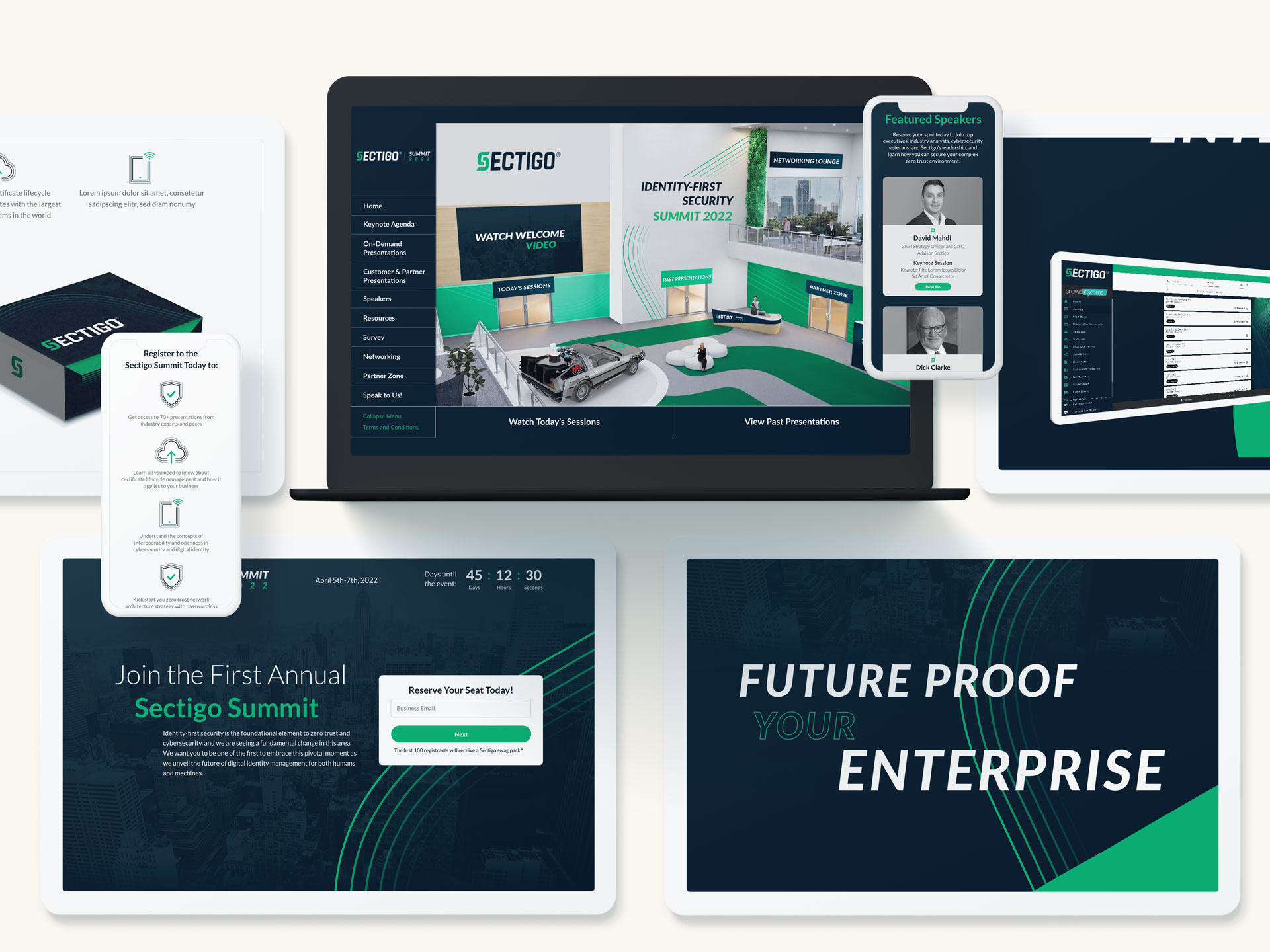
Implementing Customer Success Programs
Customer success programs are vital for maintaining ongoing engagement and ensuring that customers derive consistent value from the SaaS product. These programs are proactive, aiming to anticipate customer needs and address potential issues before they lead to churn.
Components of a successful customer success program:
- Regular check-ins: Schedule periodic reviews to discuss the customer’s goals, challenges, and how the software is helping achieve them.
- Educational resources: Provide access to webinars, training sessions, and resource libraries that help customers maximize their use of the product.
- Success metrics tracking: Collaborate with customers to define success metrics, track progress, and celebrate milestones.
Customer success teams act as a bridge between the SaaS company and its users, reinforcing the value of the subscription and cultivating loyalty.
Enhancing Product Value Through Continuous Innovation
In a competitive SaaS landscape, continuous product innovation is crucial for retaining customers. Regular updates, new features, and improvements demonstrate a commitment to delivering value and keeping pace with evolving customer needs.
To foster continuous innovation:
- Customer feedback integration: Actively incorporate customer feedback into the product development cycle. This not only improves the product but also shows customers that their input is valued.
- Transparent communication: Keep customers informed about upcoming features, updates, and improvements through newsletters, blog posts, or in-app notifications.
- Beta programs: Involve customers in beta testing for new features, creating a sense of ownership and investment in the product’s evolution.
By consistently enhancing the product, SaaS companies can prevent customer fatigue and maintain excitement around their offerings.

Utilizing Loyalty Programs and Incentives
Loyalty programs and incentives can be effective tools for encouraging long-term customer engagement. These programs reward users for continued subscription and usage, fostering a deeper connection with the brand.
Examples of loyalty initiatives include:
- Referral bonuses: Offer incentives for customers who refer new users, turning satisfied customers into active promoters.
- Usage-based rewards: Provide rewards or recognition for customers who consistently use the product or achieve certain milestones, reinforcing positive behavior.
- Tiered loyalty programs: Create a tiered system where customers can unlock additional benefits or features based on their subscription tenure or engagement level.
Such programs not only enhance retention but also contribute to customer satisfaction and brand loyalty.
Measuring and Reducing Churn
Retention efforts must be complemented by a strong focus on measuring and understanding churn. By identifying the reasons why customers leave, SaaS companies can take targeted actions to reduce churn rates.
Key strategies for managing churn:
- Churn analysis: Regularly analyze churn data to identify patterns and common reasons for cancellation.
- Exit interviews: Conduct interviews or surveys with customers who cancel to gain insights into their decision.
- Win-back campaigns: Develop campaigns aimed at re-engaging lost customers, offering special incentives or addressing previous concerns.
Continuous improvement in churn management can significantly impact overall retention rates, ensuring long-term sustainability for SaaS businesses.
Building a Retention-Driven SaaS Strategy
Retention is the cornerstone of success in the subscription economy. By focusing on personalized engagement, continuous innovation, and proactive customer success, SaaS companies can build lasting relationships with their customers. These strategies not only improve retention but also contribute to a healthier bottom line and a stronger brand reputation.
In today’s hyper-competitive market, Software-as-a-Service (SaaS) companies are often challenged to scale quickly and globally. While this growth presents immense opportunities, it also requires an equally robust content marketing strategy that can adapt and thrive across diverse markets. Developing a scalable content marketing framework is key to ensuring your messaging resonates with a global audience while maintaining consistency and efficiency.
In this post, we’ll explore how to create scalable content marketing frameworks that drive global growth for SaaS companies, from building a foundation to leveraging automation and cross-functional collaboration.
Why a Scalable Framework is Key for Global SaaS Growth
For SaaS companies, scalability isn’t just a technical or product-related goal—it applies to marketing as well. Content plays a crucial role in driving awareness, engagement, and conversion throughout the customer journey. However, scaling this content globally presents unique challenges. How can a company ensure a consistent brand voice while localizing content for different regions and cultures? How do you manage the sheer volume of content needed to reach multiple markets?
A scalable content marketing framework solves these challenges by creating a structure that allows for growth while maintaining efficiency. Such a framework ensures that content can be easily adapted, replicated, and distributed across multiple regions while still meeting local market demands.
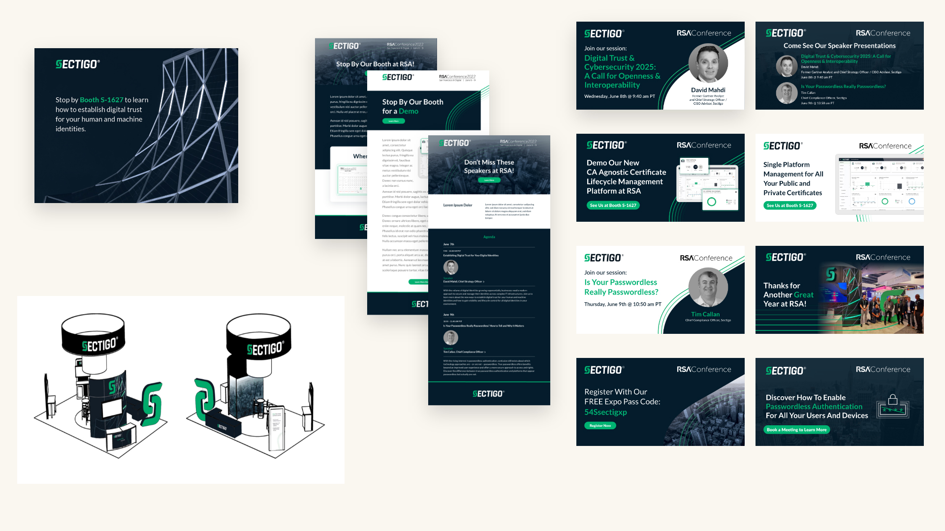
Developing a Scalable Content Marketing Framework
Creating a scalable content marketing framework starts with a solid foundation that supports global and local efforts. Here are the key components:
1. Building Blocks for Scalability
- Core Messaging: Your brand’s core messaging and value proposition must be clearly defined and consistent across all markets. This includes identifying key themes, target audience pain points, and the benefits your product provides. Ensure this messaging is flexible enough to be adapted to different cultural contexts.
- Content Pillars: Establish core content pillars that reflect your SaaS product’s benefits and use cases. These pillars should guide the creation of evergreen content (such as blog posts, guides, and whitepapers) that can be repurposed for different regions with minor adjustments.
- Templates and Modular Content: Build templates for common content types like case studies, blog posts, landing pages, and emails. Modular content allows you to maintain consistency across global markets while making localized tweaks to suit regional preferences.
2. Localization Without Losing Brand Consistency
One of the key challenges for global SaaS companies is balancing the need for consistent brand messaging with the nuances of different regions. A scalable framework allows for localization while retaining the essence of your brand.
- Localized Content Strategy: Develop content that is tailored to each region’s language, cultural nuances, and business environment. For example, what resonates with audiences in the U.S. may need to be adapted for European or APAC markets in terms of tone, references, and even the types of content that perform best.
- Maintain a Unified Brand Voice: Ensure your global team understands the importance of a consistent brand voice. Even as content is localized, the core values and personality of your brand should remain intact. This is especially critical when working with regional content creators or agencies.
3. Content for Every Stage of the Customer Journey
To effectively scale content marketing, it’s essential to map content creation to each stage of the SaaS customer journey—from awareness to purchase, onboarding, and retention. A well-planned framework ensures you produce content that not only generates leads but also supports customer success and reduces churn.
- Awareness Stage: Educational content such as blog posts, guides, and videos that introduce prospects to your product’s value. These pieces can be easily localized and repurposed globally.
- Consideration Stage: More in-depth content like case studies, webinars, and whitepapers that help potential customers evaluate your product’s fit for their needs.
- Decision Stage: Content that addresses specific objections or product comparisons. At this stage, localized versions of case studies and testimonials can be extremely effective.
- Retention Stage: Content that supports customer success, such as user guides, product updates, and educational webinars tailored to specific regional use cases.
Leveraging Data and Automation to Scale Content
As your content efforts grow globally, manually managing and personalizing content for different markets becomes increasingly challenging. This is where data and automation come into play.
- Data-Driven Insights: Use analytics to track the performance of content across different markets and regions. This data can guide your content strategy, helping you understand what works best in each location and refining your approach over time.
- Automation Tools: Content management systems (CMS) and marketing automation platforms are critical for scaling efficiently. Automation allows you to streamline content distribution, enabling you to schedule and deploy content across multiple channels and regions simultaneously. It also helps personalize content at scale, so your audience receives relevant messaging without the need for manual intervention.
- Personalization at Scale: While global consistency is essential, personalized content resonates more with audiences. Leverage automation tools to create personalized experiences that align with the customer’s location, industry, and stage in the buyer’s journey. This ensures a relevant and engaging experience, even at scale.
Collaborating with Cross-Functional Teams
Scaling content marketing globally requires close collaboration across departments, from marketing and sales to customer success. When these teams are aligned, your content can better support each stage of the customer lifecycle, from lead generation to customer retention.
- Sales Alignment: Collaborate with sales teams to ensure content addresses the needs and objections they encounter in conversations with prospects. Sales can also provide insights into regional differences in buyer behavior, which is crucial for localized content.
- Customer Success Integration: Your content doesn’t stop after a customer signs up. Work closely with the customer success team to develop content that helps onboard, educate, and retain customers. This includes user guides, product tutorials, and tailored educational materials.
- Internal Stakeholders: Engage internal stakeholders, such as regional marketing teams, to ensure that content not only aligns with global goals but also meets the unique needs of each market. Having buy-in from regional teams ensures smoother localization and implementation.
Measuring the Success of a Scalable Content Marketing Framework
To ensure your content marketing framework is effective, it’s important to establish clear metrics for success. These metrics will vary depending on the goals of your content strategy but often include:
- Content Performance: Track engagement metrics such as page views, time on page, and social shares to evaluate which content resonates most with your audience.
- Lead Generation: Monitor how effectively your content is driving qualified leads across different regions.
- Conversion Rates: Measure the impact of your content on conversion rates, from leads to paying customers.
- Customer Retention: Analyze how content supports customer retention efforts, such as reducing churn or increasing product adoption.
By continuously tracking and optimizing these metrics, you can refine your content marketing framework to ensure it scales effectively as your SaaS company grows.
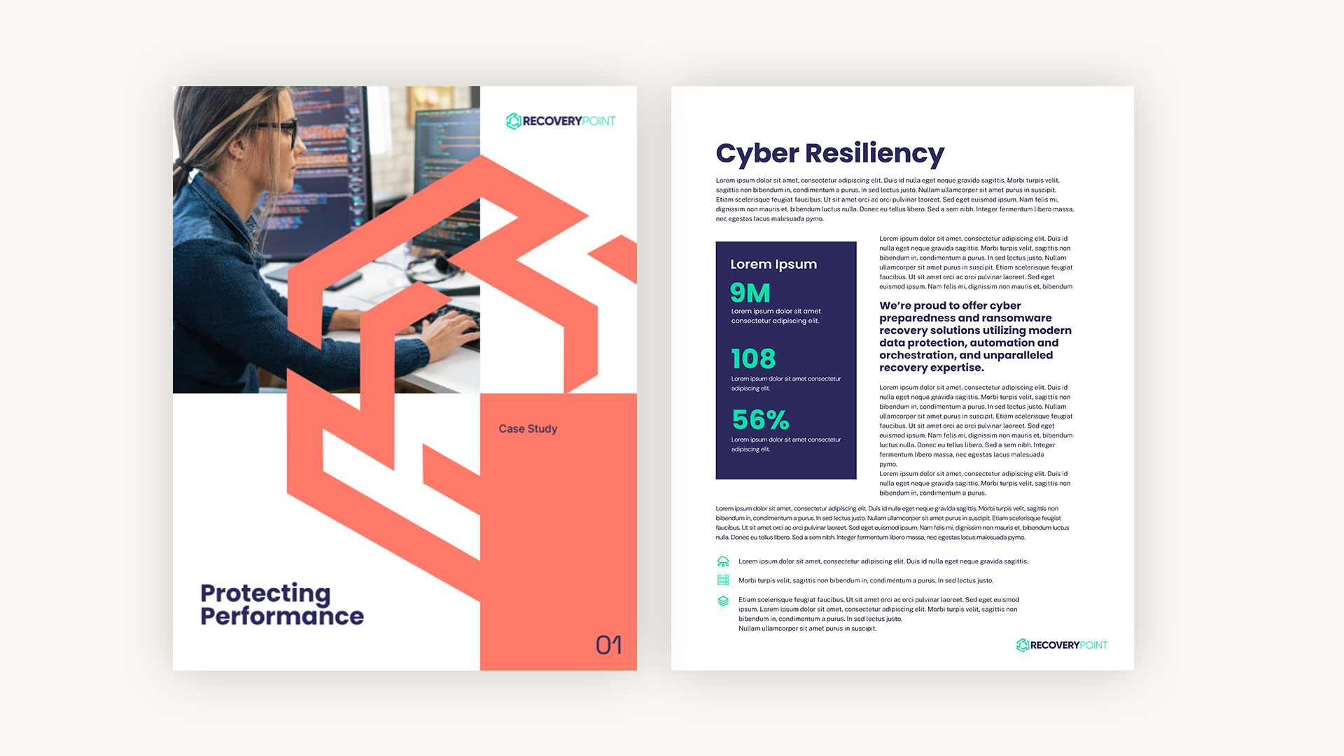
Ready to Scale Your SaaS Content Marketing Globally?
Developing a scalable content marketing framework is crucial for SaaS companies aiming for global growth. By focusing on core messaging, localization, automation, and cross-functional collaboration, you can create a framework that allows your content strategy to scale efficiently across regions, driving engagement and conversions at every stage of the customer journey.
At Bluetext, we specialize in building scalable content marketing frameworks that drive global growth for SaaS companies. From core messaging to localization and automation, we can help you create a strategy that resonates with audiences across markets while maintaining consistency.
Launching a new product is an exciting, but often challenging endeavor. Whether you’re expanding into a new market or introducing an innovative solution, success hinges on a well-crafted go-to-market (GTM) strategy. Without the right approach, even the most groundbreaking products can struggle to gain traction. In this post, we’ll break down the key components of a successful GTM strategy and provide actionable insights to ensure your product hits the ground running.
1. Conduct Thorough Market Research & Competitive Analysis
Before launching any product, it’s critical to understand the landscape in which you’re operating. Market research should reveal customer pain points, trends, and opportunities while competitive analysis uncovers where your product can stand out.
Start by identifying:
- Customer needs: What problems does your product solve?
- Market trends: What external factors could influence demand, such as technological shifts or regulatory changes?
- Competitor positioning: Where do competitors excel, and where are the gaps you can fill?
Surveys, industry reports, customer feedback, and tools like Google Trends can be invaluable in this phase. By gathering robust insights, you can fine-tune your product’s features and positioning to meet market demand.
At Bluetext, we guide clients through detailed research processes, providing data-driven insights to inform every stage of the product launch. Our experience helps ensure that your GTM strategy is rooted in a deep understanding of the market and your competition.
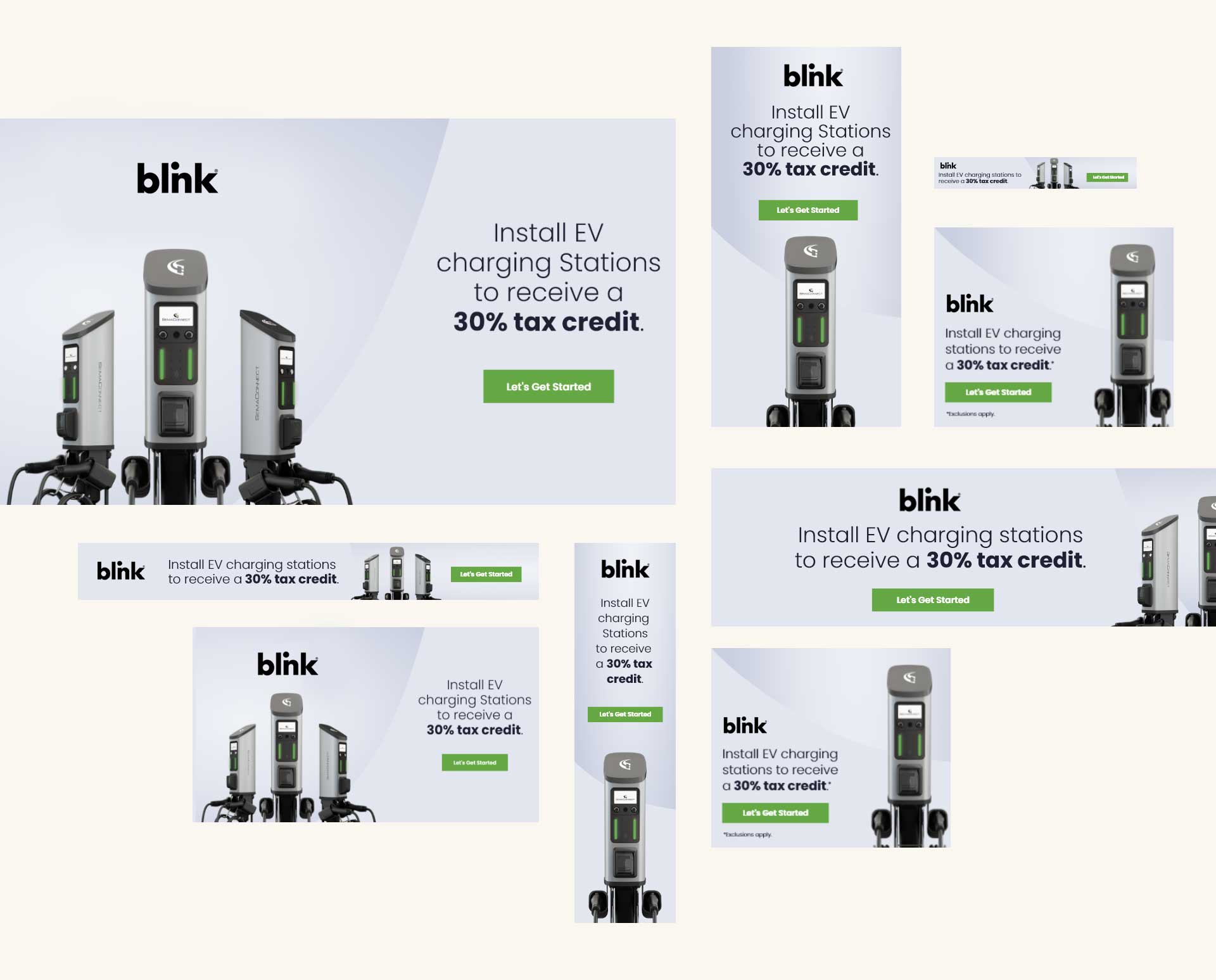
2. Define Your Target Audience & Craft Messaging
Identifying your target audience is crucial to a successful launch. The better you understand your customers, the more effectively you can speak to their needs. This starts with developing detailed buyer personas that include demographic, psychographic, and behavioral characteristics.
Once you know your audience, craft messaging that resonates with their specific pain points and desires. Focus on creating a narrative that communicates your product’s unique value in a way that speaks directly to your target market.
3. Establish a Clear Product Positioning & Value Proposition
Your product’s value proposition is the foundation of your GTM strategy. It should clearly articulate why your product is better than alternatives in the market and how it meets the needs of your target audience.
A strong value proposition:
- Addresses specific customer pain points.
- Highlights key benefits that differentiate your product from the competition.
- Speaks to the outcomes or results customers can expect.
Bluetext works closely with clients to develop compelling value propositions and positioning strategies that ensure products are set for maximum impact from day one.
4. Align Sales Enablement & Channel Strategy
Sales teams are the frontline advocates for your product, so it’s critical to provide them with the tools they need to sell effectively. This includes:
- Sales collateral: Product brochures, pitch decks, and case studies that emphasize product benefits.
- Training: Regular training sessions to keep sales teams informed on key product features and messaging.
- CRM tools: Ensure your team has the right tools to track and manage customer relationships.
Additionally, consider your distribution channels. Will you rely on direct sales, resellers, or strategic partnerships to bring your product to market? Defining this early will ensure your product reaches the widest possible audience.
Bluetext has helped numerous clients refine their channel strategies, resulting in stronger partnerships and more effective sales efforts.
5. Execute a Comprehensive Promotional Tactics & Launch Plan
Your product launch is your opportunity to create buzz and generate excitement. A strong launch plan will include:
- Pre-launch activities: Build anticipation through teasers, beta testing, and influencer outreach.
- Launch day: Use a mix of PR, digital advertising, and social media campaigns to ensure maximum visibility.
- Post-launch engagement: Continue the momentum with follow-up campaigns, customer testimonials, and product demos.
Bluetext has executed numerous successful launch campaigns, leveraging a variety of promotional tactics tailored to each client’s audience and industry. From targeted digital ads to influencer partnerships, we ensure your launch garners the attention it deserves.
6. Measure Success & Optimize
Once your product is in the market, it’s important to track its performance and adjust your strategy as needed. Key performance indicators (KPIs) to monitor include:
- Sales figures: Are you meeting your sales targets?
- Market penetration: How well is your product performing against competitors?
- Customer acquisition: Are you attracting your target audience effectively?
With Bluetext’s data-driven approach, we help clients not only track success but also refine their strategies based on performance. Regular analysis and optimization can make the difference between a product that performs well and one that dominates the market.
Setting Your Product Up for Long-Term Success
Launching a new product is no small feat, but with the right GTM strategy, you can significantly increase your chances of success. From market research to promotional tactics, each step of the process should be carefully planned and executed to ensure maximum impact.
At Bluetext, we specialize in creating tailored go-to-market strategies that deliver results. Ready to launch your next product with confidence? Contact us today to see how we can help.
Prefer listening over reading? Check out the podcast version of this blog below and enjoy insights on the go!
As the gaming industry continues to grow, it’s becoming one of the most promising avenues for brand exposure. In-game advertising, once a niche strategy, has evolved into a powerful tool for marketers looking to reach highly engaged, diverse audiences. At Bluetext, we’ve seen first-hand how brands can capitalize on this trend to build awareness and connect with consumers in a unique, immersive environment. Here’s a closer look at in-game advertising, its effectiveness, and how brands can tap into the gaming market.
The Rise of In-Game Advertising
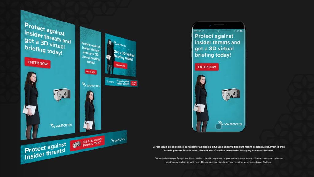
The gaming industry now rivals the film and music industries in terms of revenue, with billions of players globally. This makes it an appealing space for advertisers. Gamers spend hours immersed in virtual worlds, offering brands the chance to engage audiences where they are most attentive. The rise of mobile gaming, eSports, and virtual reality (VR) has only expanded these opportunities, creating more diverse ad placements that can be seamlessly integrated into gameplay.
Types of In-Game Advertising
- Static In-Game Ads
These are non-interactive advertisements that are built directly into the game environment. Think of billboards, posters, or branded elements within a game’s virtual world. These ads are often baked into the game’s design, allowing them to blend naturally without interrupting gameplay. Sports and racing games, for example, frequently incorporate real-life ads into stadiums or on vehicles. - Dynamic In-Game Ads
Unlike static ads, dynamic in-game ads are flexible and can be updated in real-time. This allows brands to change messaging or switch out ads based on factors like region, time of day, or player demographics. These ads are typically served via programmatic platforms, making it easy for marketers to optimize performance throughout a campaign. - Advergaming
Some brands take it a step further by creating their own custom games—known as advergames. These games are designed specifically around a brand’s products or services. While this requires more investment, it can result in deeper engagement, as players interact with branded content for extended periods. - Rewarded Ads
A popular option in mobile games, rewarded ads offer players in-game incentives—like extra lives or bonus points—in exchange for watching an ad. This ad format benefits both players and advertisers: players get rewards, and brands get guaranteed views. It’s a non-intrusive way to serve ads, as players voluntarily opt-in, creating a more positive experience. - In-Game Product Placement
Product placement is common in TV and movies, but it’s also gaining traction in the gaming world. This method involves placing real-world products or brand elements directly into gameplay. A notable example includes branded cars in racing games or having a well-known soft drink appear as an interactive item. This subtle form of advertising can make brands feel more integrated into the gaming experience.

Effectiveness of In-Game Advertising
In-game advertising offers brands several key advantages. For one, gamers are deeply engaged with the content they’re playing, meaning ads placed in these environments are more likely to be noticed and remembered. Studies have shown that in-game ads often lead to higher brand recall and positive brand associations. Moreover, the flexibility of dynamic ads allows for hyper-targeted messaging, ensuring that brands are reaching the right audience at the right time.
Additionally, in-game ads are non-intrusive compared to other digital ads. Since they are part of the gaming environment, they don’t disrupt the user experience. This makes them more palatable to audiences who are increasingly resistant to traditional ads like banners or pre-roll videos.
How Brands Can Tap Into the Gaming Market
To effectively tap into the gaming world, brands need to understand the unique dynamics of this community. Authenticity is key—gamers can quickly spot inauthentic or forced marketing attempts. Brands that take the time to learn about gaming culture and integrate their ads in a way that adds value to the experience are more likely to see success.
Additionally, brands should consider partnering with popular game developers or streamers to create custom content or sponsor events. Influencer marketing in gaming has become a powerful way to connect with large, engaged audiences. Partnering with well-known gaming influencers or streamers can help boost credibility and trust among gamers.

In-Game Advertising: A Powerful Marketing Strategy
In-game advertising is no longer just a novel concept—it’s a powerful marketing strategy that can help brands connect with diverse, engaged audiences in a way that feels natural and engaging. At Bluetext, we specialize in helping brands navigate the gaming landscape, leveraging data-driven insights and creative ad placements to build lasting connections with gamers. Ready to level up your advertising strategy? Let’s talk about how in-game advertising can work for your brand.
