2 years ago SonicWall approached Bluetext with a campaign challenge: “Help us infuse originality within an over-saturated cybersecurity market. Portray Boundless Cybersecurity ability to break free of cyber threats.”
Bluetext’s response? Hours upon hours huddled over brainstorming sessions until the winning idea came to light. Portraying the end-users in a surrealist, anti-gravity state in which they quite literally “break free” from the constraints and anxieties of impending threats. But how could this be done? With a troupe of ballet dancers, a giant trampoline, and an imaginative team of creative & strategic minds the first Boundless photoshoot was made possible.
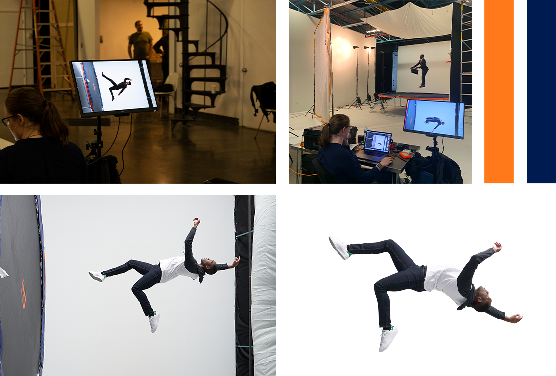
By knowing the unknown, providing real-time visibility, and enabling breakthrough economics, SonicWall protects against boundless exposure points for increasingly remote, mobile, and cloud-enabled workforces. In order to communicate SonicWall’s business values across a variety of businesses, Bluetext prescribed a verticalized approach to target the unique needs of each industry. Every detail, from costume to backdrop, was personalized to resonate with distinct audience personas. To truly stand out and earn attention in a crowded cybersecurity arena, the campaign centered on fantastical floating imagery, which served to visualize an anti-gravity feeling of breaking free of cyber threats. To achieve this vision, action photography of models jumping and free-falling atop a giant trampoline was captured. With custom photoshoots, expert post-production editing, and head-turning taglines Bluetext truly elevated the campaign to new heights. As a collection, the campaign imagery showcased SonicWall’s wide range of customer success, and as individual targeted campaign assets, the images emphasized SonicWall’s application to industry-specific use cases. New website pages, banner ads, and social graphics were developed to reinforce ”When Cyber Threats Are Limitless, Your Defenses Must Be Boundless.”

The campaign was a roaring success. So much so that it inspired a Boundless 2.0 campaign that elevated key art imagery to 3D video production to tell the evolving Boundless story. This time, the campaign focused on the end user’s journey into a surrealist, anti-gravity state of mind. The campaign video spans a variety of industry applications, from higher education libraries to retail shops, but focuses on the perspectives of an SMB and remote employee. The narrative describes the current state of cybersecurity, being a sense of closed-off isolation to avoid the fear of cyber threats, but begs the question of ‘what if?’ The main characters are shown proceeding through their daily responsibilities (whether that be commuting into the office, or multi-tasking child care responsibilities at home) until interacting with SonicWall products on their given devices. As these users connect to SonicWall they experience the unconventional possibilities of cybersecurity; ‘What if cybersecurity felt…free?’ The characters are transitioned to a surrealist Boundless world, in which 3D video effects bring a state of gravity-free liberation from constraints of the past. The characters “break free” to realize a more secure, yet freer, future with SonicWall.
To further compliment the Boundless 2.0 campaign video, Bluetext brought the story to life on the SonicWall website homepage and campaign landing page. Both of which feature 3D video in the hero zone to showcase Boundless Cybersecurity for both the remote and in-office workforce. Bluetext animators built a custom 3D environment for each character, which is showcased through 360 pan-around camera effects. Attention to detail was everything, from the outfits worn by the character to the interior decor with hints of the SonicWall brand elements. The characters themselves even parallax for hyper-realistic body motion. The rest of the pages were designed by the Bluetext website & UX designers to highlight the campaign’s core messaging, featuring new products and industry-related use cases.
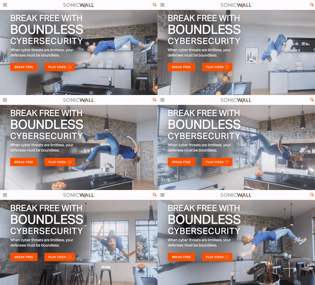
In an impressive feat of animation, website design, videography, and most of all creative brainpower, Bluetext accomplished its challenge. The Bluetext and SonicWall team combined forces to bring new energy and direction to the SonicWall Boundless Cybersecurity campaign. In two years the campaign has evolved to new heights, but just like SonicWall security, the potential is boundless. Stay tuned to see how the campaign further evolves in 2022, and contact us to see how we can develop a state-of-the-art campaign for you.
62 seconds. That’s the average amount of time a user will spend on a website before hopping to another page. 62 seconds for your website to show off all your company has to offer. 62 seconds for you to create a spark of interest that will keep your customer’s cursor away from the dreaded back button. The attention span of modern internet users is a fickle thing, dashing between emails, articles, quick searches, and more. So when you have only a little over a minute to hook a viewer, you better make every second count. A beautiful landing page can grab a viewer’s attention, but a strategically crafted landing page will keep them there. Below are some tips that top digital marketing & website design agencies use to hold the attention of your audience when they land on your site.
Helping Your Users Take Action with Interaction
A favorite UX design practice to encourage digital engagement is the use of interactive elements. This elevates the user experience from passive observer to a participant (referring to any degree of interactivity) on your landing page. When inviting users to interact with content, UX designers tread a fine line between doing too little and asking too much from their audience. Subtle elements such as eye-catching hover states and scroll-initiated animations are one way to get the user involved and create interesting effects based on their cursor movement or scroll. The logic behind these interactive elements is basic psychology — rewarding the user for viewing your content or scrolling encourages them to continue this action. Once visual interest is sparked, the user is more likely to continue scrolling on-page to view content and eventually reach a lead generation form.
Lending Your Users a Hand with Custom Cursors
Another top trend in interactive content is custom cursors. Brands are beginning to implement custom cursor shapes and styles, and even animations triggered by placement on-page. One of Bluetext’s favorite examples of interactive landing pages is Asimily, a page with several subtle interactive elements, including new content triggered on scroll, animated hover states, and typography motion.

Animations That Keep Your Audience Still
Animation is also a powerful tool to capture and retain attention, with elements like looped animations ensuring that a user catches an effect and can continue to watch it. Animated promotional videos can also be leveraged into powerful lead generation tools. Videos are quite effective for generating leads because they present a simplified version of your offering, and are far more engaging, and require less effort than reading an article. Animations are a great way to convey key information more efficiently and effectively on what your brand has to offer.
Take the Lead with Your Landing Page Strategy
Ultimately, these little changes can make a big difference in converting prospective customers into solid leads. There are many other ways to increase leads to supplement interactive elements. Targeting by channel, limiting navigation, including a clear call to action, and communicating key insights clearly all contribute to a more impactful strategy. Aggregating strong messaging, website design, and user experience best practices can enhance conversion rates on landing pages. Need help achieving better leads? Bluetext is here to bring stronger leads to your company through exceptional content and design.
New year, same buzzwords. We’re all familiar with the phrase “machine learning”, but finding a practical application for it that supports your business model is another story. The key to effective digital marketing campaigns is taking full advantage of emerging technologies, and if you’re looking to increase your marketing team’s productivity and efficacy, look no further than machine learning. From paid media campaigns to search marketing strategies, recent machine learning enhancements have skyrocketed its digital potential. As brand marketing becomes more closely integrated with performance marketing, introducing ML to your digital marketing strategy is an effective way to assist your team on both fronts.
According to Google’s Chief Search Evangelist, “The future of brand marketing is digital, and it’s automated. As a brand marketer, if you can start thinking like performance marketers when it comes to KPIs, measurement, and budgets, you’ll be poised to win.”
Looking for ways to get started with machine learning in your marketing processes? Here are a few ideas:
-
Introduce personalization at scale.
Personalized advertising is a tried-and-true success tactic, and machine learning makes personalization at scale easier than ever. Whether you’re personalizing for 100 users or 100,000, AI makes the process quick and effective. Better-targeted ads, personalized messaging, and individualized user journeys are just a few ways that ML can boost your brand. -
Leave the bidding to the machines.
Free up your team’s time by handing off PPC management to a tool like Google Smart Bidding. With automated bidding, your team can focus more on strategic planning and goal-setting instead of cent-by-cent differences. -
Implement a chatbot on your website.
Chatbots are simple integrations that can have a major impact on the conversion rate of your site. The best chatbots use AI to make the customer’s journey as simple as possible, guiding them to the right information or product with minimal back-and-forth. Trusona uses a pre-populated chatbot, so users don’t have to lift a finger to type a response; they can simply choose from the options presented. -
Iterate, optimize, and iterate again.
Iteration is one of the greatest strengths of processes that use machine learning; rapid analysis of digital performance means that your team can respond in real-time to shifting trends and interests. Ultimately, the introduction of machine learning to your brand’s marketing tactics will result in better products and better performance.
Implementation of machine learning could be the next major step in your brand’s growth. To learn more and see how Bluetext can partner with you in that growth, contact us.
Scroll-based animation offers all the benefits of on-page animation and more. Not only do pages with scroll-based animation engage users more effectively, but they can also tell more complex stories, improve page load time, and expand the capabilities of your brand identity.
Some stories are best told visually, and scroll-based animation is an effective way to make complex stories simple and elegant. Designers can use animation to guide users as they scroll, catching their eye at exactly the right time and place. Apple incorporates subtle animations into its product pages to drive user focus toward key information they want to highlight.
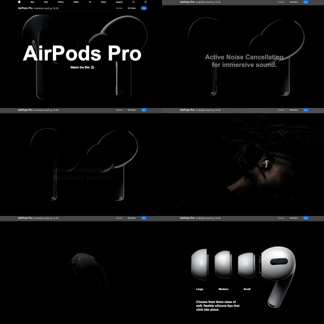
Scroll-based animation can offload elements beneath the virtual “fold” from the initial loading process, decreasing overall load time. Elements above the fold are prioritized in the initial load, saving time on down-page items that are animated to appear as the user scrolls down.
Implementing scroll-based animation provides the opportunity to add animated elements to your brand. Whether they’re completely new, or existing pieces that have been updated with motion, animated elements can help bring your brand to life. Elements like a scroll-based footer or call-to-action can be used across a website to consistently call attention to key information about your brand.
Key Tips for Scroll-Based Animation
Getting started with scroll-based animation can be tricky, so here are a few pointers to keep in mind as you go.
- Timing is everything. The flow of the animations as a user scrolls down the page is key to maintaining their interest. As a user moves down the page, elements should naturally animate or appear, so there are no gaps in the experience. A simple, well-timed scroll-based animation is always better than a complex but awkward one.
- Added effects should emphasize key information, not detract from it. Keep in mind that the whole point of on-page animation is to make it easier for users to navigate your site and find what they’re looking for. Be sure that any effects or animations make their experience easier, not more difficult.
- Less is more. When in doubt, simplify. Avoid cluttering your site by animating every element on a page or by introducing particularly drawn-out animations for no reason. As a rule of thumb, smaller elements should have shorter animation cycles, and each animation should have a purpose in guiding the user experience.
Looking for inspiration?
Clarabridge’s animated homepage brings the brand to life and elevates the user experience. On-page effects guide the user through the homepage, emphasizing the strength and ease of Clarabridge’s solutions. Click here to read our case study on this project.
HuffPost’s interactive article, Chef Jose Andreas Embraces the Chaos, is an example of “scrollytelling,” which uses scroll-based animation to enhance a written story. Hand-drawn visuals appear as the reader scrolls through the story, adding a playful, personal feeling to the page.
For Calling All Optimists, Bluetext incorporated subtle scroll-based animations throughout the site to draw attention to key information or calls-to-action. Along with the brand’s playful shapes and colors, these animations reinforce the positive, dynamic qualities of the site. Click here to read our Calling All Optimists case study.
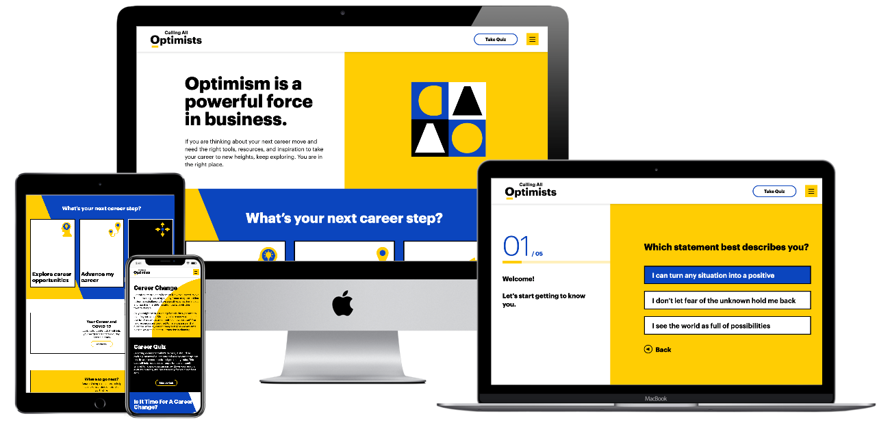
Ready to see how scroll-based animation can enhance your site? Contact Bluetext to learn about our motion design and interactive UX services.
The next time you’re in a public setting, look up, and chances are you’ll notice almost everyone around you has their eyes glued to a mobile device in hand. Modern-day mobile devices are essentially mini computers, enabling on-the-go browsing, communication, and connection at unprecedented ease. Society has become accustomed to instantaneous connection, but not all websites are up to par with user expectations. While desktop sites were once the focus, a disappointing mobile performance of websites is holding many companies back from their full online potential to garner customers. Aside from a frustrating user experience, poor mobile performance can hurt a website from a technical SEO perspective. This is why many companies are turning to digital agencies like Bluetext to revamp or create entirely new, responsive web designs & optimized performance to stand out among their competitors.
On average, mobile devices account for more website user traffic than desktops. However, despite the high traffic volume, conversion rates on mobile environments are significantly lower. So what’s turning our mobile users away? Adrienne Clem, Director of Search Ads Growth and Optimization at Google, describes that it could be an issue with any one of the following pillars of mobile website design:
Speed
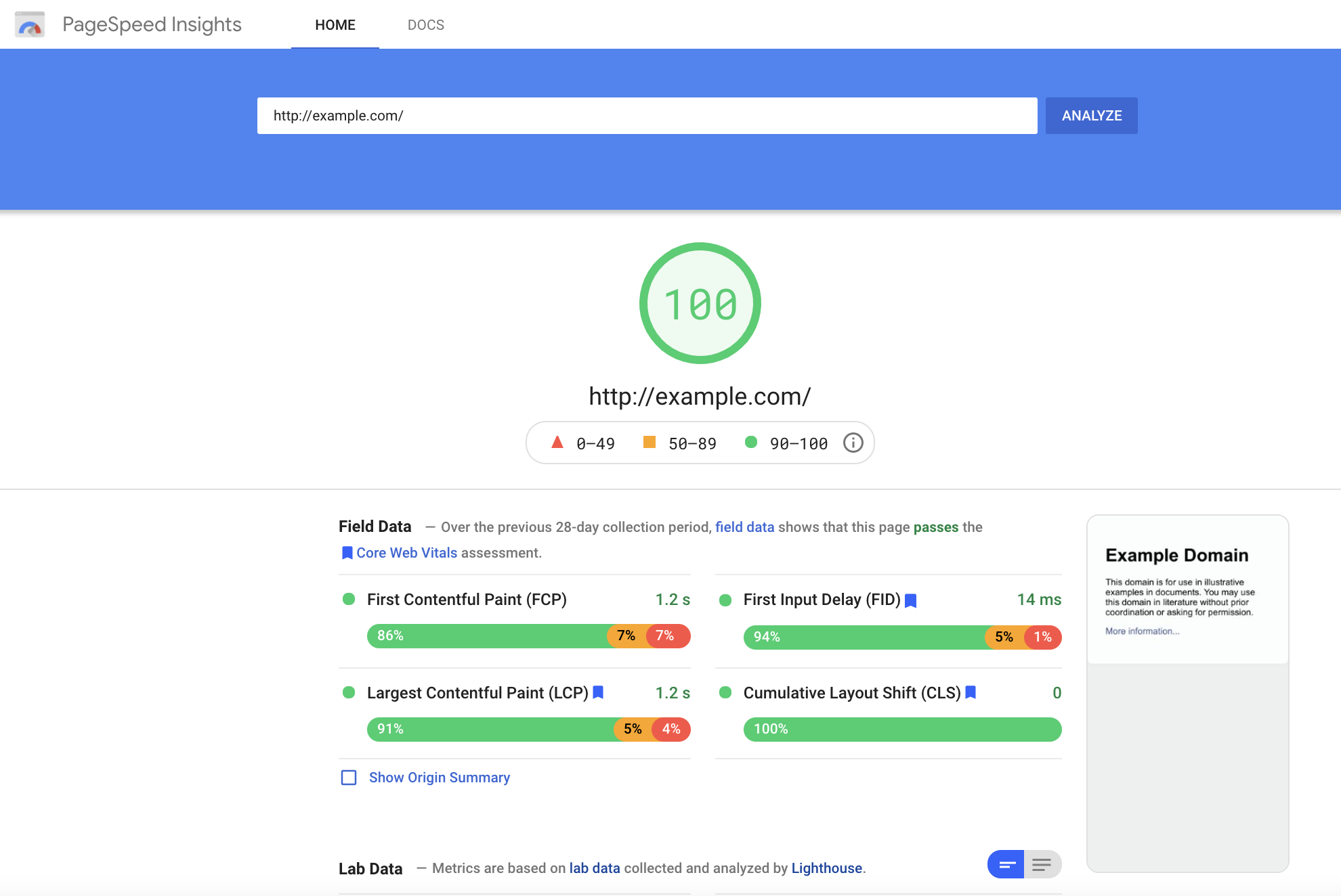
Page Speed is a key indicator of website quality, as it is a critical first impression of your website. The longer a user must wait for your website content to load, the higher the risk of the user leaving the page and increasing the bounce rate. Bounce rate, performance, and speed metrics all play a critical role in Google search crawlers’ evaluation of a website. (such as, In addition to limiting bounce rates, reducing your Time to First Byte can also increase your site’s SEO ranking. You can keep tabs on your site’s speed performance using tools like Google, PageSpeed Insights, or GTMetrix.com, but consulting a website development agency can offer further insight into actionable steps to improve your site’s performance.
User Experience
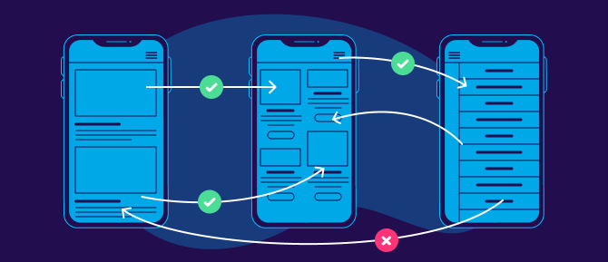
All websites should be designed to be as simple as possible for users to navigate. However, this isn’t as easy as it sounds. Content hierarchy, navigation, and calls to action are all critical components that need to be equally accessible and intuitive across desktop & mobile formats. Responsive layouts are essential in a mobile-optimized design, but more important is the speed at which content loads for a user. Mobile site speed tends to lag behind its desktop counterpart, but a poor mobile performance can significantly ding your site’s SERP ranking and create a poor user experience. Even the most creative & persuasive landing pages are wasted if features take too long to load on the screen. Pages that utilize AMP (Accelerated Mobile Performance) technology both rate higher on Google search rankings and increase chances of conversion for paid media promotions. AMP HTML is an open framework based on existing web technologies, that allows for more lightweight and speedier mobile web pages. In an initiative to enhance the shift to mobile browsing, AMP-powered webpages load instantaneously, even when they contain rich media like video, animations, or graphics, including things like Twitter and YouTube embeds.
Iterative Design
Website design is an iterative and ongoing process. Platforms & technology are constantly evolving to include new features, remedy existing pain points and approach the ever-moving target that is positive user experience. Companies should approach this process in the interest of continued learning and constant improvement. Collecting feedback should be built into the plan for any mobile site development, as the site’s performance should be re-evaluated at least every 3-6 months. Keeping track of your site’s vitals is an important step for ensuring that your site stays relevant and isn’t losing out on potential conversions.

In an increasingly mobile-first world, emphasizing the performance of sites on mobile devices can increase customer loyalty and satisfaction. Whether a prospective customer’s impression of your campaign landing page or an existing customer’s experience browsing your full website, speed is the name of the game. Keeping up-to-date with best practices in website development and enlisting the help of seasoned designers and UX specialists can transform users from mindless mobile scrolling to enthusiastic interactions on your site.
If you’re ready to start designing your site with a mobile audience in mind, Contact Bluetext for guidance and expertise.
The recent Labor Day continued to shine a spotlight on an ongoing problem brought on by COVID-19: The Great Job Exodus of 2021. According to Microsoft’s 2021 Work Trend Index, 40% of the global workforce is considering leaving their employer this year. While many companies adopted more flexible work policies to adapt to the pandemic — with some being here to stay permanently — employees are continuing to experience burnout and businesses are seeing employees flee by the dozens.

Social media platforms such as LinkedIn have exposed a high percentage of PR and marketing professionals leaving their positions no matter the industry or tenure. Businesses large and small are struggling to fill key marcomms positions — specifically those in the mid and senior roles. And who can blame them when they’ve been working for 5 years or more, exhaustedly grinding away with a pandemic raging?
Finding and retaining top in-house talent can negatively impact the ability of marcomms teams to execute. The absence of senior leaders can make it difficult to provide the C-Suite with the strategy and ideas essential to growing the business. Additionally, if you can’t fully staff the team with junior and mid-level professionals, it can bog down more experienced marcoms professionals in tactical, rather than strategic, work.
The current conditions make a strong argument to fill the gap with a tech PR agency, like Bluetext. Leaning on an agency partner for additional services and support can alleviate some of that workload and bring fresh ideas and perspectives to your business. However, picking an agency is no easy task. Businesses need to find trusted advisors and agencies that will be an extension of the company; trustworthy firms that understand your business, products, and values. So, how do you pick the right partner to fill these gaps? Let’s dive in!
Benefits of an Agency Partner vs. In-House Staff
While both options have their benefits, deciding on an agency or in-house staff really depends on what your business is looking for, and it can depend on a variety of factors. While an in-house employee will, over time, know the ins and outs of your brand, it is rare to find an in-house marketer who is adept at all aspects of digital marketing. And if you do find someone who knows all aspects of digital marketing, it could be an overwhelming experience for them and may impact employee retention.
With an agency, you gain the benefit of a team of individuals with complementary skills who already work well together. An agency can also bring a fresh perspective, based on work with others in your industry, and even competitors. In-house marcomm professionals are at times so close to the brand it can lead to overly subjective decisions.
As for media relations, a public relations agency will have years and years of experience in multiple industries. Their media relations roots are continuously growing as they’re passed from client team to client team. Agencies have a plethora of relationships with media that are nurtured continuously from client’s both past and present. In general, agencies have a better understanding of media, industry trends, and the ever-changing media landscape and can easily adapt a strategy to meet the needs of their clients.

What to Ask Yourself when Finding an Agency
1. What are my goals?
This is a no-brainer! What are your marketing goals? The answer will determine which agency is right for you, what resources an agency should have, and more. Does this agency have enough experience and resources to help you achieve core objectives, does it have a presence in your target market or will you be able to build relationships with media through this agency? All of these questions are important to ask when it comes to choosing the correct agency partner.
2. Does my staff have the required resources and skills needed to achieve said goals?
By understanding which marketing tactics your business needs and the resources and skill level needed to do it, you’ll be able to find the right agency for your business. If you’re looking for more comprehensive marketing services none of your in-house roles can accomplish, be sure to pick an agency that has a diverse skill set to cover your bases. As a fully integrated marketing agency, Bluetext has a variety of services we offer to our clients that include messaging, branding, website design and development, go-to-market campaign strategy, public relations, social media, and so much more.
3. What value will I get for the cost?
When evaluating an agency, the math needs to be done to compute the true cost of the output. With an agency, you get the support of an entire team rather than just one person, therefore, getting more for less.
4. What is my budget?
By determining your budget, you can decide how much you can afford to invest in marketing which will dictate how much work your agency will take on. Sometimes what you can afford is too little to drive real results with one agency but can work for another.
Once you’ve asked yourself what your goals, budget, staffing needs, and skillset needs are, be sure to contact Bluetext to learn how our B2B tech PR team can help you fill any in-house skills gaps you are facing.
Video marketing can be a vital tool when it comes to leveling up your marketing program. Video, as a medium, is an exceptional opportunity to tell your brand’s story and mission using dramatic visuals, voiceover, and music. Video allows you to inject emotion and feeling into your content, something that written mediums like blog posts and product pages just can’t compete with. As some may say, the medium is the message. To humanize your brand and create a memorable connection, audiovisual content can build that bridge. Additionally, the ease with which you can upload your video content to a variety of social media platforms allows you to share your story with as many potential customers and reach as wide an audience as possible.
Below, we dive deep into the five reasons you need to use video in your marketing strategy and why partnering with a video design and production firm like Bluetext is the right choice for you.
1. Authentic Video Builds Trust
Perhaps most importantly, video content helps build trust between you and the prospective buyer. Trust is the foundation that drives conversions and overall sales. 57% of consumers say that videos give them more confidence to purchase online. With a great voiceover and a moving music track, videos can provoke a very emotive, and therefore, human response, more impactful than any generic landing page. Having your team on camera explaining your product or service is also a great way to provide prospective customers with a sense of your company culture and why they should work with you. Additionally, video content filmed and edited the right way evokes authenticity and transparency, both key points when aiming to build trust.
Through our work with Invictus, we produced a video around the story of their unique, military family-oriented mission that resonated with their prospective customers.
2. Explain Difficult Concepts With Ease
We live in a fast-paced visual-based world, where users are less likely to read through a product description and more likely to prefer an infographic or video that explains the solution succinctly. Technology has made us all accustomed to immediate satisfaction in finding the answers we seek. And if users don’t find the information they’re looking for, they lose interest or look elsewhere. Video content reduces the overall effort it takes to learn something new, especially when it may be a difficult concept to understand. If you’re launching a new product or service, explaining its features and advantages will be easier through video than a product landing page. The way the human brain processes information varies by individual, some are more visual learners, some auditory, and even some kinetic. If you don’t have the words to explain your product, the use of animation can help bring any concept to life. An audiovisual medium allows you to effectively reach a wider audience. The quicker someone can understand your product, the quicker the conversion from prospect to a customer will be.
Through our work with IoT cybersecurity company, Phosphorus, we told the story of their mission and the power of their groundbreaking platform.
3. Google Loves Video Content
There are a variety of reasons Google loves video. Perhaps most importantly, Google places great value in the length of time a user spends on your webpage. If your video content is enticing enough for the user to watch it all the way through, they’re more likely to spend more time watching a video on your site than reading through a lengthy landing page. Additionally, as we know, including keywords in your written content is important in any SEO strategy and helps improve your search rankings. Using the latest Video Intelligence API, Google can catalog the relevant keywords in your videos and increase your ranking in search engine results. Relevant keywords in your video and written content packs the maximum SEO punch into your webpage. Another great reason video content is a great SEO value is as video content can be adjusted to multiple screen sizes, Google ranks this content very high in search results.
4. Mobile Users Benefit
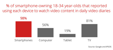
In the world we live in, everyone is glued to their smartphones throughout the day, watching, liking, and sharing content. According to a recent study, 90% of users actually watch videos on their smartphones rather than on computers or televisions. The ready availability of so much video content on smartphones is driving this statistic and will only grow as more and more content is produced. So what does this mean for you? Increasing the amount of video you put into the market will only increase the engagement with your content from prospective customers. Well-produced, informative content will be more likely shared and will lead to increased sales.
5. The Competitive Advantage
Stay one step ahead of the competition by producing video content. A lot of companies are still of the mindset that video content is way too expensive; and sure, some very well-produced content can get expensive when you’re factoring in custom shoots, actors, and multiple 8K cameras. That being said, video content doesn’t have to be expensive. With the right story and a camera as readily available as the one on your smartphone, you can create perfect video content that will resonate with your target audience and lead to many conversions. Being smart with your resources (financial & human) can result in an impressive video that no one would know was built on a budget.
Videos can play a massive role at every stage of the marketing funnel. That being said, creating high-performing video content takes time and effort. Ensure you have the right video content strategy from the get-go and that you maximize authenticity, creativity, and uniqueness. Need support putting together your video content strategy? Contact Bluetext today.
In our modern world, nearly all marketing campaigns integrate some level of digital communication to broaden their reach across their target market. But technology is changing so fast that it can be difficult to keep up with the latest and greatest. And let’s face it, trends have an expiration date. So how do marketers know what digital assets will be the most effective for their campaigns and how do they know what will stand the test of time? Let’s take a look at some digital marketing trends with timeless potential:
1. Quality UX
With more and more digital users every year, it is more important now than ever to make your presence known in the digital sphere. Though, checking off the box for “having a website” doesn’t mean that you can sit on it and let it be. It is important to ensure that your website continuously provides a quality user experience for your end-users to keep them coming back and that it appears modern and relevant to new users.
Whether you are looking to update the look and feel of your website every two or three years, or keep your content strategy up-to-date every few months, it is important to connect with a digital marketing agency, like Bluetext, who can work with you to create a well-informed and exciting new website plan. Digital marketers can work with you to keep your thought leadership up to date, create a new digital brand presence, and develop a smart, sustainable navigation strategy to ensure that your users are able to find what they are looking for on your website. User experience is a broad discipline, with many proven principles that should lay the foundation of every unique design. Quality, well-informed UX will help drive leads, make conversions, and ultimately boost revenue for your business.
2. Virtual Events
We know that the coronavirus pandemic led to a hunkered-down workforce, many working from the confines of their makeshift home offices and connecting with coworkers and clients virtually. Large-scale events were unimaginable and virtual events quickly took their place.
Virtual events are exactly what they sound like ― virtual. This means that attendees don’t need to travel to attend a virtual event as they can enjoy them from the comfort of their own homes. No venue means no geographical constraints and the elimination of travel expenses. Attendees can join from all across the country, and all around the globe without costing their companies a dime.
Virtual events also allow companies to shift their budget away from venue fees and reallocate it toward production costs for their event. High-quality production captures and sustains attendee attention. If your event is lacking in production value, your attendees will be more inclined to spend time on their email instead of participating and actively listening to your hosts and guests.
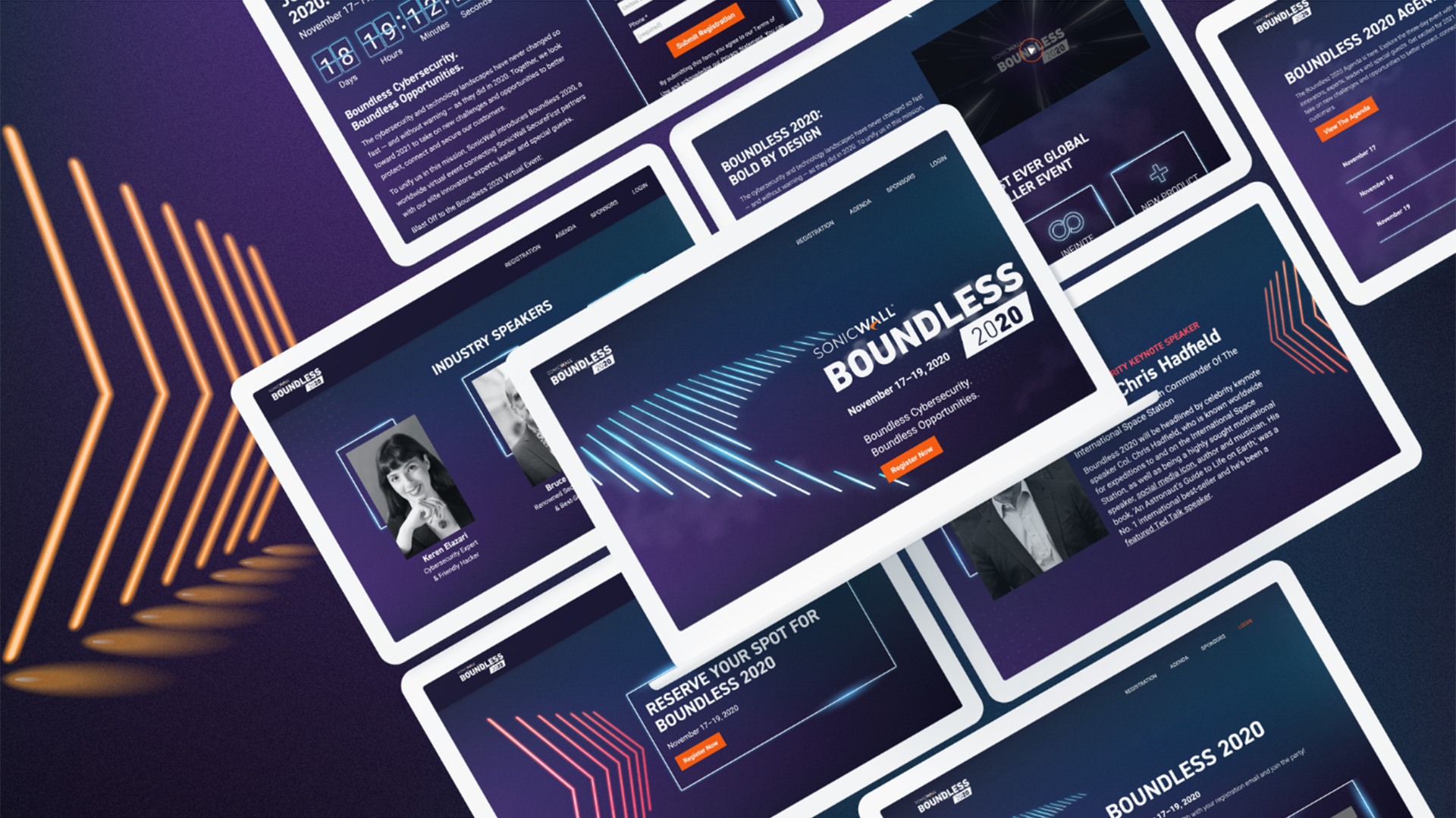
See how SonicWall successfully garnered a 135% increase in attendance over their previous high-mark partner event. The high-quality production of pre-recorded videos, a custom website with a quasi-live experience, and motion graphics all worked together to untie attendees in a shared interest no matter their physical location.
 3. Augmented Reality
For a few years now, brands have been experimenting with augmented reality to help place their products directly in front of their potential customers. For example, Wayfair and other furniture companies have an augmented reality feature that places a new piece of furniture directly in your space, allowing you to see how it would fit before making the purchase. Warby Parker leverages augmented reality to show consumers how a new pair of glasses may look without going into the store to try them on or waiting for their at-home try-on box to arrive.
Augmented reality truly allows brands to revolutionize the way consumers interact with their brands, and ultimately their products. And if you’re thinking, ‘that’s neat, but only for flashy consumer brands’ you might want to think again. B2B companies are adopting and innovating on the trend to make this technology applicable to their offerings. Because, why let consumer brands have all the fun?
Bluetext worked with AppGate to provide an immersive augmented reality experience at RSA® Conference 2020, the world’s leading information security conference in San Francisco. Bluetext conceptualized, designed, developed, advertised, and coordinated the ground-breaking Kill Your VPN campaign and augmented reality booth experience to help AppGate stand apart from the 658 other exhibitors in 2020.

4. Content from Micro-influencers
The influencer marketing industry was worth $8 billion in 2019, and it is estimated to grow to $15 billion over the next two years. But according to Kali Ridley, a marketer on Google’s Brand Studio team, the future lies not with megastars and their millions of followers; it’s with micro-influencers.
Micro-influencers are those with smaller followings, somewhere between 1,000 and 10,000 followers, who are able to form a community within their reach and share messages that will resonate with their fans. More and more, marketers are discovering relatability outshines star power. Relatability feeds directly into trust, therefore, creating a much stronger argument for your product or service.
LinkedIn has undoubtedly made changes to its platforms that enable these micro-influencers to make a further impact. The new “Creator Mode” for LinkedIn allows users to pin specific hashtags to the top of their profile to signify the themes they frequently post about. With creator mode enabled, the presentation of profiles is altered to emphasize the hashtags directly under job titles. Additionally, users can “Follow” these influencers rather than adding them to their personal networks. Now instead of feeling uneasy sending network invitations to a complete stranger, users can follow their favorite thought leaders just as easily as on other social networks.
These small changes in the social media platforms signal that micro-influencer marketing strategies are worth the investment and aren’t going anywhere anytime soon.
If you want your brand to stand out and succeed today, and tomorrow, consider getting in on any of these trends. Each of the four above have a promising future of long-term success. As a digital marketing agency, Bluetext expects these trends to be adopted by many companies over the coming years, and only improve with iterations on previous success. Contact Bluetext today if you’re interested in a future-focused marketing strategy.
Last week the goliath of technology conferences held in the U.S., CES, announced that its January 2022 event will require vaccination proof for in-person attendees. The motivation for the Consumer Technology Association, the show’s organizer, to resume a face-to-face component is strong: exhibitors recognize that generating enthusiasm for new consumer products and technologies through virtually is not nearly as powerful as live demonstrations.
Few in the tech marcomms space have endured a more challenging professional pivot over the past 18 months than those responsible for conference and event strategy and execution – whether it is determining what kind of investments should be made in industry events as well as how to manage their own annual user conferences and smaller events so critical to cultivating customer, prospect and partner relationships.
Pre-pandemic, there was of course no need to make decisions on whether to hold in-person, virtual, or hybrid events — often several months in advance of the event date itself. And through the first 15 months of the pandemic, COVID-19 in effect made the decision for marcomms and event decision-makers as everything shifted to virtual. This was no easy feat but at least the decision was.

The emergence of the Delta variant, right as tech companies were resuming planning for in-person events, exponentially complicates the decision-making process for the 2021-2022 tech conference strategy. While CES is planning in-person for vaccinated attendees, plans for other events run the gamut. As this Marketwatch article notes, tech companies with large user and developer events are re-assessing given Delta. Salesforce.com’s CRM Dreamforce is still planning for an “in-person experience” for the Fall event, but so many others have already reverted back to virtual or hybrid experiences with a limited in-person component.
As you evaluate your 2021-2022 tech conference and event strategy in light of the Delta variant and other unpredictable developments we should all expect in the months ahead, keep the following strategies in mind:
Look at the event track record
Tech conference organizers that have already executed a virtual event last year during the pandemic offer a track record that can be analyzed when it comes to attendance, engagement, and results. The Marketwatch article raised the valuable point that what virtual events lack in intimacy they make up for in some cases with larger attendance, citing feedback from Juniper Networks that attendance for its virtual Global Summit held in April was more than 2x in-person attendance for recent and similar events. It is of course easier and more cost-effective to hop into a live panel discussion on your laptop at home than it is to fly halfway across the country to attend in-person.
But for every Juniper, there is a Mobile World Congress, which forecast a significant in-person attendance drop for its hybrid 2021 Barcelona event, where the 50,000 in-person attendees expected to attend was half the number compared to its “normal” pre-pandemic numbers.
The more information you have from organizations that have already executed events during the pandemic, the less guesstimating you have to do when it comes to the right investment level for attending, speaking, sponsoring, exhibiting, or skipping altogether.
Track records matter because, with conference and event investments, you can’t just assume that all of the money will be recouped if the in-person event is canceled. There can be a difference between an organizer canceling of its own volition, and an organizer canceling because it is subject to city or state directives that are issued prior to the event. The more confidence you can have in the event organizer, the lower the risk of a negative financial and business outcome.
Size matters
If the pandemic has communicated anything to marcomms professionals it is that bigger isn’t necessarily better. Most attendees are going to baby step back to live events, so going from working from home to a crowded pavilion with 100,000 of your closest friends may be a bridge too far.
Dialing it down from potential ‘super-spreader’ to ‘super-intimate’ events that still allow for facetime but in a more controlled environment with modest numbers of people can support corporate and sales objectives. If you are a tech company evaluating what in-person events to attend, don’t discount these smaller events and if you are an event organizer, converting a large annual event into, for example, quarterly smaller regional events can pay off.
The key for user events is data. You can’t just guess how attendees might act when presented with options between in-person, hybrid, or virtual, or what size of in-person event they might be comfortable with. Survey, survey, and then survey again. External third-party data has value, but you know your customers best and keeping your finger on the pulse of their event and travel preferences is critical.
In its latest PULSE Survey, Northstar Meetings Group found that two-thirds of the 826 respondents will hold their next in-person event in Q3 or Q4 of this year – with half of them requiring attendees to wear masks indoors and 28 percent requiring proof of Covid-19 vaccination. But the survey also reinforces the need for conference organizers and meeting planners to be nimble and resilient in the face of constantly evolving federal, state, and local policies.
Re-imagine your traditional event approach
Pre-pandemic tech conferences and events were far from perfect, which helps explain why many have seen value in the shift – as temporary as it might be – to virtual and hybrid events. Marcomm and conference decision-makers should use the challenging environment as an opportunity to re-imagine traditional approaches.
Virtual and hybrid events unlock new content and access opportunities, new ways to engage with and receive feedback from attendees in real-time to drive experiences not possible with in-person events where individuals are scattered and engagement is harder to measure. While larger tech conferences made great strides in trying to make their events “smaller” when it came to networking rather than releasing thousands of people into venues to try and find each other, the results were imperfect.
Each event model comes with its own challenge. User conference organizers know that while virtual events may be easier for customers to join, they are also easier for them to blow off because it doesn’t require the same level of travel, financial, and planning commitment. Hybrid events create challenges for tech brands unsure of which path provides the better value for lead generation, networking, sponsorships, speaking, and exhibiting. And for all of these models, trying to figure out whether it still makes sense to shell out $20,000 for a sponsored virtual speaking slot in lieu of being on the big stage is no easy task.
When it comes to working with B2B tech PR, B2C tech PR, and B2G tech PR firms, Bluetext has been helping clients navigate tech conference strategy for industry events as well as client user conferences. If you are looking for the right partner to maximize your tech conference investments in the months ahead, contact Bluetext to learn how we can help.
TikTok — the clock is ticking on traditional advertising strategies. As conventional methods wane, a new star player, TikTok, is making waves. At inception, TikTok gained a sticking association with Gen Z via dance videos & lip-syncing parodies. It’s true, TikTok is a popular platform for many teens or young adults to create and send entertaining video content. However, this platform is not just a fleeting fad, but very much here to stay and continue to evolve.
Like any trend, TikTok’s high number of young users caught the attention of older demographics. All wanting to know “what the cool kids are doing”, TikTok’s user base matured. As of March 2021, research found that teenagers are only 25% of the TikTok audience. Who are the rest? Well, it’s a pretty even split of users in their 20s, 30s, and 40s, with even a significant slice of people 50 years and older!
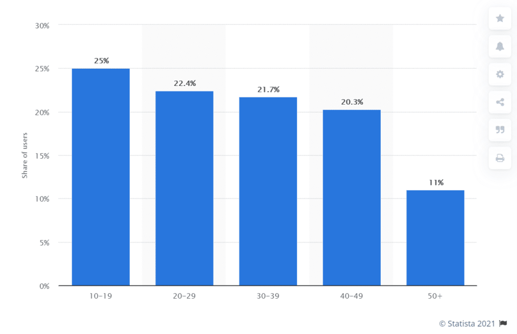
A more diverse user base brought new opportunities, as marketers observed new niche categories rise in popularity. For example, trending hashtags such as #financetok or #taxadvice providing financial advice to users during tax season. Just one of the many unique use cases of the social media platform, as everything from investing to cleaning hacks, has been reenergized by the fun, engaging nature of video clips.
So what does this mean? Well, it’s time that digital marketers begin to take TikTok seriously. Here’s why:
1.Video Content is on the Rise
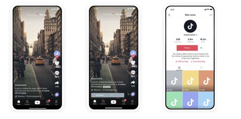
Video content is on the rise — and won’t pause anytime soon. That’s why popular video publishing platforms, TikTok and Vimeo, have joined forces to become an advertising powerhouse. Recent updates have integrated Vimeo creation tools with TikTok AdManager. This enables businesses of any size to create and publish ads directly to TikTok Ads Manager. Effectively breaking down prior production banners, smaller and medium-sized businesses can easily create and distribute engaging video ads at low cost. Going a step beyond, Vimeo offers ad templates specifically optimized for the TikTok platform. Known as Spark Ads, this format allows businesses to take organic content and quite literally re-energize ads on a new short and snippy platform.
2. Self-Served Success
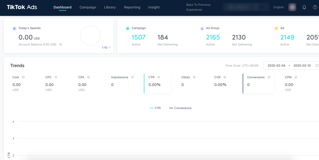
Speaking of the TikTok AdManger, a few of the hallmarks of this platform are the self-service ad publishing, creator marketplace, and other features that empower content creation. With an easy-to-use publishing experience, it allows for more experimentation and freedom with campaign concepts, creative or targeting. The format pushes brands to make their advertisements everything they should be: short, succinct, and engaging. Time limitations force marketers to cut the extraneous details that users wouldn’t retain anyways and hone in on a single direct message. It’s like the bootcamp marketers didn’t know that they needed.
3. Live it Up
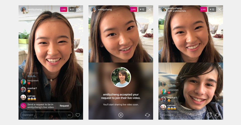
That’s right, TikTok has jumped on the trend of live streaming video content (thank you Instagram & Facebook). While this has playful applications, it’s also a prime opportunity for commentary from thought leaders and brand ambassadors on new product launches, industry events, or current trends. Live stream content has been popularized on alternative platforms (looking at you, Facebook & Instagram) for hosting Q&As and panel discussions. New TikTok features allow both the scheduling & promotion of a live-streamed event but also co-hosting to allow for multiple speakers. This creates a split-screen view and allows hosts to interact one-on-one with another, and with live audience comments.
While the first wave of use cases for these features may be tied to e-commerce and pop culture, it will be the next wave of marketing pioneers who bring a more practical flavor to the platform. Facebook and Twitter started out as purely ‘social’ social media platforms, but look what business opportunities have arisen from there. TikTok will be no different, and the businesses that invest now in their video content creation and production skills will have the upper hand.
Need to amp up your video & social media marketing? Contact Bluetext to learn more about our creative & digital marketing services.
 3. Augmented Reality