Over the past dozen months, Bluetext has renamed about the same number of brands – some as large as a global spinoff of GE – others the up and comers that challenge them.
Despite our counsel to open the naming process to a broader range of TLDs, about 90% percent of them required right up front that the new name have an available .com domain associated with it – not a simple task these days unless you are willing to cough up five – or more likely – six to seven figures to acquire it.
While we are by no means dismissing the .com as a viable option – it has been around since the birth of the internet – so it’s important to understand that as technology advances there is going to be an increasing shift to alternative TLDs as .coms eventually take their rightful place in history.
Among the steadily growing influx of new TLDs – .CO domains are widely considered the most global and credible extension for your online brand presence. Universally recognized as an abbreviation for company, corporation, commerce, and collaboration -.CO domain names are memorable and in the vast majority of applications – shorter than their .com brethren – who by the way even spots them a letter right off the bat by dropping the “m”.
With viable .COM inventory nearly exhausted, the newest innovators and challenger brands are left with limited domain choices within the extension – and often with very little in common with their brand – rendering them less and less likely to come to your user’s mind when they are searching for a specific company.
Most modern, tech savvy users are already directly typing in the URL and are likely to find you no matter what as long as they know what they are looking for. And with the emergence of even more new TLDs getting ready to stream out over the next few years – more and more consumers will be looking more closely at the tail end of the domain.
And finally, for those of you who might be worried about how a .CO domain stacks up against a .COM from an SEO perspective – a .CO web address is treated the same say as any legacy TLDs, such as .com, .net and .org. and has the same potential to rank high among primary search engines – provided of course you have valuable, accessible and contextually relevant content regardless of your choice of extension.
Here’s a link to Google’s SEO authority and search quality engineer Matt Cutts confirming exactly that:
At Bluetext, we believe that .CO is a solid alternative for branding your business – offering a perfect way for new companies to reduce their barrier of entry into the market by providing a platform to acquiring shorter, fresher and more brand centric domains.
Today’s “need for speed” mantra is evident in everything we do. Your website is no exception. We all want everything to be instantly available at our fingertips – including our online experience. For websites, that means the faster the page speed, the better. Top B2B Marketing Agencies have been working with their clients for the past decade to improve page speed, looking for all sorts of tricks and tips to reduce load time and improve response. Some major players – including Akamai in the hosting space, Google’s AMP and Lightening from Facebook – have developed significant technologies and innovations that are worth considering for your digital game plan.
A survey from Statistic Brain concluded that the average person’s attention span has fallen to 8.25 seconds down from 12 second in 2000. This statistic is projected to continue to decline. As a marketer, that means you have even less time to grab your audience’s attention before they’re on to the next shiny object.
Page speed is defined as the load time of one particular page on your website. Ideally, the site is completely rendered and ready to go on a screen within microseconds of someone typing in its URL and hitting enter. Does this seem like an impossible ask? The short answer is yes. Since a feat such as this is borderline impossible in most cases, we’re forced to resort to more realistic metrics to achieve this lofty goal.
Here are the top three reasons why lightning fast page speed is essential for the success of your organization’s website.
1) It’s all about the User
User experience is the number one priority. Without them, of course, your site is just a jumble of html that serves no purpose. Site optimization is key and should be performed often.
- Fast page load time means users will be able to quickly navigate the site, increasing pages per session, time on page, and (possibly) decreased bounce rate.
- Better numbers for the metrics listed above mean better rankings from Google.
- Referrals become more likely when a user has had a good experience on your site.
In today’s ultra-competitive marketplace, a positive user experience could easily be the edge between your site and someone else’s.
2) The Fast and the Mobile Friendly
Google expects a mobile page to render above the fold in one second or less. Since more than half of the 3.4 billion daily Google searches are done on mobile devices, it’s imperative to have a fast and mobile-friendly site. According to an experiment done by Moz, Google has indicated it may actually be measuring “time to first byte” (TTFB) — which is how long it takes the first byte of information to get from a server to a browser.
Now that you know what Google’s looking for, there are numerous tools to help pinpoint where improvements could be made on a site’s backend. At Bluetext, we like to take out any guesswork and get our insights straight from Google. Put any URL into Google’s PageSpeed Insights tool and it provides recommended fixes, as well as a speed score on both mobile and desktop.
3) Page Speed + Stellar CTA = Increased # of Conversions
It’s been proven that page speed has a direct correlation to the number of conversions as long as it’s paired with an enticing Call to Action (CTA). For example, if a user wants to download a white paper but has to wait for the page to load, that user will lose interest and most likely leave the site. For businesses, that means a prospect is bouncing and may be lost for good.
Every second counts. Don’t wait, start optimizing your site speed today because if you’re not recognizing the need for speed, you might as well go home. For more tips on making a great first impression? Click here: https://bluetext.com/top-branding-agencies-know-never-get-second-chance-make-first-impression/
Need help speeding up your digital platform to get the performance you want ? Contact us
Planning for the New Year? Is Your Branding Up to Snuff?
With a new year comes new expectations. More qualified leads. Better content. More PR coverage…just some of the areas that b2b marketers are measured against.
The New Year marks a great time to unveil a new brand identity to the market. Usually in January there is the company wide sales kickoff meeting where the team is hungry for something new. Out with the old and in with the new. A new look is always a smart way for b2b marketers to kick off the year in style.
A lot goes into creating and launching a new brand. Determining the new brand identity, then doing all the steps to launch it are critical for success. How well you handle the transition process from the old to the new and how that plays out can go a long way toward determining the success of your launch. As you only have one chance at a first impression, every step you take in in the process must be executed flawlessly.
So let’s think about audiences. First and foremost is the internal audience. They say that more than 50% of the success of a rebranding effort is determined by how well it is received by your internal champions. These are the people that will be the first line of defense when presenting the new brand to their customers and partners. They should love it. They should feel inspired. They should be prepared to scream about why you did it and what it means to the market from the mountaintop.
To best do this, they need key messages delivered on a silver platter. And they need to be easy to communicate. Having a consistent story to tell is critical. Think of it like a game of telephone. Once you tell them why you did this you have no idea where the message will go. By the time it reaches a hot prospect it may lose its impact. And remember, you only have one chance at a first impression.
Once key constituents understand why you did it, the next critical question for b2b marketers to answer is how will the news and message get communicated, and when can people talk about it. From the smallest requests (when will by new business cards arrive) to the most critical brand story telling channels (when will the website get updated), no detail should be overlooked. A detailed rollout plan is critical for success.
Say it Loud and Say It Proud
Many brand marketers don’t get the respect they are due. Their efforts are reduced to simple questions from others such as “what hours do I need to be working at the tradeshow booth?”
A new brand identity is the time to make a splash, and what better time than the New Year when we are done celebrating past years’ success and are now ready to move forward with the new branding. If you are like most b2b companies you have a big sales kickoff where everyone is hungry to see what is new for the near year. If you coordinate efforts well, all materials are ready, all messages are crisp, and you have the perfectly captive audience of internal influencers to get behind your efforts. Leverage the promotional opportunity the kickoff presents to make it memorable.
You Made the Splash, Now What?
Let’s face it. Launching the new brand is just the top of the iceberg. There are a million things to do and pieces of communication to coordinate. People have questions, and you should have answers. Now is the time to move back into your measured marketing roll and create a perfect spreadsheet to show the team how things will roll out. Use the rebrand as an opportunity to create a cadence of messages for partners, prospects, and customers. This is your new brand platform to deliver a new message for 2017. The market should experience it in everything you do, from your tradeshow booth to your website to your lead generation campaigns. A coordinated effort will enable you to get rewarded for your efforts while successfully launching the new brand identity to the market.
Don’t forget What Got You Here
If you are thinking about rebranding for 2017, you have been successful in your job in 2016. That means that you had something valuable for the market and did a good job delivering it. Now is a good time to meet with your core audiences to get their feedback. What is resonating about the new branding and message? Have you and your team done a good enough job clearly explaining why you did this? Does the identity fit the company you want to be? Does the market understand the meaning behind the new brand?
Ready to Get Started?
At Bluetext branding is in our DNA. We work with organizations across many industries to help them create and launch new brands to the market. From logo development to corporate visual identity to responsive web design to trade show booths and new collateral, we have the resources and expertise ready to tackle whatever challenge you are facing with your brand. Now is the time – the New Year is just around the corner. Do you have the platform to deliver a powerful message to the market? Reach out today to find out how Bluetext can elevate your brand.

As we have written many times, including on the Google “Hummingbird” release and “Mobilegeddon,” search engine optimization is a never-ending game of cat and mouse. The mouse–anyone with a website that they want to get noticed–is always trying to find shortcuts that make their website come up high in a Google search. The cat–the search engine team at Google–wants to eliminate any shortcuts, work-arounds or downright cheating. That’s the game that has been going on for many years, because doing it the way Google wants, which is by having great content that is fresh, original, updated and linked to by other sites, is hard. In fairness, Google has been doing a great job of reacting and responding to the evolving nature of Internet usage and protecting the integrity of its search engine, and has made it much more difficult to game the system.
So here’s where Penguin 4.0 comes in. One of the ways that Google has assessed where a particular webpage should rank in a search query is by looking at the inbound links on that page. The theory goes that if The New York Times is linking to it, it must have the type of credibility and value that warrants a high ranking. Lesser websites have value, just not as much as The New York Times. However, by making inbound links an important component in the rankings, the mice on the other side found ways to artificially have lots of websites link back to key pages, sometimes by buying links or engaging with networks of link builders. That was the first unintended consequence.
In response, Google launched a Penguin update in April 2012, to better catch sites deemed to be spamming its search results, in particular those doing so by buying links or obtaining them through link networks designed primarily to boost Google rankings. At first, the Penguin algorithm would identify suspicious links when it crawled the Internet, and simply ignore them when it performed its ranking in response to queries. But sometime in the middle of 2012, Google started punishing websites with bad links, not just ignoring them but actually driving page rankings down for offenders. And that set off a mad scramble as sites needed to somehow get “unlinked” from the bad sites. Which led to unintended consequence number two: Not only did webmasters have to worry about being punished for bad links, they also had to worry about rivals purposely inserting bad links to undermine their competitor’s search results. Ugh!
So, in October of 2012, Google tried to fix the problem it created by offering a “Disavow Links” tool that essentially tells the Google crawlers when they find a bad inbound link that the website in question has “disavowed” that bad link, and therefore please don’t punish us for it any longer. Here’s how Searchengineland described the tool at the time: “Google’s link disavowal tool allows publishers to tell Google that they don’t want certain links from external sites to be considered as part of Google’s system of counting links to rank web sites. Some sites want to do this because they’ve purchased links, a violation of Google’s policies, and may suffer a penalty if they can’t get the links removed. Other sites may want to remove links gained from participating in bad link networks or for other reasons.”
And that created yet another unintended consequence, because, unfortunately, the Penguin algorithm wasn’t updated on a regular basis. So for websites trying to clean up their links, as SearchEngineland put it, “Those sites would remain penalized even if they improved and changed until the next time the filter ran, which could take months. The last Penguin update, Penguin 3.0, happened on October 17, 2014. Any sites hit by it have waited nearly two years for the chance to be free.”
Penguin 4.0 addresses that by integrating the Penguin “filter” into the regular crawler sweeps that assess websites on an ongoing basis. Waiting for up to two years for a refresh is now a thing of the past, as suspect pages will now be identified–or freed because they are now clean–on a regular basis.
What does this mean for websites? It’s what we’ve been writing now for a half dozen years. Good SEO doesn’t just happen, and it can’t be manipulated. It takes hard work, an effective strategy, and a long-term view to create the kind of content and links that elevate your brand for your customers, prospects, and the Google search engine. For more tips on navigating Penguin, download our eBook now.

Last week I was fortunate enough to be invited by BizBash to speak at their DC event entitled “ELEVATE”.
Elevate is a one-day conference where event and meeting professionals are able to rethink and explore the new attendee journey at events. Featuring in-depth workshops on event marketing, technology, design, sponsorships, and other topics, they discovered innovative ideas and compelling insights from the most influential names in events.
As BizBash.com describes it, “Social media has become a key component in all aspects of business, especially live experiences. Understanding new, emerging platforms and how social media and event marketing strategies merge is an integral part of the event marketing process. In this session, Jason Siegel, founding partner of Bluetext, will discuss how to develop a three-part campaign style approach to social media to maximize event reach. Siegel will share new ways to create urgency to register, how to leverage website personalization, insights on interpreting engagement, and how to seamlessly integrate virtual reality to drive interest and registrations for events.”.
The energy and buzz in the Reagan Center was very strong, and it was great to get out and meet a lot of top marketers in the field of event marketing, virtual reality, and all kinds of experiential elements. Please enjoy the presentation I gave below.
In today’s mobile dominant world, app indexing is signaling the beginning of a seismic shift in the direction of search, and marketers need to pay attention.
Google has been offering app indexing for over a year and its algorithm for mobile apps has grown in complexity in lockstep with the potential impact they can have on your company’s search rankings. While the advent of mobile optimized, responsive websites has worked wonders for appealing to a now mobile dominant crowd – brands can no longer afford to ignore the online visibility advantages of a dedicated app.
Not only can mobile apps do everything that websites can – they can also deliver a more intuitive, convenient and accessible user experience – so much so that if Google has its way – apps are destined to replace websites at the speed and voracity that desktop was overtaken by mobile browsing.
According to Google, “App Indexing allows us to index apps just like websites. Deep links to your mobile app appear in Google search results, letting users get to your native mobile experience quickly and easily, landing exactly on the right content within your app.”
From a practical perspective, this means that when you perform a Google search on a mobile device, the search results will include not just web pages, but also relevant content that is within an app – even if the app is not installed on your mobile device – further assisting users in the discovery of new apps.
Google’s expansion of in-app search increases the amount of content that is being indexed – improving the search experience for mobile users – and at the same time driving higher engagement with apps.
The clear takeaway here is that brands need to grow their mobile presence to stay relevant – period. Marketers need to leverage mobile to gain traction among users and work with digital agencies like Bluetext who are already tuned into the full conversion optimization potential that mobile delivers.
This is the beginning of a mobile dynasty – and marketers need to optimize it in every way possible.
We have all been there. The requirements start stacking from all areas of the enterprise and the politics are thick. Companies are ignoring some white lies they are preaching and it is impacting a major driver that can impact your business….THE LOAD TIME OF YOUR RESPONSIVE OR MOBILE-OPTIMIZED WEBSITE.
WHITE LIE 1: “Just throw that 3rd party code snippet in the header”
Technical Saying: Minimize HTTP requests
What this means:
The quickest way to improve site mobile speed is to simplify your design.
- Streamline the number of elements on your page.
- Use CSS instead of images whenever possible.
- Combine multiple style sheets into one.
And more. Contact us if you would like an SEO assessment.
WHITE LIE 2: “Servers are all the same, it’s the cloud, ya know….right?
Technical Saying: Reduce server response time
What this means:
Your target is a server response time of less than 200ms (milliseconds). Bluetext recommends using a web application monitoring solution and checking for bottlenecks in performance. Contact us if you would like help measuring this.
WHITE LIE 3: “You don’t need compression with these fat pipes we have now”
Technical Saying: Enable compression and Optimize Images
What this means:
Large pages (which is what you could have if you’re creating high-quality content) are often 100kb and up. As a result, they’re bulky and slow to download. The best way to speed their load time is to zip them via a technique called compression. Compression reduces the bandwidth of your pages, thereby reducing HTTP response. You do this with a tool called Gzip. Oversized images take longer to load, so it’s important that you keep your images as small as possible.
WHITE LIE 4: Just throw a redirect on that problem…
Technical issue: Reduce redirects
What this means:
Redirects create additional HTTP requests and increase load time, so you want to keep them to a minimum. Considering redirecting your digital business to another agency? Contact Bluetext
WHITE LIE 5: “As we co-develop just throw the JavaScript up top”
Technical issue: Anchor pages with JavaScript vs Leading with JS
You want to place all your JavaScript at the BOTTOM of the page. This will optimize the perceived latency because as the page is loaded it stops upon encountering JavaScript. Putting scripts at the bottom allows the user interface to display before the JavaScript is loaded.
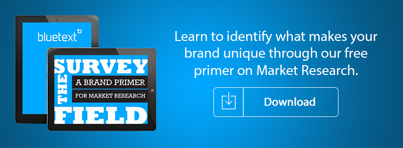
With competitive global markets, what makes your brand different from your competitors?
Sometimes, it takes market research to identify what makes you unique and what’s really important to your target customers. Fill out the form to download Bluetext’s Market Research Primer so you can understand how to:
- Leverage research to craft a market message
- Develop a positioning strategy
- Stand out from the crowd
Download the Market Research Primer to get ahead of the competition here!
Innovations in real estate marketing can help drive a company’s ability to hit their desired Key Performance Indicators. Through Bluetext’s experience working with top real estate brands like JLL and Kettler we understand what drives integrated marketing and digital marketing results.
SPEED
Faster websites make more money for their companies. Fast includes how long it takes your real estate website to load, but also how long it takes the real estate website search engine to show the user the type of available product that matches their search. Some sites use real time API calls and tons of third-party data services that bog down a search performance. This performance hit hurts seo, conversion, and engagement metrics. The bottom line is performance matters. The relationship between performance and revenue has been shown over and over again. Here are just a few examples:
- Amazon loses 1% of sales for every 100ms it takes their site to load.
- Shopzilla reduced their loading time from 7 seconds to 2. This performance boost resulted in a 25% increase in pageviews and a 9.5% increase in revenue.
- Mozilla shaved 2.2 seconds off their landing pages and increased download conversions by 15.4%, generating millions of additional Firefox downloads every year.
Ways to speed up your website include:
- Enable CMS compression
- Optimize your images
- Move JavaScript files to the footer
- Merge CSS files – Inline small CSS files
- Use a Content Delivery Network
- Minimize the number of HTTP requests
- Fix your 404 errors
- Take care of your page size
- Reduce the number of API calls
LOCATION AWARE USER EXPERIENCES
The other innovation real estate marketing executive need to consider is launching location aware marketing platforms and tools. Along with the adoption of HTML5, the Geo-location API has become very powerful technology. This allows your site to receive geographic positioning information using JavaScript. Once you have a location aware site or app, you are able to provide more accurate and appropriate content for your visitors. This is called geo-marketing. Geo-marketing is a relatively new concept defined as:
- The integration of geographical intelligence into various aspects of marketing, including websites and sales and distribution.
Although a new term, the principle of geo marketing has been around for a while. Facebook has been utilizing this approach for some time. Facebook gathers location-based data (based on users’ IP addresses) then show advertisers appropriate content for that geographic region. Google and other search engines also use this functionality and include location based search results for their users.
Your real estate website should offer the ability to search where you are located to offer up products around you. Of course many people search for information in another region for relocation scenarios, but the majority are in market moves and these use cases need to be addressed with a fast geo-personalized user experience.
We’d love to talk to you about your real estate marketing need. Let’s chat:

This goes to the heart of every company’s SEO strategy. The clues come in a patent filing for something called an “implied link.” Before I explain why this is important, let’s first take a trip back to the early days of SEO and link-building.
Early on, Google would evaluate where a site ranks for any given search by looking at how many other sites were linking back to that page. If you were a valuable site, visitors would link to you in order to share that with their audience or to cite you as a good resource. That type of analysis would seem like an obvious way to measure the quality of the site.
But SEO gurus are always trying to stay one step ahead, and once link-farms and other shady techniques for creating myriads of back-links became prevalent, Google recognized that there’s no way to verify whether a link was added because a user genuinely likes the content or whether the link was paid for. The quality of a link can be corrupted through a wide variety of Black Hat tricks, and thus the value of all links came into question.
And while Google has updated its algorithms on numerous occasions over the years, that doesn’t mean that links aren’t still valuable for SEO. They are just much less valuable than they once were. Google is now much more selective about the quality of the site that is doing the linking. The New York Times continues to be the gold standard for the most valuable links.
But what if a publication like the Times mentions a brand or its product without a hyperlink? Shouldn’t that carry some weight, even though it doesn’t include a url?
![]()
That’s where Google’s patent comes into play. SEO insiders believe that the patent is related to last year’s Panda update, and that it describes a method for analyzing the value of “implied links,” that is, mentions on prominent sites without a link.
Let’s say the Times mentions in an article the website of NewCo as a great resource for a particular topic, but doesn’t include a link to NewCo’s website. Previously, there really wasn’t a measurable way for NewCo to benefit from that quality mention. With implied links, Google sees the mention in the Times article and factors that into its search ranking.
Implied links are also used as a sort of quality control tool for back-links in order to identify those that are most likely the result of Black Hat tricks. For example, if Google sees numerous incoming links from sites of questionable quality, it might search for implied links and find that no one is talking about that brand across the internet. Google looks at that evidence from the implied links to determine if the back-links are real and adjusts the rankings accordingly.
Here are four tips for adapting to Google’s focus on implied links:
• Don’t abandon your link-building strategy. Earned links are still effective when they come from valued sites. The most valuable links will still be for relevant, unique content.
• Brand reputation is key. When asking for mentions on other sites, try to have them use your brand name as much as possible. The same is true when you are posting on other sites. Use your brand name. Do the same in descriptive fields such as bios at the bottom of contributed content.
• Engage your audiences in conversation. Similar to word-of-mouth marketing, the more your brand name is being mentioned, even without links, the more it will benefit your SEO. Encourage that conversation as much as you can.
• Be creative and flexible. Google is always evolving its search engine algorithms. It’s difficult, but not impossible, to predict how they may change over the next year, or how effective today’s best practices will be tomorrow if you know how to follow the clues.