Ever heard the phrase “if you’re not first you’re last”? A little extreme, but not untrue when it comes to search results. Businesses of every industry are scrambling to refine their content strategy in hopes of ranking within the first page of search results for relevant searches. However, the advice for how to do so is muddled by different strategies and outdated information. Keywords. Inbound links. Outbound links. Content velocity. Imagery alt text. Which one is it? Well, the simplest answer is all of the above…plus more. The truth is Google search algorithms are not completely transparent. If you feel like you’ve been shooting in the dark for a stronger search ranking, you’re not alone. Thankfully, Google does hint to what goes into its search algorithms and what search crawlers are prioritizing in rankings. And the latest news from the tech giant is the consideration of page experience.
Beginning mid-June, Google will be factoring Page Experience metrics into how they rank websites on the search engine’s results page. Is your website ready for this update? Before you panic over years of perfecting your organic search and content strategy, let’s break down exactly what Google means by “Page Experience”.
Despite the subjective phrase, Page Experience is actually dependent on measurable technical factors that affect how a website visitor interacts with your content. The latest update will concentrate on Web Core Vitals, but also include the following UX considerations, such as:
- Mobile-friendliness
- Safe-browsing
- HTTPS-security
- Intrusive interstitial guidelines
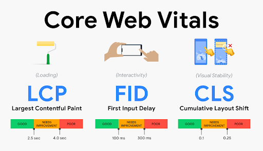
Breaking Down Core Vitals:
- Largest Contentful Paint: The time it takes for the main content (defined as “above the fold”, first viewport or hero zone) of a page to fully load. Websites should strive for a LCP measurement of 2.5 seconds or faster.
- First Input Delay: Reaction time of user’s first action (click, hover, tap). This measures the time it takes for a page to become fully interactive. An ideal measurement is less than 100 ms for 75% of pages.
- Cumulative Layout Shift: Time for all content on page to load and position correctly. This refers to the amount of unexpected layout shift of visual page content. For example, ever visiting a web page that loads, then jerks and shifts a couple seconds later? It’s a frustrating user experience, especially if you have begun reading or interacting with content. The ideal measurement for CLS is less than 0.1 seconds for 75% of pages.
75 and Sunny Rule
Each of these benchmarks have defined benchmarks that Google recommends for 75% of pages on a website. This is what Bluetext refers to as the 75 and Sunny Rule. Especially with an older website build, it may not be achievable to reach these metrics for every page. However, if you prioritize pages by traffic level or content hierarchy, you can isolate the 75% highest value pages that should reach these measures. With these prioritized pages in mind, site speed and page experience optimization can be made by website developers to meet Google’s recommended benchmarks.
There is even rumor of visual tags being implemented on Google search results to show which websites are meeting these Core Vital criteria. It’s likely that in the near future there will be no hiding whether or not your site meets these benchmarks.
How often do I need to check my core vitals?
Well, how often do you visit the doctor? Just like your health, your website’s Page Experience should be evaluated on a regular basis. You should be checking the pulse of your website every 3-6 months to ensure everything is running smoothly and not getting dinged by Google search crawlers. There are a number of site speed and page experience tools available, each providing varying levels of detail. Google PageSpeed Insights will most prominently display core vitals with lab data (measured by single, predefined device, location, and internet connection.), field data (aggregate measure of real time user experience), diagnostics and recommended solutions. However, use caution. This tool is not known for consistent accuracy. Most experienced website development agencies will cross check site performance across multiple tests, such as: Google Search Console, Lighthouse and GTMetrix.com. Consulting a website development agency offers many advantages in optimizing your website, as they are best equipped to diagnose a problem, address and resolve an issue and conduct regular maintenance to continue optimizations.
If you’ve been ignoring your site’s technical health, there is no better time than now to ramp up your site speed and site experience to give you a competitor an edge on the search engine results page. SEO is a marathon, not a sprint. A strong SEO strategy involves a multi-faceted approach to cover the bases across multiple fronts. Keyword strategy, site speed, page experience, mobile compatibility, and more still need to be considered to reach or maintain a top search ranking. As a digital marketing agency that specializes in website development and SEO content strategy, Bluetext understands the importance of page experience in both initial site build and ongoing maintenance.
Ready to be proactive and take the pulse of your website core vitals? Contact Bluetext for a website assessment and learn how we can optimize your site to meet Google’s – and your user’s – expectations.
Have you ever found yourself on a website, staring blankly at the screen wondering where the rest of the pages are? Navigation is one of the most important functions of any web page whether it be a blog, product listing page, about section, or a document library. If your user doesn’t know where this content is housed, the utility of the information is lost! As a crucial element of user experience, failing to build smart navigation into your digital interface can lead to a variety of issues including secondary UX issues, accessibility problems, and increased bounce rates from frustrated users.
Let’s take a step back; what is a navigation menu, and do I still need one if I have “search”?
Navigation menus are maps of the categories or features of your content; on websites, these are known as sitemaps. These menus can appear in a variety of ways; from the traditional header locked navigation bar, to hamburger menus that pop out to link to various interior pages of a website.
While many websites have a Search function of some kind, whether it be a search bar or filter, research shows that 70% of users rely on navigating to content directly. While search features are helpful to some users, navigation menus can lead your visitors to the content they need quickly and reliably.
No matter where you are with your website, here are some quick, easy tips to help you optimize your platform for a better user experience.
1. The 3 Click Rule
Your navigation structure should be intuitive and allow users to land on any page and find what they are looking for in 3 clicks or less.
If your site has lots of content and sub-pages that relate back to a greater unifying category, take advantage of breadcrumbs. Breadcrumbs are a component of navigation menus that help users orient themselves within a sitemap. They can be embedded into the navigation bar as a dropdown, or appear in the design of the child pages on your site to guide users through the various layers of content.
2. Show Off Your Menu
Don’t try to reinvent the wheel-don’t hide your navigation menu! When a user visits your site, it’s likely one of the hundred other web properties that they have browsed in the last few days. As our digital lives have progressed, users have become accustomed to certain kinds of queues and user interface (UI) elements. Keep your navigation menu in an intuitive location, be that the left rail, top of the browser window, or a pop-out hamburger menu with an obvious icon.
3. State the Obvious
Be as clear and descriptive as possible. Avoid using vague descriptions in your navigation headings. If a user can’t tell exactly what to expect from a page in the navigation, there’s a chance they won’t make it past the landing page. Use descriptive language to identify what your pages contain, less is more with heading titles. Streamline the main menu display experience where possible and take advantage of dropdown menus for categories with multiple child pages. If you hyperlink to pages within your site from banners or in-line content, make your hyperlinks obvious!
4. Stay on Topic
Don’t let SEO impact your navigation taxonomy. While ranking well in search engines is important, packing your Headers and menu items with keywords that don’t relate to the page contents won’t do you any favors with users. Avoid this common pitfall by using the copy and metadata on your pages for SEO strategies, leave your headings and menu items clean and accurate for better UX.
5. Lead with a Mobile-First Mentality
Over 53% of all web traffic occurs on mobile devices. When designing your navigation menu, start by thinking about how users might visit the site; on both their computers and mobile devices. Take advantage of responsive designs that can adapt to a variety of browsers and devices rather than discovering post-launch that your navigation is broken.
6. Stop Guessing! Test Your Audience
If you’ve updated your navigation menu but still see disappointing numbers for bounce rate and click through on your site, test your experience. User behavior can be monitored with tests such as a Crazy Egg Heatmap, which illustrates where your users are browsing on the page.
TLDR: improving your navigation design can improve your relationship with users
Confusing or obscure navigation will lead to fewer visitors to your interior pages and can result in awful analytics reports. Clear and effective navigation can enhance visitors understanding of where your content is located, instill confidence in browsing your site, and create credibility about your product.
Do you need to up your navigation game but you’re not sure where to start? Get in touch with us.
The recent COVID-19 outbreak has had ripple effects across almost every industry. Around the world, the global pandemic has altered the way we live, socialize and even conduct business. In this unprecedented scenario clouded with uncertainty we all, especially digital marketers, are wondering: What needs to change? And how drastically?
When it comes to search engine optimization strategies, digital marketing and content agencies are continually researching the latest trends and evolving best practices. In the current environment, the role of a top digital marketing agency is to keep a pulse on the present, while also looking forward to strategies that will drive long-term success. Here at Bluetext, our digital marketing analysts are harnessing a variety of tactics to support overall business goals and serve users the best we can during these uncertain times. Check out the top ways we’ve been monitoring and optimizing around current events.
Strength in Numbers
When in doubt, trust the data! Using top marketing analytical tools, such as SEMRush and Moz, one can track the aggregate behavior of online users. Gathering the most up to date data can be tricky, so don’t do it alone. The more expertise and tools, the better. Trust a marketing analytics agency to help break down the numbers into a comprehensible story of website traffic. Use professional tools, such as Google Analytics and Google Search Console, to monitor the recent fluctuations in your page traffic. Do a keyword analysis of your current keyword list to see if search volume has shifted. Google Trends page is a great tool to identify emerging patterns. Are there new phrases your customers are searching for? If the language has evolved, so should your SEO strategy. If you have chatbots for customer service transcripts, these can provide valuable insight into current needs.
In short, the data doesn’t lie. Businesses need to understand search traffic shifts to get as clear as possible a picture into whether to pivot your SEO strategy or not.

Content is King — Still
Ultimately any changes to your SEO strategy should be driven by your unique business needs. For example, a brick and mortar store will need to cater to how they can serve customers at home. If your business was already available online, you may be experiencing altered user behavior as people spend more time at home and online. Every business should ask: “Is the content relevant to current needs?” Your messages may need to shift in sensitivity to the current environment. A complete overhaul is not necessary, nor appropriate. However, if there are opportunities to generate new content that supports your users in a unique time, do so. And if your business is considered essential or has been significantly impacted, you should create a dedicated page to capture all relevant coronavirus traffic. Keep the page simple, focused and sensitive. Don’t try to provide the latest breaking news, but exactly what and how your company is doing. If your business has been minimally affected, perhaps there is an opportunity to contribute to emerging conversations. Exploding Topics is a valuable tool for up-to-date trends across search engines and social media mentions. At the end of the day, users are seeking timely and accurate information now and long after the dust has settled on this pandemic.
 Optimize Often
 Optimize Often
Search engine optimization is never a “one and done” task. Any digital marketing strategy requires upkeep as is the nature of the evolving industry. Now, more than ever, flexibility is paramount to staying afloat. Be proactive, be vigilant. SEO strategy will need re-evaluation in the upcoming weeks and months. No one can predict how long the pandemic will last so you must be ready to pivot to any new or resurging customer needs.
In an unpredictable environment, one thing is certain: this is our new (remote) reality. Don’t expect old strategies to work as they once did, and don’t expect this shift to “blow over soon”. Your business should be prepared to remain relevant now more than ever. There will likely be long term implications in behaviors and business operations. Get behind the shifts now and flex your agility. It will pay off in your long term business health.
If you’re looking to partner with an agency to pivot your SEO strategy, let us know.
The decades-long reign of the PC is over, with mobile devices now making up more than 52% of all internet traffic. While plenty of people preach the importance of responsive website design, far fewer have articulated updated guidelines for the reality of today’s internet. Keenly aware of trends as ever, Google has continually refined its search algorithm to keep pace with increasingly mobile and untethered internet. Advertisers, marketers, and website owners alike need to be aware of what these paradigm shifts are, and how that could impact their sites’ SEO.
Cellphones’ bountiful data has empowered Google to enhance its search engine. Search results are more custom than ever before, incorporating key differentiating factors like time of day, weather, and geography. The search results for a morning bagel in Washington D.C. will look entirely different three hours later in San Francisco.
Optimizing for Local Search
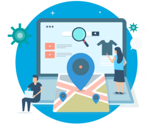
More so than ever before, websites need to be local. Gone are the days of simply tacking on addresses and list of phone lines. To be competitive in 2020, websites need to address the mindset and inquiries of the region they serve, be it a street, coast, or country. A quintessential, doughy foldable New York slice is in stark contrast to a dense, deep-dish pie from Chicago. The top result for a pizza in Manhattan will not be wasting content on merely their cheese, sauce, and pepperoni, but rather what distinguishes their slice from their other New York brethren. Language, context, and local distinctions are now a mandatory part of website content strategy.
Dealing with Short Attention Spans
Major changes to search algorithms are only a handful of the changes introduced by the rise of mobile. Attention spans online are shorter than ever with the ubiquity of the internet and easily accessible information, even more so for mobile where screen size comes at a steep premium. Hero zones should be appropriately leveraged. Heroes should state the most important critical information concisely and contain a quick and simple CTA or takeaway. Organic visitors who cannot immediately find an answer to their search query after a glance and a few swipes will assuredly bounce away to a competitor.
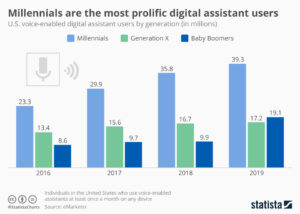
Search and Virtual Assistants
Smartphones’ impact on websites has not just been limited to mobility and smaller screens. Virtual assistants like Amazon’s Alexa, Google Assistant, and Apple’s Siri fundamentally change how people browse the internet. For many on-the-go, the automated search functionality provided by these virtual assistants have all but replaced a typical Google search.
How Google and the other virtual assistants parse through webpages and present them for voice search is a complex topic, but the vital SEO fundamentals remain in place. Research demonstrates that people are unsurprisingly far more conversational in their wording versus a typed-in search. Optimized content thus needs to serve this need directly, often best served using blogs that cover such frequent, informal topics as “What is the best X” or “Y versus Z”.
Google has been increasingly leveraging its structured data for voice search results, largely due to its predictable format and parseable nature. For best results, website owners need to cross-reference website content and identify what data could be passed off to Google using structured data. Articles, menus, locations, events, and reviews are just a handful of the many structured data formats that Google accepts. Conveniently, Google now provides a simple tutorial for anybody familiar with HTML to get started on incorporating structured data and improving their site for voice search.
The shift to mobile devices has opened up new avenues for content creation and design. Location and voice were unheard of topics even a decade ago, but they are here to stay for organic search. It’s up to website owners and marketers whether they take advantage of these new strategies, or get left in the dust.
As the world has changed in the blink of an eye, so has the way we market to consumers. Now, more than ever, your website exists as BY FAR THE MOST IMPORTANT doorway to your brand and your brand experience. While stores stay shut, and face-to-face interaction is vastly limited, brands will rely on reaching their target audiences via their websites. Therefore, your website is mission-critical to your success.
Bluetext has published a 5 part blog series to help you think about and pressure test if your website is the best it can be.
With 57% of the world’s population now on the internet, promoting your business through a website has become even more critical. Additionally, over 50% of website traffic comes from mobile, and over 66 million American adults now own a smart speaker with digital assistant capabilities. Your website is where a potential customer will get their first impression of your business, and navigating the way website browsing behavior continuously evolves can be tricky. Because having a poorly designed website can be worse for your business than having no website at all, turning toward an expert website design agency can help you find the best website solution for your company. An agency can help you stay on top of the latest web design trends, and bring both your website and your business to the next level.
User experience (UX) is one of the most important things to consider when redesigning your new website. According to Jakob’s law, users spend most of their time on websites other than yours. This means that users prefer for your site to function in a similar manner to other sites they frequently interact with. Staying up-to-date with current web design trends is imperative to keep your users engaged.
Bluetext suggests considering the following seven trends when building your website to ensure that your site combines SEO functionality with the best UX, boosting your brand’s presence online.
1. Make Mobile a Priority
Over 50% of all website traffic comes from mobile. With a user-base continuously becoming more dependent on mobile, it is even more important for website designers to prioritize and optimize web experience for mobile devices. Designers must create a thumb-friendly design to not only make mobile navigation easier for the user but also create a seamless, visually-appealing design.
More than 60% of companies reported an increase in sales after designing mobile responsive platforms; however, approximately 40% of people will leave your website if it isn’t mobile-friendly. While simply having a mobile presence may seem good enough, optimizing this experience through design to cater to mobile users is the most important factor.
If these statistics aren’t convincing enough, it’s also important to keep in mind that Google gives priority to mobile-friendly sites by ranking them higher in search results, positively impacting your SEO. Lacking a mobile-friendly experience can negatively impact your website’s ranking, whereas sites that are mobile responsive will often receive a ranking boost, even for searches on a desktop.
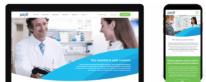
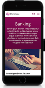
Check out some of Bluetext’s work on mobile with Paya and Mindtree.
2. Increase Page Speed
It takes users only three seconds to decide whether or not they want to stay on your website. These three seconds are crucial to your website’s dwell time (aka the time a user spends on your website before returning to the search results). Web design agencies can provide creative solutions to help engage your users within these three seconds. Additionally, web agencies know the best tactics for improving page speed, such as image compression. Image formats like JPEG 2000, JPEG XR, and WebP often provide better compression than PNG or JPEG, which means faster downloads and less data consumption.
The less time it takes your website to load, the better your SEO. Because of the Google Speed Update, Google won’t prioritize your website to users if it will take too long to load. Taking your site to a web design agency will ensure that your website is optimized for the user, while also ensuring that you have the best possible SEO ranking.
3. Optimize for Voice Search
Page speed is also becoming more important as the number of smart speakers and digital assistants continues to grow. Over 66 million American adults now have a smart speaker, and designing a website that capitalizes on Voice Search Optimization is the only way to ensure that those using smart devices for their searches will have access to your site. Voice search is meant to be a faster, more convenient way to get information, and if your website takes too long to load, it is less likely to be returned for a voice search result.
According to a PWC study, 71% of respondents would rather use their voice assistant to search for something than manually typing their query into a search engine. The differences between these spoken and typed searches may lead to different SERP results, and if your website is not properly optimized for vocal search, you may lose ground to your competitors. Because vocal searches only result in one top result, everyone is vying for this “ground zero” position. You can obtain this coveted position by gaining Google’s featured snippet spot, which aims to directly answer users’ questions. Voice searchers are also more likely to search in long-form questions as opposed to using shorter keywords, so it’s important to consider the types of questions your target audience may ask, and to position your website well to answer these searches.

4. SEO vs. SEM: Choose Wisely
How can you tell whether to focus your marketing efforts on SEO or SEM? Let’s return to square one: what’s the difference? Search Engine Optimization (SEO) was traditionally thought of as a component of Search Engine Marketing (SEM), which comprised of both paid and organic tactics. However, this language is shifting, with SEM now referring exclusively to paid search. SEO is a method to optimize your website to receive organic traffic, while SEM is a way to funnel in relevant traffic from search engines by buying paid or sponsored ad listings.
So which is better to focus on for your website? SEO allows your business to get more visibility, building brand awareness at a low cost. Choosing keywords that are relevant to your website can earn you a spot on the first page of the SERPs, automatically earning you credibility and trust from search users. In order to increase your website’s chances of making this first page, follow these simple steps:
- Use relevant keywords in the URL to describe the content of the page
- Use your main keywords in the beginning of the title tag of your page
- Use the right keywords in the meta description of your page and make sure it is enticing enough for users to click-through to your site
- Use your primary keyword(s) in the H1 tag of your page
- Use your main keywords along with related long-tail keywords in the first few paragraphs of the page
SEO will bring your website brand visibility at a lower cost, but it’s important to invest in researching which keywords will best optimize your website.
While SEO is typically more sustainable, turning to SEM can also do wonders for your website. SEM allows you to capture the attention of your target audience by claiming a spot above-the-fold of the SERPs. Sponsored listings also give you more control over the results you achieve; every element of the ad can be customized and tweaked to target your audience. SEM charges on a per-click basis, and while this may be more expensive, it allows you to achieve quick, measurable results without going through the trial-and-error process that SEO typically involves.
Both SEO and SEM have their pros and cons, and both may be right for your business at different times. Turning to an agency that specializes in SEO and SEM will help you choose the right tactic at every turn.
5. Hello, Homogenous Hero
The fast pace of modern life means that people have less time to spend on your website. When they enter your site, simple and intuitive web design will allow them to quickly find what they’re looking for. The use of minimal design allows for the rapid digestion of information and ultimately leads to more satisfied users.
The inability to spend endless time searching for information on a website also means that many web design agencies are moving away from the once-popular ubiquitous site, and shifting instead toward the homogenous hero. Instead of boldly featuring the headline in the center of the landing page, designers are opting instead to move the header and CTA to one side, with the image on the opposing side. This split-screen aesthetic also allows for easy conversion to mobile, providing a clear dividing line between the two content blocks.
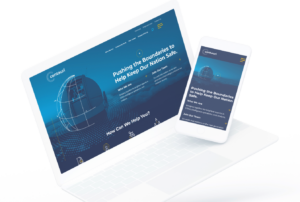
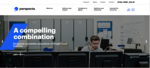
Check out some of Bluetext’s latest homogenous hero designs through their work with Centauri and Perspecta.
6. Animate Your Site
The use of animation is an easy way to make your website appear polished and dynamic. Animation also helps bring your brand’s story to life, quickly engaging users and drawing more visitors to your homepage. When used as a tool to communicate complex messages easily, animation can reduce the time that a user must spend in order to understand your message, which enables them to spend more time exploring your website.
When adding animation and motion into your website design, it is important to consider web image optimization, which is the process of providing the smallest-sized images optimized in terms of quality, resolution, and format. With the rise of internet browsing on mobile, images and animations must be optimized to perform well on mobile. While animations are a fantastic way to engage your site visitors, they can also slow down your website load times and negatively impact your SEO. Let a professional website design agency like Bluetext help ensure that your website can support lively animation without dragging down your website load time.
When Bluetext redesigned the Clarabridge website, we made sure to incorporate motion in a sophisticated way, making the UX come alive. We used motion throughout the homepage to engage the user and pull them further down the landing page. This design also quickly explains how Clarabridge works and allows a site visitor to visualize how they might best use Clarabridge’s services.


7. Incorporate More Video Content
Video content diversifies your web page, and also appeals to those fast-moving users who do not have the time to search through a lot of text. Videos are also a great way to make an emotional connection to your users and lead to a better overall website experience. By 2020, experts predict that 80% of online traffic will be video. Additionally, 72% of businesses say that video has improved their conversion rate, and 45% of people watch an hour or more of video per day.
While video content is clearly an important marketing tactic, 64% of marketers see video as the most difficult content to create. Not only do videos take time to plan, shoot, and edit, but it is also tough to decide exactly what type of content should be presented in your video. Because viewers’ attention starts to drop off after roughly two minutes, finding an expert who specializes in video content may be the best route for creating the perfect video for your website.
Not only will video content boost your website’s success, but it is also rewarded by Google. If your site includes video, it is 53X more likely to get a first-page spot in search results. Video improves SEO, which boosts your ranking. But if a short video is one of the first impressions a user will have of your business, how do you go about creating successful video content, and keep the user coming back for more? Many website design agencies have video specialists who can tell your story in a clear and powerful way. Check out Bluetext’s latest video work with Invictus.
Invictus Brand Essence Video, July 2019 from Bluetext on Vimeo.
Over the past month, we’ve taken a close look at Search Engine Optimization (SEO) and how you can use it to improve your website’s performance. But how exactly does it work? We sat down with our resident SEO expert Joe for some insight on how to take advantage of Google’s crawling capabilities and prepare your website for longevity.
Q: We know that using certain keywords can help your website appear higher in search results, but how does Google know to look for these words and display your page first?
A: Google’s algorithms parse content from a holistic perspective. They index every word on your website based on thousands and thousands of criteria, but from a high-level, Google is looking at which words are being used frequently, commonly linked, and used in high-visibility positions (like an H1 heading).
In essence, Google attempts to parallel how people use websites. If a certain range or set of related words and concepts is being frequently used on a page and is being consistently linked to from other internal pages and external sites, that’s solid evidence that the page is likely a good source of content for those keywords. The more Google is assured of this, the more likely your search position will be strong.
Q: What is the real benefit of having blogs live on your site?
A: Like any other form of content, the SEO value blogs can have will depend on execution and positioning. I believe the biggest benefit of blogs is that they offer a consistent opportunity to diversify the content on a website, with little impact on the navigation and content hierarchy.
Blogs enable site owners to feature content that can be otherwise independent of the site navigation. Blogs also allow site owners to publish content that may otherwise be too niche to present on the main menu, too broad to push into one corner of the site, or too seasonal to keep around permanently. The transience of blogs let content exist for the sake of content, rather than website politics. That freedom translates to a diverse range of content, and it’s often the case that popular blog posts are not necessarily ones that communicate product features or service offerings, but those that articulate a peripheral topic of interest.
Without blogs, websites lack dynamism and diversity. Blogs help expand the reach of a website’s overall audience, and Google’s search algorithms will take that into account.
Q: What are the top five mistakes people usually make that cause poor search results?
A:
- Losing the forest for the trees: People can fall into a black hole trying to identify every single small factor in SEO, but ROI is best maximized by tackling the major coefficients of the search algorithm – valuable content and a logical content hierarchy
- Not optimizing meta titles and descriptions: Most people see these as throwaway tasks, but at the end of the day, a site’s meta titles and descriptions are major factors in determining clickthrough rate at the search engine results page.
- Internal linking: Google’s crawlers are increasingly being programmed to replicate how humans approach and use a website. Internal links are more important than ever to guide crawlers and demonstrate what content focuses certain pages have.
- Overstuffed keyword lists: The more keywords a website tries to optimize for, the less the website will actually be optimized for any of those keywords. Aim for a lean keyword list that is regularly reviewed and re-optimized for.
- Content density: Aim to have at least 200 words for any page considered desirable for search. Anything less, and the search algorithms won’t have enough physical text to parse for scoring.
Q: Do I have to use paid search to improve SEO? What are your top three suggestions for improving SEO organically?
A: Paid search is a bonus because it can be used to “crowd” the search engine results page, giving your brand a feeling of authority, but it in no way directly affects your SEO. Top suggestions for improving SEO through organic means include:
- Researching and writing about relevant, popular content topics that people are interested in learning about.
- Developing content about topics not covered by our competitors.
- Identifying local geographical opportunities for optimization.
Q: How often do I need to update my website to keep my position in search?
A: It depends on the nature of the industry that the website operates within. A mature manufacturing industry may simply not have new topics of interest week-to-week, while a growing or dynamic industry, like electric vehicles, may necessitate daily updates to stay relevant and up-to-date.
Q: What are some tools that I can use to learn more about my website and its SEO performance?
A: Google Search Console is a completely free service provided by Google that uses Google’s own data to help site stakeholders benchmark keyword performance. More importantly, it provides data on visibility versus clickthrough, helping identify what keywords are underperforming despite their high position. All site owners should at the very least check it on occasion – the data there is incredibly valuable in understanding the nature of a website’s organic traffic before and after they arrive on the site.
SEO is not something that can be done overnight. It takes time to strategically plan and develop relevant content. Digital agencies that specialize in SEO like Bluetext can help improve your site both for the short-term and for the long-haul.
In today’s Internet ecosystem, there seems to be a blog for everything. Fashion blogs, fan club blogs, cooking blogs, review blogs — you name it. Blog types range from personal, professional, niche-interest and most importantly, business.
This begs the question; who writes these blogs? What does it take to be a blogger?
The beauty of the Internet is anyone can be a blogger. Blog writers range from influencers to B2B government contractors! In 2019 there were over 500 million blogs published on the Internet. Blogging is more than just a hobby, it is actually a very useful digital marketing tool.
What is the point of these blogs?
The average reader might guess entertainment. But to a digital content strategy firm, the value is search engine optimization.
But what does that mean and why should my company care about SEO?
Search engine optimization, or SEO, refers to the strategic content writing and website design meant to increase a website’s organic visibility. With over 3.5 billion Google searches a day, it is critical for customers, partners, and even investors to be able to find information about your business through search engines.
Blogging helps boost SEO quality by positioning your website as an appropriate answer to your customers’ questions. When potential customers and partners enter queries or keywords into the search engine, they are matched with algorithm-based results Google has determined most valuable and relevant to their search intent.
When you optimize web pages — including blog posts — you’re making your website more visible to people who are entering keywords associated with your product or service via search engines like Google.
But…how do I optimize?
There is more to a search engine optimization strategy than repeating select phrases over and over again! A digital content marketing agency will advise you to be smart about your blog. Almost as smart as Google’s algorithms, which crawl websites to determine which websites best match the intent of each user.
Sound complicated? It is, but your search engine optimization strategy doesn’t need to be. A consistently updated blog can be an incredibly effective and user-friendly way to boost your website’s organic search rank.
A digital marketing and analytics agency will analyze not only your business’ website but also competitors’ sites to identify a strategic blend of keywords to integrate into your website. Blog pages are an optimal place to include keywords because content can naturally accommodate frequently searched subjects. Using digital marketing and analytics tools, such as SEMrush or Moz, a top search engine optimization firm will recommend a series of blog topics and titles, a strategic cadence for updating your blog, and some expert tips and tricks.
Here are Bluetext’s top tips and tricks to blogging your way to the top:
- Identify the focus keywords. These should 2-3 phrases or words per post that receive high levels of search volume but have a realistically achievable level of competition.
- Head for the headers! H1 text and titles are weighted more heavily by search engines. Put your keywords in these fields, but don’t fill your pages with H1’s, as this will deduct from your search equity.
- Repeat, repeat, repeat. Aim to repeat the selected keywords 4-5 throughout the post. However, be warned: Google crawlers are smart. They value relevancy and will not rank a site that seems inauthentic or filled with spam-like content.
- A picture is worth a thousand words…quite literally! Place your keywords in the alt text section on post images, and Google crawlers will include this in your keyword count and most users won’t ever even notice.
For more tips and tricks when it comes to blog writing and SEO, check out our blog.
Do you remember when you used to have to consult books and encyclopedias for the answers to your questions? Just over 20 years ago, you had to reference the yellow pages to find a marketing agency. Nowadays, Google is the search engine king, the go-to for 73% of searches online (and 81% of mobile search). Top marketing agencies depend on Google and it’s algorithms to direct current and potential customers to their clients’ sites via both organic and paid search.
What’s the difference between non-organic and organic (search)?
Organic search is the result of entering search terms as a single string of text into a search engine. Organic search results appear as lists that are based on relevance to the search terms and exclude advertisements; they do not filter out pay-per-click advertising. Paid search is a form of digital marketing where search engines like Google and Bing allow advertisers to show ads at the top of search engine results pages (SERPs). Paid search operates on a pay-per-click model– meaning there is no cost until someone clicks on your ad or content.
Organic traffic is widely considered the most valuable traffic source for multiple reasons:
- They are the most trusted source for people researching a purchase.
- Google’s algorithms and rankings are very sophisticated — ranking in the top five results for a keyword indicates that your content is high quality.
- Results on the first page of Google (The Top 10) receive 92% of all search traffic on Google. Traffic drops 95% on the second search page.
- 33% of clicks from organic search occur on the first listing on Google.
The downside to organic search is that it takes time to get indexed and generate traffic. Although evergreen content ranks higher than paid (time-limited) placements, the lag in rank visibility may not work for every business case.
Rev up your (search) engines with a paid approach
Besides considering how much traffic will reach a site via organic or paid search, top marketing agencies also work with their clients to enhance their performance with search engine algorithms through search engine optimization (SEO). Improving your company’s search engine optimization isn’t just about the politics of appearing first, it carries financial benefits, too — 57% of B2B marketers say SEO is the biggest factor impacting lead generation.
To optimize your site rank in the organic search results, you need to employ SEO techniques to make your page as crawlable as possible to search engine algorithms. This includes using keywords in critical real estate (headers, links) and including content that relates to those key search terms.
Paid searches are the companies that have paid to appear at the top of your search engine. Even with the little yellow disclaimer “Ad” box, many users click intuitively on these paid placements. Rather than having to wait patiently for your SEO to build up through indexing, you can pay for the chance to get seen on page one of Google immediately.
You can put your money where your mouth is, or play the long SEO game
Sometimes paid search isn’t in a company’s budget – fear not, having the deepest pocket does not ensure SEO success. Google has processes in place (quality score, copy rules, landing page quality, and more) to make sure that the ads that rank are still highly relevant for searchers. Investing substantial budget in ads or paid search will only float a company so far in the ranking algorithms if their content isn’t crafted to support these buys. In both organic and paid search, Google puts user experience first, which is why top marketing agencies such as Bluetext focus on a holistic approach to SEO, creating high-quality evergreen content that ensures both organic and paid efforts are supported through continuous search engine indexing. Digital marketing agencies are experienced at selecting organic keywords that will be both effective and realistic, and they provide support in creating a strong content base to perform in SERPs.
See how Bluetext can help improve your SEO »
We’ve all heard of SEO – but what exactly is it? And how do you achieve “good” SEO? Before attempting to tackle your own search engine optimization strategy, take a look at these five SEO basics.
- What is SEO?
While there are varying definitions for SEO, SEO can be thought of as increasing the visibility and traffic to your website, brand, or company through non-paid search results.
- Why is SEO important?
SEO is important for many reasons, but here are the top four factors a digital marketing agency considers in their optimization strategy:
- The majority of online traffic is driven by search engines
- Organic search has no direct cost to run
- Visibility is determined by the relevance and utility of content, not your budget
- SEO helps effectively communicate your content to search engines
- How do search engines work?
SEO matters because it helps search engines determine if your site is relevant to users. But how does the search engine know? The specific search algorithms are complex and unknown — even to top digital marketing agencies — but a premier SEO strategy firm will tell you that search engines pick up keywords by crawling websites. They arrive on the website, go through every link and all text on the site, and summarize and bucket the content into the search engine’s index. The index is updated, and search rankings are updated to match it. This process can take days, or even weeks, depending on the popularity and size of the website.
- What is a good SEO keyword?
In order for a search engine to give you a good SEO ranking, it is important to incorporate keywords into your site that the crawlers will pick up on. Here are four factors that Bluetext, a leading digital content marketing firm, recommends considering when selecting your SEO keywords:
- Relevancy: Can you write multiple pages solely dedicated to this keyword?
- Search Volume: Do people actually search for this word?
- Competition: Is this keyword popular among your competition? Make sure your keywords are unique enough to you in order to show up on the first search results page.
- Campaign: Are there plans for a paid campaign around this keyword?
- What is the best way to utilize my chosen keywords?
Content, content, content. Blogs are not just for recipes and personal stories! They actually serve a critical function to search engine optimization. This is why digital content marketing firms recommend before your site launches, you have a solid repertoire of resources and blog posts. Here are some tips to help ensure that your SEO keywords are utilized in the most productive way possible:
- Make sure your pages have a central focus. Select one or two keywords to write about and stay on topic. If you have other keywords to optimize around, start a new post!
- Regularly link back to relevant pages with internal links. Otherwise, the search engine crawlers will not know what pages on your website are relevant or important
- Leverage the H1. H1 headings are especially weighted by search crawlers because of their visibility and size. The H1 is the single most important line of text on a page
- Ensure that pages are long enough to have crawlable body text, usually 200 words or more
Search engine optimization is a tricky terrain to navigate alone. Google search engines use a number of complex algorithms to improve the end user experience, so it is recommended you consult a digital marketing agency in planning your SEO strategy. Digital content firms, such as Bluetext, are a strong asset to leverage in keyword research and content planning. Digital marketing agencies are experienced and skilled at selecting organic keywords that will be both effective and realistic.
It’s pretty obvious that videos placed on YouTube have huge appeal with consumers who love to be entertained while seeing a product or brand in action. YouTube videos can be cutting and funny, irreverent or just dumb, yet they have the capability of capturing consumer attention and driving interest and conversion. Good videos translate to more sales—according to one recent survey, consumers are nearly two-thirds more likely to purchase a product after watching a video.
But how well does that work for enterprise and business-to-business companies? Do videos on YouTube help with marketing when the the target buyer may be a busy executive, the sales cycle can be long, and a variety of different types of individuals may have input into the decision?
With B2B and enterprise products and services, it is even more important to leverage a channel as important as YouTube. Here are a few simple reasons why:
• YouTube is the second most frequently used search engine, which not only means that your target audience is probably researching solutions on YouTube, but also that a properly labelled and tagged video can show up high in the search results;
• Attentions spans are getting shorter, and a tight video or animation can capture that attention better than words or images on a web page;
• It offers strong opportunities to engage with your target customer; and
• It allows you to show off your creativity and position your company as a thought leader in your market.
Here, then, are six tips for how to leverage YouTube for B2B marketing:
1) Short is Sweet. As recently as two years ago we were producing videos up to five minutes in length to showcase brands and their executives. That time has dropped by more than half. A recent study confirmed that the most successful videos on YouTube are under two minutes in length—and those around the one-minute mark are the most popular.
2) Set Up a Branded YouTube Channel. Creating a company channel delivers a better experience than individual uploads, even if the titling and tags are already aligned for the best search results. A branded channel allows for a branded experience, with creative elements that showcase the company or product. It also allows a company to segment the videos so that the target viewer can better find what they are after.
3) Be Disciplined About New Content. Just like your other social media platforms, YouTube thrives on consistent content. Just posting video without a regular refresh leaves too much silence and no reason for a viewer to come back. When you develop your YouTube strategy, make sure you can add new content on a regular basis for a sustained campaign.
4) Treat Your Video Like a Blog Post. Don’t waste the opportunities to drive traffic to your YouTube channel through other social media platforms. Think of it as you would a blog post. The more nurturing it gets from all of your social activities, the more traffic it will get. So tweet it, blog about it, post it on Facebook, and promote it through your email newsletters.
5) Advertise. Remember, YouTube is owned by Google, so you can promote your videos through Adwords for Video. There are currently three ways to advertise and drive traffic to your channel: as a pre-roll ad before the videos that viewers watch; as a banner ad when people are browsing and searching the Internet; or as a promoted video when people are searching for similar videos. Each requires a careful selection of keywords to make sure you are getting to the right targets.
6) Be Creative. A static video of an executive talking about the company won’t capture anyone’s attention. If it’s meant to be instructive, consider using animation to tell the story. If it’s a thought leadership campaign, then have experts discussing trends. Use multi-camera shots, tight editing, and professional sound and lighting to keep it engaging. It’s ok to be entertaining, but it also needs to give viewers the information they are searching for.
YouTube should be a key element in every campaign’s mix of platforms to reach and engage the right audiences. It provides the audience with visual content that can showcase the brand, and it’s easy to gather the analytics about what is working and what’s falling flat. It requires a disciplined and smart approach, but the results of a smart YouTube campaign are more engagement and conversions.