In today’s digital-first landscape, web design has become a critical factor in the success of B2B and B2G marketing strategies. Businesses in Washington, DC, a hub of innovation and governmental affairs, are uniquely positioned to leverage cutting-edge web design to enhance user engagement, brand perception, and conversion rates. As a leading agency, Bluetext understands the nuances of web design in DC and how it can be harnessed to drive measurable business outcomes. This blog explores advanced web design strategies that can elevate your business presence in the competitive DC market.
Understanding the Importance of User Experience (UX)
User experience is at the heart of effective web design. In the DC area, where decision-makers and influencers are inundated with digital content, a seamless and intuitive user experience can set your brand apart. Prioritizing UX involves creating a website that is easy to navigate, visually appealing, and responsive across devices. This not only enhances customer satisfaction but also contributes to improved search engine rankings. Agencies like Bluetext, recognized as a top UX interface design company, emphasize the importance of understanding user behavior and tailoring designs to meet those needs.
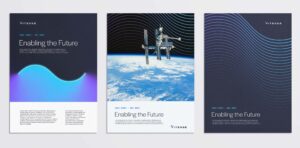
Explore how we brought clarity to the vision of Vitesse Systems
Incorporating Mobile-First Design
With the increasing reliance on smartphones and tablets, mobile-first design has become imperative. This approach ensures that your website is optimized for smaller screens, providing a superior experience for mobile users. In DC, where professionals are often on the go, a mobile-friendly website can significantly enhance accessibility and engagement. Implementing a mobile-first strategy involves simplifying navigation, optimizing load times, and ensuring content is easily readable on all devices.
Leveraging Data-Driven Design Decisions
Data analytics play a crucial role in informing web design decisions. By analyzing user data, businesses can gain insights into visitor behavior, preferences, and pain points. This information allows for the creation of a website that truly resonates with the target audience. Bluetext, a leader in marketing analytics, leverages data to craft websites that not only attract but also convert visitors into loyal customers. Data-driven design ensures that every element of the website is optimized for performance and user satisfaction.
SEO Integration in Web Design
Search engine optimization (SEO) is a critical component of web design. A well-optimized website improves visibility on search engines, driving organic traffic and enhancing credibility. In the competitive DC market, effective SEO can make the difference between a website that merely exists and one that excels. Incorporating SEO best practices into the design process involves optimizing site structure, meta tags, and content. For businesses looking to enhance their digital presence, partnering with an expert web design agency like Bluetext can ensure that SEO is seamlessly integrated into your website from the ground up.
Utilizing Advanced Design Technologies
Emerging technologies such as artificial intelligence (AI) and virtual reality (VR) are transforming web design. These technologies offer innovative ways to engage users and provide personalized experiences. For instance, AI can be used to create dynamic content tailored to user preferences, while VR can offer immersive product demonstrations. In a city like DC, where innovation is key, incorporating these technologies can position your business as a forward-thinking leader in your industry. Bluetext, with its expertise in artificial intelligence and VR, can help businesses harness these technologies to enhance their web presence.
The Role of A/B Testing in Design Optimization
A/B testing is a powerful tool for refining web design. By comparing different versions of web pages, businesses can determine which design elements perform best. This iterative approach allows for continuous improvement based on real user feedback. In the dynamic DC market, where user preferences can shift rapidly, A/B testing provides the agility needed to stay ahead. Implementing regular testing cycles helps ensure that your website remains relevant and effective in meeting user needs.
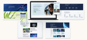
Get the inside scoop on how we designed a modern UI system for Noblis
Building a Strong Brand Identity
Consistent branding across your website is essential for building trust and recognition. Your website should reflect your brand’s values, mission, and aesthetic. This includes everything from color schemes and typography to messaging and imagery. A cohesive brand identity strengthens your position in the market and fosters a connection with your audience. Bluetext, recognized as a leading branding agency, can assist in developing a website that aligns with your brand strategy and resonates with your target audience.
Elevate Your Business with Expert Web Design
In the fast-paced and competitive environment of Washington, DC, leveraging cutting-edge web design strategies is crucial for business success. By focusing on user experience, mobile optimization, data-driven decisions, SEO, and advanced technologies, companies can significantly enhance their digital presence. At Bluetext, we are committed to helping businesses in DC and beyond achieve their marketing goals through innovative web design. Contact us today to learn how we can elevate your brand and drive growth in the digital landscape. Visit our contact page to get started on your journey to exceptional web design.
Ping — new text message! For the average American this notification is nothing new, appearing 32 times a day…even more for the younger demographics.
As more and more consumers turn to their mobile devices for online shopping, text marketing has emerged as a powerful way for businesses to connect with their audience in a personal and engaging way. In this post, we’ll explore the reasons why text marketing has become such a popular form of marketing, why it’s poised to become an even bigger player in the e-commerce landscape, and even emerge in B2B businesses’ marketing strategies in the coming years.
First, what is text marketing?
But before we dive in, let’s take a moment to consider what text marketing actually is. Simply put, text marketing involves sending promotional messages, coupons, and other marketing content directly to consumers’ mobile phones via SMS or MMS. Seems simple right? Deceivingly yes, but many nuances and personalized targeting capabilities are hidden behind these messages. This approach allows businesses to reach their audience in a way that is immediate, intimate, and highly targeted.
So why has text marketing become so popular in recent years? There are several factors at play. For one, mobile devices have become an increasingly important part of our lives – we carry them with us everywhere we go, and we rely on them for everything from socializing to shopping. Text marketing takes advantage of this trend by delivering marketing messages directly to consumers’ devices, where they are most likely to be seen and acted upon.
In addition, text marketing offers a number of advantages over other forms of marketing. For one, it’s highly personalized – businesses can tailor their messages to individual customers based on their past purchases, preferences, and behaviors. This makes the messages more relevant and engaging, which in turn increases the likelihood that customers will take action.
How can text marketing be useful in a B2B landscape?
While at first glance text marketing may feel like a more beneficial strategy for the B2C segment, the tactic can also add value as a supplemental channel in the B2B segment. While B2C text marketing is centered around quick touchpoints and quick results, B2C text marketing is more focused on building a relationship with your customer and improving your brand reputation. Here are a few ways that B2B businesses can leverage the power of text marketing:
- Lead generation: One of the most important goals of any B2B marketing strategy is to generate leads. Text marketing can be a highly effective tool for this purpose. For example, businesses can offer a special promotion or incentive in exchange for customers opting in to receive text messages. This allows businesses to build a list of interested prospects who are more likely to convert into paying customers.
- Event promotion: Many B2B businesses rely on events and conferences to generate leads and connect with potential customers. Text marketing can be a great way to promote these events and drive attendance. For example, businesses can send out text messages with event details, special offers, and reminders to register.
- Customer engagement: B2B businesses can also use text marketing to engage with customers in a more personal way. For example, businesses can send out text messages with exclusive content or behind-the-scenes insights, or offer special deals to loyal customers. This can help businesses build stronger relationships with their customers and keep them engaged over the long term.
- Account management: Text marketing can also be useful for B2B businesses looking to manage customer accounts more efficiently. For example, businesses can use text messages to send invoices, payment reminders, and other important account information directly to customers’ mobile devices. This can help streamline the account management process and improve the overall customer experience.
These are just a few examples of how B2B businesses can use text marketing as part of their marketing strategy. By leveraging the power of SMS and MMS messaging, businesses can connect with customers in a more personal and engaging way, generate leads, promote events, and more. So if you’re a B2B business looking to take your marketing to the next level, consider adding text marketing to your toolbox.
So what does the future hold for text marketing? We believe that it will continue to grow and evolve, becoming an even more important part of the e-commerce landscape. Whether you’re a B2B business looking to connect with your customers in a more personal way, or a consumer looking for deals and discounts, text marketing is a trend that you won’t want to ignore.
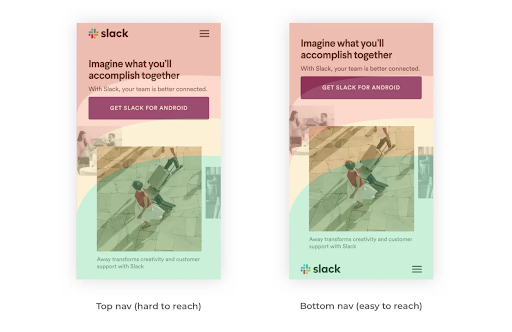
In late 2021, Apple released its iOS 15 update with a pretty drastic change in browser layout, creating a ripple effect in website UX design. The beloved search bar on Safari had been moved from the top of the screen to the bottom. Many users, who are less familiar with the thought process behind UX design were left with one question. Why?
Well, according to MacRumors, the move was more functional than aesthetic. Think about how one naturally holds and operates a smartphone; usually held within the palm of the hand and touchscreen controlled by your thumbs from the bottom corners. Therefore, controls brought to the bottom of the screen are easier to reach with one hand. This feature also creates more space for users to focus on the webpage’s content.
Research confirms that “75% of users touch the screen with one thumb.” This has led UX designers to favor a thumb-driven design, placing the most important and frequently-used features at the bottom of the screen. This ensures easy access with one thumb.
Traditionally, many website designers place navigation in the top corners of the screen. While that works with a desktop device, due to the greater range of motion coming from the computer’s mouse, it does not translate that effectively to a mobile device. With the navigation menu being placed on the top corners of the screen, the range of motion that the user’s thumb has can restrict easy access to that navigation menu. Especially as technology evolves and mobile screens grow in size, users find themselves having to reposition their hands. This in turn slows down the user’s ability to navigate webpages and ingest content.
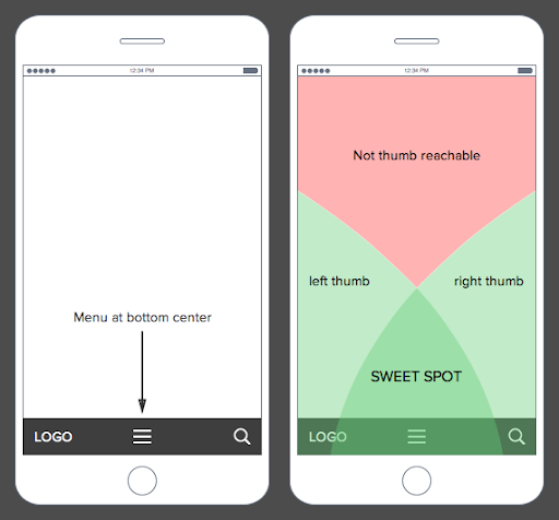
What’s the big deal? I just have to move my hand a little to be able to reach the top corner of my screen. The answer is simple: efficiency. Bottom menu navigation allows the user to accomplish tasks faster and with a greater level of comfortability, which really adds up considering that the average American spends 5.4 hours on their phones.
A lot goes into the design process, and it is not all about aesthetics. It’s about how the product functions. In today’s world, 55% of website traffic is generated using mobile devices, so functional and efficient mobile layouts for a website is imperative to the success of a brand. It is essential that UX designs make easy navigation a priority because the easier a product is to use the more often it will get used or recommended. That is why features like bottom navigation are so effective. Especially if it is designed in a streamlined way that makes content visible, clear, and simple.
As users experience the bottom menu trend, users will likely have to take some time to readjust. Looking ahead at UX design trends for 2022, there will be a continuation of the emphasis on overall usability, navigation, and aesthetics being driving forces for design. There is a desire to achieve a seamless experience, where user experience designers focus on the continuity and natural progression of connecting all the steps of finding a landing page to purchasing an item. It is imperative that functionality is favored, so it will be interesting to see more experimentation with navigation placement and overall screen flow on mobile devices in the future.
Does your website menu need a refresh? Contact Bluetext today to learn about our web and UX design services.
Establishing a personal connection between your business and the customers you serve is one of the most critical elements of a successful marketing strategy. From tailored social media posts to targeted ad campaigns, companies will pour swathes of resources and countless hours into pursuing a personal connection with consumers. Chasing that magic spark transforms them from company to companion in the eyes of the market. So why, if that human connection is so important, do many businesses abandon it when building their websites? Why, when they’ve almost gotten a customer to the finish line, do they greet them with generic home pages devoid of character and life? The answer lies not in the intentional design choices they made but rather the ones they didn’t. In a digital-first world and with the growth of online interactions, it is critical that digital marketers do not lose focus on the human behind the screen.
The Devil is in the Details
Certain aspects of every site (like copy and primary visuals) are often prioritized and will receive the care and attention they need to ensure user engagement. Many businesses, however, fail to consider more minute aspects of the user experience while building their websites. Elements like tab icons, custom cursors, and footer designs contribute to the feelings a potential customer will be left with after that crucial first impression on the home page. These subtle finishing touches are the lifeblood of humanized websites. While they may not be the main attraction, they play a significant role in setting your site apart from the pack and giving your brand its own distinct flair. Here are a few digital touchpoints you may have neglected, along with some inspiration from brands that are making the most of them.
Favicons; Small Pixels, Major Impacts
Favicons (a shortening of favorite icons) might only be a few pixels big, but they can significantly impact how potential customers are directed to your site. A favicon is a graphic element displayed in various places, including Google search results, autocomplete search suggestions, browser histories, and browser tabs. While they may be small, favicons play a significant role in how users recognize your brand and interact with your website. The average person has between 10 and 20 tabs open simultaneously while using the internet. A memorable favicon can help potential customers recognize and return to your site in a crowd of tabs.
Consistent aesthetics and responsive designs can help your favicons catch consumer attention and increase brand recognition. Google’s multi-color G is a classic example of the favicon and has seen its design applied to other products in the Google suite to maintain consistency and recognizability across websites. Trello’s dynamic tab icons change color and design to match users’ activity, drawing attention back to itself and giving users the sense that the site recognizes their presence.
Designing Footers That Use Your Head
Although they may come last on the page, the design of your footer shouldn’t be an afterthought. Often overlooked, the footer of your home page plays a critical role in the user journey, serving as the gateway to the other sections of your website. When a user isn’t sure where to navigate, the footer is a reliable option to find what they’re looking for. As a crux of the customer experience, the footer of your home page provides a great opportunity to incorporate design elements that support your overall brand messaging and drive a deeper understanding of your company’s vision.
Wild Souls, a Greek company dedicated to storing exotic nuts, features a rotating banner in their footer containing phrases and imagery that elaborate on the social causes they stand for. Bold expressions like “F**K PLASTIC” reinforce the anti-establishment and eco-friendly aesthetic of the Wild Souls brand.
Mafanfa, a website for buying hand-crafted Latin American goods, houses its footer’s website navigation links within various geometric shapes that spring to life when hovered over. The oblong shapes and dynamic movement give visitors a sense that the entire page is as customer-designed as the hand-woven clothing it sells.
Blue Stag is a UK-based creative agency that builds its mission on pushing boundaries and creating progress, a sentiment that comes through in their animated footer. Within it, a sky blue stag prances through a wavering mountainscape, a stark figure advancing through a changing landscape just like the company it’s named after.
Creating Custom Cursors That Click With Users
The cursor is the middleman between a user and your website. It’s a critical component of website navigation that will be within a user’s frame of focus the entire time they’re on your site. So why do so many companies neglect this constant source of consumer attention by settling with a generic white arrow? Custom cursors allow companies to provide visitors with a unique experience from the second they click into the site.
The digital agency Cuberto gives a masterclass in iterating on existing designs with their custom cursor that builds on the default design. A roving trail of dots hangs close to the familiar arrow and enlarges whenever it passes over important sections or key brand elements, a unique fusion of a design we’re familiar with and one that we’re not. Not only does this dynamic cursor intrigue visitors, but it allows Cuberto to more easily control the user journey through their homepage, drawing user attention to elements of the site they want to ensure that they see. Custom cursors can come in all different shapes and sizes, from brand icons to even animated designs. With so much opportunity, it’s a wonder why this UX trend is still such a rarity across website designs. A custom cursor is an unexpected detail that is likely to surprise and delight a website user and surely create a memorable browsing experience.
Making the most out of every element in your website design can seem like a daunting task. That’s where Bluetext can support. Contact us to learn more today.
We’ve all heard the old adage “the medium is the message” – and that could not be more true in today’s vast media landscape where the majority of users are browsing websites on mobile devices. Knowing that users are visiting your website and often encountering your brand for the first time on a mobile platform, it is essential to thoughtfully design a mobile user experience that takes into consideration both the benefits and limitations of mobile devices as well as known user behaviors.
Mobile web design should not just be a narrowed version of the desktop experience, it should be a responsive design in and of itself that gives way to an intuitive user experience and easy navigation to the information the user is looking for. There are so many variables that can cause a user to leave a website. A slow-loading page or poor content layout can be enough to drive users away – don’t let a lack of forethought when it comes to the mobile user experience be a barrier between your audience and your website. By implementing the following best practices, you will be sure to create the best mobile experience for your users:
Ease of Click is Key
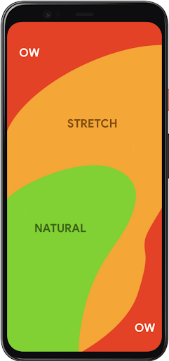
You should always keep in mind what we know about all users visiting your website – every action you ask them to take should be as easy and frictionless as possible. Before even considering the content that will go on a page, you need to consider where on page it will be most accessible. In 2011, Steven Hoober and Eric Berkman published a study called “Designing Mobile Interfaces” in which they coined the term “thumb zone.” This refers to the areas on mobile screens that are most easily reached by the users’ thumbs and therefore where all important clickable items should be placed. Placing important buttons and links in difficult-to-reach areas on screen can add barriers to content and therefore detract from the overall user experience.
Intuitive Navigation
Whether a user knows exactly what they’re looking for or they are purely just browsing on your site, the path to information should always be clear and natural. Creating the best navigation for your site requires thoughtfulness of content and consideration of your audience and the way they are used to maneuvering through a website. The navigation should make sense for the content you have to offer while also aligning with the organizational structure that your users are familiar with. There are many correct ways to layout the navigation of your website, you just need to find one that is the best fit for you and your audience. Employing intuitive navigation on your website is particularly important on mobile platforms because eliminating clicks to content while also having a well-organized site structure can assuage user frustration, encouraging them to stay on your site longer and to visit more pages. Solutions like hamburger menus help organize the menu in a way that the user isn’t overwhelmed by the menu items all at once when first arriving on the page while also mimicking the structure of the desktop site.
Cross-Device Consistency
While the mobile experience of a website should not just be a minified version of the desktop interface, keeping consistent UX design across desktop, tablet and mobile devices should always be a priority when creating your website. Responsive design across the board is crucial when trying to keep the user from disengaging from your site. Any inconsistency that arises when switching from one device to another can create confusion for the user and create the perfect opportunity for them to leave your website. Once again, it always comes back to making everything seamless and easy for your user. The mobile web design should be a full experience in and of itself that considers the intricacies of mobile user behavior while also mirroring the overall UX of the desktop interface. It is a delicate balance but is very worth it when done right.
Prioritization and Breakdown of Content
Simply due to the nature of mobile devices, there simply isn’t much space to fit content in one viewport. This means that in order to encourage your audience to 1) consume the content you write and 2) take away the most important points, you have to visually break up content to make it digestible while also pulling out the highlights as visually engaging elements on the page. Drawing users to your website is a challenge in and of itself – this is only compounded by the challenge of capturing enough of their attention so that they read a significant amount of content while on your site. The reality is you have a very short window to grab their attention and once you have it, concisely driving home the main takeaways is crucial. On mobile, in particular, breaking up content into chunks rather than overwhelming the user with massive blocks of text is a good way to make it all seem more approachable especially when you are trying to fit content into such a small screen. Highlighting specific points using statistics and images in a visually interesting way is a great way to also hold user attention.
Conclusion
Users have shown over a number of years now that the age of mobile device browsing is here to stay and if you choose to ignore it, you will get left behind. When designing for mobile devices, there is so much to be gained by considering what we know about users and the way they physically interact with their devices, and the way they consume content. Mobile web design principles center around the idea that users should always be presented with the path of least resistance when it comes to finding the information they need on your website as well as actually clicking the button to get there.
If your website needs a mobile makeover, contact Bluetext to learn about our website user experience design services.
The next time you’re in a public setting, look up, and chances are you’ll notice almost everyone around you has their eyes glued to a mobile device in hand. Modern-day mobile devices are essentially mini computers, enabling on-the-go browsing, communication, and connection at unprecedented ease. Society has become accustomed to instantaneous connection, but not all websites are up to par with user expectations. While desktop sites were once the focus, a disappointing mobile performance of websites is holding many companies back from their full online potential to garner customers. Aside from a frustrating user experience, poor mobile performance can hurt a website from a technical SEO perspective. This is why many companies are turning to digital agencies like Bluetext to revamp or create entirely new, responsive web designs & optimized performance to stand out among their competitors.
On average, mobile devices account for more website user traffic than desktops. However, despite the high traffic volume, conversion rates on mobile environments are significantly lower. So what’s turning our mobile users away? Adrienne Clem, Director of Search Ads Growth and Optimization at Google, describes that it could be an issue with any one of the following pillars of mobile website design:
Speed
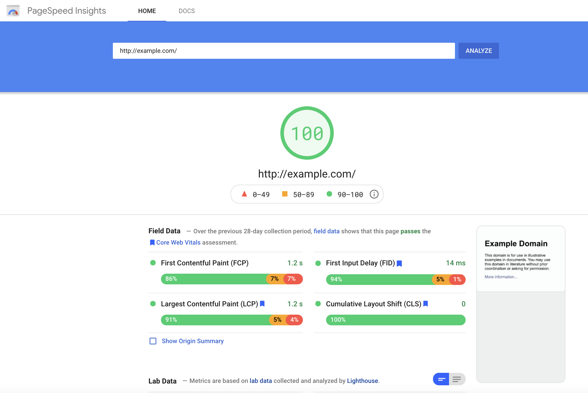
Page Speed is a key indicator of website quality, as it is a critical first impression of your website. The longer a user must wait for your website content to load, the higher the risk of the user leaving the page and increasing the bounce rate. Bounce rate, performance, and speed metrics all play a critical role in Google search crawlers’ evaluation of a website. (such as, In addition to limiting bounce rates, reducing your Time to First Byte can also increase your site’s SEO ranking. You can keep tabs on your site’s speed performance using tools like Google, PageSpeed Insights, or GTMetrix.com, but consulting a website development agency can offer further insight into actionable steps to improve your site’s performance.
User Experience
All websites should be designed to be as simple as possible for users to navigate. However, this isn’t as easy as it sounds. Content hierarchy, navigation, and calls to action are all critical components that need to be equally accessible and intuitive across desktop & mobile formats. Responsive layouts are essential in a mobile-optimized design, but more important is the speed at which content loads for a user. Mobile site speed tends to lag behind its desktop counterpart, but a poor mobile performance can significantly ding your site’s SERP ranking and create a poor user experience. Even the most creative & persuasive landing pages are wasted if features take too long to load on the screen. Pages that utilize AMP (Accelerated Mobile Performance) technology both rate higher on Google search rankings and increase chances of conversion for paid media promotions. AMP HTML is an open framework based on existing web technologies, that allows for more lightweight and speedier mobile web pages. In an initiative to enhance the shift to mobile browsing, AMP-powered webpages load instantaneously, even when they contain rich media like video, animations, or graphics, including things like Twitter and YouTube embeds.
Iterative Design
Website design is an iterative and ongoing process. Platforms & technology are constantly evolving to include new features, remedy existing pain points and approach the ever-moving target that is positive user experience. Companies should approach this process in the interest of continued learning and constant improvement. Collecting feedback should be built into the plan for any mobile site development, as the site’s performance should be re-evaluated at least every 3-6 months. Keeping track of your site’s vitals is an important step for ensuring that your site stays relevant and isn’t losing out on potential conversions.
In an increasingly mobile-first world, emphasizing the performance of sites on mobile devices can increase customer loyalty and satisfaction. Whether a prospective customer’s impression of your campaign landing page or an existing customer’s experience browsing your full website, speed is the name of the game. Keeping up-to-date with best practices in website development and enlisting the help of seasoned designers and UX specialists can transform users from mindless mobile scrolling to enthusiastic interactions on your site.
If you’re ready to start designing your site with a mobile audience in mind, Contact Bluetext for guidance and expertise.
What’s your first instinct when you have a question? For most, it’s to Google it. Whether or not it’s looking up a restaurant or finding a solution to a business challenge, Google is the go-to. So the question is, how do you make sure that your company is at the top of its Google results?
This is the central question of SEO, or search engine optimization. SEO refers to any practices that improve your placement in search engine results. Bluetext does great work helping our clients find SEO success. Below, you’ll find our top four tips for improving your website’s search engine performance!
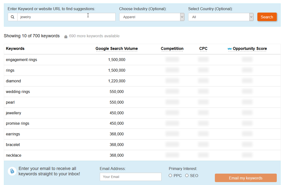
Enrich On-page Content with Keywords
Keywords are one of the first concepts to evaluate when you start improving your SEO. Customers will search Google using keywords, such as “best cell phone provider” or “easiest website making tool,” and you want to make sure your pages show up in the first page of relevant results. Once you understand what your customers are searching for and identify the keywords for your business and industry, you can interweave those keywords throughout the content on your site to advance your placement in search results pages. But beware, Google crawlers are smarter than you’d think. Be sure not to unnaturally force the keywords into your content or unnecessarily duplicate your content, both of which can negatively impact your SEO.
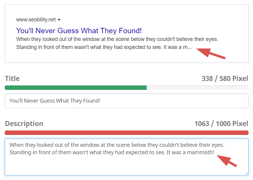
 Add Meta Descriptions
 Add Meta Descriptions
Meta descriptions are the small blurbs of text that appear under a link in a search result. Though small in size, they make a huge difference in your click-through rate. Customers are far more likely to click a link in a search engine when they can see a small promo description of the type of information that link will provide. It’s important to have accurate meta descriptions for your different pages, so do not repeat the same meta description on each page. The meta description should are the perfect opportunity to embed relevant keywords, and should tie back to the prominent H2 and H3 section headings on your page. Think of meta descriptions as invitations to users to click through to your site via powerful calls-to-action. Additionally, avoid using too many words in your meta descriptions, as Google will auto-truncate them and cut you off mid-sentence.
Be Careful with PDFs
 Be Careful with PDFs
PDFs may be an easy way to upload content to your website, but they are not very helpful from an SEO perspective. Search engines crawl web pages, but have a hard time reading the text on PDFs. Therefore, none of that content in the PDF is being used by search engines. With all the time and effort you put into creating the PDFs, it’s a lost opportunity to not reap that SEO benefit. By transferring some (or all) of your PDFs to on-page content, you can greatly increase the amount of content that Google takes into account when determining how high to place your content in the search engine results.
Prioritize your Pagespeed
Google does not just look at content and keywords to determine the placement of your website in search results. Google page speed is another piece of the SEO puzzle. Google ultimately wants to make their searchers happy, so they want to provide fast-loading pages, on both mobile and desktop devices. Therefore, having a good Google page speed will make it more likely that Google places your web pages higher in its results lists.
While SEO is always evolving with changes in search engine policies and algorithms, these are four great tips to help you get started on your way to SEO success.
If you are looking for an agency to put together and execute a customized SEO playbook for your company, contact Bluetext today to learn more about our SEO offerings.
TikTok — the clock is ticking on traditional advertising strategies. As conventional methods wane, a new star player, TikTok, is making waves. At inception, TikTok gained a sticking association with Gen Z via dance videos & lip-syncing parodies. It’s true, TikTok is a popular platform for many teens or young adults to create and send entertaining video content. However, this platform is not just a fleeting fad, but very much here to stay and continue to evolve.
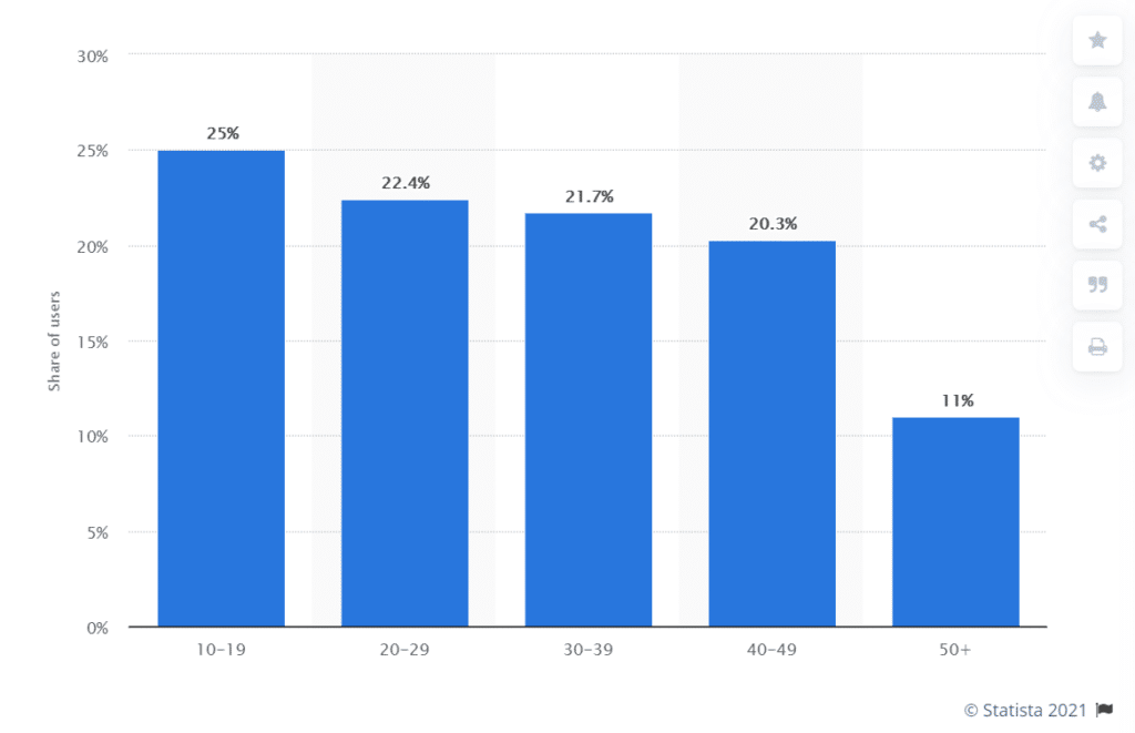
Like any trend, TikTok’s high number of young users caught the attention of older demographics. All wanting to know “what the cool kids are doing”, TikTok’s user base matured. As of March 2021, research found that teenagers are only 25% of the TikTok audience. Who are the rest? Well, it’s a pretty even split of users in their 20s, 30s, and 40s, with even a significant slice of people 50 years and older!
A more diverse user base brought new opportunities, as marketers observed new niche categories rise in popularity. For example, trending hashtags such as #financetok or #taxadvice providing financial advice to users during tax season. Just one of the many unique use cases of the social media platform, as everything from investing to cleaning hacks, has been reenergized by the fun, engaging nature of video clips.
So what does this mean? Well, it’s time that digital marketers begin to take TikTok seriously. Here’s why:
1.Video Content is on the Rise
Video content is on the rise — and won’t pause anytime soon. That’s why popular video publishing platforms, TikTok and Vimeo, have joined forces to become an advertising powerhouse. Recent updates have integrated Vimeo creation tools with TikTok AdManager. This enables businesses of any size to create and publish ads directly to TikTok Ads Manager. Effectively breaking down prior production banners, smaller and medium-sized businesses can easily create and distribute engaging video ads at low cost. Going a step beyond, Vimeo offers ad templates specifically optimized for the TikTok platform. Known as Spark Ads, this format allows businesses to take organic content and quite literally re-energize ads on a new short and snippy platform.
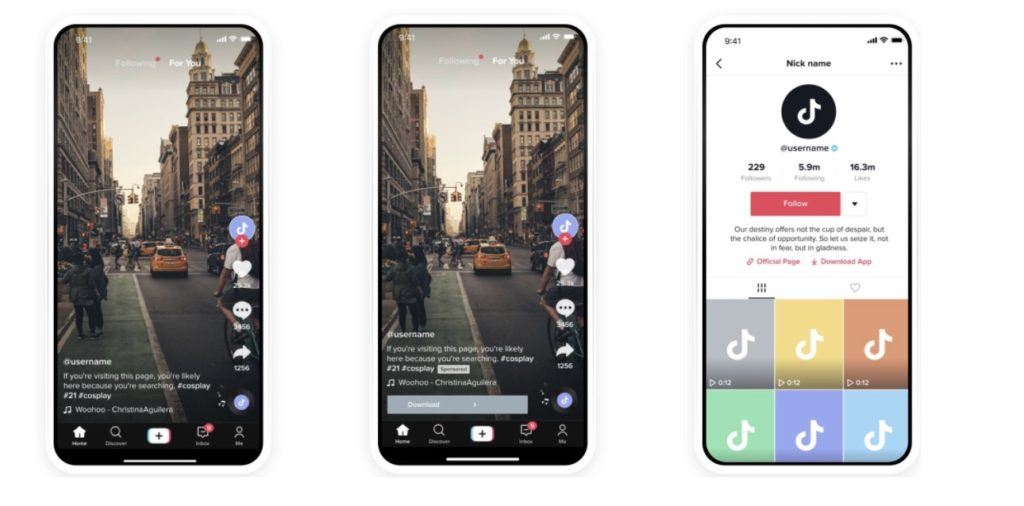
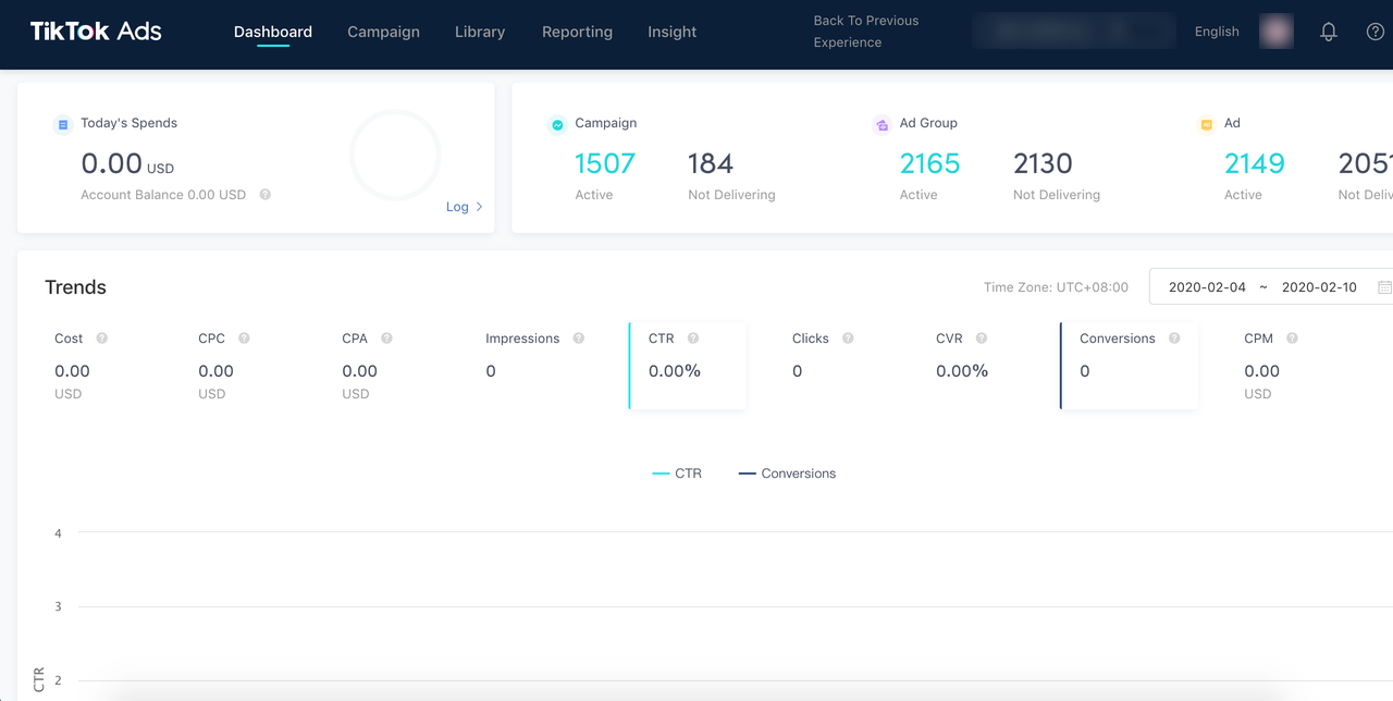
2. Self-Served Success
Speaking of the TikTok AdManger, a few of the hallmarks of this platform are the self-service ad publishing, creator marketplace, and other features that empower content creation. With an easy-to-use publishing experience, it allows for more experimentation and freedom with campaign concepts, creative or targeting. The format pushes brands to make their advertisements everything they should be: short, succinct, and engaging. Time limitations force marketers to cut the extraneous details that users wouldn’t retain anyways and hone in on a single direct message. It’s like the bootcamp marketers didn’t know that they needed.
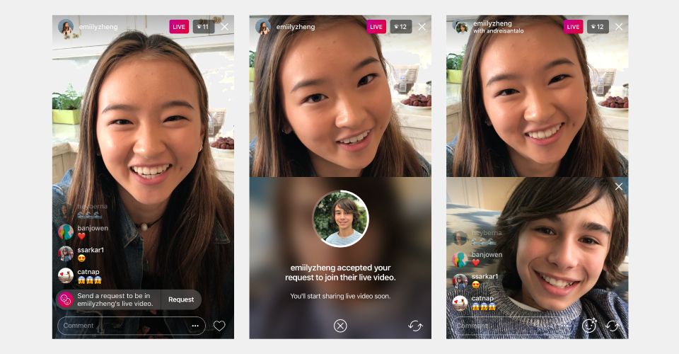
3. Live it Up
That’s right, TikTok has jumped on the trend of live streaming video content (thank you Instagram & Facebook). While this has playful applications, it’s also a prime opportunity for commentary from thought leaders and brand ambassadors on new product launches, industry events, or current trends. Live stream content has been popularized on alternative platforms (looking at you, Facebook & Instagram) for hosting Q&As and panel discussions. New TikTok features allow both the scheduling & promotion of a live-streamed event but also co-hosting to allow for multiple speakers. This creates a split-screen view and allows hosts to interact one-on-one with another, and with live audience comments.
While the first wave of use cases for these features may be tied to e-commerce and pop culture, it will be the next wave of marketing pioneers who bring a more practical flavor to the platform. Facebook and Twitter started out as purely ‘social’ social media platforms, but look what business opportunities have arisen from there. TikTok will be no different, and the businesses that invest now in their video content creation and production skills will have the upper hand.
Need to amp up your video & social media marketing? Contact Bluetext to learn more about our creative & digital marketing services.
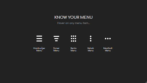
The hamburger, what’s not to love? No, not the American classic, but the navigation menu design. You know, the one with those three straight lines found in the top right corner of your screen. It’s an icon that hides a collapsible menu of possible link destinations, normally appearing on mobile designs. The hamburger menu is actually quite controversial in the UX design community. As such, Bluetext decided to break it down to deconstruct the user experience pros and cons of the hamburger menu.
Where does this funky food inspired design come from? The icon is actually a remnant of the 1980s, making it the perfect choice for retro embracing brands. The hamburger menu first debuted on Xerox copy machines, which had limited space and were therefore designed to be as simple as possible. The icon itself looked a lot like the menu that appeared when you clicked on it.
The design fell off designers’ radars for a few decades until a sudden resurgence in the mid-2000s. Why so? The emergence of mobile browsing had UX design teams more challenged to fit information on screens smaller than ever before. Facebook was one of the early adopters of the retro style and the design trend quickly caught on with many other websites and applications. 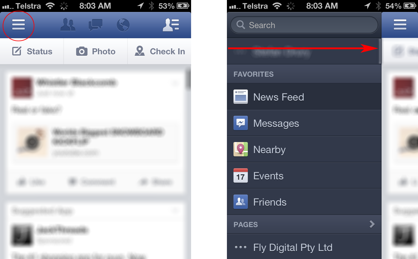
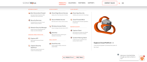
Larger websites have even adopted a hybrid approach, which uses both traditional top navigation and the hamburger even on desktops. Take the Bluetext client, SonicWall, for example. With a large number of products, solutions, and support resources to showcase, they needed a mega menu to encompass all links in an organized and interesting fashion. The top menu drops down to display page titles, short descriptions and even iconography for the high traffic areas of the website. To avoid overcrowding, other sections of the website are moved to a hamburger side menu for a cleaner user experience.
Some UX designers (vegans if you will) hate the hamburger menu. The main complaint with the design is that users can’t go anywhere or see anything without clicking the menu open. Many users expect immediate and obvious information, as seen in traditional top navigation designs. Many UX designers believe an intuitive navigation should obviously show two things: where a user currently is, and where they can go.
The hamburger menu has been the UX design go-to for years, but many companies are starting to debut some new menu items. For example the three dot approach often dubbed “the kebab”.
With mobile and tablet devices growing in popularity, there’s no doubt menu designs will continue to evolve in the future.
Does your website menu need a refresh? Contact Bluetext today to learn about our web and UX design services.
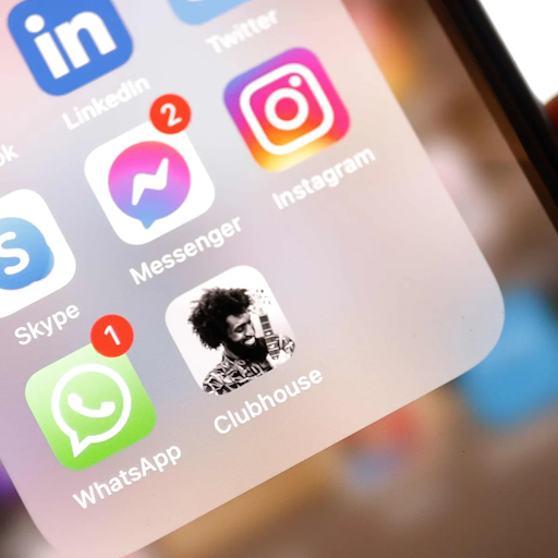
So, you want your business to get in on the latest next-generation social platform? Stay relevant and be at the forefront of the top trending tech? Join the club. Quite literally, join Clubhouse.
In the last few weeks, Clubhouse, an audio-social app emerging from Silicon Valley has captured attention nationwide. So what is Clubhouse? Well, it’s not a dance club, and it’s not associated with Mickey Mouse, but it is the next social media sensation. It’s all the buzz of celebrities, tech investors, and digital marketers. In the first week of February alone, the app reached 2 million installs.
After many brands made the mistake of dismissing TikTok as a short-lived, tween app for dance trends, they are paying attention to the promising potential of Clubhouse. New social media apps come and go. Many fail when their UX features can’t stand up to the mainstream social giants or are acquired only to be killed (rest in peace video app Vine, which was bought by Twitter). The routine rise and fall of social media fads just prove how difficult it is to achieve adoption, capture attention, and establish habitual use of platforms.
This leads branding and digital marketing agencies, such as Bluetext, to wonder which platforms will be “the next big thing” among digital users? Where should businesses focus their attention and become social pioneers? Bluetext breaks down the rising app, Clubhouse, for its digital marketing potential.
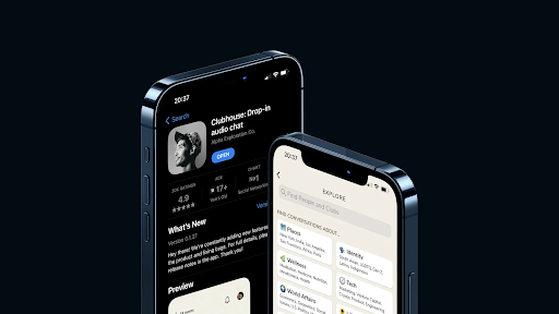
What is Clubhouse?
Clubhouse is a free, voice-based social media app with “rooms” to discuss various topics. It capitalizes on the familiarity and comfort mass audiences have found on Zoom’s “chat rooms” during the COVID-19 pandemic. Many describe Clubhouse as being on a Zoom call with the cameras off, a scenario that the remote workforce still in their pajamas at 2:00 PM knows all too well. While there is some benefit to this familiar user experience, there are also some drawbacks. Much like an overcrowded Zoom happy hour, the networking rooms can be difficult to identify the speaker and become unstructured. But maybe that’s the intent. Clubhouse has been described as a hybrid TedX talk and podcast where spontaneous conversations between strangers offer an invaluable perspective. It’s an app built for all audience types; from the passive listeners looking for entertainment, to the content creators with voices that want to be heard.
Clubhouse has taken efforts to provide a sense of order. For one, the “rooms” have a moderator with the power to mute and unmute audience members. Moderators are often thought leaders, influencers, subject matter experts, or even A-list celebrities. Users can follow their favorite moderators and have a chance to listen and participate, almost like a live two-way podcast. The app is invite-only, and the recent appearance of major celebrities and tech industry leaders has only heightened people’s curiosity and desire to adopt. Invitations are sent by current users, who receive two invites at the time of joining and the opportunity to earn more with app engagement. After news of big-name celebrities, such as Elon Musk, Oprah Winfrey, Mark Zuckerberg, guest-starring in Clubhouse rooms there has been a surge in invitations and adoptions. The app combines psychological desires of group belonging, the curiosity of mysterious and exclusive events, and fear of missing out (or “FOMO”) once you’ve achieved membership status to hook and sustain attention.
What Do Digital Marketers See in Clubhouse?
There once was a time when no one believed social media and business would overlap. But the lines of personal and professional have blurred over the years. Almost any industry can benefit from social media digital marketing, whether in paid or organic formats. Digital marketing campaigns from brand awareness to direct sales and conversions have proven successful on Facebook, Twitter, LinkedIn, and even Instagram. Any and every social media platform is subject to malleability. People will inevitably create their own use cases that meet their specific goals, which may or may not align with the original design. Platforms, like Facebook and Twitter, have evolved powerful marketing tools with robust targeting and analytical capabilities to reach worldwide audiences who have ingrained the apps into their everyday routines. We expect the same in time from Clubhouse.
Clubhouse has a unique marketing potential because of the niche topic “rooms” and audiences. Users can select the topics of interest to them, and join “rooms” where influential moderators facilitate discussion on those topics. There is an educational element to the app, much like podcasts. This is where industry thought leaders can shine, and host “rooms” to share insights and discuss trending topics with partners, customers or competitors. Think of it as a thought leadership article turned interactive audiobook. It is a golden opportunity to spread brand awareness and strengthen reputation with an interested and interactive audience.
Digital marketers everywhere are eyeing the Clubhouse app for the potential access to exclusive audiences and marketing opportunities. Unique elements, like the invite-only exclusivity or completely live no-playback content, have users eager to join and addicted once a part of the group. In time, we expect the opportunity to share your brand story or your founding story, connect with customers, get product feedback, run focus groups, and generate awareness will only grow. And the early adopters will have a competitive edge.
Ready to be at the forefront of new technology and social trends? Get in touch with Bluetext for expert branding, digital marketing, and social media strategies.