Welcome to 2020, a year of new normals, routines, and best of all, new logos! The logo design trends in 2020 thus far have been an intriguing remix of new and old. Logos have taken a trip back in time to a variety of eras, while also remixing modern styles. We’ve seen the gamut of design trends; from neon 80’s juxtaposed against inky, to futuristic 3D gradients and custom animation.
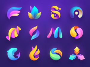
The key theme of 2020 logo design has been a digital-first focus. Many brands have modernized their logos for optimal web and mobile displays. For example, the popular gradient trend has evolved and merged with 3D design —a perfect fit for our smartphone society.
3D Gradients
Gradients are a unique way to blend any group of colors into a dynamic spectrum that exudes life and energy. Gone are the stark striped color transitions, as some brands have opted for a more subtle and gradual shift. This year, designers will give rise to the newest evolution of gradients creating depth and 3D effects in logos. Other top branding agencies are experimenting with new trends such as tapered gradients—ones that come to a central point and actually emphasize the contrast between their colors.
80’s Retro
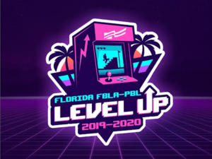
Don’t thrift away your 80’s style just yet, because some fads never go out of fashion. Enough time has finally passed for all things 80’s to be cool again: video games, pop music, and the rebel attitude associated with them. In 2020, logo design agencies expect to see a resurgence of throwback logos accented with chrome, neon, and a lot of digital pixels. These styles give a nod to the old-school tech that preceded the glowing iPhone and laptop screens our eyes are glued to today. Nostalgic marketing has made a huge comeback in recent years, necessitating a cool, retro logo to accompany any throwback campaign. Throwback logos are popular because they capitalize on consumers’ nostalgia of old-school 80s tech, which is widely known to be retro, cool, and most importantly, collectible. Some logos reference nostalgic 80’s items by literally depicting the old school cassette tapes, arcade games, etc. Others embrace this trend with 80’s typography and design trends, like GV’s logo for LI Mowz.
Ultra Thin Lines
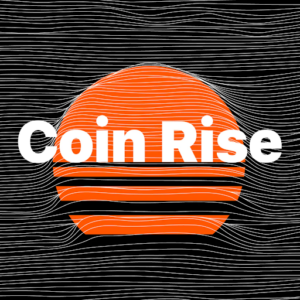
In 2020, high definition is leaving its mark on logo design. Designers push the envelope with extremely delicate lines, creating effects that can only work in the digital media. With extremely detailed linear patterns, logos began to feel ethereal and surreal — much like the original perception of radio and transmission media. With the new ability (and COVID necessity) for some brands to exist exclusively online, previous print limitations are eliminated. In an age of high-resolution screens and defined displays, complex line design makes classic logos seem elementary and easily reproducible.
Multi-Layered
2020 has been all about complexity! Logos are going deeper than ever before using artfully layered color systems. Especially with new digital affordances, designers are reverting flat and semi-flat designs to build depth through color layering. While shapes and colors remain simple, their relationship has intensified. By adding additional layers, designers create complex logos with highlights, shadows, and overlapping colors to communicate the brand brands. Especially on digital screens, the ability to create three-dimensional effects creates a unique, almost tactile experience.

Animated Logos
Top design agencies have been producing logo animation for some time now, but in 2020 we’ve seen more detailed and innovative plays on animation. Previous logos have been limited to simple movement, but over the years technology has allowed for more intricate and purposeful movement. Especially with a growing digital audience, animated logos can be more eye-catching and practical to the brand story. A popular 2020 logo design trend has been the blending of 2D and 3D animation or logos with multiple moving parts. These complex logo animations aim to take the viewer on a journey and tell a story. With lots of details to look at, the viewer looks at these logos longer than they’d look at a more simple logo animation and can potentially find something new they like about it every time they see it again.
The move toward animated logos comes from a similar place as the tapered gradient logos trend: when you’re designing for screens, there’s a whole lot more you can do as opposed to when you’re designing for print.
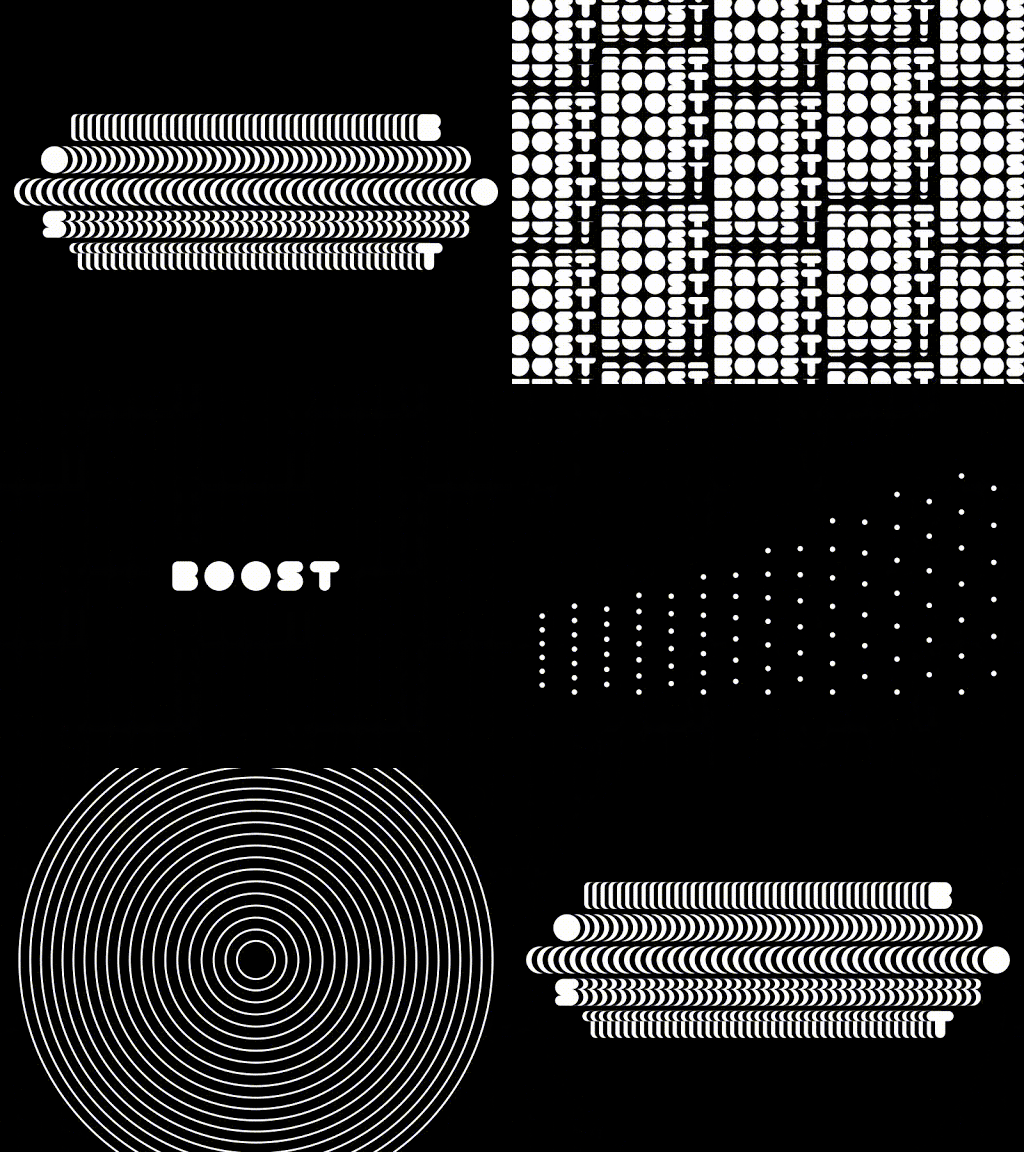
The logo design trends for 2020 will continue to build on everything designers have been exploring in the last few years, while also taking the design in directions that are totally new, totally fresh, totally right for an all-new decade. Let’s take a look at the top logo design trends that are already defining 2020.
Progressive marketing organizations are continually evaluating their approach to their brand & logo to ensure they are viewed as forward-looking and ahead of their markets. Halfway into 2019, there are a number of trends that have been making headway when it comes to this important creative and design work. Courtesy of the folks at Logo Lounge, a repository for designers to post and share their work, we have a sense of what changes are making their way into the market. As Logo Lounge is quick to remind us, when a client makes its logo selection from a typical range of five options, that also means that it has rejected the other four.
Here are four trends getting attention by logo and brand designers:
- Adding motion through “spot drag.” Spot dragging uses circular dots with tails to add a touch of motion to a logo. They give the impression of immediacy as if this logo just happened, and the ink is still drying.
- The Period makes a stand. A refinement of the recent punctuation trend, using the period in a logo gives it a little more power. Especially when it’s is used to signify something altogether different (like completing a different letter), a period makes room and draws the eyes in.

- Quarters make a play. One trend that can be seen everywhere is the use of “quarters” in logos – not the coin, but the geometric shape, which is simple and distinctive. It has balance and is being used with vibrant, solid colors. Sometimes used alone, other times with other geometric shapes, these add a purity of form that underlines the value of the brand.
- More layers. While simplicity works with many established brands, adding more layers and details is making a push into 2019 logo trends. The advantage of this approach is to invite viewers to look more closely and engage with the logo to understand what it’s trying to convey. Just don’t go overboard – two layers works, more than that can just look messy.
Learn how Bluetext can help you design a new brand & logo for a greater impact in the market.
What’s the real value of a logo fight? For most emerging brands, that answer is never obvious. Logos are never static designs, and revising it, or changing it all together, is often an option. But what if that logo belongs to one of the top tennis professionals, and he loses control over it because of a contract he signed when he was still an emerging brand, long before his current fame?
That’s exactly what’s happening to Roger Federer, a twenty-time grand slam winner for whom his initials have defined an era of tennis competition around the world. Federer, who is still recognized as one of the best players of all time, is an iconic sports figure around the globe. Because of his fame and success on the courts, his brand is also one of the most valuable in the market for tennis and other apparel and merchandise, and his logo fight makes sense.
Unfortunately, as the sports world is now learning, Federer doesn’t own the rights to his logo, even though it is comprised of his initials, RF! Early in his career—before he had achieved his global notoriety as a tennis phenomenon—he signed a deal with Nike that gave it the rights to his logo. That might have seemed ok at the time—after all, the deal with Nike was worth tens of millions of dollars over his career.
But just recently, he decided to end his 24-year partnership with Nike, and has switched to the Japanese manufacturer Uniqlo. I’m sure they cut him a massive deal, but it didn’t allow him to migrate his famous logo. That belongs to Nike, and that’s where the logo fight now stands. Here’s the history:
In 2003, when Federer was just emerging as a tennis superstar, his wife and her father developed the RF logo specifically for a perfume with his name on it. Federal liked the look of the logo so much that he talked with Nike about creating a marketing strategy around the initials. It made its first appearance on his 2006 Wimbledon blazer. The rest is logo and brand history.
The problem is, Nike is claiming ownership of the logo even with his move to the Uniqlo brand. And legal observers say the claim is solid. Federer is clearly not happy with this development. Here’s what the Swiss superstar told one reporter recently:
“The RF logo is with Nike at the moment, but it will come to me at some point. I hope rather sooner than later that Nike can be nice and helpful in the process to bring it over to me. It’s also something that was very important for me, for the fans really. Look, it’s the process. But the good news is that it will come with me at one point.”
That might be wishful thinking, and he may be trying to play nice in the hope that Nike executives will have pity on him. But I wouldn’t be so sure. Nike has no incentive to help a competitor take revenue from a product line and brand that it invested time and resources to build. The answer may play out in court, just not a tennis court.
The lesson here is pretty simple: Protect your logo and brand trademark from day one. Make sure your company has complete control over its use and its future, and don’t sign that away to a partner. It’s one of any brand’s most valuable assets, and needs to be treated that way.
Want to develop your brand and logo strategy? Find out how Bluetext can help.
Top branding agencies are always looking for new and refreshing approaches to logo designs that resonate with customers. Every designer’s dream is a new logo that is memorable and unique. But customers react to logos that interesting and different, but not too different. If a logo adheres to a style that is out-of-date or too far out of the mainstream, it may stick out from the crowd, but it won’t generate the positive feelings that it would if it were within the boundaries of the top logo trends that are hitting the market. With that in mind, here are six top logo trends that we are seeing both with our clients and across the industry:
- Flat Designs Retain Their Strength. When Microsoft released its latest new logo, the design was flat with no shading or 3-dimensional effects. The result is a logo that is straightforward, maintains its integrity and brand equity, and looks good across all channels and in all sizes. It’s also easy to print and reproduce. A flat design shows off the brand and colors well and shows off the brand in its simplest form.

- Negative Space is Your Friend. Pinterest, Instagram, Toyota and scores of other iconic brands all use negative space – sometimes with hidden shapes and symbols includes. As an article in Lifebuzz.com reveals, the three ellipses in the Toyota logo represent the heart of the automobile, the technology, and the customer. More importantly, negative space can draw attention to the brand in a way that is memorable and different.
- Stacking is Back. For many years, the logo with letters had to be simple initials in a simple design. But as a way to grab attention in a way that stands out and is easy to see and absorb, stacking can be a strong alternative – often with different fonts for each word. This offers a solid way to highlight different fonts to challenge viewers while giving them something they can quickly comprehend. Here’s an example of a recent refresh (minus the different fonts) from the American Library Association.
- Turning a Flat Logo Up a Notch. One recent trend is taking otherwise flat logos and adding a two-tone approach to add depth to the color but also to give it a hint of three-dimensionality. Dividing symmetrical images into two “zones” of shading gives depth and visual interest to a flat design. It can also add a symbolic touch to convey the brand’s core mission and direction. Check out how Pineapple Resorts turned its logo up a notch to make it more distinctive.
- Go Wide. Shapes that elongate from right to left are thought to be more recognizable for humans that narrow, tall images. With online platforms (such as websites and social media) favoring a wide design, strong brands are turning to this approach with their logos. When combined with contemporary fonts and colors, it can also convey a brand that is on the move and ready to dominate its market.

Want to explore how to apply top logo trends to your brand? Bluetext can help.
A dynamic logo is a company mark that is malleable and constantly changing while maintaining its overall look and feel. Logos were once thought of as a permanent visual representation of a company, but in the ever-changing digital world that is no longer the case. Here is what you need to know about dynamic logos.
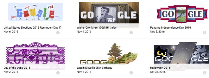
Logos are no longer static and evolve with the brand. The company mark is now transformative and many companies, such as Google, have begun consistently changing the display of their mark. The challenge is to maintain a consistent visual identity in the logo so the brand is still recognizable to consumers. This involves certain visuals of the logo to remain locked, while other elements are consistently inconsistent.
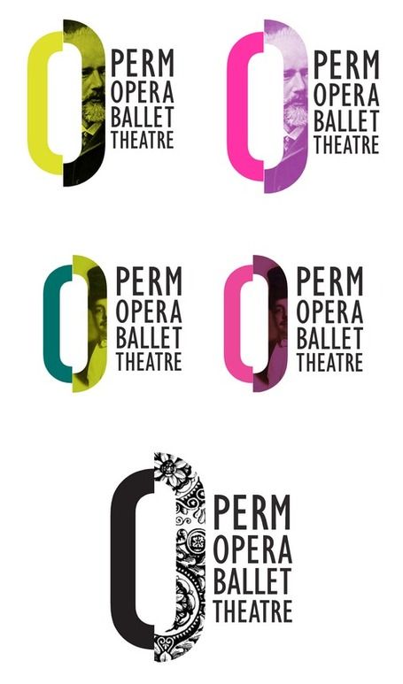
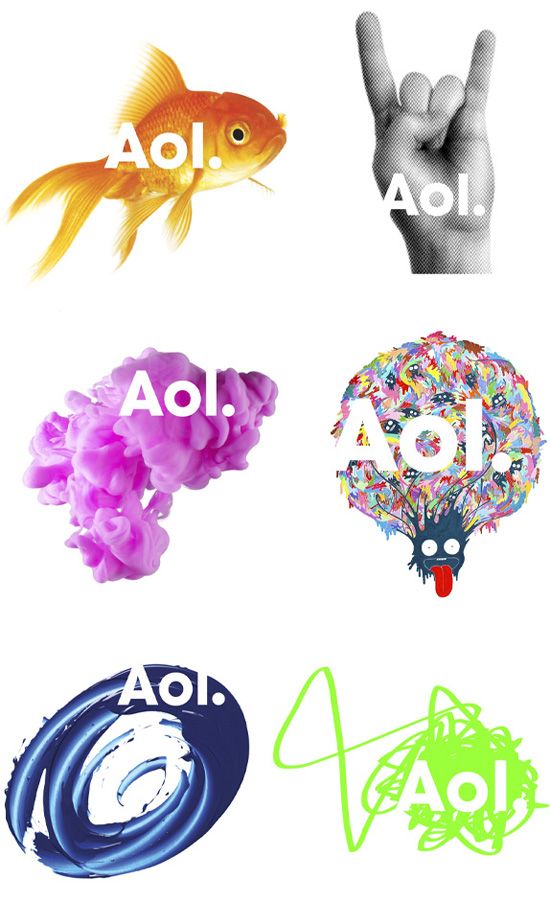
Many well-known companies have enlisted the aid of top branding agencies to shift towards dynamic logos, include AOL, MTV, and Seagate. A step further would be an animated logo that is responsive to the consumer. One such logo is the mark of Brazilian communications company, Oi. The company’s type is the fixed visual while splashs of color that shapeshift to the consumer’s voice is infinitely dynamic. With such a dynamic logo taken to the next level, there are now endless versions of the company’s mark unique to its consumers.
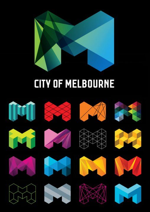
A dynamic logo allows a company to shape the consumer’s experience with its brand. By using these types of brand logos, companies have the fluidity to customize their mark for any occasion and engage their consumers.
Looking for best in class branding agency services or comprehensive and innovative digital marketing? Contact us.
A logo is a central part of a company’s brand. It’s the first thing customers see, and what they learn to recognize as a short-cut to your brand values. And it needs to convey a strong message about what you stand for, and how you work with your customers. Choosing the right logo can make a big difference. Refreshing your current logo might be even more crucial.
Here are five reasons why companies refresh their logos:
Hindrances. As a company evolves and grows, its products and services will change in tangent. A logo from its past may now risk pigeon-holing and hinder the company’s growth. A company’s original logo may include words describing its offerings. As its product and services expand a logo refresh would be needed to accurately represent its growth.
Modernization. Overtime logo images that were once fashionable can become considerably outdated. Sleek, minimalistic logos are the trend today and many companies find the need to adjust their logo to appeal to today’s audience and stay relevant in the market.
Renaming. When a company changes its name, its original logo may no longer be relevant and a logo refresh is due. This is especially true for companies where their original logo was a literal representation of its original name.
Digitization. As the world grows increasingly digital companies now need to take into consideration how their logo renders on different screen widths and other mediums on the web. Old logos did not take responsiveness into consideration and must redesign and refresh to adapt in the digital age.
Acquisitions. When two companies become one, the company name may change and their logo as well. An acquisition instantly expands a company’s products or service and their original logo may no longer be an accurate representation of the new company.
Since a company’s logo is such a close depiction of a company, a major change in any area of its business will affect its single most important visual representation. A logo refresh aligns a company with its core values and ultimately its consumers.
Looking for best in class digital marketing? Contact us.
Uber just killed off the most recognizable U on the planet. Unlike the black and white U that has emblazoned itself in the minds of millions of Uber users around the world – including myself – the new logo bears no obvious relationship to the company name.
We all know that Uber isn’t alone in leaving a loyal customer base dumbfounded – if not outright offended – by such a seemingly misguided departure from one of the most sought after icons in the world. Over the past couple of years, we have seen AOL, GAP, Pepsi, Tropicana and even Apple be indicted for similar blunders.
The most recent of these was Spotify’s stealth attempt to brighten the tone of its green that literally drove its most devoted users berserk to the extent that some even thought there was something actually wrong with their phones. What Spotify learned from this is that it was not simply about the color or even that the company changed the color, but more that it did so without clear communication to its community of users – and more importantly – not involving them in the design process.
While we can only assume that Spotify learned something about branding through this process – it appears abundantly clear by our near unanimous and collective disaffection with its head scratching visual analogy of “bits & atoms” – that Uber CEO Travis Kalanick did not. While the dust is still settling – what’s also become clear is that he simply refused to entrust the rebranding process to anyone else – and in his attempt to use “bits & atoms” to bring out the human side of the brand in contrast to the starkness of the monochrome U – he has managed to strip its personality altogether – leaving us cold and disconnected from a brand that is suddenly as abstract as it is unfamiliar.
David Shantz sums up the problem perfectly in a comment he left on this VentureBeat article:
“When building a brand – and the visual identity around that brand – the most important audience is the audience. The millions of people who will use Uber day by day. As a semi-regular Uber user, the output of this imaginative and time-consuming re-branding exercise totally leaves me cold. I don’t see or feel anything “Uber” in the logo. I don’t know what I’m looking at.”
At Bluetext, we preach brand simplification – if you have to launch into a detailed explanation of the logo – you have already failed. We strive to create an icon that is instantly recognizable and just as quickly evokes an emotional connection with the brand – through the lens of the customer. To that extent – I have to say that I do love the bolder look of Uber’s new wordmark.
But let’s flash forward three years from now – is it possible that we could look back on this and declare Kalanick a genius by identifying the perfect inflection point in consumer branding which signaled that no one really cares about the logo anymore? A future where people are more interested in what a brand can do for them than how it makes them feel when they see it?
The most powerful thing Uber has going for it that might actually fulfill that prophecy is the sheer might of its social brand platform – its ability invite participation and create value by reinventing itself and its usefulness in authentic and relevant ways is uniquely rare and clearly absent from brands that fail to impose their will to evolve without a strong social foundation.
At the end of the day – will any of us really care what their icon looks like next time we stumble out of our favorite restaurant and order up an Uber Black?
Probably not…