Innovation in content marketing is nothing new, but sometimes it takes well-known brands and how they drive their marketing operations to recognize what’s really valuable. We’ve gathered some top content marketing examples and tips from some of the most recognizable global companies. Some aren’t only about innovation, but rather they show companies sticking to what’s most important about that brand. Others are more on the cutting edge. Here are my four top picks:
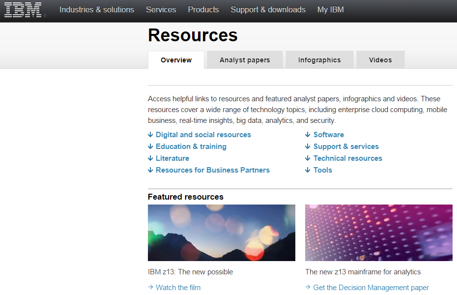
1) Pick a strategy that is core to your brand. IBM is known for three key assets: Its technical expertise, its role as long-time market leader, and its position as a respected source of IT information. To match its steady flow of content to its brand attributes IBM follows the same path. To uphold its reputation as a technology leader for more than a century, it has to produce authoritative content that underscores its thought leadership. Because the company is a technical powerhouse, it has to ensure that the content is technically authoritative. And because the company is trusted by millions to provide detailed descriptions of challenges and solutions, it has to make sure that its content is at an expert level. While trying to follow in IBM’s footsteps is not an easy task, it provides a strong lesson for how to approach your content. It should be well-written, possess authority, and have an expert voice. That’s what customers want and respond to.
2) Don’t be boring. This might sound obvious, but with many business-to-business or business-to-government solutions, it’s not always easy to sound interesting on technical topics. Resist the temptation to edit out content that might be fun and relevant, and that plays on popular topics or cultural experiences. Take Hootsuite as an example. There’s nothing very sexy about a tool that allows you to manage your social media posts. It’s mostly a dashboard with a number of useful applications tacked on. But Hootsuite rose to immense popularity by playing off a popular theme, the HBO television series “Game of Thrones.” It created a video called “Game of Social Thrones,” using graphics and music similar to the television show to demonstrate its capabilities. Each popular social platform has its own Game of Thrones city, and logos and images are cleverly used throughout. Timing is everything, of course, and the Hootsuite video garnered lots of buzz on YouTube. Hootsuite also makes sure that its content, even when serious, is fun, increasing its popular appeal. So while your brand or product may be technical and specialized, you can still write content with which your audience will identify on a popular level. The lesson: Don’t feel that you need to be serious all of the time. Create some fun, light content now and then.
3) Tell stories. It’s easy to fall back on technical explanations, and these are often important when conveying the value that a product or solution brings to the market. But telling a human interest story that illustrates what that technology brings to customers can be much more penetrating. Few do this better than Microsoft, whose “Stories” blog posts rarely even include the term software. Instead, they tell stories of how Microsoft technology has helped people, and in some cases changed their lives. In one example featuring sportscaster Daniel Jeremiah, the story is one of the human experience, of triumph, challenge and redemption. Daniel explains how as a scout for the Philadelphia Eagles, when he didn’t trust his instincts and the data at his disposal, he lost the opportunity to push for Seattle Seahawks superstar Russell Wilson. It’s a fun,personal and powerful story, and one that demonstrates Microsoft’s leadership not with a hard sell of its products, but with a tale that will stick in your mind.

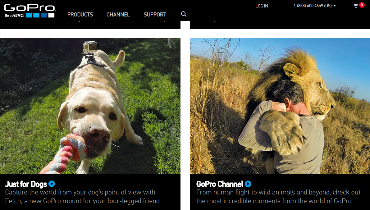
4) Go visual. Visual images draw attention, tell a story, and help illustrate a brand’s true value. The problem is, many companies, particularly in the technology space, don’t believe they have much they can show using photos or high-impact graphics. I’m going to put forward GoPro as a great example of a company that relies on the visual to tell it brand story. And yes, I recognize that it’s not a fair comparison—a company that sells action-oriented video equipment of course would have great videos to show off its products. But the thing about GoPro is that it almost never actually shows its cameras in its marketing efforts. Instead, GoPro focuses on its users. One of its leading cameras is called the Hero, and its campaign is to turn its customers into heroes. Much of its content is created by passionate users who are, in turn, becoming public heroes. Companies who aren’t in the video business can take a similar approach. Tell the story of your customers and end users using video and other visual assets to make them the heroes—for the challenges they are addressing and the problems they are solving. At the very least, use visual content and images to enhance your text-based content.
Taking an innovative approach to content marketing can pay off in spades for any brand willing to think creatively and act accordingly. But sticking to some basic truths about what customers want and expect will increase your brand footprint and drive market recognition and share.
AddThis GM Charlie Reverte calls 2015 the year of the personal web. He talks with Bluetext’s Buzz Lounge about the move to personalized web sites across the internet, making the web personal for individuals while generating more revenues for web sites.
This is part 1 of a 5 part series by Bluetext about innovation in marketing and communications.
Before hurling yourself into a production and budget battlefield to get that amazing video shot for your next campaign or brand asset, marketing commandoes now have a variety of tiny, toss-able reconnaissance robots they can hurl into any business or consumer use case as it follows you around and keeps your brand battling above its weight class.
For challenger brands without the resources of a major real estate marketer or major retailer etc, they can now have million dollar footage integrated in their marketing mix of assets for amazingly low cost.
These tactical flying robots have gained a ton of traction within the marketing world as of late for several reasons, not least of which is the fact that any time you send a robot to execute an expensive and trick task, you’re not sending a human. And that is scalable and cost effective. Traditionally robots are generally complicated, fickle machines packing a lot of moving parts. They often require on the ground pilot operators to undergo special training just to learn how to use them and fly them everytime. Not this technology, toss and follow. Really amazing technology and solution.
Removing the pilot and giving this new paint brush to the creative minds in marketing departments and their partner agencies will really improve the experiences we will start to see as this innovation sinks into the millions of brand messages we see a day.
At Bluetext we work with many companies that can benefit from this kind of technology. For example, in our real estate practice, we see many of our clients like JLL, Kettler and HomeVisit to leverage this kind of technology to deliver better more impactful imagery to deliver their product and service to market.
Interested in being innovative with your brand, marketing or communications? Talk to Bluetext
During my younger days I was fortunate enough to cut my teeth in the public sector at powerhouse Washington radio station WTOP, and was part of the launch of FederalNewsRadio. During that part of my career, I was lucky to be able to work with CMOs at just about every major defense and global technology brand serving the federal government. At the time, my biggest competitors were the stacks and stacks of Federal IT and Defense magazines that filled the bookcases behind them. These were the reams of tangible, tactile publications that their CEO’s demanded they advertise in before even considering buying 60-second slices of intangible “air.”
The precipitous decline in those print publications, combined with the impact of budget cuts on the federal agency buyer’s ability to travel to attend industry conferences, trade shows and seminars, has flipped that model on its head over the last 5 years. The resulting void of strong brand void has led to an increased thirst for more readily accessible “premium” content—white papers, e-books, survey reports and other in-depth materials that can be indispensable for government decision-makers. Yet, defense and technology vendors and contractors continue to peddle their wares using increasingly ineffective traditional methods of marketing.
The most notorious of these are companies that load up on traditional marketing to push government contracting vehicles—their IDIQs, GWACs and GSA Schedules – especially at the end of the federal buying season. There was once a time and a place for that – but no more. Marketing is now forever changed thanks to Al Gore – or who ever invented the internet.
As a result – government buyers have become real buyers just like you and I, involved to varying degrees in researching, influencing and taking themselves 75 percent through a buying process to ultimately select a solution that your company – and your 10 largest competitors – all provide.
This is why it is now so critical to target your marketing with premium content to specific and very real buyer personas. You need to put yourselves in their shoes to differentiate your brand and fill that void with contextually relevant content before your competitors do. No matter who that buyer is, they are all facing the same quandries:
- I have a problem, but I don’t know what the solution is.
- I know what some solutions are, but I don’t know which one is best for me.
- I know which solution I want, but I don’t know who to buy it from.
And while the best way to answer these is with content, the biggest obstacle I find since joining the agency side is that most of the companies we work with do not yet have mature content marketing strategies and lack the in-house resources needed to generate enough thoughtful, relevant content to drive engagement that results in traction for their brands in this market. The other challenge is their inability to harness the thought leadership of their subject matter experts. The people inside their company who have the expertise on issues most relevant to your target audience often do not have the time or have not been engaged to contribute content on a regular basis. As a result, marketers are struggling not only to develop the editorial calendar, but more importantly the content itself.
It’s no secret that a lot of successful marketers are turning to agencies to overcome this very challenge. When they do, they realize very quickly that we can capture more eyeballs – and drive much more significant and targeted brand engagement—by empowering them to become masters of their own content for far less than what they used to spend on traditional ads in all of those long-gone publications– and for a fraction of the cost of those radio ads. They all once had their time and place – and so will your brand if you continue to allow your competitors to outmarket you and find a cozy place for their content in the minds of your buyer.
Whether you’re selling B2B, B2G or B2C, chances are you’re starting to experience a crowded market space, with fierce competitors all vying for the same clients. Make sure your lead gen program is working as hard as your competitors’.
Let Bluetext do a Free Assessment of your lead generation content to make sure you are getting the best results.
Topics can include:
- Overall Marketing/Branding
- Target Audience
- Lead Generation Strategy
- Media Strategy
- Search Engine Optimization
- Social Media/ Blogging
- Website/Landing Page Conversion Optimization
- Content Strategy
- Lead Nurturing Strategy
- Analytics/ Website Management
For a FREE Lead Generation Assessment, sign up here!
The lowly infographic, once a novelty but more recently a must-have for markets trying to quickly a complicated message, seems to be in the twilight of its existence. What’s more properly referred to as a data visualization used to command the attention and admiration of marketing professionals everywhere. It wasn’t too long ago that such iconic and influential infographics as Aaron Koblin’s map of aircraft flights in the U.S. was dazzling us and pushing everyone towards this engaging new medium.
It’s easy to see why infographics became the darling of the marketing world. People like to be able to visualize complex issues. Our eyes are more comfortable scanning images than wading through data. And with the explosion of big data, making sense of all for that information through text alone can be difficult. We have worked with dozens of clients on ways to visualize and animate their complex data. The truth about infographics is that they are effective when done well, and will continue to be a valuable asset in the marketing toolkit.
Then why do they seem to be falling out of favor? Indeed, according to Sarah Rapp with the portfolio-sharing site Behance, “Infographic posting generally rose steadily from 2007 to 2012, where it peaked, and has begun to decline since then.”
As Fast Company contributor Mark Wilson wrote in a recent blog post, “A few years ago, the Internet was awash in groundbreaking data visualizations…Today, you’d be lucky to find a cheap knockoff in a world dominated by crappy promotional infographics churned out for viral attention.”
There are a few trends that help explain why infographics may seem like they are losing steam. One of the most obvious is the move to mobile, and as any reader of our recent blog post on the latest Google search algorithm change has learned, websites that aren’t mobile friendly are getting dinged in web searches. The reason is obvious—beautiful and intricate graphics typically do not translate to small-screen devices. If smartphones and tablets make up more than half of today’s web traffic, that’s a massive amount of viewers on which a sprawling data visualization would be lost.
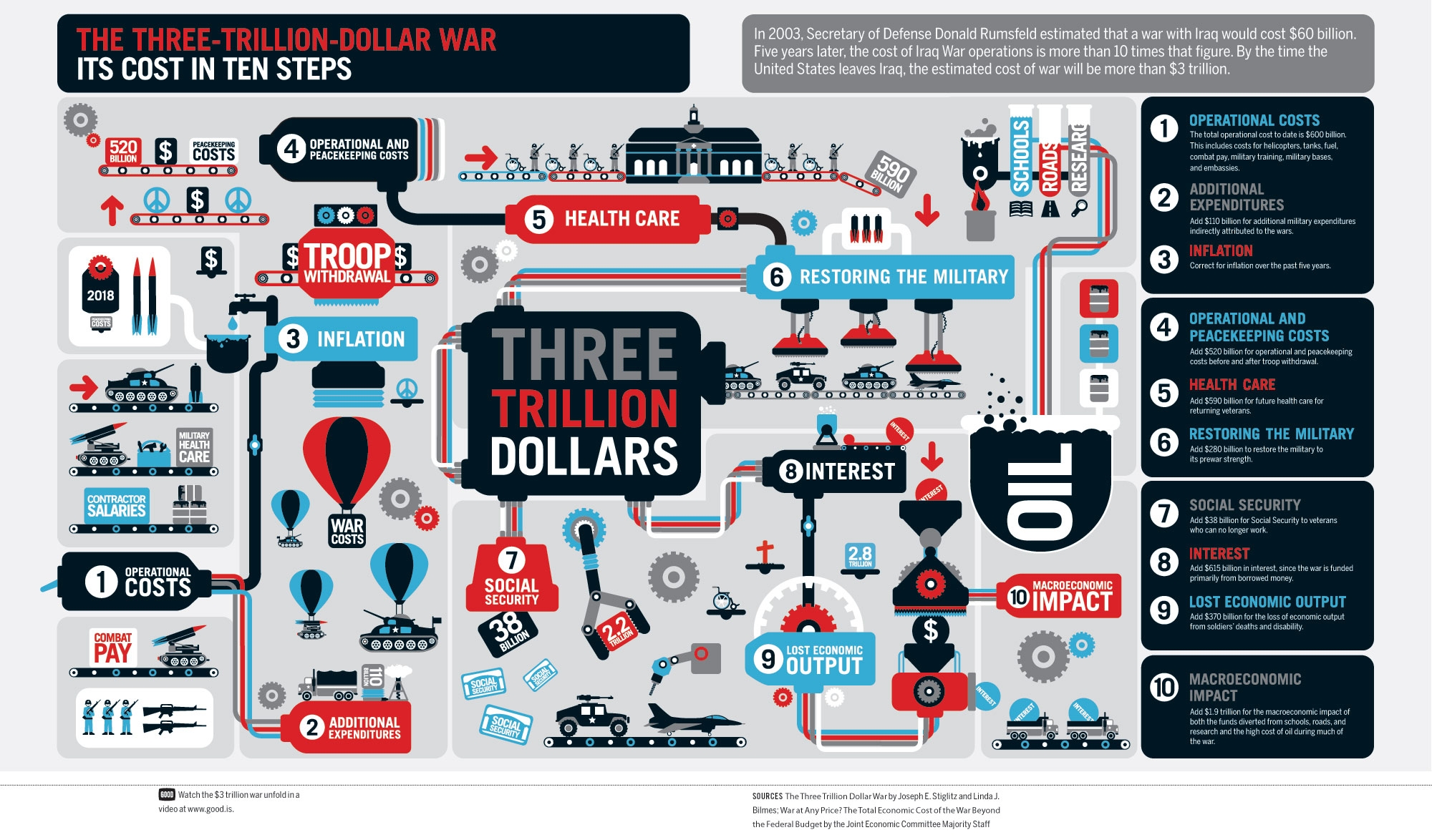
Another is more basic. Many infographics try to pack in so many details and so many data comparisons that they become incomprehensible. Rather than simplifying information, they end up confusing the viewer to the point of their eyes glazing over. Good designs are simple and eye-catching, not complicated and mind-numbing. Here’s an example of data overload:
Finally, as Mark Wilson notes, in many ways infographics have gone mainstream. “Once a playground for independent designers, data visualization has evolved into something more mature, corporate, and honest about its failings,” writes Wilson. “The quirky, experimental infographics that once peppered the Internet may be disappearing. But that’s only because data visualization, as a medium, has finally grown up and gotten a job.”
Bluetext comes at visualization from a different angle. We often work with our clients on what we call “StoryGraphics.” StoryGraphics, as the name suggests, tell a story rather than relying on comparative data to draw comparisons. In many cases, this is because the client may have key messages but not have data that lends itself to clever charts or graphs.
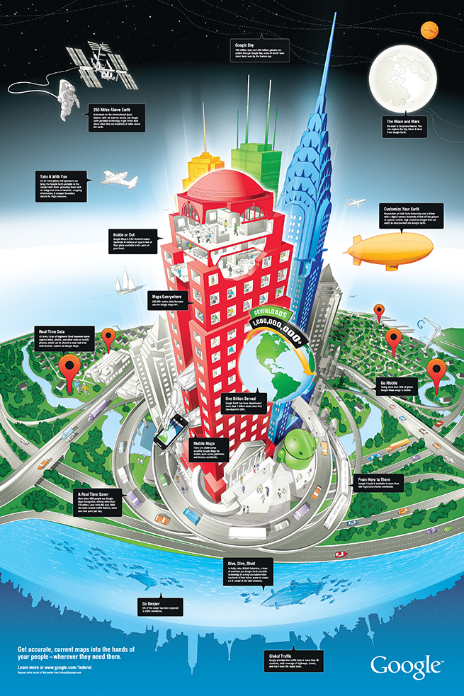
In a design we created for Google recently, the StoryGraphic tells how geospatial information can be used in space, for aviation, at all levels of commerce but also on the water and under the seas. A huge success for the Google enterprise team, this graphic would never have succeeded as a typical infographic.
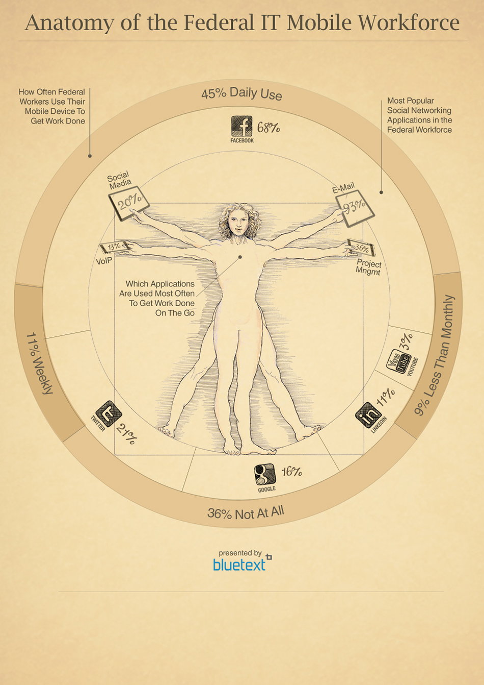
Another Bluetext example shows the move by Federal workers towards mobile devices. While data plays a role in the graphic, it leverages an iconic image to draw the viewer into the story that is being told.
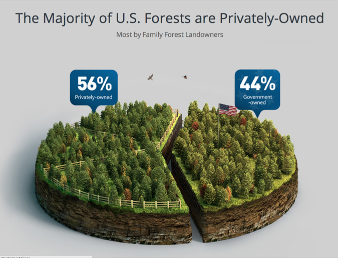
Some of our most compelling client examples do rely on comparative data, but focus on a limited number of statistics to more effectively tell the story. For a design for Georgia Pacific, one of the world’s leading wood products companies, we created a pie chart that took the form of a forest with just one cut down the middle to visualize the difference between government-owned and privately owned forests. The design instantly conveys the surprising fact that there are more private forests than government forests.
You can find compelling and intriguing examples of Bluetext StoryGraphics and infographics here in our portfolio. The bottom line is that marketers can turn to more sophisticated ways of using graphics to tell stories than a confusing jumble of facts and figures.
CSC’s Nick Panayi and I presented at the 2015 Mid Atlantic Marketing Summit on the customer journey and how digital marketing technologies are continuing to evolve, personalize and empower this very effective demand generation platform. We drilled deep into CSC’s massive digital infrastructure that supports many of their journeys, and most importantly the Bluetext produced CSC Digital Briefing Center. Slide 56 shows some outstanding results.
The Mid Atlantic Marketing Summit is greater Washington’s largest annual symposium of thought leaders in marketing. The theme focused on emerging technologies and trends in marketing communications. Topics included: metrics, mobile, social media, multi-platform campaigns, online video campaigns, experiential advertising, B2B, business development, and much more. This summit explored the disruptive technologies that are creating a major shift in how marketing and business development professionals reach their audiences and decision makers.
Bluetext Presents with CSC on Digital Customer Journey from Jason Siegel
and Nick Panayi, Head of Global Brand and Digital Marketing
As business grows, driving innovation can be challenging. Bluetext recently developed this mascot character to inspire one of our clients to drive innovation and promote an innovative spirit across its global client projects.
Bluetext named her Ana-Vation – a female spin on the key phrase Innovation.

Bluetext loves these kind of creative challenges. We see companies like consulting firms and government contractors that need to find ways of driving innovation as employee de-centralization and work on client sites can be a cultural challenge.
Here are some ideas to drive innovation in your marketing, branding, and overall cultural efforts:
- Be easygoing.
- Hire for culture.
- Bring on people who love the work they do.
- Build a diverse workforce.
- Manage innovation in a transparent methodical fashion.
- Schedule time for brainstorming.
- Tolerate and expect mistakes.
Tactical is a great word…if you are in law enforcement or the military. As a digital marketer, however, tactical has come to imply – fairly or unfairly – a lack of strategy, creativity and inability to grasp how day-to-day activities fit into the bigger picture.
In the recent Forrester report, “2015: The Year of the Big Digital Shift,” more than half of marketers admitted their digital marketing is more tactical than strategic. While a number of factors may explain this, digital marketers are a victim of their own excess: Forrester reported that investments in marketing technology grew 3.4 percent in 2014 and is projected to rise another 4 percent this year.
Marketers looking to spend their growing budgets will find an ever-expanding landscape of digital marketing tools at their disposal. Ask peers for recommendations on tools for content marketing, marketing automation, mobile marketing, SEO, and social media monitoring and you will likely get dozens of answers. It reminds me of the viral marketing videos from Blendtec’s, “Will It Blend” campaign, whereby items ranging from iPhones to baseballs are placed in a Blendtec blender to see if, in fact, they will blend. Throwing a bunch of digital marketing tools into a blender and just hoping they will “blend” together into a coherent strategy doesn’t work.
To ensure digital tools enhance rather than complicate your broader marketing strategy, consider the following:
Conduct gap analysis
Marketers must draw a definitive line between nice to have and need to have digital tools. In my recent column for PR Week The Hub Comms, I reviewed a new gap analysis tool from SAP that asks the marketer a series of questions about their organizational profile, marketing programs, current systems and processes. Based on the answers, the tool makes personalized recommendations on focus areas for marketing investment to address existing gaps. Marketers should not make tool investment decisions before having a firm grasp of existing gaps, and then evaluating which tools can plug them.
Avoid tool redundancy
There are purpose-built digital marketing tools designed to address a single pain point, such as SEO or content marketing. But it is more common today to find tools that try and do multiple things. For example, one tool might be capable of social media management, PR media measurement and reporting, while another might include a PR media database and some social media management capabilities. Many of these tools don’t run cheap, which means you do not want to be paying multiple vendors for essentially the same service.
Don’t repeat the same mistakes
The path of least resistance is continuing to use the same tools year after year. It is certainly possible that a small handful prove invaluable and are worthy of your loyalty, but the fact is that marketing needs evolve over time and your marketing strategy must adapt accordingly. The key point is that your digital marketing strategy should drive the tools you use, not vice versa. Purchasing a tool or tools and then building a marketing strategy around the tool’s capabilities is a backwards approach that will leady to tactical, rather than strategic decisions. Evaluate what worked last year and evaluate tools that will help you achieve objectives in 2015.
Don’t buy tools in a vacuum
Marketers, particularly those in the technology industry, often talk about how their company or client solutions break down silos and allow for information to be more easily shared. We see that playing out across agencies as far as a need to integrate digital marketing tools with other areas of the business. Burson-Marsteller recently unveiled a new approach aiming to combine its data analytics and Web data tools with creative and production capabilities, indicative of efforts industry-wide to cast the benefits of analysis, data and measurement organization-wide.
The Mid Atlantic Marketing Summit is greater Washington’s largest annual symposium of thought leaders in marketing. The theme will focus on emerging technologies and trends in marketing communications. Topics will include: metrics, mobile, social media, multi-platform campaigns, online video campaigns, experiential advertising, B2B, business development, and much more. This summit will explore the disruptive technologies that are creating a major shift in how marketing and business development professionals reach their audiences and decision makers.
A presentation being given by:
Nick Panayi, Global Brand and Digital Marketing, CSC
Jason Siegel, Co-Founder & Chief Creative Officer, Bluetext
Location: Mid Atlantic Marketing Summit
Gannett Building
May 8th 3PM
Nick and I will be presenting on the customer journey and how digital marketing technologies are continuing to evolve, personalize and empower this very effective demand generation platform. We will drill deep into CSC’s massive digital infrastructure that supports many of their journeys, and most importantly the Bluetext produced CSC Digital Briefing Center.
Learn why CSC’s Digital Briefing Center was so strongly needed for their most critical journeys, the concepts considered, and how we got to this great performing end product.