Every agency today is buzzing with the word “digital”, but only the best branding agencies understand that a company’s brand identity must be executed both digitally and physically. Many traditional physical marketing tactics are still very effective at building and promoting your company’s online brand. From business cards to branded gifts and accessories, the top branding agencies will tell you that consistency is key to bringing your brand to life on and offline.
It’s important to note that physical and digital branding are not substitutes for each other; instead, they should serve as complementary parts of your marketing plan. To create a strong and recognizable brand, your company’s visual identity should be carried out across all mediums. Marketing strategies that deliver the greatest impact use a combination of online and offline techniques.
Bluetext, one of DC’s top branding agencies, recommends the following tactics for a creative, strategic spin on your brand.
Bring your A-game to networking and recruiting events.
Especially important for trade shows or industry conferences, come prepared with fully branded Powerpoints, case studies, signage, and business cards. This will surely get competitors and potential customers’ attention.
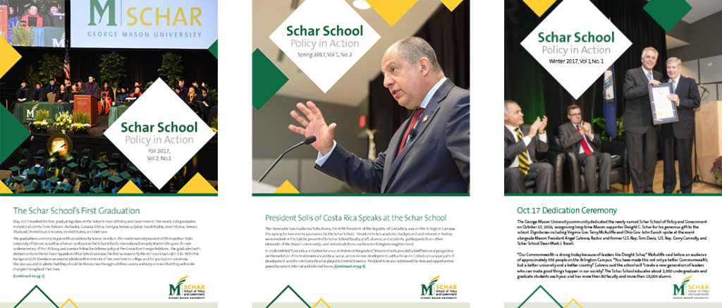
George Mason sought out Bluetext, a top dc digital branding agency for a new brand look and feel. Their website rebrand was not complete without a modernized recruitment brochure to display a new logo and tagline.
Be your own brand advocate.
Employees are by far the best brand ambassadors! Equipping them with branded portfolios, notepads and apparel provide face-to-face reinforcement that your company is well-established and cohesive. It is also a subtle yet effective strategy to showcase your proud company culture without saying a word.
Eye-catching Collateral
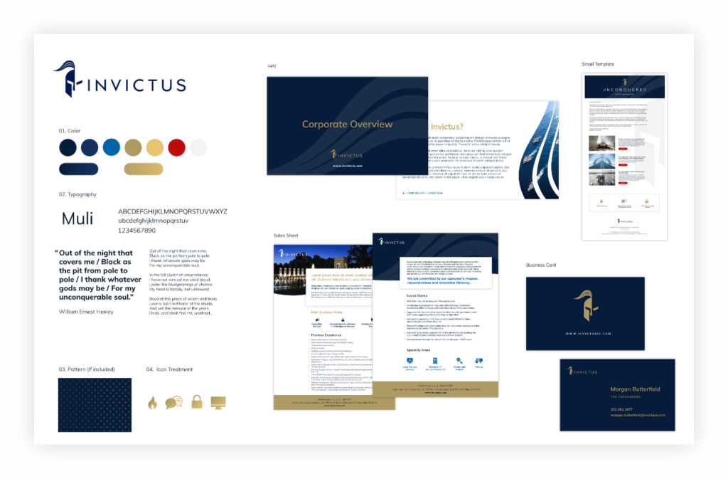
For any customer-facing company, using branded templates brings a sense of authority and confidence to any presentation or pitch. Take Invictus for example, whose recent website revamp was complimented by expertly designed templates to elevate their brand in future contracting proposals. Be sure to consult a top branding agency, though, to conduct thorough competitor research and ensure your brand is distinctive.
Celebrate Successes!
From a brand launch to a company anniversary event, don’t forget to celebrate! Any corporate event provides an opportunity for brand promotion. Company banners, napkins, and decor may seem trivial, but they go a long way. Having branded elements at the event can do wonders for company morale, and create great photo ops!
Pro Tip: Hosting a happy hour? Design company Koozies! It’s a savvy way to ensure drinks stay cold all evening and give employees a neat gift to take home and use in the future!
The bottom line is a brand is more than just a logo. A top branding agency will tell you that first impressions and emotions are at the core of brand strategy. Impactful brands trigger these feelings across all platforms. Digital KPIs are often centered around impressions, and the same strategy should be applied offline. Brand recognition is built upon repetition, and seeing a brand’s logo, colors or taglines carried out consistently in-person and online will trigger familiarity and ultimately conversions.
Ready to find out how a unified marketing strategy can amplify your brand? Check out our physical and digital branding services.
Transitioning a company that specializes in a product or service from working in the private sector to one that wins government contracts is no easy task. Negotiations can take months as organizations have to jump through a plethora of hoops to get contracts and budgets approved. Governments also favor companies with whom they’ve worked before or who have had experience operating as a government contractor in the past.
This begs the question — how does a company, perhaps one who doesn’t have as much experience working in the public sector, catch their attention and earn a place at the table? The answer is Content Marketing. You, as a government contractor, can offset your inexperience in the government contract realm via content production. This content can range from blogs to white papers; from videos to infographics; anything and everything that demonstrates your expertise in a given subject and gives you the upper hand over your competition. Most contracting officers, when looking for the right company to reward a contract to, will conduct research, looking at different options with three main criteria in mind: risk mitigation, brand reputation, and visibility.
Getting noticed by contracting officers doesn’t happen overnight, however. Building brand awareness and gaining reputation takes time and effort, and the content you produce must be created with the contracting officer in mind. Knowing who those specific agencies are that you’re targeting and specializing your content for them can set you on the right path from the outset and get you closer to winning those highly coveted government contracts.
Risk Mitigation
When a government agency decides to partner with a new government contractor, the biggest concern they have is mitigating the risk of working with a new partner. Their main goal is to get their contract fulfilled promptly without going over budget. Risk is usually mitigated by choosing to work with a partner they’ve previously worked with, or by working with someone who has a reputation for doing good work on government contracts. If you don’t necessarily have the experience of working in the public sector, you can mitigate as much risk as possible by proving to the client, through content that you produce and they are exposed to, that you have the expertise to handle the work and that you’re able to fulfill the contract and meet the government agency’s demands.
Brand Reputation
Ensuring that your company’s brand is being communicated to your desired audience in the way that you want is crucial when looking to attract government contracts. Although you should not aim to win every contract that comes along, you can set yourself up to showcase your abilities in the shop window using content on your website to prove your worth and show that you do have what it takes to work with government agencies and provide them with the products or services they require. Believe in yourself, your company, and your brand to get the job done, and make it known that you are the go-to company in your field. Create content that showcases your work in the commercial industry and educates readers on how that same success can translate to the public sector.
Visibility
To prove your reputation, you must be visible to your potential clients. You may have the best product or service in the business, but if you don’t have an active presence online, and you’re not showcasing your expertise, it’s not going to get you anywhere. Creating content on your site and sharing it through your social media channels can have a remarkable effect on your brand’s visibility. Sharing news and blog posts to your email subscribers build your brand awareness and attract potential new clients. Do everything and anything to increase the visibility of your brand and drive contracting officers to your site and to the content that you’ve created to show off your products and services.
Bluetext: your leading government contractor branding agency
That’s where Bluetext comes in. With years of experience working with government contractors, Bluetext is your one-stop-shop branding agency for content production. When NetApp, a cloud data services and data management company, had grown its offerings within the market, they turned to Bluetext to partner with and help inform public sector decision makers of the capabilities of their new solutions. Bluetext helped NetApp develop news stories, authored by NetApp experts, to key publications that both educate readers and inform decisions. Through our combined work, we helped position NetApp as a recognized thought leader within the government space.
![]()
Content production for experienced government contractors
Bluetext also has a background of working with large, experienced, well-known government contractors. Take our work with ManTech, for example. ManTech is a multibillion dollar public company that provides subcontracted technological services to the government. We partnered with them to produce a series of branded videos for their new website, highlighting their capabilities in one cohesive and powerful story.
Showcasing your abilities to government agencies
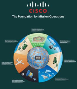
Cisco turned to Bluetext when they were looking for help showcasing how their solutions directly address the global networking requirements for the U.S. Federal Government’s integrated intelligence and operations functions. We worked with them to develop a visually appealing storygraphic, which included an interactive wheel to demonstrate the integration and impact of Cisco’s solutions across air, land, and sea to help the government achieve end-to-end mission success.
From veteran-owned SMB to big-time government contractor
One of our more recent projects involved Invictus, a cyber and national security firm, who turned to Bluetext to embark on their next mission: grow from a veteran-owned small business to full-service government contractor. Not only did we update their logo, reimagine their corporate visual identity, and design a modern website, we also created a corporate video that showed their clients exactly who they are, what they stand for, and what they can do for them.
Proving expertise through content
Showing potential end-users proof that your company possesses the grit, determination, and expertise to successfully execute contracts is vital for any company that wants to win government contracts. Expertise is often shown through experience; however, experience can be supplemented with relevant and actionable content on your website. If you can prove that you know the subject matter, agencies will treat you like a veteran government contractor and have faith in you to carry out their contracts. Partnering with a branding firm like Bluetext, who has the experience and expertise in working with government contractors both large and small, can help you achieve your goal of getting your company’s name on the shortlist for that government contract.
To view more of our work with government contractors and how we can partner with you, visit our website today.
Top branding agencies are always looking for new and refreshing approaches to logo designs that resonate with customers. Every designer’s dream is a new logo that is memorable and unique. But customers react to logos that interesting and different, but not too different. If a logo adheres to a style that is out-of-date or too far out of the mainstream, it may stick out from the crowd, but it won’t generate the positive feelings that it would if it were within the boundaries of the top logo trends that are hitting the market. With that in mind, here are six top logo trends that we are seeing both with our clients and across the industry:
- Flat Designs Retain Their Strength. When Microsoft released its latest new logo, the design was flat with no shading or 3-dimensional effects. The result is a logo that is straightforward, maintains its integrity and brand equity, and looks good across all channels and in all sizes. It’s also easy to print and reproduce. A flat design shows off the brand and colors well and shows off the brand in its simplest form.

- Negative Space is Your Friend. Pinterest, Instagram, Toyota and scores of other iconic brands all use negative space – sometimes with hidden shapes and symbols includes. As an article in Lifebuzz.com reveals, the three ellipses in the Toyota logo represent the heart of the automobile, the technology, and the customer. More importantly, negative space can draw attention to the brand in a way that is memorable and different.
- Stacking is Back. For many years, the logo with letters had to be simple initials in a simple design. But as a way to grab attention in a way that stands out and is easy to see and absorb, stacking can be a strong alternative – often with different fonts for each word. This offers a solid way to highlight different fonts to challenge viewers while giving them something they can quickly comprehend. Here’s an example of a recent refresh (minus the different fonts) from the American Library Association.
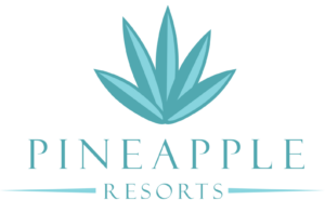
- Turning a Flat Logo Up a Notch. One recent trend is taking otherwise flat logos and adding a two-tone approach to add depth to the color but also to give it a hint of three-dimensionality. Dividing symmetrical images into two “zones” of shading gives depth and visual interest to a flat design. It can also add a symbolic touch to convey the brand’s core mission and direction. Check out how Pineapple Resorts turned its logo up a notch to make it more distinctive.
- Go Wide. Shapes that elongate from right to left are thought to be more recognizable for humans that narrow, tall images. With online platforms (such as websites and social media) favoring a wide design, strong brands are turning to this approach with their logos. When combined with contemporary fonts and colors, it can also convey a brand that is on the move and ready to dominate its market.


Want to explore how to apply top logo trends to your brand? Bluetext can help.
As every top branding agency knows, the brand style guide is a key component in a brand’s visual identity. It sets out how brand elements, including color palette, imagery, iconography, and layout should be incorporated into every piece of collateral or content that represents the brand. In essence, it’s the brand bible for every designer and marketer in the organization.
Yet, for a typical top branding agency, it’s often an afterthought. Only after the new brand elements are designed, options are provided to the client, the visual identity is applied to the website, collateral templates, and signage, and all is approved, does the team turn to the style guide. And even then, it is often lacking in the type of detail and content that will make it useful for more than a brief period. It needs to be thorough and future-proof.
Let’s face it: The brand style guide isn’t the sexy or fun part of the project. Oftentimes, it’s delivered as a thinly printed document and other times as a PDF with limited detail. We understand that digging through a lengthy document to find out precisely how to use the logo, fonts, and imagery can be frustrating. Here, then, is the Bluetext guide to a good – and useful – brand style guide.
- Make sure the style guide is comprehensive. The goal of the guide is consistency, in how the brand is represented regardless of platform, outlet or venue. It will be used by a wide variety of people, ranging from employees to partners to media. This doesn’t mean it has to cover every random or infrequent scenario, but more detail works in your company’s favor.
- Go deep in coverage. Even the term “brand guide” is sometimes misleading. While it is important to include details on the specific usage of a creative asset, such as how much white space needs to pad a logo or how a logo should play out depending on the background color, this should be only a part of the what the guide includes. Don’t neglect core brand-building guidelines, such as what the organization’s tone and voice need to be in different contexts, or how employees should use branded imagery on social media. Provide enough detail so that anyone reading the brand guide from cover to cover will feel like an expert on every aspect of the brand.
- Update the guide on a regular basis. With the prevalence of eBooks, articles, and infographics, brands are experiencing a faster rate of evolution than ever before. That means it is important to do a regular review of the guide to keep it up to date.
- Make it easy to find, share, and update. Many style guides look great in a printed, bound volume. But those are hard to find, hard to distribute, and really hard to keep updated. And if the brand guide requires time and money to update, executives will be reluctant to refresh the guide to match their evolving brand until they absolutely have to.
Our recommendations as a top branding agency: Make the style guide a dynamic window to your brand. Include intangible elements that come from the brand’s core message platform, like tone, voice and the types of language to use. Use a digital platform that is easy to share and easy to update. Make it comprehensive. And make sure you review it at least once a year.
Style Guide Examples:
Learn How Bluetext Can Help With All of Your Branding Needs!
In scanning the marketing headlines this past week, it is clear to me a theme is emerging about how CMOs are viewing their evolving role and the need to think business first, and marketing second.
So what does that mean exactly? For HP CMO Antonio Lucio, it means that, “if you want a seat at the top table you need to demonstrate that your efforts are not just about building your brand but about building your business, otherwise you don’t matter.” Lucio was answering a question about the changing role of the CMO at an event hosted by The Economist at the Cannes Lions Festival.
I love that quote; it is a nod to a more holistic view of how CMOs and marketers can strengthen and even expand its purview beyond marketing and advertising. In many ways the CMO must take a business-first rather than a brand-first approach to ensure a seat at the management table. For Lucio, his job as CMO has four separate roles: “chief brand officer, driving capability as chief personal officer of the marketing function, working with other departments “to get shit done” as chief alignment officer and chief storyteller “ensuring everything is aligned to the brand”. Lucio is making the point that the easy road for CMOs to take is the shortest one that builds the brand but fails to take into account how the broader business is impacted.
At the Cannes Lions Festival event, fellow speaker Syl Saller, CMO of Diageo, further supported this perspective by adding that CMOs are always tempted to pursue short term thinking at the expense of a longer-term perspective that includes a “strong vision of the future”.
In a separate article by CNBC.com writer Lucy Handley, Lucio’s comments at the event were once again highlighted: “”The CMO needs to be a business person and a marketer second. If you don’t have a seat at the business table, you really don’t matter. (You must) demonstrate that your efforts are not only building the brand but are building the business.”
CMOs have seen a number of factors disrupt their organizational roles and purviews in recent years, ranging from data analytics tools enabling more precise decision making to the increasingly digital customer journey. All of this does impact how CMOs communicate the brand to target audiences, but also offers an even greater opportunity to positively impact the long-term prospects of the business. In fact Forbes, which recently released its 2017 list of the world’s most influential chief marketing officers, noted that business impact was a key filter in ranking top CMOs this year.
As CMOs “increasingly assume responsibility for driving not just brand but business growth, they have an unprecedented opportunity to affect revenue and customer experience,” notes the Forbes summary. As a result, they’re not only gaining influence within their companies and with top management and boards; they’re “becoming more visible and accessible corporate leaders outside of their organizations,” in part through their “personal brands.”