Design trends reflect the world we live in, and the past year has been tumultuous, to say the least! Below, Bluetext explores 5 branding trends and how marketing designers can make the most of them when expressing their brand identity.
1. Motion Logos
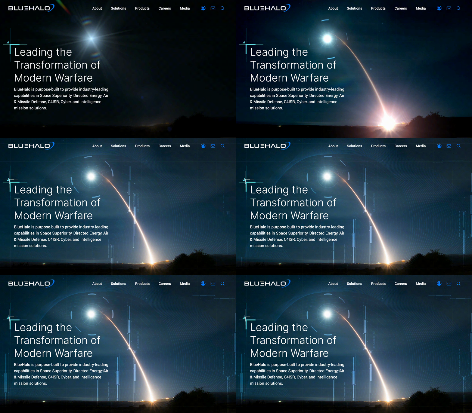
We all want our users to spend as much time as possible engaging with a brand, and adding motion to a logo will do the trick. Logo animation is a modern and dynamic way to attract clients. They hold the user’s attention, make for better storytelling, and increase brand awareness. People gloss over hundreds of brands each week, so this is the perfect way to stand out.
2. Geometric Shapes
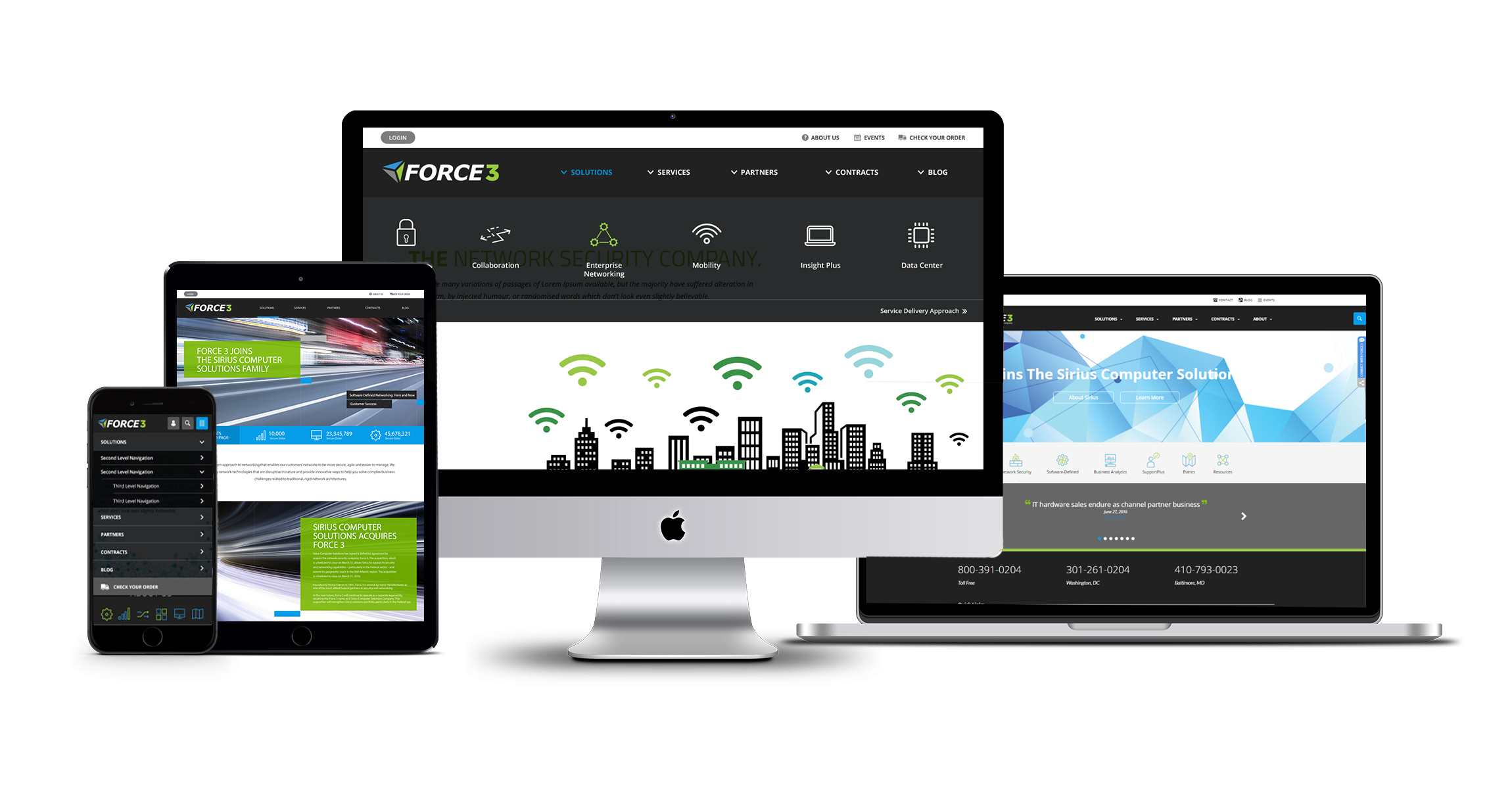
Recently we’ve seen many brands go back to basics. Especially through the use of simple shapes, you may recognize from way back when in geometry class. Geometric shapes are a straightforward way to establish consistency across the visual identity of a brand. While appearing simple at first glance, these shapes pack a punch with the ability to express a range of emotions. Squares and rectangles feel solid and stable while circles feel unrestrained and fluid. Take a look at how we use geometric shapes to give these brands a sleek and minimalistic feel.
3. Natural Designs
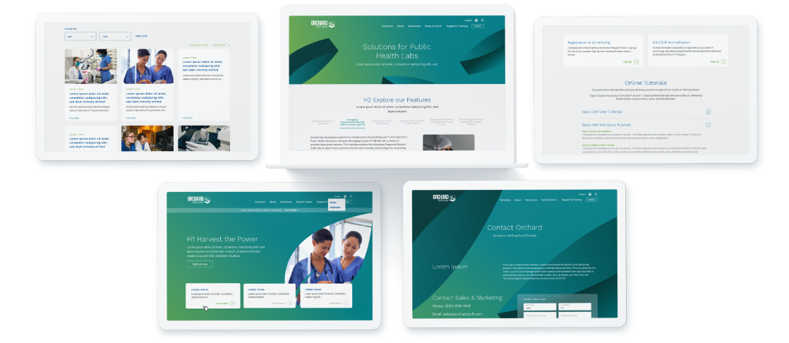
Recently, designers have been looking to nature for inspiration. This includes more natural color palettes as well as gradients to represent natural light. With our daily lives inevitably turning more and more digital, more natural elements provide a refreshing contrast from bright screens and persistent notifications. Studies have shown the benefits of natural branding include stress relief and enhanced creativity, which companies & users alike know and love.

4. Simple and Classic Fonts
When choosing a font for your brand, remember simple and classic fonts can evoke nostalgia, elegance, and trustworthiness. Streamlined typography marries the widespread push towards consumer trust with recent retro trends Design and marketing agencies are moving towards a more modern and minimalistic branding, which is often complemented by simplified type. Users are finding the fine details and complex logos to be distracting from key brand messaging and attributes. Simple and classic fonts are also more compatible with reduced mobile screen sizes and digital platforms.
5. Data Visualizations
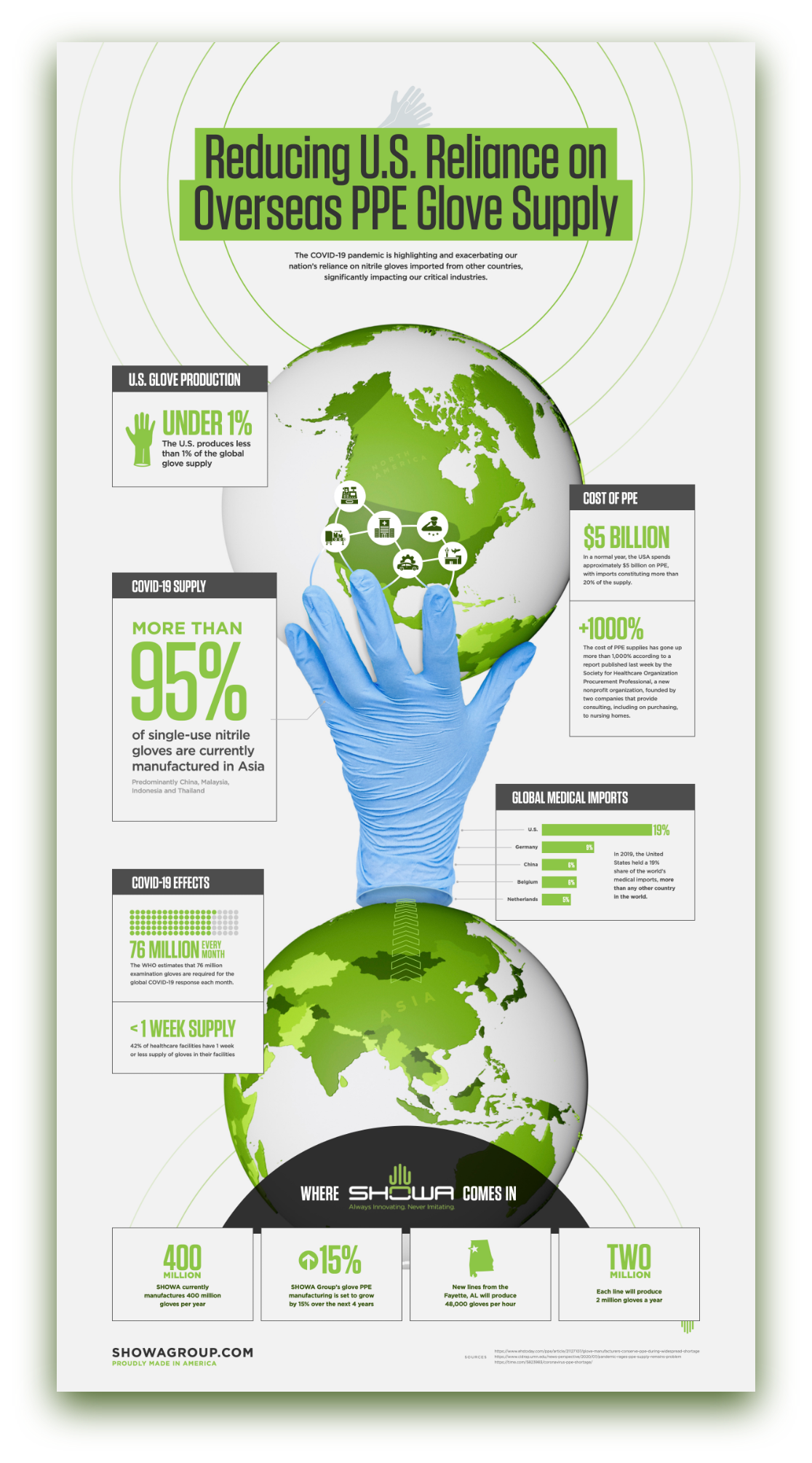
Sharing raw data holds little value to the viewer. Why? Because nobody wants to look at a bunch of numbers. Especially when quickly scanning a webpage or collateral asset, key statistics often get overlooked. Data visualizations are not only more visually appealing, but they provide a bigger picture for the viewer. Attractively branded diagrams and illustrations naturally draw the eye and focus attention to the story your statistics tell. Improving data visualization is an easy way to make the user stop scrolling and absorb your brand’s value and relevance.
Branding has the power to instill trust and excitement in any audience. Take advantage of these upcoming trends to increase user attention and spread brand awareness this year. Need help? Bluetext is here to give you the tools you need to develop or enhance your brand. Contact us today.


