This past Thursday creatives around the world kept their eyes out for a highly anticipated announcement: the 2024 Pantone Color of the Year. An annual tradition now 25 years old, Pantone’s hue selection usually sets the stage for design & style trends for the upcoming year. Take 2023 for example, when “Viva Magenta” foreshadowed the upcoming wave of Barbie-core pinks that dominated the design world.

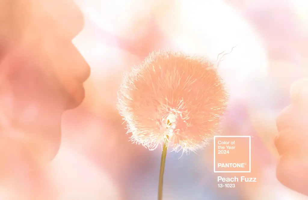
The finalist for 2024? Peach Fuzz, a neutral pink-orange hue the company describes as “gentle,” “velvety,” “contemporary” and “nurturing.” Pantone’s Leatrice Eiseman, explains: “Peach Fuzz brings belonging, inspires recalibration, and an opportunity for nurturing. Drawing comfort from PANTONE 13-1023 Peach Fuzz, we can find peace from within, impacting our wellbeing.”
All the buzz around the fuzz got our creative wheels spinning, what was Bluetext’s color of the year? We decided to turn the tradition on its head and reflect back, rather than forecast forward, on our most inspired color palettes of the past year.
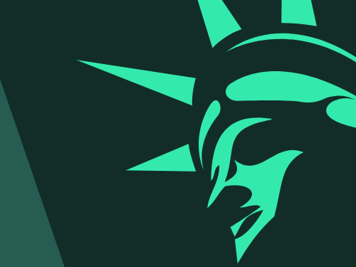
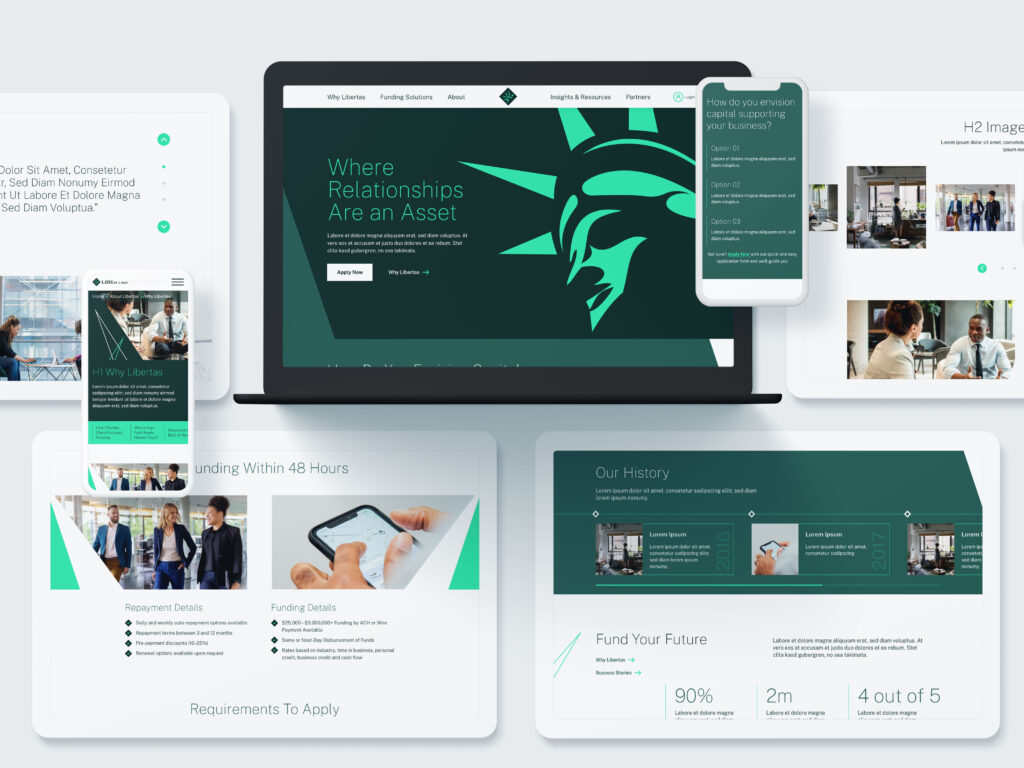
In the eyes of Bluetext’s creative director, Jason Siegel, Libertas’ iconic green-based palette stood out. As a financial services company, green tones are a bit on-the-nose, however the Bluetext creative team sought out to question and redefine the obvious. Marrying deep, jewel-toned emeralds with energetic pops of neon kelly green breathed a new life into an established brand. Torn between a determination to stay true to its root, and desire to innovate and prove its technology prowess to the market had been a long standing challenge for Libertas, but finally solved with the support of Bluetext’s creative expertise.
Another fan favorite of the Bluetext team has been Obrela, who proved real threat detectors do wear pink. The cybersecurity company’s website features a predominant dark mode theme, using a deep indigo gradient to backlight vibrant pops of fluorescent pink and highlighter yellow. As a creative agency with long standing experience in the cybersecurity market, we’re no stranger to the color blue. It’s tried and true across many industries, with a trustworthy color psychology and professional tone. What we love most about the Obrela color palette is the ability to bridge tradition with nuance. A successful balance of the familiar and the uncomfortable, using well known tones as majority with the thought provoking pops of pink strategically placed at critical conversion points.

Ultimately, we here at Bluetext feel 2023 has been a year of creative success. We’ve seen a trend of vibrant color schemes making its way across the B2B landscape. Often paired with a darker or more muted tone within the same color family, but definitely standing out in unique ways. As we approach 2024 we can only look forward to more modernized monochromatic schemes, particularly ones that seek to balance energy with expertise.
Are you looking to refresh your brand in 2024? Contact us at Bluetext to learn how we can partner with you.
Recent Posts
Bluetext’s Recent Work