A crucial part of any successful website design is not only catching the attention of a target market but keeping that attention. Oftentimes, UX experts will achieve attention retention through eye-catching animations, clean layouts, and intentional content strategy. But in some industries where flashy design and lifestyle imagery isn’t relevant, this can be an intimidating challenge. As a B2B technology marketing agency, Bluetext has done a deep dive into some key elements to help give your B2B website the winning edge.
The Difference Between B2B and B2C Websites
When it comes to designing a website for a B2B versus a B2C audience, the design landscape and tone change in response to respective target audiences. Consumers are often online to fulfill an emotional need, such as instant satisfaction from a purchase. The B2B audience, however, tends to take more time examining all the information about the product before making a decision. Why is this important? Understanding the audience’s motivations is the first step to giving your B2B tech website a leg up in UX design.
Now that we have covered audience motivation, let’s discuss how this translates into web design. In a broad sense, UX experts recommend the key aspects of technology website should be: simple navigation, concise language, and responsive web design. In the market of technology, it is also important to emphasize successful security checks throughout the design of the site. Those are the core ingredients one would expect every website to contain, but below we explore three best practices to help B2B websites stand out against the pack.
Rely on Content
UX experts first and foremost rely on content. As we mentioned earlier, B2B audiences often have much higher stakes in their purchasing decision. Yes, it may be a sole individual making the decision but they are often selecting a product or solution that will impact many people and departments across their company. Therefore, the B2B target audience likes to know everything about the product before making their long-term purchase decision. A tech website design must accommodate large amounts of text to describe each product. Keeping this in mind, UX designers can implement specific modules for a site that best present large amounts of content in digestible chunks.
B2B tech websites’ extensive amount of content must also convey a professional tone. Most B2B site visitors are informed to some extent about the product or solution they are seeking. If a company cannot clearly explain its product in a professional and concise way, it will drive away sales. There is nothing more professionally relatable than a crunch for time, so a site should respect the user’s busy schedule and likely short-lived attention span for acquiring key details. Another common mistake for tech companies is not clearly explaining company messaging and why they stand out against their competitors at the forefront of their website. Upon first landing, a user should be able to tell what your company does, and why they should pay attention to it. The Bluetext messaging team uses a highly thought out process to make sure the tone of a brand addresses all competitors in the marketplace and stakeholders within a company.

Clear Call-to-Action
In the same vein of time awareness, B2B web designs must have a clear call to action. If you happen to capture a user’s attention enough to generate genuine interest, there needs to be a frictionless and obvious way for them to find and take the next step. Research has shown that a B2B audience is more likely to call to purchase a product than purchase online. Therefore, a website should address this pain point with live chat solutions, well-integrated contact forms, customer care information, telephone numbers, and more.

High-quality video and images
Along with the expectation of a professional tone comes a professional look. The first step is implementing high-quality videos and images onto the new site. Strong visual content can help break up the large blocks of content and avoid the risk of eye fatigue when scanning and reading lengthy text blocks. Videos are a useful and engaging way to provide a clear explanation of what the product can achieve. Coupling visual and audio elements increase the memorability of your brand and capture attention for much longer. Videos can also give a closer look at the company’s values as a whole. The Bluetext video team uses a strong brand voice, innovative animations, and professional editing to create persuasive and informative content for their clients.
Mobile Friendly
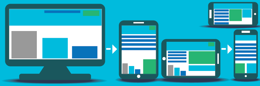
If you’re selling tech, you have to show you are tech-savvy and keeping up with the times. This should be a no-brainer, but too many technology websites across the web don’t take advantage of responsive design practices to ensure equitable desktop and mobile experiences. Bluetext implements this with well-thought-out wireframes addressing all content needs. One of the ways to best implement a strong user experience is keeping in mind the significance of a mobile-friendly design. With mobile traffic driving up to 40% of revenue, this design compatibility should never be ignored.

B2B differs from B2C in terms of their audience needs, wants, and decision-making processes. While some core differences set these types of websites apart, an informed UX and content strategy that matches audience needs is crucial to both. Consult a website design and UX agency like Bluetext so you can be sure that your website addresses the needs of your target audience, and formats content and visual components to convey a professional and interesting tone. Contact Bluetext to learn more about our services and how we can address all of your content and website design needs.