Whenever you add or change a feature on your website, you should consider the impact on the UX, or user experience. When you assess how users will interact with your website, it is important to consider users with differing abilities. Accessibility is a critical component of website design, not only for inclusivity but also because Google search crawlers reward websites that implement accessibility best practices.
Most websites don’t even realize that their content is not accessible to all users and use designs and visuals that create poor accessibility unintentionally. For example, you might like the relaxing feel of muted colors, but there needs to be enough contrast for users with visual impairments to read your content. If you use video content, be sure to include closed captioning to provide users who are deaf and hard of hearing the same access to information.

When thinking about accessibility, it’s also important to remember the universal benefit to every single user of your website. Too often, we think of accessibility as a way to benefit a small subset of users who need accommodations, but making your content more accessible actually helps everyone. If you’ve ever tried to watch a video on the metro, you know the benefit of closed captioning. On that day your mouse broke, you probably learned pretty quickly which websites you could access using a keyboard.
While there are many different ways you can improve accessibility, here are some great ways to start bettering your site.
Check Color Contrast
Run your website through a contrast checking tool (there are many free options online, such as a11y’s color contrast tool). This will help you spot any colors that might be difficult to read or view, so you can update text and CTAs to ensure that all your users interact more easily with your site.
Break Up Long Chunks of Text
While some areas of your site might require a long article when possible try to break up long periods of text with images or different types of components. This will make your content more accessible for neurodiverse users, and it will make important content more digestible for anyone who comes to your website.

Add Alternative Text for Images
Many content management systems will already ask you for alternate text for images, so this is an easy way to immediately make your website more accessible. This text does not need to be a detailed description of every single piece of the image but should be a few descriptive words that capture the main points of the image.
Make Menu Items Unique
Repeated menu items are confusing for everyone. If you have the same item under two different parts of the menu, it is difficult for users to tell which one has the information they need. It becomes more difficult to tell the difference when using a screen reader. Think through your menu, and choose the single most accurate spot for each menu item.

Improve Heading Hierarchy
Headings help you visually separate your content, and using the correct headings will help neurodiverse users and people using screen readers. Most websites use headings from <h1>, being the most visually impactful and important, to <h6>, being the least. As you write your content, think about where it makes sense to group content under a heading and what type of heading should be used. A major section of your page should not be delineated by <h6>, and a short paragraph should not use an <h1>.
Hopefully, these recommendations will help you as you begin creating a more accessible website. Reach out to Bluetext to dive further into accessibility and make sure every user has a great experience on your website.
You don’t want your users to get an error page, but if they do, make sure it is a good one.
If someone finds a 404 page on your website, they are probably in the wrong place; your goal should be to make it as easy (and fun) as possible for them to find the right page. You need to make sure that your visitor can find a way back to their intended location, so it’s helpful to direct them to popular pages or a search feature. By giving your user some direction, you can make lost pages feel more like a detour than a dead end on your website.
While your primary focus should be to help your users find a new page to travel to, there is also a trend toward having more interesting and fun 404 pages. You want to keep any error pages within the realm of the company brand, but you should also see it as a chance to add some humor or engagement to your website. By infusing some witty text or a cool graphic into your 404 page, you help website visitors have a good experience on your site even when they face an error code. After all, the happier your website visitors are, the more likely they are to continue exploring the website, rather than exit out altogether.
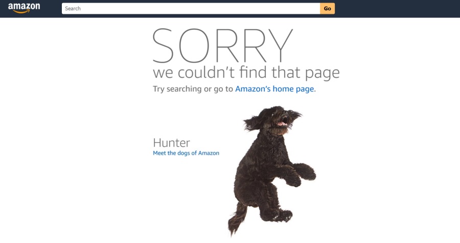
Take Amazon for example, when a page is lost users are shown a cute dog with redirection back home. Even better is that the dog photo changes each and every time to feature one of their 43 “Dogs of Amazon”.
Ceros has a great example of a fun and helpful 404 page. The company recently updated its 404 page to have an interactive wheel that leads users to random content. By encouraging interactivity as Ceros does, you can keep your users interested in your content even when they’ve lost what they are looking for. Engaging features like this motivate visitors to look beyond their original search and consider other areas of your website.
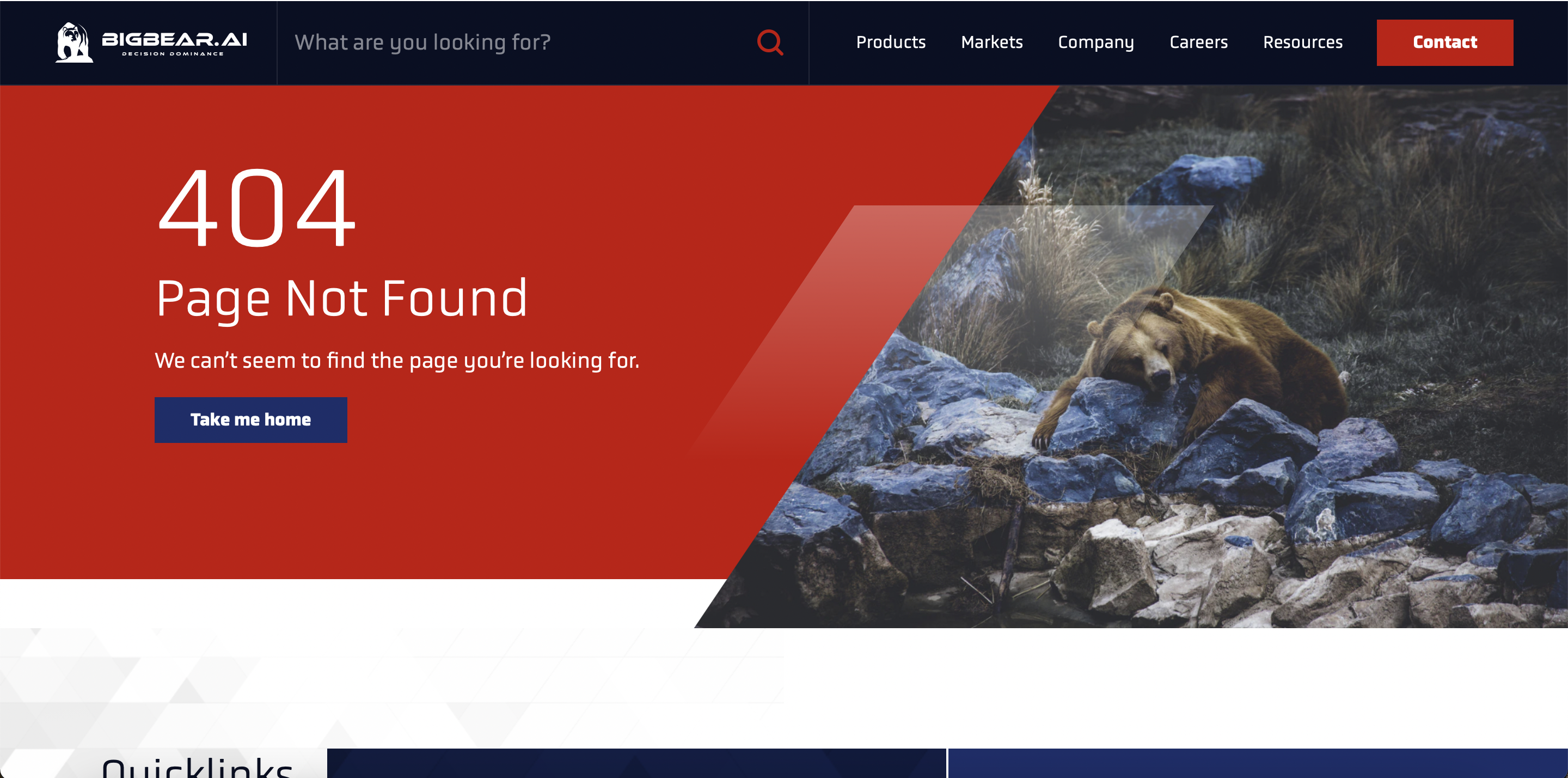
The new BigBear website, which Bluetext worked on, is another example of an excellent error page. On their 404 page, you can see a picture of a lost bear. This adds a little humor to the page while keeping the content on-brand for the company. The 404 page does not end there, though. It also has quick links to encourage visitors to continue interacting with the website.
Both of these examples illustrate the usefulness of having an informative but fun 404 page since the ultimate goal of any website is to keep visitors engaged! While a 404 error is never the ideal landing page for your website users, it is critical to prepare and design for this scenario. And by turning what was traditionally a dead-end into an interesting detour with clear next steps, you increase the chances of a positive user experience on your website.
If you need help setting up a new 404 page, reach out to our experts at Bluetext.
Second-only to your homepage, your sitemap is one of the most important and most visible parts of your website. What value is a website if people can’t find the content they are looking for?
A sitemap is quite literally a map of your website’s page inventory. Sounds simple right? As a content creator, you may know exactly where all of your content lives and how to get from Point A to Point B but to an unfamiliar website user, this may not be as intuitive. To complicate the process even further, creating a sitemap is not always black and white. Every website and its content is different, but there are certain steps you can take to develop the most user-friendly version possible.
Prioritizing Specific Content
Your first step should be determining what type of information will be available on your site, and more importantly how that information should be prioritized to meet business goals. First, it is important to conduct a content audit to take inventory of what is available to the user. Are you featuring lots of products? Are you trying to build up your thought leadership presence? Do you need a lot of information to educate users about your services, or will they already know about your area of expertise when they come to the site? Establishing your top three objectives for the website is a great place to start when conducting a content inventory.
After you have an idea of what kind of content your site will feature, you should take a step back and imagine being in the shoes of your target audience. What might your users look for? And how do they phrase their needs? While you might have an internal structuring of products or services that makes sense to employees with deep technical knowledge, your website is for a broader, often less specialized audience. Consult your SEO keyword strategy to ensure your menu labels match organic search teams. Added bonus: Google crawlers pay special attention to a website’s sitemap, making it a golden opportunity to embed top keywords. Make sure that any terms you use will be searched by your ideal audience and are likely to catch their attention on the website.
Establishing your Navigation Structure
Next, you will need to think about the most intuitive way to structure your main-level navigation in the menu bar. This navigation will be present on every page, and for ease of use, it should be relatively short (we usually recommend four to seven items). You can have many child pages under this navigation, but you want to make sure that those top-level items present a few clear high-level categories to organize the information below them.
Once you have determined your top-level navigation, it’s time to determine the child, and even grandchild, pages that will live below in the website menu. While it might seem like you need a new page for every topic, think critically about what could be on-page content and what should be entirely its own page. Some pages might fit under a couple of umbrella categories, but make sure that pages are neatly assigned and do not repeat in different areas of the menu. For accessibility reasons, you want each page title to appear only once. Menu duplicity is a common problem for companies offering both “products” and “solutions”. While the argument could be made to categorize a page under either one, you should strive to pick one.

Don’t Forget About the Utility Navigation
After structuring your main navigation, make sure you don’t forget to add items to your utility navigation as well. The utility nav is a great opportunity to pull out some important content that otherwise might get buried in your website. The utility navigation is the smaller links above your main menu and is always present at every step of the user journey. This is a perfect opportunity for ever-green content that appeals to broad audiences. For example, we often recommend putting careers in the utility navigation to make it easier for potential employees to efficiently find job listings and apply.
These steps will surely get your website sitemap off to a great start! However, keep in mind this is an iterative process and will need to be updated as needed. By tracking in-site searches in Google Analytics, you can see what users seem to have trouble finding through the navigation alone. If any term is getting significant search traffic, it might be worth changing the sitemap to make that content more clearly available.
Creating a sitemap can be challenging, and often benefits from a fresh, third-party perspective. Trusting a content marketing & user experience agency, like Bluetext, can help establish clear content goals and a reorganized sitemap. Contact Bluetext to learn about our experience creating intuitive sitemaps that will make your site shine.
What’s your first instinct when you have a question? For most, it’s to Google it. Whether or not it’s looking up a restaurant or finding a solution to a business challenge, Google is the go-to. So the question is, how do you make sure that your company is at the top of its Google results?
This is the central question of SEO, or search engine optimization. SEO refers to any practices that improve your placement in search engine results. Bluetext does great work helping our clients find SEO success. Below, you’ll find our top four tips for improving your website’s search engine performance!
Enrich On-page Content with Keywords
Keywords are one of the first concepts to evaluate when you start improving your SEO. Customers will search Google using keywords, such as “best cell phone provider” or “easiest website making tool,” and you want to make sure your pages show up in the first page of relevant results. Once you understand what your customers are searching for and identify the keywords for your business and industry, you can interweave those keywords throughout the content on your site to advance your placement in search results pages. But beware, Google crawlers are smarter than you’d think. Be sure not to unnaturally force the keywords into your content or unnecessarily duplicate your content, both of which can negatively impact your SEO.
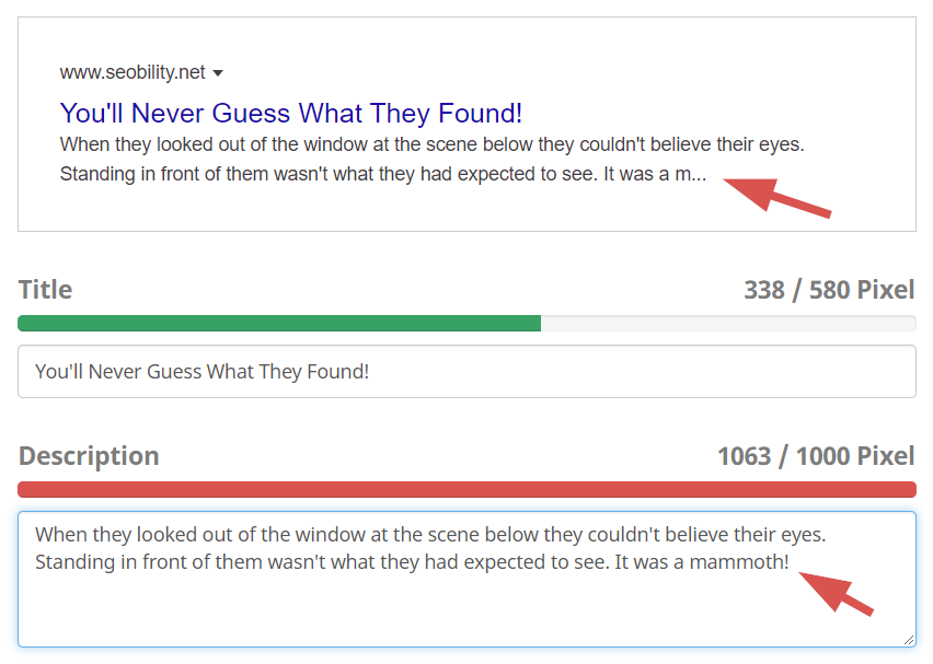
 Add Meta Descriptions
 Add Meta Descriptions
Meta descriptions are the small blurbs of text that appear under a link in a search result. Though small in size, they make a huge difference in your click-through rate. Customers are far more likely to click a link in a search engine when they can see a small promo description of the type of information that link will provide. It’s important to have accurate meta descriptions for your different pages, so do not repeat the same meta description on each page. The meta description should are the perfect opportunity to embed relevant keywords, and should tie back to the prominent H2 and H3 section headings on your page. Think of meta descriptions as invitations to users to click through to your site via powerful calls-to-action. Additionally, avoid using too many words in your meta descriptions, as Google will auto-truncate them and cut you off mid-sentence.
Be Careful with PDFs
 Be Careful with PDFs
PDFs may be an easy way to upload content to your website, but they are not very helpful from an SEO perspective. Search engines crawl web pages, but have a hard time reading the text on PDFs. Therefore, none of that content in the PDF is being used by search engines. With all the time and effort you put into creating the PDFs, it’s a lost opportunity to not reap that SEO benefit. By transferring some (or all) of your PDFs to on-page content, you can greatly increase the amount of content that Google takes into account when determining how high to place your content in the search engine results.
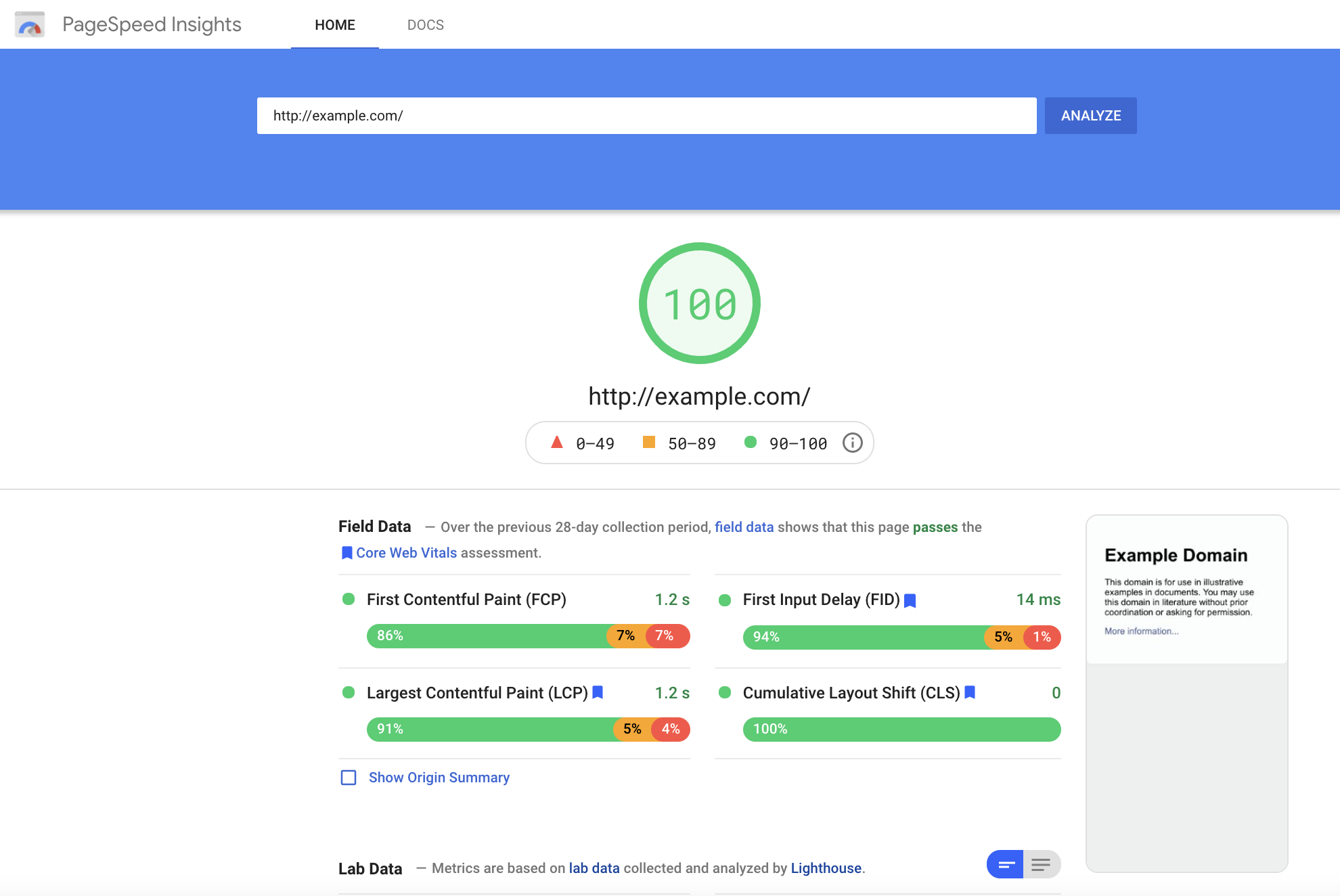
Prioritize your Pagespeed
Google does not just look at content and keywords to determine the placement of your website in search results. Google page speed is another piece of the SEO puzzle. Google ultimately wants to make their searchers happy, so they want to provide fast-loading pages, on both mobile and desktop devices. Therefore, having a good Google page speed will make it more likely that Google places your web pages higher in its results lists.
While SEO is always evolving with changes in search engine policies and algorithms, these are four great tips to help you get started on your way to SEO success.
If you are looking for an agency to put together and execute a customized SEO playbook for your company, contact Bluetext today to learn more about our SEO offerings.
After crafting the perfect campaign, ad creative, and hook-worthy copy, there is nothing more frustrating than a user coming to your website only to leave after a few seconds.
In order to prevent those high bounce rates and low clickthrough rates, you need to set up engaging and informative landing pages that lead visitors to the actions you want them to take on your website. It’s not an easy task, but thankfully digital marketing agencies, such as Bluetext, have experience and tips to share. Let’s look at five ways you can master the art of the landing page.
1. Emphasize Calls to Action
As this Elementor article states, “Unlike most webpages, landing pages often actively discourage exploration in an attempt to push visitors toward the CTA.” The whole goal of your landing page will be to push your users to a certain action or link, so make sure you place CTAs throughout your landing page to encourage clicks as the user scrolls. Also, be certain the CTAs are the most prominent component of your landing page, by color, placement, or other characteristics, they need to stick out to grab visitors’ attention and entice click-throughs. Also consider adding sticky CTA menus that follow the user down the page, enticing them to click-through at any time during their experience with your site. Some top placements of sticky CTAs lock onto the right-hand side or directly under the main menu navigation.

2. Think Through Your First Viewport
When a user first appears on your landing page, they are looking for an immediate answer to their question. Every one of us has looked at a website for all of one second before exiting because we could not immediately find the information we wanted or perhaps there was too much text to read through.
Make sure that you use that first viewport wisely to start appealing to user needs. Have informative, relevant headlines, eye-catching images or video, and helpful secondary text. All of these pieces will go a long way in convincing your users to continue to scroll, and eventually click that CTA button.
3. Write Intriguing Copy
If you can grab your visitor with their first look at your landing page, you’ve already overcome a significant challenge of landing pages. However, now you need to sustain that attention. It’s a tricky maneuver, balancing providing immediate information while also ensuring they absorb additional details. Give everything away at once and the user never interacts further with your website, but tease it out too long and you risk users bouncing off the page. Digital marketers recommend to not overwhelm the user with small, dense text but instead offer answers to their questions. Additionally, psychological elements can be used to reach your visitors and convince them to use your CTAs. By the time someone finishes reading your landing page, they should have a clear idea of why your product or service will give them the best solution to their problem.
4. Optimize for Search Engines
You may have the most magnificent landing page in the world, but that does nothing if people can’t find it. Using keyword phrases and writing rich meta descriptions is an important part of SEO for a successful landing page. By getting to the top 20 results of Google (or in the first two pages of results), the chances of someone actually seeing and clicking on your landing page rise substantially.

5. Design with Your Users in Mind
As with any page, design can make or break your user experience. As you write copy, consider what information is most important to the user and needs to be emphasized in valuable H1’s and H2’s, think about which details could be shown in more interactive formats, and choose media that adds to instead of distracts from your main purpose. You also need to ensure that your landing pages are fully accessible for all your potential users.
A great example of a compelling, successful landing page comes from our campaign with Varonis. Bluetext worked with Varonis to create ads that drove viewers to landing pages and CTAs. By targeting the right audiences and leveraging intriguing copy, Bluetext helped Varonis grow its click-through rates above the industry benchmarks.

Want to learn more about creating successful landing pages or are interested in working with Bluetext to create a successful, data-driven landing page strategy? Contact us today.
It’s not what you say, it’s how you say it.
You could have the best product in the world, but if your website’s user experience is not up to par, how will customers find and use your product? What’s in your website is important, but how your user interacts with it is even more essential. That is why it is so important to focus on UX when designing, or redesigning, your site.
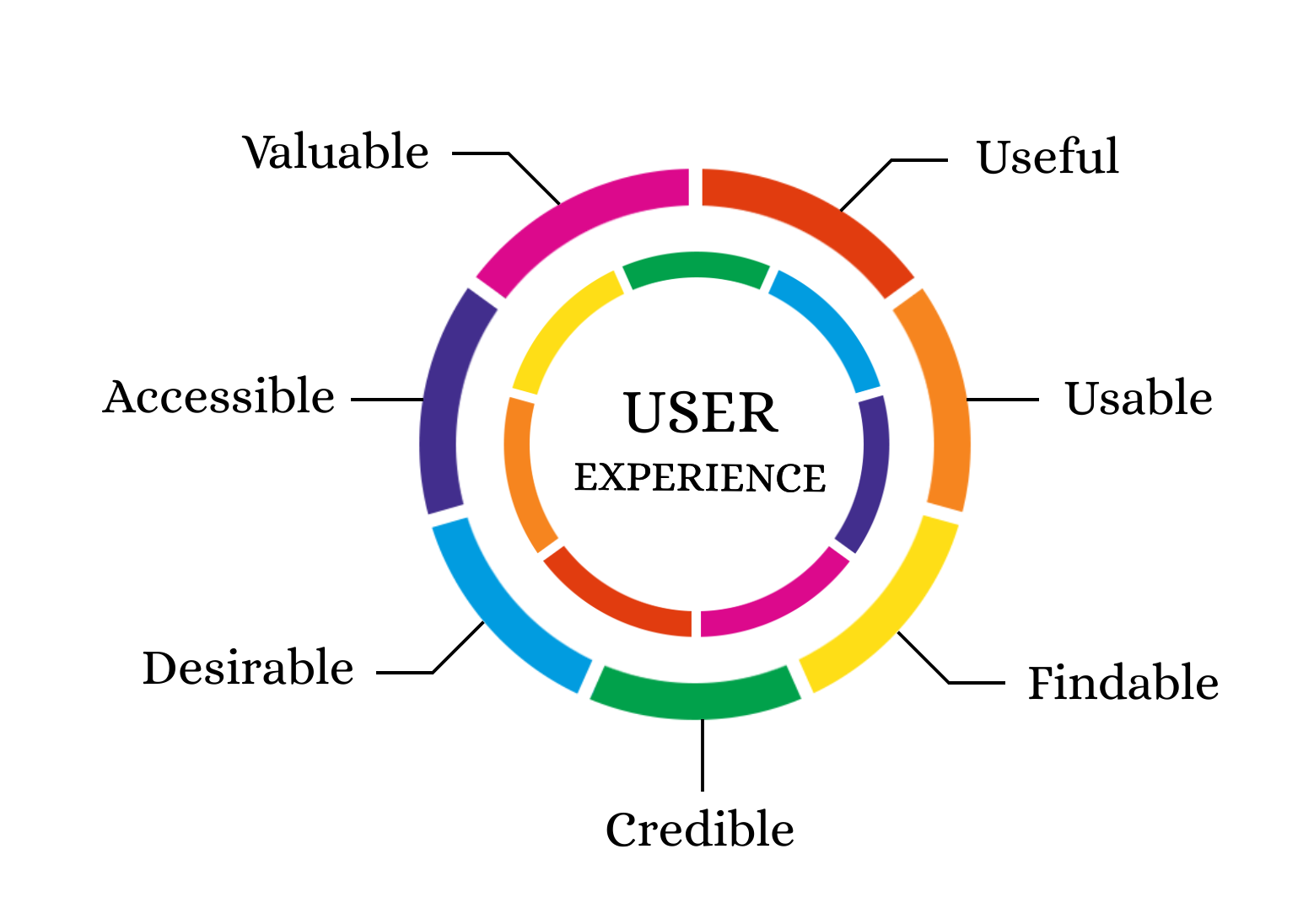
What is UX?
UX– or User Experience– is how your users interact with and experience your product. While UX can apply to any product or system, from making a call on a cell phone to standing in lines at Disney World, it is commonly associated with digital media. Everyone has had that moment where you can’t find what you need on a website because it is buried so far behind menu items and hyperlinks. With proper UX, though, your users will be able to find everything more easily and therefore be more satisfied with your overall product.
Why is UX Important?
UX is important for a client because it gives them easier access to your products. It is important for a business because happier clients are more likely to return to your business. According to this Inside Design post, “88% of online consumers are less likely to return to a site after a bad experience.”
Thinking specifically about your users’ experiences is also an initial step in helping as many users as possible succeed on your website. As the internet and computer technology have expanded, accessibility becomes easier to implement and more important than ever. Accessible UX will help everyone use your website better.
So how can my company find a way to use UX to the fullest?
The first step to any good user experience design is knowing and understanding your users. After you determine your users, or potential users, your most important task is researching how users interact with your website (or other products). What parts of your website make users love to visit the site and buy your products? What parts of your website are so challenging that users exit the page? How can you make the more challenging parts of your website better and easier for users? In your research about current users and website design, don’t forget to think about your content editors as well. How do your employees add content to the site? Does the backend need improvement as well?
After you have a good understanding of your current website’s strengths and weaknesses, you can move on to thinking about how to redesign your user experience and interface. Consistently refer back to your research to make sure that you are properly addressing user needs. Also, be sure to follow accessibility guidelines even if that did not come up in your specific research (Bluetext’s Aly Gumprich shares some great information about accessible design here!) While brand-new, complex designs might seem fun, it is important to make sure the website is functional and not just visually pleasing (although it should be both!).
Once you complete your redesign, make sure to test, test, test. The whole point of UX is to make sure your website is usable. Have as many people as possible test the website and provide feedback. As you get feedback, use it to make your website even more user-friendly.
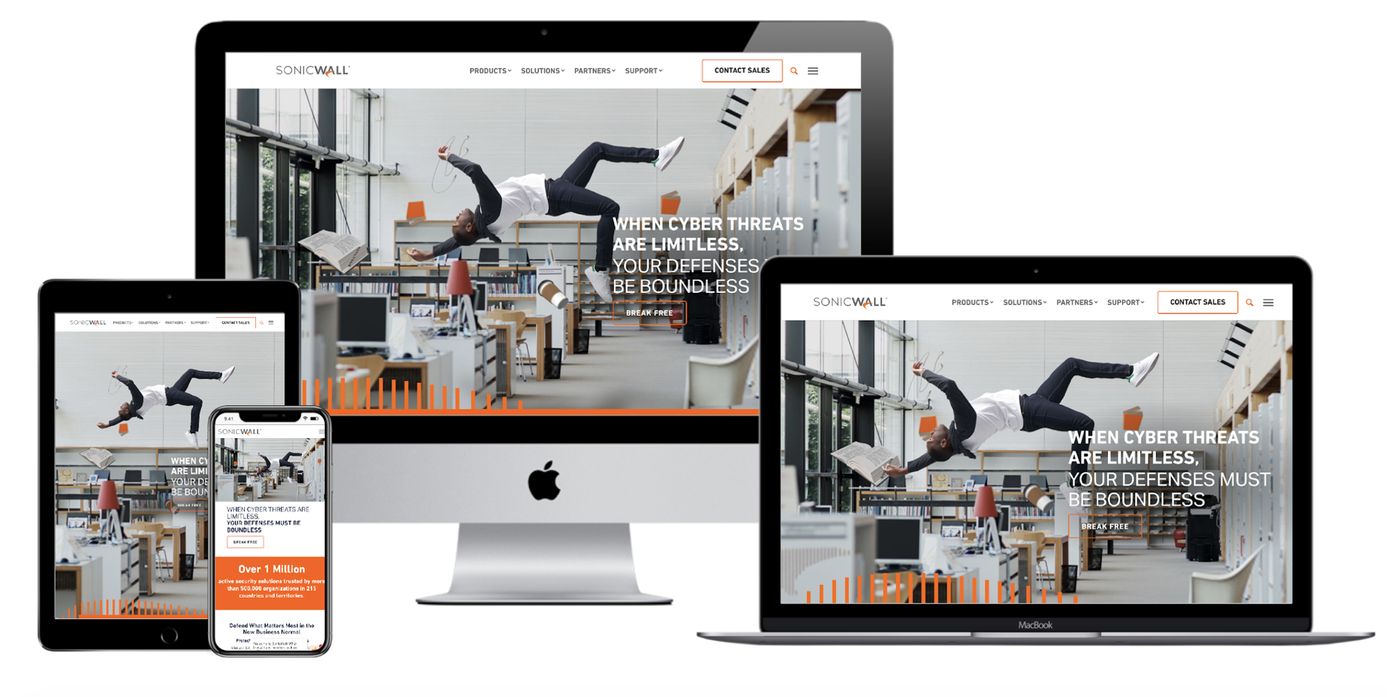
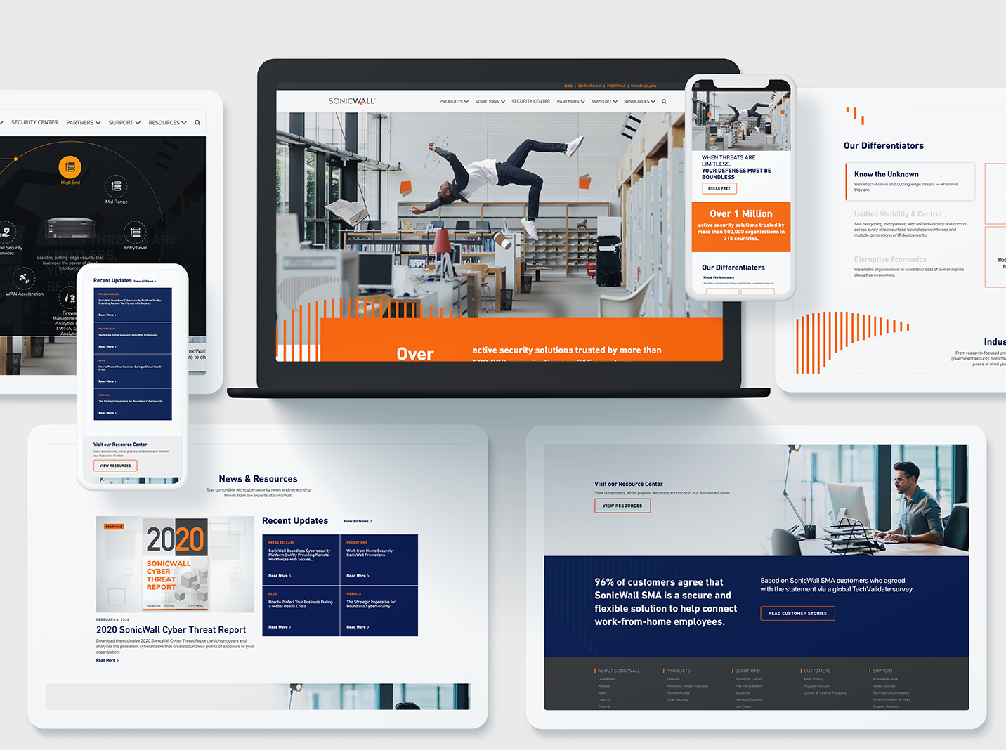
A great example of how to maximize innovative, clean design while still ensuring a seamless customer experience is Bluetext’s redesign of the SonicWall website. This redesign highlighted creative elements that matched SonicWall’s brand and mission, but Bluetext also made sure that the website streamlined product information to boost customer satisfaction and make researching and buying products easier. Bluetext also took care of all the details that make a user experience truly great–like fast website speed and an easy-to-use navigation system.
Whether you are updating a current website or completely redesigning, make sure you consider your user experience during every step of your design process to ensure the best site possible!
Need help? Contact Bluetext to get expert support in perfecting your user experience design.