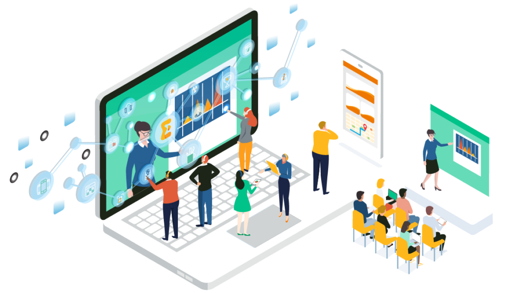
Have you ever navigated to a new website with a question, and spent too much time hunting for an answer? While companies spend large amounts of time developing and building out an information architecture for their user journeys, they may not always have the use case of each unique user in mind. To be fair, they aren’t mind readers! There are times when consumers may simply need to be guided to exactly what they’re looking for – and there is no better way to ensure that than with a chat experience integrated on your site.
As consumer behavior changes over time, it is important to be able to meet your user and provide a user experience that matches what they have become accustomed to. In the same way that it has become the norm to order a pizza online instead of calling into your neighborhood spot, the prevalence of 24/7 support and availability should be captured in the online experience.
With younger generations, in particular, an instant messaging option is a preferred way to communicate, and if companies can make it easier for their customers to get what they are looking for through a chatbot, this will pay off. A recent study found that up to 68% of respondents indicated that they are more likely to use a business that offers convenient communications if they have the option to choose where to make a purchase.
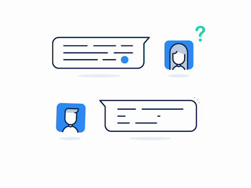
A seamless integration for a chat experience where a bot or a real person responds in real-time is critical. It can be extremely frustrating when users are waiting around for something that should warrant a quick response. Ever been stuck on the phone waiting for hours to get past automated messaging machines to ask a question? It’s incredibly frustrating and more often than not people get impatient and hang up. Online inquiries are no different, if you leave a user aimlessly browsing on their own and unsuccessful in finding their answer they will get impatient and bounce from your site. Installing an automated chatbot gives users a clear destination for their questions, and avoids the dead-end drop-off. While chatbots may not be real people, it gives users the illusion of a more personal experience and grows brand trust that your company is willing to solve their problems. Convenience is key in today’s society, and online browsing is no exception.
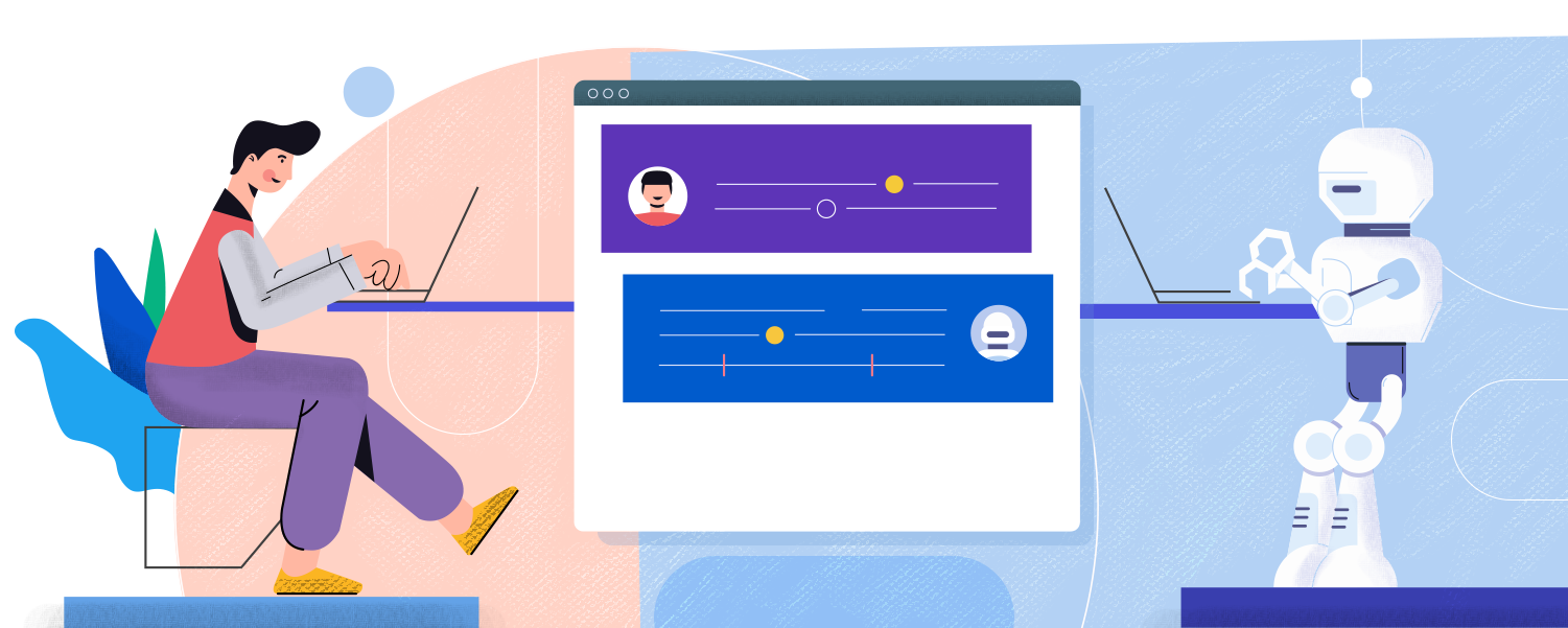
Online chatbots sound great in theory but can seem intimidating to execute. However, with the assistance of a website design and development agency, such as Bluetext, you can integrate a chat service into your current or new website design. The advantage of working with a full-service digital marketing agency is that they can analyze your search traffic patterns, help identify some common user journeys and pain points, but also style and develop a chatbot fit to your brand identity. This creates an even more seamless user experience on your site because the chatbot integrates and matches the current website, almost like a well-dressed store employee ready and able to answer any questions.
Is it time for your website to step up its support game? Consult Bluetext to find out what kind of chatbot or user experience modifications can improve your website.
It’s no secret that after a year of virtual, well, everything, people have entered into a phase of “digital fatigue”. Dr. Alexander Aizman, a New York-based physician and surgeon has coined this term to describe “the physical discomfort that is experienced after prolonged exposure to a digital screen”. Ever been shocked when your iPhone sends your weekly screen time report? It’s no wonder people are growing weary of the time spent on digital devices…
When COVID-19 forced the world online a little over a year ago, device use increased as many calls, events, and other in-person interactions became video conferences. Everything from professional networking, to personal tasks like ordering groceries, quickly pivoted to digital platforms. With people rejecting increasing screen time and looking to alternatives that allow them to avert their eyes, designers must establish a way to create enticing experiences in the midst of digital fatigue.
Cut Down on Blue Light
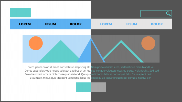
One way to switch things up is to create an alternative, dark mode experience for users. Dark mode isn’t just a trendy aesthetic, it is actually backed by UX research and health studies to benefit users. The majority of websites we interact with on a daily basis leverage white or light color-dominant backgrounds and excessive exposure to this can cause eye strain, dry eyes, and even disrupt our sleep cycles.
Allowing users to choose their experience, or programming a design that is time responsive, and will automatically update to dark mode for evening and nighttime hours based on the user’s location, can provide a break from all of the white space.
To learn more about ways you could incorporate dark mode into your designs, read our previous blog post.
Break Up the Monotony
Spending the majority of the day on screens and devices of various sizes can become exhausting for a number of reasons. Particularly if you are reading large amounts of online text content. When designers approach a new interface or even just a new landing page, it’s important to always keep the audience, and the environment, in mind.
Think of a trip to the museum…it can be a great outing until the initial excitement wears off when each exhibit feels the same. Walking around and reading long content labels, in every roped-off section can only retain attention levels for so long. Yet when there is an interactive exhibit, the interest returns, and the learning and engagement experience offers a higher reward. The same concept applies to online businesses, websites that receive more engagement and interest offer a higher ROI.
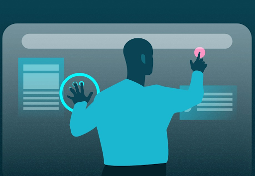
Utilizing interactive content, whether it be diagrams, comparison tables, or even simple graphics, can break up long walls of text. Inviting users to interact with content and bringing in visual elements that convey information in easy to grasp and easy-to-understand ways will improve the users’ overall experience.
Introduce Motion and Movement
One notable way to make sure your users connect with content and accompanying design is to create experiences that introduce motion. Static content requires the user to continue scrolling or navigate to other pages and can quickly become repetitive and uninteresting. Incorporating movement into your design as users interact with the page can create a unique experience that will build interest and encourage interaction.

All of the techniques mentioned above bring exciting alternatives to custom designs, and avoiding digital fatigue will ensure users have positive online experiences.
If your website could benefit from a boost in online engagement and website interaction, you’ve come to the right place. Contact Bluetext to learn about our services in UX design, motion graphics and interactive website development.
Due to the global pandemic, the rise in virtual events over the past year has created a new element of accessibility to gathering. The past year has exposed previously unacknowledged limitations to in-person events, where only a limited number of attendees could be a part of the action. However, the advantages of event accessibility can bring implications to traditional registration strategies that previously relied on limited availability and exclusivity.
Recorded webinars, streaming services, and many other on-demand materials can remove the sense of urgency from common event marketing tactics. If an audience member knows they will have access to an event at any point in time, they may feel less inclined to participate in, or even join an event in real-time.
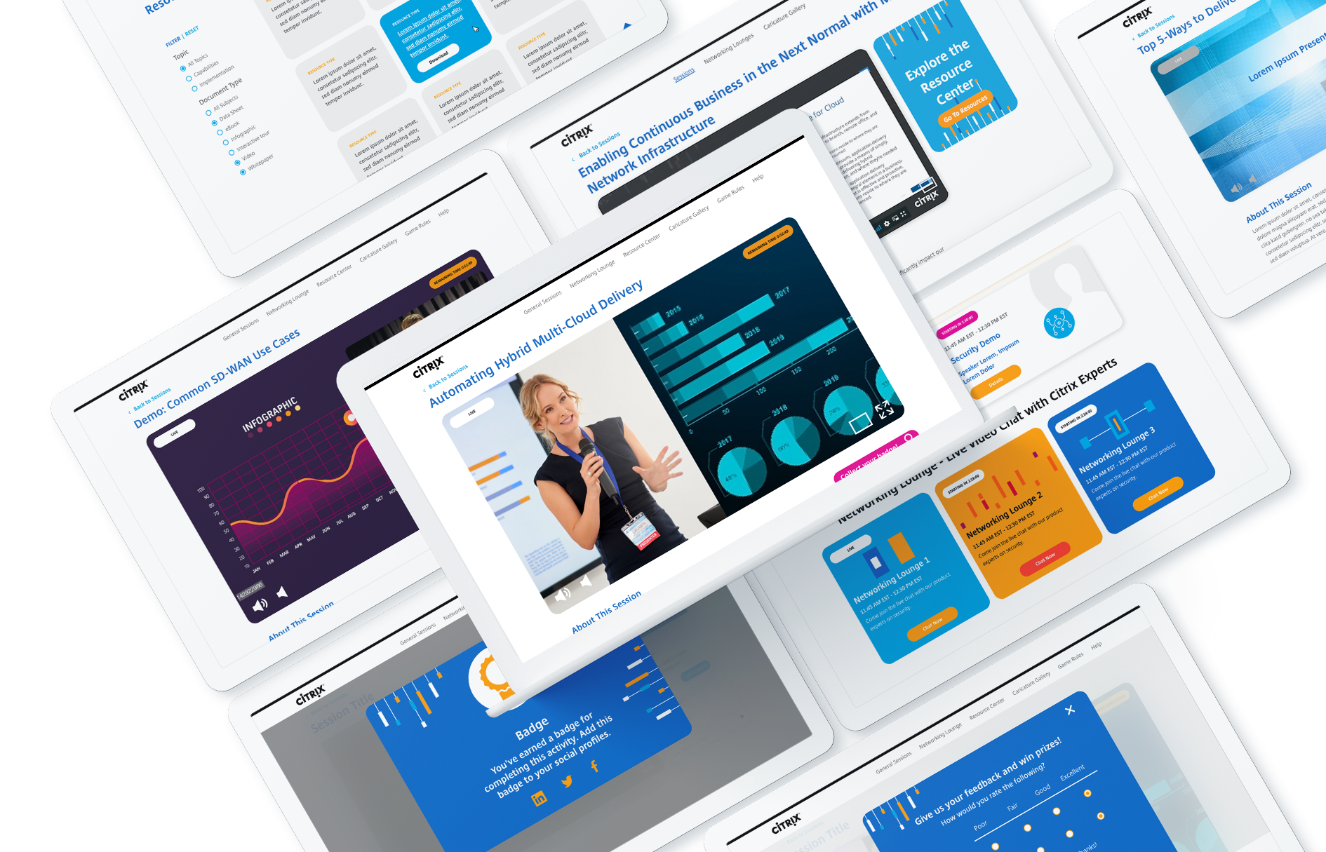
At Bluetext, we have found a way to help our clients capture interest and create urgency around virtual events. Leveraging the best industry tools available and reliable systems to create a realistic and professional virtual event experience allows you to open your virtual event to a wider audience, without sacrificing the emotions and experience of in-person, physical events.
Stay true to your brand
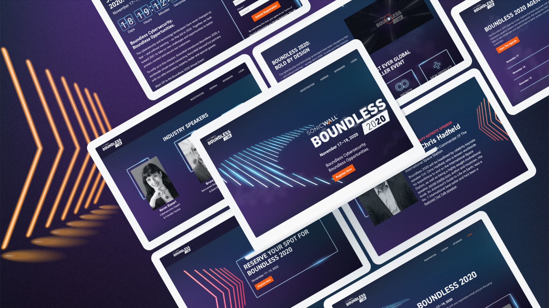
This piece of age-old advice has never been more true. If you get away from your core values and try to create a virtual event setting that would be unfamiliar to your typical target audience, potential attendees and customers may not come away with the right message. A virtual event is an opportunity to get creative with event-specific branding, but make sure that there are still remnants of the brand your users know and love. Take SonicWall’s Boundless 2020 event for example. Bluetext created a specific EVI (event visual identity) inspired by their Boundless campaign, new product dark mode features, and existing brand identity.
Drum up your attendance
The old goal for larger event attendees was to get people in the room. Now, a successful campaign will convert registrations into live viewers. Everyone wants more eyes on the screen and ultimately your brand.
Everything comes down to how you plan and offer an event. One way to create urgency includes making sure that people know it will only be a one-time opportunity. The novelty of exclusive and experiential experiences very much still exists in the virtual world—it is just a question of making sure the audience knows what to expect and what they could miss out on if they don’t attend.
Play the long game
Many experts are hinting that even after the pandemic recedes, aspects of virtual events may be here to stay. The success story of the virtual event is twofold. Some companies have noticed an increasing number of event attendees due to the ease of people signing on from home, and a hybrid option of partially virtual, partially in-person events will allow non-local attendees from around the world to participate in events they may not have otherwise due to the hard cost and opportunity cost of travel. It is now more important than ever that your company is prepared to comply with today’s event regulations by going virtual but also invest in a sustainable digital marketing strategy for future events, campaigns, and more.
Watch Bluetext founder, Jason Siegel, discuss how to create and maintain urgency in event marketing with Travelocity Founder and keynote speaker Terry Jones in this week’s Virtual Marketing Minute.
In the past few years, the option for “dark mode” has become increasingly popular as our time spent on-screen steadily climbs. Dark mode is a display setting on a computer, tablet, or mobile device that allows the user to view their content with a predominantly dark theme, compared to the typical white background we find on most websites and apps. So what is the purpose of this change? UX research shows that dark backgrounds enhance page contrast, making visuals pop and easier for the user to focus on.
Early adopters of dark mode will remember when it was only a one-off feature, offered exclusively within certain mobile apps. Slowly, as time passed and more software updates were revealed, operating systems like iOS 13 and Android 10 offered a dark mode option that applied device-wide; making the switch for all of your default apps (i.e. your notepad, weather, and more). Now that dark mode is more widely available on our top visited apps like Instagram, Twitter and soon Facebook, many website designers and developers are wondering if a dark mode option is right for their site.
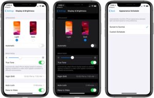
Is Dark Mode for Me?
There are a number of factors to consider before adding a dark mode setting option on your site. The trendiness vs. the more concrete usability points is the main question to ask yourself. What is the goal of your site? If the focus is on the style and design, it makes a better case for a dark mode implementation. There is evidence that users viewing content in dark mode are able to more easily focus on the visuals on screen, over the content. Dark mode is ideal for distinct CVIs or attractive product imagery. If brand awareness or e-commerce is your site’s main focus, dark mode may improve page performance. If a KPI is more content driven, focusing on conversions and leads, dark mode might not be a critical feature.
Web developers should also be aware of the time needed to implement a dark mode option—both initially and to factor it in with future updates. If the project is already on a timeline with a quick turn around, it could be better to revisit the integration as a post-launch add-on item.
Consider Your Users:
Two key end-user benefits stand out when considering dark mode for your site:
- The highly convincing argument that it may be easier on the eyes. This is pretty self-explanatory. Users are becoming more aware of daily screen time and actively seeking out ways to maintain a healthy balance with technology. For instance, Apple recently released Screen Time, allowing users to track the amount of time spent on their devices. Though it is not the responsibility of web designers and developers to look out for users’ natural light-dark cycles and circadian rhythms, it serves as an added bonus to offer your site visitors a dark mode option. Think of it this way: the easier on the eyes, the longer your visitors will stay on the site.
- It can improve device battery life. That’s right—some developers claim that dark mode consumes only a fraction of the percentage that using a site or application takes from your battery, saving your users time between charges.
With the rise of digital personalization and online interactions, it’s important that your users feel your brand has their best interest in mind. Especially when attracting new users, these subtle enhancements to their experience can make all the difference. Ultimately, dark mode is largely an aesthetic decision, so you’ll want to think through how to integrate this with current branding.
Recommendations for How to Use
If you decide to include a version of a dark mode integration in your site or app, here are some additional recommendations to use as a guideline. Start by establishing an alternate dark mode color palette for your brand. Since your users will be more drawn to the visual aspects of the site while viewing a darker background, make sure that none of the brand colors you’re using are too saturated or too bright in contrast to the dark background.
The development team should explore the options for adding additional theming options to your site using custom CSS classes on existing code. Decide whether you will allow your site’s visitors to choose their display options, revealing a dark mode theme, or if it will be automatically based on their browser settings, and even other in-app indicated preferences if designing for a mobile app. The best option being that whatever you decide for the user’s interaction with it, it should closely resemble other display settings and theme updates available on your site. If these are not present, recognizable icons, like a light bulb or sunshine (for light mode) and the moon (for dark mode) are acceptable for a quick turn-on turn-off functionality.
As the popularity of user-end site personalization options increases, rely on these helpful tools to help the decision-makers on your team in their choice to join the dark mode movement.