Now more than ever it’s important to understand and master the skills of remote client relations and project management tasks. Even though the pandemic will not last forever, we have the opportunity to take a look at lessons learned, opportunities created, and skills we’ve grown to use daily. Not only will this help make one a better and more flexible employee, but allow the opportunity for a digital agency to tackle a whole new client base. Let’s dive into some of the most important skills of remote client work.
Over-Communication
Striving to over-communicate with clients is always a good thing. Scheduling weekly status calls, both for the internal project management team and with the client, is great to keep a consistent base of communication and ensure that everyone is aware of where the project stands to date. These weekly calls can be used to review completed and upcoming deadlines, updates on various levels of project status, and resolve any questions in real-time. Having frequent touchpoints with the client helps reach deadlines successfully. If frequent phone calls and video conferences are not possible, never underestimate the power of an email! Digital project managers understand how busy schedules can get, and sometimes that meeting really could have been an email.

Patience
Patience and understanding is an extremely necessary skill for managing remote client work. Remember, no work-from-home situation is the same. Especially in the wake of COVID-19, many employees who were not prepared or planning to work from home are finding their kitchen table is doubling as their new conference room. Try to be understanding and empathetic with background noise, kids, or pets interfering during conference calls. Don’t get frustrated when someone experiences issues with virtual meetings or is having trouble with technical issues – instead, offer some assistance. Everyone’s circumstances and experience with remote work are different, so be as empathetic as you can.

Cross-Team Collaboration
As a digital marketing agency, Bluetext offers a wide variety of services – which translates into a wide variety of roles and skillsets. Many client projects include multiple tracks of deliverables, such as messaging, branding, website design, and development. It is more important than ever in a remote workplace to keep the lines of communication across these tracks clear and consistent. While agencies might not have the luxury of gathering all creatives, copywriters, project managers, and developers in one room to brainstorm or ask one-off questions, it’s important to keep everyone on the account on the same page. Bluetext recommends setting up recurring scrum meetings to run through the statuses of all parallel tracks, or regular touch bases within the different departments. Online collaboration software, such as Slack or Teams, is a great place to facilitate conversation between groups for questions, blockers, or ideation.

Organization
Although organization is a keystone of regular client and project management, switching to remote work requires an even stronger set of organizational skills. Make sure you have a separate work space (that does not include your bed or the couch) where you can have a space to focus and create a productive working environment. This should be free of distractions and allow you to maximize your full potential. In addition, comprehensive project schedules, project trackers, to-do lists and conference reports help keep yourself, your team and your client organized with clear-cut deadlines, updates and project progress.
Time Management
When doing remote work, it can be difficult to differentiate between work-life and personal life. Sometimes, even just reminding yourself to take appropriate lunch breaks can make all the difference. Block chunks of time off on your calendar for lunch breaks and to tackle specific projects. This helps keep yourself accountable and make sure you’re accomplishing everything on your to-do list. In addition, prioritization of high-priority and low-priority tasks will help you be extremely successful. Identify the items on your to-do list that need to be tackled right away and which can wait. This better helps you manage your time as well as delivering items on deadline, which all leads to a more successful project.

Adaptability
Adaptability is one of the most critical skills for remote client and project management work. You must be willing to test out new tools, new applications and whatever can help you perform your job successfully. In a new environment, new tools are inevitable. Your client might even have their own favorite tools they want you to try out. Always willing to be adaptable and try out new things!
At Bluetext, we’re extremely dedicated to our work and our clients, remote or not. We have a variety of clients based outside of Washington, D.C., such as Wallix, based in France; AppGate, based in Texas; Citrix, based in New York City. We have the talent, skills, and resources to take your business to the next level, no matter where you are.
A style guide is a fundamental apparatus for building up brand character. A brand style guide establishes your brand identity and is an extraordinary resource for making on-brand, consistent content.
The style guide is crucial in communicating your brand and design standards. Not only does this help maintain consistency with your company’s brand, but it also helps other key members of your team, such as writers, project managers and developers by serving as a solid point of reference.
Style guides should include examples of brand messaging, headlines and overall themes. This is significant in that it sets up a solid brand voice that reverberates with the crowd, which is a key driver for building brand mindfulness. Overtime, that mindfulness and consistency creates trust with your audience. This ensures every time someone experiences your brand, they’re experiencing the same underlying elements and traits.
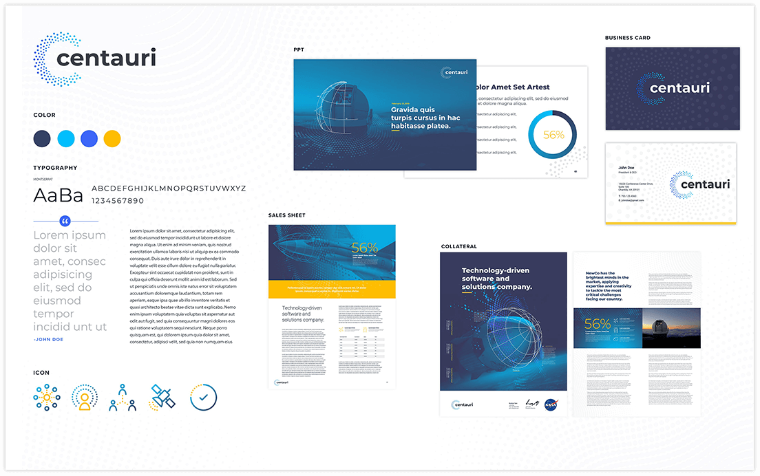 So what should go in a style guide? Typically, you want to include a logo, tagline, typography, color palettes, messaging guidelines and imagery guidelines. A more robust style guide can include things like the company overview, brand attributes, brand elements, iconography and more. While you provide specific guidelines on how to apply the brand, it’s important to also provide examples of how not to use the brand. This can include improper logo usage, incorrect use of design elements, messaging to avoid, and imagery to steer clear from. It’s important to be as clear and comprehensive as possible.
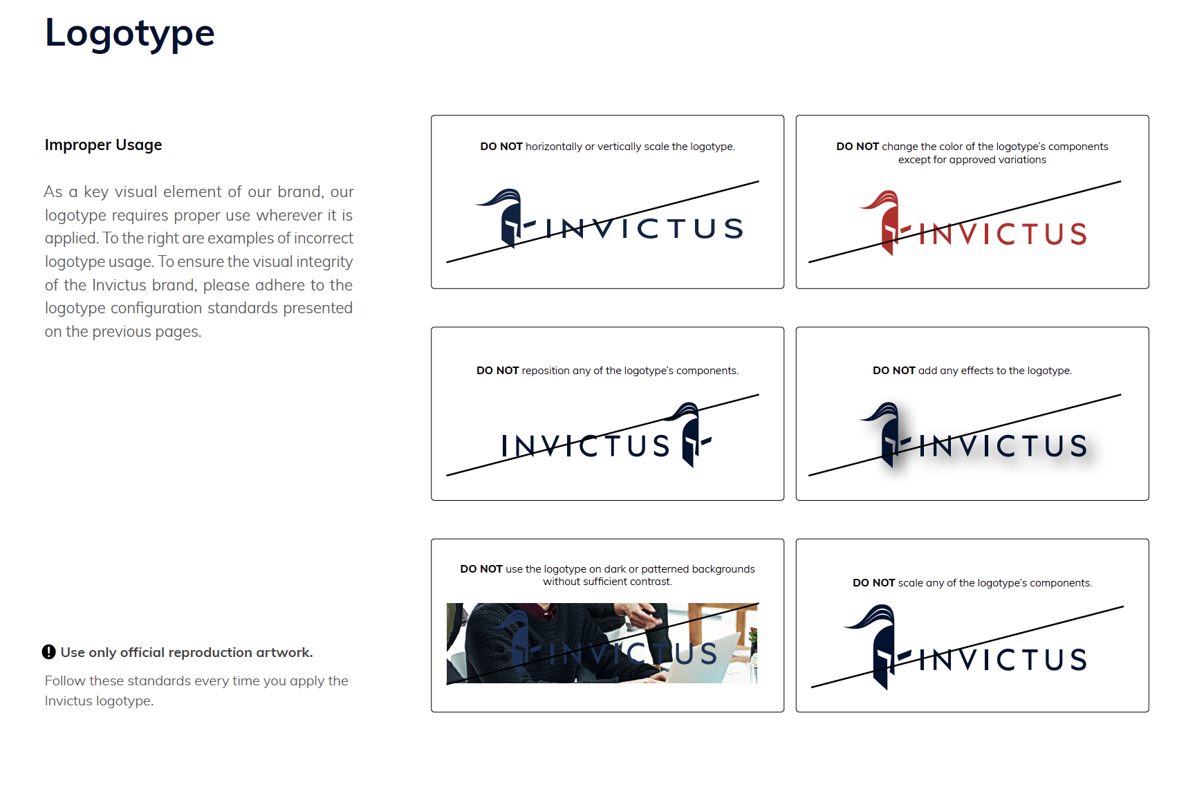
Remember: this style guide is a living document! You should expect your style guide to change as your brand evolves over time. It’s important to keep it updated as rules and guidelines change. Just like a living, breathing organism, your brand will continually be adapting, evolving and changing.
Style guides shouldn’t just be used by large well-known companies. Every company should have one – no matter the size. This will not only help members of your internal team in staying consistent with the branded artifacts they produce, but it will also help ensure your company is seen as a cohesive and trustworthy entity. The more credible you are seen with your customers and your audience, the more positive they will feel about you.
Interested in a style guide and how it can transform your business? Bluetext can help. Contact us today.
A business’ marketing content is crucial in informing and educating prospects and customers about the company. It helps communicate the company’s story, credibility, leadership in the industry, as well as specific solutions and challenges they can solve. It not only represents your business but also your value proposition. It determines what sets you apart from your competition. Content marketing helps to educate and guide customers on authentic and trustworthy experiences, ultimately leading to conversions for your business.
There is no shortage of marketing resources available. From infographics to whitepapers, to case studies and blogs, marketing content exists in all shapes and sizes. The variance helps open your resources to a wide range of audiences while also keeping content fresh and modern. But what is the best way to showcase all your resources together in one organized, concise place?
Rise of the Resource Centers
The popularity of businesses creating online Resource Centers/Hubs on their websites is through the roof. Resource Centers consist of pages and pages of content marketing assets. End users typically can preview the type of content, a short description, and maybe even a thumbnail image. Resource Centers can often become extremely overwhelming for a user, driving away conversions. The user journey is important to keep top-of-mind when designing your Resource Center.
One of the best ways to improve the user experience while browsing content marketing is to aid them in finding exactly what would cater to their needs. Taxonomy tags are the most efficient way to categorize content by type, category, or keyword. Users should be able to easily search or filter between taxonomies, to view results relevant to them as a click of a button. Resource Center listing pages can even pre-filter content and allow the user to view specific collateral types, topics, or more upon landing.
Industry Examples
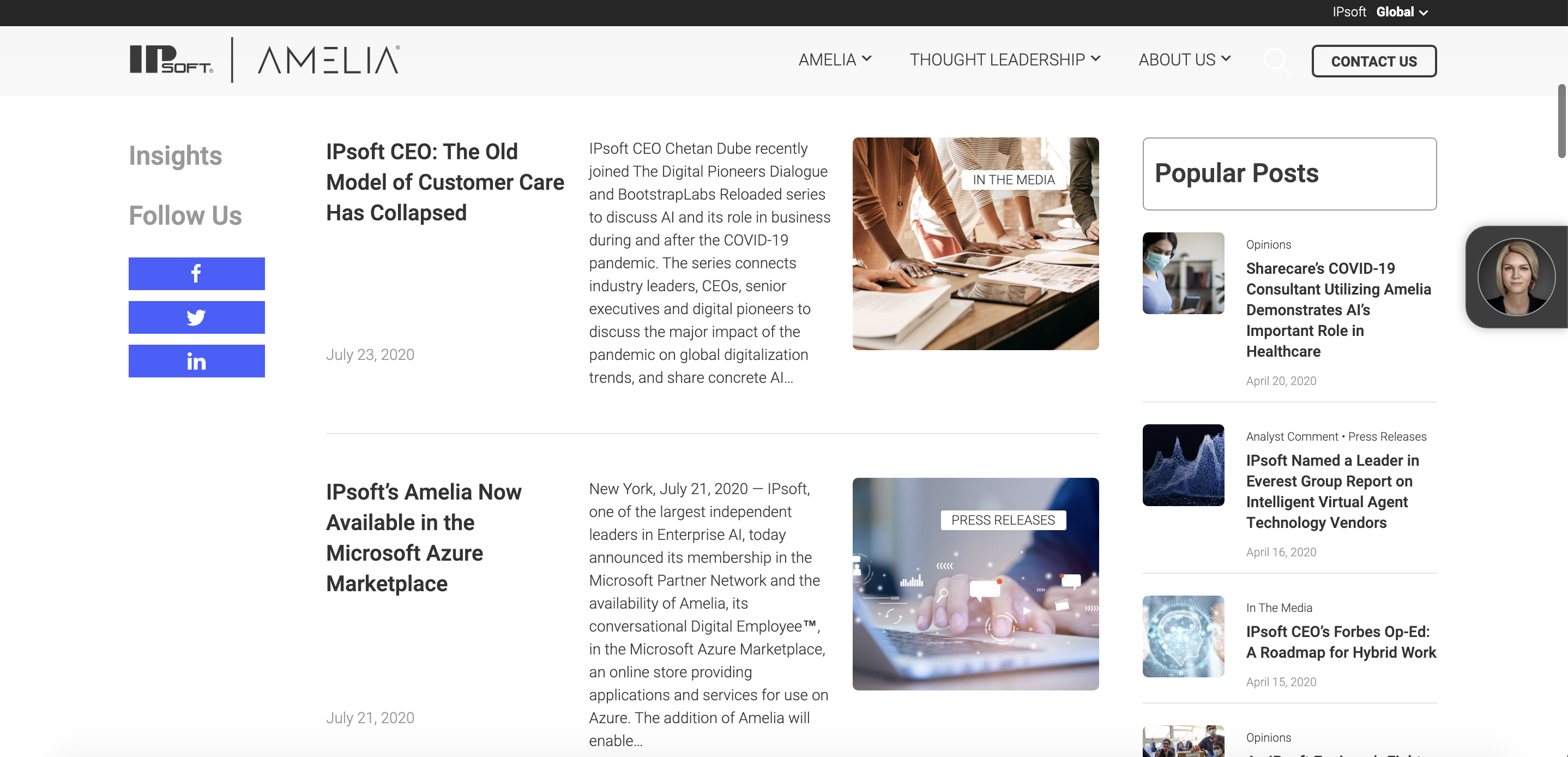
For example, Genpact exemplifies a simple user journey on their Resource Center. The first thing a user sees landing on their “Insights” page is the ability to search for content related to a specific industry, function, or even to improve a strategic goal. By establishing obvious and easy to use personalization options, users feel catered to and confident they will find exactly what they are looking for. And even without a specific intent in mind, users can pre-filter options to simply browse by industry, function, or goal-relevant to them. Users can even combine all three filtering options to view even more tailored results.
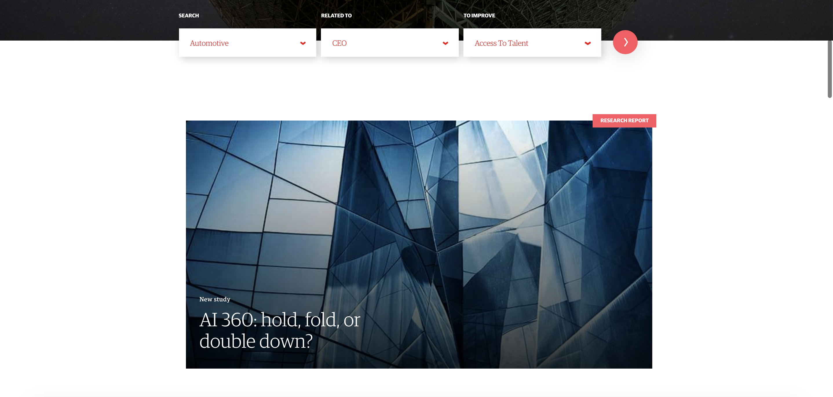
Another great example of pre-filtered content in a Resource Center is IPsoft. IPsoft filters all content by types, such as Press Releases, Opinions or blogs, or educational resources such as whitepapers and videos. For users browsing the newsroom, all content is sorted chronologically and categorized by large, recognizable tags. In addition, popular posts constantly follow the user in the right-hand column while social media share buttons are easily accessible in the left-hand column.
McKinsey takes a unique approach in its Resource Center by showcasing its range of content marketing and news types in nugget-sized promotional banners. With this approach, a user is introduced to a wealth of resources and content types, without being overwhelmed. With only one to four resources shown per type, the page is easily scannable. This not only caters to the simplified user journey for the user who knows what they want they’re looking for, but also for the user who wants to explore and browse content. McKinsey sorts by popular posts, magazine insights, global institute insights, and podcasts and videos into one streamlined interface, much like a magazine stand. This further cements the credibility of the company as well by highlighting various company publications.
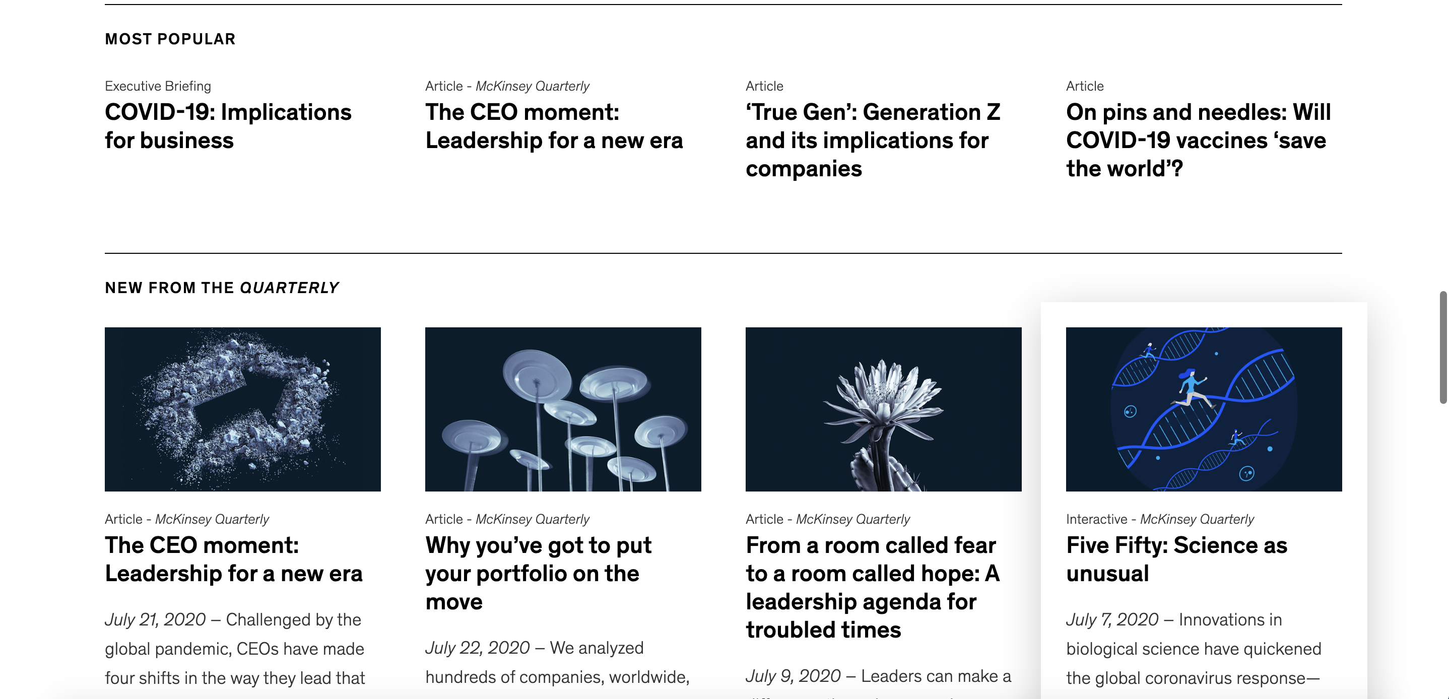
Along with pre-filtering content for your audience, creating a unique and well-designed Resource Center is key for standing out amongst your competitors and bringing in potential conversions. It’s crucial you recognize the goal for your Resource Center – is it to highlight outstanding thought leadership? Or is it to showcase your wide range of insights? Once you have your goal in mind, focus on user experience, and strategic branding to achieve your goals and watch the conversions come in.
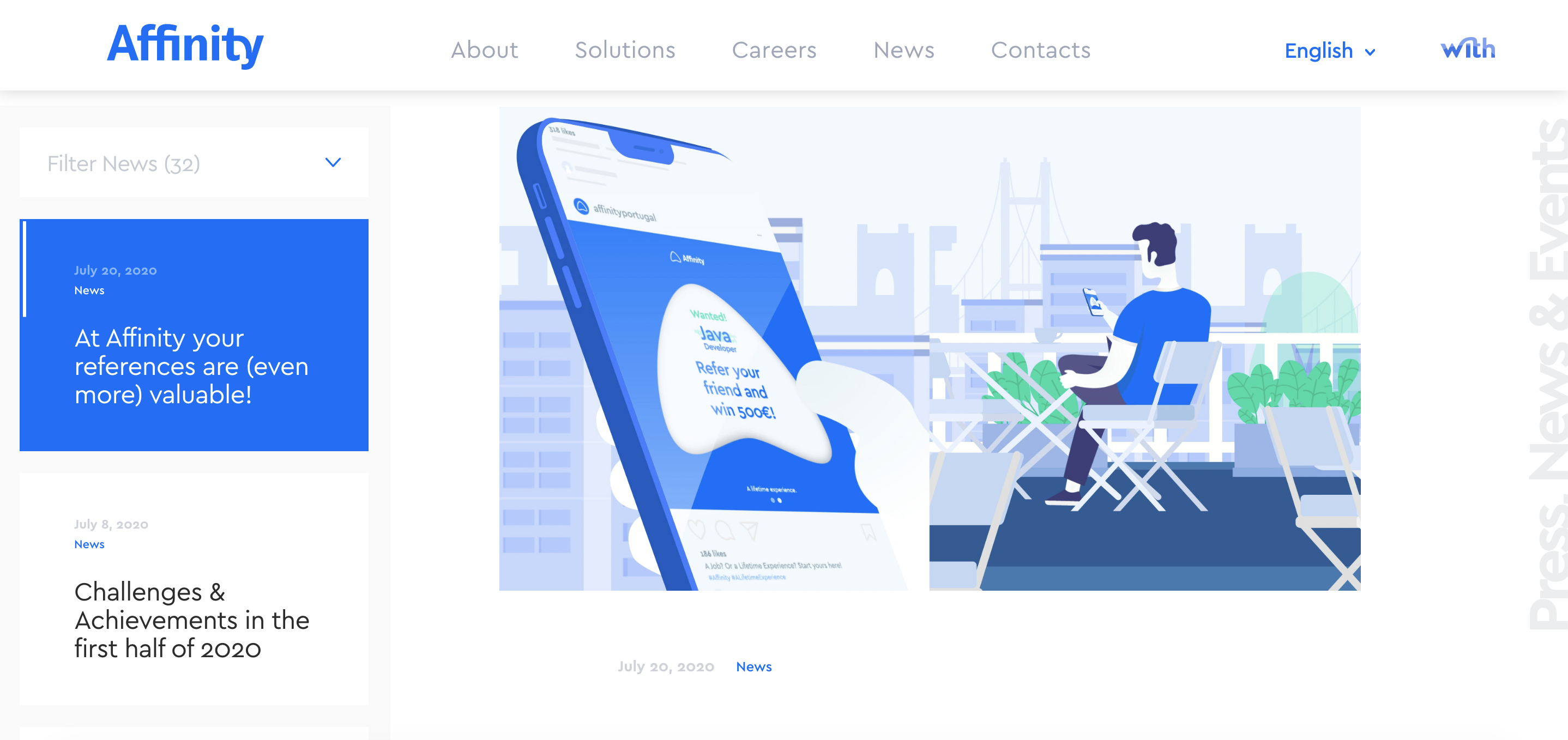
Affinity is a prime example of using unique branding to frame their content marketing as interesting and valuable. Affinity is focused on showcasing a breadth of content and has created a unique design to accomplish this goal. When you land on the News, you immediately view the most recent article, ready for your users to read. While prioritizing the most up to date content, the left-hand column allows users to scroll through other posts or resource types with the ability to filter by categories. It gets a user hooked on the breaking headline, but not without showing off the greatest hits.
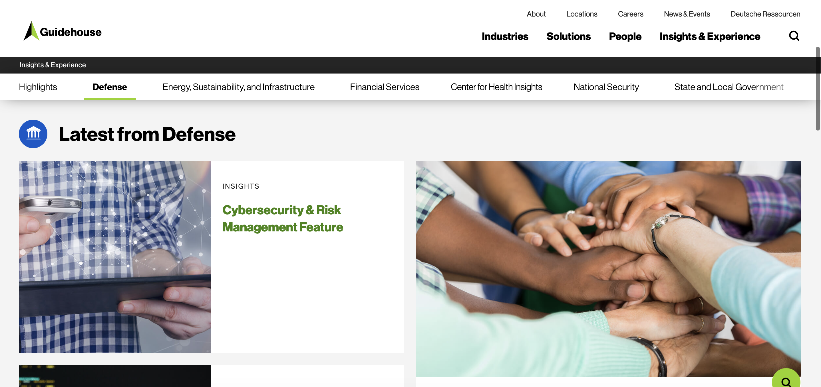
Another great example of a unique Resource Center is Guidehouse. Guidehouse has a large number of insights, thus utilizes sticky navigation. Sticky navigation follows a user as they scroll up and down on a page so that a menu of alternate pages or sections are always in view. Their sticky navigation showcases pre-filtered content in a variety of industries. This highlights their range of abilities, while also ensuring users never feel lost in an unfamiliar industry.
We all want to be thought leaders, but your company has to look the part. Don’t underestimate the power of your marketing content. Utilize your content and drive conversions for business and reputational success!
Considering amping up your Resource Center? Trust Bluetext with all your digital marketing and design needs!
Branding is one of the most important marketing strategies for a company. Your brand tells a story about who you are and what you do to prospects, clients, and, importantly, your internal employees. Branding typically involves a consistent and recognizable set of design elements, including colors, typography, logos, messaging, graphic elements, and more. It allows your company to make a consistent, meaningful, and lasting impression with consumers. Through your brand, you have the opportunity to stand out amongst the competition, showcase a product, but also drive new business by raising awareness for your company. But how do you keep branding consistent with various different products and/or services you want to highlight?
 The Rise of Sub-Brands
Sub-branding is a lesser-known, yet equally as important, subdivision of a branding strategy. In an article from Brand Marketing Blog, “If you are a brand builder, then often there is more than one brand that you are building: the brand of your business and the brands of your products.” Sub-branding is focused on creating new subsections of the parent brand to best fit the specific products and/or services you offer to your customers. This is directly tied to the solution architecture of the company – the structure of how different offerings of a company are connected. Typically, a sub-brand strategy shares the same fundamental factors of the overarching brand’s personality, tone, design, and image. This can include sharing common factors such as typography, imagery, and more. They utilize outside elements, including graphic elements, primary colors, messaging, etc., to stand out from the parent brand. What makes a sub-brand unique is its goal to appeal to a very specific, niche audience.
Sourcefire Brands and Sub-Brands
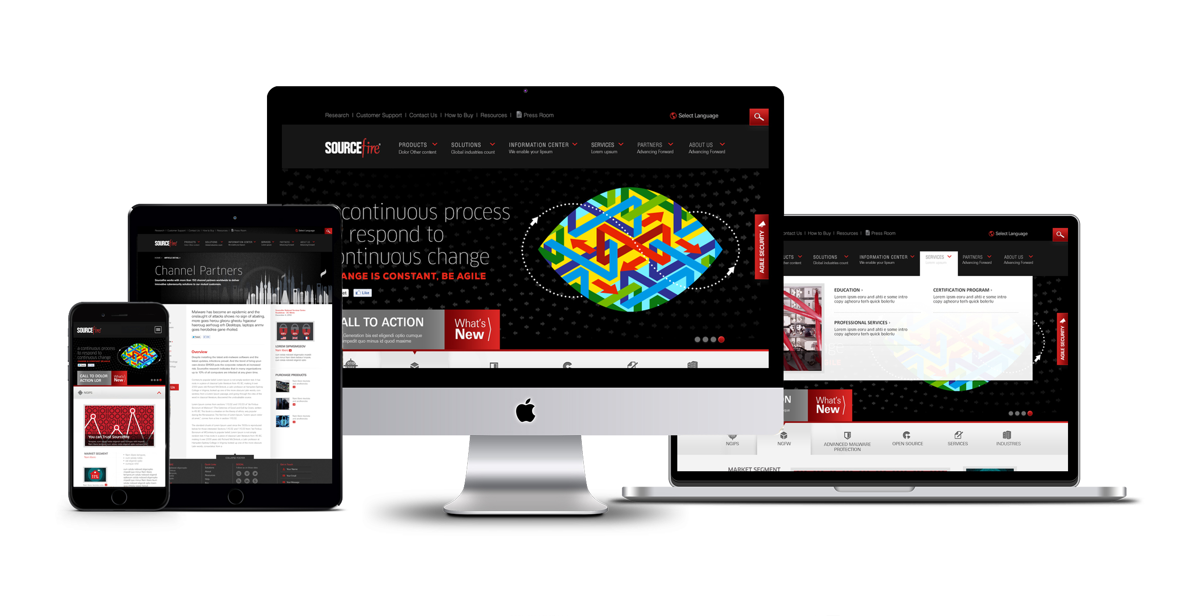
To fully understand what a sub-brand is, let’s take a look at one of the most successful sub-brands in the Cybersecurity industry: Sourcefire. When Bluetext rebranded the company, we also worked with the Sourcefire team to sub-brand each of their most popular product offerings: FirePower, FireSight, FireAmp, and FireCloud. Each product has its own logo for users to differentiate between the four. While each product has its own unique logo, they still follow the overarching Sourcefire branding within the sub-brands: matching typography, custom graphic elements, abstract textures, and bold primary colors.

 The Impact
Sub-branding is extremely important as it creates exposure for both the parent and child brands. It helps customers easily differentiate, organize, and search in a complex environment. It creates the opportunity to engage both new and existing audiences while taking advantage of the trust previously built in your specific industry. Because a sub-brand appeals to a very specific and niche customer, you have the affirmation that your marketing messaging is as targeted as possible. Your customers have the ability to have a unique, custom experience that is completely separate from the parent brand and in turn, are more likely to engage with the parent brand’s other products if they connect with an individual sub-brand.
Want to elevate your brand even more? Bluetext can help.
Best Practices for Conversion Driven UX Design
If your company has a website published in the public domain, chances are, you know a thing or two about conversion goals. Conversion goals help to measure marketing performance, set goals and most importantly, provide conversions for a company. On websites, conversion goals can range from lead generation to sales to even page views. The point is, you must find your conversion goal and optimize your website toward it. There are various design choices that are simple, yet efficient in achieving different types of conversion goals. The goal is to keep it simple – the lesser the cost per conversion, the higher the return-on-investment (ROI).
Hack Your Way to Higher Conversion Rates
Less is More
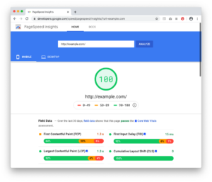
According to CEO of Chartbeat, Tony Haile, “You have just 15 seconds (or less) to convince new visitors to stay through the power of your site’s design alone.” Compared to years ago when web-design trends were over-the-top and animation and flash were all the rage, clean and simple flat designs are what reign supreme today. Market trends indicate today’s consumers appreciate a nice, clean layout. Impress your visitors with your content and offerings. Bombarding them with unnecessary flash and animation not only annoys them, but it also slows down the load time of your website. Whatever you do, don’t mirror your site after this masterpiece. You can always check the speed of your website using Google’s PageSpeed Insights tool. PageSpeed Insights analyzes the content of a web page, then generates suggestions to make that page faster.
Fire Excessive Fonts
When a user lands on a site with various different styles of old and new fonts, it becomes a disjointed and confusing user experience. If you’ve got more than two or three fonts on your homepage, trim them down to create a more modern look. Having two primary fonts keeps your website consistent and organized. While you’re at it, consider increasing your font size for readability. Smashing Magazine reported that “anything less than 16 pixels could impair your site’s readability.” Your website should not only be consistent but also readable.
Give Content a Break
Put yourself in the user’s perspective. Nothing is more intimidating and scary than landing on a page with big blocks of unbroken text. You would bounce too! Large text fields are an immediate red flag that digesting the material will be time-consuming and complex. Mix it up and improve your site’s readability by adding headings, subheadings, bulleted lists and numbered lists to break down content into easily-digested segments.
Improve Your Visuals
While you’re thinking about breaking up content, consider adding imagery. Customers or prospects may need to literally “see it to believe it” and images can be a powerful tool to help contextualize value. Custom graphics and visuals are a great option that is sure to impress users. Cheesy stock photos can seem generic and off-putting, so consider upgrading to simple tools like Canva and PicMonkey which make it easy to customize your images. In addition, if you’re looking to generate confidence in your service or product, try human photography. According to various studies, images of human faces can have a positive image in driving contact form conversions. Remember, people trust people! Human faces help establish an emotional connection, which in turn makes your website a more personalized experience.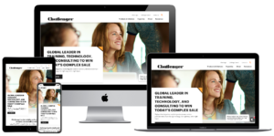
Trust in the Numbers
While imagery and human photography might make a subconscious impact on trust, seal the deal with statistics and testimonials. People inherently trust in data and social proof. Statistics can help rationalize and solidify the decision-making process, especially when compared against competitors. Highlighting elements of social proof is an extremely easy and effective way to drive conversions. Consider positioning this information higher on the page, or perhaps in eye-catching designs, so users can be sure not to miss it.
Always Open the Window
Outbound links are a critical component of the ideal SEO formula, but be sure never to lead users away from your site. Make sure that all external links open in a new window. This ensures not only the best user experience for the user, but your site will stay open and users won’t drop off in search of content elsewhere.
Make it Stick
Add a Contact or Sales call-to action-directly in the main menu. Keeping the main conversion at top of mind (and menu) ensures your users are always enabled to contact you. You would never want a customer or potential lead to finally be ready to convert, only to be lost in the site and unable to contact you. To really make your central call to actions stand out, consider implementing a sticky navigation. This means that the main menu will lock in place above your content, no matter where the user is on the page.
Need to make changes to your website to improve your navigation? Bluetext can help.
 The Impact