Huffington Post’s former Politics editor, Chris Gentilviso talks about trends in digital media.
Working at a Washington DC digital agency that works with brands spanning the largest, most cautious Fortune 500 companies to the most speedy of start-ups disrupting every corner of Earth, we need to back up our creative and marketing recommendations with stats. Here are some that stats could arm you in your next planning phase, ranging from user experience design to marketing promotion and branding.
WHO ARE YOU BROWSING FOR?
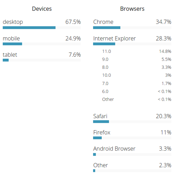
The latest stats are in from the US Government on Browser and device usage. Plan your next website user experience design based on these stats as well as the stats from your analytic application.
WHAT DID THAT ICON SAY?
According to ScienceDaily’s recent study, Icons need to tell something very clearly or face horrible usability issues with your user experience.
The recent report asked users to look at an icon and try to avoid thinking of both the word of that image, as well as how many letters that word had (for example, a subject is told to look at a iPhone and not think “iPhone” or think “6,” the number of letters in the word). Nearly 80% of people could not stop themselves from “sub-speaking” the word in their head and only 50% could stop themselves from saying the number of letters in the word. Stopping the brain from making associations in the subconscious is nearly impossible, which makes it extremely important to ensure that visual icons and representations are completely recognizable and aren’t easily confused by the user to have another meaning.
Placement of icons should not just be for visual effect. It can actually aid your user without making them think at all. It’s important that you choose the right icons as well, because you don’t want to trigger an automatic association from your user about something unrelated to the purpose of the icon.
DO YOU PERSUADE WITH VIDEO?
A recent User Experience Dynamic study by SearchEngineWatch shows that 73% of people will convert to the sites desired action when they enhance their user experience design with video.
HAVE YOU JOURNEYED BELOW THE FOLD?
Countless recent studies are showing that almost every user (yup over 99%!) these days are scrolling below the fold. Be adventurous and think of the user experience taking place on a tall dynamic canvas.
GOT SHARES?
Facebook continues to be the most widely used social channel for sharing. It gained 8.2% share and made up 81% of all shares in Q4. Sharing activity by email also increased, but it still only represents about 1% of total share volume. Looking at the channel distribution of sharing on mobile, Facebook edges out the competition even further. Facebook activity jumped 51% from last year and now represents 85% of mobile sharing activity. Pinterest and Twitter have also gained traction on mobile.
Force 3 is one of the fastest growing network security services and solutions company servicing the Federal Government with revenues of more than one billion dollars annually. When it’s brand, messaging and website needed an update it turned to Bluetext. We added a fresh set of colors and a new design with the sensation of motion to the logo, a theme that plays out across the website. We also created an animated introduction that uses the color palette to draw the visitor into the site.
The new website is infused with search engine optimization so that Force 3 comes up when customers are searching for network security solutions. One of the company’s key differentiators is the expertise and passion of its team of experts. That message is persistent across the site.
The imagery is clean and modern on each page.The new brand design plays out not only on the website, but in collateral, iconography, and a new trade show booth. It delivers a brand that is in tune with today’s government customer and differentiates their offering and value from competitors.
Bozzuto’s VP of Digital, Shashi Bellamkonda talks about trends in real estate digital marketing.
Shana Glenzer, VP of Social Marketing at SocialRadar, talks about how real time location-based marketing is disrupting the retail sector.
With crowded markets, how do you differentiate your brand from your competitors?
While you’re thinking about how to stand out from your competitors, download a poster from our Adult Coloring Book that you can bring to life, and let Bluetext solve your bigger marketing challenges.
Click here to download our free Adult Coloring Book!
Bloomberg BNA is one of top providers of legal information for attorneys, ranging from court decisions and legal filings to law review articles and news coverage that can affect a company or case. Bloomberg saw a huge opportunity to reach in-house counsel at companies and organizations where litigation, intellectual property, transactions and compliance are managed internally. It needed a dynamic campaign to reach those target attorneys with a good reason why they should add Bloomberg BNA tools to their arsenal.
Bluetext designed a campaign micro-site that begins with a live-action video with six individual personas, representing six use cases, so that target visitors could select the example that most closely matches their own responsibilities. Once the individual is selected, the visitor is taken to a page that provides in-depth details about that particular offering including examples and screen shots.
The site serves as its own segmentation filter, placing targets more directly into the best lead nurture channel. Calls-To-Action are prominent across every page to make it simple to download a whitepaper or infographic, sign up for a relevant newsletter, request a free trial or to learn more. The campaign included a direct mail piece with graphics and designs that match the site.
CITRIX TAKES ON ITS COMPETITION
When Citrix wanted to go after its competitor VMware head-on, Bluetext designed a gamificiation experience that pitted the two contenders against each other. The teaser video features the training regime of a real world champion fighter, and leads to an interactive rock-em, sock-em fighters game with the Citrix kid taking on Victor Machismo– and winning of course. Key messages fill the screen with every punch.
PR is not a sinking ship. It’s still an essential element in your marketing mix, especially in the crowded cybersecurity market. But is your PR program delivering the results you need to meet your revenue goals?
Let Bluetext do a free PR assessment to see if:
- Your outreach is delivering the results you need
- You are gaining ground in the market
- You’re getting the coverage that will drive your growth
Our Share of Voice assessment can let you know if you are hitting on all cylinders, or if your program needs a shot of high-test to get it in gear.
Click here to sign up for your FREE Cybersecurity PR Assessment!
Real Estate marketing is a fast-paced and ever changing target, and we often see big trends come and go in how websites are designs. Many of the real estate centric web design trends we’ve seen in the last few years are still around, and more new trends are emerging in 2016.
Here are 5 trends that will likely dominate the best real estate websites in 2016:
Stick with Sticky
Fixed or “sticky” navigation bars are a prevalent trend in some of the most shockingly beautiful sites across the web. These benignly set bars allow for ease of access to a website’s core functionalities, regardless of where a user may be in the midst of a page’s content.
Some pro’s for going with a sticky interface:
• Advantages in usability
• Speed up your customer journey
• All the cool brands are doing it – its white hot
Real estate companies like HomeAway.com and Kangaroom.net are doing this very well. With users needing to recall all their search parameters and being able to easily toggle from map view to list view, Real Estate is one of the best vertical markets that can benefit its digital experiences by adding sticky interface elements.
Hamburgers Attack
We have all seen the hamburger icon. As a matter of fact most of us probably use it on a daily basis. It has become a staple in website and app design. I’m even looking at it now on the top right corner of Google Chrome.
Real estate sites continue to attack their interface design projects with hamburgers. Why? Because hamburgers are the most minimal interface you could have. And that means more screen real estate for those great real estate images and videos.
Where are you with Wearables?
Wearable Technology is the latest “next big thing” and its main focus is making life simpler.
Wearable technology will redefine the world. The shift to the proliferation of mobile devices meant that many new design principles had to be created and learned. The same will apply with Wearables, so don’t get left behind!
All websites for real estate companies should look at their responsive website design deliverables and add wearable browsers to the list of deliverables you would like to see your website looking optimized for.
Suggest “Search Suggest”
As digital advertising costs continue to rocket, having consumers search on your website instead of Trulia, zillow, redfine, etc is more important than ever.
If you’re optimizing your site aggressively that should be accompanied by a search centric homepage and general interface design.
The old adage was you want less clicks to the most critical conversion points. How about ZERO clicks. Search should be up front and center and EVERYWHERE.
On top of being search centric, you should streamline even further with a multi data point search suggest experience. In that magic AJAX powered fly out you should have closest geographic matches which have accompanying information like real time pricing and inventory, and other compelling content.
3D Virtual Tours
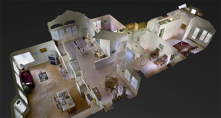
Companies like Matterport have introduced a ground-breaking technology for real estate – 3D Experiences assembled from still photography. Think Google Street View for your interior home tours. Create a realistic and immersive online experience covering the entire interior of any home. Captivate Buyers and impress Sellers with this innovative technology.
With 3D Experiences, companies like Matterport are revolutionizing how brokerages and agents showcase homes. A special camera rotating 360 degrees and controlled by an iPad is placed in multiple locations in every room in the home. The image data is then uploaded to a cloud server, and then you have a captivating 3D model of the entire home is ready for viewing. Embed this model directly into your Virtual Tours so Buyers can experience the 3D tour everywhere your content goes, be it your corporate website, MRIS, Realtor.com, your Broker site, your realtors site, Zillow, Trulia, RedFin and many more. A great company for capturing Matterports are HomeVisit.


![citrixcollage[1]](https://bluetext.com/wp-content/uploads/2022/09/citrixcollage1.jpg)
![citrix1[1]](https://bluetext.com/wp-content/uploads/2022/09/citrix11.jpg)


