If you haven’t yet heard, adult coloring books are in. No, not coloring books with naughty drawings—these are designed for adults, using colored pencils and markers, with intricate designs and geometric patterns. We started hearing about them last year, and they soon became the sleeper hit of the Christmas season, especially among millennials and college students.
The media stumbled upon their popularity after the holiday season. CNN.com discovered that:
Coloring books are no longer just for the kids. In fact, adult coloring books are all the rage right now. And while researchers and art therapists alike have touted the calming benefits for over a decade, it’s childhood favorite Crayola that’s gotten adult coloring books some serious grown-up attention.
CNN reported that the iconic crayon maker—the one that everyone knows from their own childhood—had launched a set of markers, colored pencils and a collection of adult coloring books, called Coloring Escapes, to take advantage of this new-found market.
Cute story, but what does it have to do with smart marketing?
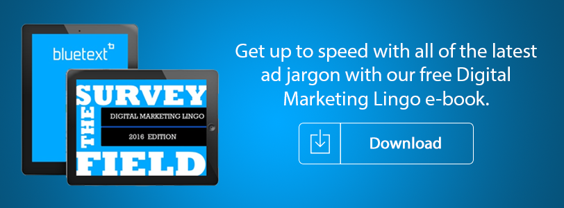
At Bluetext, we thought it might be fun to create a page from an adult coloring book and push it out through digital channels to our clients, colleagues, prospects, friends and others in the marketing world. We thought it might strike a chord of both nostalgia for our crayon years and curiosity on this new trend. We also thought it would differentiate us from other creative agencies, who may not always be looking for new ways their clients can differentiate themselves in their markets. You can see it for yourself here.
And we were right! The response has been amazing. We’ve had far more downloads than we ever imagined. It’s just another way for us to keep top of mind with our clients and prospects, one that does it in a fun and little bit different way. That’s smart digital marketing.
This is the creativity we bring to Bluetext. Imagine what we can do for your brand.

One of the most popular video series anywhere right now is comedian Jerry Seinfeld’s “Comedians In Cars Getting Coffee,” where Jerry takes other comedians out for rides in classic cars, and then they get coffee. It sounds simple, but it’s very funny, and very well-done. But what’s unique about the series is how it is designed: The videos are made first and foremost to be seen on mobile devices, not on television sets or even desktops or laptops. These aren’t just “mobile-friendly,” they were shot on video for the very small screen.
Once you know that, you can watch and see how that is done. All of the shots are tight on Jerry and his guests. Images of people and cars fill up the screen. Colors are rich and saturated, coffee cups are shown in close up, even the froth of the cappuccino is given over to the screen. There is no small type to get lost or details that can’t be seen on a small device. And while they still look good on larger screens, this is a mobile-first design in its purest form.
What does “Comedians in Cars” tell us marketers about video campaigns?
Number one, it’s a clear sign that consumers are comfortable ingesting rich content in its most compact form—on the small screen of a mobile device. If Jerry Seinfeld is creating for the smallest of video sizes, then that is where the audience is moving. And if marketing is going to reach this audience, it needs to create content that works well in that format.
Number two, creating a mobile-friendly video cannot be an after-thought. Every aspect of the design of the video, from concept and storyboard to shooting and post-production, must contemplate the mobile device as the primary focus. Not only must all of the key images be seen in tight focus, but any calls-to-action must be large and easy to read. Text must be minimal and clear. Subtlety is not your friend. Actions must be obvious and dialog crisp.
Number three, and assuming the video will be hosted on your company website, the video player must be capable of managing a responsive video, and your video size must be device agnostic. Your video content should be visible on an iPhone, a larger mobile device and a large monitor.
Number four, choose a bold image for your splash screen while the video is loading. It will draw viewers in and it’s good for search as it will make your video easily recognizable. Here’s an example of a bold splash screen image:
Finally, think carefully about your Call to Action. CTAs in videos on a mobile device may not be clickable. If you are unable to create a clickable CTA, consider a CTA that’s external to the video but still on the landing page.
As consumers rely on their mobile devices for gathering the information they need to make purchasing decisions, a video that is truly mobile first can move you ahead of the competition.
We all remember playing the game Battleship as kids, where the goal was to sink your opponent’s fleet of ships by guessing where they were placed on a grid. The origins of this simple game actually goes back to World War I, when the Allied Navy had developed large artillery guns but didn’t have the technology—such as sophisticated Radar—to know where to aim. Just as in the real life naval battles of a hundred years ago, the game of Battleship involves a series of guesses.
So what’s that have to do with smart website design? Well, here’s an easy trick to remember if you want to win the game. Line up your entire fleet along the outer edges of the grid. While the mathematical odds of being sunk by your opponent are theoretically the same no matter where you place your ships, in fact recent research into human nature proves that our guesses aren’t truly random. Instead, we tend to adhere to predictable patterns when it comes to the focus of our attention on the grid, and the same preferences hold true in the digital world.
The trick in Battleship is to avoid the places that your opponent is most likely to look. In a 2009 study that looked specifically at where people are most likely to focus on a grid, a phenomenon known as “the middle bias” was identified. Put simply, our eyes are three times more likely to gravitate towards the upper middle section of a grid or screen than towards a random location. The top most frequently chosen spots are all clustered right around the middle. Anything on the outer edges is far down the list.
By now, I hope the implications have sunk in. If there’s important information you want a visitor to quickly find on your website, don’t hide it along the edges—take advantage of the “middle bias” where their attention will hit first. Like the game of Battleship, web screens are a highly visual medium, and as we continue to adapt our thinking and processing to the digital world, smart design and placement will continue to influence our visual habits, especially when it comes to what we notice and engage with online.
This is only one of the more recent findings that new research into human behavior is revealing when it comes to how people interact with their screens. In another study, researchers used eye-tracking technology to see how people made choices when a number of options were displayed across a web screen. The findings showed that where the subjects looked on the screen depended on how many options they had in front of them. The more options on the screen, the more that their eyes settled near the center of the display. Those first locations remained the most popular spots even when additional screens were shown with more options. Just as importantly, the study demonstrated that decisions about which options to choose were heavily influenced by where their eyes focused.
Shlomo Benartzi, who chairs UCLA’s Behavioral Decision-Making Group in the Anderson School of Management, reaches this conclusion in his new book on web design called “The Smarter Screen: Surprising Ways to Influence and Improve Online Behavior:”
We like to imagine our choices as reflections of our conscious desires… But this data suggests that our choices are often shaped by the perceptual habits of the eye, which are drawn to certain items and areas of the screen. Sometimes, salience matters more than preference.
The results of this and similar studies is that subconscious preferences can play a larger role in shaping decisions on screen. Again, the implication should seem obvious: If you want a visitor to your home or landing page to make a particular selection from a range of options, place that option in the center of the selections and not on the edges.
At Bluetext, we spend a lot of time evaluating visitor preferences and habits to maximize their engagement when designing websites and digital marketing campaigns for our clients. As with all digital experiences today, our clients are competing for the attention of their target audiences, and understanding human nature can mean the difference between conversion and abandonment when it comes to their customers.
At Bluetext, we are frequently approached by organizations who are questioning the strength and positioning of their brand. They sometimes feel that their brand is getting stale, or that their service and solutions offerings no longer match up to the original name and are looking for guidance on what they should do. This is never an easy question. Any brand that has been in a market has built up brand equity and has begun to stand for something. Target audiences, including current customers, prospects, employees, partners, industry analysts and influencers, have perceptions of the brand, an image in their heads about its people, what the company can deliver, the quality of its products, solutions and services and whether they want to do business with the organization.
Knowing if and when to update the brand, through a new look and feel, a refreshed logo or tag line, its messaging and even its name, is important. We talked with a large company recently that was the market leader in their key verticals. Yet they didn’t think that their legacy brand and name would take them where they wanted to go, and wanted our counsel. Making the decision to jettison a name for a company in a leadership is a huge commitment and one that should never be taken lightly.
The answer is often found in market research in the form of a carefully crafted survey that will uncover what customers and prospects know about the brand, feel about the brand and how they would be likely to react if that brand underwent significant changes. It might be that a simple brand refresh is the best move, modernizing the logo and look and feel, for example. In other cases, a whole new name and approach to the market might be what’s needed to move the company to the next level. In every case, that decision should be informed by real insights into the market, and not just gut feelings that executives might have, no matter how close they think they are to their customers.
By surveying customers about a brand, the goal is to gain insight into very specific areas of knowledge and associations. This means that the survey approach has to be deliberate and precise. When done right, a brand awareness survey can offer the needed insights into:
Brand Recall: With brand recall, the respondent is given what’s known in the trade as an “unaided” question about which brands come to mind when, for example, they think about that particular market or solution. No options are provided to select from.
Brand Recognition: This is the “aided” opposite of an “unaided” question. The respondents are provided a list of companies with the goal of understanding when presented with a list of brands, do they recognize the company as a reputable option.
Brand Identity: Brand identity seeks to test which attributes the respondents associate with the company, and to understand how effective the marketing efforts have been in presenting the brand to the audience.
Brand Image: A brand’s image is based on the customer’s perception alone. Tracking disparities in the marketing and the image can reveal important gaps in marketing campaigns and results.
Brand Trust: This a fairly direct question that measures whether your audiences feel the brand is trustworthy, and is important for understanding client retention trends as well as new client acquisition.
Brand Loyalty: Loyal customers are often the best way to win over new ones, so tracking loyalty can give insight to whether the company is building the kind of customer relationships that turn them into evangelists for the brand.
Customer Profile: Changes in your core customer base may signal the need for a pivot, either in the product or service or in the marketing.
We are big believers in market research to inform these types of high-risk decisions, but only if it is the right kind of research that will deliver the insights that are needed. Not every research tool is going to deliver the best results for the client. Bluetext employs a number of methodologies for understanding how a market perceives a brand. They fall into a family of four types of survey tools and strategies, each providing a different way to reach a target audience and each that will deliver different types of insights:
IDI’s—In-Depth-Interviews are an easy way to understand the perspectives of the company’s executives as well as key customers. They are typically done one-on-one and follow a guided set of questions in order to compare answers among executives. They are conversational in order to get into more depth than a multiple choice question on a survey. We recommend including the CEO and head of sales as well as board members, customers and partners.
IDI’s help set a baseline from those with the most knowledge of the company and the market. They also allows us to gain insights from those on the front lines with clients and prospects, and how those key decision makers react and respond to the brand’s messaging. What IDI’s don’t do is give an unbiased view of the company, because by definition they rely on those with the most knowledge of the company. We think that is very valuable when beginning any research project. We use IDI’s extensively as part of our Discovery process and to develop new messages.
Online Panel Surveys—Online panels are today’s version of the phone surveys that used to dominate the research field, and understanding the difference is important. Panel surveys are gathered from people who agree to be included in online surveys, and are broad enough to provide a random sample for statistical purposes. One of the main differences from phone surveys is that the audience is self-selecting: they agree in advance to be included in panels.
Phone surveys have gone out of favor for our purposes due to the shrinking demographics of households that have phone lines, legal restrictions on calls to cell phones, high cost and declining participation rates. While phones surveys are important when a very precise analysis of public attitudes is needed, such as political campaigns, for example, we rarely include these in our clients’ projects.
Online panel surveys deliver a broad section of the target market with a randomized sampling that enables projections within a margin of error, and are the most economical way to do that. Online panels will include individuals who may not have a direct knowledge of the company or brand at issue, and so may provide insight into how well a brand is known compared to its competitors. However, those same individuals won’t have any insights to a company with which they are unfamiliar. For that reason, these types of surveys make the most sense when the company has enough name recognition or a large enough footprint that a majority of the survey respondents would have a good likelihood of at least some recognition of the company. We also recommend online panel surveys to understand market trends, audience behavior and to generate news or content in the form of proof points or even surprising results that challenge conventional wisdom.
Database Surveys—When the goal is analyzing how a company’s market and ecosystem perceives that brand, for example in relation to its key competitors, relying on people who already have familiarity with the company can often deliver the best results. This is especially true for brands that may not be a house-hold name in that market, and thus the majority of respondents to an online panel survey would not know the company. In these situations, we often recommend leveraging the company’s own database, which typically includes current and past customers and clients, prospects and others with whom they have communicated with or marketed to previously. By definition, this audience will have at least some familiarity with the brand, either through direct experience or through receiving emails or being targeted in marketing campaigns.
We call this approach “database surveys.” This allows us to employ a method that is more cost effective while still obtaining the valuable insight the company needs to make the hard brand decisions. The cost savings come in not having to purchase an online panel list or survey tool. We can employ survey tools like Survey Monkey to compile the responses and parse the data.
Focus Groups—The fourth tool that we use is called a Focus Group, which is a conversation with up to a dozen people at one time, led by a moderator who guides the discussion. Focus groups can use recruited individuals who fit certain categories, such as the industry they work in, the rank in their company, and even demographics for age and location. They can also use members of the company or customers, much as the IDI’s do. Focus groups are not randomly selected and do not return statistically significant responses, but that is not their purpose. They are better suited for testing new messaging, getting a response to a new brand or look and feel, or diving more deeply into perceptions and biases. One challenge of a focus group is that a particular individual can dominate the discussion and limit the participation from others, but a good moderator can keep the group on track and the conversation productive.
If you feel that your brand isn’t performing up to expectations, or believe it may be time for a refresh or a new direction, gives us a call. Bluetext can craft the right approach that will deliver the insights and results to make the right decisions.
This goes to the heart of every company’s SEO strategy. The clues come in a patent filing for something called an “implied link.” Before I explain why this is important, let’s first take a trip back to the early days of SEO and link-building.
Early on, Google would evaluate where a site ranks for any given search by looking at how many other sites were linking back to that page. If you were a valuable site, visitors would link to you in order to share that with their audience or to cite you as a good resource. That type of analysis would seem like an obvious way to measure the quality of the site.
But SEO gurus are always trying to stay one step ahead, and once link-farms and other shady techniques for creating myriads of back-links became prevalent, Google recognized that there’s no way to verify whether a link was added because a user genuinely likes the content or whether the link was paid for. The quality of a link can be corrupted through a wide variety of Black Hat tricks, and thus the value of all links came into question.
And while Google has updated its algorithms on numerous occasions over the years, that doesn’t mean that links aren’t still valuable for SEO. They are just much less valuable than they once were. Google is now much more selective about the quality of the site that is doing the linking. The New York Times continues to be the gold standard for the most valuable links.
But what if a publication like the Times mentions a brand or its product without a hyperlink? Shouldn’t that carry some weight, even though it doesn’t include a url?
![]()
That’s where Google’s patent comes into play. SEO insiders believe that the patent is related to last year’s Panda update, and that it describes a method for analyzing the value of “implied links,” that is, mentions on prominent sites without a link.
Let’s say the Times mentions in an article the website of NewCo as a great resource for a particular topic, but doesn’t include a link to NewCo’s website. Previously, there really wasn’t a measurable way for NewCo to benefit from that quality mention. With implied links, Google sees the mention in the Times article and factors that into its search ranking.
Implied links are also used as a sort of quality control tool for back-links in order to identify those that are most likely the result of Black Hat tricks. For example, if Google sees numerous incoming links from sites of questionable quality, it might search for implied links and find that no one is talking about that brand across the internet. Google looks at that evidence from the implied links to determine if the back-links are real and adjusts the rankings accordingly.
Here are four tips for adapting to Google’s focus on implied links:
• Don’t abandon your link-building strategy. Earned links are still effective when they come from valued sites. The most valuable links will still be for relevant, unique content.
• Brand reputation is key. When asking for mentions on other sites, try to have them use your brand name as much as possible. The same is true when you are posting on other sites. Use your brand name. Do the same in descriptive fields such as bios at the bottom of contributed content.
• Engage your audiences in conversation. Similar to word-of-mouth marketing, the more your brand name is being mentioned, even without links, the more it will benefit your SEO. Encourage that conversation as much as you can.
• Be creative and flexible. Google is always evolving its search engine algorithms. It’s difficult, but not impossible, to predict how they may change over the next year, or how effective today’s best practices will be tomorrow if you know how to follow the clues.
If anyone is looking for a strong example of the impact of website personalization, they don’t need to look any further than this year’s redesign of ESPN.com. ESPN’s move shouldn’t come as a surprise—after all, most enterprises redesign their websites every 18-to-24 months. But the reason that ESPN received so much attention is that it made one very significant strategic shift—its new website adapts to the person who is viewing it.
Some of the techniques that were built into the site allow it to reflect the location, preferences, interests and the device of each of its visitors. For example, it can predict (within reason-more on that later) your favorite team based on its best guess on your location. Once preferences are determined, it can prioritize relevant content every time you return to the site. That means the dynamic delivery of relevant content, a tailor-made river of information that is constantly updated.
ESPN certainly isn’t a pioneer in website personalization—after all, Amazon has been delivering that type of individualized content for years. But ESPN has figured out what every enterprise company needs to learn: Website visitors across all industries and sectors now expect at least some level of a customized experience. In fact, according to one recent survey, three-quarters of online consumers get frustrated when websites offer content that has nothing to do with their interests.
In other words, enterprise organizations that don’t start offering a more personalized experience will soon see their target audience abandoning their websites—resulting in lost opportunities for conversion, and, ultimately, lost revenues.
Here are four tips to help get you on your way to a better customized experience for your visitors:
Go Mobile First. This means installing technology that identifies the various devices that visitors use to view your content. First and foremost, Google rewards mobile-friendly sites in its page ranking, and is beginning to penalize those that aren’t. Viewers using their mobile devices need to be easily able to access content on those devices, and that requires a far different design than for a desktop or laptop.
Recognize the Buyer’s Journey. A first time visitor is going to need different types of content than someone who has already visited the site on several occasions. That means more general explanatory content for first-time visitors, with content moving towards specific questions and specifications as they move through the journey and towards a purchasing decision.
Use the Best Tools for Persona-based Content. Cookie technology is a necessity to understand and track where returning visitors have been on the site, what types of information they have sought, and what they might need next. Anticipating their needs and interests will result in a significant increase in conversion, and a decrease in frustration.
Allow Visitors to Contribute Their Own Personalization Settings. In the case of ESPN, it might seem obvious to assume that a visitor from Washington, D.C., was a Washington Nationals fan. translate But they could just as easily be a Baltimore Orioles lover. Checking in with that visitor directly will deliver better engagement, and better results.
Bluetext was one of the first agencies to sound the alarm for mobile-optimized websites after Google tweaked its search algorithm in late April. Dubbed “MobileGeddon” by SEO experts, Google announced that it would now reward mobile-friendly sites in search results that were coming from mobile devices. The only question in the minds of search marketers was how much of an impact this would have, or whether it was more of a bluff.
The results are in, and this was no bluff! According to a survey by Moovweb, having a mobile-friendly site is absolutely essential in the SEO competition for search result rankings. Moovweb tracked more than 1000 important keywords across a range of industries over a six-week period to see if Google was serious. Here is a snapshot of the results:
• 83 percent of the key words returned a mobile-friendly website as the top result.
• In 81 percent of the cases, the top three rankings went to mobile-friendly sites.
• When looking at all 10 of the search results that make up the first page of a Google search, 77 percent were mobile-friendly.
In other words, if you aren’t mobile-optimized, the odds of landing towards the top of a search, or even at the bottom of the first page, are very low. And for any company that relies on search to drive leads, conversions or outright sales, that can be very costly. According to recent report on CNN Money, the fall from the top can be precipitous:
• The top spot on a search result receives 20-to-30 percent of the page’s clicks;
• Spots number two and three produce five-to-10 percent of the page’s clicks;
• Any results below the fold attract less than one percent of the clicks;
• If you’re on the second page or lower, your clicks from search will be negligible.
The survey results can be interpreted as the glass being half full and as the glass being half empty. It’s impressive that such a high percentage of results returned mobile-friendly sites, demonstrating that companies with a lot at stake were able to quickly meet the Google requirements. That might be partly explained by Google’s early warning to the market that it was making this change—a heads up that Google has rarely given previously when it comes to search algorithm revisions.
On the other hand, who are the companies that show up in the 17 percent of the top results where sites are not mobile-friendly? The survey doesn’t say, but those brands may not be there for long. As the impact of the algorithm changes continues to be felt, those numbers will all climb towards 100 percent.
What’s interesting about the results when broken down by industry is that some sectors are more advanced than others, at least based on this survey. For example, retail has the highest percentage of mobile-friendly sites ranked in the number one spot for the keywords that Moovweb reviewed. That makes sense, as retailers have been early adapters in the mobile commerce world where the competitive stakes are so high. Close behind are healthcare, insurance and travel and hospitality.
Lagging far behind are the education and transportation verticals. These markets may simply not be as competitive in terms of SEO and are behind on the “mobile maturity” curve. Yet, as the use of mobile devices increases and search engine results become more important and more competitive in these lagging markets, organizations without a mobile-optimized platform will be left behind.
Here’s the bottom line: MobileGeddon is real, and the effects are being seen as well as felt. Even small changes to Google’s search engine algorithm can have a huge impact on a brand. The CNN Money report cites one company that had to lay off 10 percent of its work force because of its slide down the search result pages. Mobile matters, and that will only become more apparent over time.
Google has done it again. It has quietly released yet another tweak to its search engine that will have a dramatic impact on how a company’s website performs when viewers are searching. The bottom line for organizations: The user experience is becoming more and more important to a site’s rankings.
If you’re a marketing executive who has devoted a lot of time and resources to improving your SEO, you may find that keyword analysis and other search engine techniques are no longer enough. While still important, other site attributes may play just as big a role in where your site ranks in search results.
You may recall the last significant adjustment from Google, dubbed in the media as “MobileGeddon.” That update simply noted that a user’s experience from a mobile device was important. If a website wasn’t appropriately mobile-optimized for viewers, its ranking would be lower when a visitor was searching from their mobile device, and sites that were mobile-friendly would rank higher. That version of the Google algorithm got a lot of attention.
This latest rev has been well under the radar screen. There were no announcements from Google. In fact, it only came to light after search engine aficionados began sounding the alarms in early May, when they noticed that some sites’ rankings were plummeting. Two weeks passed before Google gave any official acknowledgment of what the company simply calls its “Quality Update.” Search engine wonks have dubbed it the “Phantom Update.”
So what does it do?
“How Google assesses quality is sometimes a thing of mystery,” writes Thomas Smale of Entrepeneur.com, “but we do know that it wants to provide users the the best information possible.”
The new Google update rewards sites that have a good user experience in addition to what it considers quality content. Having high quality content is important, but it’s also about rewarding sites that deliver a better experience, and punishing those who don’t deliver a good experience. So while redundant and thin content will get dinged, so too will sites that have self-starting videos, banner ads, and 404 errors.Here are four ways to make sure your site delivers the type of user experience that will be rewarded by Google’s search engine:
1) Get Rid of Thin Content. According to Google, this can include automatically-generated articles, thin affiliate pages, thin content from other sources such as the “scraped” content of low-quality guest blog posts, and “Doorway” pages created to rank highly for specific search queries, which Google views as bad for users because they end up taking the user to essentially the same destination. These techniques don’t provide users with substantially unique or valuable content. As a result, Google has applied a manual spam action to the portions of a site that include this type of thin content.
2) Remove Any Auto-Play Videos. Like many disruptive ad formats these are seen as providing a bad user experience and are punished by Google.
3) Filter User-Generated Content. That means having a strong moderator function for user-submitted posts to make sure that any blatant self-promotion or answers that are too general to be useful aren’t marked as spam by Google.
4) Eliminate Annoying Ad Formats. If your site begins to attract enough visitors so that advertisers want to pay for that real estate, be cautious. Excessive and disruptive ad displays, including above-the-fold ads, pop-ups, and similar techniques, are viewed by Google as a bad user experience and treated accordingly.
Websites should be designed to do what they were intended for in the first place; delivering a high-quality experience to users. That’s what Google likes and rewards in the race for page rankings.
Innovation in content marketing is nothing new, but sometimes it takes well-known brands and how they drive their marketing operations to recognize what’s really valuable. We’ve gathered some top content marketing examples and tips from some of the most recognizable global companies. Some aren’t only about innovation, but rather they show companies sticking to what’s most important about that brand. Others are more on the cutting edge. Here are my four top picks:
1) Pick a strategy that is core to your brand. IBM is known for three key assets: Its technical expertise, its role as long-time market leader, and its position as a respected source of IT information. To match its steady flow of content to its brand attributes IBM follows the same path. To uphold its reputation as a technology leader for more than a century, it has to produce authoritative content that underscores its thought leadership. Because the company is a technical powerhouse, it has to ensure that the content is technically authoritative. And because the company is trusted by millions to provide detailed descriptions of challenges and solutions, it has to make sure that its content is at an expert level. While trying to follow in IBM’s footsteps is not an easy task, it provides a strong lesson for how to approach your content. It should be well-written, possess authority, and have an expert voice. That’s what customers want and respond to.
2) Don’t be boring. This might sound obvious, but with many business-to-business or business-to-government solutions, it’s not always easy to sound interesting on technical topics. Resist the temptation to edit out content that might be fun and relevant, and that plays on popular topics or cultural experiences. Take Hootsuite as an example. There’s nothing very sexy about a tool that allows you to manage your social media posts. It’s mostly a dashboard with a number of useful applications tacked on. But Hootsuite rose to immense popularity by playing off a popular theme, the HBO television series “Game of Thrones.” It created a video called “Game of Social Thrones,” using graphics and music similar to the television show to demonstrate its capabilities. Each popular social platform has its own Game of Thrones city, and logos and images are cleverly used throughout. Timing is everything, of course, and the Hootsuite video garnered lots of buzz on YouTube. Hootsuite also makes sure that its content, even when serious, is fun, increasing its popular appeal. So while your brand or product may be technical and specialized, you can still write content with which your audience will identify on a popular level. The lesson: Don’t feel that you need to be serious all of the time. Create some fun, light content now and then.
3) Tell stories. It’s easy to fall back on technical explanations, and these are often important when conveying the value that a product or solution brings to the market. But telling a human interest story that illustrates what that technology brings to customers can be much more penetrating. Few do this better than Microsoft, whose “Stories” blog posts rarely even include the term software. Instead, they tell stories of how Microsoft technology has helped people, and in some cases changed their lives. In one example featuring sportscaster Daniel Jeremiah, the story is one of the human experience, of triumph, challenge and redemption. Daniel explains how as a scout for the Philadelphia Eagles, when he didn’t trust his instincts and the data at his disposal, he lost the opportunity to push for Seattle Seahawks superstar Russell Wilson. It’s a fun,personal and powerful story, and one that demonstrates Microsoft’s leadership not with a hard sell of its products, but with a tale that will stick in your mind.

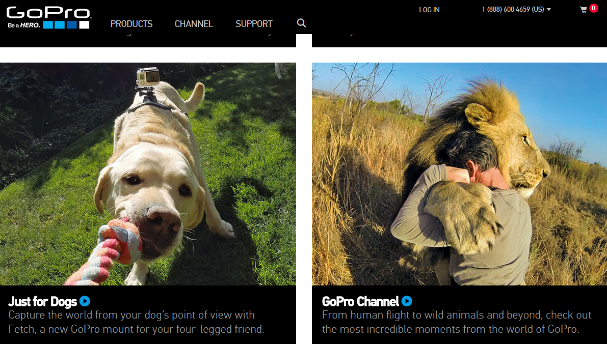
4) Go visual. Visual images draw attention, tell a story, and help illustrate a brand’s true value. The problem is, many companies, particularly in the technology space, don’t believe they have much they can show using photos or high-impact graphics. I’m going to put forward GoPro as a great example of a company that relies on the visual to tell it brand story. And yes, I recognize that it’s not a fair comparison—a company that sells action-oriented video equipment of course would have great videos to show off its products. But the thing about GoPro is that it almost never actually shows its cameras in its marketing efforts. Instead, GoPro focuses on its users. One of its leading cameras is called the Hero, and its campaign is to turn its customers into heroes. Much of its content is created by passionate users who are, in turn, becoming public heroes. Companies who aren’t in the video business can take a similar approach. Tell the story of your customers and end users using video and other visual assets to make them the heroes—for the challenges they are addressing and the problems they are solving. At the very least, use visual content and images to enhance your text-based content.
Taking an innovative approach to content marketing can pay off in spades for any brand willing to think creatively and act accordingly. But sticking to some basic truths about what customers want and expect will increase your brand footprint and drive market recognition and share.
The lowly infographic, once a novelty but more recently a must-have for markets trying to quickly a complicated message, seems to be in the twilight of its existence. What’s more properly referred to as a data visualization used to command the attention and admiration of marketing professionals everywhere. It wasn’t too long ago that such iconic and influential infographics as Aaron Koblin’s map of aircraft flights in the U.S. was dazzling us and pushing everyone towards this engaging new medium.
It’s easy to see why infographics became the darling of the marketing world. People like to be able to visualize complex issues. Our eyes are more comfortable scanning images than wading through data. And with the explosion of big data, making sense of all for that information through text alone can be difficult. We have worked with dozens of clients on ways to visualize and animate their complex data. The truth about infographics is that they are effective when done well, and will continue to be a valuable asset in the marketing toolkit.
Then why do they seem to be falling out of favor? Indeed, according to Sarah Rapp with the portfolio-sharing site Behance, “Infographic posting generally rose steadily from 2007 to 2012, where it peaked, and has begun to decline since then.”
As Fast Company contributor Mark Wilson wrote in a recent blog post, “A few years ago, the Internet was awash in groundbreaking data visualizations…Today, you’d be lucky to find a cheap knockoff in a world dominated by crappy promotional infographics churned out for viral attention.”
There are a few trends that help explain why infographics may seem like they are losing steam. One of the most obvious is the move to mobile, and as any reader of our recent blog post on the latest Google search algorithm change has learned, websites that aren’t mobile friendly are getting dinged in web searches. The reason is obvious—beautiful and intricate graphics typically do not translate to small-screen devices. If smartphones and tablets make up more than half of today’s web traffic, that’s a massive amount of viewers on which a sprawling data visualization would be lost.
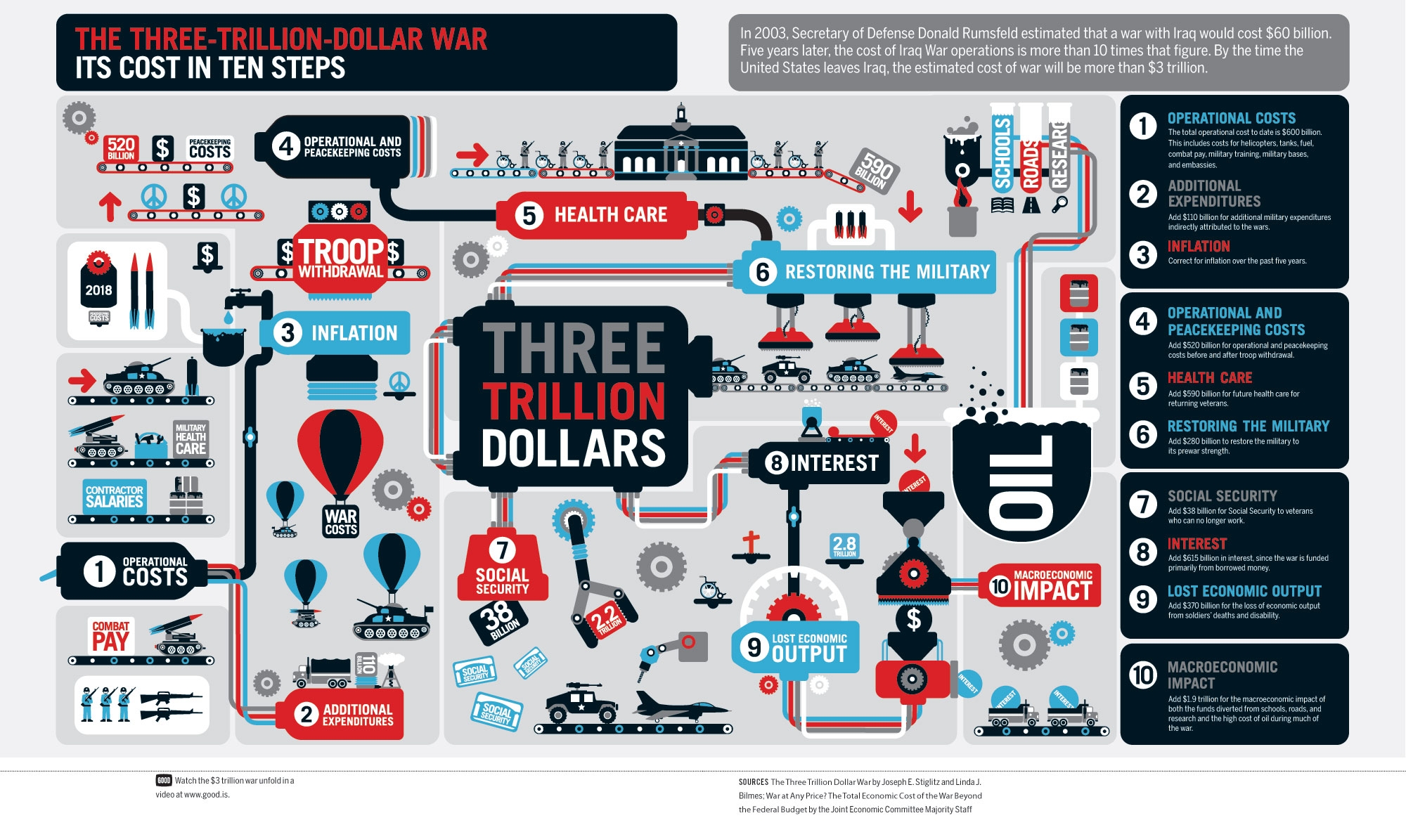
Another is more basic. Many infographics try to pack in so many details and so many data comparisons that they become incomprehensible. Rather than simplifying information, they end up confusing the viewer to the point of their eyes glazing over. Good designs are simple and eye-catching, not complicated and mind-numbing. Here’s an example of data overload:
Finally, as Mark Wilson notes, in many ways infographics have gone mainstream. “Once a playground for independent designers, data visualization has evolved into something more mature, corporate, and honest about its failings,” writes Wilson. “The quirky, experimental infographics that once peppered the Internet may be disappearing. But that’s only because data visualization, as a medium, has finally grown up and gotten a job.”
Bluetext comes at visualization from a different angle. We often work with our clients on what we call “StoryGraphics.” StoryGraphics, as the name suggests, tell a story rather than relying on comparative data to draw comparisons. In many cases, this is because the client may have key messages but not have data that lends itself to clever charts or graphs.
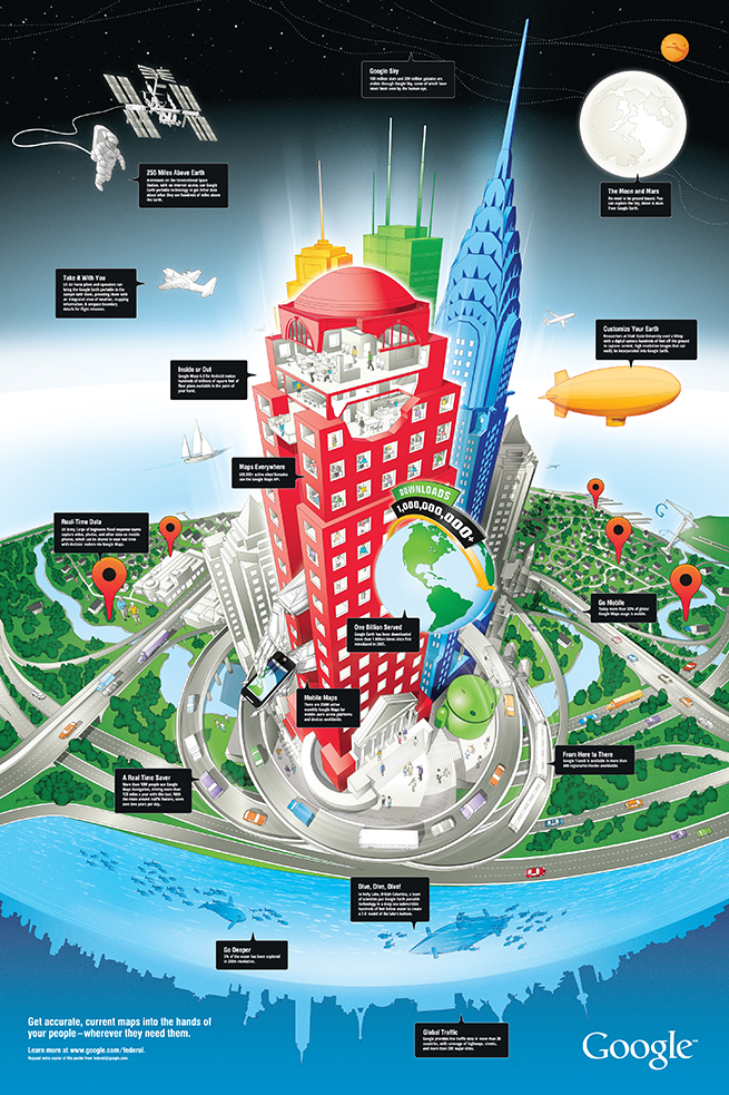
In a design we created for Google recently, the StoryGraphic tells how geospatial information can be used in space, for aviation, at all levels of commerce but also on the water and under the seas. A huge success for the Google enterprise team, this graphic would never have succeeded as a typical infographic.
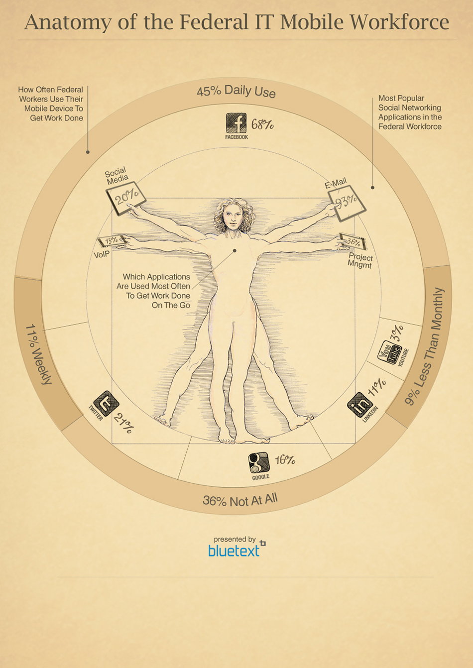
Another Bluetext example shows the move by Federal workers towards mobile devices. While data plays a role in the graphic, it leverages an iconic image to draw the viewer into the story that is being told.
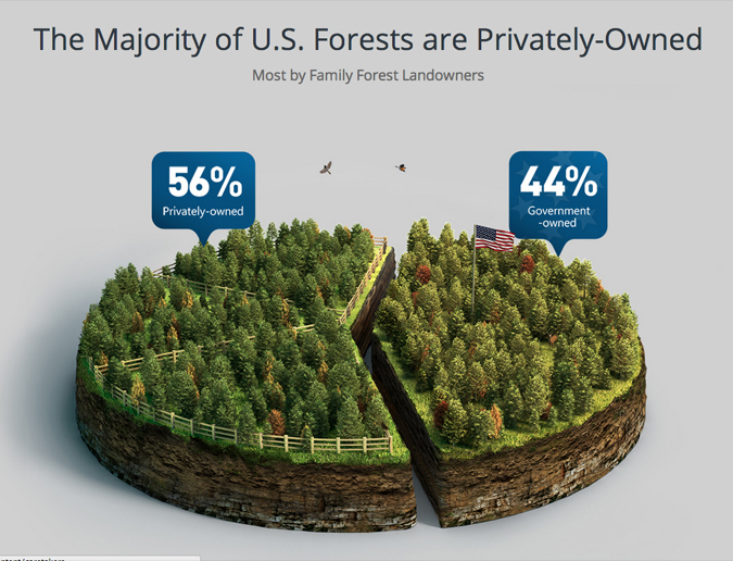
Some of our most compelling client examples do rely on comparative data, but focus on a limited number of statistics to more effectively tell the story. For a design for Georgia Pacific, one of the world’s leading wood products companies, we created a pie chart that took the form of a forest with just one cut down the middle to visualize the difference between government-owned and privately owned forests. The design instantly conveys the surprising fact that there are more private forests than government forests.
You can find compelling and intriguing examples of Bluetext StoryGraphics and infographics here in our portfolio. The bottom line is that marketers can turn to more sophisticated ways of using graphics to tell stories than a confusing jumble of facts and figures.